ポケットモンスター 教師なし機械学習・教師あり機械学習
私はポケモンに詳しくないので、ポケモンのデータを解析してみました。データセットは Pokemon with stats から取得。
データ読み込み
import pandas as pd # ライブラリ pandas をインポートし、以下 pd と呼ぶことにする。
詳細は タブ区切りデータ、コンマ区切りデータ等の読み込み を参照のこと。
# https://www.kaggle.com/abcsds/pokemon から取得した Pokemon.csv を読み込む。
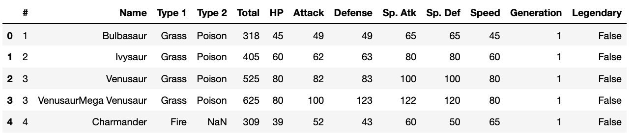
df = pd.read_csv("Pokemon.csv") # df とは、 pandas の DataFrame 形式のデータを入れる変数として命名
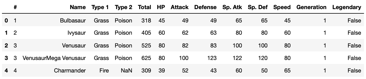
df.head() # 先頭5行を表示
https://www.kaggle.com/abcsds/pokemon によると、各カラム(列)は次のような意味らしいです。
- #: PokeDex index number
- Name: Name of the Pokemon
- Type 1: Type of pokemon
- Type 2: Other Type of Pokemon
- Total: Sum of Attack, Sp. Atk, Defense, Sp. Def, Speed and HP
- HP: Hit Points
- Attack: Attack Strength
- Defense: Defensive Strength
- Sp. Atk: Special Attack Strength
- Sp. Def: Special Defensive Strength
- Speed: Speed
- Generation: Number of generation
- Legendary: True if Legendary Pokemon False if not (more revision on mythical vs legendary needed)
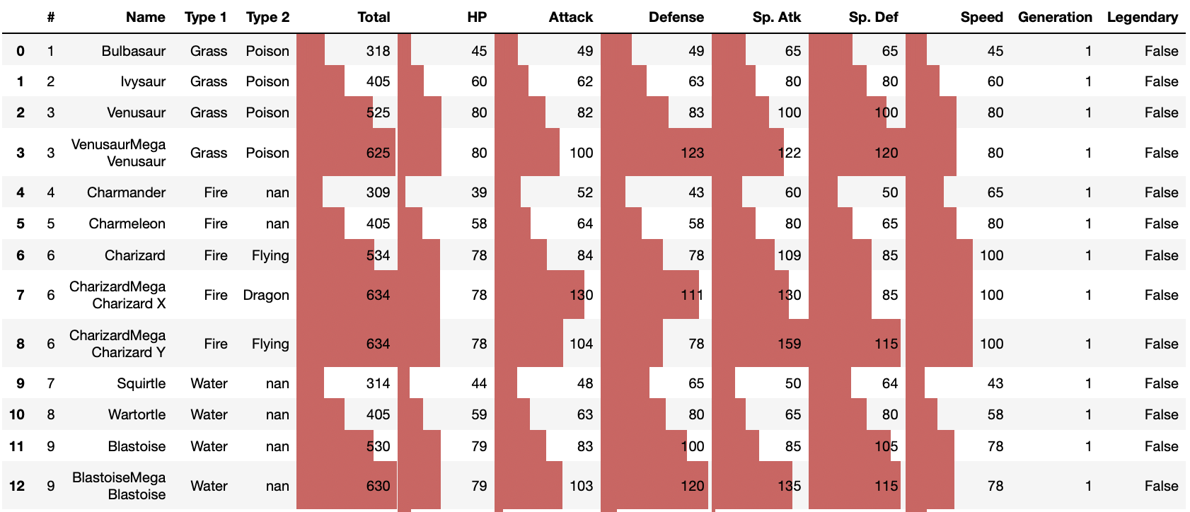
pandas 0.24.2 documentation » User Guide » Styling を参考に、数字の大きさに応じて棒グラフを表示してみます。
df.head(50).style.bar(subset=['Total', 'HP', 'Attack', 'Defense', 'Sp. Atk', 'Sp. Def', 'Speed'])
df.describe() # 平均値、標準偏差、最小値、25%四分値、中央値、75%四分値、最大値をまとめて表示
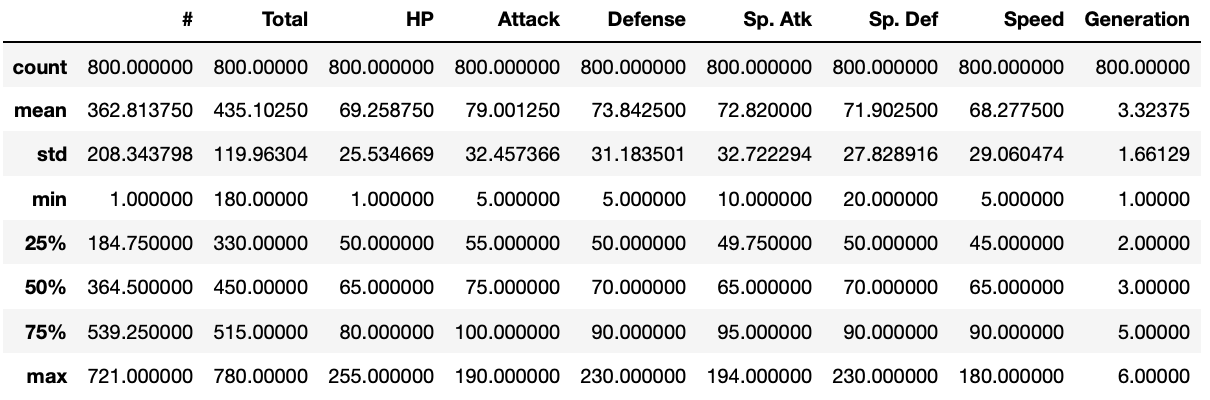
800体のポケモンのデータをこれから概観していきます。
散布図行列
まずは、データの全体像を眺めるため、散布図行列を描いてみましょう。
# Jupyter 上で絵を表示するためのマジックコマンド
%matplotlib inline
import matplotlib.pyplot as plt # matplotlib.pyplot をインポートし、以下 plt と呼ぶ。
# 散布図行列
from pandas.tools import plotting
# from pandas import plotting # 新しいバージョンではこちらを
plotting.scatter_matrix(df.iloc[:, 4:11], figsize=(8, 8))
plt.show()

ポケモンのパラメータ(Total、HP、Attack、Defense、Sp. Atk、Sp. Def、Speed)間の関係が何となく見えてきましたね。これらのパラメータと、属性(Type 1)との間に関係はあるでしょうか?まずは属性が何種類あるかリストアップしてみましょう。
type1s = list(set(list(df['Type 1'])))
print(len(type1s), type1s)
18 ['Ground', 'Bug', 'Grass', 'Fire', 'Normal', 'Fighting', 'Psychic', 'Electric', 'Water', 'Ice', 'Poison', 'Dark', 'Fairy', 'Rock', 'Steel', 'Flying', 'Ghost', 'Dragon']
属性は18種類。これらと各パラメータとの間に関係があるかどうか、散布図行列に属性で色をつけてみましょう。
cmap = plt.get_cmap('coolwarm')
colors = [cmap((type1s.index(c) + 1) / (len(type1s) + 2)) for c in df['Type 1'].tolist()]
plotting.scatter_matrix(df.iloc[:, 4:11], figsize=(8, 8), color=colors, alpha=0.5)
plt.show()

、、、よく分かりませんね。ちょっと横道に逸れますが、色のつけ方を自分好みにしたければ下記のようにして設定できます。
from matplotlib.colors import LinearSegmentedColormap
dic = {'red':   ((0, 0, 0), (0.5, 1, 1), (1, 1, 1)),
       'green': ((0, 0, 0), (0.5, 1, 1), (1, 0, 0)),
       'blue':  ((0, 1, 1), (0.5, 0, 0), (1, 0, 0))}

tricolor_cmap = LinearSegmentedColormap('tricolor', dic)
cmap = tricolor_cmap
colors = [cmap((type1s.index(c) + 1) / (len(type1s) + 2)) for c in df['Type 1'].tolist()]
plotting.scatter_matrix(df.iloc[:, 4:11], figsize=(8, 8), color=colors)
plt.show()

、、、この色のつけ方が好みかどうかはさておき、どっちにしても、パラメータと属性との関係はよく分かりませんね。
相関行列
パラメータ間の関係は、散布図行列を描くのも良いですが、ピアソンの相関係数を使って表すこともできます。
import numpy as np
pd.DataFrame(np.corrcoef(df.iloc[:, 4:11].T.values.tolist()),
             columns=df.iloc[:, 4:11].columns, index=df.iloc[:, 4:11].columns)
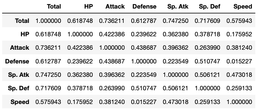
これでは全体を把握しづらいので、カラーマップとして表現してみましょう。
corrcoef = np.corrcoef(df.iloc[:, 4:11].T.values.tolist())
plt.imshow(corrcoef, interpolation='nearest', cmap=plt.cm.coolwarm)
plt.colorbar(label='correlation coefficient')
tick_marks = np.arange(len(corrcoef))
plt.xticks(tick_marks, df.iloc[:, 4:11].columns, rotation=90)
plt.yticks(tick_marks, df.iloc[:, 4:11].columns)
plt.tight_layout()
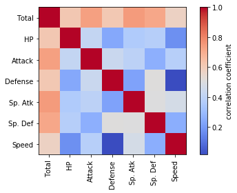
どのパラメータも互いに正の相関があるようですが、Defence(防御力)と Speed (スピード)の間にはほとんど相関がないようです。
相関行列も、先ほどの「自分好みの」配色にしてみましょう。
corrcoef = np.corrcoef(df.iloc[:, 4:11].T.values.tolist())
plt.imshow(corrcoef, interpolation='nearest', cmap=tricolor_cmap)
plt.colorbar(label='correlation coefficient')
tick_marks = np.arange(len(corrcoef))
plt.xticks(tick_marks, df.iloc[:, 4:11].columns, rotation=90)
plt.yticks(tick_marks, df.iloc[:, 4:11].columns)
plt.tight_layout()
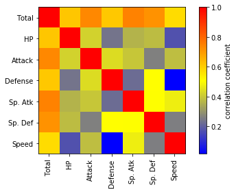
、、、分かりにくくなってしまったかもしれませんが。
バイオリンプロット
バイオリンプロットは各変数の分布を眺めるいわゆるひとつの便利な方法です。
# バイオリンプロット
fig = plt.figure()
ax = fig.add_subplot(111)
ax.violinplot(df.iloc[:, 4:11].values.T.tolist())
ax.set_xticks([1, 2, 3, 4, 5, 6, 7]) #データ範囲のどこに目盛りが入るかを指定する
ax.set_xticklabels(df.columns[4:11], rotation=90)
plt.grid()
plt.show()

属性ごとに、バイオリンプロットを描いてみましょう。それぞれのポケモンの強さの傾向の違いが見えるはずです。
for index, type1 in enumerate(type1s):
    df2 = df[df['Type 1'] == type1]
    fig = plt.figure(figsize=(8, 4))
    ax = fig.add_subplot(1, 1, 1)
    plt.title(type1)
    ax.set_ylim([0, 260])
    ax.violinplot(df2.iloc[:, 5:11].values.T.tolist())
    ax.set_xticks([1, 2, 3, 4, 5, 6]) #データ範囲のどこに目盛りが入るかを指定する
    ax.set_xticklabels(df2.columns[5:11], rotation=90)
    plt.grid()
    plt.show()
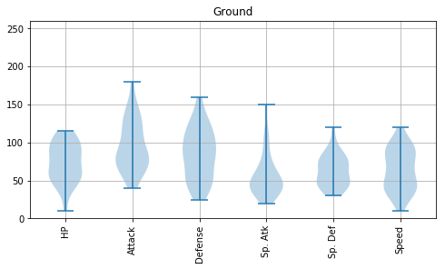


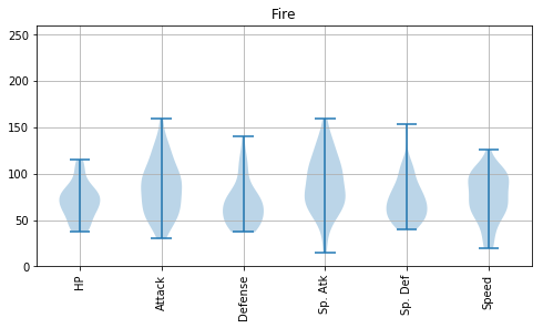


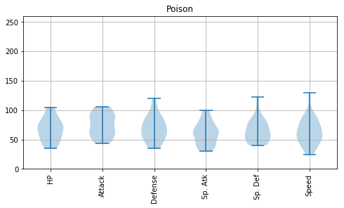


Psychic は攻撃力含め総合的に高いものがいるとか、Steel は防御力が高めだとか、Flying の能力分布は上位の方に偏っているとか、Dragon は意外と防御力が低めだとか、いろんな傾向が読み取れます。
主成分分析
800体のポケモンを主成分分析して、第一主成分と第二主成分を用いて2次元平面状にプロットしてみましょう。
主成分分析(principal component analysis, PCA)とは多変量解析手法のうち次元削減手法としてよく用いられる手法の一種で、相関のある多変数から、相関のない少数で全体のばらつきを最もよく表す変数を合成します。
今回のデータは、800体のポケモンの特徴が、6種類の「観測変数」(x1, x2, x3, x4, x5, x6) で表されています。この6変数を説明変数とします。これに対し、PCAで合成する合成変数は「主成分得点」といい、次式のように線型結合で与えられます。「合成変数」と呼んだり「潜在変数」と呼んだりすることもあり、紛らわしいです。
yPC1 = a1,1 x1 + a1,2 x2 + a1,3 x3 + a1,4 x4 + a1,5 x5 + a1,6 x6
yPC2 = a2,1 x1 + a2,2 x2 + a2,3 x3 + a2,4 x4 + a2,5 x5 + a2,6 x6
yPC3 = a3,1 x1 + a3,2 x2 + a3,3 x3 + a3,4 x4 + a3,5 x5 + a3,6 x6
...
yPC6 = a6,1 x1 + a6,2 x2 + a6,3 x3 + a6,4 x4 + a6,5 x5 + a6,6 x6
ここで、係数 aij (i = 1...6, j = 1...6) を「固有ベクトル」といい、主成分得点に対する観測値の影響度を表します。説明変数の個数が p の場合、主成分PCは p 個算出されます。
主成分分析では、固有値(=主成分得点の分散)が大きい主成分得点ほど重要と判断します。
ちなみに、主成分分析は「教師なし機械学習」の一種とされ、データ自身が持つ構造を明らかにします。詳しくは 主成分分析をExcelで理解する や 主成分分析を Python で理解する などを参照のこと。
from sklearn.decomposition import PCA #主成分分析器
# 主成分分析の実行
pca = PCA()
pca.fit(df.iloc[:, 5:11])
# データを主成分空間に写像 = 次元圧縮
feature = pca.transform(df.iloc[:, 5:11])
# 第一主成分と第二主成分でプロットする
plt.figure(figsize=(8, 8))
plt.scatter(feature[:, 0], feature[:, 1], alpha=0.8)
plt.xlabel('PC1')
plt.ylabel('PC2')
plt.grid()
plt.show()

このプロットがどの程度の量の情報を表しているでしょうか。主成分分析した時は、累積寄与率を確認することが必要です。
# 累積寄与率を図示する
import matplotlib.ticker as ticker
import numpy as np
plt.gca().get_xaxis().set_major_locator(ticker.MaxNLocator(integer=True))
plt.plot([0] + list( np.cumsum(pca.explained_variance_ratio_)), "-o")
plt.xlabel("Number of principal components")
plt.ylabel("Cumulative contribution ratio")
plt.grid()
plt.show()
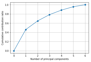
第一主成分と第二主成分で累積寄与率が70%弱。けっこう情報損失していますが、これで何が言えるか考えてみましょう。主成分分析のプロットを属性で色分けしてみます。
# 主成分分析の実行
pca = PCA()
pca.fit(df.iloc[:, 5:11])
# データを主成分空間に写像 = 次元圧縮
feature = pca.transform(df.iloc[:, 5:11])
# 第一主成分と第二主成分でプロットする
plt.figure(figsize=(8, 8))
for type1 in type1s:
    plt.scatter(feature[df['Type 1'] == type1, 0], feature[df['Type 1'] == type1, 1], alpha=0.8, label=type1)
plt.xlabel('PC1')
plt.ylabel('PC2')
plt.legend(loc = 'upper right',
          bbox_to_anchor = (0.7, 0.7, 0.5, 0.1),
          borderaxespad = 0.0)
plt.grid()
plt.show()

んー、主成分と属性は特に関係なさそうですね。では、世代(generation)はどうでしょうか。
# 主成分分析の実行
pca = PCA()
pca.fit(df.iloc[:, 5:11])
# データを主成分空間に写像 = 次元圧縮
feature = pca.transform(df.iloc[:, 5:11])
# 第一主成分と第二主成分でプロットする
plt.figure(figsize=(8, 8))
for generation in range(0, 7):
    plt.scatter(feature[df['Generation'] == generation, 0], feature[df['Generation'] == generation, 1], alpha=0.8, label=generation)
plt.xlabel('PC1')
plt.ylabel('PC2')
plt.legend(loc = 'upper right',
          bbox_to_anchor = (0.7, 0.7, 0.5, 0.1),
          borderaxespad = 0.0)
plt.grid()
plt.show()

これも特に関係なさそうです。では Legendary (伝説のポケモンかどうか)は?
# 主成分分析の実行
pca = PCA()
pca.fit(df.iloc[:, 5:11])
# データを主成分空間に写像 = 次元圧縮
feature = pca.transform(df.iloc[:, 5:11])
# 第一主成分と第二主成分でプロットする
plt.figure(figsize=(8, 8))
for binary in [True, False]:
    plt.scatter(feature[df['Legendary'] == binary, 0], feature[df['Legendary'] == binary, 1], alpha=0.8, label=binary)
plt.xlabel('PC1')
plt.ylabel('PC2')
plt.legend(loc = 'upper right',
          bbox_to_anchor = (0.7, 0.7, 0.5, 0.1),
          borderaxespad = 0.0)
plt.grid()
plt.show()
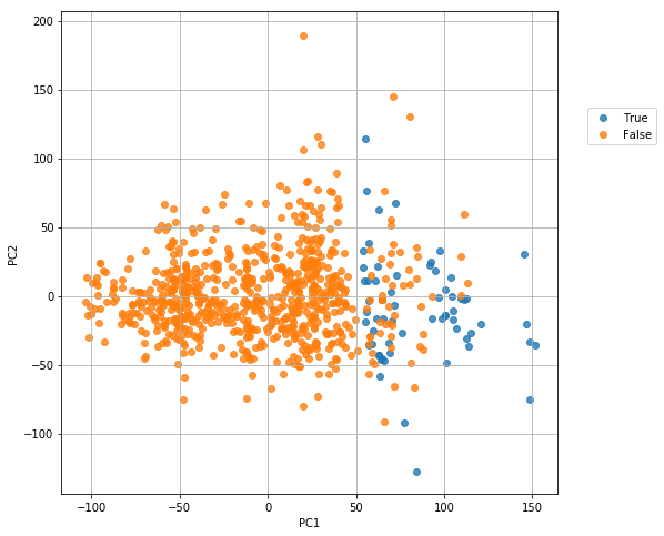
第一主成分(PC1)が 50 のところで、完全ではありませんが、伝説のポケモンになれるどうかの区別ができそうです!
では、第一主成分(PC1)がどの説明変数(パラメータ)からどの程度寄与されているかローディングプロットで図示してみましょう。
# 第一主成分と第二主成分における観測変数の寄与度をプロットする
plt.figure(figsize=(8, 8))
for x, y, name in zip(pca.components_[0], pca.components_[1], df.columns[5:11]):
    plt.text(x, y, name)
plt.scatter(pca.components_[0], pca.components_[1])
plt.grid()
plt.xlabel("PC1")
plt.ylabel("PC2")
plt.show()
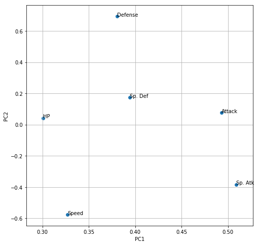
第一主成分(PC1)が「伝説のポケモンになれるかどうかの指標」だとして、それは「Sp. Atk」(会心の一撃の強さ?かと思ってたけど「特殊攻撃力」だそうです)と「Attack」(攻撃力)の寄与が大きいようです。
第二主成分(PC1)は、Defence(防御力)と Speed (スピード)が正負逆の寄与をしています。これは
「当たらなければ、どうということはない!」
という名言で有名な、通常の3倍速い赤い彗星ことシャア・アズナブル的な戦術を取るかどうかという流儀の違いでしょうか。
因子分析
主成分分析とは似て非なる手法として「因子分析」(Factor Analysis) があります。
主成分分析(PCA)では、説明変数に対して重み行列(固有ベクトル)a を線形結合した「主成分」 yPC1を合成しました。ここで、主成分は、説明変数と同じ数だけ定義します。
yPC1 = a1,1 x1 + a1,2 x2 + a1,3 x3 + a1,4 x4 + a1,5 + ...
因子分析では、説明変数(観測変数)x が「因子」(factor) という潜在変数から合成されるという考え方に基づき、その因子得点 f と重み行列(因子負荷) w 、そして独自因子 e を特定します(主成分分析に独自因子という考え方はありません)。
x1 = w1,1 f1 + w1,2 f2 + e1
x2 = w2,1 f1 + w2,2 f2 + e2
x3 = w3,1 f1 + w3,2 f2 + e3
x4 = w4,1 f1 + w4,2 f2 + e4
x5 = w5,1 f1 + w5,2 f2 + e5
x6 = w6,1 f1 + w6,2 f2 + e6
因子得点 f は、各個体(サンプル)が独自に持つ潜在変数です。因子得点と因子負荷の線形和(w1,1 f1 + w1,2 f2 など)を「共通因子」と呼び、観測変数独自の「独自因子」e と足し合わせることで「観測変数」として観測できるという考え方です。因子の個数は説明変数よりも小さな個数を使うのが普通で、あらかじめ決めておく必要があります。
(ただし、共通因子や因子などの用語は、調べてみた限り異なる人が異なる定義をしているように見えますので、大変紛らわしいです。私の説明のほうが間違っている可能性もありますのでその際はご容赦ください。)
詳しくは 因子分析をExcelで理解する を参照のこと。
from sklearn.decomposition import FactorAnalysis
fa = FactorAnalysis(n_components=2, max_iter=500)
factors = fa.fit_transform(df.iloc[:, 5:11])
plt.figure(figsize=(8, 8))
for binary in [True, False]:
    plt.scatter(factors[df['Legendary'] == binary, 0], factors[df['Legendary'] == binary, 1], alpha=0.8, label=binary)
plt.xlabel("Factor 1")
plt.ylabel("Factor 2")
plt.legend(loc = 'upper right',
          bbox_to_anchor = (0.7, 0.7, 0.5, 0.1),
          borderaxespad = 0.0)
plt.grid()
plt.show()
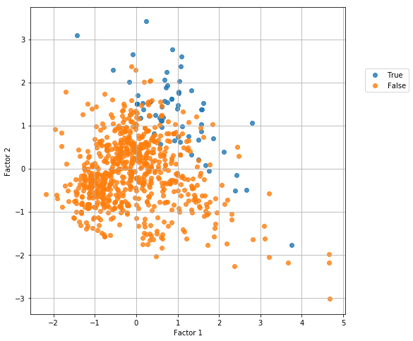
伝説のポケモンになれるかどうかは、因子1と因子2の和が一定以上になるかどうかで決まりそうですが、因子2の大きい方にやや偏っているようです。ではその因子2や因子1はどのパラメータに寄与しているでしょうか?
# 第一主成分と第二主成分における観測変数の寄与度をプロットする
plt.figure(figsize=(8, 8))
for x, y, name in zip(fa.components_[0], fa.components_[1], df.columns[5:11]):
    plt.text(x, y, name)
plt.scatter(fa.components_[0], fa.components_[1])
plt.grid()
plt.xlabel("Factor 1")
plt.ylabel("Factor 2")
plt.show()

因子2は「Sp. Atk」(特殊攻撃力)に、因子1は Defense (防御力)に大きく寄与しているようです。
行列の標準化
次の処理に用いるため、データの標準化を行っておきましょう。平均値で引いてから標準偏差で割ります。 axis=0 (列ごとの処理)と axis=1(行ごとの処理)の違いに注意しましょう。詳しくは Pandas を用いた演算 を参照のこと。
# 行列の正規化
dfs = df.iloc[:, 5:11].apply(lambda x: (x-x.mean())/x.std(), axis=0)
階層的クラスタリング
階層的クラスタリングについては 階層的クラスタリング入門の入門 などを参照のこと。これも「教師なし機械学習」の一種です。
クラスタリングには色んな metric(「距離」の定義)と method (結合方法)があるので、その中からそれぞれ一つずつを選択します。
# metric は色々あるので、ケースバイケースでどれかひとつ好きなものを選ぶ。
# method も色々あるので、ケースバイケースでどれかひとつ好きなものを選ぶ。
from scipy.cluster.hierarchy import linkage, dendrogram
result1 = linkage(dfs,
                  #metric = 'braycurtis',
                  #metric = 'canberra',
                  #metric = 'chebyshev',
                  #metric = 'cityblock',
                  #metric = 'correlation',
                  #metric = 'cosine',
                  metric = 'euclidean',
                  #metric = 'hamming',
                  #metric = 'jaccard',
                  #method= 'single')
                  method = 'average')
                  #method= 'complete')
                  #method='weighted')
plt.figure(figsize=(8, 128))
dendrogram(result1, orientation='right', labels=list(df['Name']), color_threshold=2)
plt.title("Dedrogram")
plt.xlabel("Threshold")
plt.grid()
plt.show()

指定したクラスタ数になるよう分割
上記の結果をもとに、指定したクラスタ数でクラスタ(特徴のよく似たグループ)を作りましょう。詳細は 階層的クラスタリングとシルエット係数 を参照のこと。
# 指定したクラスタ数でクラスタを得る関数を作る。
def get_cluster_by_number(result, number):
    output_clusters = []
    x_result, y_result = result.shape
    n_clusters = x_result + 1
    cluster_id = x_result + 1
    father_of = {}
    x1 = []
    y1 = []
    x2 = []
    y2 = []
    for i in range(len(result) - 1):
        n1 = int(result[i][0])
        n2 = int(result[i][1])
        val = result[i][2]
        n_clusters -= 1
        if n_clusters >= number:
            father_of[n1] = cluster_id
            father_of[n2] = cluster_id

        cluster_id += 1

    cluster_dict = {}
    for n in range(x_result + 1):
        if n not in father_of:
            output_clusters.append([n])
            continue

        n2 = n
        m = False
        while n2 in father_of:
            m = father_of[n2]
            #print [n2, m]
            n2 = m

        if m not in cluster_dict:
            cluster_dict.update({m:[]})
        cluster_dict[m].append(n)

    output_clusters += cluster_dict.values()

    output_cluster_id = 0
    output_cluster_ids = [0] * (x_result + 1)
    for cluster in sorted(output_clusters):
        for i in cluster:
            output_cluster_ids[i] = output_cluster_id
        output_cluster_id += 1

    return output_cluster_ids
たとえば 50 個のクラスタに分割したいと思います。
clusterIDs = get_cluster_by_number(result1, 50)
print(clusterIDs)
[0, 0, 1, 2, 0, 3, 4, 4, 2, 0, 0, 1, 2, 0, 0, 3, 0, 0, 3, 5, 0, 0, 3, 4, 0, 3, 0, 3, 0, 3, 0, 3, 0, 0, 0, 0, 3, 0, 0, 3, 0, 1, 0, 3, 6, 7, 0, 3, 0, 0, 1, 0, 0, 0, 3, 8, 9, 0, 3, 0, 3, 0, 3, 0, 4, 0, 0, 3, 10, 10, 4, 11, 0, 0, 12, 0, 0, 12, 13, 1, 14, 14, 15, 3, 3, 0, 1, 16, 14, 17, 0, 0, 3, 0, 1, 0, 12, 14, 18, 10, 10, 4, 11, 19, 0, 1, 14, 12, 10, 9, 14, 12, 14, 0, 20, 20, 1, 14, 17, 14, 15, 21, 17, 22, 22, 14, 17, 0, 3, 10, 3, 13, 3, 4, 3, 3, 12, 23, 3, 8, 22, 24, 1, 0, 0, 1, 4, 20, 0, 14, 17, 14, 12, 3, 5, 25, 1, 4, 4, 0, 3, 24, 4, 26, 26, 1, 0, 0, 1, 0, 3, 4, 0, 0, 3, 0, 3, 0, 1, 0, 13, 0, 0, 3, 0, 1, 8, 0, 6, 14, 0, 0, 3, 0, 0, 1, 27, 1, 0, 1, 14, 1, 0, 0, 3, 0, 0, 1, 3, 0, 12, 4, 28, 3, 1, 3, 0, 29, 3, 14, 15, 1, 30, 31, 31, 0, 12, 3, 12, 24, 32, 22, 23, 9, 0, 12, 0, 33, 0, 12, 0, 0, 12, 0, 13, 30, 0, 3, 4, 1, 0, 15, 1, 3, 0, 0, 20, 10, 3, 3, 22, 21, 4, 22, 1, 0, 0, 24, 24, 28, 2, 1, 0, 3, 3, 4, 0, 0, 4, 4, 0, 0, 12, 24, 0, 3, 0, 3, 0, 0, 0, 0, 0, 0, 0, 1, 0, 0, 3, 0, 9, 0, 17, 0, 0, 4, 2, 0, 0, 0, 12, 0, 3, 34, 14, 9, 35, 0, 0, 3, 0, 25, 0, 36, 0, 0, 0, 33, 0, 33, 14, 15, 31, 31, 0, 3, 3, 0, 3, 4, 3, 3, 3, 3, 3, 0, 1, 37, 4, 4, 7, 7, 0, 12, 27, 15, 0, 1, 0, 35, 0, 3, 0, 12, 0, 1, 1, 3, 12, 3, 3, 0, 3, 0, 12, 0, 1, 0, 1, 0, 12, 8, 1, 3, 1, 0, 12, 20, 36, 33, 1, 3, 12, 4, 0, 0, 3, 4, 0, 1, 1, 14, 17, 17, 15, 10, 0, 0, 4, 24, 0, 0, 24, 24, 31, 38, 39, 1, 2, 4, 2, 2, 40, 24, 41, 42, 26, 1, 43, 43, 39, 44, 0, 0, 12, 0, 3, 3, 0, 0, 1, 0, 0, 3, 0, 3, 0, 3, 0, 0, 4, 0, 4, 37, 45, 36, 39, 0, 0, 0, 0, 0, 0, 1, 3, 0, 3, 0, 3, 0, 1, 3, 0, 7, 0, 3, 5, 4, 12, 0, 3, 0, 0, 3, 36, 33, 14, 13, 6, 3, 33, 0, 3, 22, 24, 25, 0, 4, 4, 0, 15, 14, 30, 0, 3, 12, 0, 3, 13, 0, 3, 27, 5, 17, 1, 15, 15, 4, 4, 1, 3, 30, 17, 30, 22, 4, 20, 23, 39, 33, 3, 3, 17, 17, 17, 17, 17, 28, 1, 4, 2, 2, 2, 24, 42, 42, 28, 3, 1, 4, 1, 4, 42, 1, 0, 3, 3, 0, 3, 12, 0, 0, 12, 0, 3, 0, 0, 22, 0, 3, 0, 3, 0, 3, 0, 3, 0, 1, 0, 0, 3, 0, 3, 14, 14, 15, 0, 3, 0, 22, 1, 28, 0, 12, 15, 0, 0, 3, 25, 22, 0, 0, 3, 0, 14, 3, 0, 3, 0, 3, 3, 0, 0, 22, 0, 22, 46, 12, 0, 15, 0, 33, 3, 14, 33, 14, 15, 12, 4, 0, 3, 0, 4, 0, 3, 0, 0, 1, 47, 47, 1, 0, 3, 0, 0, 1, 0, 3, 3, 0, 15, 0, 1, 0, 1, 7, 0, 3, 36, 33, 0, 0, 30, 0, 0, 12, 0, 1, 0, 0, 17, 0, 12, 12, 0, 12, 13, 14, 9, 1, 0, 4, 12, 0, 12, 0, 12, 12, 0, 22, 0, 22, 12, 30, 0, 0, 4, 0, 4, 30, 22, 1, 4, 3, 4, 4, 2, 24, 4, 4, 42, 24, 42, 4, 4, 2, 22, 4, 0, 0, 15, 0, 3, 4, 0, 3, 3, 0, 3, 0, 0, 3, 0, 0, 3, 0, 3, 0, 0, 2, 0, 1, 0, 12, 3, 0, 3, 3, 14, 15, 48, 39, 0, 1, 0, 3, 0, 3, 0, 15, 0, 1, 0, 1, 0, 4, 0, 15, 0, 1, 1, 3, 3, 39, 0, 1, 2, 3, 0, 12, 0, 0, 0, 0, 30, 30, 15, 15, 14, 31, 0, 3, 42, 42, 1, 39, 49, 2, 40, 2]
クラスタへの分配のされ方は次のようになりました。
plt.hist(clusterIDs, bins=50)
plt.grid()
plt.show()

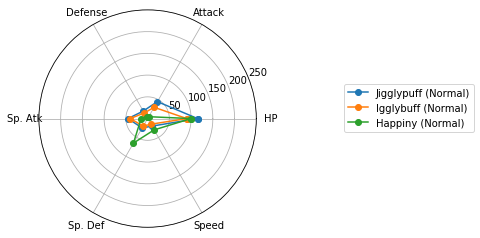
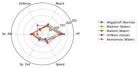
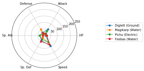
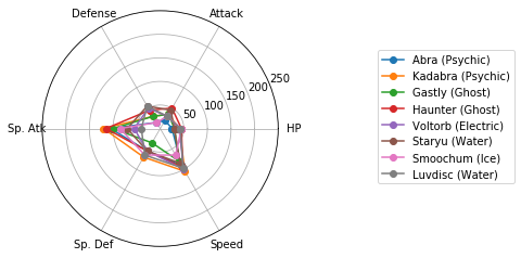
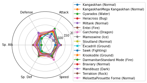
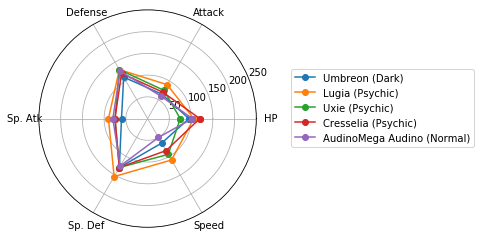
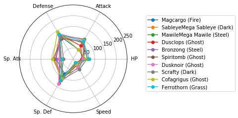
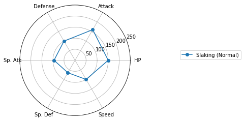
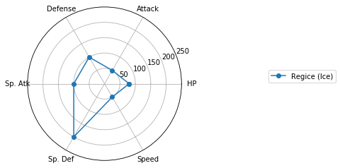
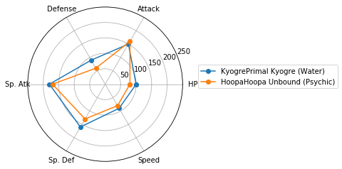
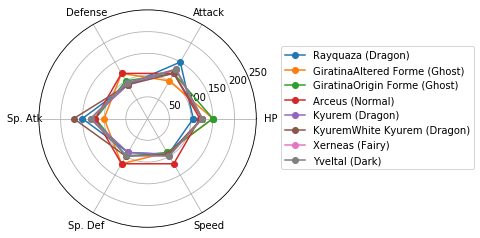
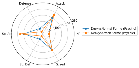
レーダーチャートによるクラスタの図示
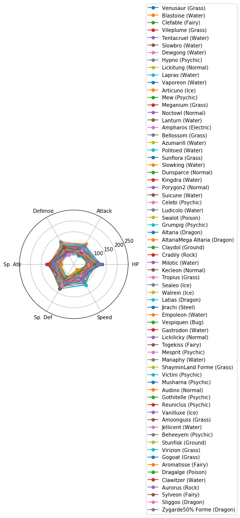
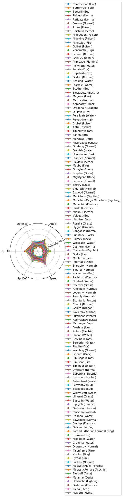
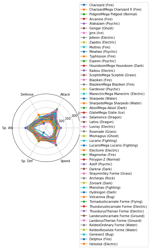
Matplotlibでレーダーチャートを描く(16行) を参考に、各クラスターに分類されたポケモンの特徴を可視化しましょう。
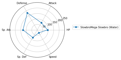
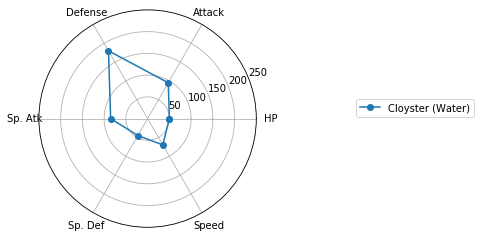
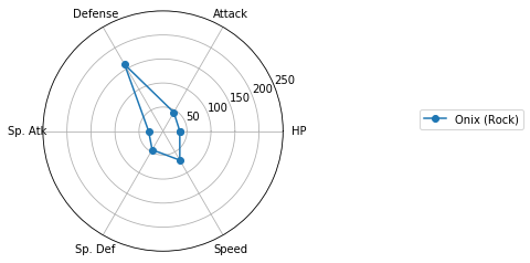
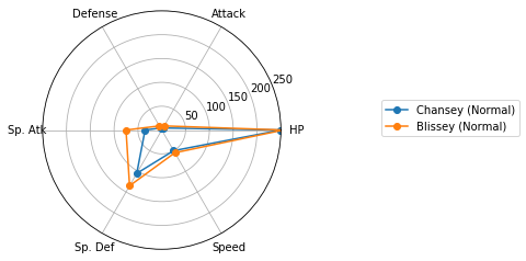
for i in range(max(clusterIDs) + 1):
    cluster = []
    for j, k in enumerate(clusterIDs):
        if i == k:
            cluster.append(j)
    fig = plt.figure()
    print("Cluster {}: {} samples".format(i + 1, len(cluster)))
    for j in cluster:
        labels = list(df.columns[5:11])
        values = list(df.iloc[j, 5:11])
        angles = np.linspace(0, 2 * np.pi, len(labels) + 1, endpoint=True)
        values = np.concatenate((values, [values[0]]))  # 閉じた多角形にする
        ax = fig.add_subplot(111, polar=True)
        ax.plot(angles, values, 'o-', label=df.iloc[j, :]['Name'] + " (" + df.iloc[j, :]['Type 1'] + ")")  # 外枠
        #ax.fill(angles, values, alpha=0.25)  # 塗りつぶし
        ax.set_thetagrids(angles[:-1] * 180 / np.pi, labels)  # 軸ラベル
        ax.set_rlim(0 ,250)
    plt.legend( loc = 'center right',
          bbox_to_anchor = (1.5, 0.5, 0.5, 0.1),
          borderaxespad = 0.0)
    plt.show()
Cluster 1: 264 samples

Cluster 2: 68 samples
Cluster 3: 17 samples

Cluster 4: 128 samples
Cluster 5: 52 samples
Cluster 6: 4 samples

Cluster 7: 3 samples
Cluster 8: 5 samples
Cluster 9: 4 samples
Cluster 10: 6 samples

Cluster 11: 8 samples
Cluster 12: 2 samples

Cluster 13: 41 samples

Cluster 14: 7 samples

Cluster 15: 28 samples

Cluster 16: 21 samples

Cluster 17: 1 samples
Cluster 18: 16 samples

Cluster 19: 1 samples
Cluster 20: 1 samples
Cluster 21: 6 samples

Cluster 22: 2 samples
Cluster 23: 17 samples
Cluster 24: 3 samples

Cluster 25: 14 samples

Cluster 26: 4 samples

Cluster 27: 3 samples

Cluster 28: 3 samples

Cluster 29: 5 samples
Cluster 30: 1 samples

Cluster 31: 10 samples

Cluster 32: 6 samples

Cluster 33: 1 samples

Cluster 34: 10 samples
Cluster 35: 1 samples
Cluster 36: 2 samples

Cluster 37: 5 samples

Cluster 38: 2 samples

Cluster 39: 1 samples
Cluster 40: 7 samples

Cluster 41: 2 samples
Cluster 42: 1 samples

Cluster 43: 8 samples
Cluster 44: 2 samples
Cluster 45: 1 samples

Cluster 46: 1 samples

Cluster 47: 1 samples

Cluster 48: 2 samples

Cluster 49: 1 samples

Cluster 50: 1 samples

どうやら、特殊なパラメータ配分を持つポケモンはいるものの、属性(Type 1)とパラメータ(HPなど)との間には、特別関係があるわけではなさそうです。
回帰
今度は「回帰」をしてみましょう。回帰は「教師あり機械学習」の一種で、説明変数 X から目的変数 y を予測する手法のうち、目的変数 y が連続値のものをいいます。ここで、説明変数 X と目的変数 y との関係を「学習」するのですが、目的変数 y のことを「教師」と呼ぶことがあります。
まずは 説明変数 X と目的変数 y を決めましょう。ここでは、HPなどのパラメータを説明変数 X, 総合値(Total)を目的変数 y とします。
X = df.iloc[:, 5:11]
y = df['Total']
線形重回帰
回帰のうち最も基本的なものが「線形回帰」で、そのうち説明変数が複数あるものを「線形重回帰」と呼びます。詳しくは 線形単回帰を Python で理解する を参照のこと。
from sklearn import linear_model
regr = linear_model.LinearRegression()
regr.fit(X, y) # 予測モデルを作成

print("回帰係数= ", regr.coef_)
print("切片= ", regr.intercept_)
print("決定係数= ", regr.score(X, y))
回帰係数=  [1. 1. 1. 1. 1. 1.]
切片=  5.684341886080802e-14
決定係数=  1.0
ありゃ...回帰係数が全部 1 ... 「Total」は各パラメータの単純な和でしたか...そういえば
Total: Sum of Attack, Sp. Atk, Defense, Sp. Def, Speed and HP
って書いてあったわ。
改めてデータ構造を見直してみて、
df.head()
df.columns[[5, 6, 7, 10]]
Index(['HP', 'Attack', 'Defense', 'Speed'], dtype='object')
この4つを説明変数 X とし、"Sp. Atk" を予測してみましょう。すると問題が良い感じに難しくなるはず。
X = df.iloc[:, [5, 6, 7, 10]]
y = df['Sp. Atk']
from sklearn import linear_model
regr = linear_model.LinearRegression()
regr.fit(X, y) # 予測モデルを作成

print("回帰係数= ", regr.coef_)
print("切片= ", regr.intercept_)
print("決定係数= ", regr.score(X, y))
回帰係数=  [0.28468407 0.10004721 0.12673883 0.4439368 ]
切片=  5.529675896993538
決定係数=  0.3333279772212076
つまり、
'Sp. Atk' = 0.28 * HP + 0.10 * Attack + 0.13 * Defence + 0.44 * Speed + 5.5
という関係にあるわけですね。ただし、決定係数が大変小さいので、信頼できるモデルとは言えません。
クロスバリデーション(交差検証)
機械学習ではその性能評価をするために、既知データを訓練データ(教師データ、教師セットともいいます)とテストデータ(テストセットともいいます)に分割します。訓練データを用いて訓練(学習)して予測モデルを構築し、その予測モデル構築に用いなかったテストデータをどのくらい正しく予測できるかということで性能評価を行ないます。そのような評価方法を「交差検証」(cross-validation)と呼びます。ここでは、
- 訓練データ(全データの60%)
- X_train : 訓練データの説明変数
- y_train : 訓練データの目的変数
- テストデータ(全データの40%)
- X_test : テストデータの説明変数
- y_test : テストデータの目的変数
とし、X_train と y_train の関係を学習して X_test から y_test を予測することを目指します。もしも、訓練データでは良い性能を示しているように見えても、学習に用いなかったテストデータでは性能が低い場合、そのモデルは「過学習した」と言います。詳しくは 機械学習入門の入門 を参照のこと。
# from sklearn.cross_validation import train_test_split # 訓練データとテストデータに分割
from sklearn.model_selection import train_test_split
X_train, X_test, y_train, y_test = train_test_split(X, y, test_size=.4) # 訓練データ・テストデータへのランダムな分割
from sklearn import linear_model
regr = linear_model.LinearRegression()
regr.fit(X_train, y_train) # 予測モデルを作成

print("回帰係数= ", regr.coef_)
print("切片= ", regr.intercept_)
print("決定係数(train)= ", regr.score(X_train, y_train))
print("決定係数(test)= ", regr.score(X_test, y_test))
回帰係数=  [0.28050284 0.13629344 0.09994709 0.48036096]
切片=  4.510621382128264
決定係数(train)=  0.3494685274982846
決定係数(test)=  0.2558419802439882
訓練データ・テストデータへの分割はランダムに行われるため、上記の値は計算のたびに変わります。
標準回帰係数
回帰式を求めるなら上記のようにすれば良いわけですが、説明変数・目的変数を標準化してから回帰することで「標準回帰係数」が求められ、これが「変数の重要度」の指標になります。
Xs = X.apply(lambda x: (x-x.mean())/x.std(), axis=0)
ys = list(pd.DataFrame(y).apply(lambda x: (x-x.mean())/x.std()).values.reshape(len(y),))
from sklearn import linear_model
regr = linear_model.LinearRegression()

regr.fit(Xs, ys) # 予測モデルを作成

print("標準回帰係数= ", regr.coef_)
print("切片= ", regr.intercept_)
print("決定係数= ", regr.score(Xs, ys))
標準回帰係数=  [0.22215171 0.0992372  0.12077883 0.39425762]
切片=  3.2105349393792207e-16
決定係数=  0.33332797722120766
得られた標準回帰係数を図示してみると
pd.DataFrame(regr.coef_, index=list(df.columns[[5, 6, 7, 10]])).sort_values(0, ascending=False).style.bar(subset=[0])
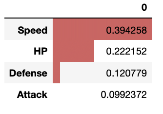
「Sp. Atk」(特殊攻撃力)を予測するにあたり、Speed(スピード)の重要度が大きいようです。
拡張型数量化I類
数量化理論とは、数値ではない「カテゴリカルデータ」と呼ばれるデータをいかに統計学の世界に招き入れるかという理論で、数量化I類、数量化II類などが有名です。
重回帰分析などの回帰分析は、数値データを説明変数とし、数値データを目的変数として予測します。一方で、数値ではないカテゴリカルデータを説明変数とし、数値データを目的変数として予測するのが数量化I類です。説明変数に数値データとカテゴリカルが混在している場合は拡張型数量化I類と呼ばれます。
詳しくは 数量化理論をPythonで理解する を参照のこと。
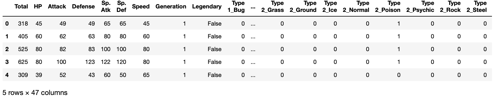
カテゴリカルデータをダミー変数に変換
pandas.get_dummies() を用いて、カテゴリカルデータをダミー変数に変換します。ダミー変数とは、そのカテゴリーに属すれば1、属さなければ0の変数です。dummy_na=True を指定すると、データが NaN(欠損値) の場合に1、欠損でなければ0とします。
重回帰分析などでは、カテゴリーの数がN個ある場合、N個のダミー変数を作ると予測できないため、どれか1個の変数を除外します。scikit-learnの重回帰分析 LinearRegression() では、この問題を回避する設計にしているようで、N個のダミー変数を作成しても動作します。
なお、pandas.get_dummies(drop_first=True) とすると、ダミー変数を作成するときに最初のカテゴリーを無視します。
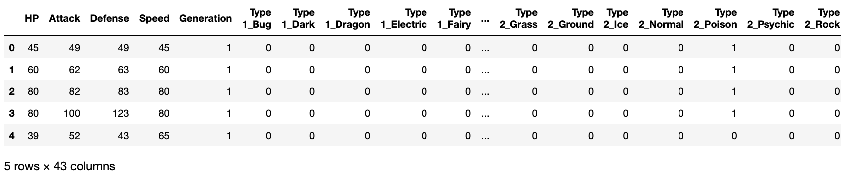
df2 = pd.get_dummies(df.iloc[:, 2:], dummy_na=True)
df2.head()
X = df2
del X['Total']
del X['Sp. Atk']
del X['Sp. Def']
del X['Legendary']
X.head()
# from sklearn.cross_validation import train_test_split # 訓練データとテストデータに分割
from sklearn.model_selection import train_test_split
X_train, X_test, y_train, y_test = train_test_split(X, y, test_size=.4) # 訓練データ・テストデータへのランダムな分割
from sklearn import linear_model
regr = linear_model.LinearRegression()
regr.fit(X_train, y_train) # 予測モデルを作成

print("回帰係数= ", regr.coef_)
print("切片= ", regr.intercept_)
print("決定係数(train)= ", regr.score(X_train, y_train))
print("決定係数(test)= ", regr.score(X_test, y_test))
回帰係数=  [ 2.28431738e-01  2.97742060e-01  8.02614939e-02  2.20997067e-01
 -1.55704518e-01 -1.47132780e+01 -5.84090849e+00  2.19195137e+00
  1.77819922e+01  1.91024750e+01 -2.45614311e+01  1.85155570e+01
  7.95924485e+00  9.10518038e+00  3.54309623e+00 -2.24760486e+01
  8.41016188e+00 -1.78568717e+01 -2.51439443e+00  2.62609157e+01
 -1.41838440e+01 -1.43994552e+01  3.67565689e+00 -1.61076024e-15
 -5.36512027e+00 -1.06042187e+01  1.22074186e+01  4.27173718e+00
  7.26562566e+00 -2.00570257e+01  2.25619608e+01 -4.07020702e+00
  3.76104637e+00 -7.93072478e+00 -1.15056412e+01  1.91256670e+01
 -3.63271870e+00  6.58290356e+00  1.54416323e+01 -1.33194463e+01
 -1.09096992e+01  3.44875964e+00 -7.27194918e+00]
切片=  17.69492260426813
決定係数(train)=  0.5716379265230409
決定係数(test)=  0.4658252989421211
変数を増やすことで、いくらか性能が上がったようですね。
ランダムフォレストによる回帰
Scikit-learn というライブラリには、線形重回帰以外にも様々な回帰手法が実装されています。今回はその中のひとつ、ランダムフォレストを使った回帰をしてみましょう。
from sklearn.ensemble import RandomForestRegressor
regr = RandomForestRegressor(max_depth=2, random_state=0, n_estimators=100)
regr.fit(X_train, y_train)
print("決定係数(train)= ", regr.score(X_train, y_train))
print("決定係数(test)= ", regr.score(X_test, y_test))
決定係数(train)=  0.37839205866915593
決定係数(test)=  0.3265735023596227
ランダムフォレストの興味深い点は、feature importance という指標で、パラメータの重要性を相対的に評価できることです。
regr.feature_importances_
array([0.3960066 , 0.04625405, 0.05236526, 0.42465029, 0.        ,
       0.00299188, 0.        , 0.00357449, 0.00097514, 0.        ,
       0.        , 0.        , 0.        , 0.004711  , 0.        ,
       0.        , 0.        , 0.05131166, 0.        , 0.00934274,
       0.        , 0.        , 0.        , 0.        , 0.        ,
       0.        , 0.00412505, 0.        , 0.00098141, 0.        ,
       0.        , 0.        , 0.        , 0.        , 0.        ,
       0.00122454, 0.        , 0.00148591, 0.        , 0.        ,
       0.        , 0.        , 0.        ])
ほとんどの feature importance は0となりました。上位10個のパラメータを並べてみましょう。
pd.DataFrame(regr.feature_importances_, index=list(X.columns)).sort_values(0, ascending=False).head(10).style.bar(subset=[0])
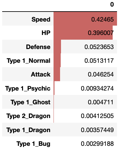
Speed、HP、Defence の順に重要であるということは線形重回帰の結果と同じですが、Type 1_Normal や Type 1_Psychic などが重要なパラメータとしてリストアップされています。
2クラス分類
今度は、パラメータ(HPなど)から「伝説のポケモンかどうか」を予測するような「2クラス分類」問題を解いてみましょう。
目的変数が連続値の場合は「回帰」と呼ばれますが、目的変数が0か1かなどの離散値(カテゴリカルデータ)の場合は「分類」と呼ばれます。その中で、数値ではないカテゴリカルデータを説明変数とするものを数量化II類と呼びます。説明変数に数値データとカテゴリカルデータが混在している場合は拡張型数量化II類と呼ばれます。
df2 = pd.get_dummies(df.iloc[:, 2:], dummy_na=True)
X = df2
del X['Total']
del X['Sp. Atk']
del X['Sp. Def']
del X['Legendary']
X.head()
y = df['Legendary']
# from sklearn.cross_validation import train_test_split # 訓練データとテストデータに分割
from sklearn.model_selection import train_test_split
X_train, X_test, y_train, y_test = train_test_split(X, y, test_size=.4) # 訓練データ・テストデータへのランダムな分割
ロジスティック回帰
ロジスティック回帰については ロジスティック回帰を scipy.optimize.curve_fit で実装する や ロジスティック回帰をExcelで理解する を参照のこと。
from sklearn.linear_model import LogisticRegression # ロジスティック回帰
clf = LogisticRegression(solver='lbfgs', max_iter=10000) #モデルの生成
clf.fit(X_train, y_train) #学習
print("正解率(train): ", clf.score(X_train,y_train))
print("正解率(test): ", clf.score(X_test,y_test))
正解率(train):  0.9479166666666666
正解率(test):  0.93125
from sklearn.metrics import confusion_matrix # 混合行列
# 予測結果と、正解(本当の答え)がどのくらい合っていたかを表す混合行列
pd.DataFrame(confusion_matrix(clf.predict(X_test), y_test), index=['predicted 0', 'predicted 1'], columns=['real 0', 'real 1'])

多層パーセプトロン
多層パーセプトロンについては 多層パーセプトロン (Multilayer perceptron, MLP)を scipy.optimize.curve_fit で実装する や 多層パーセプトロン (Multilayer perceptron, MLP)をPythonで理解する を参照のこと。
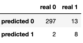
from sklearn.neural_network import MLPClassifier
clf = MLPClassifier(max_iter=10000)
clf.fit(X_train, y_train) #学習
print("正解率(train): ", clf.score(X_train,y_train))
print("正解率(test): ", clf.score(X_test,y_test))
正解率(train):  0.9625
正解率(test):  0.934375
from sklearn.metrics import confusion_matrix # 混合行列
# 予測結果と、正解(本当の答え)がどのくらい合っていたかを表す混合行列
pd.DataFrame(confusion_matrix(clf.predict(X_test), y_test), index=['predicted 0', 'predicted 1'], columns=['real 0', 'real 1'])
ランダムフォレスト
ランダムフォレストを使った分類もできます。ランダムフォレストについては 機械学習入門の入門 を参照のこと。
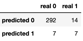
from sklearn.ensemble import RandomForestClassifier
clf = RandomForestClassifier(n_estimators=100)
clf.fit(X_train, y_train) #学習
print("正解率(train): ", clf.score(X_train,y_train))
print("正解率(test): ", clf.score(X_test,y_test))
正解率(train):  1.0
正解率(test):  0.953125
from sklearn.metrics import confusion_matrix # 混合行列
# 予測結果と、正解(本当の答え)がどのくらい合っていたかを表す混合行列
pd.DataFrame(confusion_matrix(clf.predict(X_test), y_test), index=['predicted 0', 'predicted 1'], columns=['real 0', 'real 1'])
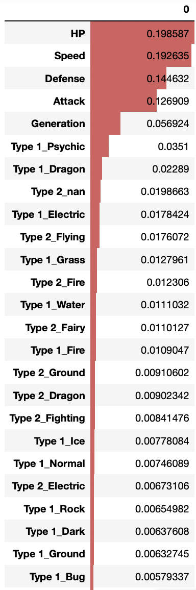
feature importance を見てみましょう。 Sp. Atk を予測するために重要な変数と、伝説のポケモンかどうかを予測するために重要な変数は異なることがわかります。
pd.DataFrame(clf.feature_importances_, index=list(X.columns)).sort_values(0, ascending=False).style.bar(subset=[0])
AUC スコアと ROC カーブ
分類問題の指標として AUC スコアと ROC カーブ があります。説明は 【ROC曲線とAUC】機械学習の評価指標についての基礎講座 が詳しいです。
from sklearn.metrics import roc_curve, precision_recall_curve, auc, classification_report, confusion_matrix
# AUCスコアを出す。
probas = clf.fit(X_train, y_train).predict_proba(X_test)
fpr, tpr, thresholds = roc_curve(y_test, probas[:, 1])
roc_auc = auc(fpr, tpr)
print ("ROC score : ",  roc_auc)
ROC score : 0.9632107023411371
# ROC curve を描く
plt.clf()
plt.plot(fpr, tpr, label='ROC curve (area = %0.2f)' % roc_auc)
plt.plot([0, 1], [0, 1], 'k--')
plt.xlim([0.0, 1.0])
plt.ylim([0.0, 1.0])
plt.xlabel('False Positive Rate')
plt.ylabel('True Positive Rate')
plt.title('Receiver operating characteristic example')
plt.legend(loc="lower right")
plt.show()

AUPR スコアと PR カーブ
インバランスデータ(正例と負例の数に大きな偏りがあるデータ)の場合はAUPR スコアと PR カーブで評価されることがあります。説明は インバランスデータにおいてPR曲線がROC曲線より優れているのをアニメーションで理解する。 が詳しいです。
# AUPRスコアを出す
precision, recall, thresholds = precision_recall_curve(y_test, probas[:, 1])
area = auc(recall, precision)
print ("AUPR score: " , area)
AUPR score: 0.760277018572971
# PR curve を描く
plt.clf()
plt.plot(recall, precision, label='Precision-Recall curve')
plt.xlabel('Recall')
plt.ylabel('Precision')
plt.ylim([0.0, 1.05])
plt.xlim([0.0, 1.0])
plt.title('Precision-Recall example: AUPR=%0.2f' % area)
plt.legend(loc="lower left")
plt.show()

最後まで読んでくれてありがとうございます。