スケジュール
- 1日目 要件定義編
- 2日目 環境構築編
- 3日目 ドーナッツグラフ編←今ここ
- 4日目 棒グラフ編
- 5日目 GraphQL編
- 6日目 GraphQL編2
- 7日目 GraphQL編3
- 8日目 GraphQL編4
- 9日目 デプロイ編
前提条件
- node.js v8.3以上
- yarn or npmが入っている(Document見るとyarnの方が推奨とのこと)
- Gridsomeのプロジェクトを作成している
vue-chart.jsでグラフを作成
まず前回入れたvue-chart.jsでドーナッツグラフを表示する処理を作っていきます。
<script>
import { Doughnut } from 'vue-chartjs'
export default {
  extends: Doughnut,
  name: 'chart',
  data () {
    return {
      labels: ['QQQ', 'VOO', 'NFLX', 'MSFT', 'BND','VWO','MRNA', 'SQ', 'JNJ', 'VZ'],
      chartData: [271.47, 307.36, 494.73, 212.48, 89.38, 43.44, 74.10, 147.22, 148.60, 58.53],
      options: {
        cutoutPercentage: 30,
      }
    }
  },
  mounted () {
    this.renderChart(
        {
          labels: this.labels,
          datasets: [
            {
              backgroundColor: [
                'rgba(255, 99, 132, 0.2)',
                'rgba(54, 162, 235, 0.2)',
                'rgba(255, 206, 86, 0.2)',
                'rgba(75, 192, 192, 0.2)',
                'rgba(153, 102, 255, 0.2)',
                'rgba(255, 159, 64, 0.2)'
              ],
              data: this.chartData,
            }
          ]
        },
        this.options)
  }
}
</script>
まず前回入れたvue-chart.jsをimportします。今回使うのはドーナッツグラフなので、Doughnutを指定します。
import { Doughnut } from 'vue-chartjs'
他にもLineやPieなど色々な種類があります。
https://www.chartjs.org/docs/latest/charts/
vue-chart.jsについてはこちらの記事が大変参考になりました。
https://qiita.com/kiyc/items/a94a202bf06fff644f62
<template>
  <Layout>
    <h1>Portfolio</h1>
    <chart></chart>
  </Layout>
</template>

<script>
import Chart from "../../components/Chart"
export default {
  components: {
    Chart
  },
  metaInfo : {
    title: 'Hello, world!'
  }
}
</script>

<style>
.home-links a {
  margin-right: 1rem;
}
</style>
作ったChart.vueのcomponentsを表示させたいpageに追加します。
tooltipsにcallback処理を追加する
グラフにカーソルを合わせた時に表示させるtooltipsに処理を追加していきます。
<script>
import { Doughnut } from 'vue-chartjs'
export default {
  extends: Doughnut,
  name: 'chart',
  data () {
    return {
      labels: ['QQQ', 'VOO', 'NFLX', 'MSFT', 'BND','VWO','MRNA', 'SQ', 'JNJ', 'VZ'],
      chartData: [271.47, 307.36, 494.73, 212.48, 89.38, 43.44, 74.10, 147.22, 148.60, 58.53],
      options: {
        // ここに追加
        tooltips: {
          callbacks: {
            label: function(tooltipItem, data) {
              let label = data.labels[tooltipItem.index] || '';
              return label;
            },
            afterLabel: function (tooltipItem, data) {
              const currentData = data.datasets[tooltipItem.datasetIndex].data[tooltipItem.index];
              const total = data.datasets[tooltipItem.datasetIndex].data.reduce((a,x) => a+=x,0);
              const ratio = ((currentData / total) * 100);
              let afterLabel = '$' + currentData;
              afterLabel += '(' + (Math.floor(ratio * 10) / 10) + '%)';
              return afterLabel;
            }
          }
        },
        cutoutPercentage: 30,
      }
    }
  },
  mounted () {
    this.renderChart(
        {
          labels: this.labels,
          datasets: [
            {
              backgroundColor: [
                'rgba(255, 99, 132, 0.2)',
                'rgba(54, 162, 235, 0.2)',
                'rgba(255, 206, 86, 0.2)',
                'rgba(75, 192, 192, 0.2)',
                'rgba(153, 102, 255, 0.2)',
                'rgba(255, 159, 64, 0.2)'
              ],
              data: this.chartData,
            }
          ]
        },
        this.options)
  }
}
</script>
labelの表示とlabelの後にthis.chartDataの値と全体に対するパーセントを表示をする処理を入れました。
グラフの色を自動で割り当てる
今は固定でbackground-colorを配列で指定しているので、自動で割り当てるようにします。
こちらの記事が大変参考になりました。
https://qiita.com/muramasawani/items/e61d889ebb53e0974e5f
まず追加でライブラリを追加します。
yarn add google-palette
こちらのライブラリを追加した最終的なコードがこちら
<script>
import { Doughnut } from 'vue-chartjs'
// importを追加
import * as Palette from 'google-palette'
export default {
  extends: Doughnut,
  name: 'chart',
  data () {
    return {
      labels: ['QQQ', 'VOO', 'NFLX', 'MSFT', 'BND','VWO','MRNA', 'SQ', 'JNJ', 'VZ'],
      chartData: [271.47, 307.36, 494.73, 212.48, 89.38, 43.44, 74.10, 147.22, 148.60, 58.53],
      options: {
        tooltips: {
          callbacks: {
            label: function(tooltipItem, data) {
              let label = data.labels[tooltipItem.index] || '';
              return label;
            },
            afterLabel: function (tooltipItem, data) {
              const currentData = data.datasets[tooltipItem.datasetIndex].data[tooltipItem.index];
              const total = data.datasets[tooltipItem.datasetIndex].data.reduce((a,x) => a+=x,0);
              const ratio = ((currentData / total) * 100);
              let afterLabel = '$' + currentData;
              afterLabel += '(' + (Math.floor(ratio * 10) / 10) + '%)';
              return afterLabel;
            }
          }
        },
        cutoutPercentage: 30,
      }
    }
  },
  mounted () {
    this.renderChart(
        {
          labels: this.labels,
          datasets: [
            {
              // ここに追加
              backgroundColor: Palette('mpn65', this.chartData.length).map(
                  function(hex) {
                    return '#' + hex
                  }
              ),
              data: this.chartData,
            }
          ]
        },
        this.options)
  }
}
</script>
Palette('mpn65', this.chartData.length)の第一引数にどんなカラータイプを使うかを指定できます。
指定するカラータイプによっては8つまでしか用意していなかったりするので、今回はmpn65というのにしました。
http://google.github.io/palette.js/
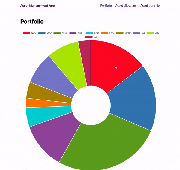
最終的な出来上がったドーナッツグラフ
あとがき
今回はドーナッツグラフを作ってみました。明日は折れ線グラフを作る予定です。