実務1年目駆け出しエンジニアがLaravel&ReactでWebアプリケーション開発に挑戦してみた!(その32)
0. 初めに
こんにちは!
Webアプリケーションを一から作成・解説しているシリーズです!
今回は、ログイン・新規登録モーダルを作成します!
現状は、Breezeを導入した時のままであるため、ログイン・新規登録をしようとするとページ遷移が発生します。
これでも問題ないのですが、より使いやすさを重視するなら、モーダルを表示させて、そこでユーザー情報を入力してもらった方が良いかなと思いました。
1. ブランチ運用
前回の作業内容をdevelopに反映させて、そこから新規ブランチを切ります。
ブランチ名は、feature/frontend/auth-modalとかにします。
2. 共通モーダル作成
Modal.jsxを作成する
新規ファイルを作成しましょう。
import { useEffect, useCallback } from "react";

/**
 * 汎用モーダルコンポーネント
 * @param {Object} props
 * @param {boolean} props.isOpen - モーダルの開閉状態
 * @param {Function} props.onClose - モーダルを閉じる関数
 * @param {React.ReactNode} props.children - モーダル内のコンテンツ
 * @param {string} [props.title] - モーダルのタイトル(オプション)
 * @param {string} [props.size='md'] - モーダルのサイズ ('sm' | 'md' | 'lg')
 */

const Modal = ({ isOpen, onClose, children, title, size = 'md' }) => {
  // Escキーでモーダルを閉じる
  const handleEscape = useCallback((e) => {
    if (e.key === 'Escape' && isOpen) onClose();
  }, [onClose]);

  useEffect(() => {
    if (isOpen) {
      document.addEventListener('keydown', handleEscape);
      document.body.classList.add('overflow-hidden');
    }

    return () => {
      document.removeEventListener('keydown', handleEscape);
      document.body.classList.remove('overflow-hidden');
    };
  }, [isOpen, handleEscape]);

  // サイズに応じたクラス名
  const sizeClasses = {
    sm: 'max-w-sm',
    md: 'max-w-md',
    lg: 'max-w-lg',
  };

  return (
    <>
      {/* オーバーレイ */}
      <div
        onClick={onClose}
        className={`
          fixed inset-0 bg-black/40 transition-opacity duration-300
          ${isOpen ? 'opacity-100 pointer-events-auto' : 'opacity-0 pointer-events-none'}
        `}
        aria-hidden="true"
      />

      {/* 本体 */}
      <div
       role="dialog"
       aria-modal="true"
       aria-activedescendant={title ? 'modal-title' : undefined}
       className={`
          fixed inset-0 z-[101] flex items-center justify-center p-4
          transition-all duration-300
          ${isOpen ? 'opacity-100 pointer-events-auto' : 'opacity-0 pointer-events-none'}
      `}
      >
        <div
         className={`
            w-full ${sizeClasses[size]}
            bg-[#EEF7FB] rounded-lg shadow-xl
            transform transition-all duration-300
            ${isOpen ? 'scale-100 translate-y-0' : 'scale-95 -translate-y-4'}
          `}
        >

          {/* 閉じるボタン */}
          <button
            type="button"
            onClick={onClose}
            className="absolute top-3 right-3 text-[#747D8C] hover:opacity-80 transition"
            aria-label="閉じる"
          >
            <svg className="w-5 h-5" fill="none" stroke="currentColor" viewBox="0 0 24 24">
              <path strokeLinecap="round" strokeLinejoin="round" strokeWidth={2} d="M6 18L18 6M6 6l12 12" />
            </svg>
          </button>

          {/* タイトル */}
          {title && (
            <div className="px-6 pt-5 pb-0">
              <h2 id="modal-title" className="text-lg font-semibold text-gray-900">
                {title}
              </h2>
            </div>
          )}

          {/* コンテンツ */}
          <div className="p-6">
            {children}
          </div>
        </div>
      </div>
    </>
  );
};

export default Modal;
2. 認証モーダル作成
AuthSubmitButton.jsxを作成する
認証モーダルで使うボタンを先に作成しておきましょう。
新規ファイルを作成してください。
/**
 * 認証ボタンコンポーネント
 * @param {Object} props
 * @param {string} props.mode - 'login' | 'register'
 * @param {boolean} [props.disabled=false] - 無効状態
 * @param {string} [props.type='submit'] - ボタンタイプ
 * @returns {JSX.Element} コンポーネントのJSX
 */
const AuthSubmitButton = ({ mode, disabled = false, type = 'submit' }) => {
  const label = mode === 'login' ? 'ログイン' : '新規登録';

  return (
    <button
      type={type}
      disabled={disabled}
      className={`
        p-1 bg-[#33E1ED] shadow-md rounded-md
        hover:shadow-lg transition-shadow
        ${disabled ? 'opacity-50 cursor-not-allowed' : 'cursor-pointer'}
      `}
    >
        <span className="px-14 py-1 block rounded text-white font-bold">
        {label}
      </span>
    </button>
  );
};

export default AuthSubmitButton;
最近作ったレビュー作成ボタンや戻るボタン(←やめましたけどw)と見た目は似ています。
propsとして受け取るmodeによって、ログインと新規登録を分けて表示できるようにしています。
AuthModal.jsxを作成する
では、いよいよモーダル本体を作成します。
こちらも新規ファイルを作成します。
import { useForm } from '@inertiajs/react';
import Modal from '../Common/Modal';
import FieldBar from '../Common/FieldBar';
import AuthSubmitButton from './AuthSubmitButton';

/**
 * 認証モーダル
 * @param {Object} props
 * @param {string|null} props.mode - 'login' | 'register' | null
 * @param {Function} props.onClose - モーダルを閉じる
 * @param {Function} props.onSwitchMode - モード切り替え
 * @returns {JSX.Element} コンポーネントのJSX
 */
const AuthModal = ({ mode, onClose, switchMode }) => {
  const isOpen = mode === 'login' || mode === 'register';
  const isLoginMode = mode === 'login';
  const isRegisterMode = mode === 'register';

  return (
    <Modal
      isOpen={isOpen}
      onClose={onClose}
      title={isLoginMode ? 'ログイン' : isRegisterMode ? '新規登録' : ''}
      size="sm"
    >
      {/* タブ切り替え */}
      <div className="flex border-b mb-6">
        <button
          type="button"
          onClick={() => switchMode('login')}
          className={`flex-1 pb-3 text-sm font-medium transition-colors ${
            isLoginMode
              ? 'text-[#297FF0] border-b-2 border-[#297FF0]'
              : 'text-gray-500 hover:text-gray-700'
          }`}
        >
          ログイン
        </button>
        <button
          type="button"
          onClick={() => switchMode('register')}
          className={`flex-1 pb-3 text-sm font-medium transition-colors ${
            isRegisterMode
              ? 'text-[#297FF0] border-b-2 border-[#297FF0]'
              : 'text-gray-500 hover:text-gray-700'
          }`}
        >
          新規登録
        </button>
      </div>

      {/* ログインフォーム */}
      {isLoginMode && <LoginForm onClose={onClose} />}

      {/* 新規登録フォーム */}
      {isRegisterMode && <RegisterForm onClose={onClose} />}
    </Modal>
  );
};

/**
 * ログインフォーム
 * @param {Object} props
 * @param {Function} props.onClose - モーダルを閉じる
 * @returns {JSX.Element} コンポーネントのJSX
 */
const LoginForm = ({ onClose }) => {
  const { data, setData, post, processing, errors } = useForm({
    email: '',
    password: '',
    remember: false,
  });

  const submit = e => {
    e.preventDefault();
    post(route('login'), {
      onSuccess: () => onClose(),
    });
  };

  return (
    <form onSubmit={submit}>
      {/* 入力欄 */}
      <FieldBar className="mb-4">
        <input
          type="email"
          value={data.email}
          onChange={e => setData('email', e.target.value)}
          placeholder="メールアドレス"
          required
          className="w-full outline-none bg-transparent border-none focus:outline-none focus:ring-0"
        />
      </FieldBar>
      {errors.email && <p className="text-red-500 text-sm">{errors.email}</p>}
      <FieldBar className="mb-4">
        <input
          type="password"
          value={data.password}
          onChange={e => setData('password', e.target.value)}
          placeholder="パスワード"
          required
          className="w-full outline-none bg-transparent border-none focus:outline-none focus:ring-0"
        />
      </FieldBar>
      {errors.password && <p className="text-red-500 text-sm">{errors.password}</p>}

      {/* Google ログイン追加部分 */}
      <div className="my-6">
        <div className="relative my-4">
            <div className="absolute inset-0 flex items-center">
              <span className="w-full border-t" style={{ borderColor: '#747D8C' }} />
            </div>
          <div className="relative flex justify-center text-xs uppercase">
            <span className="bg-[#EEF5F9] px-2 text-[#747D8C]">または</span>
          </div>
        </div>

        <a
           href={typeof route === 'function' ? route('auth.google') : '/auth/google'}
           className="inline-flex w-full items-center justify-center gap-2 rounded-md border px-4 py-2 text-sm font-medium hover:bg-[#E2EDF6] transition"
        >
          <svg width="18" height="18" viewBox="0 0 533.5 544.3" aria-hidden="true">
            <path
              fill="#4285f4"
              d="M533.5 278.4c0-18.5-1.7-36.3-4.9-53.5H272.1v101h146.9c-6.3 34.1-25.6 62.9-54.6 82.2v68h88.2c51.6-47.5 80.9-117.6 80.9-197.7z"
            />
            <path
              fill="#34a853"
              d="M272.1 544.3c73.3 0 134.9-24.2 179.9-65.2l-88.2-68c-24.5 16.5-55.9 26.1-91.7 26.1-70.6 0-130.4-47.6-151.8-111.6H30.8v70.2c44.8 88.8 136.6 148.5 241.3 148.5z"
            />
            <path
              fill="#fbbc05"
              d="M120.3 325.6c-10.1-30.1-10.1-62.7 0-92.8v-70.2H30.8c-41.4 82.8-41.4 180.5 0 263.3l89.5-70.3z"
            />
            <path
              fill="#ea4335"
              d="M272.1 106.3c38.8-.6 76.1 13.7 104.5 39.9l78.1-78.1C407 .8 343-18.1 272.1 18.4 167.4 18.4 75.6 78.2 30.8 167l89.5 70.2c21.4-64 81.1-110.9 151.8-110.9z"
            />
          </svg>
          <span>Googleでログイン</span>
        </a>
      </div>

      {/* 送信ボタン */}
      <div className="mt-6">
        <AuthSubmitButton mode="login" disabled={processing} />
      </div>
    </form>
  );
};

/**
 * 新規登録フォーム
 * @param {Object} props
 * @param {Function} props.onClose - モーダルを閉じる
 * @returns {JSX.Element} コンポーネントのJSX
 */
const RegisterForm = ({ onClose }) => {
  const { data, setData, post, processing, errors } = useForm({
    name: '',
    email: '',
    password: '',
    password_confirmation: '',
  });

  const submit = e => {
    e.preventDefault();
    post(route('register'), {
      onSuccess: () => onClose(),
    });
  };

  return (
    <form onSubmit={submit}>
      <FieldBar className="mb-4">
        {/* 入力欄 */}
        <input
          type="text"
          value={data.name}
          onChange={e => setData('name', e.target.value)}
          placeholder="ニックネーム"
          className="w-full outline-none bg-transparent border-none focus:outline-none focus:ring-0"
        />
      </FieldBar>
      {errors.name && <p className="text-red-500 text-sm">{errors.name}</p>}
      <FieldBar className="mb-4">
        <input
          type="email"
          value={data.email}
          onChange={e => setData('email', e.target.value)}
          placeholder="メールアドレス"
          className="w-full outline-none bg-transparent border-none focus:outline-none focus:ring-0"
        />
      </FieldBar>
      {errors.email && <p className="text-red-500 text-sm">{errors.email}</p>}
      <FieldBar className="mb-4">
        <input
          type="password"
          value={data.password}
          onChange={e => setData('password', e.target.value)}
          placeholder="パスワード"
          className="w-full outline-none bg-transparent border-none focus:outline-none focus:ring-0"
        />
      </FieldBar>
      {errors.password && <p className="text-red-500 text-sm">{errors.password}</p>}
      <FieldBar className="mb-4">
        <input
          type="password"
          value={data.password_confirmation}
          onChange={e => setData('password_confirmation', e.target.value)}
          placeholder="パスワード(確認用)"
          className="w-full outline-none bg-transparent border-none focus:outline-none focus:ring-0"
        />
      </FieldBar>
      {errors.password_confirmation && (
        <p className="text-red-500 text-sm">{errors.password_confirmation}</p>
      )}

      {/* Google ログイン追加部分 */}
      <div className="my-6">
        <div className="relative my-4">
            <div className="absolute inset-0 flex items-center">
              <span className="w-full border-t" style={{ borderColor: '#747D8C' }} />
            </div>
          <div className="relative flex justify-center text-xs uppercase">
            <span className="bg-[#EEF5F9] px-2 text-[#747D8C]">または</span>
          </div>
        </div>

        <a
           href={typeof route === 'function' ? route('auth.google') : '/auth/google'}
           className="inline-flex w-full items-center justify-center gap-2 rounded-md border px-4 py-2 text-sm font-medium hover:bg-[#E2EDF6] transition"
        >
          <svg width="18" height="18" viewBox="0 0 533.5 544.3" aria-hidden="true">
            <path
              fill="#4285f4"
              d="M533.5 278.4c0-18.5-1.7-36.3-4.9-53.5H272.1v101h146.9c-6.3 34.1-25.6 62.9-54.6 82.2v68h88.2c51.6-47.5 80.9-117.6 80.9-197.7z"
            />
            <path
              fill="#34a853"
              d="M272.1 544.3c73.3 0 134.9-24.2 179.9-65.2l-88.2-68c-24.5 16.5-55.9 26.1-91.7 26.1-70.6 0-130.4-47.6-151.8-111.6H30.8v70.2c44.8 88.8 136.6 148.5 241.3 148.5z"
            />
            <path
              fill="#fbbc05"
              d="M120.3 325.6c-10.1-30.1-10.1-62.7 0-92.8v-70.2H30.8c-41.4 82.8-41.4 180.5 0 263.3l89.5-70.3z"
            />
            <path
              fill="#ea4335"
              d="M272.1 106.3c38.8-.6 76.1 13.7 104.5 39.9l78.1-78.1C407 .8 343-18.1 272.1 18.4 167.4 18.4 75.6 78.2 30.8 167l89.5 70.2c21.4-64 81.1-110.9 151.8-110.9z"
            />
          </svg>
          <span>Googleでログイン</span>
        </a>
      </div>

      {/* 送信ボタン */}
      <div className="mt-6">
        <AuthSubmitButton mode="register" disabled={processing} />
      </div>
    </form>
  );
};

export default AuthModal;
ちょっと長くて混乱しそうですが、よく見ると大きなAuthModalコンポーネントの中にLoginFormとRegisterFormの二つの小さなコンポーネントが定義されていることが分かります。
これら二つのコンポーネントはこのファイルの中でしか使わないため、エクスポートやインポートなしで使うことができます。
また、useFormというフックを使用することで、フォームの入力内容などを自分でuseStateなどを使ってゼロから状態管理する必要がなくなり、楽です。
useFormについては、また後程少し解説を入れます。
さらに、最近作成したFieldBarをインポートして入力フィールドとして活用しています。
Sidebar.jsxで開く
「ログイン」と「新規登録」はサイドバーから開くため、ここにに処理を追加します。
既存のファイルを修正しましょう。
/**
 * サイドバーコンポーネント
 * @param {Object} props - コンポーネントのprops
 * @param {boolean} props.isOpen - サイドバーの開閉状態
 * @param {Function} props.onClose - サイドバーを閉じるためのコールバック関数
 * @param {boolean} props.isLoggedIn - ユーザーのログイン状態
 * @param {Function} props.onOpenAuthModal - 認証モーダルを開く関数(引数に'mode'を取る)
 * @returns {JSX.Element} コンポーネントのJSX
 */
const Sidebar = ({ isOpen, onClose, isLoggedIn, onOpenAuthModal }) => {
  const handleLoginClick = () => {
    onClose();
    onOpenAuthModal('login');
  };

  const handleRegisterClick = () => {
    onClose();
    onOpenAuthModal('register');
  };

  // メニュー定義
  const items = isLoggedIn
    ? [
        { label: 'ホーム', href: route('home'), icon: home },
        { label: 'マイページ', href: route('mypage.index'), icon: mypage },
        { label: 'ブックマーク', href: route('mypage.bookmarks'), icon: bookmark },
        { label: 'ランキング', href: null, icon: ranking },
        { label: 'ログアウト', href: route('logout'), method: 'post', icon: logout },
      ]
    : [
        { label: 'ホーム', href: route('home'), icon: home },
        { label: '新規登録', onClick: handleRegisterClick, icon: register },
        { label: 'ログイン', onClick: handleLoginClick, icon: login },
        { label: 'ランキング', href: null, icon: ranking },
      ];

  return (
    <>
      {/* オーバーレイ */}

      {/* 本体 */}
      <aside
        role="dialog"
        aria-modal="true"
        className={`
          fixed right-0 top-0 h-dvh w-[270px] max-w-[90vw] bg-[#EEF5F9] shadow-2xl
          transform transition-transform duration-300
          ${isOpen ? 'translate-x-0' : 'translate-x-full'}
          flex flex-col
        `}
      >
        {/* ヘッダー(バツ印) */}

        {/* リスト */}
        <nav className="p-2">
          <ul className="space-y-1">
            {items.map(it => (
              <li key={it.label}>
                {it.href ? (
                  <Link
                    href={it.href}
                    method={it.method}
                    as={it.method ? 'button' : 'a'}
                    className="
                      text-expand text-lg w-full text-left flex items-center gap-3 px-4 py-3 rounded-lg
                      hover: transition
                      text-[#747D8C] font-medium
                    "
                    onClick={onClose}
                  >
                    <img src={it.icon} alt="" className="h-8 w-8" />
                    {it.label}
                  </Link>
                ) : it.onClick ? (
                  <button
                    type='button'
                    onClick={it.onClick}
                    className="
                      text-expand text-lg w-full text-left flex items-center gap-3 px-4 py-3 rounded-lg
                      hover:transition text-[#747D8C] font-medium
                    "
                    >
                      <img src={it.icon} alt="" className="h-8 w-8" />
                      {it.label}
                    </button>
                ) : (
                  <span
                    className="
                      w-full text-left flex items-center gap-3 px-4 py-3 rounded-lg
                      text-gray-400 font-medium cursor-not-allowed
                    "
                  >
                    <img
                      src={it.icon}
                      alt=""
                      className={`${it.label === 'ランキング' ? 'h-8 w-8' : 'h-5 w-5'} opacity-40`}
                    />
                    {it.label}
                  </span>
                )}
              </li>
            ))}
          </ul>
        </nav>
      </aside>
    </>
  );
}

export default Sidebar;
モーダルを開く関数を定義して、onClick時に発動するようにitemsオブジェクト配列のプロパティに追加しました!
AppLayout.jsxから呼び出す
しかし、実際のモーダルの開閉状態の管理は親コンポーネントであるAppLayoutで行いたいため、こちらも修正します。
先ほどのSidebarが受け取っていたonOpenAuthModalもここで定義します。
import AuthModal from '@/Components/Auth/AuthModal'; // 追加

const AppLayout = ({ children, title, mode='default' }) => {
  // ユーザーの認証状態を管理

  // サイドバーの開閉状態を管理

  // ホームページかどうか

  // 追加: 認証モーダルの状態('login' | 'register' | null)を管理
  const [authModal, setAuthModal] = useState(null);

  //  サイドバーが開いている間は、背景のスクロールを防止
  // ...

  return (
    <div className="min-h-dvh flex flex-col bg-[#EEF5F9]">
      <Head title={title} />

      {/* ホームモード: ハンバーガーアイコンのみを固定表示(サイドバー非表示時のみ) */}
      {isHome ? (
        !isSidebarOpen && (
          <div className="fixed top-4 right-6 z-50">
            <HamburgerMenu onOpenSidebar={() => setSidebarOpen(true)} />
          </div>
        )
      ) : (
        /* デフォルト: フルヘッダー表示 */
        <Header title={title} onOpenSidebar={() => setIsSidebarOpen(true)} />
      )}

      {/* メインコンテンツ領域 */}

      {/* サイドバー */}
      <Sidebar
        isOpen={isSidebarOpen}
        onClose={() => setSidebarOpen(false)}
        isLoggedIn={isLoggedIn}
        onOpenAuthModal={setAuthModal}
      />

      {/* 認証モーダル */}
      <AuthModal
        mode={authModal}
        onClose={() => setAuthModal(null)}
        switchMode={(mode) => setAuthModal(mode)}
      />
    </div>
  );
}

export default AppLayout;
ちょっとわかりにくいかもですが、authModalで開閉状態とログイン・新規登録の区別も管理しています。
nullの時は閉じているとしています。
AuthModalのインポートもお忘れなく!
こんな感じに開ければ成功です!
試しにログインしてみてください。

3. ログイン後遷移先変更
現在ログインすると/dashboardにリダイレクトされるようになっています。

※新規登録後も自動でログインされて同じくリダイレクトされます。
せっかくモーダルを作ったので、ログイン後・新規登録後は遷移させず、同じページのままにしたいですよね。
ログインと新規登録に関するコントローラーを修正します。
<?php
class AuthenticatedSessionController extends Controller
{
    public function store(LoginRequest $request): RedirectResponse
    {
        $request->authenticate();

        $request->session()->regenerate();

        return redirect()->back(); // 修正
    }
<?php
class RegisteredUserController extends Controller
{
    public function store(Request $request): RedirectResponse
    {
        $request->validate([
            'name' => 'required|string|max:255',
            'email' => 'required|string|lowercase|email|max:255|unique:'.User::class,
            'password' => ['required', 'confirmed', Rules\Password::defaults()],
        ]);

        $user = User::create([
            'name' => $request->name,
            'email' => $request->email,
            'password' => Hash::make($request->password),
        ]);

        event(new Registered($user));

        Auth::login($user);

        return redirect()->back(); // 修正
    }
}
これで直前のページに戻ります。
念のためスクロール位置を固定できるようにしておきます。
AutModal内のLoginFormとRegisterFormのsubmit関数内に修正です。
  const submit = e => {
    e.preventDefault();
    post(route('register'), {
      onSuccess: () => onClose(),
      preserveScroll: true, // 追加
    });
  };
これでログイン後にページ遷移せず、元のページにとどまることができるようになりました。
4. バリデーションメッセージ作成
現状だとバリデーションメッセージが英語なので、日本語表示を出来るようにしましょう。
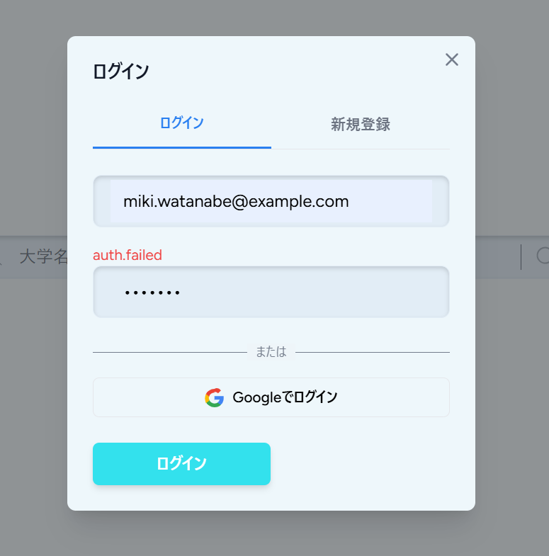
※画像は、あえて間違ったパスワードを入力しています。
validation.phpを修正する
バリデーションメッセージはLaravel側で定義していました(作っていたのが結構前なので忘れているかと思いますがw)。
<?php

return [
    // 基本的なバリデーションメッセージ
    'required' => ':attribute は必須項目です。',
    'string' => ':attribute は文字列である必要があります。',
    'unique' => 'この:attribute は既に登録されています。',

    // ↓追加してください
    'email' => ':attribute は有効なメールアドレスである必要があります。',
    'confirmed' => ':attribute の確認が一致しません。',
    'min' => [
        'string'  => ':attribute は :min 文字以上にしてください。',
    ],

    'max' => [
        'numeric' => ':attribute は :max 以下の値にしてください。',
        'file'    => ':attribute は :max KB以下のファイルにしてください。',
        'string'  => ':attribute は :max 文字以下にしてください。',
        'array'   => ':attribute は :max 個以下にしてください。',
    ],

    'custom' => [
        // 大学関連
        // ...
    ],

    'attributes' => [
        // ↓追加です
        'nickname' => 'ニックネーム',
        'email' => 'メールアドレス',
        'password' => 'パスワード',
        'password_confirmation' => 'パスワード(確認用)',
        // ↑ここまで
        'name' => '大学名',
        'faculty.name' => '学部名',
        'mentorship_style' => '指導スタイル',
        'lab_atmosphere' => '雰囲気・文化',
        'achievement_activity' => '成果・活動',
        'constraint_level' => '拘束度',
        'facility_quality' => '設備',
        'work_style' => '働き方',
        'student_balance' => '人数バランス',
    ],

];
/lang/ja/auth.phpを作成する
今の修正では、フィールドの入力値一つ一つに対するバリデーションが設定されました。
例えば、フォーマットや文字数といったものです。
一方で、メールアドレスやパスワードが登録内容と一致しない場合などのエラーメッセージも同じように表示したいです。
それ用の新規ファイルを作成しましょう。
<?php

return [
    'failed' => 'メールアドレスまたはパスワードが正しくありません。',
    'password' => 'パスワードが正しくありません。',
    'throttle' => 'ログイン試行回数が多すぎます。:seconds 秒後に再度お試しください。',
];
RegisteredUserController.phpを修正する
気が付いた方もいたと思いますが、nicknameというのはフィールド値とは異なりますよね。
実は、バリデーションの方に既に大学名という意味でnameが使われていたので、かぶらなようにさりげなくユーザー名の方はnicknameに変えて起きました。
よって、つじつまを合わせるためにコントローラーとフォーム側を修正します。
<?php

class RegisteredUserController extends Controller
{
    public function store(Request $request): RedirectResponse
    {
        $request->validate([
            'nickname' => 'required|string|max:255', // 修正です
            'email' => 'required|string|lowercase|email|max:255|unique:'.User::class,
            'password' => ['required', 'confirmed', Rules\Password::defaults()],
        ]);

        $user = User::create([
            'name' => $request->nickname, // DBはnameのまま登録します
            'email' => $request->email,
            'password' => Hash::make($request->password),
        ]);

        event(new Registered($user));

        Auth::login($user);

        return redirect()->back();
    }
}
AuthModal.jsxを修正する
同様に新規登録フォームも修正します。
const RegisterForm = ({ onClose }) => {
  const { data, setData, post, processing, errors } = useForm({
    nickname: '', // 修正です
    email: '',
    password: '',
    password_confirmation: '',
  });

  const submit = e => {
    e.preventDefault();
    post(route('register'), {
      onSuccess: () => onClose(),
      preserveScroll: true,
    });
  };

  // ↓name => nicknameに統一してください
  return (
    <form onSubmit={submit}>
      {errors.nickname && <p className="text-red-500 text-sm">{errors.nickname}</p>}
      <FieldBar className="mb-4">
        {/* 入力欄 */}
        <input
          type="text"
          value={data.nickname}
          onChange={e => setData('nickname', e.target.value)}
          placeholder="ニックネーム"
          className="w-full outline-none bg-transparent border-none focus:outline-none focus:ring-0"
        />
      </FieldBar>
あと、バリデーションメッセージの表示位置ですが、各フィールドの下から上に変更しています。
上の方が見やすいと思うので、他のフィールドについても併せメッセージ表示位置をすべて移動させておいてください。
あとあと、requiredが中途半端にあったりなかったりしたと思いますが、それはやめてバリデーションメッセージに統一しました。
最終的なAuthModal.jsxは以下の通り修正されています。
import { useForm } from '@inertiajs/react';
import Modal from '../Common/Modal';
import FieldBar from '../Common/FieldBar';
import AuthSubmitButton from './AuthSubmitButton';

/**
 * 認証モーダル
 * @param {Object} props
 * @param {string|null} props.mode - 'login' | 'register' | null
 * @param {Function} props.onClose - モーダルを閉じる
 * @param {Function} props.onSwitchMode - モード切り替え
 * @returns {JSX.Element} コンポーネントのJSX
 */
const AuthModal = ({ mode, onClose, switchMode }) => {
  const isOpen = mode === 'login' || mode === 'register';
  const isLoginMode = mode === 'login';
  const isRegisterMode = mode === 'register';

  return (
    <Modal
      isOpen={isOpen}
      onClose={onClose}
      title={isLoginMode ? 'ログイン' : isRegisterMode ? '新規登録' : ''}
      size="sm"
    >
      {/* タブ切り替え */}
      <div className="flex border-b mb-6">
        <button
          type="button"
          onClick={() => switchMode('login')}
          className={`flex-1 pb-3 text-sm font-medium transition-colors ${
            isLoginMode
              ? 'text-[#297FF0] border-b-2 border-[#297FF0]'
              : 'text-gray-500 hover:text-gray-700'
          }`}
        >
          ログイン
        </button>
        <button
          type="button"
          onClick={() => switchMode('register')}
          className={`flex-1 pb-3 text-sm font-medium transition-colors ${
            isRegisterMode
              ? 'text-[#297FF0] border-b-2 border-[#297FF0]'
              : 'text-gray-500 hover:text-gray-700'
          }`}
        >
          新規登録
        </button>
      </div>

      {/* ログインフォーム */}
      {isLoginMode && <LoginForm onClose={onClose} />}

      {/* 新規登録フォーム */}
      {isRegisterMode && <RegisterForm onClose={onClose} />}
    </Modal>
  );
};

/**
 * ログインフォーム
 * @param {Object} props
 * @param {Function} props.onClose - モーダルを閉じる
 * @returns {JSX.Element} コンポーネントのJSX
 */
const LoginForm = ({ onClose }) => {
  const { data, setData, post, processing, errors } = useForm({
    email: '',
    password: '',
    remember: false,
  });

  const submit = e => {
    e.preventDefault();
    post(route('login'), {
      onSuccess: () => onClose(),
      preserveScroll: true,
    });
  };

  return (
    <form onSubmit={submit}>
      {/* 入力欄 */}
      {errors.email && <p className="text-red-500 text-sm">{errors.email}</p>}
      <FieldBar className="mb-4">
        <input
          type="email"
          value={data.email}
          onChange={e => setData('email', e.target.value)}
          placeholder="メールアドレス"
          className="w-full outline-none bg-transparent border-none focus:outline-none focus:ring-0"
        />
      </FieldBar>
      {errors.password && <p className="text-red-500 text-sm">{errors.password}</p>}
      <FieldBar className="mb-4">
        <input
          type="password"
          value={data.password}
          onChange={e => setData('password', e.target.value)}
          placeholder="パスワード"
          className="w-full outline-none bg-transparent border-none focus:outline-none focus:ring-0"
        />
      </FieldBar>

      {/* Google ログイン追加部分 */}
      <div className="my-6">
        <div className="relative my-4">
            <div className="absolute inset-0 flex items-center">
              <span className="w-full border-t" style={{ borderColor: '#747D8C' }} />
            </div>
          <div className="relative flex justify-center text-xs uppercase">
            <span className="bg-[#EEF5F9] px-2 text-[#747D8C]">または</span>
          </div>
        </div>

        <a
           href={typeof route === 'function' ? route('auth.google') : '/auth/google'}
           className="inline-flex w-full items-center justify-center gap-2 rounded-md border px-4 py-2 text-sm font-medium hover:bg-[#E2EDF6] transition"
        >
          <svg width="18" height="18" viewBox="0 0 533.5 544.3" aria-hidden="true">
            <path
              fill="#4285f4"
              d="M533.5 278.4c0-18.5-1.7-36.3-4.9-53.5H272.1v101h146.9c-6.3 34.1-25.6 62.9-54.6 82.2v68h88.2c51.6-47.5 80.9-117.6 80.9-197.7z"
            />
            <path
              fill="#34a853"
              d="M272.1 544.3c73.3 0 134.9-24.2 179.9-65.2l-88.2-68c-24.5 16.5-55.9 26.1-91.7 26.1-70.6 0-130.4-47.6-151.8-111.6H30.8v70.2c44.8 88.8 136.6 148.5 241.3 148.5z"
            />
            <path
              fill="#fbbc05"
              d="M120.3 325.6c-10.1-30.1-10.1-62.7 0-92.8v-70.2H30.8c-41.4 82.8-41.4 180.5 0 263.3l89.5-70.3z"
            />
            <path
              fill="#ea4335"
              d="M272.1 106.3c38.8-.6 76.1 13.7 104.5 39.9l78.1-78.1C407 .8 343-18.1 272.1 18.4 167.4 18.4 75.6 78.2 30.8 167l89.5 70.2c21.4-64 81.1-110.9 151.8-110.9z"
            />
          </svg>
          <span>Googleでログイン</span>
        </a>
      </div>

      {/* 送信ボタン */}
      <div className="mt-6">
        <AuthSubmitButton mode="login" disabled={processing} />
      </div>
    </form>
  );
};

/**
 * 新規登録フォーム
 * @param {Object} props
 * @param {Function} props.onClose - モーダルを閉じる
 * @returns {JSX.Element} コンポーネントのJSX
 */
const RegisterForm = ({ onClose }) => {
  const { data, setData, post, processing, errors } = useForm({
    nickname: '',
    email: '',
    password: '',
    password_confirmation: '',
  });

  const submit = e => {
    e.preventDefault();
    post(route('register'), {
      onSuccess: () => onClose(),
      preserveScroll: true,
    });
  };

  return (
    <form onSubmit={submit}>
      {errors.nickname && <p className="text-red-500 text-sm">{errors.nickname}</p>}
      <FieldBar className="mb-4">
        {/* 入力欄 */}
        <input
          type="text"
          value={data.nickname}
          onChange={e => setData('nickname', e.target.value)}
          placeholder="ニックネーム"
          className="w-full outline-none bg-transparent border-none focus:outline-none focus:ring-0"
        />
      </FieldBar>
      {errors.email && <p className="text-red-500 text-sm">{errors.email}</p>}
      <FieldBar className="mb-4">
        <input
          type="email"
          value={data.email}
          onChange={e => setData('email', e.target.value)}
          placeholder="メールアドレス"
          className="w-full outline-none bg-transparent border-none focus:outline-none focus:ring-0"
        />
      </FieldBar>
      {errors.password && <p className="text-red-500 text-sm">{errors.password}</p>}
      <FieldBar className="mb-4">
        <input
          type="password"
          value={data.password}
          onChange={e => setData('password', e.target.value)}
          placeholder="パスワード"
          className="w-full outline-none bg-transparent border-none focus:outline-none focus:ring-0"
        />
      </FieldBar>
      {errors.password_confirmation && (
        <p className="text-red-500 text-sm">{errors.password_confirmation}</p>
      )}
      <FieldBar className="mb-4">
        <input
          type="password"
          value={data.password_confirmation}
          onChange={e => setData('password_confirmation', e.target.value)}
          placeholder="パスワード(確認用)"
          className="w-full outline-none bg-transparent border-none focus:outline-none focus:ring-0"
        />
      </FieldBar>

      {/* Google ログイン追加部分 */}
      <div className="my-6">
        <div className="relative my-4">
            <div className="absolute inset-0 flex items-center">
              <span className="w-full border-t" style={{ borderColor: '#747D8C' }} />
            </div>
          <div className="relative flex justify-center text-xs uppercase">
            <span className="bg-[#EEF5F9] px-2 text-[#747D8C]">または</span>
          </div>
        </div>

        <a
           href={typeof route === 'function' ? route('auth.google') : '/auth/google'}
           className="inline-flex w-full items-center justify-center gap-2 rounded-md border px-4 py-2 text-sm font-medium hover:bg-[#E2EDF6] transition"
        >
          <svg width="18" height="18" viewBox="0 0 533.5 544.3" aria-hidden="true">
            <path
              fill="#4285f4"
              d="M533.5 278.4c0-18.5-1.7-36.3-4.9-53.5H272.1v101h146.9c-6.3 34.1-25.6 62.9-54.6 82.2v68h88.2c51.6-47.5 80.9-117.6 80.9-197.7z"
            />
            <path
              fill="#34a853"
              d="M272.1 544.3c73.3 0 134.9-24.2 179.9-65.2l-88.2-68c-24.5 16.5-55.9 26.1-91.7 26.1-70.6 0-130.4-47.6-151.8-111.6H30.8v70.2c44.8 88.8 136.6 148.5 241.3 148.5z"
            />
            <path
              fill="#fbbc05"
              d="M120.3 325.6c-10.1-30.1-10.1-62.7 0-92.8v-70.2H30.8c-41.4 82.8-41.4 180.5 0 263.3l89.5-70.3z"
            />
            <path
              fill="#ea4335"
              d="M272.1 106.3c38.8-.6 76.1 13.7 104.5 39.9l78.1-78.1C407 .8 343-18.1 272.1 18.4 167.4 18.4 75.6 78.2 30.8 167l89.5 70.2c21.4-64 81.1-110.9 151.8-110.9z"
            />
          </svg>
          <span>Googleでログイン</span>
        </a>
      </div>

      {/* 送信ボタン */}
      <div className="mt-6">
        <AuthSubmitButton mode="register" disabled={processing} />
      </div>
    </form>
  );
};

export default AuthModal;
こんな感じに日本語で表示されていれば完了です!

5. レイアウト整え
最後にレイアウトを整えて完成としましょう!
送信ボタンを中央に移動させる
まず、気になるところとしては、ログイン・新規登録ボタンがちょっと左にずれてしまっているところです。
中央寄せにしましょう。
      {/* 送信ボタン */}
      <div className="mt-6 flex justify-center">
        <AuthSubmitButton mode="register" disabled={processing} />
      </div>

フィールドの大きさを調整する
次に、入力フィールドの縦幅が大きすぎる問題を直したいと思います。
入力フィールドには、FieldBarコンポーネントを使っているので、これにサイズに関するプロパティを要して、propsとして受け取れるようにしたいと思います。
さらに、FeildBarを呼び出して、その中でinputを使用しているためパディングが二重になってしまっています。
修正は最後にお見せします。(笑)
モーダル切り替え時の大きさをそろえる
色々と修正したので要チェックです。
変更を加えたファイルの最終的なファイルの中身は以下のようになります!
import { useForm } from '@inertiajs/react';
import Modal from '../Common/Modal';
import AuthSubmitButton from './AuthSubmitButton';
import InputField from '../Common/InputField';

/**
 * 認証モーダル
 * @param {Object} props
 * @param {string|null} props.mode - 'login' | 'register' | null
 * @param {Function} props.onClose - モーダルを閉じる
 * @param {Function} props.onSwitchMode - モード切り替え
 * @returns {JSX.Element} コンポーネントのJSX
 */
const AuthModal = ({ mode, onClose, switchMode }) => {
  const isOpen = mode === 'login' || mode === 'register';
  const isLoginMode = mode === 'login';
  const isRegisterMode = mode === 'register';

  return (
    <Modal
      isOpen={isOpen}
      onClose={onClose}
      title={isLoginMode ? 'ログイン' : isRegisterMode ? '新規登録' : ''}
      size="sm"
    >
      <div className="h-[500px] flex flex-col">
        {/* タブ切り替え */}
        <div className="flex border-b mb-6">
          <button
            type="button"
            onClick={() => switchMode('login')}
            className={`flex-1 pb-3 text-sm font-medium transition-colors ${
              isLoginMode
                ? 'text-[#297FF0] border-b-2 border-[#297FF0]'
                : 'text-gray-500 hover:text-gray-700'
            }`}
          >
            ログイン
          </button>
          <button
            type="button"
            onClick={() => switchMode('register')}
            className={`flex-1 pb-3 text-sm font-medium transition-colors ${
              isRegisterMode
                ? 'text-[#297FF0] border-b-2 border-[#297FF0]'
                : 'text-gray-500 hover:text-gray-700'
            }`}
          >
            新規登録
          </button>
        </div>

        {/* フォーム領域 */}
        <div className="flex-1">
          {isLoginMode && <LoginForm onClose={onClose} />}
          {isRegisterMode && <RegisterForm onClose={onClose} />}
        </div>
      </div>
    </Modal>
  );
};

/**
 * ログインフォーム
 * @param {Object} props
 * @param {Function} props.onClose - モーダルを閉じる
 * @returns {JSX.Element} コンポーネントのJSX
 */
const LoginForm = ({ onClose }) => {
  const { data, setData, post, processing, errors } = useForm({
    email: '',
    password: '',
    remember: false,
  });

  const submit = e => {
    e.preventDefault();
    post(route('login'), {
      onSuccess: () => onClose(),
      preserveScroll: true,
    });
  };

  return (
    <form onSubmit={submit} className="h-full flex flex-col">
      <div className="flex-1">
        {/* 入力欄 */}
        <ErrorSlot message={errors.email} />
        <InputField
          type="email"
          value={data.email}
          onChange={e => setData('email', e.target.value)}
          placeholder="メールアドレス"
          size="sm"
          className="mb-4 w-full"
        />
        <ErrorSlot message={errors.password} />
        <InputField
          type="password"
          value={data.password}
          onChange={e => setData('password', e.target.value)}
          placeholder="パスワード"
          size="sm"
          className="mb-4 w-full"
        />

        {/* Google ログイン追加部分 */}
        <div className="my-6">
          <div className="relative my-4">
            <div className="absolute inset-0 flex items-center">
              <span className="w-full border-t" style={{ borderColor: '#747D8C' }} />
            </div>
            <div className="relative flex justify-center text-xs uppercase">
              <span className="bg-[#EEF5F9] px-2 text-[#747D8C]">または</span>
            </div>
          </div>

          <a
            href={typeof route === 'function' ? route('auth.google') : '/auth/google'}
            className="inline-flex w-full items-center justify-center gap-2 rounded-md border px-4 py-2 text-sm font-medium hover:bg-[#E2EDF6] transition"
          >
            <svg width="18" height="18" viewBox="0 0 533.5 544.3" aria-hidden="true">
              <path
                fill="#4285f4"
                d="M533.5 278.4c0-18.5-1.7-36.3-4.9-53.5H272.1v101h146.9c-6.3 34.1-25.6 62.9-54.6 82.2v68h88.2c51.6-47.5 80.9-117.6 80.9-197.7z"
              />
              <path
                fill="#34a853"
                d="M272.1 544.3c73.3 0 134.9-24.2 179.9-65.2l-88.2-68c-24.5 16.5-55.9 26.1-91.7 26.1-70.6 0-130.4-47.6-151.8-111.6H30.8v70.2c44.8 88.8 136.6 148.5 241.3 148.5z"
              />
              <path
                fill="#fbbc05"
                d="M120.3 325.6c-10.1-30.1-10.1-62.7 0-92.8v-70.2H30.8c-41.4 82.8-41.4 180.5 0 263.3l89.5-70.3z"
              />
              <path
                fill="#ea4335"
                d="M272.1 106.3c38.8-.6 76.1 13.7 104.5 39.9l78.1-78.1C407 .8 343-18.1 272.1 18.4 167.4 18.4 75.6 78.2 30.8 167l89.5 70.2c21.4-64 81.1-110.9 151.8-110.9z"
              />
            </svg>
            <span>Googleでログイン</span>
          </a>
        </div>
      </div>

      {/* 送信ボタン */}
      <div className="mt-6 flex justify-center">
        <AuthSubmitButton mode="login" disabled={processing} />
      </div>
    </form>
  );
};

/**
 * 新規登録フォーム
 * @param {Object} props
 * @param {Function} props.onClose - モーダルを閉じる
 * @returns {JSX.Element} コンポーネントのJSX
 */
const RegisterForm = ({ onClose }) => {
  const { data, setData, post, processing, errors } = useForm({
    nickname: '',
    email: '',
    password: '',
    password_confirmation: '',
  });

  const submit = e => {
    e.preventDefault();
    post(route('register'), {
      onSuccess: () => onClose(),
      preserveScroll: true,
    });
  };

  return (
    <form onSubmit={submit} className="h-full flex flex-col">
      <div className="flex-1">
        <ErrorSlot message={errors.nickname} />
        {/* 入力欄 */}
        <InputField
          type="text"
          value={data.nickname}
          onChange={e => setData('nickname', e.target.value)}
          placeholder="ニックネーム"
          size="sm"
          className="mb-4 w-full"
        />
        <ErrorSlot message={errors.email} />
        <InputField
          type="email"
          value={data.email}
          onChange={e => setData('email', e.target.value)}
          placeholder="メールアドレス"
          size="sm"
          className="mb-4 w-full"
        />
        <ErrorSlot message={errors.password} />
        <InputField
          type="password"
          value={data.password}
          onChange={e => setData('password', e.target.value)}
          placeholder="パスワード"
          size="sm"
          className="mb-4 w-full"
        />
        <ErrorSlot message={errors.password_confirmation} />
        <InputField
          type="password"
          value={data.password_confirmation}
          onChange={e => setData('password_confirmation', e.target.value)}
          placeholder="パスワード(確認用)"
          size="sm"
          className="mb-4 w-full"
        />

        {/* Google ログイン追加部分 */}
        <div className="my-6">
          <div className="relative my-4">
            <div className="absolute inset-0 flex items-center">
              <span className="w-full border-t" style={{ borderColor: '#747D8C' }} />
            </div>
            <div className="relative flex justify-center text-xs uppercase">
              <span className="bg-[#EEF5F9] px-2 text-[#747D8C]">または</span>
            </div>
          </div>

          <a
            href={typeof route === 'function' ? route('auth.google') : '/auth/google'}
            className="inline-flex w-full items-center justify-center gap-2 rounded-md border px-4 py-2 text-sm font-medium hover:bg-[#E2EDF6] transition"
          >
            <svg width="18" height="18" viewBox="0 0 533.5 544.3" aria-hidden="true">
              <path
                fill="#4285f4"
                d="M533.5 278.4c0-18.5-1.7-36.3-4.9-53.5H272.1v101h146.9c-6.3 34.1-25.6 62.9-54.6 82.2v68h88.2c51.6-47.5 80.9-117.6 80.9-197.7z"
              />
              <path
                fill="#34a853"
                d="M272.1 544.3c73.3 0 134.9-24.2 179.9-65.2l-88.2-68c-24.5 16.5-55.9 26.1-91.7 26.1-70.6 0-130.4-47.6-151.8-111.6H30.8v70.2c44.8 88.8 136.6 148.5 241.3 148.5z"
              />
              <path
                fill="#fbbc05"
                d="M120.3 325.6c-10.1-30.1-10.1-62.7 0-92.8v-70.2H30.8c-41.4 82.8-41.4 180.5 0 263.3l89.5-70.3z"
              />
              <path
                fill="#ea4335"
                d="M272.1 106.3c38.8-.6 76.1 13.7 104.5 39.9l78.1-78.1C407 .8 343-18.1 272.1 18.4 167.4 18.4 75.6 78.2 30.8 167l89.5 70.2c21.4-64 81.1-110.9 151.8-110.9z"
              />
            </svg>
            <span>Googleでログイン</span>
          </a>
        </div>
      </div>

      {/* 送信ボタン */}
      <div className="mt-6 flex justify-center">
        <AuthSubmitButton mode="register" disabled={processing} />
      </div>
    </form>
  );
};

const ErrorSlot = ({ message }) => (
  <p className="h-5 text-sm leading-5 text-red-500 overflow-hidden">
    {message ?? '\u00A0'}
  </p>
);

export default AuthModal;
/**
 * フィールドバーコンポーネント
 * @param {Object} props - コンポーネントのprops
 * @param {React.ReactNode} [props.left] - 左側に表示する要素
 * @param {React.ReactNode} [props.right] - 右側に表示する要素
 * @param {React.ReactNode} props.children - 中央に表示するコンテンツ
 * @param {string} [props.size='md'] - サイズ ('sm' | 'md' | 'lg')
 * @param {string} [props.className=''] - 追加のCSSクラス
 * @returns {JSX.Element} コンポーネントのJSX
 */
const FieldBar = ({ left, right, children, size = "md", className = "" }) => {
  const sizeClasses = {
    sm: 'px-3 py-1 text-sm', // 認証モーダル用
    md: 'px-4 py-2',         // 標準
    lg: 'px-4 py-3 text-lg', // 大きめ
  };

  return (
    <div
      className={`
        flex items-center
        rounded-lg
        bg-[#E2EDF6]
        border border-[#E2EDF6]
        shadow-[inset_0_2px_4px_rgba(0,0,0,0.15)]
        ${sizeClasses[size]}
        ${className}
      `}
    >
      {left ? (
        <div className="mr-0.5 flex-shrink-0">
          {left}
        </div>
      ) : null}

      <div className="flex-grow min-w-0">
        {children}
      </div>

      {right ? (
        <div className="flex items-center">
          <div className="h-6 mx-3" />
          {right}
        </div>
      ) : null}
    </div>
  );
};

export default FieldBar;
import FieldBar from './FieldBar';

/**
 * 入力フィールドコンポーネント
 * @param {Object} props
 * @param {string} props.type - input の type
 * @param {string} props.value - 値
 * @param {Function} props.onChange - 変更ハンドラ
 * @param {string} [props.placeholder] - プレースホルダー
 * @param {string} [props.size='md'] - サイズ ('sm' | 'md' | 'lg')
 * @param {string} [props.className=''] - FieldBar への追加クラス
 * @returns {JSX.Element} コンポーネントのJSX
 */
const InputField = ({
  type = 'text',
  value,
  onChange,
  placeholder,
  size = 'md',
  className = '',
}) => {
  return (
    <FieldBar size={size} className={className}>
      <input
        type={type}
        value={value}
        onChange={onChange}
        placeholder={placeholder}
        className="w-full bg-transparent border-none outline-none focus:ring-0 p-0 m-0"
      />
    </FieldBar>
  );
};

export default InputField;
新しいファイルInputField.jsxを作成し、その中にinputを書くことで、入力フィールドの二重化を防ぎました。
すみません、最後説明がやや雑になってしまいましたね....
6. まとめ・次回予告
今回からページ遷移をやめてモーダルを作成してユーザーに入力させていく方針にしています。
今回は、ログイン・新規登録モーダルの作成を行いました!
次回は、大学作成・編集用モーダルを作成します。
お楽しみに!
これまでの記事一覧
☆要件定義・設計編
☆環境構築編
- その2: 環境構築編① ~WSL, Ubuntuインストール~
- その3: 環境構築編② ~Docker Desktopインストール~
- その4: 環境構築編③ ~Dockerコンテナ立ち上げ~
- その5: 環境構築編④ ~Laravelインストール~
- その6: 環境構築編⑤ ~Gitリポジトリ接続~
☆バックエンド実装編
- その7: バックエンド実装編① ~認証機能作成~
- その8: バックエンド実装編②前編 ~レビュー投稿機能作成~
- その8.5: バックエンド実装編②後編 ~レビュー投稿機能作成~
- その9: バックエンド実装編③ ~レビューCRUD機能作成~
- その10: バックエンド実装編④ ~レビューCRUD機能作成その2~
- その11: バックエンド実装編⑤ ~新規大学・学部・研究室作成機能作成~
- その12: バックエンド実装編⑥ ~大学検索機能作成~
- その13: バックエンド実装編⑦ ~大学・学部・研究室編集機能作成~
- その14: バックエンド実装編⑧ ~コメント投稿機能~
- その15: バックエンド実装編⑨ ~コメント編集・削除機能~
- その16: バックエンド実装編⑩ ~ブックマーク機能~
- その17: バックエンド実装編⑪ ~排他制御・トランザクション処理~
- その18: バックエンド実装編⑫ ~マイページ機能作成~
- その19: バックエンド実装編⑬ ~管理者アカウント機能作成~
- その20: バックエンド実装編⑭ ~通知機能作成~
- その21: バックエンド実装編⑮ ~ソーシャルログイン機能作成~
☆フロントエンド実装編
- その22: フロントエンド実装編① ~メインコンテンツ領域作成~
- その23: フロントエンド実装編② ~ヘッダー作成~
- その24: フロントエンド実装編③ ~サイドバー作成~
- その25: フロントエンド実装編④ ~ホームページ作成~
- その26: フロントエンド実装編⑤ ~大学検索結果画面作成~
- その27: フロントエンド実装編⑥ ~大学詳細・学部一覧画面作成~
- その28: フロントエンド実装編⑦ ~学部詳細・研究室一覧画面作成~
- その29: フロントエンド実装編⑧前編 ~研究室詳細・レビュー画面作成前編~
- その29.5: フロントエンド実装編⑧後編 ~研究室詳細・レビュー画面作成後編~
- その30: フロントエンド実装編⑨ ~マイページ作成~
- その31: フロントエンド実装編⑩ ~パンくずリスト作成~
軽く宣伝
YouTubeを始めました(というか始めてました)。
内容としては、Webエンジニアの生活や稼げるようになるまでの成長記録などを発信していく予定です。
現在、まったく再生されておらず、落ち込みそうなので、見てくださる方はぜひ高評価を教えもらえると励みになると思います。"(-""-)"