前回の内容はこちら
環境構築~とりあえずMCPの情報を取ってこれるところまで確認できました。
Figma MCP×Cursorを使ってみる①
画像として読み込まれてしまったので今回はもう少し工夫してやってみたいと思います!
Figmaのベストプラクティスに沿って作ってみる
Figmaを作る際に大事なことは以下のようです。
- コンポーネントの利用
- コンポーネントに命名する
- オートレイアウトを使用(flexとかしてくれるもの?)
- 間隔、色、半径、タイポグラフィにはバリアブルを使用する
バリアブル→変数を使用するとのこと。ボタンを押してカウントアップする等をFigma で実現する際に使用するみたいです - Code Connectを介してコンポーネントをコードベースにリンク
1つずつ試して、どのように変わっていくのか試してみたいと思います。
※4、5は今回やりません。
Cursorのプロンプト
CursorのカスタムルールはFigmaの公式に記載のものを使用しています。
 - Figma Dev Mode MCPサーバーは、画像やSVGアセットを提供するアセットエンドポイントを提供します。
 - 重要: Figma Dev Mode MCP サーバーが画像またはSVGのローカルホストソースを返す場合、その画像またはSVGソースを直接使用してください。
 - 重要: 新しいアイコンパッケージをインポート/追加しないでください。すべてのアセットはFigmaペイロードに含まれている必要があります。
 - 重要: ローカルホストソースが提供されている場合、プレースホルダーを使用または作成しないでください。
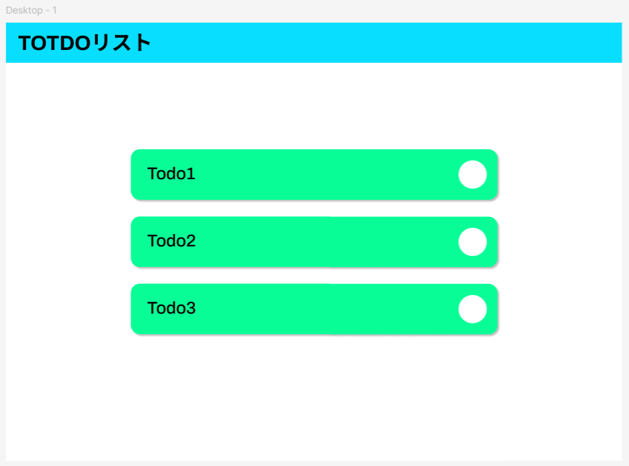
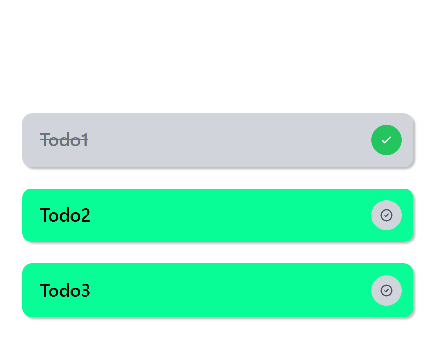
## 作成した画面
簡易的なTODOListです。
リポジトリは以下です。
ステップごとにブランチを切っています。
1. コンポーネントの利用
命名は何もせずコンポーネントを作成しています。
色や影は付けました。
プロンプトは以下でひとまず統一しました。
get_codeはFigmaでコピーした内容をReact+Tailwind CSSで解釈してくれるツールのようです。
あなたはプロのフロントエンドエンジニアです。
このFigmaフレームを作成してください。:[Figmaリンク]
get_codeを使用して作成してください。
必要に応じてcomponentsフォルダ配下にコンポーネントを作成しても構いません。
作られた画面
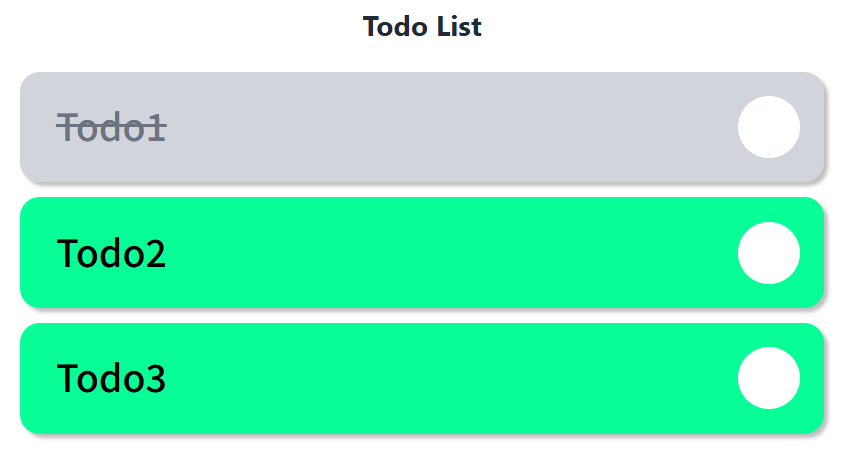
TODOの完了まで実装してくれてました。すごい。
アウトプットされたコンポーネント
- components
- TodoItem.tsx
- TodoList.tsx
import React from 'react';

interface TodoItemProps {
  text: string;
  completed?: boolean;
  onToggle?: () => void;
}

const TodoItem: React.FC<TodoItemProps> = ({ text, completed = false, onToggle }) => {
  const imgEllipse1 = "http://localhost:3845/assets/aa5ec7d4dea4138413481bc4ef74c83a409c0713.svg";

  return (
    <div className="relative w-full h-[118px] mb-4">
      <div
        className={`absolute inset-0 rounded-[21px] shadow-[4px_4px_4px_0px_rgba(0,0,0,0.25)] transition-all duration-300 ${
          completed ? 'bg-gray-300' : 'bg-[#09fd97]'
        }`}
      />
      <div
        className="absolute bottom-[22.034%] left-[89.382%] right-[2.917%] top-[22.034%] cursor-pointer"
        onClick={onToggle}
      >
        <img
          alt="todo status"
          className="block max-w-none size-full"
          src={imgEllipse1}
        />
      </div>
      <div
        className={`absolute bottom-[25.424%] flex flex-col font-['Archivo:Medium',_sans-serif] font-medium justify-center leading-[0] left-[4.434%] right-[34.306%] text-[40px] text-left top-[22.034%] transition-all duration-300 ${
          completed ? 'text-gray-500 line-through' : 'text-[#000000]'
        }`}
        style={{ fontVariationSettings: "'wdth' 100" }}
      >
        <p className="block leading-[24px]">{text}</p>
      </div>
    </div>
  );
};

export default TodoItem;
import React, { useState } from 'react';
import TodoItem from './TodoItem';

interface Todo {
  id: number;
  text: string;
  completed: boolean;
}

const TodoList: React.FC = () => {
  const [todos, setTodos] = useState<Todo[]>([
    { id: 1, text: 'Todo1', completed: false },
    { id: 2, text: 'Todo2', completed: false },
    { id: 3, text: 'Todo3', completed: false },
  ]);

  const toggleTodo = (id: number) => {
    setTodos(todos.map(todo =>
      todo.id === id ? { ...todo, completed: !todo.completed } : todo
    ));
  };

  return (
    <div className="bg-[#ffffff] min-h-screen p-8">
      <div className="max-w-[857px] mx-auto">
        <h1 className="text-3xl font-bold text-center mb-8 text-gray-800">
          Todo List
        </h1>
        <div className="space-y-4">
          {todos.map((todo) => (
            <TodoItem
              key={todo.id}
              text={todo.text}
              completed={todo.completed}
              onToggle={() => toggleTodo(todo.id)}
            />
          ))}
        </div>
      </div>
    </div>
  );
};

export default TodoList;
get_codeを使用したおかげか、結構いい感じにできていますね。
オートレイアウトをしていないからなのかabsoluteが指定されています。
2. コンポーネントに命名する
→1ですでに命名まできちんとしてくれていたので、今回は割愛します。
3. オートレイアウトを使用
オートレイアウトでフローは垂直にしてみました。
プロンプトや資産はまっさらにしてStep1のプロンプトと同様の指示を出します。
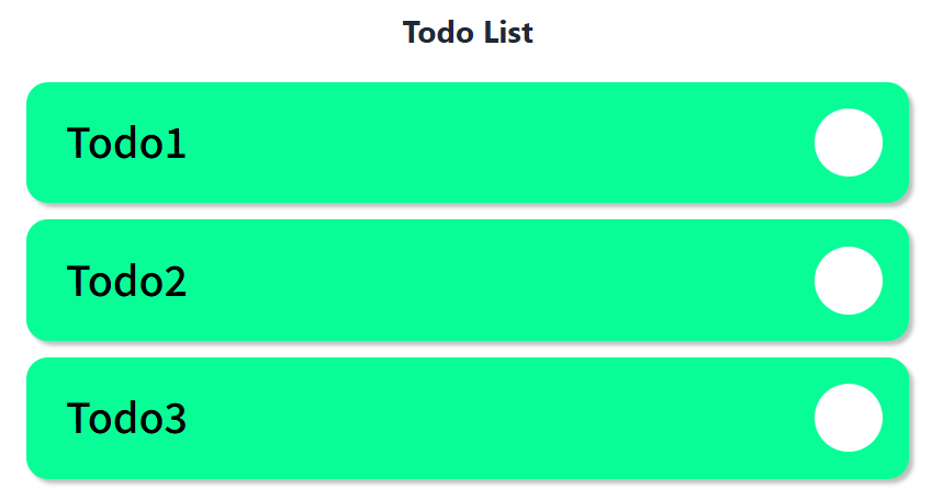
作られた画面
ヘッダがうまく選択されておらず作られなかったですが、見た目は相変わらずきれいです。
アウトプットされたコンポーネント
- components
- TodoICard.tsx
- TodoList.tsx
前回とコンポーネント名が変わっていました。やはり、コンポーネントを指定してあげるのは大事なようですね。
import React from 'react';

interface TodoCardProps {
  text: string;
  completed?: boolean;
  onClick?: () => void;
}

const TodoCard: React.FC<TodoCardProps> = ({ text, completed = false, onClick }) => {
  return (
    <div
      className="relative w-full h-[118px] cursor-pointer transition-all duration-300 hover:scale-[1.02]"
      onClick={onClick}
    >
      {/* 背景の緑色のカード */}
      <div className={`absolute inset-0 rounded-[21px] shadow-[4px_4px_4px_0px_rgba(0,0,0,0.25)] transition-all duration-300 ${
        completed ? 'bg-gray-300' : 'bg-[#09fd97]'
      }`} />

      {/* 右側のアイコン */}
      <div className="absolute bottom-[22.034%] left-[89.382%] right-[2.917%] top-[22.034%]">
        <div className={`w-full h-full rounded-full flex items-center justify-center transition-all duration-300 ${
          completed ? 'bg-green-500' : 'bg-gray-300'
        }`}>
          {completed ? (
            <svg
              className="w-8 h-8 text-white"
              fill="none"
              stroke="currentColor"
              viewBox="0 0 24 24"
            >
              <path
                strokeLinecap="round"
                strokeLinejoin="round"
                strokeWidth={2}
                d="M5 13l4 4L19 7"
              />
            </svg>
          ) : (
            <svg
              className="w-8 h-8 text-gray-600"
              fill="none"
              stroke="currentColor"
              viewBox="0 0 24 24"
            >
              <path
                strokeLinecap="round"
                strokeLinejoin="round"
                strokeWidth={2}
                d="M9 12l2 2 4-4m6 2a9 9 0 11-18 0 9 9 0 0118 0z"
              />
            </svg>
          )}
        </div>
      </div>

      {/* テキスト */}
      <div className="absolute bottom-[25.424%] flex flex-col justify-center left-[4.434%] right-[34.306%] top-[22.034%]">
        <p className={`text-[40px] font-medium leading-[24px] transition-all duration-300 ${
          completed ? 'text-gray-500 line-through' : 'text-black'
        }`}>
          {text}
        </p>
      </div>
    </div>
  );
};

export default TodoCard;
import React from 'react';
import TodoCard from './TodoCard';

interface TodoItem {
  id: number;
  text: string;
  completed: boolean;
}

interface TodoListProps {
  todos: TodoItem[];
  onTodoClick?: (id: number) => void;
}

const TodoList: React.FC<TodoListProps> = ({ todos, onTodoClick }) => {
  return (
    <div className="flex flex-col gap-[47px] items-start justify-start w-full max-w-[857px]">
      {todos.map((todo) => (
        <div key={todo.id} className="w-full">
          <TodoCard
            text={todo.text}
            completed={todo.completed}
            onClick={() => onTodoClick?.(todo.id)}
          />
        </div>
      ))}
    </div>
  );
};

export default TodoList;
そこまで大きな変化は見られなかったです。
プロンプトやCursorのカスタムルールをもっと工夫すればうまくできそうな気がします。
結果
- Figmaでコンポーネント化するだけで劇的にコードがよくなりました!
- オートレイアウトは今回の画面では劇的には変わりませんでした。もっと複雑な画面とかだと旨味が出てくるのかもしれません!
- 生成毎にコンポーネント名が変わってしまったので、Figmaでコンポーネント名の指定も必須だと思いました!
今回は触れませんでしたが、Code Connectを使用したり、複雑な画面だとFigmaの選択範囲を狭めてリンクコピーをすると精度が上がるみたいなので試してみようかなと思います!