概要
matplotlibで生成したグラフの体裁調整・微調整のためのTips(~軸・図枠・目盛・目盛文字~編)です。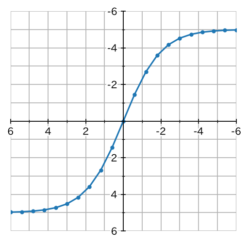
matplotlib 3.2.2、GoogleColab.(Python 3.6.9)により動作確認をしています。
準備・共通
グラフのなかで日本語が使えるように japanize-matplotlib ライブラリをインストールします。GoogleColab.の場合、コードセルで以下を実行することでインストールできます。
!pip install japanize-matplotlib
各種ライブラリをインポートをします。
import matplotlib
import matplotlib.pyplot as plt
import matplotlib.ticker as ticker
import matplotlib.transforms as transforms
import matplotlib.patheffects as patheffects
import japanize_matplotlib
import numpy as np
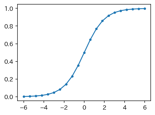
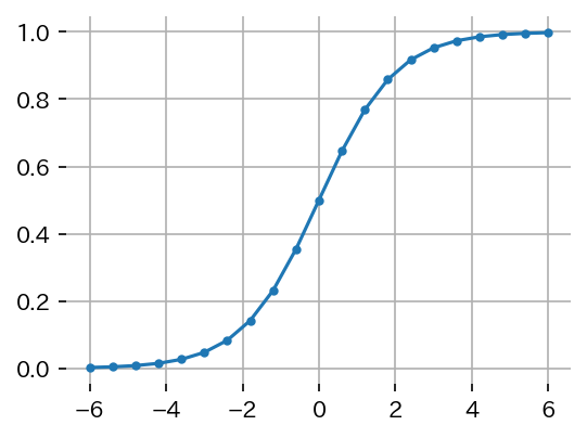
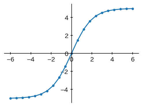
基本形として、特に体裁調整していないグラフを出力してみます。
x = np.linspace(-6,6,21)
y = 1/(1+np.exp(-x))
fig,ax = plt.subplots(figsize=(4,3),facecolor='white',dpi=150)
ax.plot(x,y,marker='.')
plt.show()
以下のようなグラフが出力できればOKです。
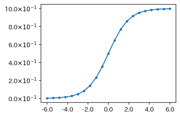
目盛文字(TickLabel)の書式設定
X軸の主目盛の書式を小数第1位まで表示する形式に、Y軸の主目盛の書式を「2.0×10⁻¹のような形式」に設定してみます。
import matplotlib.ticker as ticker を忘れないように。
x = np.linspace(-6,6,21)
y = 1/(1+np.exp(-x))
fig,ax = plt.subplots(figsize=(4,3),facecolor='white',dpi=150)
ax.plot(x,y,marker='.')

ax.xaxis.set_major_formatter(ticker.FuncFormatter(lambda x,_: f'{x:.1f}'))
ax.yaxis.set_major_formatter(ticker.FuncFormatter(lambda y,_: f'{y*10:.1f}'+ r'$\times 10^{-1}$'))

plt.show()
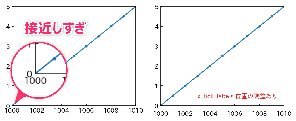
目盛文字(TickLabel)の位置調整
後述する方法で目盛を「内向き」に設定すると、X軸とY軸の目盛文字が近すぎて見苦しくなる場合があります。これを解決するために、X軸の主目盛の文字位置を下方向に微調整してみます。matplotlib.transforms as transforms を忘れないように。
x = np.linspace(1000,1010,11)
y = (x-1000)*0.5

fig,axes = plt.subplots(1,2,figsize=(8,3),facecolor='white',dpi=150)
axes = axes.ravel()
for ax in axes:
  ax.plot(x,y,marker='.')
  ax.set_xlim(1000,1010)
  ax.set_ylim(0,5)
  ax.tick_params(direction='in')

# 右側(axes[1])のみ xticklabels 位置の調整
mv = transforms.ScaledTranslation(0,-0.07,fig.dpi_scale_trans)
for label in axes[1].xaxis.get_majorticklabels() :
    label.set_transform(label.get_transform() + mv)

axes[1].text(0.95,0.075,'x_tick_labels 位置の調整あり',ha='right',c='tab:red',transform=ax.transAxes)
plt.show()
もっと簡単に移動する方法がありました。
x = np.linspace(1000,1010,11)
y = (x-1000)*0.5

fig,axes = plt.subplots(1,2,figsize=(8,3),facecolor='white',dpi=150)
axes = axes.ravel()
for ax in axes:
  ax.plot(x,y,marker='.')
  ax.set_xlim(1000,1010)
  ax.set_ylim(0,5)
  ax.tick_params(direction='in')

# 右側(axes[1])のみ xticklabels 位置の調整
ax = axes[1]
ax.get_xaxis().set_tick_params(pad=8)
ax.text(0.95,0.075,'x_tick_labels 位置の調整あり',ha='right',c='tab:red',transform=ax.transAxes)

plt.show()
軸/図枠を非表示に設定
imshow(...) などを使用した場合、軸/図枠を表示させたくない場合があります。軸/図枠を非表示にしてみます。
x = np.linspace(-6,6,21)
y = 1/(1+np.exp(-x))
fig,ax = plt.subplots(figsize=(4,3),facecolor='white',dpi=150)
ax.plot(x,y,marker='.')

for p in ['left','top','right','bottom']:
  ax.spines[p].set_visible(False)

ax.grid() # グリッド
plt.show()
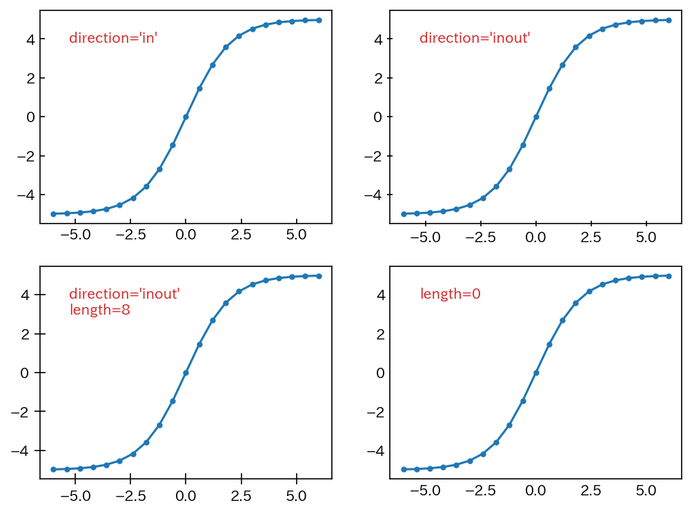
目盛(Tick)の向きと長さを調整
軸の目盛の向きを「内側」「外側」「両側」に変更してみます。また、目盛の「長さ」を調整してみます。長さをゼロに設定すれば、実質的に目盛を非表示にすることができます。
x = np.linspace(-6,6,21)
y = 10/(1+np.exp(-x))-5
fig,axes = plt.subplots(2,2,figsize=(8,6),facecolor='white',dpi=150)
axes = axes.ravel()

for ax in axes :
  ax.plot(x,y,marker='.')

axes[0].tick_params(direction='in')
axes[0].text(0.1,0.9,"direction='in'",c='tab:red',va='top',transform=axes[0].transAxes)
axes[1].tick_params(direction='inout')
axes[1].text(0.1,0.9,"direction='inout'",c='tab:red',va='top',transform=axes[1].transAxes)
axes[2].tick_params(direction='inout',length=8)
axes[2].text(0.1,0.9,"direction='inout'\nlength=8",c='tab:red',va='top',transform=axes[2].transAxes)
axes[3].tick_params(length=0)
axes[3].text(0.1,0.9,"length=0",c='tab:red',va='top',transform=axes[3].transAxes)

plt.show()
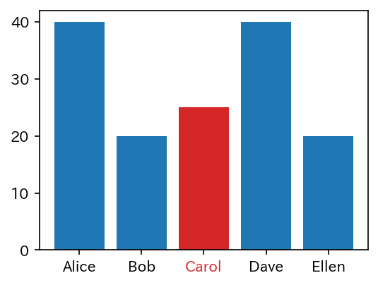
特定の目盛文字(TickLabel)だけ色を変更する
相手に注目してもらうために TickLabel のうち特定の項目だけ色を変えたい場合があります。ここでは、xticklabels の2番目の要素である Carol だけを赤文字にしてみます。
x = ['Alice','Bob','Carol','Dave','Ellen']
y = [40,20,25,40,20]

fig,ax = plt.subplots(figsize=(4,3),facecolor='white',dpi=150)
bars = ax.bar(x,y)
bars[2].set_facecolor('tab:red') # おまけ:バーも赤色に変更
# print(type(bars[2])) # <class 'matplotlib.patches.Rectangle'>

labels = ax.get_xticklabels()
labels[2].set_color('tab:red') # 2番目の要素を赤文字に変更
# print(type(labels[2])) # <class 'matplotlib.text.Text'>

plt.show()
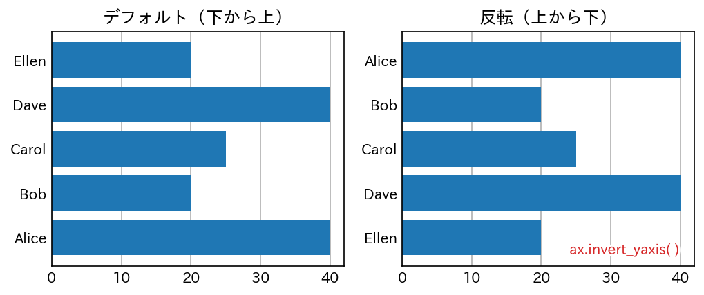
Y軸の上下を反転
Y軸の TickLabel は、デフォルトでは下から上に向かって並びます。これを、反転させ上から下に向かって並ぶようにしてみます。
x = ['Alice','Bob','Carol','Dave','Ellen']
y = [40,20,25,40,20]

fig,axes = plt.subplots(1,2,figsize=(8,3),facecolor='white',dpi=150)
axes = axes.ravel()

for ax in axes:
  ax.barh(x,y)
  ax.tick_params(length=0)
  ax.grid(axis='x')
  ax.set_axisbelow(True)

axes[0].set_title('デフォルト(下から上)')
axes[1].set_title('反転(上から下)')

# 右図で上下を反転
ax = axes[1]
ax.invert_yaxis()
t = axes[1].text(0.95,0.05,'ax.invert_yaxis( )',c='tab:red',ha='right',transform=ax.transAxes)
t.set_path_effects([patheffects.Stroke(linewidth=3,foreground='white'),patheffects.Normal()])

plt.show()
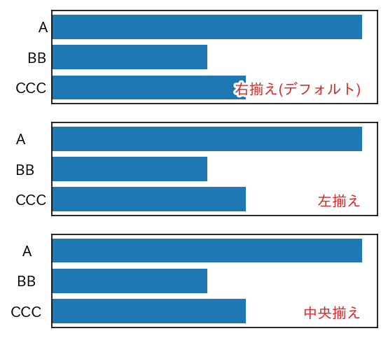
Y軸の目盛ラベルの配置を調整(右揃え、左揃え、中央揃え)
x = ['A','BB','CCC']
y = [40,20,25]

fig,axes = plt.subplots(3,1,figsize=(4,4),facecolor='white',dpi=150)
axes = axes.ravel()

text=['右揃え(デフォルト)','左揃え','中央揃え']
for i, ax in enumerate(axes):
  ax.barh(x,y)
  ax.invert_yaxis()
  ax.tick_params(length=0)
  ax.set_xticklabels([])
  t = ax.text(0.95,0.1,text[i],c='tab:red',ha='right',transform=ax.transAxes)
  t.set_path_effects([patheffects.Stroke(linewidth=3,foreground='white'),patheffects.Normal()])

# 左揃え
ax = axes[1]
ax.set_yticklabels(x,ha ='left')
ax.get_yaxis().set_tick_params(pad=25)

# 中央揃え
ax = axes[2]
ax.set_yticklabels(x,ha ='center')
ax.get_yaxis().set_tick_params(pad=17.5)

plt.show()
X軸とY軸をゼロ位置にセット
数学の教科書に記載されているようなグラフスタイル(X軸とY軸の目盛文字が「ゼロ」の位置にある)に変更してみます。
x = np.linspace(-6,6,21)
y = 10/(1+np.exp(-x))-5  # 変更

fig,ax = plt.subplots(figsize=(4,3),facecolor='white',dpi=150)
ax.plot(x,y,marker='.')

ax.spines['bottom'].set_position('zero')
ax.spines['left'].set_position('zero')
ax.spines['top'].set_visible(False)
ax.spines['right'].set_visible(False)
ax.tick_params(direction='inout')

plt.show()
さらに、細かな調整を行ないます。
x = np.linspace(-6,6,21)
y = 10/(1+np.exp(-x))-5  # 変更

fig,ax = plt.subplots(figsize=(4,4),facecolor='white',dpi=150)
ax.plot(x,y,marker='.')

ax.spines['bottom'].set_position('zero')
ax.spines['left'].set_position('zero')
ax.spines['top'].set_visible(False)
ax.spines['right'].set_visible(False)

ax.set_xlim(6,-6)
ax.set_ylim(6,-6)

# 主目盛:刻み間隔2、0は非表示、文字を白縁取り
ax.set_xticks(np.arange(-6,6+1,2))
labels = ax.set_xticklabels( [ ( x if x!=0 else '') for x in np.arange(-6,6+1,2)] )
for t in labels :
  t.set_path_effects([patheffects.Stroke(linewidth=3,foreground='white'),patheffects.Normal()])

ax.set_yticks(np.arange(-6,6+1,2))
labels = ax.set_yticklabels( [ ( y if y!=0 else '') for y in np.arange(-6,6+1,2)] )
for t in labels :
  t.set_path_effects([patheffects.Stroke(linewidth=3,foreground='white'),patheffects.Normal()])

ax.tick_params(which='major',direction='inout',length=5)

# 補助目盛(minor):刻み間隔1でグリッド描画するための準備
ax.set_xticks(np.linspace(-6,6,13),minor=True)
ax.set_yticks(np.linspace(-6,6,13),minor=True)
ax.tick_params(which='minor',direction='inout',length=3)

# グリッド(which='both'で、majorとminorの目盛位置にグリッド)
ax.grid(which='both')

plt.show()