はじめに
2変量の相関関係は、散布図(plt.scatter(...))を作成することより概要を掴むことができます。しかし、試験得点(100点満点)と成績評定(1~5までの5段階)ような2変量について散布図を作成すると、プロット点が重なってしまい残念なグラフとなってしまいます(正の相関がありそう・・・といったことは読み取れますが)。
サンプル数が多くなれば多くなるほど(情報の質が上がるはずなのですが)、散布図では点の重なりが激しくなり図から読み取れる情報が少なくなってしまいます。
そのため、何らかの工夫が求められます。ここでは、ジッター処理、箱ひげ図、ヒートマップによる置き換え(あるいは散布図との併用)を考えていきます。
実行環境
Python 3.6.9(Google Colab.環境)で実行・動作確認をしています。グラフ作成には、matplotlib/seaborn を使います。
japanize-matplotlib      1.0.5
matplotlib               3.1.3
matplotlib-venn          0.11.5
seaborn                  0.10.0
ダミーデータの生成
模試の試験得点(100点満点)と通知表の成績評定(1~5までの5段階)についてのダミーデータを作成します。ここでは、これらに正の相関を持たせます。
そのために、まず、分散共分散行列を引数に与えて、numpy.random.multivariate_normal(...) により、相関のある正規乱数(正規分布 $N(55,20^2)$ と $N(50,18^2 )$に従う)を、それぞれ $200$ 個生成します。
次に $N(55,20^2)$ に従う乱数を得点用に「$0$ 以上 $100$ 以下の整数値」になるように加工します。また、$N(50,18^2)$ のほうを評定用に「$1$ から $5$ の整数値」になるように加工します。
import numpy as np
import pandas as pd
# ダミーデータの生成
m = [55,50] # 平均
s = [[20**2,17**2],
[17**2,18**2]] # 分散共分散行列
# 相関のある正規乱数を200個生成
v = np.random.multivariate_normal(m, s, 200)
# 得点
p = v[:,0]
p = p.clip(0, 100)
p = p.astype(np.int)
# 評定
r = v[:,1]
r = r//20+1
r = r.clip(1, 5)
r = r.astype(np.int)
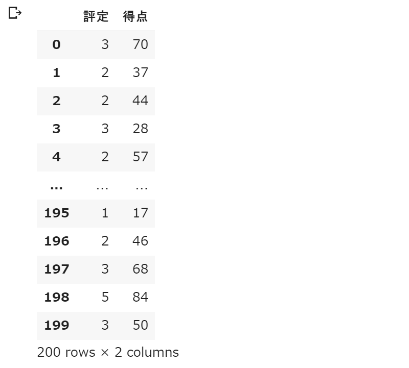
df = pd.DataFrame({'評定':r,'得点':p})
display(df)
次のようなダミーデータが得られました。基本的に評定が高いほど、得点も高いという関係を持ったデータになります。
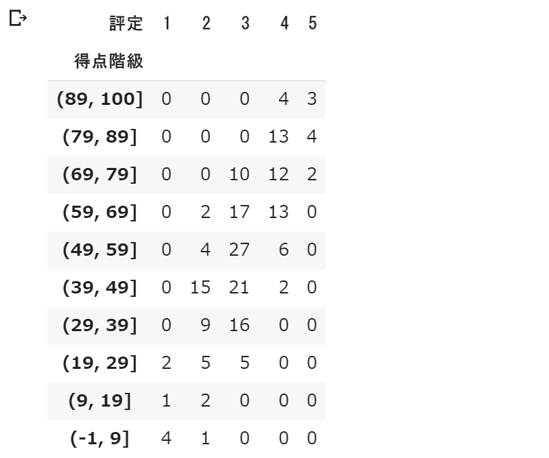
得点と評定の関係が分かりやすいように集計します。得点を $10$ 点刻みで区切って、評定とのクロス集計をとります。
nx = 5
ny = 10

df['得点階級'] = pd.cut(df['得点'], list(range(-1,90,10))+[100])
df_ct = pd.crosstab(index=df['得点階級'], columns=df['評定'])

# 欠損している評定があれば追加
for i in range(1,nx+1) :
  if i not in df_ct.columns :
    df_ct[i] = 0
df_ct = df_ct.reindex(sorted(df_ct.columns), axis=1)

# 欠損している得点階級の追加
df_ct = df_ct.reindex(df_ct.index.categories,fill_value=0)
df_ct = df_ct.sort_index(ascending=False)
display(df_ct)
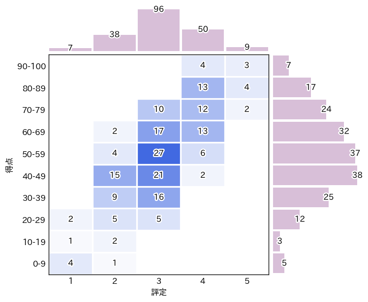
実行結果は次のようになります。得点が $90$ から $100$ の範囲の学生は $7$ 人いて、そのうち評定 $4$ の学生は $4$ 名、評定 $5$ の学生は $3$ 名といったことが読み取れます。
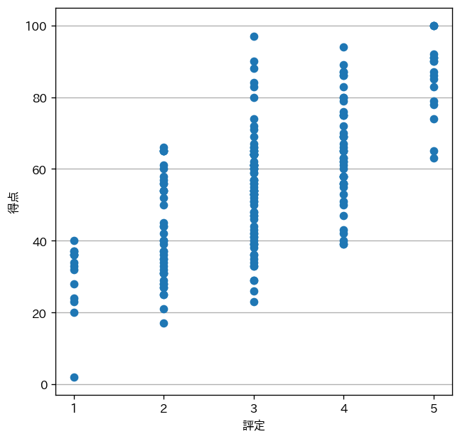
オーソドックスな散布図
ダミーデータを使って(ごく普通に)散布図を描いてみます。なお、日本語表示のために Google Colab. 環境では !pip install japanize-matplotlib を先に実行しておく必要があります。
import japanize_matplotlib
import matplotlib.pyplot as plt

plt.figure(figsize=(6,6),dpi=120)
plt.gcf().patch.set_facecolor('white')
ax = plt.gca()
ax.scatter(df['評定'],df['得点'])
ax.set( xticks=range(1,nx+1), xlabel='評定',ylabel='得点')
ax.set_axisbelow(True)
ax.grid(axis='y')
plt.show()
実行結果は次のようになります。
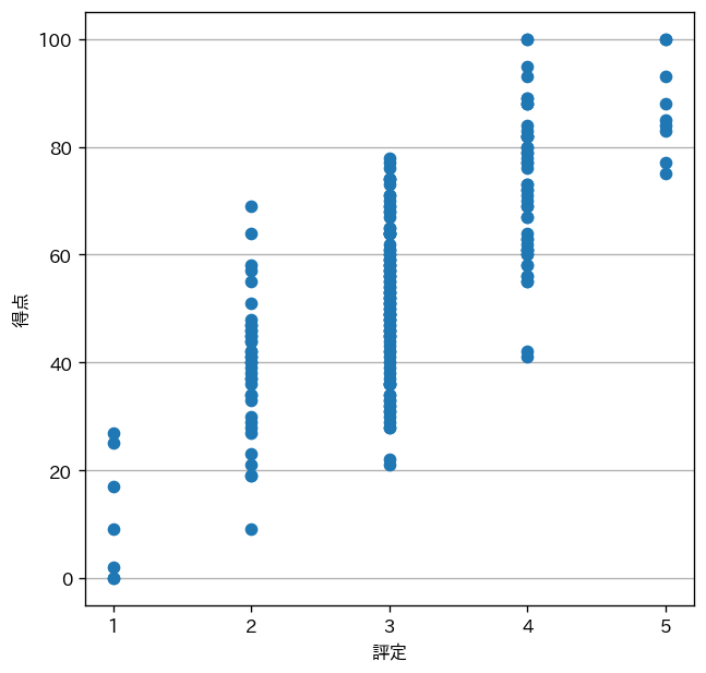
プロット点が重なってしまい、評定ごとの得点分布が読み取りずらいものになっていまいました。しかし、クロス集計では分からなかった情報(例えば、評定 $1$ の得点は中央に集中していない等)が分かりました。
ジッター処理した散布図
散布図においてプロット点が重なってしまう場合、ジッター処理(ジッタリング)によって図を見やすくすることができます。ここでは、seaborn を利用し、各プロット点について $X$ 方向にわずかなランダム値を付加しています(プロット点にも透過率を設定しています)。また、回帰直線とその $95$ %信頼区間も描いています。
import japanize_matplotlib
import matplotlib.pyplot as plt
import seaborn as sns

plt.figure(figsize=(6,6),dpi=120)
plt.gcf().patch.set_facecolor('white')
ax = plt.gca()
ax = sns.regplot('評定','得点',df, x_jitter=.1,
                 scatter_kws={'alpha':0.2},line_kws={'linestyle':':'})
ax.set( xticks=range(1,nx+1), yticks=range(0,100+1,20), xlabel='評定',ylabel='得点')
ax.set_axisbelow(True)
ax.grid(axis='y')
plt.show()
実行結果は、次のようになります。
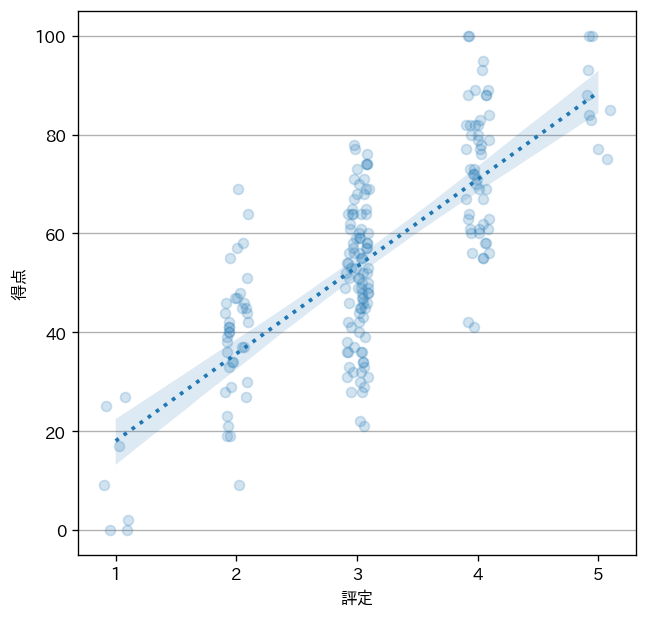
図からは「評定 $1$ で、得点が $0$ 点の者が $2$ 名いる」といったことが新たに読み取れるようになりました。
箱ひげ図
箱ひげ図(ボックスプロット)にするという手段もあります。
dfg = df.groupby('評定')
plt.figure(figsize=(6,6),dpi=120)
plt.gcf().patch.set_facecolor('white')
ax = plt.gca()
mp = dict(marker='x', markeredgecolor='black')
fp = dict(marker='o', markerfacecolor='white')
mp2 = dict(linestyle='-', linewidth=2.5, color='black',solid_capstyle='butt')
ax.boxplot([dfg.get_group(i+1)['得点'] for i in range(nx)],
           meanprops=mp, medianprops=mp2,
           flierprops=fp, showmeans=True)
ax.set( xticks=range(1,nx+1), xlabel='評定',ylabel='得点')
ax.set_axisbelow(True)
ax.grid(axis='y')
plt.show()
実行結果は次のようになります。X 印が平均値、箱中央の太線が中央値、箱の上下が $75$ パーセンタイル、$25$ パーセンタイル、O 印が外れ値になります。
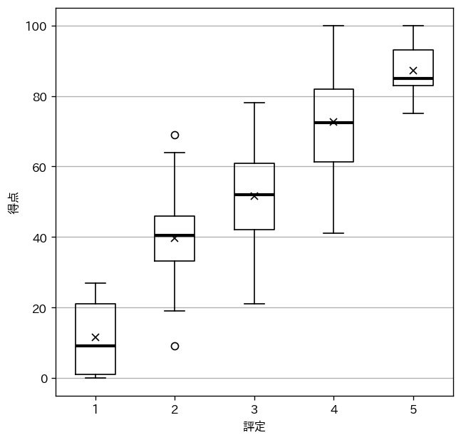
評定ごとの得点分布の概要がつかみやすくなりました。一方で、評定 $1$ には何人いて、評定 $3$ には何人いるかといった情報は失われてしまいました。
ヒートマップ+ヒストグラム
ヒートマップとヒストグラムをあわせたような図をつくってみます。seaborn.jointplot(..., kind='hex') 参照 の六角形を四角形にしたバージョンの自作です。
import japanize_matplotlib
import seaborn as sns
import matplotlib
import matplotlib.pyplot as plt
import matplotlib.ticker as ticker
import matplotlib.patheffects as path_effects

fig, m_ax = plt.subplots(nrows=2,ncols=2, figsize=(6.85,6), dpi=120,
                       gridspec_kw={'height_ratios':(1,5),'width_ratios':(5,2)} )
plt.subplots_adjust(hspace=0.025,wspace=0.025)
fig.patch.set_facecolor('white')

# (1) 左下のヒートマップ
ax = m_ax[1][0]

cl = [(0.00,'white'),(1.00,'royalblue')]
ccm = matplotlib.colors.LinearSegmentedColormap.from_list('custom_cmap', cl)

ax.imshow(df_ct,cmap=ccm,aspect=0.5)
ax.tick_params(axis='both', which='both',length=0)
ax.set_xticks(range(0,nx))
ax.set_xticks(np.arange(-0.5, nx-1), minor=True);
ax.set_xticklabels(range(1,nx+1))

ax.set_yticks(range(0,ny))
ax.set_yticks(np.arange(-0.5, ny-1), minor=True);
ax.set_yticklabels(['90-100'] + [f'{i}-{i+9}' for i in range(80,-1,-10)] )

ax.grid(which='minor',color='white',linewidth=2)
ax.set(xlabel='評定',ylabel='得点')

tp = dict(horizontalalignment='center',verticalalignment='center')
ep = [path_effects.Stroke(linewidth=3, foreground='white'),path_effects.Normal()]

for y,i in enumerate(df_ct.index.values) :
  for x,c in enumerate(df_ct.columns.values) :
    n = df_ct.iloc[y,x]
    if n != 0 :
      t = ax.text(x, y, str(n),**tp)
      t.set_path_effects(ep)

# (2) 左上 ヒストグラム
ax = m_ax[0][0]

r_hist = df['評定'].value_counts(sort=False,bins=range(nx+1))
ax.bar(range(0,nx),r_hist,width=0.95,color='thistle')
ax.set(xlim=(-0.5,nx-0.5),xticks=[],yticks=[])

for x,y in enumerate(r_hist) :
  if y != 0 :
    t = ax.text(x,y,str(y),**tp)
    t.set_path_effects(ep)

# (3) 右下 ヒストグラム
ax = m_ax[1][1]

p_hist = df['得点'].value_counts(sort=False,bins=[0]+list(range(9,90,10))+[100])
ax.barh(range(0,ny), p_hist, height=0.9,color='thistle')
ax.set(ylim=(-0.5,ny-0.5),xticks=[],yticks=[])

for x,y in enumerate(p_hist) :
  if y != 0 :
    t = ax.text(y,x,str(y),**tp)
    t.set_path_effects(ep)

# (4) 左上・右下 ヒストグラム共通
for ax in [m_ax[1][1],m_ax[0][0]]:
  for p in ['top','bottom','left','right']:
    ax.spines[p].set_linewidth(0)

# (5) 右上 非表示
m_ax[0][1].axis('off')

plt.show()
実行結果は、次のようになります。
それぞれ一長一短です。
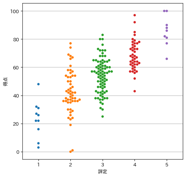
追記:Swarmplot
Swarmplot(Swarm=群れ)。プロット点が重ならないように位置調整されています。コメント欄にて @konandoiruasa さんに教えていただきました。感謝。
import japanize_matplotlib
import matplotlib.pyplot as plt
import seaborn as sns

plt.figure(figsize=(6,6),dpi=120)
plt.gcf().patch.set_facecolor('white')
ax = plt.gca()
ax = sns.swarmplot(x='評定',y='得点',data=df )
ax.set( yticks=range(0,100+1,20), xlabel='評定',ylabel='得点')
ax.set_axisbelow(True)
ax.grid(axis='y')
plt.show()
実行結果は、次のようになります(評定と得点のデータは、上記の各グラフとは異なるものを使っています)。