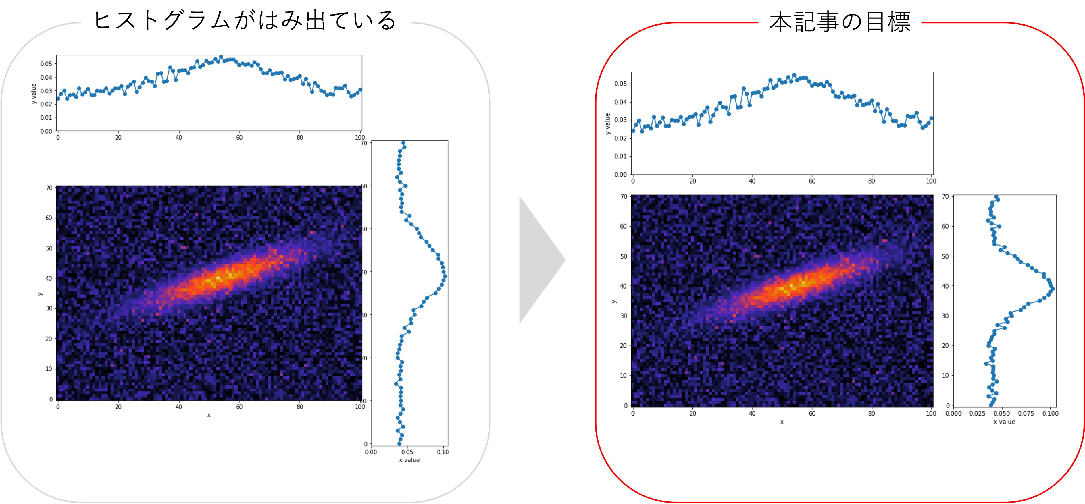
概要
2次元ヒートマップの縦横比が等しい場合の軸方向のProjectionを取る方法は、matplotlib公式(Scatter plot with histograms)で紹介されています。しかし、公式そのままでは、縦横比が異なるイメージの場合に下図左側のようになってしまい上手くいかないと思います。そこで、本記事では縦横比が異なる場合のProjectionを取る方法について紹介します。
また、応用編では慣性主軸を使って2次元ヒートマップのいい感じの軸を選び、その方向にProjectionを取る方法について紹介します。おまけでは3次元空間での表示例も紹介します。
実装コード
Google Colabで作成したコードは、こちらにあります。
各種インポート
import cv2
import numpy as np
import matplotlib.pyplot as plt
import matplotlib.cm as cm
from mpl_toolkits.mplot3d import axes3d
from scipy.stats import multivariate_normal
from scipy import ndimage
実行時の各種バージョン
| Name | Version |
|---|---|
| opencv-python | 4.6.0.66 |
| numpy | 1.21.6 |
| matplotlib | 3.2.2 |
| scipy | 1.7.3 |
使用関数
def get_sample_image():
    x, y = np.mgrid[-35:36:, -50:51:]
    pos = np.dstack((x, y))
    mean = np.array([5, 5])  # 分布の平均
    cov = np.array([[40, 90], [90, 280]])  # 分布の分散共分散行列
    rv = multivariate_normal(mean, cov)
    img = rv.pdf(pos)
    np.random.seed(2022)
    img += np.random.normal(0, 5e-4, img.shape)  # ガウシアンノイズも追加
    img[img < 0] = 0
    return img

def projection_layout(img, fig_size=12, padding=0.1, spacing=0.04, hist_height=0.2):
    """Projectionのレイアウト用
    img: 2次元配列
    fig_size: matplotlibの出力時の画像サイズ((n, m)のような2つの引数を入れることができないので注意)
    padding: matplotlibの出力時の隅の余白(全体の占める割合で指定)
    spacing: matplotlibの出力時のProjectionエリアとヒートマップとの余白(全体の占める割合で指定)
    hist_height: Projectionの縦軸方向の大きさ(全体の占める割合で指定)
    注意事項:
    Google Colabでは出力画像の余白は自動で除かれる仕様のためあまり関係はないが、
    ``fig.savefig()``で保存する時はpadding=0などにするとプロットエリアも途切れる場合がある。
    全体の占める割合の引数は、仕様上完全に全体の割合が反映されないので、大体の目安程度に指定する。
    """
    left, width = padding, img.shape[1]/np.sum(img.shape)
    bottom, height = padding, img.shape[0]/np.sum(img.shape)
    norm_x = 2*padding + spacing + hist_height + img.shape[1]/np.sum(img.shape)
    norm_y = 2*padding + spacing + hist_height + img.shape[0]/np.sum(img.shape)
    norms = [norm_x, norm_y, norm_x, norm_y]  # for normalizing the figure sum ratio to 1
    rect_img = np.divide([left, bottom, width, height], norms)
    rect_histx = np.divide([left, bottom + height + spacing, width, hist_height], norms)
    rect_histy = np.divide([left + width + spacing, bottom, hist_height, height], norms)
    fig = plt.figure(figsize=(norm_x*fig_size, norm_y*fig_size))
    return fig, rect_img, rect_histx, rect_histy

def rebinc(x, y, rebin=2, renorm=False, cut=True):
    """1次元のビンとその値の入った配列からビンまとめ
    x: 各ビンの座標が入った1次元配列
    y: 各ビンの値が入った1次元配列
    rebin: ビンをまとめる個数
    renorm: rebin数で割って1ビンあたりの値に規格化するか
    """
    if not len(x) % rebin == 0:
        print("Warning : len(x)/rebin was not an integer.")
    v = np.ones(rebin)
    if renorm:
        v = v / rebin
    xd = np.convolve(x, v, mode='valid')
    yd = np.convolve(y, v, mode='valid')
    if cut:
        xd = xd[::rebin]
        yd = yd[::rebin]
    return xd, yd

def get_gravity_coord(img):
    M = cv2.moments(img)
    gravity_x = int(M["m10"] / M["m00"])
    gravity_y = int(M["m01"] / M["m00"])
    return gravity_x, gravity_y

def get_inertia_angle(img):
    M = cv2.moments(img)
    inertia_theta = 0.5*np.arctan2(2*M['mu11'], M['mu20']-M['mu02'])
    inertia_angle = inertia_theta / np.pi * 180
    return inertia_angle

def rotate_img(img, angle, pivot):
    """任意の回転軸からの回転
    img: 2次元配列
    angle: 回転角
    pivot: 回転軸(x, y)
    """
    padX = [img.shape[1] - pivot[0], pivot[0]]
    padY = [img.shape[0] - pivot[1], pivot[1]]
    imgP = np.pad(img, [padY, padX], 'constant')
    imgR = ndimage.rotate(imgP, -angle, reshape=False)
    return imgR[padY[0]:-padY[1], padX[0]:-padX[1]]
-
get_sample_image(): サンプル画像 -
projection_layout(): Projectionのレイアウト用の関数。詳細な説明・使い方は補足のprojection_layout関数の説明より(Scatter plot with histogramsを参考に改良) -
rebinc: ビンまとめ用の関数(pythonでヒストグラムをビンまとめ(rebin)する方法の記事を引用) -
get_gravity_coord(): 2次元ヒートマップの重心を求める関数(【OpenCV+matplotlib】画像の重心と慣性主軸を表示する方法を参考) -
get_inertia_angle(): 2次元ヒートマップの慣性主軸を求める関数(【OpenCV+matplotlib】画像の重心と慣性主軸を表示する方法を参考) -
rotate_img(): 任意の座標まわりの回転させる関数(stack overflow: Rotate a 2D image around specified origin in Pythonを参考)
サンプル画像
img = get_sample_image()
fig, ax = plt.subplots(1, 1, figsize=(10, 4))
cbar = ax.imshow(img, vmin=0, vmax=5e-3, cmap=cm.CMRmap, origin='lower')
ax.set_xlabel('x')
ax.set_ylabel('y')
fig.colorbar(cbar)
plt.show()

サンプル画像は何でも良いですが、本記事では(縦, 横)=(71, 101)の2次元画像を使います。現実のデータに近づけたいため、ガウシアンノイズも加えています。
使い方
projection_layout()関数で画像サイズに合わせてグラフエリアを調整できるようにしています。projection_layout()の詳細な説明は補足のprojection_layout関数の説明をご覧ください。コード上で、
fig, rect_img, rect_histx, rect_histy = projection_layout(img)
ax = fig.add_axes(rect_img)
ax_histx = fig.add_axes(rect_histx, sharex=ax)
ax_histy = fig.add_axes(rect_histy, sharey=ax)
とはじめにaxisを定義して、その後は通常のmaptlotlibの書き方で動くと思います。
ビンまとめなし
プロットで表示
img = get_sample_image()

# axisの設定
fig, rect_img, rect_histx, rect_histy = projection_layout(img)
ax = fig.add_axes(rect_img)
ax_histx = fig.add_axes(rect_histx, sharex=ax)
ax_histy = fig.add_axes(rect_histy, sharey=ax)

# 2次元ヒートマップの表示
ax.imshow(img, cmap=cm.CMRmap, vmin=0, vmax=5e-3, origin='lower')
ax.set_xlabel('x')
ax.set_ylabel('y')

# x軸方向のProjectionを表示
x_bins = np.arange(img.shape[1])
y_values = np.sum(img, axis=0)
ax_histx.plot(x_bins, y_values, 'o-')
ax_histx.set_ylim(0,)
ax_histx.set_ylabel('y value')

# y軸方向のProjectionを表示
y_bins = np.arange(img.shape[0])
x_values = np.sum(img, axis=1)
ax_histy.plot(x_values, y_bins, 'o-')  # xとyの対応が反対になるので注意
ax_histy.set_xlim(0,)
ax_histy.set_xlabel('x value')

plt.show()

Projectionの目盛ラベルの非表示にしたい方は補足のProjectionの目盛ラベルの非表示をご覧ください。
ヒストグラムで表示
img = get_sample_image()

# axisの設定
fig, rect_img, rect_histx, rect_histy = projection_layout(img)
ax = fig.add_axes(rect_img)
ax_histx = fig.add_axes(rect_histx, sharex=ax)
ax_histy = fig.add_axes(rect_histy, sharey=ax)

# 2次元ヒートマップの表示
ax.imshow(img, cmap=cm.CMRmap, vmin=0, vmax=5e-3, origin='lower')
ax.set_xlabel('x')
ax.set_ylabel('y')

# x軸方向のProjectionを表示
x_bins = np.arange(img.shape[1])
y_values = np.sum(img, axis=0)
ax_histx.bar(x_bins, y_values, width=1, ec='black')
ax_histx.set_ylim(0,)
ax_histx.set_ylabel('y value')

# y軸方向のProjectionを表示
y_bins = np.arange(img.shape[0])
x_values = np.sum(img, axis=1)
ax_histy.barh(y_bins, x_values, height=1, ec='black')
ax_histy.set_xlim(0,)
ax_histy.set_xlabel('x value')

plt.show()

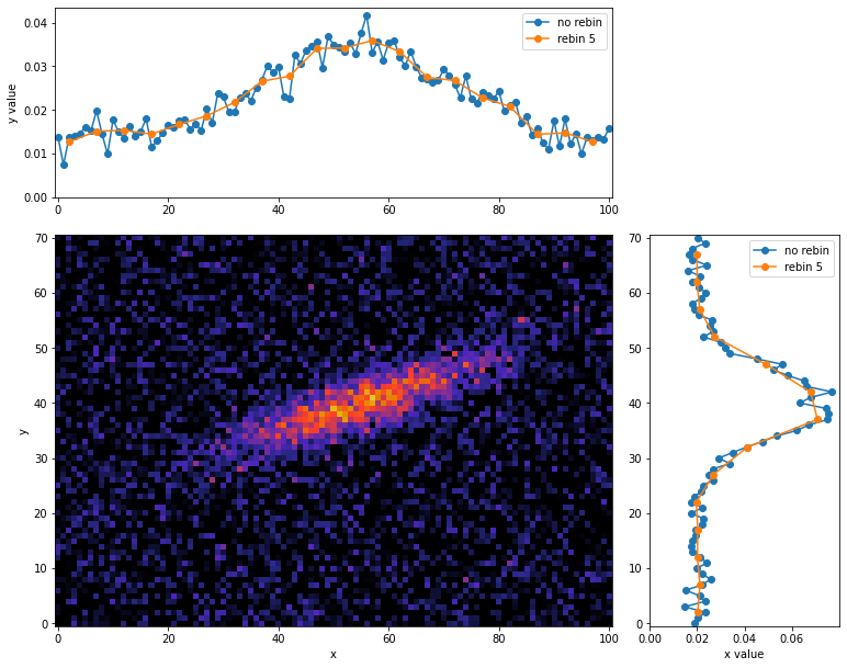
ビンまとめあり
5ビンでのヒストグラムを表示します。こちらの詳しい説明は
を参照ください。
プロットで表示
rebin = 5
img = get_sample_image()

# axisの設定
fig, rect_img, rect_histx, rect_histy = projection_layout(img)
ax = fig.add_axes(rect_img)
ax_histx = fig.add_axes(rect_histx, sharex=ax)
ax_histy = fig.add_axes(rect_histy, sharey=ax)

# 2次元ヒートマップの表示
ax.imshow(img, cmap=cm.CMRmap, vmin=0, vmax=5e-3, origin='lower')
ax.set_xlabel('x')
ax.set_ylabel('y')

# x軸方向のProjectionを表示(5ピクセル毎にビンまとめしたものを重ねる)
x_bins = np.arange(img.shape[1])
y_values = np.sum(img, axis=0)
x_rebins, y_revalues = rebinc(x_bins, y_values, rebin=rebin, renorm=True, cut=True)
ax_histx.plot(x_bins, y_values, 'o-',  label='no rebin')
ax_histx.plot(x_rebins, y_revalues, 'o-', label='rebin 5')
ax_histx.set_ylim(0,)
ax_histx.set_ylabel('y value')
ax_histx.legend()

# y軸方向のProjectionを表示(5ピクセル毎にビンまとめしたものを重ねる)
y_bins = np.arange(img.shape[0])
x_values = np.sum(img, axis=1)
y_rebins, x_revalues = rebinc(y_bins, x_values, rebin=rebin, renorm=True, cut=True)
ax_histy.plot(x_values, y_bins, 'o-', label='no rebin')  # xとyの対応が反対になるので注意
ax_histy.plot(x_revalues, y_rebins, 'o-',  label='rebin 5')
ax_histy.set_xlim(0,)
ax_histy.set_xlabel('x value')
ax_histy.legend()

plt.show()
ヒストグラムで表示
rebin = 5
img = get_sample_image()

# axisの設定
fig, rect_img, rect_histx, rect_histy = projection_layout(img)
ax = fig.add_axes(rect_img)
ax_histx = fig.add_axes(rect_histx, sharex=ax)
ax_histy = fig.add_axes(rect_histy, sharey=ax)

# 2次元ヒートマップの表示
ax.imshow(img, cmap=cm.CMRmap, vmin=0, vmax=5e-3, origin='lower')
ax.set_xlabel('x')
ax.set_ylabel('y')

# x軸方向のProjectionを表示
x_bins = np.arange(img.shape[1])
y_values = np.sum(img, axis=0)
x_rebins, y_revalues = rebinc(x_bins, y_values, rebin=rebin, renorm=True, cut=True)
ax_histx.bar(x_bins, y_values, width=1, ec='black', alpha=0.6, label='norebin')
ax_histx.bar(x_rebins, y_revalues, width=rebin, ec='black', alpha=0.6, label='rebin 5')
ax_histx.set_ylim(0,)
ax_histx.set_ylabel('y value')
ax_histx.legend()

# y軸方向のProjectionを表示
y_bins = np.arange(img.shape[0])
x_values = np.sum(img, axis=1)
y_rebins, x_revalues = rebinc(y_bins, x_values, rebin=rebin, renorm=True, cut=True)
ax_histy.barh(y_bins, x_values, height=1, ec='black', alpha=0.6, label='no rebin')
ax_histy.barh(y_rebins, x_revalues, height=rebin, ec='black', alpha=0.6, label='rebin 5')
ax_histy.set_xlim(0,)
ax_histy.set_xlabel('x value')
ax_histy.legend()

plt.show()

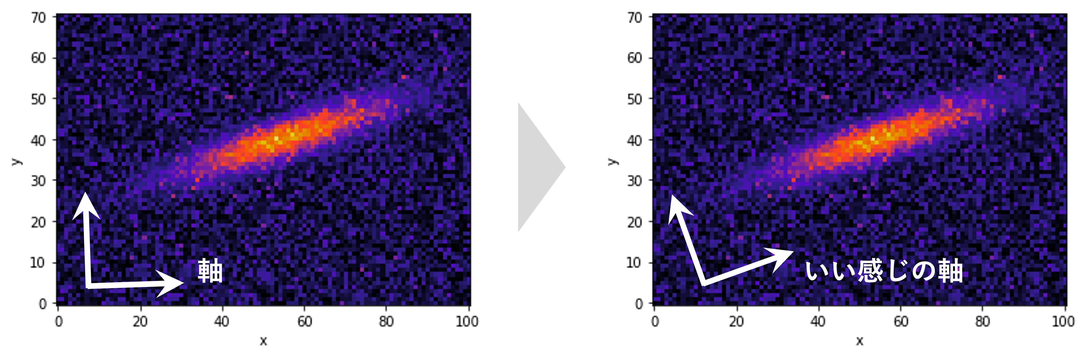
応用編
慣性主軸を使って2次元ヒートマップの下図のようにいい感じの軸を選び、その方向にProjectionを取る方法について紹介します。
慣性主軸
img = get_sample_image()
gravity = get_gravity_coord(img)
inertia_angle = get_inertia_angle(img)
inertia_slope = np.tan(inertia_angle / 180 * np.pi)
x = np.arange(101)
y = inertia_slope*(x-gravity[0]) + gravity[1]

fig, ax = plt.subplots(1, 1, figsize=(10, 4))
cbar = ax.imshow(img, cmap=cm.CMRmap, vmin=0, vmax=5e-3, origin='lower')
ax.scatter(gravity[0], gravity[1], c='w')
ax.plot(x, y, c='w')
ax.set_xlabel('x')
ax.set_ylabel('y')
fig.colorbar(cbar)
plt.show()

点が重心、直線が慣性主軸です。慣性主軸が明るいところに沿うように引かれてほしいですが、このようにノイズがあると上手く軸を求めることができません。そこで、ある値以下を0に置換して再度慣性主軸を計算してみます。
ある閾値を導入した場合の慣性主軸
img = get_sample_image()
filtered_img = np.copy(img)
filtered_img[filtered_img < 1.5e-3] = 0  # ある値以下を含めないで重心と慣性主軸を計算
gravity = get_gravity_coord(filtered_img)
inertia_angle = get_inertia_angle(filtered_img)
inertia_slope = np.tan(inertia_angle / 180 * np.pi)
x = np.arange(101)
y = inertia_slope*(x-gravity[0]) + gravity[1]

fig, ax = plt.subplots(1, 1, figsize=(10, 4))
cbar = ax.imshow(filtered_img, vmin=0, vmax=5e-3, cmap=cm.CMRmap, origin='lower')
ax.scatter(gravity[0], gravity[1], c='w')
ax.plot(x, y, c='w')
ax.set_xlabel('x')
ax.set_ylabel('y')
fig.colorbar(cbar)
plt.show()

閾値を導入して0に置換することでノイズの影響を抑え、慣性主軸が期待通りのところに引かれたのがわかると思います。ここで、 重心を回転軸に取り慣性主軸の角度分だけ回転させてProjectionを取ります。
# 慣性主軸分回転させてProjection
img = get_sample_image()
filtered_img = np.copy(img)
filtered_img[filtered_img < 1.5e-3] = 0  # ある値以下を含めないで重心と慣性主軸を計算
gravity = get_gravity_coord(filtered_img)
inertia_angle = get_inertia_angle(filtered_img)
rorate_img = rotate_img(img, -inertia_angle, gravity)  # 重心を回転軸に取り慣性主軸の角度分だけ回転
print('gravity', gravity)
print('inertia_angle', inertia_angle)

# axisの設定
fig, rect_img, rect_histx, rect_histy = projection_layout(rorate_img)
ax = fig.add_axes(rect_img)
ax_histx = fig.add_axes(rect_histx, sharex=ax)
ax_histy = fig.add_axes(rect_histy, sharey=ax)

# 2次元ヒートマップの表示
ax.imshow(rorate_img, vmin=0, vmax=5e-3, cmap=cm.CMRmap, origin='lower')
ax.set_xlabel('x')
ax.set_ylabel('y')

# x軸方向のProjectionを表示(5ピクセル毎にビンまとめしたものを重ねる)
x_bins = np.arange(rorate_img.shape[1])
y_values = np.sum(rorate_img, axis=0)
x_rebins, y_revalues = rebinc(x_bins, y_values, rebin=5, renorm=True, cut=True)
ax_histx.plot(x_bins, y_values, 'o-',  label='no rebin')
ax_histx.plot(x_rebins, y_revalues, 'o-', label='rebin 5')
ax_histx.set_ylim(0,)
ax_histx.set_ylabel('y value')
ax_histx.legend()

# y軸方向のProjectionを表示(5ピクセル毎にビンまとめしたものを重ねる)
y_bins = np.arange(rorate_img.shape[0])
x_values = np.sum(rorate_img, axis=1)
y_rebins, x_revalues = rebinc(y_bins, x_values, rebin=5, renorm=True, cut=True)
ax_histy.plot(x_values, y_bins, 'o-', label='no rebin')  # xとyの対応が反対になるので注意
ax_histy.plot(x_revalues, y_rebins, 'o-',  label='rebin 5')
ax_histy.set_xlim(0,)
ax_histy.set_xlabel('x value')
ax_histy.legend()

plt.show()
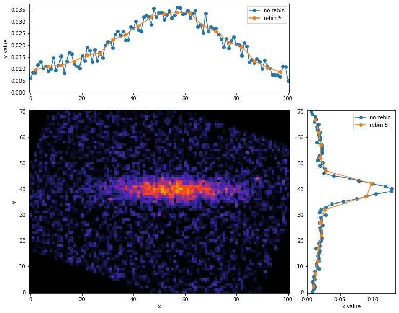
このように、慣性主軸を利用すると最適な軸に対するProjectionを取ることができます。ただ今回のようにノイズがある場合は、閾値を設けるかなど何かしらの方法ノイズを除去する必要があるので注意しましょう。
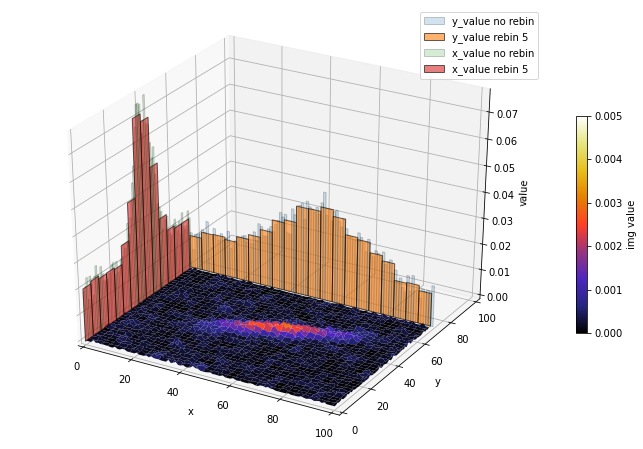
おまけ
2次元ヒートマップを3次元に表示して各軸にProjectionを取ることもできます。こちらの詳しい説明は
を参照ください。
ax.view_init()を使うと、任意の角度で表示できます。
3次元にProjectionのプロット作成用コード
rebin = 5
img = get_sample_image()

fig = plt.figure(figsize=(12, 8))
ax = fig.gca(projection='3d')
# ax.view_init(40, 270)  # 表示角度の追加, ax.view_init(縦方向の角度, 横方向の角度)

# 2次元ヒートマップから3次元ヒートマップへ変換
y, x = np.mgrid[:img.shape[0], :img.shape[1]]

# 3次元ヒートマップ表示
cbar = ax.plot_surface(x, y, img, cmap=cm.CMRmap, vmin=0, vmax=5e-3)

# x軸方向のProjectionを表示
x_bins = np.arange(img.shape[1])
y_values = np.sum(img, axis=0)
x_rebins, y_revalues = rebinc(x_bins, y_values, rebin=rebin, renorm=True, cut=True)
ax.plot(x_bins, y_values, zs=img.shape[0], zdir='y', label='y_value no rebin')
ax.plot(x_rebins, y_revalues, zs=img.shape[0], zdir='y', label='y_value rebin 5')

# y軸方向のProjectionを表示
y_bins = np.arange(img.shape[0])
x_values = np.sum(img, axis=1)
y_rebins, x_revalues = rebinc(y_bins, x_values, rebin=rebin, renorm=True, cut=True)
ax.plot(y_bins, x_values, zs=0, zdir='x', label='x_value no rebin')
ax.plot(y_rebins, x_revalues, zs=0, zdir='x', label='x_value rebin 5')

ax.set_xlabel('x')
ax.set_ylabel('y')
ax.set_zlabel('value')
ax.set_xlim(0, np.max(img.shape))
ax.set_ylim(0, np.max(img.shape))
ax.legend()
fig.colorbar(cbar, shrink=0.5, label='img value')

plt.show()

3次元にProjectionのヒストグラム作成用コード
rebin = 5
img = get_sample_image()

fig = plt.figure(figsize=(12, 8))
ax = fig.gca(projection='3d')
# ax.view_init(40, 270)  # 表示角度の追加, ax.view_init(縦方向の角度, 横方向の角度)

# 2次元ヒートマップから3次元ヒートマップへ変換
y, x = np.mgrid[:img.shape[0], :img.shape[1]]

# 3次元ヒートマップ表示
cbar = ax.plot_surface(x, y, img, cmap=cm.CMRmap, vmin=0, vmax=5e-3)

# x軸方向のProjectionを表示
x_bins = np.arange(img.shape[1])
y_values = np.sum(img, axis=0)
x_rebins, y_revalues = rebinc(x_bins, y_values, rebin=rebin, renorm=True, cut=True)
ax.bar(x_bins, y_values, zs=img.shape[0], zdir='y',  ec='black', width=1, alpha=0.2, label='y_value no rebin')
ax.bar(x_rebins, y_revalues, zs=img.shape[0], zdir='y', ec='black', width=rebin, alpha=0.6, label='y_value rebin 5')

# y軸方向のProjectionを表示
y_bins = np.arange(img.shape[0])
x_values = np.sum(img, axis=1)
y_rebins, x_revalues = rebinc(y_bins, x_values, rebin=rebin, renorm=True, cut=True)
ax.bar(y_bins, x_values, zs=0, zdir='x', ec='black', width=1, alpha=0.2, label='x_value no rebin')
ax.bar(y_rebins, x_revalues, zs=0, zdir='x', ec='black', width=rebin, alpha=0.6, label='x_value rebin 5')

ax.set_xlabel('x')
ax.set_ylabel('y')
ax.set_zlabel('value')
ax.set_xlim(0, np.max(img.shape))
ax.set_ylim(0, np.max(img.shape))
ax.legend()
fig.colorbar(cbar, shrink=0.5, label='img value')

plt.show()
補足
projection_layout()関数の説明
projection_layout()関数の説明
- 変数とグラフエリアの関係

-
projection_layout()関数のコードの説明
x軸方向について説明します。画像サイズも割合で示す必要があるため、どんなサイズの画像が読み込まれてもコード内でとりあえず1を超えないimg.shape[1]/np.sum(img.shape)と定義しています。
しかしそうすると、x軸の合計norm_x = 2*padding + spacing + hist_height + img.shape[1]/np.sum(img.shape)が1になりません。
全ての位置を割合で表したいので、norm_xで割ってあげることで、各軸毎で割合を規格化でき、割合で位置を表すことができます。
y軸方向も同様に計算します。
最後に、グラフの全体のサイズはfig = plt.figure(figsize=(norm_x*fig_size, norm_y*fig_size))で各軸毎にnorm_x,norm_yをかけることで縮尺の異なる画像でも正しく表示できます。
この関数の注意するところは、img.shape[1]/np.sum(img.shape)で、画像サイズを割合として扱うところです。このため、img.shape[1]/np.sum(img.shape):padding:spacing:hist_heightの比をとっているので、projection_layout()関数のpaddingなどの引数は完全なグラフの割合を表しているわけではなく、相対的な割合を表しています。 -
各パラメータの見た目

Projectionの目盛ラベルの非表示
Projectionの目盛ラベルの非表示
- 目盛ラベルの非表示
Projetcionの目盛ラベルの非表示にはAxes.tick_params()を使います。
img = get_sample_image()

# axisの設定
fig, rect_img, rect_histx, rect_histy = projection_layout(img)
ax = fig.add_axes(rect_img)
ax_histx = fig.add_axes(rect_histx, sharex=ax)
ax_histy = fig.add_axes(rect_histy, sharey=ax)

# 2次元ヒートマップの表示
ax.imshow(img, cmap=cm.CMRmap, vmin=0, vmax=5e-3, origin='lower')
ax.set_xlabel('x')
ax.set_ylabel('y')

# x軸方向のProjectionを表示
x_bins = np.arange(img.shape[1])
y_values = np.sum(img, axis=0)
ax_histx.plot(x_bins, y_values, 'o-')
ax_histx.set_ylim(0,)
ax_histx.set_ylabel('y value')
ax_histx.tick_params(labelbottom=False)  # 目盛ラベルの非表示

# y軸方向のProjectionを表示
y_bins = np.arange(img.shape[0])
x_values = np.sum(img, axis=1)
ax_histy.plot(x_values, y_bins, 'o-')  # xとyの対応が反対になるので注意
ax_histy.set_xlim(0,)
ax_histy.set_xlabel('x value')
ax_histy.tick_params(labelleft=False)  # 目盛ラベルの非表示

plt.show()

- 目盛ラベルの非表示+目盛内向き
ax_histx.tick_params(direction='in', labelbottom=False),ax_histy.tick_params(direction='in', labelleft=False)とすると内側に目盛を付けてラベルを非表示にすることもできます。
img = get_sample_image()

# axisの設定
fig, rect_img, rect_histx, rect_histy = projection_layout(img)
ax = fig.add_axes(rect_img)
ax_histx = fig.add_axes(rect_histx, sharex=ax)
ax_histy = fig.add_axes(rect_histy, sharey=ax)

# 2次元ヒートマップの表示
ax.imshow(img, cmap=cm.CMRmap, vmin=0, vmax=5e-3, origin='lower')
ax.set_xlabel('x')
ax.set_ylabel('y')

# x軸方向のProjectionを表示
x_bins = np.arange(img.shape[1])
y_values = np.sum(img, axis=0)
ax_histx.plot(x_bins, y_values, 'o-')
ax_histx.set_ylim(0,)
ax_histx.set_ylabel('y value')
ax_histx.tick_params(direction='in', labelbottom=False)  # 目盛ラベルの非表示+目盛内向き

# y軸方向のProjectionを表示
y_bins = np.arange(img.shape[0])
x_values = np.sum(img, axis=1)
ax_histy.plot(x_values, y_bins, 'o-')  # xとyの対応が反対になるので注意
ax_histy.set_xlim(0,)
ax_histy.set_xlabel('x value')
ax_histy.tick_params(direction='in', labelleft=False)  # 目盛ラベルの非表示+目盛内向き

plt.show()

まとめ
2次元ヒートマップのProjectionを取ることで画像情報を別の視点から議論することができるので便利です。本記事は単純に軸方向に足し上げただけですが、1画素値あたりの平均に規格化しても良いと思います。
また、本記事のサンプルのような細長い構造などは、最適な軸を選ぶと構造の厚みなどの特徴を知ることができます。画像の特徴を見るときは、おまけのように一旦3次元で表示してみるのもおすすめです。
散布図のProjectionの記事(散布図のProjectionを取る方法)も書いているので、よろしければ合わせてご覧ください。
参考資料
関連資料