概要
散布図のProjectionを取る方法は、matplotlib公式(Scatter plot with histograms)で紹介されています。しかし、公式そのままでは、縦横軸のアスペクト比を揃えるためにプロットエリアを揃えるため、下図左側のように余分な領域ができてしまい見栄えがあまりよろしくないです。そこで、本記事では余分な領域を作らずに縦横軸のアスペクト比を揃えてProjectionを取る方法について紹介します。
また、おまけでは最適なProjetcionを取る方法について紹介します。

実装コード
Google Colabで作成したコードは、こちらにあります。
各種インポート
import numpy as np
import matplotlib.pyplot as plt
実行時の各種バージョン
| Name | Version |
|---|---|
| numpy | 1.21.6 |
| matplotlib | 3.2.2 |
使用関数
def get_sample_scatter():
    mean = np.array([20, 5])  # 平均
    cov = np.array([[280, 90], [90, 40]])  # 分散共分散行列
    np.random.seed(2022)
    x, y = np.random.multivariate_normal(mean, cov, 1000).T
    return x, y

def scatter_projection_layout(x, y, fig_size=12, padding=0.1, spacing=0.02, hist_height=0.2):
    """Projectionのレイアウト用
    x: 散布図のx座標
    y: 散布図のy座標
    fig_size: matplotlibの出力時の画像サイズ((n, m)のような2つの引数を入れることができないので注意)
    padding: matplotlibの出力時の隅の余白(全体の占める割合で指定)
    spacing: matplotlibの出力時のProjectionエリアと散布図との余白(全体の占める割合で指定)
    hist_height: Projectionの縦軸方向の大きさ(全体の占める割合で指定)
    注意事項:
    Google Colabでは出力画像の余白は自動で除かれる仕様のためあまり関係はないが、
    ``fig.savefig()``で保存する時はpadding=0などにするとプロットエリアも途切れる場合がある。
    全体の占める割合の引数は、仕様上完全に全体の割合が反映されないので、大体の目安程度に指定する。
    """
    # 散布図のグラフエリアは、各軸のプロット範囲の(最大値-最小値)×1.1倍がデフォルトで確保される
    # ただし、各軸のプロット範囲が0の場合は、0.1デフォルトで確保される
    if (np.max(x) - np.min(x)) == 0:
        x_range= 0.1
    else:
        x_range = (np.max(x) - np.min(x))*1.1
    if (np.max(y) - np.min(y)) == 0:
        y_range= 0.1
    else:
        y_range = (np.max(y) - np.min(y))*1.1

    left, width = padding, x_range/(x_range+y_range)
    bottom, height = padding, y_range/(x_range+y_range)
    norm_x = 2*padding + spacing + hist_height + x_range/(x_range+y_range)
    norm_y = 2*padding + spacing + hist_height + y_range/(x_range+y_range)
    norms = [norm_x, norm_y, norm_x, norm_y]  # for normalizing the figure sum ratio to 1

    rect_scatter = np.divide([left, bottom, width, height], norms)
    rect_histx = np.divide([left, bottom + height + spacing, width, hist_height], norms)
    rect_histy = np.divide([left + width + spacing, bottom, hist_height, height], norms)
    fig = plt.figure(figsize=(norm_x*fig_size, norm_y*fig_size))

    return fig, rect_scatter, rect_histx, rect_histy
-
get_sample_image(): サンプル散布図 -
scatter_projection_layout(): 散布図用のProjectionのレイアウト用の関数。(Scatter plot with histogramsを参考に改良)
サンプル散布図
x, y = get_sample_scatter()
fig, ax = plt.subplots()
ax.scatter(x, y)
ax.set_xlabel('x')
ax.set_ylabel('y')
ax.set_aspect('equal')
plt.show()

サンプル散布図は何でも良いですが、本記事の目的に合うように縦軸横軸で範囲が異なるような散布図を使います。
使い方
scatter_projection_layout()関数で縦軸横軸の表示範囲に合わせてグラフエリアを調整できるようにしています。コード上で、
fig, rect_scatter, rect_histx, rect_histy = scatter_projection_layout(x, y)
ax = fig.add_axes(rect_scatter)
ax_histx = fig.add_axes(rect_histx)
ax_histy = fig.add_axes(rect_histy)
とはじめにaxisを定義して、その後は通常のmaptlotlibの書き方で動くと思います。
ax.set_xlim(), ax.set_ylim(), ax.autoscale(), ax.set_xscale('log'), ax.set_yscale('log')などの軸の表示範囲に関わるオプションは、アスペクト比が崩れてしまうため使わないでください。なお、散布図の表示範囲は(散布図の最大値-散布図の最小値)×1.1がデフォルト確保されるので、それを考慮してグラフエリアを調整しています。
scatter_projection_layout()関数の説明
-
変数とグラフエリアの関係

-
projection_layout()関数のコードの説明
x軸方向について説明します。x_range = (np.max(x) - np.min(x))*1.1と定義しています。この1.1倍する理由ですが、matplotlibはグラフエリアが最小値+余白、最大値+余白のように完全に最小値と最大値の範囲が表示されるわけではないです。その余白分はデフォルトで(最大値-最小値)×1.1のため、1.1倍しています。ただし、最大値-最小値が0の時は例外で、デフォルトでその値±0.5の範囲が表示されるため、0.1にしています。
次に、どんな散布図でもコード内でとりあえず1を超えない値として、x_range/(x_range+y_range)としています。そして、割合で示したいので軸方向の合計であるnorm_x = 2*padding + spacing + hist_height + x_range/(x_range+y_range)が1になるようにnorm_xで割って規格化します。
y軸方向も同様に計算します。
最後に、グラフの全体のサイズはfig = plt.figure(figsize=(norm_x*fig_size, norm_y*fig_size))で各軸毎にnorm_x,norm_yをかけることでプロット範囲の異なる散布図でもアスペクト比を揃えて表示できます。
この関数の注意するところは、paddingなどの引数はグラフエリア全体の占める割合を表しているわけではないというところです。散布図の縦横比に依存しているため、あくまで相対的な割合であることに注意してください。
sharex=axを使わない理由
matplotlibの公式のように
ax_histx = fig.add_axes(rect_histx, sharex=ax)を使わない理由について触れておきます。sharex=axを使うと、散布図とProjectionで軸の範囲を揃えることができますが、binの指定サイズが散布図の範囲より大きい場合に、Projectionのグラフエリアの方の範囲に散布図が合わせられます。そうなると、アスペクト比が異なってしまうので、ax.set_xlim(散布図の最小値, 散布図の最大値)と指定すれば良いと考えます。ただ、それはそれでグラフの端のプロット点が切れてしまい見栄えが悪くなるのと、scatter_projection_layout()関数はmatplotlibのデフォルトの((最大値-最小値)×1.1)分を考慮して作られているので結果的にアスペクト比が崩れます。なので、sharex=axは使っていません。
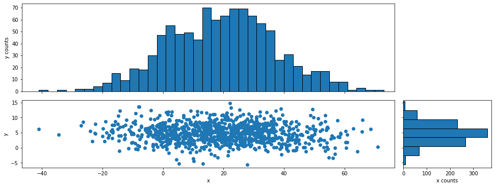
ヒストグラムで表示
binのサイズや指定範囲などは何でも良いです。
x, y = get_sample_scatter()

# axisの設定
fig, rect_scatter, rect_histx, rect_histy = scatter_projection_layout(x, y)
ax = fig.add_axes(rect_scatter)
ax_histx = fig.add_axes(rect_histx)
ax_histy = fig.add_axes(rect_histy)

# 散布図の表示
ax.scatter(x, y)
ax.set_xlabel('x')
ax.set_ylabel('y')

# x軸方向のProjectionを表示
x_binwidth = 3
x_bins = np.arange(min(x), max(x) + x_binwidth, x_binwidth)
ax_histx.hist(x, bins=x_bins, ec='black')
ax_histx.set_ylabel('y counts')
ax_histx.tick_params(labelbottom=False)  # 目盛ラベルの非表示

# y軸方向のProjectionを表示
y_binwidth = 3
y_bins = np.arange(min(y), max(y) + y_binwidth, y_binwidth)
ax_histy.hist(y, bins=y_bins, ec='black', orientation='horizontal')
ax_histy.set_xlabel('x counts')
ax_histy.tick_params(labelleft=False)  # 目盛ラベルの非表示

# 散布図に表示範囲を合わせる
ax_histx.set_xlim(ax.get_xlim())
ax_histy.set_ylim(ax.get_ylim())

plt.show()

プロットで表示
Projectionのプロット点をbinの中央に表示する例です。
y_bins[:-1] + y_binwidth/2で各binの中央にプロットすることができます。
x, y = get_sample_scatter()

# axisの設定
fig, rect_scatter, rect_histx, rect_histy = scatter_projection_layout(x, y)
ax = fig.add_axes(rect_scatter)
ax_histx = fig.add_axes(rect_histx)
ax_histy = fig.add_axes(rect_histy)

# 散布図の表示
ax.scatter(x, y)
ax.set_xlabel('x')
ax.set_ylabel('y')

# x軸方向のProjectionを表示
x_binwidth = 3
x_bins = np.arange(min(x), max(x) + x_binwidth, x_binwidth)
y_hist, _ = np.histogram(x, bins=x_bins)
ax_histx.plot(x_bins[:-1] + x_binwidth/2, y_hist, 'o-')
ax_histx.set_ylabel('y counts')
ax_histx.tick_params(labelbottom=False)  # 目盛ラベルの非表示


# y軸方向のProjectionを表示
y_binwidth = 3
y_bins = np.arange(min(y), max(y) + y_binwidth, y_binwidth)
x_hist, _ = np.histogram(y, bins=y_bins)
ax_histy.plot(x_hist, y_bins[:-1] + y_binwidth/2, 'o-')  # xとyの対応が反対になるので注意
ax_histy.set_xlabel('x counts')
ax_histy.tick_params(labelleft=False)  # 目盛ラベルの非表示

# 散布図に表示範囲を合わせる
ax_histx.set_xlim(ax.get_xlim())
ax_histy.set_ylim(ax.get_ylim())

plt.show()

おまけ
縦横の次元が同じ意味を持つ(2次元空間など)場合に、最適なProjectionを表示する方法を紹介します。
使用関数
def rotate_scatter(x, y, angle, pivot):
    """任意の回転軸からの回転
    x: 散布図のx座標
    y: 散布図のy座標
    angle: 回転角(度)
    pivot: 回転軸(x, y)
    """
    # 回転軸を原点に平行移動
    shift_x = x - pivot[0]
    shift_y = y - pivot[1]

    array = np.vstack((shift_x, shift_y))
    rad = np.radians(angle)
    c, s = np.cos(rad), np.sin(rad)
    rot_matrix = np.array([[c, -s], [s, c]])  # 回転行列
    rot_shift_x, rot_shift_y = np.dot(rot_matrix, array)  # 回転後の座標を取得

    # 回転軸を原点から元の座標に平行移動
    rot_x = rot_shift_x + pivot[0]
    rot_y = rot_shift_y + pivot[1]

    return rot_x, rot_y
-
rotate_scatter(): 散布図を任意の回転軸で任意の角度回転
重心と回帰直線を計算
重心と回帰直線を求めます。回帰直線にはnp.polyfit()を使います。
# 重心を求める
gravity_x = np.sum(x) / len(x)
gravity_y = np.sum(y) / len(y)

# 回帰直線を求める(a:傾き, b:切片)
a, b = np.polyfit(x, y, 1)
predict = np.poly1d([a, b])

# 重心と回帰直線を散布図に表示
fig, ax = plt.subplots()
ax.scatter(x, y)
ax.scatter(gravity_x, gravity_y, c='r', label=f'gravity ({gravity_x:.2f}, {gravity_y:.2f})')
ax.plot(x, predict(x), c='k',label=f'regressionline {predict}')
ax.set_xlabel('x')
ax.set_ylabel('y')
ax.set_aspect('equal')
ax.legend()

plt.show()

重心と回帰直線を基準に回転
簡単な流れです。
- 散布図の重心を計算します。
- 回帰直線の傾きから角度を計算し、マイナスをかけて回帰直線が水平になるような角度に変換します。
- 散布図の各プロット点を回転軸に重心、回転角に2で求めた角度を使い、回転移動させます。
- その移動後の散布図に対してProjectionを計算します。
x, y = get_sample_scatter()

# 重心を求める
gravity_x = np.sum(x) / len(x)
gravity_y = np.sum(y) / len(y)

# 回帰直線を求める(a:傾き, b:切片)
a, b = np.polyfit(x, y, 1)
angle = -np.tan(a) / np.pi * 180

# 重心を回転軸に回帰直線の傾きの角度のマイナスを回転角とし、回転移動
rot_x, rot_y = rotate_scatter(x, y, angle=angle, pivot=(gravity_x, gravity_y))

# axisの設定
fig, rect_scatter, rect_histx, rect_histy = scatter_projection_layout(rot_x, rot_y)
ax = fig.add_axes(rect_scatter)
ax_histx = fig.add_axes(rect_histx)
ax_histy = fig.add_axes(rect_histy)

# 散布図の表示
ax.scatter(rot_x, rot_y)
ax.set_xlabel('x')
ax.set_ylabel('y')

# x軸方向のProjectionを表示
x_binwidth = 3
x_bins = np.arange(min(rot_x), max(rot_x) + x_binwidth, x_binwidth)
ax_histx.hist(rot_x, bins=x_bins, ec='black')
ax_histx.set_ylabel('y counts')
ax_histx.tick_params(labelbottom=False)  # 目盛ラベルの非表示

# y軸方向のProjectionを表示
y_binwidth = 3
y_bins = np.arange(min(rot_y), max(rot_y) + y_binwidth, y_binwidth)
ax_histy.hist(rot_y, bins=y_bins, ec='black', orientation='horizontal')
ax_histy.set_xlabel('x counts')
ax_histy.tick_params(labelleft=False)  # 目盛ラベルの非表示

# 散布図に範囲を合わせる
ax_histx.set_xlim(ax.get_xlim())
ax_histy.set_ylim(ax.get_ylim())

plt.show()
回転前後の比較
一応、回転前後のProjectionの比較もしておきましょう。
x軸について、_concat_x = np.concatenate((x, rot_x))により回転前後の配列を繋ぎ合わせている理由は、散布図のアスペクト比をプロットエリアを調整するためです。2つの分布をプロットする時、プロットエリアの最小値、最大値を知る必要があり、そのため、scatter_projection_layout()関数へ_concat_xを代入しています。y軸も同様です。
x, y = get_sample_scatter()

# 重心を求める
gravity_x = np.sum(x) / len(x)
gravity_y = np.sum(y) / len(y)

# 回帰直線を求める(a:傾き, b:切片)
a, b = np.polyfit(x, y, 1)
angle = -np.tan(a) / np.pi * 180

rot_x, rot_y = rotate_scatter(x, y, angle=angle, pivot=(gravity_x, gravity_y))

# axisの設定
_concat_x = np.concatenate((x, rot_x))  # axisのグラフエリアの比率計算のため分布を重ねておく
_concat_y = np.concatenate((y, rot_y))  # axisのグラフエリアの比率計算のため分布を重ねておく
fig, rect_scatter, rect_histx, rect_histy = scatter_projection_layout(_concat_x, _concat_y)
ax = fig.add_axes(rect_scatter)
ax_histx = fig.add_axes(rect_histx)
ax_histy = fig.add_axes(rect_histy)

# 散布図の表示
ax.scatter(x, y, alpha=0.7, label='original')
ax.scatter(rot_x, rot_y, alpha=0.7, label='rotate py regressionline angle')
ax.set_xlabel('x')
ax.set_ylabel('y')
ax.legend()

# x軸方向のProjectionを表示
x_binwidth = 3
x_bins = np.arange(min(rot_x), max(rot_x) + x_binwidth, x_binwidth)
ax_histx.hist(x, bins=x_bins, ec='black', alpha=0.6)
ax_histx.hist(rot_x, bins=x_bins, ec='black', alpha=0.6)
ax_histx.set_ylabel('y counts')
ax_histx.tick_params(labelbottom=False)  # 目盛ラベルの非表示

# y軸方向のProjectionを表示
y_binwidth = 3
y_bins = np.arange(min(rot_y), max(rot_y) + y_binwidth, y_binwidth)
ax_histy.hist(y, bins=y_bins, alpha=0.6, ec='black', orientation='horizontal')
ax_histy.hist(rot_y, bins=y_bins, alpha=0.6, ec='black', orientation='horizontal')
ax_histy.set_xlabel('x counts')
ax_histy.tick_params(labelleft=False)  # 目盛ラベルの非表示

# 散布図に範囲を合わせる
ax_histx.set_xlim(ax.get_xlim())
ax_histy.set_ylim(ax.get_ylim())

plt.show()

このように、最適なProjectionの軸を選ぶことで、分布の広がりを見積もることができます。
まとめ
matplotlib公式のようにアスペクト比を調整する方法は便利ですが、縦横のプロット範囲が大きく異なる場合は余白が大きくなっていまう問題がありました。その場合の対策として、本記事のような散布図の表示範囲をなるべく押さえつつアスペクト比を調整するProjectionの方法を紹介しました。
また、本記事のおまけでは縦横の次元が同じ意味を持つ(2次元空間など)場合に、最適なProjectionの軸を選べると分布の広がりを見積もることができるので、その導出例として重心と回帰直線を用いた方法を紹介しました。
2次元ヒートマップのProjectionの記事(2次元ヒートマップのProjectionを取る方法)も書いているので、よろしければ合わせてご覧ください。
参考資料
関連資料