※自分の学習記録のメモとしてこの記事を書いています。
1日目:Flutter学習1日目 -公式を読む 1. インストール編-
2日目前編:Flutter学習2日目前編 -公式を読む 2. エディターの設定編-
2日目後編:Flutter学習2日目後編 -公式を読む 3. テストドライブ編-
3日目: Flutter学習3日目 -公式を読む 4. スターターFlutterアプリを作成する-
4日目: Flutter学習4日目 -公式を読む 5. インタラクティブ機能を実装-
5日目:Flutter学習5日目 -公式を読む 6. Web開発者のためのFlutter-(イマココ)
今日はよりFlutterへの理解を深めるためにLearn moreのFlutter for web developersを読み進めます!🧜♀️
私はWeb開発経験があるためこのページを読み進めますが、他にも
- Android開発者のためのFlutter
- JavaからDartへ codelab
- iOS開発者のためのFlutter
- React Native 開発者のための Flutter
- Xamarin.Forms 開発者のための Flutter
があるので、それぞれ学んできた環境に合わせて読み進めるのが良さそうです🙆♀️
それでは読み進めていきます👉👉👉
Web開発者のためのFlutter
このページは、アプリケーションの UI のコンポーネントを配置するための HTML と CSS の構文に精通しているユーザーのためのページです。このページでは、HTML/CSS のコードスニペットを Flutter/Dart のコードに対応させています。
Web レイアウトと Flutter レイアウトの設計の基本的な違いの1つは、制約がどのように機能するか、ウィジェットのサイズや位置をどのように設定するかを学ぶことです。
この例では、次のことを前提としています。
- HTML ドキュメントは で始まり、すべての HTML 要素の CSS ボックスモデルは、Flutter モデルとの整合性のために border-box に設定されています。
{
  box-sizing: border-box;
}
- Flutter では、"Lorem ipsum" テキストのデフォルトのスタイリングは、構文をシンプルに保つために bold24Roboto 変数で以下のように定義されています。
TextStyle bold24Roboto = TextStyle(
  color: Colors.white,
  fontSize: 24,
  fontWeight: FontWeight.w900,
);
基本的なレイアウト操作を行う
テキストのスタイリングと整列
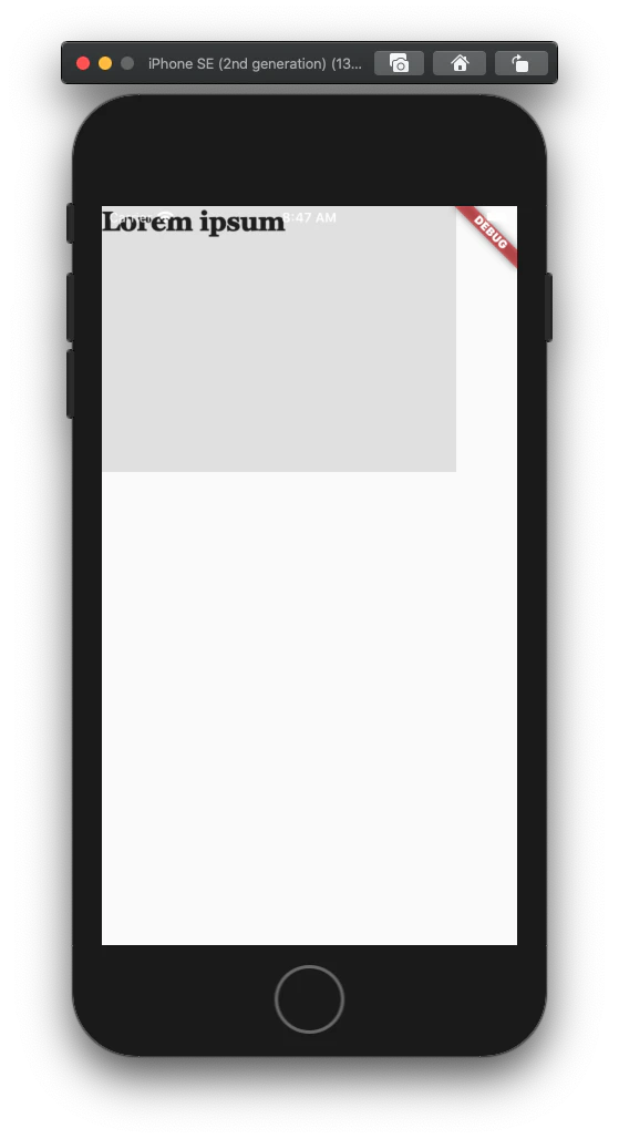
フォントのスタイルやサイズなど、CSSがフォントやカラーのプロパティで扱うテキスト属性は、TextウィジェットのTextStyleの子要素の個別のプロパティです。
<div class="greybox">
    Lorem ipsum
</div>

.greybox {
    background-color: #e0e0e0; /* grey 300 */
    width: 320px;
    height: 240px;
    font: 900 24px Georgia;
}
var container = Container( // grey box
  child: Text(
    "Lorem ipsum",
    style: TextStyle(
      fontSize: 24,
      fontWeight: FontWeight.w900,
      fontFamily: "Georgia",
    ),
  ),
  width: 320,
  height: 240,
  color: Colors.grey[300],
);
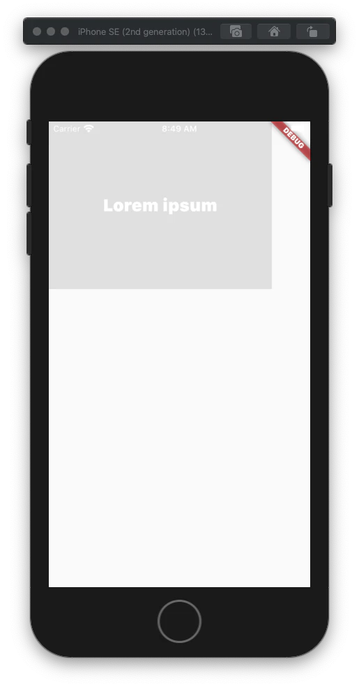
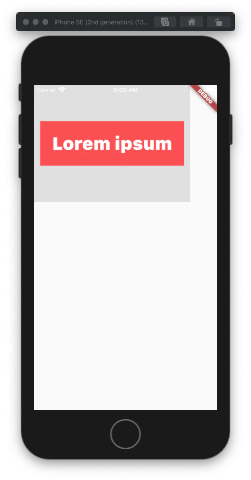
背景色の設定
Flutter では、Container の decoration プロパティを使って背景色を設定します。
CSS の例では、Material カラーパレットに相当する 16 進数の色を使用しています。
<div class="greybox">
  Lorem ipsum
</div>

.greybox {
  background-color: #e0e0e0; /* grey 300 */
  width: 320px;
  height: 240px;
  font: 900 24px Roboto;
  display: flex;
  align-items: center;
  justify-content: center;
}
var container = Container( // grey box
  child:  Center(
    child:  Text(
      "Lorem ipsum",
      style: bold24Roboto,
    ),
  ),
  width: 320,
  height: 240,
  color: Colors.grey[300],
);
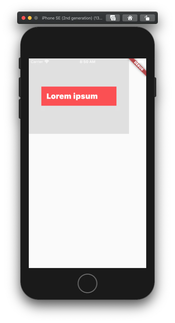
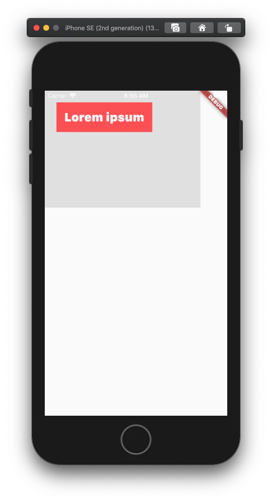
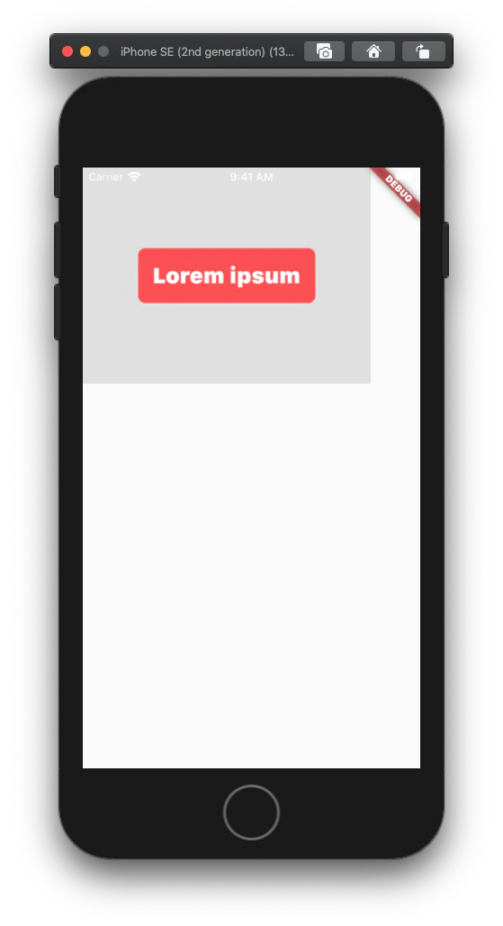
Containerの幅を設定する
Container ウィジェットの幅を指定するには、その width プロパティを使用します。これは、Containerの幅を最大値まで調整する CSS の max-width プロパティとは異なり、固定の幅です。Flutter でこの効果を真似るには、Container の constraints プロパティを使用します。minWidth または maxWidth を持つ新しい BoxConstraints ウィジェットを作成します。
入れ子になったContainerの場合、親の幅が子の幅よりも小さい場合、子Containerは親に合わせてサイズを調整します。
<div class="greybox">
  <div class="redbox">
    Lorem ipsum
  </div>
</div>

.greybox {
  background-color: #e0e0e0; /* grey 300 */
  width: 320px;
  height: 240px;
  font: 900 24px Roboto;
  display: flex;
  align-items: center;
  justify-content: center;
}
.redbox {
  background-color: #ef5350; /* red 400 */
  padding: 16px;
  color: #ffffff;
  width: 100%;
  max-width: 240px;
}
var container = Container( // grey box
  child: Center(
    child: Container( // red box
      child: Text(
        "Lorem ipsum",
        style: bold24Roboto,
      ),
      decoration: BoxDecoration(
        color: Colors.red[400],
      ),
      padding: EdgeInsets.all(16),
      width: 240, //max-width is 240
    ),
  ),
  width: 320,
  height: 240,
  color: Colors.grey[300],
);
位置とサイズの操作
絶対位置の設定
デフォルトでは、ウィジェットは親に対して相対的に配置されます。
ウィジェットの絶対位置を x-y 座標で指定するには、Stack ウィジェットに入れ子になっている Positioned ウィジェットに入れ子にします。
<div class="greybox">
  <div class="redbox">
    Lorem ipsum
  </div>
</div>

.greybox {
  background-color: #e0e0e0; /* grey 300 */
  width: 320px;
  height: 240px;
  font: 900 24px Roboto;
  position: relative;
}
.redbox {
  background-color: #ef5350; /* red 400 */
  padding: 16px;
  color: #ffffff;
  position: absolute;
  top: 24px;
  left: 24px;
}
var container = Container( // grey box
  child: Stack(
    children: [
      Positioned( // red box
        child:  Container(
          child: Text(
            "Lorem ipsum",
            style: bold24Roboto,
          ),
          decoration: BoxDecoration(
            color: Colors.red[400],
          ),
          padding: EdgeInsets.all(16),
        ),
        left: 24,
        top: 24,
      ),
    ],
  ),
  width: 320,
  height: 240,
  color: Colors.grey[300],
);
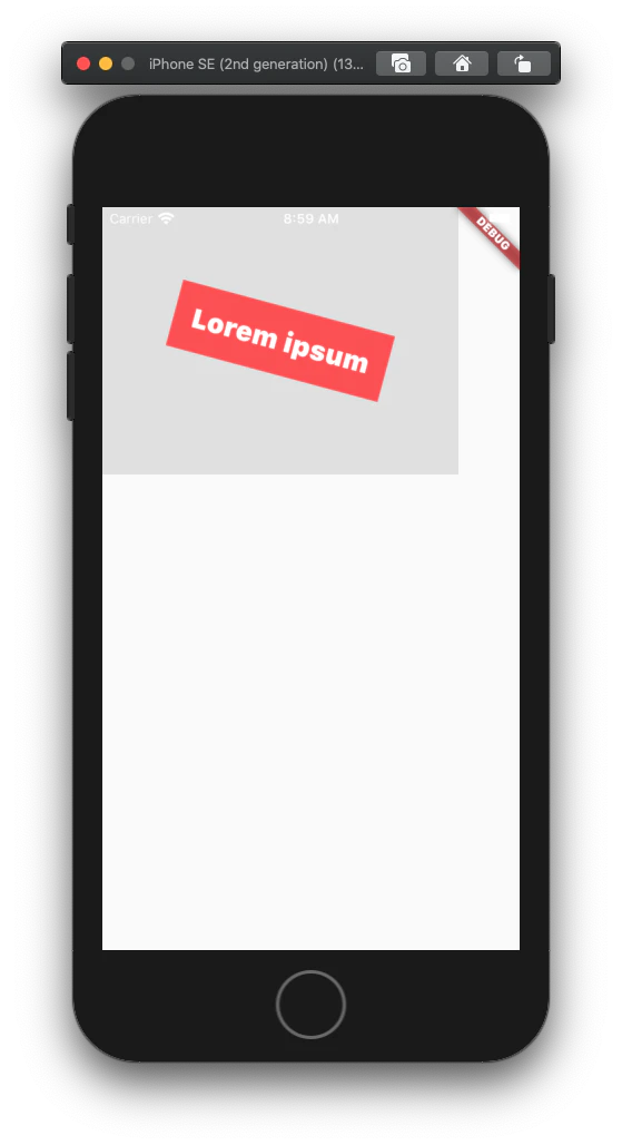
回転コンポーネント
ウィジェットを回転させるには、Transform ウィジェットに入れ子にします。Transform ウィジェットの alignment と origin プロパティを使用して、それぞれ相対語と絶対語で変換原点(支点)を指定します。
ウィジェットをZ軸で回転させる単純な2D回転については、新しいMatrix4 identityオブジェクトを作成し、そのrotateZ()メソッドを使用して、ラジアン(度×π/180)を使用して回転係数を指定します。
<div class="greybox">
  <div class="redbox">
    Lorem ipsum
  </div>
</div>

.greybox {
  background-color: #e0e0e0; /* grey 300 */
  width: 320px;
  height: 240px;
  font: 900 24px Roboto;
  display: flex;
  align-items: center;
  justify-content: center;
}
.redbox {
  background-color: #ef5350; /* red 400 */
  padding: 16px;
  color: #ffffff;
  transform: rotate(15deg);
}
var container = Container( // gray box
  child: Center(
    child:  Transform(
      child:  Container( // red box
        child: Text(
          "Lorem ipsum",
          style: bold24Roboto,
          textAlign: TextAlign.center,
        ),
        decoration: BoxDecoration(
          color: Colors.red[400],
        ),
        padding: EdgeInsets.all(16),
      ),
      alignment: Alignment.center,
      transform: Matrix4.identity()
        ..rotateZ(15 * 3.1415927 / 180),
    ),
  ),
  width: 320,
  height: 240,
  color: Colors.grey[300],
);
拡大縮小コンポーネント
ウィジェットを拡大縮小するには、Transformウィジェットに入れ子にします。Transform ウィジェットの alignment と origin プロパティを使用して、それぞれ相対的または絶対的に変換原点(支点)を指定します。
x軸に沿った単純なスケーリング操作を行うには、新しいMatrix4 identityオブジェクトを作成し、その scale()メソッドを使用してスケーリング係数を指定します。
親ウィジェットをスケーリングすると、その子ウィジェットもそれに応じてスケーリングされます。
<div class="greybox">
  <div class="redbox">
    Lorem ipsum
  </div>
</div>

.greybox {
  background-color: #e0e0e0; /* grey 300 */
  width: 320px;
  height: 240px;
  font: 900 24px Roboto;
  display: flex;
  align-items: center;
  justify-content: center;
}
.redbox {
  background-color: #ef5350; /* red 400 */
  padding: 16px;
  color: #ffffff;
  transform: scale(1.5);
}
var container = Container( // gray box
  child: Center(
    child:  Transform(
      child:  Container( // red box
        child: Text(
          "Lorem ipsum",
          style: bold24Roboto,
          textAlign: TextAlign.center,
        ),
        decoration: BoxDecoration(
          color: Colors.red[400],
        ),
        padding: EdgeInsets.all(16),
      ),
      alignment: Alignment.center,
      transform: Matrix4.identity()
        ..scale(1.5),
    ),
  ),
  width: 320,
  height: 240,
  color: Colors.grey[300],
);
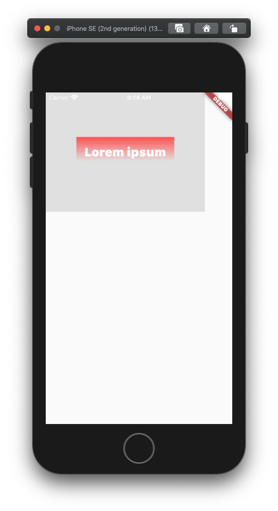
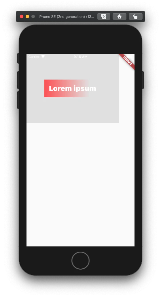
線形グラデーションの適応
ウィジェットの背景に線形グラデーションを適用するには、 Container ウィジェットに入れ子にします。次に、Container ウィジェットの decoration プロパティを使用して BoxDecoration オブジェクトを作成し、BoxDecoration の gradient プロパティを使用して背景の塗りつぶしを変換します。
グラデーションの「角度」は、Alignment (x, y) の値に基づいています。
- x の最初と最後の値が等しい場合、グラデーションは垂直方向 (0° | 180°) となります。
- y の最初と最後の値が等しい場合、グラデーションは水平 (90° | 270°) です。
<div class="greybox">
  <div class="redbox">
    Lorem ipsum
  </div>
</div>

.greybox {
  background-color: #e0e0e0; /* grey 300 */
  width: 320px;
  height: 240px;
  font: 900 24px Roboto;
  display: flex;
  align-items: center;
  justify-content: center;
}
.redbox {
  padding: 16px;
  color: #ffffff;
  background: linear-gradient(180deg, #ef5350, rgba(0, 0, 0, 0) 80%);
}
var container = Container( // grey box
  child: Center(
    child: Container( // red box
      child: Text(
        "Lorem ipsum",
        style: bold24Roboto,
      ),
      decoration: BoxDecoration(
        gradient: LinearGradient(
          begin: const Alignment(0.0, -1.0),
          end: const Alignment(0.0, 0.6),
          colors: <Color>[
            const Color(0xffef5350),
            const Color(0x00ef5350)
          ],
        ),
      ),
      padding: EdgeInsets.all(16),
    ),
  ),
  width: 320,
  height: 240,
  color: Colors.grey[300],
);
<div class="greybox">
  <div class="redbox">
    Lorem ipsum
  </div>
</div>

.greybox {
  background-color: #e0e0e0; /* grey 300 */
  width: 320px;
  height: 240px;
  font: 900 24px Roboto;
  display: flex;
  align-items: center;
  justify-content: center;
}
.redbox {
  padding: 16px;
  color: #ffffff;
  background: linear-gradient(90deg, #ef5350, rgba(0, 0, 0, 0) 80%);
}
var container = Container( // grey box
  child: Center(
    child: Container( // red box
      child: Text(
        "Lorem ipsum",
        style: bold24Roboto,
      ),
      decoration: BoxDecoration(
        gradient: LinearGradient(
          begin: const Alignment(-1.0, 0.0),
          end: const Alignment(0.6, 0.0),
          colors: <Color>[
            const Color(0xffef5350),
            const Color(0x00ef5350)
          ],
        ),
      ),
      padding: EdgeInsets.all(16),
    ),
  ),
  width: 320,
  height: 240,
  color: Colors.grey[300],
);
角を丸くする
矩形の角を丸めるには、BoxDecoration オブジェクトの borderRadius プロパティを使用します。各角を丸めるための半径を指定する BorderRadius オブジェクトを新規に作成します。
<div class="greybox">
  <div class="redbox">
    Lorem ipsum
  </div>
</div>

.greybox {
  background-color: #e0e0e0; /* gray 300 */
  width: 320px;
  height: 240px;
  font: 900 24px Roboto;
  display: flex;
  align-items: center;
  justify-content: center;
}
.redbox {
  background-color: #ef5350; /* red 400 */
  padding: 16px;
  color: #ffffff;
  border-radius: 8px;
}
var container = Container( // grey box
  child: Center(
    child: Container( // red circle
      child: Text(
        "Lorem ipsum",
        style: bold24Roboto,
      ),
      decoration: BoxDecoration(
        color: Colors.red[400],
        borderRadius: BorderRadius.all(
          const Radius.circular(8),
        ),
      ),
      padding: EdgeInsets.all(16),
    ),
  ),
  width: 320,
  height: 240,
  color: Colors.grey[300],
);
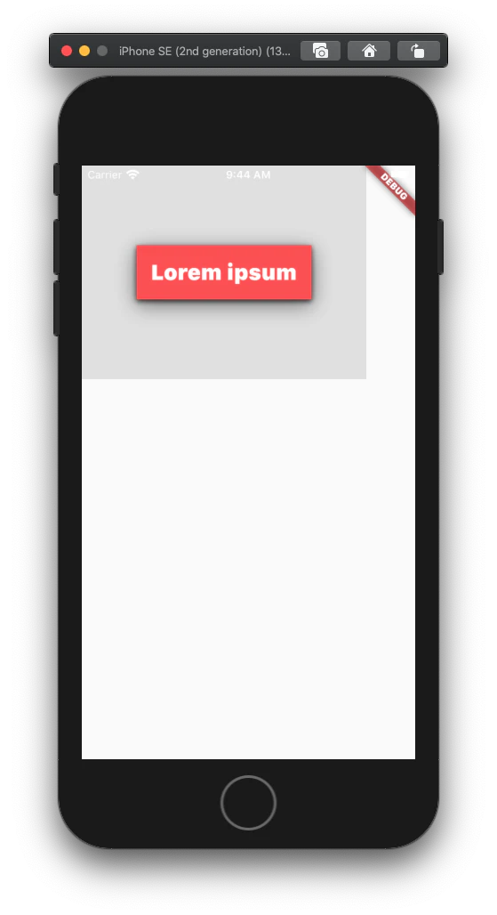
ボックスシャドウの追加
Flutterでは、それぞれのプロパティと値を個別に指定します。BoxDecoration の boxShadow プロパティを使って BoxShadow ウィジェットのリストを作成します。1つまたは複数のBoxShadow ウィジェットを定義することができ、それらを積み重ねて影の深さや色などをカスタマイズすることができます。
<div class="greybox">
  <div class="redbox">
    Lorem ipsum
  </div>
</div>

.greybox {
  background-color: #e0e0e0; /* grey 300 */
  width: 320px;
  height: 240px;
  font: 900 24px Roboto;
  display: flex;
  align-items: center;
  justify-content: center;
}
.redbox {
  background-color: #ef5350; /* red 400 */
  padding: 16px;
  color: #ffffff;
  box-shadow: 0 2px 4px rgba(0, 0, 0, 0.8),
              0 6px 20px rgba(0, 0, 0, 0.5);
}
var container = Container( // grey box
  child: Center(
    child: Container( // red box
      child: Text(
        "Lorem ipsum",
        style: bold24Roboto,
      ),
      decoration: BoxDecoration(
        color: Colors.red[400],
        boxShadow: [
          BoxShadow (
            color: const Color(0xcc000000),
            offset: Offset(0, 2),
            blurRadius: 4,
          ),
          BoxShadow (
            color: const Color(0x80000000),
            offset: Offset(0, 6),
            blurRadius: 20,
          ),
        ],
      ),
      padding: EdgeInsets.all(16),
    ),
  ),
  width: 320,
  height: 240,
  decoration: BoxDecoration(
    color: Colors.grey[300],
  ),
  margin: EdgeInsets.only(bottom: 16),
);
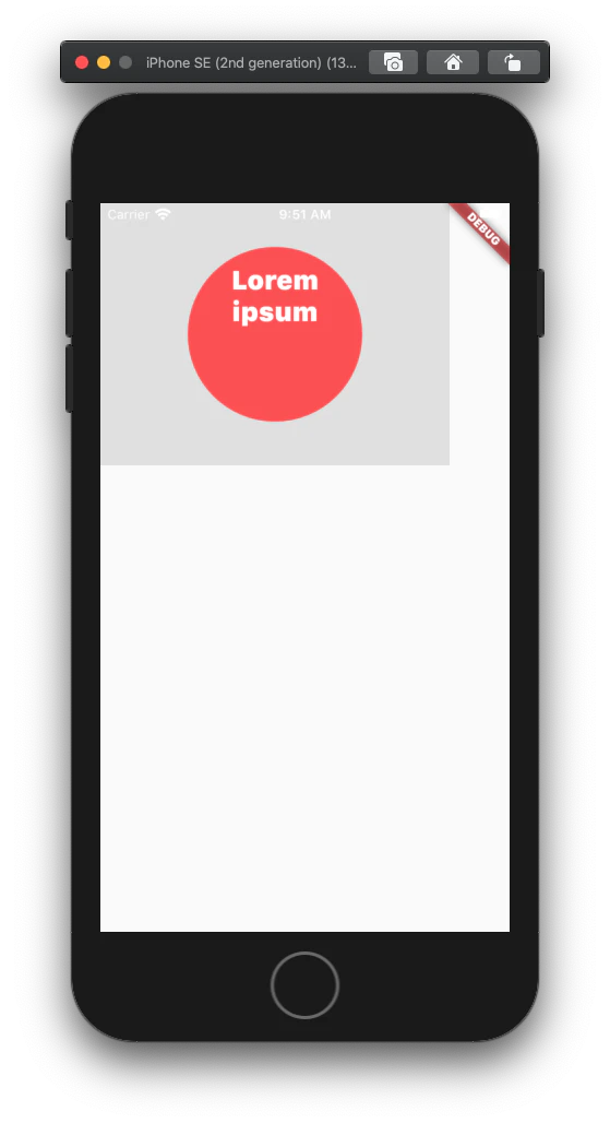
円と楕円を作る
CSS で円を作るには四角形の四辺すべてに 50% の境界線を適用する必要があります。
Flutter は BoxDecoration の borderRadius プロパティでもサポートされていますが、円と楕円を作るために BoxShape enum で shape プロパティを提供しています。
<div class="greybox">
  <div class="redcircle">
    Lorem ipsum
  </div>
</div>

.greybox {
  background-color: #e0e0e0; /* gray 300 */
  width: 320px;
  height: 240px;
  font: 900 24px Roboto;
  display: flex;
  align-items: center;
  justify-content: center;
}
.redcircle {
  background-color: #ef5350; /* red 400 */
  padding: 16px;
  color: #ffffff;
  text-align: center;
  width: 160px;
  height: 160px;
  border-radius: 50%;
}
var container = Container( // grey box
  child: Center(
    child: Container( // red circle
      child: Text(
        "Lorem ipsum",
        style: bold24Roboto,
        textAlign: TextAlign.center,
      ),
      decoration: BoxDecoration(
        color: Colors.red[400],
        shape: BoxShape.circle,
      ),
      padding: EdgeInsets.all(16),
      width: 160,
      height: 160,
    ),
  ),
  width: 320,
  height: 240,
  color: Colors.grey[300],
);
テキストの操作
テキストの間隔を調整する
CSSでは、文字間隔プロパティと単語間隔プロパティにそれぞれ長さの値を与えることで、各文字や単語の間の空白の量を指定します。スペースの量は px、pt、cm、em などの単位で指定できます。
Flutter では、Text ウィジェットの TextStyle 子の letterSpacing と wordSpacing プロパティに、論理ピクセル(負の値も可)で空白を指定します。
<div class="greybox">
  <div class="redbox">
    Lorem ipsum
  </div>
</div>

.greybox {
  background-color: #e0e0e0; /* grey 300 */
  width: 320px;
  height: 240px;
  font: 900 24px Roboto;
  display: flex;
  align-items: center;
  justify-content: center;
}
.redbox {
  background-color: #ef5350; /* red 400 */
  padding: 16px;
  color: #ffffff;
  letter-spacing: 4px;
}
var container = Container( // grey box
  child: Center(
    child: Container( // red box
      child: Text(
        "Lorem ipsum",
        style: TextStyle(
          color: Colors.white,
          fontSize: 24,
          fontWeight: FontWeight.w900,
          letterSpacing: 4,
        ),
      ),
      decoration: BoxDecoration(
        color: Colors.red[400],
      ),
      padding: EdgeInsets.all(16),
    ),
  ),
  width: 320,
  height: 240,
  color: Colors.grey[300],
);

インラインの書式変更を行う
テキストウィジェットは、いくつかのフォーマット特性を持つテキストを表示することができます。複数のスタイルを使用するテキスト (この例では、強調された単一の単語) を表示するには、代わりにリッチテキストウィジェットを使用します。その text プロパティは、個別にスタイルを設定できる 1 つ以上の TextSpan ウィジェットを指定することができます。
次の例では、"Lorem"はデフォルト(継承)のテキストスタイリングを持つTextSpanウィジェット内にあり、"ipsum "はカスタムスタイリングを持つ別のTextSpan内にあります。
<div class="greybox">
  <div class="redbox">
    Lorem <em>ipsum</em>
  </div>
</div>

.greybox {
  background-color: #e0e0e0; /* grey 300 */
  width: 320px;
  height: 240px;
  font: 900 24px Roboto;
  display: flex;
  align-items: center;
  justify-content: center;
}
.redbox {
  background-color: #ef5350; /* red 400 */
  padding: 16px;
  color: #ffffff;
}
 .redbox em {
  font: 300 48px Roboto;
  font-style: italic;
}
var container = Container( // grey box
  child: Center(
    child: Container( // red box
      child:  RichText(
        text: TextSpan(
          style: bold24Roboto,
          children: <TextSpan>[
            TextSpan(text: "Lorem "),
            TextSpan(
              text: "ipsum",
              style: TextStyle(
                fontWeight: FontWeight.w300,
                fontStyle: FontStyle.italic,
                fontSize: 48,
              ),
            ),
          ],
        ),
      ),
      decoration: BoxDecoration(
        color: Colors.red[400],
      ),
      padding: EdgeInsets.all(16),
    ),
  ),
  width: 320,
  height: 240,
  color: Colors.grey[300],
);

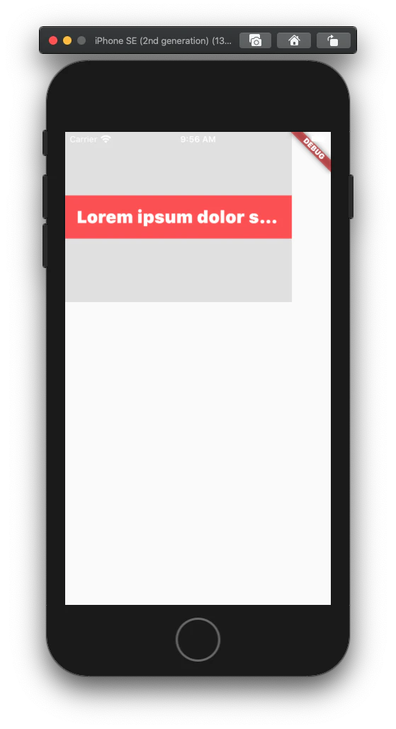
テキストの抜粋を作成する
抜粋は、段落内のテキストの最初の行を表示し、オーバーフローしたテキストを処理します。HTML/CSSでは、抜粋は1行以下にすることができます。複数行の後に切り詰めるには、JavaScript のコードが必要です。
Flutter では、テキストウィジェットの maxLines プロパティを使用して、抜粋に含める行数を指定し、オーバーフローテキストを処理するために overflow プロパティを使用します。
<div class="greybox">
  <div class="redbox">
    Lorem ipsum dolor sit amet, consec etur
  </div>
</div>

.greybox {
  background-color: #e0e0e0; /* grey 300 */
  width: 320px;
  height: 240px;
  font: 900 24px Roboto;
  display: flex;
  align-items: center;
  justify-content: center;
}
.redbox {
  background-color: #ef5350; /* red 400 */
  padding: 16px;
  color: #ffffff;
  overflow: hidden;
  text-overflow: ellipsis;
  white-space: nowrap;
}
var container = Container( // grey box
  child: Center(
    child: Container( // red box
      child: Text(
        "Lorem ipsum dolor sit amet, consec etur",
        style: bold24Roboto,
        overflow: TextOverflow.ellipsis,
        maxLines: 1,
      ),
      decoration: BoxDecoration(
        color: Colors.red[400],
      ),
      padding: EdgeInsets.all(16),
    ),
  ),
  width: 320,
  height: 240,
  color: Colors.grey[300],
);
感想
learn moreのコンテンツ内にあることもあり、結構読み飛ばしてしまう方が多いんじゃないかという気がしますが個人的には必読だと感じました。
今回ので理解がさらに深まった実感があります!✨
次回はIntroduction to widgetでウィジェットについて読んで行きたいと思います!