はじめに
matplotlibのcolorbarの調整は好きですか?私は大っ嫌いでした。例えば複数のsubplotを使っている時などは最悪です。ググってでてきたStack Overflowのいろいろなレシピを真似ても、何をやっているのかよくわからず理想の状態まであと一歩というところで力尽きます。キーワードを変えてググってみても同じ回答しかでてきません。こればっかりはダブルクリックすれば済むGUIのグラフ作成ソフトのほうがよかったなと何度も思いました。思わぬ反響だったArtistの話は、実はtickとcolorbarについての理解を深めるために自分自身のために書いたものでした。この記事では、その続編として__colorbarの微調整に伴う苦労、苦心、苦痛、苦行や検索に費やす時間を軽減するのに役立つ基礎知識を説明します__。最後に少し具体的な処方箋も例示しますが、応用の効く基礎知識と公式マニュアルを含めウェブ上に散らばる様々なcolorbar関連のノウハウを整理した解説が中心です1。
こんな人向け
- __colorbarの調整方法を調べてたらいつのまにか2時間経ってた__ことがある2
- __colorbarをダブルクリックしたい衝動__に襲われたことがある
- __colorbarの調整をIllustrator等で無理やりやった__ことがある
- __「cbarとcaxってなにか違うの?」__と思ったことがある
- Seabornのheatmapなどで自動的に添えられたcolorbarを調整したいけど、__なにがどうなっているのかさっぱりわからなくて途方に暮れた__ことがある。
- まだcolorbarの調整で苦しんだことがない
見た目調整の個別相談も受け付けます。記事の最後にリンクがあります。
先行文献
colorbarの調整に関して述べた日本語記事はQiitaだけでもいろいろあります。これらの記事の手順もこの記事を読むとすっきり理解できるようになります。
- matplotlib で colorbar の大きさを揃える - Qiita
- matplotlibでジャーナルに投稿可能な図を作るためのメモ - Qiita > カラーバーを水平につけてラベルを書く
- matplotlibのbarプロットでカラーバーをつける方法 - Qiita
- matplotlibでcolorbarを図にあわせる - Qiita
Stack Overflowにもcolorbarに関する質問はたくさんありますが、一番voteが多いのはサイズ調整に関するMatplotlib 2 Subplots, 1 Colorbar で、かなり網羅的な回答がついています。本稿では、メインテーマである"colorbarの解剖"に加え、それらを応用する具体例としてcolorbarのサイズ調整に関するこのSOの質問に対する回答群のまとめとlogスケールで色付けした図のcolormapの調整について述べます。
準備
Python 3.6とJupyter notebookを使っています。matplotlibは2.1.1です。
この後で使う各種モジュールと関数を読み込んでおきます。
%matplotlib inline
import numpy as np
import matplotlib.pyplot as plt
from matplotlib.patches import Rectangle # colorbarの解剖図に使う
from matplotlib.ticker import LogLocator, MultipleLocator, FixedLocator
from matplotlib.ticker import LogFormatterSciNotation, FuncFormatter, NullFormatter
from matplotlib.colors import LogNorm # imshowとcolorbarをlogスケールにする
from mpl_toolkits.axes_grid1 import make_axes_locatable, ImageGrid # colorbarをうまく配置する
from pprint import pprint # オブジェクトの入ったlistを表示する際に要素ごとに改行されて見やすくなる
# cf. https://docs.python.jp/3/library/pprint.html
# サンプルデータ作成用
def gaussian2d(x, y, cen, sig):
qx = x - cen[0]
qy = y - cen[1]
r = np.sqrt(qx**2 + qy**2)
return np.exp(-(r/sig)**2/2)
# colorbarの解剖図に長方形を書く
def AddAxesBBoxRect(fig, ax, ec='k'):
axpos = ax.get_position()
rect = fig.patches.append(Rectangle((axpos.x0, axpos.y0), axpos.width, axpos.height,
ls='solid', lw=2, ec=ec, fill=False, transform=fig.transFigure))
return rect
# ax.get_position()で得られるのはFigureに対する座標
# fig.pathcesにRectagleオブジェクトを追加するax.add_patchはaxに対する座標
# fig.add_patchはないので、RectangleのtansformオプションでFigure座標を使うことを明示する
# axposはBboxオブジェクトで属性として四隅の座標や幅や高さを持っている
# 長方形にテキストを添える
def AddAxesBBoxRectAndText(fig, ax, text, ec='k', ls='solid', va='top', ha='left', dx=0.01, dy=-0.01) :
axpos = ax.get_position()
fig.patches.append(Rectangle((axpos.x0, axpos.y0), axpos.x1-axpos.x0, axpos.y1-axpos.y0,
ls=ls, lw=2, ec=ec,
fill=False, transform=fig.transFigure, figure=fig))
fig.text(axpos.x0+dx, axpos.y1+dy, text, va=va, ha=ha, weight='bold', color=ec, )
return None
# 複数のsubplotにまとめてimshowでデータを描画して長方形とテキストを加える
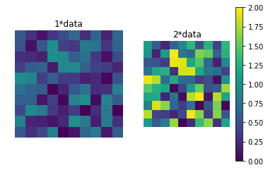
def MultipleImagesAndRectangle(fig, axes, data, draw_rect=True, aspect='equal') :
imgs = []
if isinstance(axes, np.ndarray):
axes = axes.ravel()
vmax = len(axes)
for i, ax in enumerate(axes):
if draw_rect:
AddAxesBBoxRectAndText(fig, ax, 'before imshow')
imgs.append(ax.imshow((i+1)*data, origin='lower', vmin=0, vmax=vmax, aspect=aspect))
ax.set_title('{}*data'.format(i+1))
ax.axis('off')
return imgs
# NaNや負の値があっても警告が出ないようにしたlog10関数
def SafeLog10(data, nansub=None):
tmp = np.copy(data)
tmp[np.where(tmp <= 0)] = np.nan # to avoid RuntimeWarning of np.log10
log = np.log10(tmp)
if nansub is not None:
log[np.isnan(log)] = nansub
return log
# オブジェクトが持つ全てのメソッドと属性をdictionaryとして返す関数
def PrintMethodsAndAttributes(obj, public=True):
results = {}
for x in dir(obj):
if public:
if not x[0] is '_':
results[x] = type(getattr(obj, x))
else:
results[x] = type(getattr(obj, x))
return results
Figure, Axes, Axis, Tickと聞いてそれらの階層関係にピンとこない方は、先に 早く知っておきたかったmatplotlibの基礎知識、あるいは見た目の調整が捗るArtistの話 を一読しておくことをお勧めします。
colorbarを解剖する3
plt.colorbar()やfig.colorbar(img)だけでも特に不満がない方はとてもラッキーです。これらはいろんなことをちゃちゃっとやってくれるので何が起こってるのかわかりにくいのですが、それでことが足りるに越したことはありません。しかし、colorbarはデフォルト設定に任せると大きさやtickが微妙な見た目になりやすいパーツです。plt.colorbar()一発で出てきてしまうcolorbarの実体は掴みづらく、何をしてるのかわからないまま公式ドキュメントのExamplesやStack Overflowの回答に盲従している方も多いでしょう。この項目ではimshowとcolorbarを組み合わせた例を"解剖"して、__私たちがいつもcolorbarと呼んでいるパーツがmatplotlibにおいてどうやって描画されているか__を段階を追って詳しく調べていきます。少し冗長な部分もありますが、ここをきちんと把握しておくとcolorbarの調整に関する各種レシピをスムーズに理解できるようになります。
Axesが一つの場合
まずはimshow前のAxesだけの状態をみます。
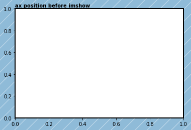
fig = plt.figure()
ax = fig.add_subplot(111)

# fig.patch(単数形)はFigureの領域を定義するRectangle。色をつけてfigの領域を明示させる。
fig.patch.set_facecolor(('#1f77b4ff')) # RGBA表記
fig.patch.set_hatch('/') # ついでにハッチで飾りつけ
fig.patch.set_alpha(0.5) # alphaのデフォルトはNoneなので設定しないとhatchが見えない

axpos = ax.get_position() # Figureベースの座標で定義されたaxの領域を取得
AddAxesBBoxRect(fig, ax) # fig内でaxが占める領域を示す長方形をfig.patchesに追加
fig.text(axpos.x0, axpos.y1+0.01, 'ax position before imshow', weight='bold')
print('axpos in Figure coordinate before imshow:\n', axpos)
axpos in Figure coordinate before imshow:
 Bbox(x0=0.125, y0=0.125, x1=0.9, y1=0.88)
太枠の長方形の左下頂点が(0.125, 0.125)、右上頂点が(0.9, 0.88)です。次にimshowでデータを表示してみます4。
data = np.arange(100).reshape(10, 10)
img = ax.imshow(data, origin='lower')
fig
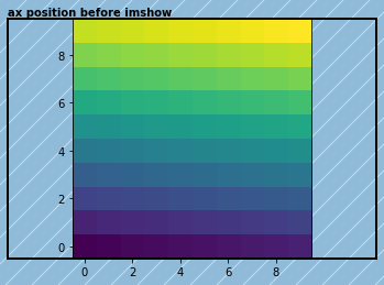
ax.imshowはデフォルトのaspect=Noneではピクセルデータのアスペクト比をそのままにして表示するので、横長のaxに正方形のデータを表示する場合は左右に空白ができます。実はこの時axの領域が変更されています5。
axpos = ax.get_position()
print('axpos in Figure coordinate after imshow:\n', axpos)
axpos in Figure coordinate after imshow:
 Bbox(x0=0.26083333333333336, y0=0.125, x1=0.7641666666666667, y1=0.88)
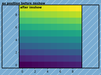
この領域を長方形で図示します。
AddAxesBBoxRect(fig, ax)
axpos = ax.get_position()
fig.text(axpos.x0+0.01, axpos.y1-0.01, 'after imshow', va='top', weight='bold')
fig
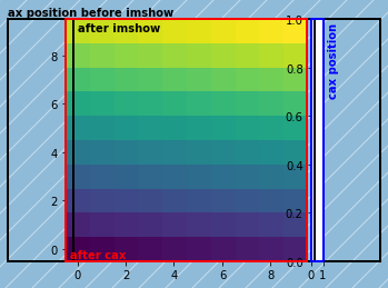
colorbarを添えるもっとも簡単な方法にfig.colorbarメソッドがありますが、これはいろいろと自動的にやってしまうため段階を追って解剖する今回の目的には合いません。そこでここではaxes_gird1ツールキットにあるmake_axes_locatableというヘルパーファンクションを使って親Axesからcolorbarを追加するための領域を奪い、そこにcolorbarを乗せるAxesを作ります。
divider = make_axes_locatable(ax)
cax = divider.append_axes("right", size="5%", pad=0.05)
fig
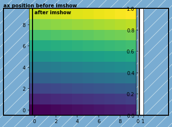
axの領域が少し左にずれました。検証したわけではありませんが、おそらくaxとcaxを合わせた領域がfigに対してセンタリングされているのでしょう。__colorbarを追加すると親Axesの描画領域がずれたり場合によっては狭くなってしまうこの挙動はcolorbarに関する悩みのかなりの部分を占める__と思います。この段階ではfig.add_subplotなどでAxesを作ったときと同様に、caxのXAxisとYAxisがそれぞれ下と左に設定されているのがtickからわかります。このときのaxとcaxの領域を明示します。
axpos = ax.get_position()
caxpos = cax.get_position()

AddAxesBBoxRect(fig, ax, ec='r')
AddAxesBBoxRect(fig, cax, ec='b')
fig.text(axpos.x0+0.01, axpos.y0+0.01, 'after colorbar', weight='bold', color='r')
fig.text(caxpos.x1+0.01, caxpos.y1-0.01, 'cax position', va='top', weight='bold', color='b', rotation='vertical')

fig
最後にcolorbar本体を設置します。
cbar = fig.colorbar(img, cax=cax) # caxオプションでcolorbar本体を乗せる`Axes`オブジェクトを指定
fig
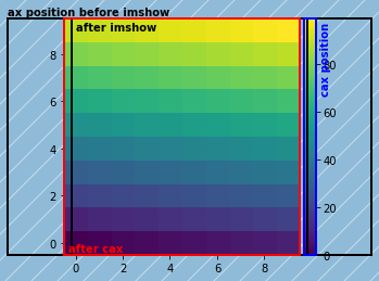
XAxisのtickが消えてYAxisのtickが右側に移動しました。またtickも表示データのスケールに合わせて変わっています。ここまで解剖すると、colorbarと呼ばれるパーツをグラフ上に表示するには最低でも
-
Figure内にcolorbarを置くスペースを確保する - そこに
Axesを作る -
Axesにcolorbar本体を乗せる -
Axisのtickを消したり移動させる -
Axisのtickをデータのスケールに合わせる
という一連の操作が必要なことがわかります。colorbarを表示するのに一番簡単なplt.colorbarやfig.colorbarメソッドはこれらをまとめてやってくれています。ちなみに、colorbar本体と何気なく呼んでいますが、以下のようにmatplotlibの定義上もcbarがまさにColorbarオブジェクトであることがわかります。
print(type(cbar))
<class 'matplotlib.colorbar.Colorbar'>
ここまで確認したことから、__普段colorbarと呼ばれているパーツが、実はいつもグラフの見た目調整のためにいじっているAxesオブジェクトを中心として構成されている__ことがわかりました。つまりcolorbarのサイズや位置の調整、あるいはtick関連の調整はAxesやAxisをいじればいいことになりそうです。しかし、実はcolorbar調整の苦しみはこの勘違いから始まる場合があります。
caxとcbarを調べてみる
cax
colorbarと呼ばれるパーツも結局はプロットと同じようにAxesオブジェクトに描画されていることがわかったので、Artistの話のときにやったようにcaxを調べてみます。
# pprintはオブジェクトの入ったリストを表示する時に便利なモジュール。冒頭のimport参照。
print('cax.get_children():')
pprint(cax.get_children()) # caxに所属する`Artist`オブジェクトのリスト
print('\ncax.xaxis.get_visible:', cax.xaxis.get_visible())
print('cax.yaxis.get_visible:', cax.yaxis.get_visible())
print('\ncax.xaxis.majorTicks:')
pprint(cax.xaxis.majorTicks)
print('\ncax.yaxis.majorTicks')
pprint(cax.yaxis.majorTicks)
print('\ncax.yaxis.get_ticks_position:', cax.yaxis.get_ticks_position())
cax.get_children():
[<matplotlib.collections.QuadMesh object at 0x10ff08630>,
 <matplotlib.patches.Polygon object at 0x10fdcf6a0>,
 <matplotlib.patches.Polygon object at 0x10fe17240>,
 <matplotlib.spines.Spine object at 0x10fded668>,
 <matplotlib.spines.Spine object at 0x10fded908>,
 <matplotlib.spines.Spine object at 0x10fd9c278>,
 <matplotlib.spines.Spine object at 0x10fd9c4e0>,
 <matplotlib.axis.XAxis object at 0x10fd9c588>,
 <matplotlib.axis.YAxis object at 0x10fdcfdd8>,
 Text(0.5,1,''),
 Text(0,1,''),
 Text(1,1,''),
 <matplotlib.patches.Rectangle object at 0x10fe1d828>]

cax.xaxis.get_visible: True
cax.yaxis.get_visible: True

cax.xaxis.majorTicks:
[<matplotlib.axis.XTick object at 0x10fd65be0>,
 <matplotlib.axis.XTick object at 0x10fdc60b8>]

cax.yaxis.majorTicks
[<matplotlib.axis.YTick object at 0x10fd74780>,
 <matplotlib.axis.YTick object at 0x10faec940>,
 <matplotlib.axis.YTick object at 0x10fd546d8>,
 <matplotlib.axis.YTick object at 0x10fef2b00>,
 <matplotlib.axis.YTick object at 0x10fef2438>,
 <matplotlib.axis.YTick object at 0x10fefb2b0>]

cax.yaxis.get_ticks_position: right
cax.get_childrenはcaxに属するArtistをかき集めたリストを返します。表示されているオブジェクトは上から順番に以下の表の通りです。
| オブジェクト | 説明 |
|---|---|
QuadMesh |
Artistオブジェクトレベルでのcolorbarの実体。cax.collectionsに入っている。 |
Polygon |
おそらくextendオプション使用時に上下端に表示される三角形。cax.artistsに入っている。 |
Spine |
Axisが乗っているcaxの四方の枠。cax.spinesに入っている。 |
XAxis, YAxis
|
x軸とy軸。これらの下にTicksオブジェクトが所属している。 |
Text |
タイトルなどの文字列。cax.titleと正体不明の二つの文字列。 |
Rectangle |
caxの描画領域を定義する長方形。cax.patchに入っている。 |
図を見るとXAxisにはtickが表示されていないのでcax.xaxis.get_visibleがFalseかと思いましたが、Trueになっています。ということはtickが設定されていないということになり、これはcax.xaxis.majorTicksが描画範囲外にあるであろう二つのXTickしか持たないことから確認できます6。また、cax.yaxis.get_ticks_positionがrightになっているのでYAxisのtickが右のSpineに表示されていることが分かります。
cbar
次にcbarを詳しく調べてみます。ColorbarオブジェクトはArtistのcontainerではないためget_childrenメソッドは持っていません。以下にcbarが属性として保持する主なオブジェクトとそれらがどこからやってきたかをisを使って示します。
print('cbar.ax is cax:', cbar.ax is cax)
print('cbar.mappable:', cbar.mappable)
print('cbar.mappable is ax.images[0]:', cbar.mappable is ax.images[0])
print('cbar.solids:', cbar.solids)
print('cbar.solids is cax.collections[0]:', cbar.solids is cax.collections[0])
print('cbar.cmap:', cbar.cmap)
print('cbar.cmap is img.cmap:', cbar.cmap is img.cmap)
print('cbar.norm:', cbar.norm)
print('cbar.norm is img.norm:', cbar.norm is img.norm)
cbar.ax is cax: True
cbar.mappable: AxesImage(105.444,36;217.44x217.44)
cbar.mappable is ax.images[0]: True
cbar.solids: <matplotlib.collections.QuadMesh object at 0x13b9c34e0>
cbar.solids is cax.collections[0]: True
cbar.cmap: <matplotlib.colors.ListedColormap object at 0x10ba18860>
cbar.cmap is img.cmap: True
cbar.norm: <matplotlib.colors.Normalize object at 0x13b85d0b8>
cbar.norm is img.norm: True
ここから以下のことがわかります。
-
cbar.axはcolorbarを配置したcax -
cbar.mappableはimshowで表示したAxesImageオブジェクト -
cbar.solidsはArtistオブジェクトレベルでのcolorbarの実体であるQuadMeshで、これはax.collectionsリストにも保持されている -
cbar.cmapはimshowで使われているcmap(color map)である -
cbar.normはimshowで使われているnorm(規格化クラスオブジェクト)である
cbar.normはcmapの両端の色とデータの値を対応させます。imshowでvminのvmaxを指定した場合はそれらの値が、指定しなかった場合はデータの最小値と最大値が設定されます。設定された値は以下の属性から確認できます。
print('cbar.norm.vmax:', cbar.norm.vmax, type(cbar.norm.vmax))
print('cbar.norm.vmin:', cbar.norm.vmin, type(cbar.norm.vmin))
print('cbar.vmax', cbar.vmax, type(cbar.vmax))
print('cbar.vmin', cbar.vmin, type(cbar.vmin))
cbar.norm.vmax: 99 <class 'numpy.int64'>
cbar.norm.vmin: 0 <class 'numpy.int64'>
cbar.vmax 99.0 <class 'numpy.float64'>
cbar.vmin 0.0 <class 'numpy.float64'>
caxの実態はただのAxesオブジェクトですがcbarはmatplotlib.colorbar.Colorbarオブジェクトです。これはどんなメソッドや属性を持っているのでしょうか。冒頭で定義したPrintMethodsAndAttributes関数を使って調べてみます。
result = PrintMethodsAndAttributes(cbar)
for k, v in result.items():
    print('{:20}{}'.format(k, v))
add_checker         <class 'method'>
add_lines           <class 'method'>
alpha               <class 'NoneType'>
autoscale           <class 'method'>
autoscale_None      <class 'method'>
ax                  <class 'matplotlib.axes._axes.Axes'>
boundaries          <class 'NoneType'>
callbacksSM         <class 'matplotlib.cbook.CallbackRegistry'>
changed             <class 'method'>
check_update        <class 'method'>
cmap                <class 'matplotlib.colors.ListedColormap'>
colorbar            <class 'NoneType'>
config_axis         <class 'method'>
dividers            <class 'NoneType'>
draw_all            <class 'method'>
drawedges           <class 'bool'>
extend              <class 'str'>
extendfrac          <class 'NoneType'>
extendrect          <class 'bool'>
filled              <class 'bool'>
formatter           <class 'matplotlib.ticker.ScalarFormatter'>
get_array           <class 'method'>
get_clim            <class 'method'>
get_cmap            <class 'method'>
get_ticks           <class 'method'>
lines               <class 'list'>
locator             <class 'NoneType'>
mappable            <class 'matplotlib.image.AxesImage'>
n_rasterize         <class 'int'>
norm                <class 'matplotlib.colors.Normalize'>
on_mappable_changed <class 'method'>
orientation         <class 'str'>
outline             <class 'matplotlib.patches.Polygon'>
patch               <class 'matplotlib.patches.Polygon'>
remove              <class 'method'>
set_alpha           <class 'method'>
set_array           <class 'method'>
set_clim            <class 'method'>
set_cmap            <class 'method'>
set_label           <class 'method'>
set_norm            <class 'method'>
set_ticklabels      <class 'method'>
set_ticks           <class 'method'>
solids              <class 'matplotlib.collections.QuadMesh'>
spacing             <class 'str'>
stale               <class 'bool'>
ticklocation        <class 'str'>
to_rgba             <class 'method'>
update_bruteforce   <class 'method'>
update_dict         <class 'dict'>
update_normal       <class 'method'>
update_ticks        <class 'method'>
values              <class 'NoneType'>
vmax                <class 'numpy.float64'>
vmin                <class 'numpy.float64'>
なんだか想像つかないもののありますが、getterやsetterやなんとなくわかるのではないでしょうか。
これらは非常に細かい話にも見えますが、例えば__オブジェクトのことなど気にせずにいろいろと良きに計らってくれるseabornでcolorbarを調整したい場面に遭遇すると、ここに書いてある知識が必要になります__。例えば、Stack Overflowのこの質問をみましょう。要約すると「seabornで作ったグラフをベクター形式で保存するとcolorbarに白い線がでてきてしまうので、公式ドキュメントに書いてある処方箋を適用したいけどどうしたらいいかわからない」というものです。よくある間違いのax.colorbarを試したけどだめだったとも言っています。公式ドキュメントの処方箋ではcolorbarのArtistレベルの実体であるQuadMeshオブジェクトを直接触っています。seabornが良きに計らって作ってくれたcolorbarのQuadMeshにアクセスするには、FigureからcolorbarのAxesを取得してそのcollectionsリストの最初の要素にあるQuadMeshオブジェクトまで到達する必要があります。以下に示すこの回答はまさにそれをやっています。
# https://stackoverflow.com/a/33655762/9131000 より
import numpy as np
import seaborn as sns
import matplotlib.pyplot as plt

x = np.random.randn(10, 10)

f, ax = plt.subplots()
sns.heatmap(x)
cbar_ax = f.axes[-1]
cbar_solids = cbar_ax.collections[0]
cbar_solids.set_edgecolor("face")
f.savefig("heatmap.svg")
ここで検証した内容を知っていれば自力でも到達できそうですが、Artistやcolorbarの構造に関して知らない状態であれば質問者のようにお手上げになるのは想像に難くありません。
colorbarのtick関連の落とし穴7
先ほど示したcbarのメソッドと属性の一覧にcbar.locatorとcbar.formatterというのがあります。その名の通りcolorbarのLocatorとFormatterオブジェクトだろうと想像できますが、よく考えてみるとtickやtick labelの自動設定を担うticker(FormatterとLocator)は通常Axisに対して設定されているものです(Artistの話を参照)。ではcolorbarが乗っているcaxのAxisはどうなっているのでしょうか。
print('cbar.locator:\t\t', cbar.locator)
print('cbar.formatter:\t\t', cbar.formatter)
# verticalのcolorbarなのでtick類の設定はyaxisが担っている
print('cax yaxis locator:\t', cax.yaxis.get_major_locator())
print('cax yaxis formatter:\t', cax.yaxis.get_major_formatter())
cbar.locator:		 None
cbar.formatter:		 <matplotlib.ticker.ScalarFormatter object at 0x120fd1b70>
cax yaxis locator:	 <matplotlib.ticker.FixedLocator object at 0x121563ba8>
cax yaxis formatter:	 <matplotlib.ticker.FixedFormatter object at 0x120e6ac50>
ちょっと奇妙な結果になりました。今度はcbarとcax.yaxisが持っているcolorbarの上下端の値とtickの位置を比べて見ます。
vmax, vmin = data.max(), data.min()
print('data.min(), data.max():\t', vmin, vmax) # データの最小値と最大値
print('cbar.get_clim:\t\t', cbar.get_clim()) # cbarにはデータの範囲が設定されている
print('cbar.get_ticks:\t\t', cbar.get_ticks()) # 上の方で示したfigのcolorbarのtickの値
print('cax.get_ylim:\t\t', cax.get_ylim()) # cbarが乗っているcaxのy軸の範囲はデータの値とは異なる
print('cax major ticks:\t', cax.yaxis.get_majorticklocs())
print('normalized tickpos:\t', (np.array(cbar.get_ticks())-vmin)/(vmax-vmin)) # cbarの持つデータ値に対応したtick情報を規格化
pprint([t for t in cax.yaxis.get_majorticklabels()]) # 表示されているyaxisのtick labelはデータに対応した値
data.min(), data.max():	 0 99
cbar.get_clim:		 (0, 99)
cbar.get_ticks:		 [  0.  20.  40.  60.  80.]
cax.get_ylim:		 (0.0, 1.0)
cax major ticks:	 [ 0.          0.2020202   0.4040404   0.60606061  0.80808081]
normalized tickpos:	 [ 0.          0.2020202   0.4040404   0.60606061  0.80808081]
[Text(1,0,'0'),
 Text(1,0.20202,'20'),
 Text(1,0.40404,'40'),
 Text(1,0.606061,'60'),
 Text(1,0.808081,'80')]
cbarとcax.yaxisの持っている境界値とtickの位置情報が異なっていることがわかります。上の方で示したfigのcolorbarの軸の表示範囲は0から99までのデータの値に対応していますが、その実体であるcax.yaxisの範囲は0から1になっています。どういうことでしょうか。実はmatplotlib.colorbar.Colorbarのtick類は、__cbar.locatorで用意したtick(cbar.locatorがNoneの場合は良きに計らった値)をvminとvmaxにより規格化した位置(0-1)にFixedLocatorを使って配置し、cbar.formatterで用意した規格化前のデータ値を反映したtick labelをFixedFormatterで表示するというかなり癖のある仕様__になっています。通常のtickの調整はset_major_locator/formatterを使うとよいのですが、colorbarのAxisにこのそこそこ有名なレシピを適用しても想定通りの結果は得られず、update_ticksをすればいいのかなと実行してみてもFixed系に上書きされて元に戻ってしまいます。私は何度かこれにハマって匙を投げた記憶があります。Stack Overflowにもいくつかtickの調整に関連する質問がありますが、tickerをつかわずにこの奇妙な仕様に対応してくれるcbar.set_ticksとcbar.set_ticklabelsに手打ちのリストを渡す方法に頼っていることが多いようです。公式マニュアルにもこの話に関する記述は見つかりませんでした。もしかしたらcolorbar.pyを読むなどして自力で到達できた人以外にはあまり知られていない話なのかもしれません。これに関するもう少し詳しい話はlogスケールにしたcolorbarのtick関連設定に関する具体例にて述べます。
Axesが複数ある場合
先行文献で紹介した二つのsubplotに一つだけcolorbarを付ける時にグラフが縮んでしまう問題は、ベスト回答に200個近いvoteが付いていることから、__よく遭遇するけど付け焼き刃の知識では解決しにくい問題である__と推測できます。前述したAxesが一つの場合に起こっていることを踏まえると、この問題で起きている現象はすっきり理解できます。subplot作成からcolorbarが付くまでの各段階で各Axesの領域がどう変化するかを枠を書きながら追ってみます。今回は最終的なfigのみがほしいので、ax.get_positionで得られる値の更新には、セルを分割して一旦figを表示する方法の代わりにfig.canvas.draw()を使っています。
# dataはAxesが一つの例に使ったものを流用

fig, axes = plt.subplots(1,2)

### ax before imshow ###
for ax in axes.flat:
    axpos = ax.get_position()
    AddAxesBBoxRect(fig, ax)
    fig.text(axpos.x0+0.01, axpos.y1-0.01, 'ax before imshow', va='top', weight='bold', color='k')
    ax.imshow(data, origin='lower')

fig.canvas.draw()

### after imshow ###
for ax in axes.flat:
    axpos = ax.get_position()
    AddAxesBBoxRect(fig, ax, ec='r')
    fig.text(axpos.x0+0.01, axpos.y1-0.01, 'after imshow', va='top', weight='bold', color='r')

fig.canvas.draw()

### after colorbar & cax position ###
divider = make_axes_locatable(axes[1])
cax = divider.append_axes("right", size="5%", pad=0.05)
cbar = fig.colorbar(img, cax=cax)

fig.canvas.draw()

axpos = ax.get_position()
AddAxesBBoxRect(fig, ax, ec='g')
fig.text(axpos.x0+0.01, axpos.y0+0.01, 'after colorbar', weight='bold', color='g')
caxpos = cax.get_position()
AddAxesBBoxRect(fig, ax, ec='b')
fig.text(caxpos.x1+0.01, caxpos.y1-0.01, 'cax position', ha='left', va='top', weight='bold', color='b', rotation='vertical')
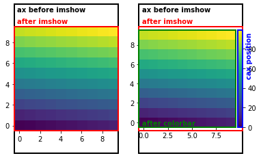
最終的にできたfigからデータとcolorbarを除いてより見やすくします。
axes[0].set_visible(False)
axes[1].set_visible(False)
cax.set_visible(False)
fig
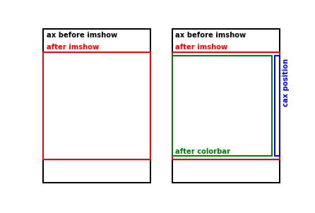
この図から、colorbarを追加すると図が縮む機序は以下のようになってると言えます。
-
plt.suplotsは(gridspec_kwでwidth_ratiosなどを指定しない限り)余白を除いたFigureの領域を等分割してsubplotのAxesに割り当てる。 -
imshowはアスペクト比の固定されたデータが"ax before imshow"の枠ギリギリに収まるようAxesの領域を変更してデータを描画する。 -
divider.append_axesは"after imshow"の枠で示されたAxes領域から指定された割合でcaxのスペースを奪い取り、奪い取った後のimshow描画領域の高さにcaxの高さを自動調節する。 - この結果、スペースを奪われた
Axes領域はcolorbarのついていないAxesより小さくなる。
つまり、全てのsubplotを同じ大きさに保ちつつcolorbarを一本だけ追加するには
- 他のsubplotの
Axes領域をcolorbarをつけたAxesと同じだけ縮ませる - colorbar設置時に親
Axesが場所を譲らずに済むように、subplot作成時になんらかの方法で前もってcolorbar用のAxes領域(通称cax)を確保しておく
という二つの方針が有効だとわかります。また、場合によってはcolorbarのサイズをsubplotに合わせる必要もあります8。先に紹介したMatplotlib 2 Subplots, 1 Colorbar
についた回答群では、これらの方針に基づいたcolorbarのサイズと位置調整の方法が網羅されています。そこで、解剖によって得た基礎知識を適用する具体例として上記回答群の中ででてきた手法を整理して詳しく見てみます。
サイズと位置調整の例:複数のsubplotに共通スケールのcolorbarを一つ添える
下の図のようにシンプルなfig.colorbarだけではイマイチな仕上がりになってしまう失敗例に対して、少し寄り道をしながらいろいろな方法を適用して、いい感じに仕上げていきます。
目標
調整の基準は以下の通りです。
- 複数のsubplotに共通のスケールを表すcolorbarを一つ添える。
- subplotの大きさを全て揃える。
- colorbarの幅あるいは高さをsubplotに合わせる
- Examplesのこれのような手動調整や計算は可能な限り避ける。
- subplotの間隔とfigsizeに対する位置は調整対象にしない。
「colorbar用AxesをどうやってFigureに押し込むか」「subplotとcolorbarのサイズ調整が必要かどうか」という点で異なるいくつかの方法を用いて、これらの基準をクリアしていきます。前者に着目すると以下の二つの方針があり、それぞれにいくつかの方法が対応しています。
- 親
Axesからスペースを奪う-
axオプション make_axes_locatable
-
- subplot用
Axesを用意する際に同時にcolorbar用Axesも確保する-
subplots_adjust+add_axes -
width_ratiosキーワード ImageGrid
-
また、colorbarのサイズ調整には
-
Figure座標ベースのax.get_positionメソッド -
Axes座標ベースのmpl_toolkits.axes_grid1.inset_locator.InsetPosition
が使えます。Figureのサイズに対する割合でcolorbarの大きさを指定したほうが見た目を想定して数字を指定しやすいので、この後の説明では前者を採用します。後者のInsetPositionを使うやり方はこの回答で知りましたが、この方法が適したケースはあまりないのではないかなと思っています。
サイズ調整の有無が必要かどうかは、Axesの追加方法だけでなくデータとAxesのアスペクト比、colorbarの長軸方向によっても左右されます。したがって、SOの回答やここの例でうまくできてるように見えても、subplotの行と列の数やfigsizeが変わると親Axes作成時のアスペクト比も変わるので、手元のデータに適用する際には不都合が生じる可能性があります。また、表示したいデータのアスペクト比を固定するかどうかも決定的な差を生みます。例えばimshowのaspectが固定の'equal'(デフォルト)かAxes領域にピッタリ合わせてくれる'auto'かで話は大きく変わります9。
シンプルなfig.colorbarで起こっていること
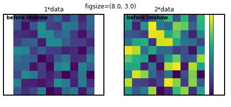
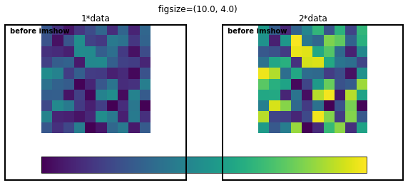
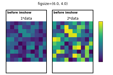
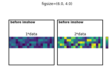
先ほど示した図にplt.subplots直後のAxesの領域を示す枠をつけて、colorbarのtickを消した図を再度作ります。解剖の例と見分けやすくするため、サンプルデータは乱数にします。
np.random.seed(100) # 再現性確保のための乱数シード
data = np.random.rand(10, 10)

fig, axes = plt.subplots(nrows=1, ncols=2)
fig.suptitle('figsize=({}, {})'.format(fig.get_figwidth(), fig.get_figheight()))

imgs = MultipleImagesAndRectangle(fig, axes, data)

cbar = fig.colorbar(imgs[-1], orientation='vertical') # デフォルトはfraction=0.15, aspect=20, pad=0.05
cbar.ax.axis('off')
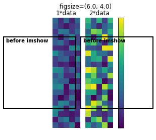
この図と、先ほどmake_axes_locatableをつかって解剖した図(下に再掲)を比べてみます。
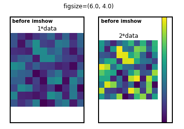
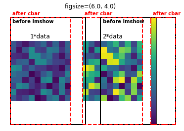
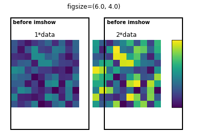
fig.colorbarのみで追加したcolorbarの右側には"ax before imshow"枠との間に余白があります。これは親Axesから5%の間隔をあけて15%の領域を奪っておきながら(デフォルト設定のpad=0.05, fraction=0.15)、Figure描画時にaspect=20になるように幅が調整されているからです。これはAxes領域が変化するたびに枠を書くとよくわかります。
fig, axes = plt.subplots(nrows=1, ncols=2)
fig.suptitle('figsize=({}, {})'.format(fig.get_figwidth(), fig.get_figheight()))

# "before imshow"枠追加
imgs = MultipleImagesAndRectangle(fig, axes, data)

cbar = fig.colorbar(imgs[-1], orientation='vertical') # デフォルトはfraction=0.15, aspect=20
cbar.ax.axis('off')

AddAxesBBoxRectAndText(fig, axes[0], 'after cbar', 'r', ls='--', va='bottom', dy=0.01)
AddAxesBBoxRectAndText(fig, axes[1], 'after cbar', 'r', ls='--', va='bottom', dy=0.01)
AddAxesBBoxRectAndText(fig, cbar.ax, 'after cbar', 'r', ls='-.', va='bottom', dy=0.01)

fig.canvas.draw() # この後に書いた枠が実際に描画されるAxes領域
AddAxesBBoxRectAndText(fig, axes[0], 'after draw', 'b', '--', va='bottom', dy=0.01)
AddAxesBBoxRectAndText(fig, axes[1], 'after draw', 'b', '--', va='bottom', dy=0.01)
AddAxesBBoxRectAndText(fig, cbar.ax, 'after draw', 'b', '--')
aspectに従った自動調整は余計な余白を発生させることが多いです。これは、この後の方法に出てくるとおり、自分で用意したcolorbar用のAxes領域をcaxオプションで指定してaspectを無効にすることで回避できます。
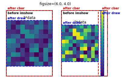
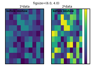
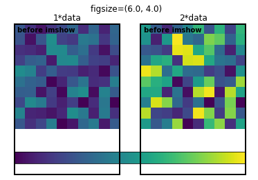
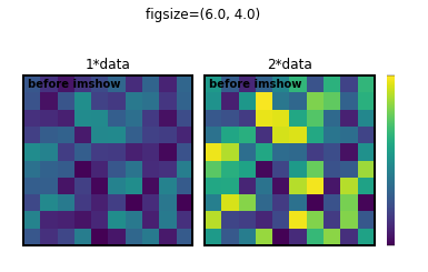
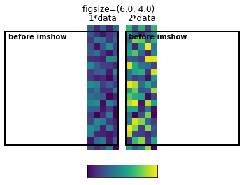
調整しなくてもよい場合
データやAxesの描画領域のアスペクト比の関係によってはAxesやcolorbarのサイズを調整しなくてよいこともあります。
# 縦長Axesに縦長データの場合
fig, axes = plt.subplots(nrows=1, ncols=2)
fig.suptitle('figsize=({}, {})'.format(fig.get_figwidth(), fig.get_figheight()))

imgs = MultipleImagesAndRectangle(fig, axes, data.reshape(20,5))

cbar = fig.colorbar(imgs[-1], orientation='vertical')
cbar.ax.axis('off')
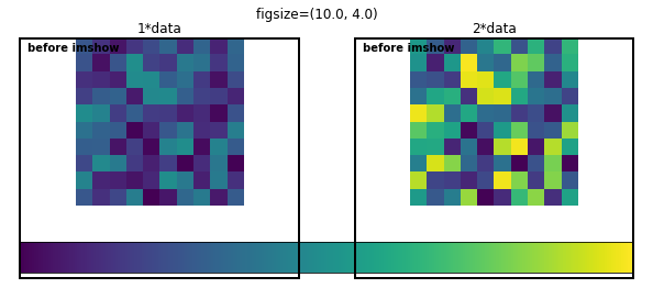
# 横長Axesに正方形データの場合
fig, axes = plt.subplots(nrows=1, ncols=2, figsize=(8, 3))
fig.suptitle('figsize=({}, {})'.format(fig.get_figwidth(), fig.get_figheight()))

imgs = MultipleImagesAndRectangle(fig, axes, data)

cbar = fig.colorbar(imgs[-1], orientation='vertical')
cbar.ax.axis('off')
# データのアスペクト比を'equal'で固定せずに、'auto'でAxesに合わせた場合
# ax.pcolorなども該当
fig, axes = plt.subplots(nrows=1, ncols=2)
fig.suptitle('figsize=({}, {})'.format(fig.get_figwidth(), fig.get_figheight()))

imgs = MultipleImagesAndRectangle(fig, axes, data, aspect='auto')

cbar = fig.colorbar(imgs[-1], orientation='vertical')
cbar.ax.axis('off')
axオプション
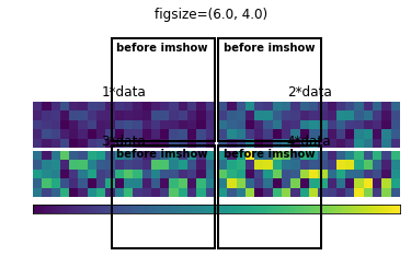
この回答の方法です。fig.colorbarメソッドのマニュアルをよく読むと、__axオプションはAxesのリストを受け取るとそれらのスペースを"盗んで" colorbarを作る__と書いてあります。axを使わない場合と同様に、fractionオプションで親Axesから奪うスペースの割合を指定できますが、以下の例では全てデフォルトのfraction=0.15のままです。
# 水平方向は問題ない
fig, axes = plt.subplots(nrows=1, ncols=2)
fig.suptitle('figsize=({}, {})'.format(fig.get_figwidth(), fig.get_figheight()))

imgs = MultipleImagesAndRectangle(fig, axes, data)

# horizontalではデフォルトはpad=0.15
cbar = fig.colorbar(imgs[-1], ax=axes.ravel().tolist(), orientation='horizontal')
cbar.ax.axis('off')
上の例では余白調整の余地はありますが、縦長Axesに正方形のデータを表示させているのでcolorbarのサイズはばっちりです。しかし、colorbarは"before imshow"の領域を目一杯使ってしまうため親Axesが横長になると微妙になります10。
# 横長Axesに水平方向につけると微妙になる
fig, axes = plt.subplots(nrows=1, ncols=2, figsize=(10, 4))
fig.suptitle('figsize=({}, {})'.format(fig.get_figwidth(), fig.get_figheight()))

imgs = MultipleImagesAndRectangle(fig, axes, data)

cbar = fig.colorbar(imgs[-1], ax=axes.ravel().tolist(), orientation='horizontal')
cbar.ax.axis('off')
このケースのように、colorbarのサイズをAxesの幅に合わせたいときは、Figure座標系ベースのAxes描画領域を取得するax.get_position()が使えます。fig.canvas.draw()で値を更新する必要がある点に注意が必要です。
# `get_position`で取得した`Axes`の位置とサイズを使ってcolorbarの幅を自動的に合わせる
fig, axes = plt.subplots(nrows=1, ncols=2, figsize=(10, 4))
fig.suptitle('figsize=({}, {})'.format(fig.get_figwidth(), fig.get_figheight()))

imgs = MultipleImagesAndRectangle(fig, axes, data)

cbar = fig.colorbar(imgs[-1], ax=axes.ravel().tolist(), orientation='horizontal')
cbar.ax.axis('off')

fig.canvas.draw() # get_positionがimshow後の値になるように更新

x0 = axes[0].get_position().x0 # 左図の左端x座標
x1 = axes[1].get_position().x1 # 右図の右端x座標
caxpos = cbar.ax.get_position() # colorbar自体の座標
cbar.ax.set_position([x0, caxpos.y0, x1-x0, caxpos.height]) # [left, bottom, width, height]
colorbarを図の右側にverticalにつけてみるとまた事情が変わります。
# 縦長Axesに縦につけるとシンプルなfig.colorbarと同じ結果になる
# このときスペース強奪対象は左側のaxes[1]のみ
fig, axes = plt.subplots(nrows=1, ncols=2)
fig.suptitle('figsize=({}, {})'.format(fig.get_figwidth(), fig.get_figheight()))

imgs = MultipleImagesAndRectangle(fig, axes, data)

cbar = fig.colorbar(imgs[-1], ax=axes[1], orientation='vertical')
cbar.ax.axis('off')

AddAxesBBoxRectAndText(fig, axes[0], 'after cbar', 'r', ls='--', va='bottom', dy=0.01)
AddAxesBBoxRectAndText(fig, axes[1], 'after cbar', 'r', ls='--', va='bottom', dy=0.01)
AddAxesBBoxRectAndText(fig, cbar.ax, 'after cbar', 'r', ls='-.', va='bottom', dy=0.01)

上の図では、右側のaxes[1]だけからスペースを奪うようにaxオプションを指定しているため、シンプルなfig.colorbarを使った時と全く同じ図ができます。このとき、左側のaxes[0]はスペース強奪対象ではなく、colorbarにスペースを奪われた右のaxes[1]だけが縮まっています。この不均衡は両方のAxesを強奪対象にすることで解消されます。
# 両方のAxesからスペースを奪う
fig, axes = plt.subplots(nrows=1, ncols=2)
fig.suptitle('figsize=({}, {})'.format(fig.get_figwidth(), fig.get_figheight()))

imgs = MultipleImagesAndRectangle(fig, axes, data)

cbar = fig.colorbar(imgs[-1], ax=axes.ravel().tolist(), orientation='vertical')
cbar.ax.axis('off')

AddAxesBBoxRectAndText(fig, axes[0], 'after cbar', 'r', ls='--', va='bottom', dy=0.01)
AddAxesBBoxRectAndText(fig, axes[1], 'after cbar', 'r', ls='--', va='bottom', dy=0.01)
AddAxesBBoxRectAndText(fig, cbar.ax, 'after cbar', 'r', ls='-.', va='bottom', dy=0.01)
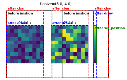
左右の"after cbar"の枠が"before imshow"より縮んでることから、axオプションで指定した左右のAxesが強奪対象になっていることがわかります。次はcolorbarのサイズ調整です。上で描画したfigに対して、次のセルで先程と同様にax.get_position()で取得したAxesの座標を使ってcolorbarのサイズを設定します。描画領域をcaxオプションで直接指定していないため、親Axesから奪った後の領域に対してcolorbarのアスペクト比(デフォルトaspect=20)が適用され最終的に描画されます。
AddAxesBBoxRectAndText(fig, axes[0], 'after draw', 'b', '--', va='bottom', dy=0.01)
AddAxesBBoxRectAndText(fig, axes[1], 'after draw', 'b', '--', va='bottom', dy=0.01)
AddAxesBBoxRectAndText(fig, cbar.ax, 'after draw', 'b', '--')
axpos = axes[1].get_position()
caxpos = cbar.ax.get_position()

cbar.ax.set_position([caxpos.x0, axpos.y0, caxpos.width, axpos.height])
AddAxesBBoxRectAndText(fig, cbar.ax, 'after set_position', 'g')
# 高さを縮めるとfig.colorbarのデフォルトのaspect=20に合わせて幅も縮む
# cbar.ax.set_aspect(axpos.height/caxpos.width) # これでcax領域ぴったりになると思ったがならない。
cbar.ax.set_aspect(14) # だいたいcaxを埋める値

fig
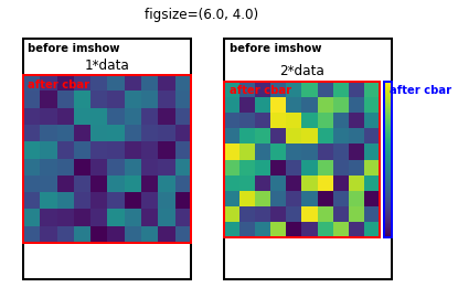
make_axes_locatable
colorbarの高さを図に合わせる方法として公式マニュアルで紹介されている方法だからか、colorbarの調整に関するレシピでよく見かけます。しかし、この方法でも複数のsubplotがあるときはカラーバーのついてるAxesだけ縮んでしまいます。
# 公式マニュアル通りにやると図が縮む
fig, axes = plt.subplots(1, 2)
fig.suptitle('figsize=({}, {})'.format(fig.get_figwidth(), fig.get_figheight()))

imgs = MultipleImagesAndRectangle(fig, axes, data)

divider = make_axes_locatable(axes[1])
cax = divider.append_axes("right", "5%", pad="3%")
cbar = fig.colorbar(imgs[-1],  cax=cax, orientation='vertical')
cax.axis('off')

fig.canvas.draw()

AddAxesBBoxRectAndText(fig, axes[0], 'after cbar', 'r')
AddAxesBBoxRectAndText(fig, axes[1], 'after cbar', 'r')
AddAxesBBoxRectAndText(fig, cax, 'after cbar', 'b')
make_axes_locatableも親Axesの領域を奪うタイプの方法ですが、fig.colorbarのaxオプションとは違い、スペース強奪対象に複数のAxesを指定できない仕様になっています。そこで、Axesのサイズを統一させるためにcolorbarのついていないAxesを縮ませる方法を採用します。
# 仮描画してget_position()の値を更新、下端と幅、高さを右の図と合わせる

fig, axes = plt.subplots(1, 2)
fig.suptitle('figsize=({}, {})'.format(fig.get_figwidth(), fig.get_figheight()))

imgs = MultipleImagesAndRectangle(fig, axes, data)

divider = make_axes_locatable(axes[1])
cax = divider.append_axes("right", "10%", pad="3%")
cbar = fig.colorbar(imgs[-1],  cax=cax, orientation='vertical')
cax.axis('off')

fig.canvas.draw()

axpos = axes[1].get_position() # 右の図の描画領域
x0 = axes[0].get_position().x0 # 左の図の左下のFigure座標系での横方向位置
axes[0].set_position([x0, axpos.y0, axpos.width, axpos.height])

スペース強奪対象に複数のAxesを指定できないので、make_axes_locatableにはaxオプションの例にあったようなsubplot2行分にまたがるcaxは(少なくとも気軽には)作れないという欠点があります。しかし、自分で用意したcaxをfig.colorbarに渡しているため、aspectによる最終描画時の(多くの場合想定外の見た目につながる)高さと幅の自動調整がないという利点があります。
gridspec_kwオプションのwidth_ratios
Joe Kingtonに並ぶ名物回答者ImportanceOfBeingErnestの回答で紹介されています。
plt.subplotsはFigureを等分割するタイプのsubplotによく使われますが、実はgridspec_kwオプションのwidth_ratiosやheight_ratiosを使うと行と列ごとに高さと幅の比率を指定したsubplotを作ることもできます。以下の例では1行2列のsubplotと幅の細い3列目のcolorbar用Axesを用意しています。
# numpy arrayで渡されるAxesのうち最後の要素をcaxに、あとはaxesに代入
fig, (*axes, cax) = plt.subplots(nrows=1, ncols=3, gridspec_kw={'width_ratios':(1,1,0.1)})
fig.suptitle('figsize=({}, {})'.format(fig.get_figwidth(), fig.get_figheight()))

imgs = MultipleImagesAndRectangle(fig, axes, data)

cbar = fig.colorbar(imgs[-1], cax=cax)
cax.axis('off')

fig.canvas.draw()

axpos = axes[1].get_position()
caxpos = cax.get_position()
cax.set_position([caxpos.x0, axpos.y0, caxpos.width, axpos.height]) # caxの下端と高さを右のグラフに合わせる
スペース強奪によって図が小さくなることはなくなりましたが、データとAxesのアスペクト比の関係によってはcbarのサイズ調整が必要なのは変わりません。上の例ではcaxの下端と高さをデータ描画Axesに合わせています。2行にまたがるcolorbarが欲しい場合はGridSpecを使ってcolorbar用に2行分のAxesを結合するなど少しややこしいことが必要になりますが、一方でこの方法もcaxを指定しているのでaspectによる自動調整はありません。
fig.subplots_adjust+fig.add_axes
前述のSOの質問に対してもっともvoteの多いJoe Kingtonの回答でも紹介されています11。fig.subplots_adjustによってデータ描画用Axesからcolorbar用のスペースを奪い、fig.add_axesで奪ったスペースにcolorbar用のAxesを作るという、一連の作業を最も明示的に行う方法です。元のSOの回答ではcaxの領域をマニュアルで指定していますが、下の例ではsubplotの高さに合わせるためにax.get_positionで得た数字を使うように改良しました。この改良は複数行のsubplotでも使えます。
fig, axes = plt.subplots(1, 2)
fig.suptitle('figsize=({}, {})'.format(fig.get_figwidth(), fig.get_figheight()))

imgs = MultipleImagesAndRectangle(fig, axes, data)

fig.subplots_adjust(right=0.8)

fig.canvas.draw()

axpos = axes[1].get_position()
cax = fig.add_axes([0.85, axpos.y0, 0.05, axpos.height])
cbar = fig.colorbar(imgs[-1],  cax=cax, orientation='vertical')
cax.axis('off')
mpl_toolkits.axes_grid1.ImageGrid
実は最後に紹介するこの方法が__複数のsubplotにcolorbarをつける方法の中で最も良きに計らってくれる方法__です12。AxesGridとしているチュートリアルもありますが、開発途中で名前が変わったのか現在はImageGridが正式名称のようです。ソースコードでもAxesGrid = ImageGridとなっています。どれだけ良きに計らってくれるかはこちらのギャラリーを見ると分かるでしょう。ここでも上で紹介してきた方法と同じような図を作ります。
fig = plt.figure()
fig.suptitle('figsize=({}, {})'.format(fig.get_figwidth(), fig.get_figheight()))

# plt.subplotsは配置に基づいたnumpy arrayを返すが、ImageGridはつねにリストを返す
grid = ImageGrid(fig, 111, nrows_ncols=(1, 2), axes_pad=0.15, share_all=True, label_mode='L',
                cbar_location='right', cbar_mode='single')

fig.canvas.draw()

imgs = MultipleImagesAndRectangle(fig, grid, data)

cbar = grid.cbar_axes[0].colorbar(imgs[-1])
cbar.ax.axis('off') # これまでのcbar.axとはこのコマンドの振る舞いが少し違う(枠が消えてしまう)
cbar_locationとcbar_modeオプションを使って__「右側に一本だけcolorbarをつけて」と指示しただけ__で統一されたサイズのsubplotとそれらと同じ高さのcolorbarができました。これまでの方法に比べていかに楽かがわかります。この非常に便利なImageGridを使うにあたっては、いくつかの注意があります。
- 配置を再現した2D numpy arrayを返す
plt.subplotsと違い、ImageGridが返すのはつねにリスト -
ImageGridオブジェクト作成時に同時に作られるcolorbar用の領域はmpl_toolkits.axes_grid1.axes_grid.CbarAxesオブジェクトであり、これまでの方法で作ってきたmatplotlib.axes._axes.Axesオブジェクトとは少し振る舞いが異なる -
grid.cbar_axes[0].colorbarで生成されたcolorbarはmpl_toolkits.axes_grid1.colorbar.Colorbarオブジェクトであり、これもこれまでfig.colorbarで作ってきたmatplotlib.colorbar.Colorbarオブジェクトとは少し異なる - 少し描画に時間がかかる
1はforループにgridを渡す際に、Axesオブジェクトでいつもやるようにgrid.ravel()やgrid.flatとやるとエラーになる原因です。2は、この記事で扱っている範囲ではcbar.ax.axis('off')の振る舞い(枠線の有無)に現れています。3は例えばImageGridのcolorbarだとcbar.cbar_axisでtickのついているAxisを指定できます。上の図ではおそらく2に関連してcolorbarの左右両端に妙な色の部品(PathPatch)がつくという、これまでの例で作ってきたcolorbarには見られなかった現象が起こっています。これらに対応してこれまでと同様の見た目に仕上げるには以下のようにします。
fig = plt.figure()
fig.suptitle('figsize=({}, {})'.format(fig.get_figwidth(), fig.get_figheight()))

# plt.subplotsは配置に基づいたnumpy arrayを返すが、ImageGridはつねにリストを返す
grid = ImageGrid(fig, 111, nrows_ncols=(1, 2), axes_pad=0.15, share_all=True, label_mode='L',
                cbar_location='right', cbar_mode='single')

fig.canvas.draw()

imgs = MultipleImagesAndRectangle(fig, grid, data)

cbar = grid.cbar_axes[0].colorbar(imgs[-1])
# cbar.ax.axis('off')
cbar.cbar_axis.set_visible(False) # これまでと同じ見た目にするにはこっち(cbar_axisはtickがついているAxisを指す)
# cbar.ax.xaxis.set_visible(False) # このようにtickのついているAxisオブジェクトを直接操作するのと等価
cbar.ax.artists = [] # axisを消すと両端に見える謎のPathPatchを削除
cbar.cbar_axisというattributeは他の例で作ったcolorbarにはなかったものです。また、cbar.cbar_axisと似たようなgrid.cbar_axesというcolorbar用のAxesだけが入ったリストもあります。ここからもImageGridがcolorbarに特別な配慮をしていることがわかります。以下にデータのアスペクト比とcolorbarの位置を変えた例を示します。
grid = ImageGrid(fig, 111, nrows_ncols=(1, 2), axes_pad=0.15, share_all=True, label_mode='L',
                cbar_location='right', cbar_mode='single')
imgs = MultipleImagesAndRectangle(fig, grid, data.reshape(5,20))
grid = ImageGrid(fig, 111, nrows_ncols=(1, 2), axes_pad=0.15, share_all=True, label_mode='L',
                 cbar_location='right', cbar_mode='single', cbar_size='20%')
imgs = MultipleImagesAndRectangle(fig, grid, data.reshape(20,5))
grid = ImageGrid(fig, 111, nrows_ncols=(1, 2), axes_pad=0.15, share_all=True, label_mode='L',
                cbar_location='bottom', cbar_mode='single')
imgs = MultipleImagesAndRectangle(fig, grid, data.reshape(5,20))

grid = ImageGrid(fig, 111, nrows_ncols=(1, 2), axes_pad=0.15, share_all=True, label_mode='L',
                cbar_location='bottom', cbar_mode='single')
imgs = MultipleImagesAndRectangle(fig, grid, data.reshape(20,5))
grid = ImageGrid(fig, 111, nrows_ncols=(2, 2), axes_pad=0.05, share_all=True, label_mode='L',
                cbar_location='bottom', cbar_mode='single', cbar_size='10%')
imgs = MultipleImagesAndRectangle(fig, grid, data.reshape(5,20))
ImageGrid以外の方法ではこれらの中のどれかのケースは必ずデータ描画領域かcolorbarの調整を要しましたが、ImageGridでは必要ありません。Axes間隔やcolorbarの太さもaxes_padやcbar_sizeで変えられます。
tick関連調整の例:桁の異なる数値を持つ二次元データをlogスケールで色付けし、colorbarに適切なtickをつける
ここではlogスケールを使うべきデータをimshowで表示する際のcolorbar調整の具体的な方法を説明します。まずシャープで強いピークとブロードで弱いバックグラウンドのような強度分布を持つデータを用意します。
size = 100
X, Y = np.meshgrid(range(size), range(size))
data = 2*gaussian2d(X, Y, (20, 30), 5) + 0.05*gaussian2d(X, Y, (49, 49), 40)
fig = plt.figure(figsize=(10,4))
grid = ImageGrid(fig, 111, nrows_ncols=(1, 2), axes_pad=0.5, label_mode='L',
                cbar_location='right', cbar_mode='each', cbar_pad=0.2)

im = grid[0].imshow(data, origin='lower')
grid[0].set_title('linear scale')
cbar = grid.cbar_axes[0].colorbar(im)
im = grid[1].imshow(data, origin='lower', norm=LogNorm())
grid[1].set_title('log scale')
cbar = grid.cbar_axes[1].colorbar(im, locator=LogLocator())
cbar.cbar_axis.set_major_formatter(LogFormatterSciNotation())
cbar.cbar_axis.set_minor_locator(LogLocator(subs='auto'))
cbar.ax.xaxis.set_visible(False)
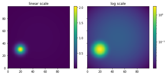
左のようにlinearスケールで表示してもバックグラウンド構造は見えませんが、右のようにlogスケールにするとぼんやりとなにか見えます。こういうデータをlogスケールで色付けして適切なcolorbarを添えるにはどういう方法があるのか、何を知っていればいいのかという点に注目して述べます。ただし、前述の通りplt.colorbar及びfig.colorbarで追加したcolorbarとImageGridのcolorbarは別モノであり、tick関連の仕様が少し違うので注意が必要です13。
plt.colorbar及びfig.colorbarの場合
前述したようにplt.colorbarやfig.colorbarで作ったcolorbarのtick関連の調整をする際は、cbar自体に属性として設定されているtickerの働きに注意する必要があります。以下にmatplotlib.colorbar.Colorbarオブジェクトの仕様と注意点をまとめます。
- colorbarには
Axisのtickerとは別にcbar.locator,cbar.formatterが設定されている。 - colorbarのtickとtick labelはこれらに従って作られ、
AxisのFixedLocatorによりvminとvmaxで規格化された位置に設定され,FixedFormatterによってデータの実際の値に対応するtick labelが表示されている。 -
cbar.locatorがNoneの場合でも良きに計らった値が用意されFixed系tickerに渡される。 -
cbar.formatterとcbar.locatorを変更したらcbar.update_ticks()を実行しないと反映されない。 -
cbar.update_ticks()はcbarのtickerを元にset_ticksとset_ticklabelsを実行してAxisにFixed系tickerを設定する。 -
Axisに設定したmajor tickerはFixed系に上書きされる。つまりAxisのmajor tickにtickerを設定しても意味がない。 - minor tickとtick labelはNull系になっているだけなので上書きはされず、
set_minor_locator/formatterで設定した内容は有効。
つまり、取るべき方針は以下の二つになります。
- major tickは
cbar.locatorとcbar.formatterで調整する。 - minor tickは
vminとvmaxを使って規格化した0-1の値を用意してFixedLocatorで設置する。
Locatorのいじり方
実際にlogスケールの設定方法を説明する前に、matplotlib.colorbar.Colorbarオブジェクトのtickerの振る舞いを確認します。以下の例ではキリの良い整数(この例では1と2)にだけmajor tickを配置するようにいろいろな方法でMultipleLocator(1)を設定しています。
fig, axes = plt.subplots(2, 4, figsize=(16,8))
fig.suptitle('MultipleLocator(1) test', y=0.93)


axes_ = axes.ravel()

titles = ['1. default',
          '2. colorbar `ticks` kw',
          '3. cbar.locator\nupdate_ticks',
          '',
          '4. set_major_locator',
          '5. set_major_locator\nupdate_ticks',
          '6. set_ticks\nupdate_ticks=True',
          '7. set_ticks\nupdate_ticks=False']

tickskw = [None, MultipleLocator(1), None, None, None, None, None, None]
cblocs = [False, False, True, False, False, False, False, False]
mjlocs = [False, False, False, False, True, True, False, False]
set_ticks = [False, False, False, False, False, False, True, True]
updates = [False, False, True, False, False, True, True, False]

for i, (ax, title, tickloc, cbloc, mjloc, set_ticks_, update) in enumerate(zip(axes_, titles, tickskw, cblocs, mjlocs, set_ticks, updates)):
    if i==3:
        ax.set_visible(False)
        continue

    img = ax.imshow(data, origin='lower')
    cbar = fig.colorbar(img, ax=ax, ticks=tickloc)
    ax.set_title(title)
    ax.axis('off')

    if cbloc:
        cbar.locator = MultipleLocator(1)

    if mjloc:
        cbar.ax.yaxis.set_major_locator(MultipleLocator(1))

    if set_ticks_:
        cbar.set_ticks(MultipleLocator(1), update_ticks=update) # update_ticksはTrueがデフォルト
        print('\n', title)
        print('cbar.locator:\t', type(cbar.locator))
        print('yaxis locator:\t', type(cbar.ax.yaxis.get_major_locator()))
        continue

    if update:
        cbar.update_ticks()

    print('\n', title)
    print('cbar.locator:\t', type(cbar.locator))
    print('yaxis locator:\t', type(cbar.ax.yaxis.get_major_locator()))
 1. default
cbar.locator:	 <class 'NoneType'>
yaxis locator:	 <class 'matplotlib.ticker.FixedLocator'>

 2. colorbar `ticks` kw
cbar.locator:	 <class 'matplotlib.ticker.MultipleLocator'>
yaxis locator:	 <class 'matplotlib.ticker.FixedLocator'>

 3. cbar.locator
update_ticks
cbar.locator:	 <class 'matplotlib.ticker.MultipleLocator'>
yaxis locator:	 <class 'matplotlib.ticker.FixedLocator'>

 4. set_major_locator
cbar.locator:	 <class 'NoneType'>
yaxis locator:	 <class 'matplotlib.ticker.MultipleLocator'>

 5. set_major_locator
update_ticks
cbar.locator:	 <class 'NoneType'>
yaxis locator:	 <class 'matplotlib.ticker.FixedLocator'>

 6. set_ticks
update_ticks=True
cbar.locator:	 <class 'matplotlib.ticker.MultipleLocator'>
yaxis locator:	 <class 'matplotlib.ticker.FixedLocator'>

 7. set_ticks
update_ticks=False
cbar.locator:	 <class 'matplotlib.ticker.MultipleLocator'>
yaxis locator:	 <class 'matplotlib.ticker.FixedLocator'>

2, 3, 6だけうまくいっています。set_major_locatorを使った失敗例では、update_ticks前は規格化されたcbar.ax.yaxisの両端である0と1にだけmajor tickが表示され、tick labelはよくわからないことになっています(上図の4)。update_ticksを実行するとdefaultのtickに上書きされていることがわかります(上図の5)。これでcbar.locatorの設定方法には三つの方法があることがわかりました。
-
plt.colorbarまたはfig.colorbarのticksオプションでLocatorオブジェクトを指定する -
cbar.locatorに直接Locatorオブジェクトを渡してcbar.update_ticksを実行する -
cbar.set_ticksメソッドにLocatorオブジェクトを渡す14(update_ticksオプションはTrueがデフォルト)
Formatterのいじり方
Formatterも同様に調べて見ます。tickの位置はデフォルトのままで、tick labelにFuncFormatterで使われる引数xとposをそのまま表示してみます。
fig, axes = plt.subplots(2, 3, figsize=(12,8))
fig.suptitle('FuncFormatter test', y=0.93)

@FuncFormatter # FuncFormatterはデコレータとしても使えます
def TestFormatter(x, pos):
   # xはcax.yaxis上のtickの位置、posは0始まりで何番目のtickかを示す
    return '{:.2f}, {}'.format(x, pos)

axes_ = axes.ravel()

titles = ['1. default',
          '2. colorbar format kw',
          '3. cbar.formatter\nupdate_ticks',
          '4. set_major_formatter',
          '5. set_major_formatter\nupdate_ticks']

formatkw = [None, TestFormatter, None, None, None]
cbforms = [False, False, True, False, False]
mjforms = [False, False, False, True, True]
updates = [False, False, True, False, True]

for i, (ax, title, tickformat, cbform, mjform, update) in enumerate(zip(axes_, titles, formatkw, cbforms, mjforms, updates)):

    img = ax.imshow(data, origin='lower')
    cbar = fig.colorbar(img, ax=ax, format=tickformat)
    ax.set_title(title)
    ax.axis('off')

    if cbform:
        cbar.formatter = TestFormatter

    if mjform:
        cbar.ax.yaxis.set_major_formatter(TestFormatter)

    if update:
        cbar.update_ticks()

    print('\n', title)
    print('cbar.formatter:\t', type(cbar.formatter))
    print('yaxis formatter:\t', type(cbar.ax.yaxis.get_major_formatter()))

axes_[5].set_visible(False)
 1. default
cbar.formatter:	 <class 'matplotlib.ticker.ScalarFormatter'>
yaxis formatter:	 <class 'matplotlib.ticker.FixedFormatter'>

 2. colorbar format kw
cbar.formatter:	 <class 'matplotlib.ticker.FuncFormatter'>
yaxis formatter:	 <class 'matplotlib.ticker.FixedFormatter'>

 3. cbar.formatter
update_ticks
cbar.formatter:	 <class 'matplotlib.ticker.FuncFormatter'>
yaxis formatter:	 <class 'matplotlib.ticker.FixedFormatter'>

 4. set_major_formatter
cbar.formatter:	 <class 'matplotlib.ticker.ScalarFormatter'>
yaxis formatter:	 <class 'matplotlib.ticker.FuncFormatter'>

 5. set_major_formatter
update_ticks
cbar.formatter:	 <class 'matplotlib.ticker.ScalarFormatter'>
yaxis formatter:	 <class 'matplotlib.ticker.FixedFormatter'>
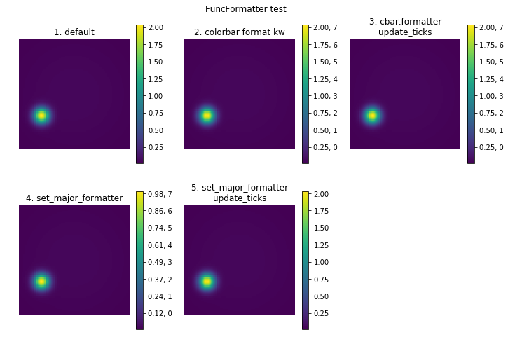
うまくいっているのは2と3です。set_ticklabelsメソッドは、Locatorを受け付けるset_ticksメソッドとは異なり、tick labelのリストしか受け付けないのでFormatterの設定には使えません。上の図から二つの方法でcolorbarのFormatterを設定できることがわかります。
-
plt.colorbarまたはfig.colorbarのformatオプションでFormatterを指定する -
cbar.formatterに直接Formatterオブジェクトを渡してupdate_ticksを実行する
logスケールに適した見た目にする
ここまで述べてきたmatplotlib.colorbar.Colorbarオブジェクトのtickerに関する知識を応用してlogスケールのデータにふさわしいcolorbarを作ってみます。おすすめはimshowにlinearスケールのデータを渡してLogNormを使う方法ですが、ここでは0-1に規格化されたcolorbarのtickの扱い方を学ぶためにlogスケールに変換したデータにうまいことlogスケールのtickをもつcolorbarをつける方法も述べます。どちらの方法もNaNや負の値を含むデータであっても警告は出ますがエラーにはならずにそれらの要素をNaNとして扱って背景色(デフォルトのカラーマップviridisでは透明)で表示します15。
# 一部にNaNと負の数値を設定
data[60:65, 70:75] = -0.1
data[50:55, 80:85] = np.nan

fig, axes = plt.subplots(2, 4, figsize=(16,8))
fig.suptitle('Log scale examples with NaN and negative pixels')

axes_=axes.ravel()

titles = ['1. default:imshow(data)',
          '2. norm=LogNorm',
          '3. norm=LogNorm\nminor locator',
          '4. set_norm(LogNorm)',
          '5. imshow(SafeLog10(data))',
          '6. imshow(SafeLog10(data))\nmajor locator&formatter',
          '7. imshow(SafeLog10(data))\nmajor locator&formatter\nminor locator']
logdata =SafeLog10(data)
logs = [data, data, data, data, logdata, logdata, logdata]
normkws = [None, LogNorm(), LogNorm(), None, None, None, None]
norms = [False, False, False, True, False, False, False]
mnlocs = [False, False, True, False, False, False, True]
mjlocforms = [False, False, False, False, False, True, True]

# logスケールにしたデータのtick label用
@FuncFormatter
def ConvertToExponent(x, pos):
    return '10$^{}$'.format({int(x)})

for i, (ax, title, log, normkw, norm, mnloc, mjlocform) in enumerate(zip(axes_, titles, logs,
                                                                         normkws, norms, mnlocs, mjlocforms)):

    img = ax.imshow(log, origin='lower', norm=normkw)
    if norm:
        img.set_norm(LogNorm())

    cbar = fig.colorbar(img, ax=ax)
    ax.set_title(title)
    ax.axis('off')

    # linearスケールでキリのいい数字を持ったlogスケールのtick位置をvmin, vmaxで規格化
    if mnloc:
        if isinstance(cbar.norm, LogNorm):
            # LogNormが0-1の間に設定したminor tickもどきを含むmajor tickを取得する
            allticks = cbar.ax.yaxis.get_majorticklocs()
        elif log is logdata:
            # tick位置を規格化する必要があるので厄介
            # 適当にたくさんtickを作ってデータ値の範囲に収まるtickだけ表示させる方法はダメ
            boundaries = 10**np.array((cbar.vmin, cbar.vmax)) # linearスケールでの最小値と最大値を取得
            decimals = np.floor((cbar.vmin, cbar.vmax)) # オーダーを取得
            # linearスケールでキリのいい数字の両端のtick
            endticks = np.array(np.ceil(boundaries[0]*10**-decimals[0]),
                                np.floor(boundaries[1]*10**-decimals[1]))*10**decimals
            allticks = []
            scale = int(decimals[1]-decimals[0]+1) # 何桁に渡るデータか
            # linearスケールで各桁のminor tickの位置を計算
            for i in range(scale):
                start = 10**(decimals[0]+i)
                end = 10**(decimals[0]+i+1)
                step = start
                if i == 0:
                    start = endticks[0]
                elif i == scale-1:
                    end = endticks[1] + step
                allticks.extend(np.arange(start, end, step))
            # logスケールで規格化する
            allticks = (np.log10(allticks)-cbar.vmin)/(cbar.vmax-cbar.vmin) # normalizing

        cbar.set_ticks([1, 0.1])
        cbar.ax.yaxis.set_minor_locator(FixedLocator(allticks))
        cbar.update_ticks()

    if mjlocform:
        cbar.locator = MultipleLocator(1)
        cbar.formatter = ConvertToExponent
        cbar.update_ticks()

    print('------- ', title.replace('\n', ', '))
    print('cbar.locator:\t', type(cbar.locator))
    print('cbar.formatter:\t', type(cbar.formatter))
    print('yaxis mn loc:\t', type(cbar.ax.yaxis.get_minor_locator()))
    print('yaxis mn form:\t', type(cbar.ax.yaxis.get_minor_formatter()))

axes_[7].set_visible(False)
-------  1. default:imshow(data)
cbar.locator:	 <class 'NoneType'>
cbar.formatter:	 <class 'matplotlib.ticker.ScalarFormatter'>
yaxis mn loc:	 <class 'matplotlib.ticker.NullLocator'>
yaxis mn form:	 <class 'matplotlib.ticker.NullFormatter'>
-------  2. norm=LogNorm
cbar.locator:	 <class 'NoneType'>
cbar.formatter:	 <class 'matplotlib.ticker.LogFormatterSciNotation'>
yaxis mn loc:	 <class 'matplotlib.ticker.NullLocator'>
yaxis mn form:	 <class 'matplotlib.ticker.NullFormatter'>
-------  3. norm=LogNorm, minor locator
cbar.locator:	 <class 'matplotlib.ticker.FixedLocator'>
cbar.formatter:	 <class 'matplotlib.ticker.LogFormatterSciNotation'>
yaxis mn loc:	 <class 'matplotlib.ticker.FixedLocator'>
yaxis mn form:	 <class 'matplotlib.ticker.NullFormatter'>
-------  4. set_norm(LogNorm)
cbar.locator:	 <class 'NoneType'>
cbar.formatter:	 <class 'matplotlib.ticker.LogFormatterSciNotation'>
yaxis mn loc:	 <class 'matplotlib.ticker.NullLocator'>
yaxis mn form:	 <class 'matplotlib.ticker.NullFormatter'>
-------  5. imshow(SafeLog10(data))
cbar.locator:	 <class 'NoneType'>
cbar.formatter:	 <class 'matplotlib.ticker.ScalarFormatter'>
yaxis mn loc:	 <class 'matplotlib.ticker.NullLocator'>
yaxis mn form:	 <class 'matplotlib.ticker.NullFormatter'>
-------  6. imshow(SafeLog10(data)), major locator&formatter
cbar.locator:	 <class 'matplotlib.ticker.MultipleLocator'>
cbar.formatter:	 <class 'matplotlib.ticker.FuncFormatter'>
yaxis mn loc:	 <class 'matplotlib.ticker.NullLocator'>
yaxis mn form:	 <class 'matplotlib.ticker.NullFormatter'>
-------  7. imshow(SafeLog10(data)), major locator&formatter, minor locator
cbar.locator:	 <class 'matplotlib.ticker.MultipleLocator'>
cbar.formatter:	 <class 'matplotlib.ticker.FuncFormatter'>
yaxis mn loc:	 <class 'matplotlib.ticker.FixedLocator'>
yaxis mn form:	 <class 'matplotlib.ticker.NullFormatter'>
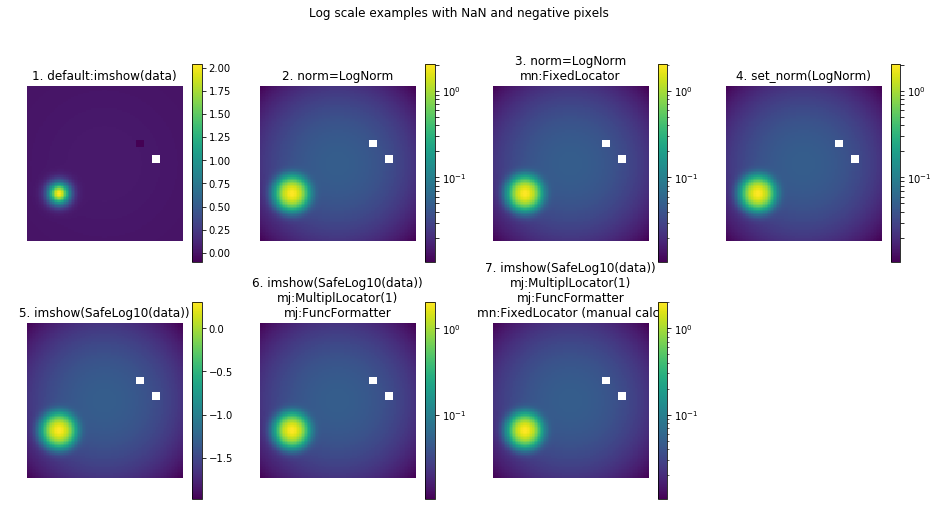
imshowのnormオプションにLogNormを設定するとlinearスケールのデータをlogスケールで表示でき、2のようにcolorbarも自動的にいい感じになるのですが、__よくみるとminor tickがmajor tickと同じ長さ__です。これはfig.colorbarが「Mappableオブジェクト(ここではimg)にLogNormが設定されている場合はLogLocator(subs='all')を使う」という仕様になっているからです。LogLocatorのマニュアルによると、subs='all'の場合は対数の底(デフォルトは10)の整数乗とその間のlinearスケールでキリのいい位置にtickが生成されます。つまり、通常minor tickとして控えめに表示されることが多い後者もmajor tickとして扱っているため2のような結果になっています16。あまり理想的とは言えないこの結果を修正したのが3です。一旦major tickに設定されたminor tickもどきを本物のminor tickとして設定し直しています。4に示した通り、LogNormはimshowのあとでもset_normで設定できます。
5, 6, 7ではあらかじめデータをlogスケールに変換した場合を示しています。このとき、colorbarのtickはlogスケールでキリのいい数字に設置されています。logスケールでの整数のtickはmajor tickとして残しておきたいので、6ではMultipleLocatorとFuncFormatterを使ってまずこれらを適切な表示にしています。ここまでは比較的簡単なのですが、サンプルコードからわかる通りminor tickも欲しい場合は少し厄介です。ゆえに先にデータをlogスケールに変換する方法はあまりおすすめできません。ただtickの位置をvminとvmaxで規格化する例としては参考になるかなと思い載せました。
ImageGridの場合
colorbarの位置とサイズの調整には大変良きに計らってくれたImageGridですが、logスケールのtickに関しては少し微妙なところがあります。これまでと同じく、いくつかの方法を並べてみます。
fig = plt.figure(figsize=(16, 8))
grid = ImageGrid(fig, 111, nrows_ncols=(2, 4), axes_pad=0.5, share_all=True, label_mode='L',
                 cbar_location='right', cbar_mode='each', cbar_pad=0.1)
cbars = []

titles = ['1.default',
          '2.LogNorm\nfailed tick locations (bug)\nunwanted xaxis tick label (bug)',
          '3.LogNorm\nmj:LogLocator()',
          "4.LogNorm\nmj:LogLocator(subs='all')\nmj:LogFormatterSciNotation",
          "5.LogNorm\nmj:LogLocator()\nmj:LogFormatterSciNotation\nmn:LogLocator(subs='auto')",
          '6.Safelog10(data)',
          '7.Safelog10(data)\nmj:MultipleLocator(1)\nmj:ConvertToExponent\nmn:manual calc']

images = [data, data, data, data, data, SafeLog10(data), SafeLog10(data)]
norms = [None, LogNorm(), LogNorm(), LogNorm(), LogNorm(), None, None]
mjlocs = [None, None, LogLocator(), LogLocator(subs='all'), LogLocator(), None, MultipleLocator(1)]
mjforms = [None, None, None, LogFormatterSciNotation(), LogFormatterSciNotation(), None, ConvertToExponent]
mnlocs = [None, None, None, None, LogLocator(subs='auto'), None, 'manual']
xvis = [None, True, False, False, False, None, None]

def SetNormalizedMinorTicks(cbar):
    vmin, vmax = cbar.get_clim()
    boundaries = 10**np.array((vmin, vmax))
    decimals = np.floor((vmin, vmax))
    # truncate is not appropriate in this case
    endticks = np.array(np.ceil(boundaries[0]*10**-decimals[0]),
                        np.floor(boundaries[1]*10**-decimals[1]))*10**decimals
    minortickslog = []
    scale = int(decimals[1]-decimals[0]+1)

    for i in range(scale):
        start = 10**(decimals[0]+i)
        end = 10**(decimals[0]+i+1)
        step = start

        if i == 0:
            start = endticks[0]
        elif i == scale-1:
            end = endticks[1] + step

        minortickslog.extend(np.arange(start, end, step))

    minortickslog = np.log10(minortickslog)
    cbar.cbar_axis.set_minor_locator(FixedLocator(minortickslog))
    cbar.cbar_axis.set_minor_formatter(NullFormatter())

titlekw = dict(y=0.92, va='top', bbox=dict(facecolor=(1,1,1,0.9), edgecolor=(1,1,1,0.9)))

for i, (gr, title, image, norm, mjloc, mjform, mnloc, vis) in enumerate(zip(grid, titles, images, norms,
                                                                            mjlocs, mjforms, mnlocs, xvis)):
    gr.set_title(title, **titlekw)
    im = gr.imshow(image, origin='lower', norm=norm)
    cbars.append(grid.cbar_axes[i].colorbar(im))

    if not mjloc is None:
        # ImageGridのcolorbarにはcbar.locatorはない
        cbars[-1].cbar_axis.set_major_locator(mjloc)

    if not mjform is None:
        # cbar.formatterもない
        cbars[-1].cbar_axis.set_major_formatter(mjform)

    if not mnloc is None:
        if mnloc is 'manual':
            SetNormalizedMinorTicks(cbars[-1])
        else:
            # LogLocator(subs='auto')は整数以外のtickを設定する
            cbars[-1].cbar_axis.set_minor_locator(mnloc)

    cbars[-1].ax.artists.clear() # 両端に見える妙な帯を消す
    grid.cbar_axes[i].xaxis.set_visible(vis) # xaxisにtick labelが表示されるバグに対応
    print('-----', title.replace('\n', ', '))
    print('major:\t', type(cbars[-1].cbar_axis.get_major_locator()))
    print('\t', type(cbars[-1].cbar_axis.get_major_formatter()))
    print('minor:\t', type(cbars[-1].cbar_axis.get_minor_locator()))
    print('\t', type(cbars[-1].cbar_axis.get_minor_formatter()))

grid[-1].set_visible(False)
grid.cbar_axes[-1].set_visible(False)
----- 1.default
major:	 <class 'matplotlib.ticker.MaxNLocator'>
		 <class 'matplotlib.ticker.ScalarFormatter'>
minor:	 <class 'matplotlib.ticker.NullLocator'>
		 <class 'matplotlib.ticker.NullFormatter'>
----- 2.LogNorm, failed tick locations (bug), unwanted xaxis tick label (bug)
major:	 <class 'matplotlib.ticker.MaxNLocator'>
		 <class 'matplotlib.ticker.LogFormatter'>
minor:	 <class 'matplotlib.ticker.NullLocator'>
		 <class 'matplotlib.ticker.LogFormatterSciNotation'>
----- 3.LogNorm, mj:LogLocator()
major:	 <class 'matplotlib.ticker.LogLocator'>
		 <class 'matplotlib.ticker.LogFormatter'>
minor:	 <class 'matplotlib.ticker.NullLocator'>
		 <class 'matplotlib.ticker.LogFormatterSciNotation'>
----- 4.LogNorm, mj:LogLocator(subs='all'), mj:LogFormatterSciNotation
major:	 <class 'matplotlib.ticker.LogLocator'>
		 <class 'matplotlib.ticker.LogFormatterSciNotation'>
minor:	 <class 'matplotlib.ticker.NullLocator'>
		 <class 'matplotlib.ticker.LogFormatterSciNotation'>
----- 5.LogNorm, mj:LogLocator(), mj:LogFormatterSciNotation, mn:LogLocator(subs='auto')
major:	 <class 'matplotlib.ticker.LogLocator'>
		 <class 'matplotlib.ticker.LogFormatterSciNotation'>
minor:	 <class 'matplotlib.ticker.LogLocator'>
		 <class 'matplotlib.ticker.LogFormatterSciNotation'>
----- 6.Safelog10(data)
major:	 <class 'matplotlib.ticker.MaxNLocator'>
		 <class 'matplotlib.ticker.ScalarFormatter'>
minor:	 <class 'matplotlib.ticker.NullLocator'>
		 <class 'matplotlib.ticker.NullFormatter'>
----- 7.Safelog10(data), mj:MultipleLocator(1), mj:ConvertToExponent, mn:manual calc
major:	 <class 'matplotlib.ticker.MultipleLocator'>
		 <class 'matplotlib.ticker.FuncFormatter'>
minor:	 <class 'matplotlib.ticker.FixedLocator'>
		 <class 'matplotlib.ticker.NullFormatter'>
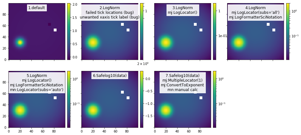
2に示した通り、ImageGridのcolorbarにはLogNormに正しく対応できないバグがあります17。どうもtickを振るべきAxisと振るべきでないAxisを取り違えているようです。これは3, 4, 5に順を追って効果を示したように、majorとminor両方にLogLocatorを指定することで解決できます。cbar.locatorなどがなく規格化もしていないため、set_minor_locatorなどが使えます。これはminor tickを自分で用意する際にややこしい規格化をする必要がないことも意味します。一方で、本来ならLogNormがFormatterをLogFormatterSciNotationにするはずなのですが、これもバグにより失敗しているため手動で設定しています。あらかじめデータをlogスケールにする場合は、7に示したようにfig.colorbarと同じ方法が使えます。
最後に
私が使う範囲でcolorbarの設定に必要なことはだいたい述べたつもりです。他にも細かい設定をしたい場合はあるでしょうが、caxとcbarの解剖で述べたような内容を把握していればいろいろと応用が効くと思います。いろいろと調べる途中で行き着いたGitHubのissueを読んでみると、どうもcolorbarは大幅な改良が必要だと認識されているようです。matplotlibはかなり巨大なライブラリでありissueの数も半端ないため、colorbarの改良にどれだけリソースが割かれるかわかりませんが、今後仕様が変わる可能性があることは頭の片隅に置いておいて損はないと思います。
個別相談始めました
matplotlib 最後の一歩
見た目の微調整に苦労してる方、コーヒー1杯で相談に乗ります。
-
特定の可視化ソフトの特定のパーツについてこれだけ詳しい記事を書くのもバカバカしいなとも思いましたが、「こんなことでもう苦労したくない」という思いからヤケになって調べた内容を手元に抱えておくのももったいないですし、誰かが無駄な苦労をしないための助けになればいいかと考えて解説記事風にしてみました。 ↩
-
この記事の調査と執筆にかかってる時間は2時間どころではありませんが、いろいろとすっきりしたのでよしとします。 ↩
-
ここで解剖対象にしているのは
plt.colorbar及びfig.colorbarで作ったcolorbarです。ImageGridのcolorbarは少し事情が異なりますが、同じような考え方で理解することは可能です。 ↩ -
この記事ではJupyter notebookでinline表示されたpngファイルをそのまま使用しています。
plt.figureで何も指定していないのでfigsizeはデフォルトの6x4インチのはずですが、どうもinline表示されるのはplt.tight_layout()を使った時と同等の余白が削られた図のようです。したがって、この記事では図によってサイズが異なる場合がありますが、設定はデフォルトの6x4インチです。図のtitleに表示している場合もあります。 ↩ -
この変更は一度描画されたあとに更新されるようで、
ax.imshowの直後にax.get_position()を実行してもimshow前と同じ数字が表示されます。この値を更新するには、セルを分割してfigを加えて一度inline表示する、fig.savefig(io.BytesIO())で一度メモリーに書き出す、plt.draw()やfig.canvas.draw()やfig.canvas.draw_idle()でfigの内容を更新するといった方法があります。fig.colorbarのあとも更新されるようです。 ↩ -
公式ドキュメントに記述をみつけたわけではありませんが、これは
Tickオブジェクトの数がつねに表示されているtickの本数より2個多いことから予想できます。 ↩ -
この話は
fig.colorbarかplt.colorbarで追加したcolorbarに関する話で、ImageGridのcolorbarでは事情が異なります。 ↩ -
この後の説明にある通り、colorbar用の
Axes領域を確保する方法の中で、subplotとcolorbarのサイズに関して良きに計らってくれるのはmpl_toolkits.axes_grid1.ImageGrid(あるいは別名AxesGrid)のみであり、他の方法はcolorbarのサイズやAxesの位置やサイズの調整を伴うことが多いです。 ↩ -
この記事ではピクセルデータの扱いを想定して
imshowのデフォルトaspect=equalを前提としています。 ↩ -
これは
fig.colorbarの前のfig.canvas.draw()でax.get_position()の値を更新しても解決しません。 ↩ -
たしか誰かがSciPyカンファレンスで「彼のSOの回答一覧をみると大体の問題が解決する」とも言っていた名物回答者です。彼の回答にはmatplotlib公式マニュアルのExamplesに採用されたものもあるそうです。 ↩
-
ただし、後述する通りtickとtick label関連では少し奇妙な挙動(おそらくバグ)があります。 ↩
-
matplotlib開発チームのcolorbar関連に詳しい人のGitHubでのコメントによると
ImageGridが入っているaxes_grid1ツールキットのcolorbarは昔の標準colorbarから派生したもので、ほとんどメンテナンスされていないため現在の標準colorbarの仕様は反映されていないそうです。 ↩ -
GitHubのこのissueとそれをcloseしたPRを見ると、2017年6月まで公式マニュアルには
cbar.set_ticksがLocatorオブジェクトを受け取れるとは明記されていなかったそうです。 ↩ -
このSOの回答にある通り、colormapの
set_badメソッドでcolorオプションを指定すればNaNの色も変えられます。現在設定されている色はcmap._rgba_bad属性で確認できます。 ↩ -
cbar.ax.minorticks_offを使ってもcolorbarのminor tickが消えないバグとしてGitHubに報告されているのは、このややこしい見た目とimplicitな振る舞いの当然の帰結でしょう。ただし、将来のバージョンで改善される可能性はあります。 ↩