良い記事でなくてすみませんが、論文投稿前になって図を直す時いっつも忘れて苦労するのでメモしました。
そもそも図のサイズを指定
fig = plt.figure(figsize=(15,3))
図の内外にtextを入れる
相対比での座標指定
ax.annotate('Test', xy=(0, 1.1), xycoords='axes fraction', fontsize=16)
データ点での座標指定
ax.annotate('Test', xy=(0, 0.1), xycoords='data', fontsize=16)
補足
上のax.なんとか、というのは
ax = fig.add_subplot(1,1,1)
とかのaxです。以下おなじ表記を使います。
x軸の数値のいらないところを消す。
ax.xaxis.set_ticklabels([])
tickも消す
ax.axes.get_xaxis().set_ticks([])
軸の数値の表記法を0.1, 0.5みたいにする
from matplotlib.ticker import MultipleLocator, FormatStrFormatter
ax.xaxis.set_major_formatter(FormatStrFormatter("%.1f"))
y軸の数字がながいとき
ax.yaxis.set_major_formatter(FormatStrFormatter("%1.e"))
x軸の数字が長くてかぶってる
つまりこういう状況です。
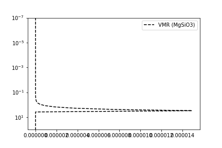
plt.gca().get_xaxis().get_major_formatter().set_powerlimits([-3,3])
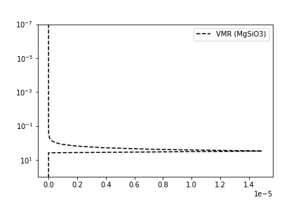
なおります。
軸の向きを逆転
plt.gca().invert_xaxis()
軸の数値を適宜拡大する
plt.tick_params(labelsize=20)
minorとmajorの指定は以下
plt.tick_params(which ="minor",labelsize=16)
plt.tick_params(which ="major",labelsize=16)
(データと無関係に)アスペクト比を変える。
この場合、plotのdata比を取得してから利用することが必要である。
すなわち、0.7の場合、ax.plotしてから
ax.set_aspect(0.7/ax.get_data_ratio())
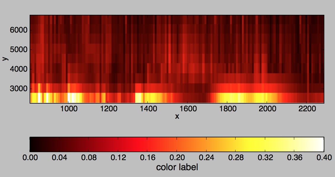
カラーバーがなんか長くてイヤなのでとにかく短くする
colorbar(bar,shrink=0.3)
カラーバーのサイズをまじめに図に合わせる
from mpl_toolkits.axes_grid1 import make_axes_locatable

divider = make_axes_locatable(ax)
cax = divider.append_axes("right", size="5%", pad=0.05)
plt.colorbar(a, cax=cax)
真面目な人向け。
カラーバーを水平につけてラベルを書く
cbar=colorbar(bar, orientation='horizontal')
cbar.set_label(‘color label',size=14)
カラーを対数でぬる
from matplotlib.colors import LogNorm
bar=ax.imshow(stdall,vmin=0.01,vmax=1.0,extent[w[0],w[-1],2250.0,6750.0],\
interpolation='nearest',cmap="hot",norm=LogNorm())
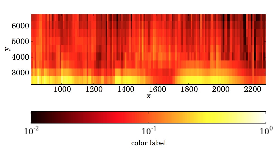
カラーバーのtickを追加する
 cbar=colorbar(bar, orientation='horizontal',ticks=\
[0.05,0.06,0.07,0.08,0.09,0.1,0.2,0.3,0.4,0.5,0.6,0.7,0.8,0.9,1.0])
下のラベル字がはみださないようにする
fig.subplots_adjust(bottom=0.2)
大量の点が打たれているので重いPDFになってしまうのを防ぐ
大量の点を打ったりした挙句、PDFにすると全部のベクター情報が残ってしまい非常に重い。そこでたくさんのプロットをする要素はrasterizedして画像化する。
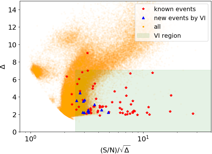
例えば、この図のオレンジの点はものすごい数あるのでベクター情報を残したくない。そこで、この部分は
plt.plot(x,y,".",alpha=0.01,color="orange",rasterized=True)
こんな感じにrasterizeする。
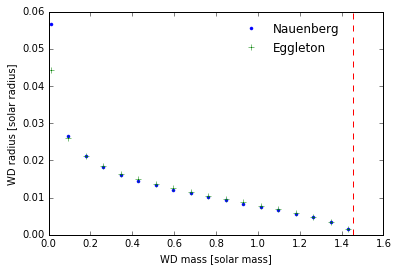
凡例
- 凡例の囲いをなくして
- 位置を調整し
- 凡例に表示される点を一つにする
ax.legend(["Nauenberg","Eggleton"],frameon=False,bbox_to_anchor=(0.9, 1.0),numpoints=1)
フォントを変える
plt.rcParams['font.family']='FreeSerif'
使用できるフォントは
import matplotlib.font_manager as fm
fm.findSystemFonts()
などでチェックできる。
変な余白やらラベルが切れたりするのを防いでPDF出力する。
plt.savefig("figure1.pdf", bbox_inches="tight", pad_inches=0.0)