pc画面幅でファーストビューを表示させたい!
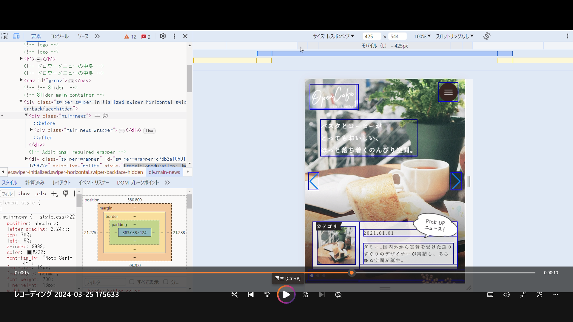
解決したいこと
pc画面幅でファーストビューを表示させたい
スマホ画面では表示されるが
pcサイズではファーストビューが表示されない。(ドロワーメニューが全画面に表示され左寄せにならないため?)
理想
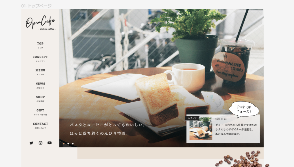
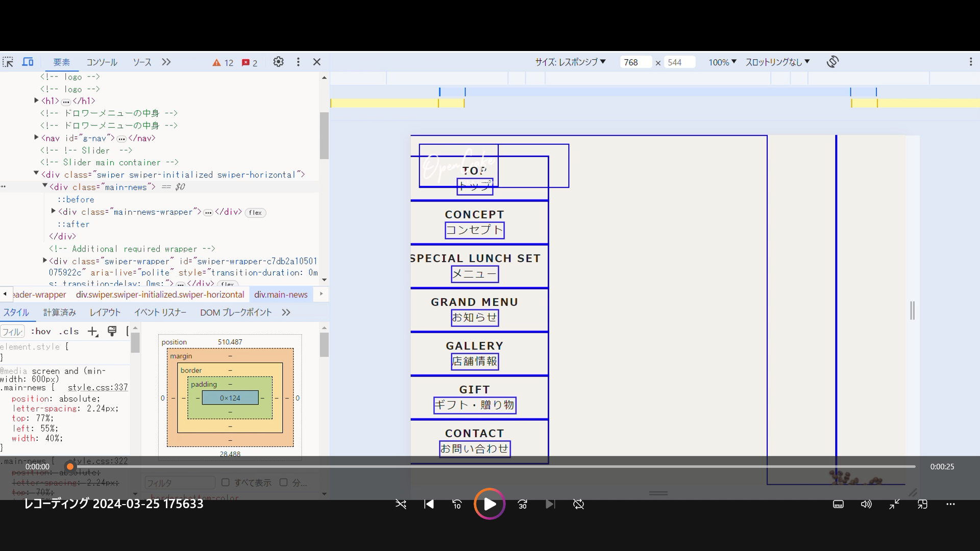
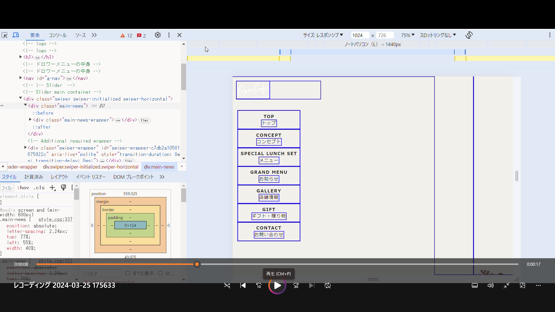
pc画面で一度表示させるとスマホ画面でも表示されので、検証ツールでcssを変更(z-indexなど)をしていますが思うようにいきません。
↓↓↓↓
発生している問題・エラー
HTML↓
<!DOCTYPE html>
<html lang="ja">
  <head prefix="og: https://ogp.me/ns#">
    <meta charset="UTF-8" />
    <meta name="viewport" content="width=device-width, initial-scale=1.0" />
    <meta name="robots" content="noindex" />
    <title>1.16- opencafe</title>
    <meta
      name="description"
      content="1.16- opencafe"
    />
    <meta property="og:type" content="website" />
    <!-- 案件では実際のURLを入れる -->
    <meta property="og:url" content="https://example.com/" />
    <!-- 案件では実際のURLを入れる -->
    <meta property="og:image" content="https://example.com/img/ogp.png" />
    <link rel="preconnect" href="https://fonts.googleapis.com" />
<!-- font ↓-->
<link rel="preconnect" href="https://fonts.googleapis.com">
<link rel="preconnect" href="https://fonts.gstatic.com" crossorigin>
<link href="https://fonts.googleapis.com/css2?family=Amatic+SC:wght@400;700&family=Noto+Serif+JP&display=swap" rel="stylesheet">


    <link href="https://fonts.googleapis.com/css?family=Damion" rel="stylesheet">
    <link rel="preconnect" href="https://fonts.googleapis.com">
<link rel="preconnect" href="https://fonts.gstatic.com" crossorigin>
<link href="https://fonts.googleapis.com/css2?family=Amatic+SC:wght@400;700&display=swap" rel="stylesheet">


    <link href="https://fonts.google.com/specimen/Patua+One" rel="stylesheet">
    <link href="https://fonts.google.com/specimen/Damion" rel="stylesheet">


    <link rel="preconnect" href="https://fonts.googleapis.com" />
    <link rel="preconnect" href="https://fonts.gstatic.com" crossorigin />
    <link
      href="https://fonts.googleapis.com/css2?family=Montserrat:wght@400;600;700&display=swap"
      rel="stylesheet"
    />

    <link rel="stylesheet" href="./css/lib/swiper-bundle.min.css" />
    <link rel="stylesheet" href="./css/reset.css" />
    <link rel="stylesheet" href="./css/style.css" />
</head>
<body>
  <header>
    <div class="header-wrapper">
      <!-- ハンバーガーボタン -->
      <!-- ハンバーガーボタン -->
      <!-- ハンバーガーボタン -->
      <div class="openbtn1"><span></span><span></span><span></span>
      </div>
      <!-- logo -->
      <!-- logo -->
      <!-- logo -->
      <h1>
        <a href="#">
          <img src="img/logo_light.png" alt="">
        </a>
      </h1>
    <!-- ドロワーメニューの中身 -->
    <!-- ドロワーメニューの中身 -->
      <nav id="g-nav">
        <div id="g-nav-list"><!--ナビの数が増えた場合縦スクロールするためのdiv※不要なら削除-->
          <ul>
            <li ><a href="#home">TOP <span class="is-sp">/</span><br class="is-pc">
              <span class="navi-sub-ttl">トップ</span></a></li>
            <li><a href="#concept">CONCEPT<span class="is-sp">/</span><br class="is-pc">
              <span class="navi-sub-ttl">コンセプト</span></a></li>
            <li><a href="#s-lunch">SPECIAL LUNCH SET <span class="is-sp">/</span><br class="is-pc">
              <span class="navi-sub-ttl">メニュー</span></a></li>
            <li><a href="#g-menu">GRAND MENU <span class="is-sp">/</span><br class="is-pc">
              <span class="navi-sub-ttl">お知らせ</span></a></li>
            <li><a href="#shop">GALLERY <span class="is-sp">/</span><br class="is-pc"><span class="navi-sub-ttl">店舗情報</span></a></li>
            <li><a href="#gift">GIFT <span class="is-sp">/</span>
              <br class="is-pc"><span class="navi-sub-ttl">ギフト・贈り物</span></a></li>
            <li><a href="#contact">CONTACT <span class="is-sp">/</span><br class="is-pc">
              <span class="navi-sub-ttl">お問い合わせ</span></a></li>
          </ul>
        </div>
      </nav>
      <!-- !-- Slider  -->
      <!-- Slider main container -->
      <div class="swiper">
        <div class="main-news">
          <div class="main-news-wrapper">
            <div class="main-news-img">
              <img src="./img/mv-1.png" alt="">
            </div>
            <div class="main-news-top">
              <ul>
                <li class="main-news-day">2021.01.01</li>
                <li class="main-news-text">
                  <p>ダミー_国内外から賞賛を受けた選りすぐりのデザイナーが集結し、あらゆる空間が誕生。</p>
                </li>
              </ul>
            </div>
          </div>
        </div>
        <!-- Additional required wrapper -->
        <div class="swiper-wrapper">
          <!-- Slides -->
          <div class="swiper-slide slide-01">
            <div class="item">
              <div class="main-text">パスタとコーヒーが
                <br class="is-sp">とってもおいしい、<br class="is-sp">
                ほっと落ち着くのんびり空間。
              </div>
            </div>
          </div>
          <div class="swiper-slide slide-02">
            <div class="item">
              <div class="main-text">パスタとコーヒーが
                <br class="is-sp">とってもおいしい、<br class="is-sp">
                ほっと落ち着くのんびり空間。
              </div>
            </div>
          </div>
          <div class="swiper-slide slide-03">
            <div class="item">
              <div class="main-text">パスタとコーヒーが
                <br class="is-sp">とってもおいしい、<br class="is-sp">
                ほっと落ち着くのんびり空間。
              </div>
            </div>
          </div>
        </div>
        <!-- If we need pagination -->
        <div class="swiper-pagination"></div>
        <!-- If we need navigation buttons -->
        <div class="swiper-button-prev"></div>
        <div class="swiper-button-next"></div>

        <!-- If we need scrollbar -->
        <div class="swiper-scrollbar"></div>
      </div>

          </div>
  </header>


<!-- concept -->
<!-- concept -->
<!-- concept -->

<section id="concept" class="concept">
  <div class="section-wrapper concept-wrapper">
    <div class="concept-text-box">
      <h2 class="ttl-concept">CONCEPT
          <span>当店のこだわり</span>
        </h2>
        <div class="ttl-concept-text">
          最高のコーヒーと、<br >時の流れを味わうことができる<br >手作りカフェ
        </div>
        <div class="concept-text">
          ダミー_国内外から賞賛を<br>
          受けた選りすぐりのデザイナーが集結し、ガーデニングの設計・建築から<br class="is-pc">料理まで、あらゆる空間が誕生。<br>
          ダミー_国内外から賞賛を受けた選りすぐりのデザイナーが集結し、ガーデ<br class="is-pc">ニングの設計・建築から料理まで、あらゆる空間が誕生。<br><br>
          ダミー_国内外から賞賛を受けた選りすぐりのデザイナーが集結し、ガーデ<br class="is-pc">ニングの設計・建築から料理まで、あらゆる空間が誕生。
      </div>
      <div class="btn-box">
        <div class="concept-btn">
          <button class="black-btn concept-btn is-pc">
            <p>詳しくはこちら</p>
          </button>
        </div>
      </div>
    </div>
    <div class="concept-image-box">
      <div class="concept-image">
        <picture srcset="./img/nathan-dumlao-pnmRtTHWqDM-unsplash.png" alt="トップ画像" media="(max-width: 800px)">
    <!-- ブラウザ幅最大~1024pxまでsample3の画像が表示 -->
    <source srcset="./img/3ed1cf1afea0c03908d0212bc0f2503f.jpg" media="(min-width: 1024px)" type="">
    <!-- ブラウザ幅1023~768pxまでsampleの画像が表示 -->
    <source srcset="" media="(min-width: 768px)" type="">
    <!-- ブラウザ幅767px~から最小幅までsample2の画像が表示 -->
    <img src="./img/nathan-dumlao-pnmRtTHWqDM-unsplash.png" alt=”代替テキスト”>
        </picture>
      </div>
    </div>
  </div>
</section>
css
* {
  outline: 2px solid blue;
}


@media screen and (min-width: 680px) {
  .is-pc { display:block; white-space: normal; }
  .is-sp{ display:none; }
}
@media screen and (max-width:680px) {
  .is-pc{ display:none; }
  .is-sp{ display:block;  white-space: pre-line; }
}


/*========= ナビゲーションのためのCSS ===============*/
@media screen and (min-width: 680px) {
  #g-nav{
    position:static !important;
    width:72% !important;
    background: #F3EFEB !important;

  }
}

#g-nav{
  /*position:fixed;にし、z-indexの数値を大きくして前面へ*/
  position:fixed;
  z-index: 999;
  /*ナビのスタート位置と形状*/
  top:0;
  right: -120%;
  width:100%;
  height: 100vh;/*ナビの高さ*/
  background: #382620;;
  /*動き*/
  transition: all 0.6s;
}

/*アクティブクラスがついたら位置を0に*/
#g-nav.panelactive{
    right: 0;
}


/*ナビゲーションの縦スクロール*/
#g-nav.panelactive #g-nav-list{
  /*ナビの数が増えた場合縦スクロール*/
  position: fixed;
  z-index: 999;
  width: 100%;
  height: 100vh;/*表示する高さ*/
  overflow: auto;
  -webkit-overflow-scrolling: touch;
}

/*ナビゲーション*/
@media screen and (min-width: 680px) {
  #g-nav ul {
    left:13% !important;

  }
}

#g-nav ul {
  /*ナビゲーション天地中央揃え*/
  position: absolute;
  z-index: 999;
  top:50%;
  left:50%;
  transform: translate(-50%,-50%);
}

/*リストのレイアウト設定*/

#g-nav li{
  list-style: none;
  text-align: center;
}


@media screen and (min-width: 680px) {
  #g-nav li a{
    color: #222 !important;
    text-align: center;
    padding-top: 32px;

    font-size: 16px !important;
    letter-spacing: 1.92px !important;
  }
}

#g-nav li a{
  color: #FFF;
  font-family: Patua One;
  font-size: 24px;
  font-style: normal;
  font-weight: 400;
  line-height: normal;
  letter-spacing: 2.88px;
  text-decoration: none;
  padding:10px;
  display: block;
  text-transform: uppercase;
  letter-spacing: 0.1em;
  font-weight: bold;
}
/*========logo ===============*/


/*========= ボタンのためのCSS ===============*/
.openbtn1{
  position:fixed;
    z-index: 9999;/*ボタンを最前面に*/
  top:0;
  right: 10px;
  cursor: pointer;
    width: 50px;
    height:50px;
  background: url(../img/menu-icon.png) center center/cover;
  margin-right: 10px;
    margin-top: 10px;

}

/*×に変化*/
.openbtn1.active
{
  background: url(../img/close.png)center center/cover;
}


/*========= レイアウトのためのCSS ===============*/

h1{
  font-size:1.2rem;
  position:fixed;
  z-index: 9999;/*ボタンを最前面に*/
  top:1%;
  cursor: pointer;
  width: 30vw;
  height:65px;
  margin-top: 10px;
  margin-left: 14px;
}

// h2{
//   font-size:1.2rem;
//   text-align: center;
//   margin: 0 0 30px 0;
// }

p{
  margin-top:20px;
}

small{
  color:#fff;
  display: block;
  text-align: center;
}

#header{
  width:100%;
  background:#333;
  color:#fff;
  text-align: center;
  padding: 20px;
}

@media screen and (min-width: 680px) {
  .header-wrapper{
    display: flex;
  }
  .openbtn1{
    display: none;
  }
}

// section{
//   padding:100px 30px;
// }

section:nth-child(2n){
  background:#f3f3f3;
}

#footer{
  background:#333;
  padding:20px;
}

/*==================================================
スライダーのためのcss
===================================*/

.swiper{
  position: relative;
}
.swiper-slide{
  height: 360px;
}

.slide-01{
  height: 100vh;
  background-image: url(../img/img_mainvisual1@2x.png);
  background-repeat:no-repeat; /*背景画像の繰り返しを解除*/
  background-size:cover; /*背景画像のサイズ指定*/
  background-position: center;
  height: 100vh;
  width: 100%;
}
.slide-02{
  height: 100vh;
  background-image: url(../img/img_mainvisual2@2x.png);
  background-repeat:no-repeat; /*背景画像の繰り返しを解除*/
  background-size:cover; /*背景画像のサイズ指定*/
  background-position: center;

  height: 100vh;
  width: 100%;
}
.slide-03{
  height: 100vh;
  background-image: url(../img/img_mainvisual3@2x.png);
  background-repeat:no-repeat; /*背景画像の繰り返しを解除*/
  background-size:cover; /*背景画像のサイズ指定*/
  background-position: center;

  height: 100vh;
  width: 100%;
}
.item{
  /* background-image: url(../img/img_mainvisual1@2x.png); */
  height: 100vh;

}

.main-text{
  position: absolute;
  color: #FFF;
  font-family: Noto Serif JP;
  font-size: 16px;
  font-style: normal;
  font-weight: 700;
  line-height: 32px; /* 200% */
  letter-spacing: 2.24px;
  top: 20%;
  left: 10%;
  width: auto;
  height: 96px;
}
@media screen and (min-width: 600px) {
  .main-text{
    top:77%;
    left: 5%;
    width: 50%;
  }
}


.button {
  font-weight: 700;
  letter-spacing: 0.48px;
  padding: 8px 28px;
  display: inline-block;
  border-radius: 60px;
  border: 2px solid currentColor;
  background: #fff;
  font-size: 16px;
  line-height: 1.7;
  color: #111;
  min-width: 150px;
  text-align: center;
  -webkit-transition: background-color 0.3s, color 0.3s;
  transition: background-color 0.3s, color 0.3s;
}
.button:hover {
  background-color: #fabe00;
}
.button--type2 {
  background-color: #111;
  color: #fff;
}
.button--type2:hover {
  background-color: #fff;
  color: #111;
}

.swiper-horizontal>.swiper-pagination-bullets, .swiper-pagination-bullets.swiper-pagination-horizontal{
  text-align: left !important;
  margin-left: 10px !important;
}
.swiper-horizontal>.swiper-pagination-bullets .swiper-pagination-bullet, .swiper-pagination-horizontal.swiper-pagination-bullets .swiper-pagination-bullet{
  background-color: #FFF;
}

// // *==================================================
// css
// ======*/
body {
  font-size: 16px;
  line-height: 1.7;
  color: #111;
  font-family: "Noto Sans JP", sans-serif;
  background: #F3EFEB;
  // @include mq(tab){
  //   background:pink;
  // }
  // @include mq(sp){
  //   background:green;
  // }
}

ul{
margin:0;
padding: 0;
list-style: none;
}

a{
color: #fff;
}

a:hover,
a:active{
text-decoration: none;
}

img:hover{
  opacity: 0.7;
  transition: .5s;
}


picture{
  max-width: 100%;
  height: auto;
  vertical-align: middle;
}

.main-news{

  position: absolute;
  letter-spacing: 2.24px;
  top: 70%;
  left: 5%;
  // width: 254px;
  // height: 100px;
  z-index: 9999;/*ボタンを最前面に*/
  color: #222;
  font-family: "Noto Serif JP";
  font-size: 12px;
  font-style: normal;
  font-weight: 700;
  line-height: 18px; /* 150% */
  width: 90%;
  @media screen and (min-width: 600px) {
    position: absolute;
    letter-spacing: 2.24px;
    top: 77%;
    left: 55%;
    width: 40%;
  }

}


.section-wrapper{
  margin: 120px 20px 0;
}

.ttl{
  text-align: center;
  display:inline;
  color: #222;
  font-family: "Amatic SC";
  font-size: 40px;
  font-style: normal;
  font-weight: 700;
  line-height: normal;
  letter-spacing: 4px;
  position: absolute;
  top: 50%;
  left: 50%;
  margin-right: -50%;
  transform: translate(-50%, -50%);
  white-space: nowrap;
  width: 100%;
  height: auto;

}

.ttl span{
  color: #222;
font-family: "Noto Serif JP";
font-size: 12px;
font-style: normal;
font-weight: 700;
line-height: normal;
display: block;
}

.ttl-text{
  padding-top: 34px;

  color: #222;
font-family: "Noto Serif JP";
font-size: 20px;
font-style: normal;
font-weight: 700;
line-height: 40px; /* 200% */
position: relative;
}


.main-news::after{
  position: absolute;
  content: '';
  top: -22%;
  right: 0;
  padding: 0.2em;/*余白*/
  background:url(../img/吹き出しNEWS.png);
  width: 120px;
  height: 71.379px;
  transform: rotate(5deg);
  flex-shrink: 0;
}
.main-news::before{
  position: absolute;
  content: 'カテゴリ';
  top: 0;
  left: 2%;
  color: white;/*文字色*/
  padding: 0.2em;/*余白*/
  background:url(../img/パス\ 68.png);
  width: 70px;
  height: 22px;
  flex-shrink: 0;
  z-index: 9999;

}

.main-news-wrapper{
  display: flex;
  opacity: 0.85;
background: #FFF;
width: 100%;
height: 124px;
flex-shrink: 0;
}
.main-news-img{
width: 100px;
height: 100px;
flex-shrink: 0;
margin: 12px;
  & img{
    width: 100%;
    height: inherit;
    // transition: .6s;
  }
}
.main-news-img:hover {
	transform: scale(1.3,1.3) !important;
  transition: .5s;
}


.main-news-top{
  width: 100%;
}
.main-news-day{
  margin-top:20px ;
  color: #222;
  font-family: "Noto Serif JP";
  font-size: 12px;
  font-style: normal;
  font-weight: 500;
  line-height: normal;
  margin-left: 4%;
}
.main-news-text{
  margin-bottom: 20px;
  margin-left: 4%;
  margin-right: 4%;
  color: #222;
  font-family: "Noto Serif JP";
  font-size: 12px;
  font-style: normal;
  font-weight: 700;
  line-height: 18px; /* 150% */
}

.news-text{
  & P{
    color: #222;
    font-family: "Noto Serif JP";
    font-size: 12px;
    font-style: normal;
    font-weight: 400;
    line-height: 18px; /* 150% */
  }
}
0 likes