Livebook を使ってグラフを描きたいときは VegaLite を使います。VegaLite は Vega-Lite の Elixirラッパーとなっており、これが結構高機能です。Vega-Lite ではプログラムコードを書くことなしに、JSON specification を書くだけで高度なグラフの描画が可能であり、ある意味新鮮です。本記事の目的は Vega-Lite で使われる基本用語や基本概念の整理を行うことです。そのため公式ドキュメントにあるガイドに従って、Livebook で確認していきたいと思います。本記事で、少しでもドキュメントが読みやすくなれば良いなと思います。
Introduction to Vega-Lite 公式ドキュメント
実際のコードは Livebook で記述しますが、VegaLite では Vl.from_json/1 という関数が用意されており、Vega-Lite の JSON specification をそのまま使うことができます。最後に VegaLite の Elixir 記法への変換も試みてあります。全体的にドキュメントの翻訳となってしまってますが、一応全て Livebook で動作確認しています。
関連記事
VegaLite で埼玉県を切る( Elixir, Livebook) - Qiita
Vega-Lite の View Composition (Elixir, Livebook) - Qiita
VegaLite の基礎 (Elixir, Livebook) -Qiita
Livebook 事始め (Elixir) - Qiita
1. Data と Encoding
まずは以下のコードを Livebook に入力し Evaluate します。
Mix.install([
  {:vega_lite, "~> 0.1.6"},
  {:kino_vega_lite, "~> 0.1.4"},
  {:jason, "~> 1.2"}
])

alias VegaLite, as: Vl
次に以下のコードを Evaluate します。
Vl.from_json("""
{
  "data": {
    "values": [
      {"a": "C", "b": 2}, {"a": "C", "b": 7}, {"a": "C", "b": 4},
      {"a": "D", "b": 1}, {"a": "D", "b": 2}, {"a": "D", "b": 6},
      {"a": "E", "b": 8}, {"a": "E", "b": 4}, {"a": "E", "b": 7}
    ]
  },
  "mark": "point",
  "encoding": {
    "x": {"field": "a", "type": "nominal"},
    "y": {"field": "b", "type": "quantitative"}
  }
}
""")
この JSON specification では data と mark 、 encoding という3つの property を設定しています。それぞれ以下に詳しく見ていきますが、まずはこれによって描かれるグラフを確認しておきましょう。
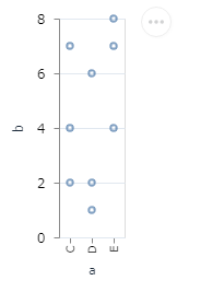
1-1. Data
data property では描画対象のデータソースを指定します。ここでは values property を指定してインラインのデータを使うことを宣言しています。例えば url property で外部のデータソースを指定することも可能です。
1-2. Data を Mark で Encoding する
mark property では、Data を描画するためのグラフィカル要素を指定します。ここでは mark property に point を指定します。
encoding property では、Data を channel へ encode します。
encoding は data field をどのように channel (座標)に対応させて、Dataを可視化するかを定義するものです。key-value mapping オブジェクトとして定義されます。channel の定義は、field と type で記述されます。
channel はザックリ言えば、座標 のようなものと考えられます。例えば Data を 2次元座標 で表せば異なる point でも同じ座標にプロットしてしまうところを、3次元座標 で表せばキチンと異なる座標にプロットすることが可能なことがあります。当然 3次元の方がより多角的に Data を見ることができます。例えば (x, y) 座標の point に色を加え、 つまりcolor軸 を設けて (x, y, color) 座標 で表現することが可能です。
ここでは a field を x channel ( x-position ) へ、 b field を y channel ( y-position ) へ とencode しています。Data それぞれに 違った position を与え描画することで、Dataのより有効な可視化が可能となります。a の data type として nominal (カテゴリ)を、b の data type として quantitative (数値)を指定しています。
主な data type
- quantitative - data が数値の場合
- nominal - data が文字列の場合
- temporal - data が time object の場合
- ordinal - data がランク順を表現している場合
もっと詳しくは以下を参照してください
ちなみに座標のラベルやタイトル、グリッドは自動的に付加されます。
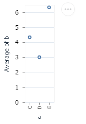
2. Data Transformation: Aggregation
Vega-Lite は data transformation をサポートします。
y channel の定義に "aggregate": "average" を追加します。x のカテゴリごとに、b の平均値を計算してy 座標に描画します。
Vl.from_json("""
{
  "data": {
    "values": [
      {"a": "C", "b": 2}, {"a": "C", "b": 7}, {"a": "C", "b": 4},
      {"a": "D", "b": 1}, {"a": "D", "b": 2}, {"a": "D", "b": 6},
      {"a": "E", "b": 8}, {"a": "E", "b": 4}, {"a": "E", "b": 7}
    ]
  },
  "mark": "point",
  "encoding": {
    "x": {"field": "a", "type": "nominal"},
    "y": {"aggregate": "average", "field": "b", "type": "quantitative"}
  }
}
""")
Evaluate で実行します。
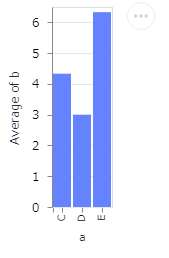
今度は bar チャートで描いてみます。mark type を point から bar に変更するだけです。
Vl.from_json("""
{
  "data": {
    "values": [
      {"a": "C", "b": 2}, {"a": "C", "b": 7}, {"a": "C", "b": 4},
      {"a": "D", "b": 1}, {"a": "D", "b": 2}, {"a": "D", "b": 6},
      {"a": "E", "b": 8}, {"a": "E", "b": 4}, {"a": "E", "b": 7}
    ]
  },
  "mark": "bar",
  "encoding": {
    "x": {"field": "a", "type": "nominal"},
    "y": {"aggregate": "average", "field": "b", "type": "quantitative"}
  }
}
""")
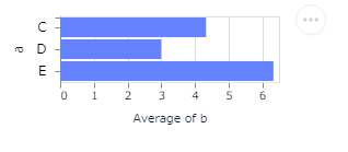
ここで、x と y channel の定義を交換すると以下のように水平バーになります。
Vl.from_json("""
{
  "data": {
    "values": [
      {"a": "C", "b": 2}, {"a": "C", "b": 7}, {"a": "C", "b": 4},
      {"a": "D", "b": 1}, {"a": "D", "b": 2}, {"a": "D", "b": 6},
      {"a": "E", "b": 8}, {"a": "E", "b": 4}, {"a": "E", "b": 7}
    ]
  },
  "mark": "bar",
  "encoding": {
    "y": {"field": "a", "type": "nominal"},
    "x": {"aggregate": "average", "field": "b", "type": "quantitative"}
  }
}
""")
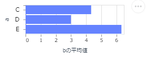
3. 可視化のカスタマイズ
property を追加することで可視化のカスタマイズが行えます。x channel の定義に title property を追加することで、X軸のタイトルを変更することができます。
Vl.from_json("""
{
  "data": {
    "values": [
      {"a": "C", "b": 2}, {"a": "C", "b": 7}, {"a": "C", "b": 4},
      {"a": "D", "b": 1}, {"a": "D", "b": 2}, {"a": "D", "b": 6},
      {"a": "E", "b": 8}, {"a": "E", "b": 4}, {"a": "E", "b": 7}
    ]
  },
  "mark": "bar",
  "encoding": {
    "y": {"field": "a", "type": "nominal"},
    "x": {"aggregate": "average", "field": "b", "type": "quantitative",
           "title": "bの平均値"}
  }
}
""")
4. Data の調査
以下のドキュメントに従って進めていきます。
Exploring Data
これ以降は JSON specification と共に、VegaLite の Elixir 記法のコードも併記します。
Elixir の方が JSON よりスッキリ書けますね。
以下のデータリソースを使って。Dataの検査を行っていきます。
seattle-weather.csv
seattle-weather.csv の頭だけを表示すると、以下のようなデータです。1,400日分の気象データが含まれています。
| date | precipitation | temp_max | temp_min | wind | weather |
|---|---|---|---|---|---|
| 2012-01-01 | 0 | 12.8 | 5 | 4.7 | drizzle |
| 2012-01-02 | 10.9 | 10.6 | 2.8 | 4.5 | rain |
| 2012-01-03 | 0.8 | 11.7 | 7.2 | 2.3 | rain |
| 2012-01-04 | 20.3 | 12.2 | 5.6 | 4.7 | rain |
| 2012-01-05 | 1.3 | 8.9 | 2.8 | 6.1 | rain |
precipitation(降雨量) を可視化します。
Vl.from_json("""
{
  "data": {"url": "https://vega.github.io/vega-lite/data/seattle-weather.csv"},
  "mark": "tick",
  "encoding": {
    "x": {"field": "precipitation", "type": "quantitative"}
  }
}
""")
Vl.new()
|> Vl.data_from_url("https://vega.github.io/vega-lite/data/seattle-weather.csv")
|> Vl.mark(:tick)
|> Vl.encode_field(:x, "precipitation", type: :quantitative)
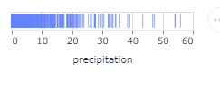
これからわかることは、降水量が低い値に密集していることです。つまり、多くの日の場合、雨が降ることがあっても、多く降ることはない、という感じです。
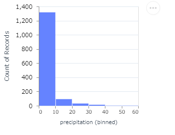
降水量のヒストグラムをみると、より一層この傾向をつかむことができます。このために y の encoding channel を追加します。x は連続値のまま扱うのではなく離散化します。降水量を10ごとに区切り、その区間に含まれる日数を count するわけです。降水量の離散化は "bin": true で指定します。type のデフォルト値は quantitative なのでここでは省略してあります。
y channel の "aggregate": "count" に注意してください。aggregate が count 指定の時は、field property はありません。代わりに、x channnel のグループごとの data object の数、ここでは bin でグループ分けされた日数をカウントしてくれます。同様に、x channel が "timeUnit": "month" でグループ化されていた場合は、月ごとの日数をカウントしてくれます。
ビニング ( bin ) は、多かれ少なかれ連続する値の数をより少ない数の「ビン」にグループ化する(離散化)方法です。たとえば、人々のグループに関するデータがある場合、彼らの年齢をより少ない数の年齢間隔に配置することができます。
Vl.from_json("""
{
  "data": {"url": "https://vega.github.io/vega-lite/data/seattle-weather.csv"},
  "mark": "bar",
  "encoding": {
    "x": {"bin": true, "field": "precipitation"},
    "y": {"aggregate": "count"}
  }
}
""")
Vl.new()
|> Vl.data_from_url("https://vega.github.io/vega-lite/data/seattle-weather.csv")
|> Vl.mark(:bar)
|> Vl.encode_field(:x, "precipitation", type: :quantitative,  bin: true)
|> Vl.encode(:y, aggregate: :count, type: :quantitative)
次はシアトルの一年を通した降水量の偏移を見ます。Vega-Liteは時間軸をサポートしており、date 軸の離散化が可能です。月単位で降水量の離散化を行い、その平均値の遷移を以下のように plot できます。月単位の離散化は "timeUnit": "month" で行います。
Vl.from_json("""
{
  "data": {"url": "https://vega.github.io/vega-lite/data/seattle-weather.csv"},
  "mark": "line",
  "encoding": {
    "x": {"timeUnit": "month", "field": "date"},
    "y": {"aggregate": "mean", "field": "precipitation"}
  }
}
""")
Vl.new()
|> Vl.data_from_url("https://vega.github.io/vega-lite/data/seattle-weather.csv")
|> Vl.mark(:line)
|> Vl.encode_field(:x, "date", time_unit: :month)
|> Vl.encode_field(:y, "precipitation", aggregate: :mean)
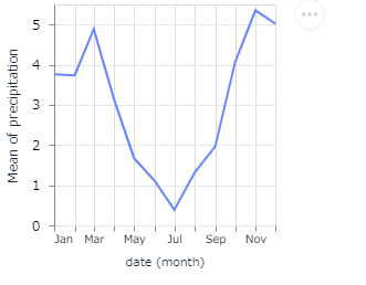
このチャートは、シアトルでは夏より冬の方が圧倒的に降水量が多いことを示しています。
次に temperature (温度)の、年月による推移を見ます。単に月で見るのではなく、年も考慮して遷移を見ます。"timeUnit": "yearmonth" で指定します。月ごとの温度の平均値ではなく、最高温度の値を使います。温度としては日中の最高温度(temp_max)を使います。
Vl.from_json("""
{
  "data": {"url": "https://vega.github.io/vega-lite/data/seattle-weather.csv"},
  "mark": "line",
  "encoding": {
    "x": {"timeUnit": "yearmonth", "field": "date"},
    "y": {"aggregate": "max", "field": "temp_max"}
  }
}
""")
Vl.new()
|> Vl.data_from_url("https://vega.github.io/vega-lite/data/seattle-weather.csv")
|> Vl.mark(:line)
|> Vl.encode_field(:x, "date", time_unit: :yearmonth)
|> Vl.encode_field(:y, "temp_max", aggregate: :max)
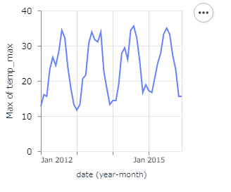
この遷移を見ると、年ごとにだんだん日中の最高温度が高くなっている傾向が見て取れます。その傾向をもっとはっきりさせます。年単位で温度の平均値をとり plot します。
Vl.from_json("""
{
  "data": {"url": "https://vega.github.io/vega-lite/data/seattle-weather.csv"},
  "mark": "line",
  "encoding": {
    "x": {"timeUnit": "year", "field": "date"},
    "y": {"aggregate": "mean", "field": "temp_max"}
  }
}
""")
Vl.new()
|> Vl.data_from_url("https://vega.github.io/vega-lite/data/seattle-weather.csv")
|> Vl.mark(:line)
|> Vl.encode_field(:x, "date", time_unit: :year)
|> Vl.encode_field(:y, "temp_max", aggregate: :mean)
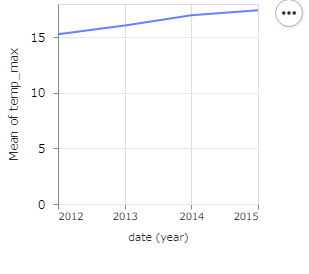
確かに、日中の最高温度は、年々高くなっていると言えそうです。
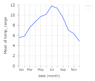
次に温度差(温度変動幅)、日中の最高温度から最低温度を引いたもの、の遷移を見たいと思います。
Vl.from_json("""
{
  "data": {"url": "https://vega.github.io/vega-lite/data/seattle-weather.csv"},
  "transform": [
    {"calculate": "datum.temp_max - datum.temp_min", "as": "temp_range"}
  ],
  "mark": "line",
  "encoding": {
    "x": {
      "timeUnit": "month",
      "field": "date"
    },
    "y": {
      "aggregate": "mean",
      "field": "temp_range"
    }
  }
}
""")
Vl.new()
|> Vl.data_from_url("https://vega.github.io/vega-lite/data/seattle-weather.csv")
|> Vl.transform(calculate: "datum.temp_max - datum.temp_min", as: "temp_range")
|> Vl.mark(:line)
|> Vl.encode_field(:x, "date", time_unit: :month)
|> Vl.encode_field(:y, "temp_range", aggregate: :mean)
ここでは transform を使って新しい field の temp_range を定義しています。temp_range は一日の温度差を表します。この新しい field は、他の field と同じように使うことができます。
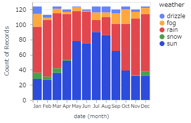
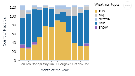
次に年を通してどの weather がどれだけ多いのかを見たいと思います。
- x channel を "field": "date" として "timeUnit": "month" で離散化する
- y channel はレコード数(日数)で count する
- さらに y 軸を、 color channel を追加することで、weather type で分割する
Vl.from_json("""
{
  "data": {"url": "https://vega.github.io/vega-lite/data/seattle-weather.csv"},
  "mark": "bar",
  "encoding": {
    "x": {
      "timeUnit": "month",
      "field": "date",
      "type": "ordinal"
    },
    "y": {
      "aggregate": "count",
      "type": "quantitative"
    },
    "color": {
      "field": "weather",
      "type": "nominal"
    }
  }
}
""")
Vl.new()
|> Vl.data_from_url("https://vega.github.io/vega-lite/data/seattle-weather.csv")
|> Vl.mark(:bar)
|> Vl.encode_field(:x, "date", time_unit: :month, type: :ordinal)
|> Vl.encode(:y, aggregate: :count, type: :quantitative)
|> Vl.encode_field(:color, "weather", type: :nominal)
channel はザックリ言えば、座標 のようなものと考えられます。例えば Data を 2次元座標 で表せば異なる point でも同じ座標にプロットしてしまうところを、3次元座標 で表せばキチンと異なる座標にプロットすることが可能なことがあります。当然 3次元の方がより多角的に Data を見ることができます。例えば (x, y) 座標の point に色を加え、 つまりcolor軸 を設けて (x, y, color) 座標 で表現することが可能です。
しかしデフォルトで割り当てられたカラーは、データをうまく表現できていない可能性があります。color scale range を使ってどの weather にどの Color を割り当てるかを指定します。ついでに x 軸と legend のタイトルもカスタマイズします。
Vl.from_json("""
{
  "data": {"url": "https://vega.github.io/vega-lite/data/seattle-weather.csv"},
  "mark": "bar",
  "encoding": {
    "x": {
      "timeUnit": "month",
      "field": "date",
      "type": "ordinal",
      "title": "Month of the year"
    },
    "y": {
      "aggregate": "count",
      "type": "quantitative"
    },
    "color": {
      "field": "weather",
      "type": "nominal",
      "scale": {
        "domain": ["sun", "fog", "drizzle", "rain", "snow"],
        "range": ["#e7ba52", "#c7c7c7", "#aec7e8", "#1f77b4", "#9467bd"]
      },
      "title": "Weather type"
    }
  }
}
""")
Vl.new()
|> Vl.data_from_url("https://vega.github.io/vega-lite/data/seattle-weather.csv")
|> Vl.mark(:bar)
|> Vl.encode_field(:x, "date", time_unit: :month, type: :ordinal, title: "Month of the year")
|> Vl.encode(:y, aggregate: :count, type: :quantitative)
|> Vl.encode_field(:color, "weather", type: :nominal, title: "Weather type",
    scale: [domain: ["sun", "fog", "drizzle", "rain", "snow"],
            range: ["#e7ba52", "#c7c7c7", "#aec7e8", "#1f77b4", "#9467bd"]])
5. VegaLite (Elixir)
Vega-Lite は JSON specification で記述しますが、これを VegaLite の Elixir 記法に変えてみたいと思います。
VegaLite 公式ドキュメント
例題として以下のドキュメントを利用します。
Binning
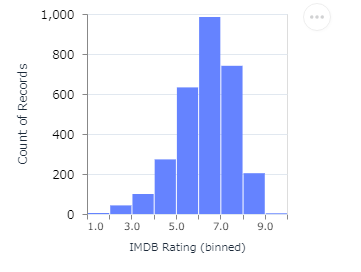
5-1.Example: Histogram
Histogram の JSON specification です。
Vl.from_json("""
{
  "data": {"url": "https://vega.github.io/vega-lite/data/movies.json"},
  "mark": "bar",
  "encoding": {
    "x": {
      "bin": true,
      "field": "IMDB Rating"
    },
    "y": {"aggregate": "count"}
  }
}
""")
Elixir での記法です
Vl.new()
|> Vl.data_from_url("https://vega.github.io/vega-lite/data/movies.json")
|> Vl.mark(:bar)
|> Vl.encode_field(:x, "IMDB Rating", type: :quantitative,  bin: true)
|> Vl.encode(:y, aggregate: :count, type: :quantitative)
どちらも同じ結果が得られます。
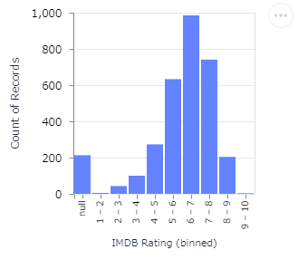
5-2. Example: Histogram with Ordinal Scale
Ordinal Scale を持ったHistogram の JSON specification です。
Vl.from_json("""
{
  "data": {"url": "https://vega.github.io/vega-lite/data/movies.json"},
  "mark": "bar",
  "encoding": {
    "x": {
      "bin": true,
      "field": "IMDB Rating",
      "type": "ordinal"
    },
    "y": {"aggregate": "count"}
  }
}
""")
Elixir での記法です
Vl.new()
|> Vl.data_from_url("https://vega.github.io/vega-lite/data/movies.json")
|> Vl.mark(:bar)
|> Vl.encode_field(:x, "IMDB Rating", type: :ordinal,  bin: true)
|> Vl.encode(:y, aggregate: :count, type: :quantitative)
どちらも同じ結果が得られます。
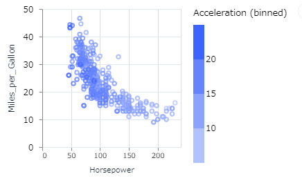
5-3. Example: Binned color
Binned color の JSON specification です。
Vl.from_json("""
{
  "data": {"url": "https://vega.github.io/vega-lite/data/cars.json"},
  "mark": "point",
  "encoding": {
    "x": {"field": "Horsepower", "type": "quantitative"},
    "y": {"field": "Miles_per_Gallon", "type": "quantitative"},
    "color": {"bin": true, "field": "Acceleration"}
  }
}
""")
Elixir での記法です
Vl.new()
|> Vl.data_from_url("https://vega.github.io/vega-lite/data/cars.json")
|> Vl.mark(:point)
|> Vl.encode_field(:x, "Horsepower", type: :quantitative)
|> Vl.encode_field(:y, "Miles_per_Gallon", type: :quantitative)
|> Vl.encode(:color, field: "Acceleration", bin: true)
どちらも同じ結果が得られます。
今回は以上です。
全てのグラフがドキュメント通り、Livebook 上で実現できました。