Matplotlib
Matplotlibを活用したデータビジュアライゼーションの基礎を紹介します。
一見複雑そうなデータも、ビジュアル表現を活用することで思わぬ特徴や構造を見つけることができます。
⑴では、簡単なデータを使い折れ線グラフの出力と編集を紹介します。
グラフ出力の初歩とスタイルの編集方法が身につくかと思います。
⑵様々なグラフの出力と編集事例 → https://qiita.com/ryo111/items/8b881ac78c897bdf8cb2
⑶複数のグラフを出力 → https://qiita.com/ryo111/items/dbf266a83b3029aa3a35
■デザイン関連まとめ【カラー・マーカー・スタイル】→ https://qiita.com/ryo111/items/c9b66d4f990c6749f39b

Matplotlibとは
Pythonのグラフ描画ライブラリ、NumPyやpandasで作成・編集したデータのグラフ出力も可能。
機械学習やデーサイエンス分野で活用されています。
https://matplotlib.org/
0.ライブラリのインポート
import matplotlib.pyplot as plt
%matplotlib inline
1.折れ線グラフの出力
■ 折れ線グラフ plt.plot()
# 元データ作成
number = [1, 2, 3, 4, 5]
price = [200, 250, 350, 400, 550]

# plotでグラフを描画
plt.plot(number, price);  #(横軸データ, 縦軸データ)

# グラフを表示
plt.show();

2.グラフの編集
■ タイトルと軸ラベルを追加 plt.title(), plt.xlabel(), plt.ylabel()
plt.plot(number, price)

# グラフのタイトルを追加
plt.title("number-price")

# x軸のラベルを追加
plt.xlabel("number")

# y軸のラベルを追加
plt.ylabel("price")

plt.show();

■ グリッドの追加 plt.grid()
plt.plot(number, price)
plt.title("number-price")
plt.xlabel("number")
plt.ylabel("price")

# グリッドを表示する
plt.grid(True)

plt.show();

■ マーカーの選択・表示 marker="o"
よく使われるマーカーリスト
- “.” 点
- “o” 丸
- “^” 三角形
- “x” バツ印
- “s” 四角形
# 丸のマーカーを選択
plt.plot(number, price, marker="o")

plt.title("number-price")
plt.xlabel("number")
plt.ylabel("price")
plt.grid(True)
plt.show();

■ 色の選択 color='red'
主要な色であればカラー名で指定可能
カラーコードの指定にも対応(#ff0000等)
# 赤色を選択
plt.plot(number, price, marker="o", color='red')

plt.title("number-price")
plt.xlabel("number")
plt.ylabel("price")
plt.grid(True)
plt.show();

■ 線のスタイルを選択 linestyle='--'
よく使われるラインスタイル
【 - -- -. : 】
# 点線を選択
plt.plot(number, price, marker="o", color='red', linestyle='--')

plt.title("number-price")
plt.xlabel("number")
plt.ylabel("price")
plt.grid(True)
plt.show();

■ 線の太さを変更 linewidth = 3.0
# 線の太さを3.0に変更
plt.plot(number, price, marker="o", color='red', linestyle='--', linewidth = 3.0)

plt.title("number-price")
plt.xlabel("number")
plt.ylabel("price")
plt.grid(True)
plt.show();

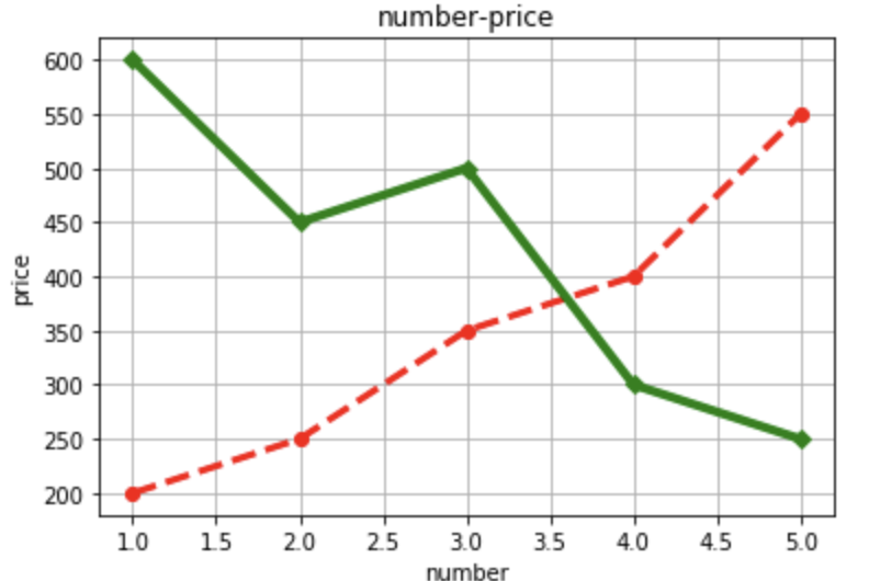
■ 複数の折れ線グラフを表示
# 別のデータを作成
price_2 = [600, 450, 500, 300, 250]
plt.plot(number, price, marker="o", color='red', linestyle='--', linewidth = 3.0)

# price_2をプロット
plt.plot(number, price_2, marker="D", color='g', linestyle='-', linewidth = 4.0)

plt.title("number-price")
plt.xlabel("number")
plt.ylabel("price")
plt.grid(True)
plt.show();
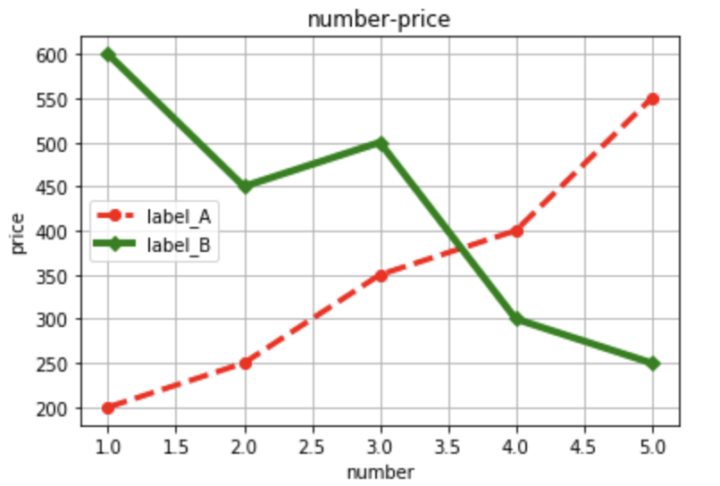
■ ラベルの表示 label="label_A"
# ラベルを設定
plt.plot(number, price, marker="o", color='red', linestyle='--', linewidth = 3.0, label="label_A")
plt.plot(number, price_2, marker="D", color='g', linestyle='-', linewidth = 4.0,label="label_B")

plt.title("number-price")
plt.xlabel("number")
plt.ylabel("price")
plt.grid(True)

# ラベルを表示する
plt.legend()

plt.show();
■ グラフの表示範囲の設定 plt.xlim() plt.ylim()
plt.plot(number, price, marker="o", color='red', linestyle='--', linewidth = 3.0, label="label_A")
plt.plot(number, price_2, marker="D", color='g', linestyle='-', linewidth = 4.0,label="label_B")
plt.title("number-price")
plt.xlabel("number")
plt.ylabel("price")
plt.grid(True)
plt.legend()

# x軸、y軸の表示範囲を指定
plt.xlim([0, 6])
plt.ylim([100, 700])

plt.show();

■ グラフの大きさを変更 plt.figure(figsize=(a, b))
# グラフの縦横の大きさを指定
plt.figure(figsize=(9, 5)) #plt.plotよりも前に書く

plt.plot(number, price, marker="o", color='red', linestyle='--', linewidth = 3.0, label="label_A")
plt.plot(number, price_2, marker="D", color='g', linestyle='-', linewidth = 4.0,label="label_B")
plt.title("number-price")
plt.xlabel("number")
plt.ylabel("price")
plt.grid(True)
plt.legend()
plt.xlim([0, 6])
plt.ylim([100, 700])
plt.figure(figsize=(1, 1))
plt.show();

⑵では、主要なグラフの基礎的な出力方法を紹介します。
→ https://qiita.com/ryo111/items/8b881ac78c897bdf8cb2