Matplotlib
Matplotlibを活用したデータビジュアライゼーションの基礎を紹介します。
一見複雑そうなデータも、ビジュアル表現を活用することで思わぬ発見や構造を見つけることができます。
この記事では、ビジュアル面でより完成度の高いグラフを作成するためのメモをまとめました。

Matplotlibとは
Pythonのグラフ描画ライブラリ、NumPyやpandasで作成・編集したデータのグラフ出力も可能。
機械学習やデーサイエンス分野で活用されています。
https://matplotlib.org/
0.ライブラリのインポート
import matplotlib.pyplot as plt
%matplotlib inline
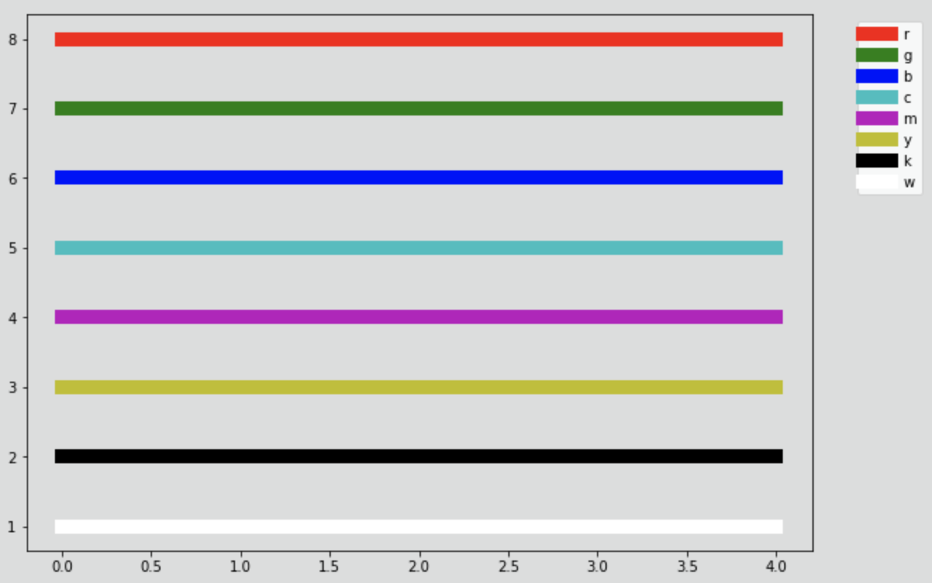
1.基本カラーの紹介
■ 1文字で表現できる基本カラーリスト
- 'b' : ブルー
- 'r' : レッド
- 'g' : グリーン
- 'c' : シアン(水色)
- 'm' : マゼンダ(赤紫)
- 'y' : 黄色
- 'k' : 黒
- 'w' : 白
■ サンプルをグラフに出力
colorlist = ["r", "g", "b", "c", "m", "y", "k", "w"]

plt.rcParams["axes.facecolor"] = (1,1,1,0)
plt.figure(figsize=(10, 7), facecolor='#DCDDDD')
for i, color in enumerate(colorlist):
    plt.plot([8-i]*5, color=color, linewidth = 10.0, label=color)

plt.legend(bbox_to_anchor=(1.05, 1), loc='upper left')
plt.show;
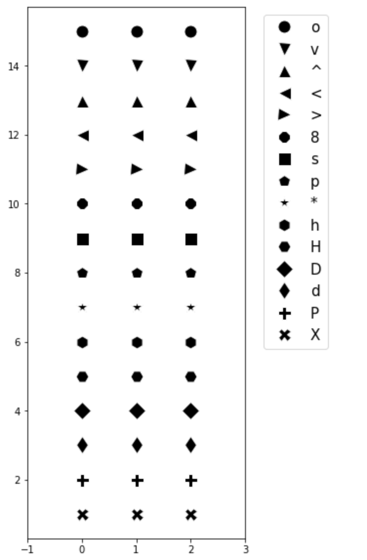
2.マーカーの紹介
■ 主要マーカーリスト
- 'o' : 丸
- 'v' : 下向き三角形
- '^' : 上向き三角形
- '<' : 左向き三角形
- '>' : 右向き三角形
- '8' : 八角形
- 's' : 四角形
- 'p' : 五角形
- '*' : 星
- 'h' : 六角形 (縦長)
- 'H' : 六角形 (横長)
- 'D' : 菱形
- 'd' : 細い菱形
- 'P' : プラス
- 'X' : バツ
■ マーカーリスト出力
markers = ['o', 'v', '^', '<', '>', '8', 's', 'p', '*', 'h', 'H', 'D', 'd', 'P', 'X']

plt.figure(figsize=(4, 10))
plt.xlim([-1, 3])
for i, marker in enumerate(markers):
    plt.plot([15-i]*3, marker=marker, markersize=13, markerfacecolor='k', color='w', label=marker)

plt.legend(bbox_to_anchor=(1.05, 1), loc='upper left', prop={'size': 15})
plt.show;
3.スタイル
■ スタイルの種類を出力
>>> plt.style.available # スタイルのリストを表示

['seaborn-dark',
 'seaborn-darkgrid',
 'seaborn-ticks',
 'fivethirtyeight',
 'seaborn-whitegrid',
 'classic',
 '_classic_test',
 'fast',
 'seaborn-talk',
 'seaborn-dark-palette',
 'seaborn-bright',
 'seaborn-pastel',
 'grayscale',
 'seaborn-notebook',
 'ggplot',
 'seaborn-colorblind',
 'seaborn-muted',
 'seaborn',
 'Solarize_Light2',
 'seaborn-paper',
 'bmh',
 'tableau-colorblind10',
 'seaborn-white',
 'dark_background',
 'seaborn-poster',
 'seaborn-deep']
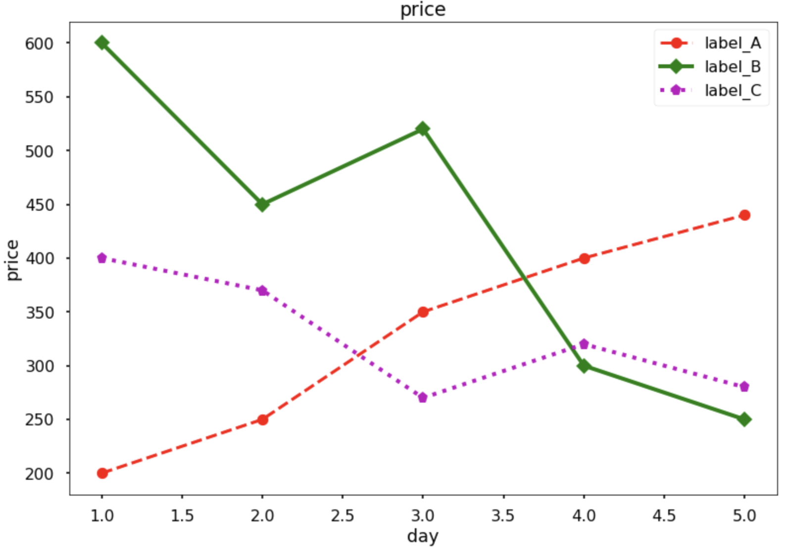
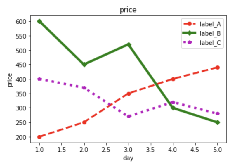
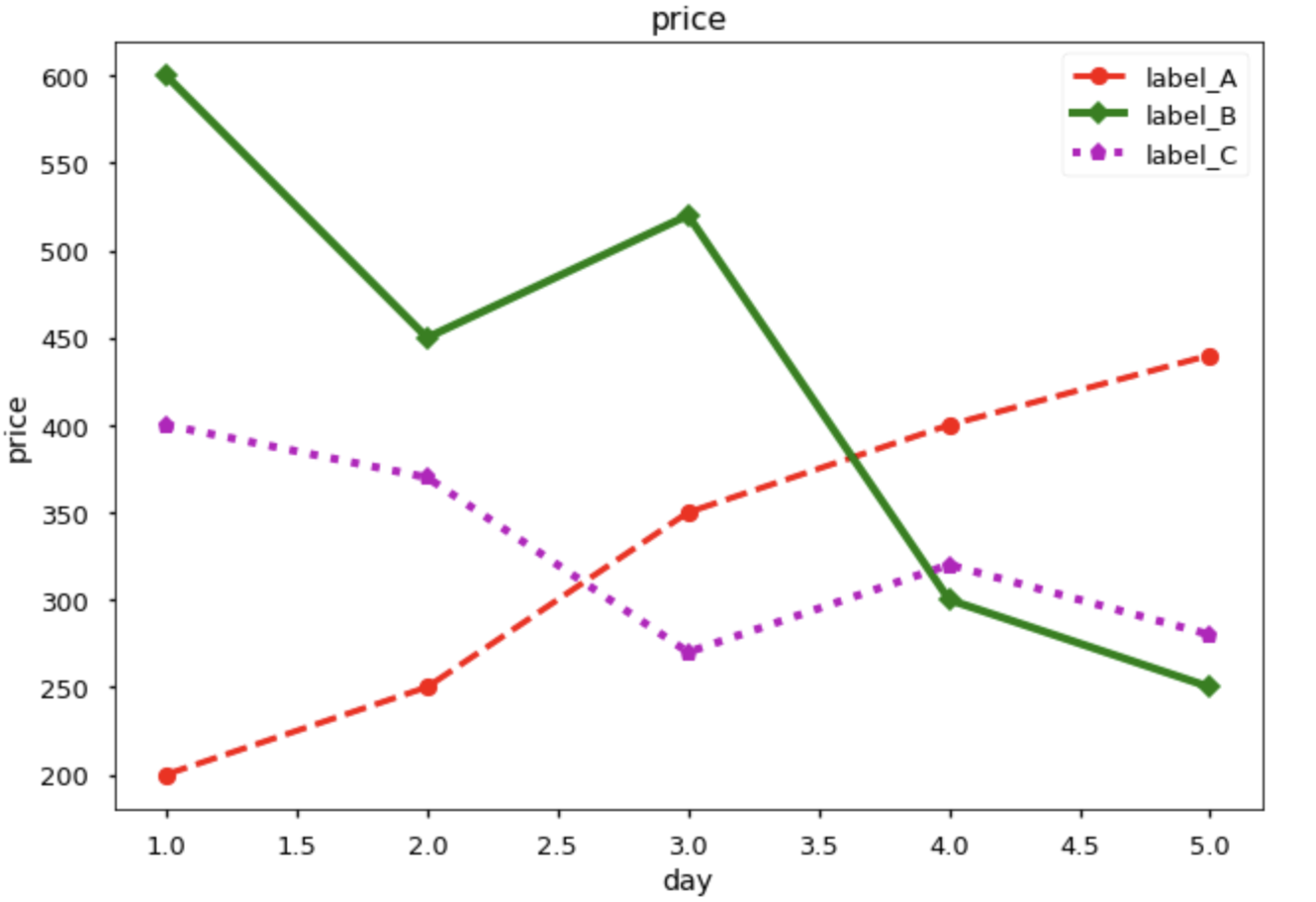
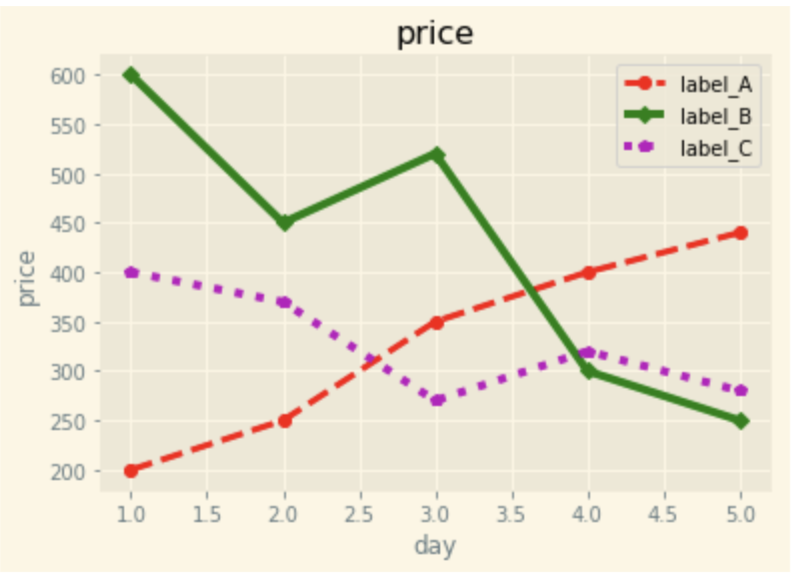
■ グラフを用意
days = [1, 2, 3, 4, 5]
price1 = [200, 250, 350, 400, 440]
price2 = [600, 450, 520, 300, 250]
price3 = [400, 370, 270, 320, 280]

plt.plot(days, price1, marker="o", color='red', linestyle='--', linewidth = 3.0, label="label_A")
plt.plot(days, price2, marker="D", color='g', linestyle='-', linewidth = 4.0,label="label_B")
plt.plot(days, price3, marker="p", color='m', linestyle=':', linewidth = 4.0,label="label_C")

plt.title("price")
plt.xlabel("day")
plt.ylabel("price")
plt.legend()

plt.show();
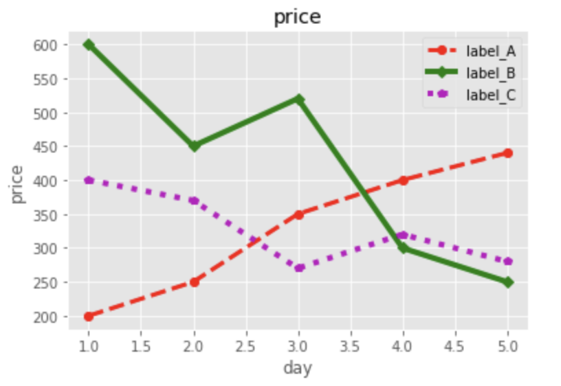
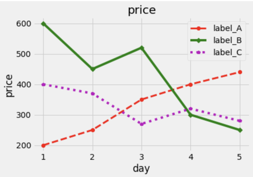
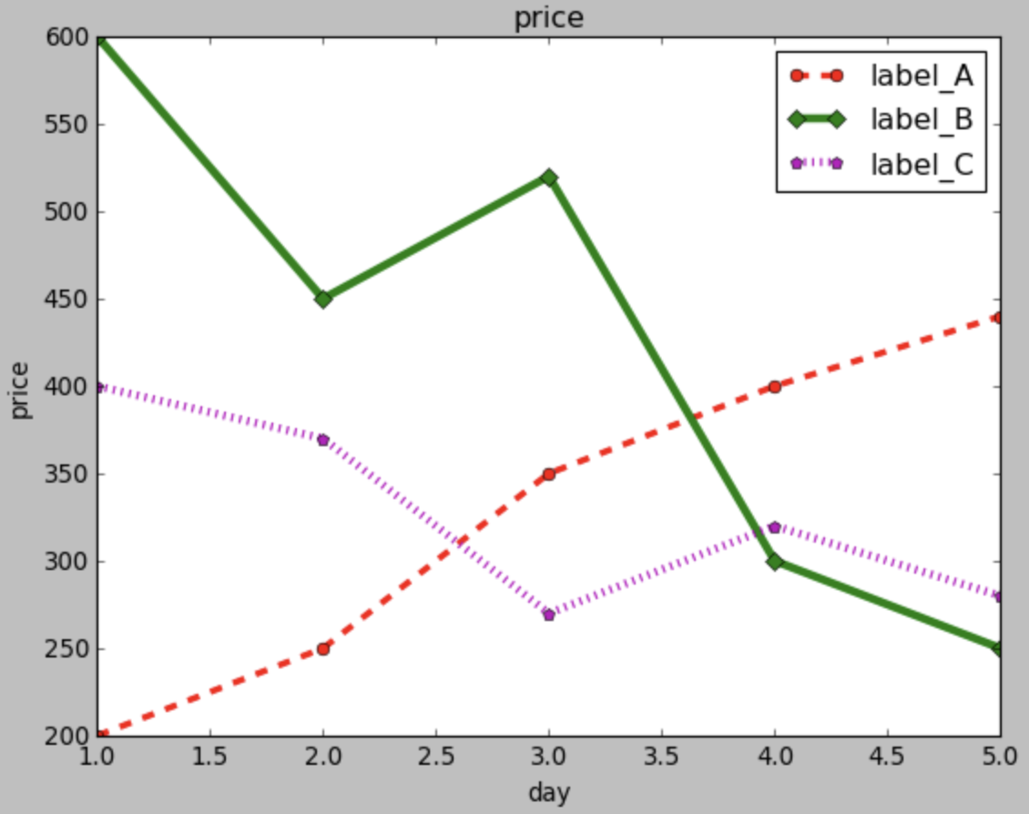
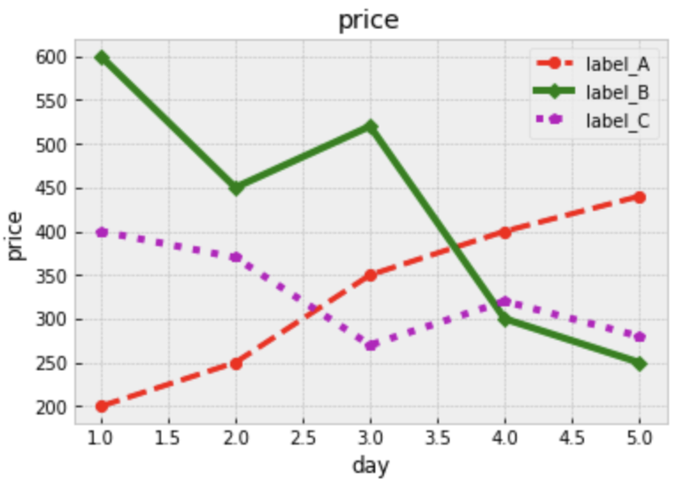
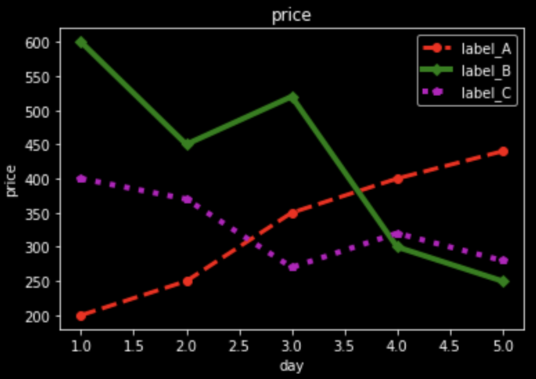
■ スタイルを適用
リストの中から使いやすく特徴的がわかりやすいものを使い同じグラフを出力します。
plt.style.use('ggplot')

# グラフのコードは省略
plt.style.use('fivethirtyeight')

# グラフのコードは省略
plt.style.use('classic')

# グラフのコードは省略
plt.style.use('seaborn-talk')

# グラフのコードは省略
plt.style.use('Solarize_Light2')

# グラフのコードは省略
plt.style.use('bmh')

# グラフのコードは省略
plt.style.use('dark_background')

# グラフのコードは省略
plt.style.use('seaborn-poster')

# グラフのコードは省略