Matplotlib
Matplotlibを活用したデータビジュアライゼーションの基礎を紹介します。
一見複雑そうなデータも、ビジュアル表現を活用することで思わぬ発見や構造を見つけることができます。
⑵では、主要なグラフの基礎的な出力方法を紹介します。
データの種類や分析の目的に応じたグラフの選択・活用能力が身につくかと思います。
⑴グラフの出力と編集 → https://qiita.com/ryo111/items/e9d01053df76c7b6b171
⑶複数のグラフを出力 → https://qiita.com/ryo111/items/dbf266a83b3029aa3a35
■デザイン関連まとめ【カラー・マーカー・スタイル】→ https://qiita.com/ryo111/items/c9b66d4f990c6749f39b

Matplotlibとは
Pythonのグラフ描画ライブラリ、NumPyやpandasで作成・編集したデータのグラフ出力も可能。
機械学習やデーサイエンス分野で活用されています。
https://matplotlib.org/
0.ライブラリのインポート
import matplotlib.pyplot as plt
%matplotlib inline

# Numpyとpandasもインポート
import numpy as np
import pandas as pd
1.折れ線グラフ
⑴の復習になります。
■ グラフ出力 plt.plot(x, y)
# 元データ作成
x = np.arange(1, 11)
y = np.array([200, 240, 300, 320, 290, 360, 410, 290, 320, 340])

# グラフの出力、設定
plt.plot(x, y, marker="o" , color="b")
plt.xlabel("x")
plt.ylabel("y")
plt.grid(True)
plt.show();

2.棒グラフ
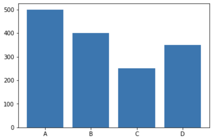
■ グラフ出力 plt.bar(x, y)
# 元データ作成
x = ["A", "B", "C", "D"]
y = [500, 400, 250, 350]

# グラフの出力
plt.bar(x, y)
plt.show();
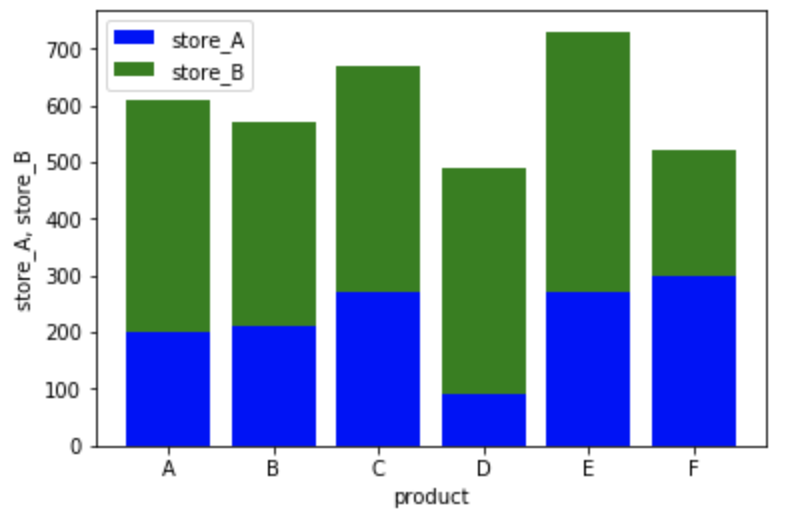
■ より編集されたグラフの出力
product = ["A", "B", "C", "D", "E", "F"]
store_A = [200, 210, 270, 90, 270, 300]
store_B = [410, 360, 400, 400, 460, 220]

plt.bar(product, store_A, color="b")
plt.bar(product, store_B, bottom=store_A, color="g") #bottom=で下側データを指定
plt.xlabel("product")
plt.ylabel("store_A, store_B")
plt.legend(("store_A", "store_B"))
plt.show()
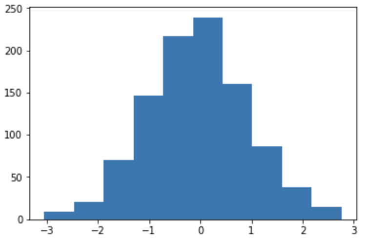
3.ヒストグラム plt.hist(x)
■ グラフ出力
# 元データ作成
np.random.seed(0)
x = np.random.randn(1000)

# グラフの出力
plt.hist(x)
plt.show();
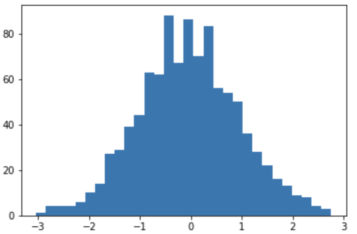
- ビン数変更
np.random.seed(0)
x = np.random.randn(1000)

# ビン数指定
plt.hist(x, bins=30)
plt.show();
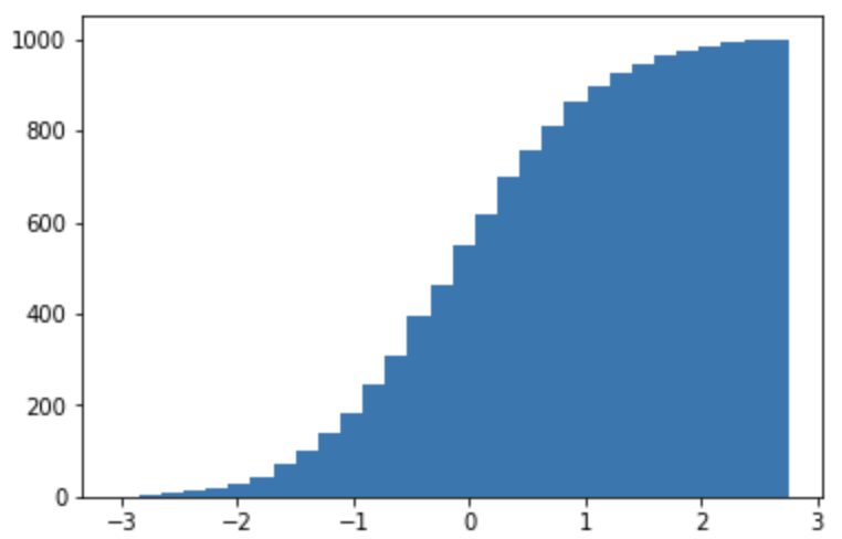
- 累積ヒストグラム
np.random.seed(0)
x = np.random.randn(1000)

# 累積ヒストグラムに変更
plt.hist(x, bins=30, cumulative=True)
plt.show();
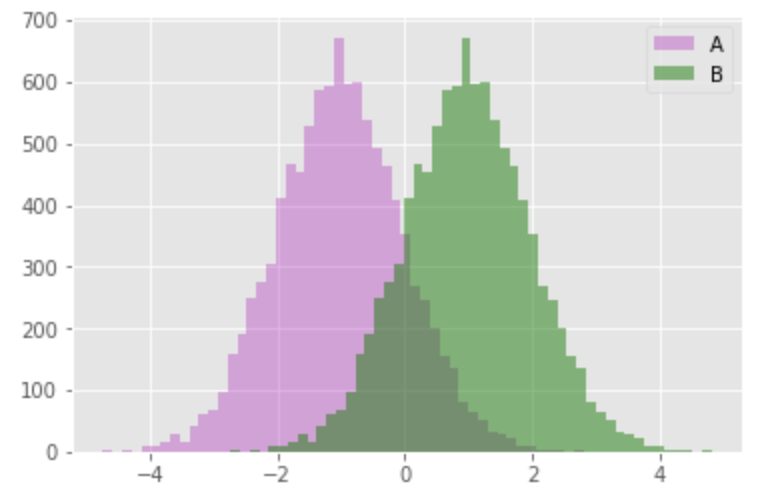
■ より編集されたグラフの出力
np.random.seed(0)
x = np.random.randn(10000)

plt.style.use('ggplot') #スタイル変更

# alphaで透明度を調節し色やラベルを追加
plt.hist(x-1, bins=50, alpha=0.3, histtype='stepfilled', color='m', label="A")
plt.hist(x+1, bins=50, alpha=0.5, histtype='stepfilled', color='g', label="B")
plt.legend()
plt.show();
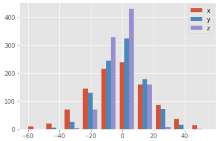
np.random.seed(0)
x = np.random.normal(0, 20, 1000)
y = np.random.normal(0, 15, 1000)
z = np.random.normal(0, 10, 1000)
labels = ['x', 'y', 'z']

plt.style.use('ggplot')
plt.hist((x, y, z), label=labels)
plt.legend()
plt.show();
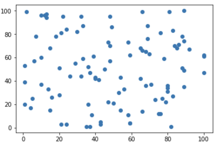
4.散布図 plt.scatter(x, y)
■ グラフ出力
# 元データ作成
np.random.seed(0)
# 1から100までの数値をランダムに100個出力
x = np.random.randint(1, 101, 100)
y = np.random.randint(1, 101, 100)


# グラフの出力
plt.scatter(x, y)
plt.show();
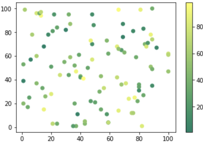
■ より編集されたグラフの出力
np.random.seed(0)
x = np.random.randint(1, 101, 100)
y = np.random.randint(1, 101, 100)
z = np.random.randint(1, 101, 100) #第3の変数追加

# zの値を色の濃淡で表現するよう指定
plt.scatter(x, y, c=z, cmap="summer")

# カラーバーを表示
plt.colorbar()

plt.show();
np.random.seed(0)
x = np.random.randint(1, 101, 100)
y = np.random.randint(1, 101, 100)
z = np.random.randint(1, 101, 100)
z_2 = np.random.randint(1, 101, 100)

# z_2の値が各点の大きさで表現されるよう指定
plt.scatter(x, y, c=z, cmap="coolwarm", s=z_2)
plt.colorbar()
plt.show()

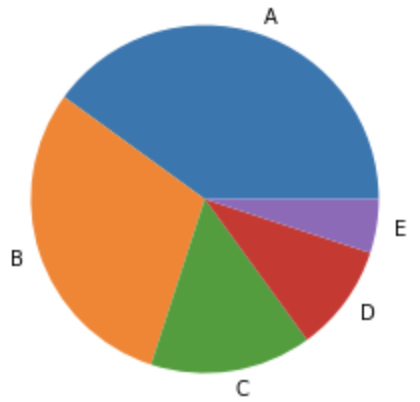
4.円グラフ plt.pie(x)
■ グラフ出力
# 元データ作成
x = [40, 30, 15, 10, 5]
labels = ["A", "B", "C", "D", "E"]

# グラフの出力
plt.pie(x, labels=labels)
plt.show();
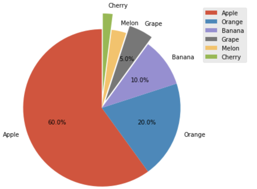
■ より編集されたグラフの出力
x = [60, 20, 10, 5, 3, 2]
labels = ["Apple", "Orange", "Banana", "Grape", "Melon", "Cherry"]
explode = [0, 0, 0, 0.1, 0, 0.2]

plt.figure(figsize=(9, 6))
plt.style.use('ggplot') #スタイル変更
plt.pie(x, labels=labels, explode = explode, startangle=90,
        autopct=lambda p:'{:.1f}%'.format(p) if p>3 else '') #構成比を表示
plt.axis("equal", loc='left')
plt.legend()
plt.show()
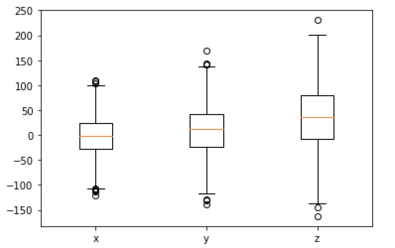
4.箱ひげ図 plt.boxplot(x)
■ グラフ出力
# データを生成
np.random.seed(0)
x = np.random.normal(0, 40, 1000)
y = np.random.normal(10, 50, 1000)
z = np.random.normal(40, 65, 1000)

# グラフの出力
labels = ['x', 'y', 'z']
plt.boxplot((x, y, z), labels=labels)
plt.show();
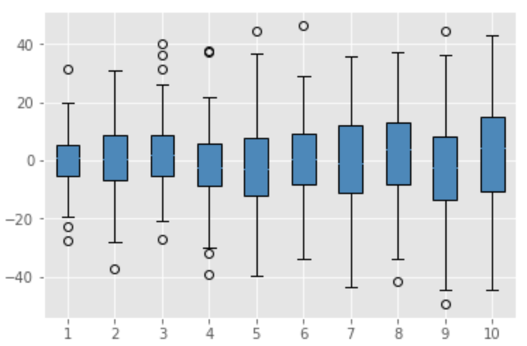
■ より編集されたグラフの出力
fig.suptitle('four_graphs') #デザインを変更

x = [np.random.normal(0, a, 100) for a in range(11, 21)]

plt.boxplot(x,vert=True, patch_artist=True) #patch_artistでカラー表示設定

plt.grid(True) #グリッド追加

plt.show();
⑶では複数のグラフの出力を紹介します。
→ https://qiita.com/ryo111/items/dbf266a83b3029aa3a35