Matplotlib
Matplotlibを活用したデータビジュアライゼーションの基礎を紹介します。
一見複雑そうなデータも、ビジュアル表現を活用することで思わぬ発見や構造を見つけることができます。
⑴グラフの出力と編集 → https://qiita.com/ryo111/items/e9d01053df76c7b6b171
⑵様々なグラフの出力と編集事例 → https://qiita.com/ryo111/items/8b881ac78c897bdf8cb2
■デザイン関連まとめ【カラー・マーカー・スタイル】→ https://qiita.com/ryo111/items/c9b66d4f990c6749f39b
⑶では、フィギュアやサブプロットを使ったオブジェクト指向のグラフ描画を紹介します。
これらを活用し複数のグラフの出力を行います。

Matplotlibとは
Pythonのグラフ描画ライブラリ、NumPyやpandasで作成・編集したデータのグラフ出力も可能。
機械学習やデーサイエンス分野で活用されています。
https://matplotlib.org/
0.ライブラリのインポート
import matplotlib.pyplot as plt
%matplotlib inline

# Numpyとpandasもインポート
import numpy as np
import pandas as pd
1.複数のグラフを出力
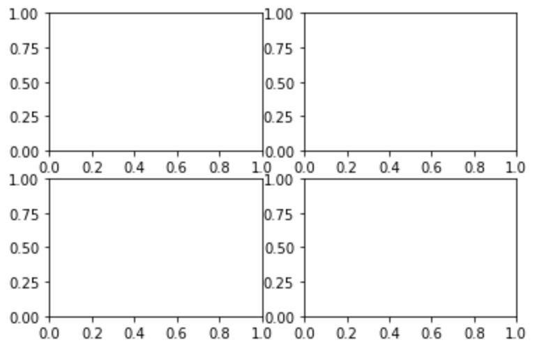
■ 空のグラフを出力
オブジェクト指向のグラフ描画では、「フィギュア」と「サブプロッ ト」を生成する必要があります。
フィギュアはサブプロットを収めるグラフ全体の領域で、サブプロットはグラフを描画する領域です。
# フィギュアオブジェクトを作成
fig = plt.figure()

# フィギュア内にサブプロットを4つ配置
ax1 = fig.add_subplot(221) # 2行2列の1番
ax2 = fig.add_subplot(222) # 2番
ax3 = fig.add_subplot(223) # 3番
ax4 = fig.add_subplot(224) # 4番

plt.show();
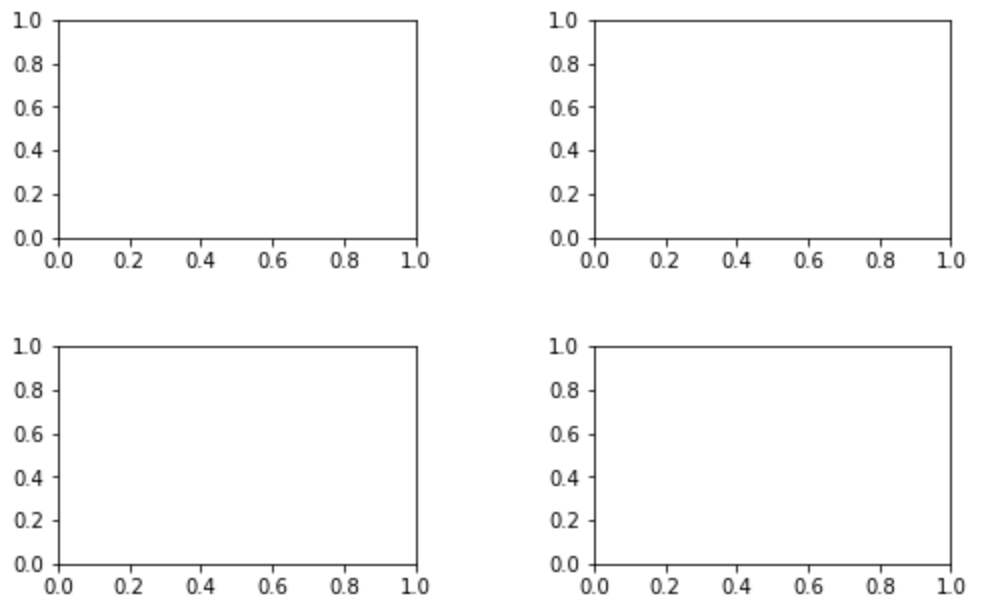
■ 大きさや間隔の調整
fig = plt.figure(figsize=(8, 5)) #figsizeで大きさ指定

ax1 = fig.add_subplot(221)
ax2 = fig.add_subplot(222)
ax3 = fig.add_subplot(223)
ax4 = fig.add_subplot(224)

# フィギュア内のサブプロットの間隔を縦横0.5の分量で空ける
plt.subplots_adjust(wspace=0.5, hspace=0.5)

plt.show();
■ 1つ目のサブプロットにグラフを表示
fig = plt.figure(figsize=(8, 5))

ax1 = fig.add_subplot(221)
ax2 = fig.add_subplot(222)
ax3 = fig.add_subplot(223)
ax4 = fig.add_subplot(224)

plt.subplots_adjust(wspace=0.5, hspace=0.5)

# ax1にタイトルをつける
ax1.set_title('ax1')

# ax1にグラフを表示
a = [1, 2, 3, 4, 5]
ax1.plot(a)

plt.show();

■ その他のサブプロットにグラフを表示
fig = plt.figure(figsize=(8, 5))

ax1 = fig.add_subplot(221)
ax2 = fig.add_subplot(222)
ax3 = fig.add_subplot(223)
ax4 = fig.add_subplot(224)

plt.subplots_adjust(wspace=0.5, hspace=0.5)

ax1.set_title('ax1')
a = [1, 2, 3, 4, 5]
ax1.plot(a)

# ax2にヒストグラムを表示
ax2.set_title('ax2')
np.random.seed(0)
b = np.random.randn(1000)
ax2.hist(b)

# ax3に散布図を表示
ax3.set_title('ax3')
np.random.seed(0)
c_1 = np.random.randint(1, 101, 50)
c_2 = np.random.randint(1, 101, 50)
ax3.scatter(c_1, c_2)

# ax4に折れ線グラフを表示
ax4.set_title('ax4')
d_1 = np.arange(1, 11)
d_2 = np.array([250, 240, 260, 300, 290, 340, 310, 290, 360, 330])
ax4.plot(d_1, d_2, marker="o")


plt.show();

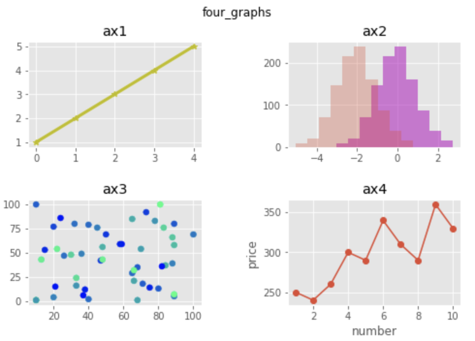
■ フィギュア・各グラフを個別に編集
# フィギュア内のデザインを変更
plt.style.use('ggplot')

fig = plt.figure(figsize=(8, 5))

# フィギュアのタイトルを表示
fig.suptitle('four_graphs')

ax1 = fig.add_subplot(221)
ax2 = fig.add_subplot(222)
ax3 = fig.add_subplot(223)
ax4 = fig.add_subplot(224)

plt.subplots_adjust(wspace=0.5, hspace=0.5)

# デザインを変更
ax1.set_title('ax1')
a = [1, 2, 3, 4, 5]
ax1.plot(a, marker='*', color='y', linewidth = 3.0)

# ヒストグラムを追加し、透明度とカラーを変更
ax2.set_title('ax2')
np.random.seed(0)
b = np.random.randn(1000)
ax2.hist(b, color='m', alpha=0.5)
ax2.hist(b-2, alpha=0.3)

# 変数を追加し色で表現
ax3.set_title('ax3')
np.random.seed(0)
c_1 = np.random.randint(1, 101, 50)
c_2 = np.random.randint(1, 101, 50)
c_3 = np.random.randint(1, 101, 50)
ax3.scatter(c_1, c_2, c=c_3, cmap='winter')

# x,yラベルを追加
ax4.set_title('ax4')
d_1 = np.arange(1, 11)
d_2 = np.array([250, 240, 260, 300, 290, 340, 310, 290, 360, 330])
ax4.plot(d_1, d_2, marker="o")
ax4.set_xlabel("number")
ax4.set_ylabel("price")

plt.show();
主要グラフの出力方法は、グラフ活用の基礎⑵で解説しています。
→ https://qiita.com/ryo111/items/8b881ac78c897bdf8cb2