概要
以前、Blazor向けのUIフレームワークとしてRadzen.Blazorを紹介しました。
(参照)
他にも主だった機能が揃ったUIフレームワークとしてMatBlazorがありましたので紹介したいと思います。
前提
.NET Core SDK 3.1.100-preview3-014645
Microsoft.AspNetCore.Blazor 3.1.0-preview2.19528.8
Visual Studio 2019
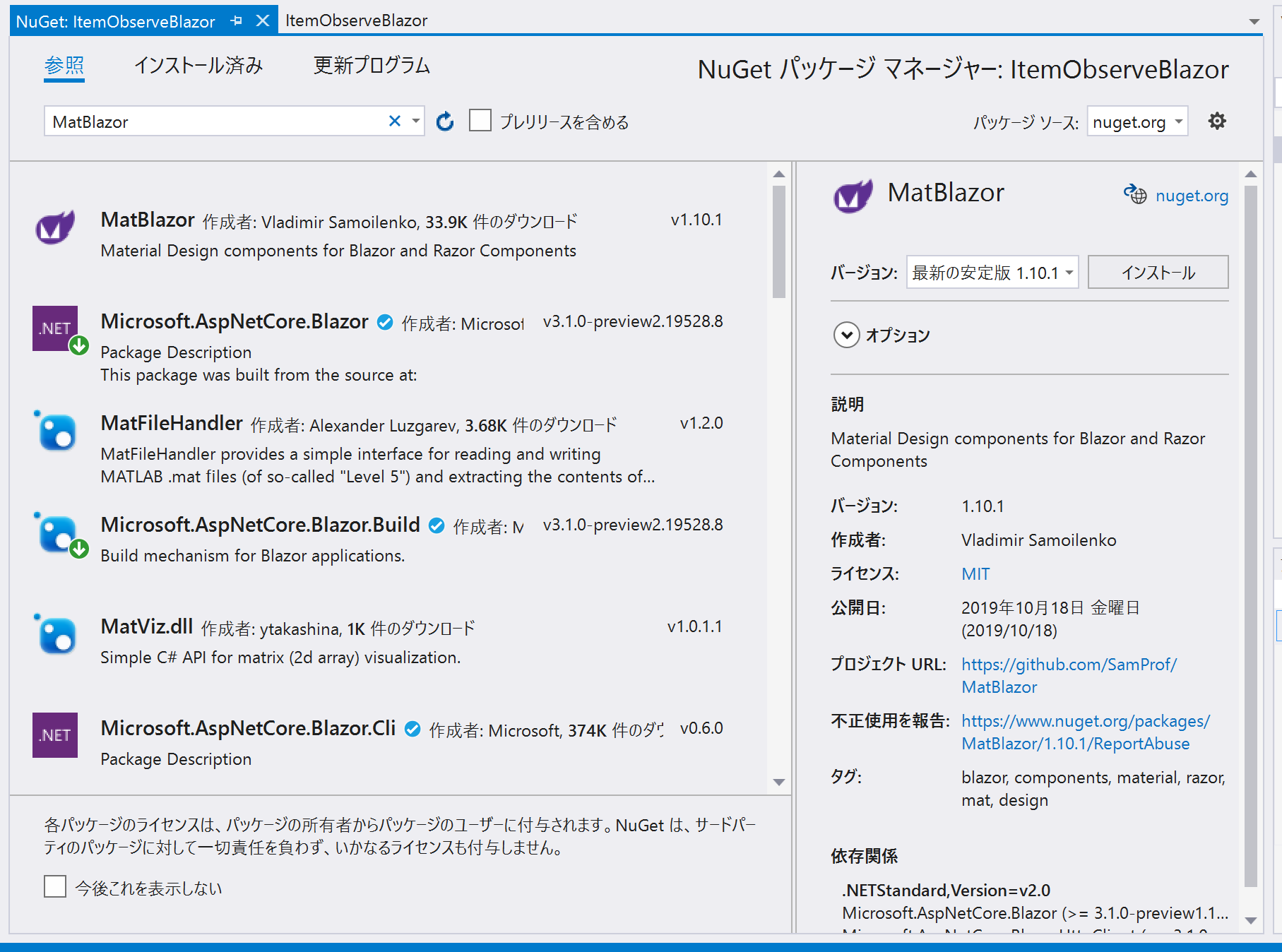
MatBlazor 1.10.1
導入手順
BlazorのWebAssembly App版をのプロジェクトを作成し、
NugetからMatBlazorをインストールします。
_Imports.razorに参照を追加します。
(@using MatBlazor)
Visual StudioのGUIを使わない場合、下記のいずれかのコマンドでも追加できるようです。
Install-Package MatBlazor
dotnet add package MatBlazor
コンポーネント紹介
何点かコンポーネントを紹介します。
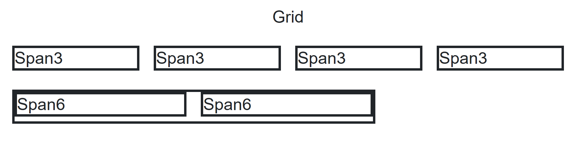
Layout Grid
Bootstrapなどと同じようにカラム数を指定することでレスポンシブデザインを実現します。
1行のカラム数はデスクトップが12,タブレットが8,スマホが4です。
mat-layout-grid → mat-layout-grid-inner → mat-layout-grid-cell
といった形で入れ子で記載していきます。
Cellにはspanでカラムの占有数を指定します。
Cell内にinnerを追加することで入れ子でさらにカラムを分割することができます。
<div class="mat-layout-grid">
    <div class="mat-layout-grid-inner">
        <div class="mat-layout-grid-cell mat-layout-grid-cell-span-12 ">
            <h3 align="center">Grid</h3>
        </div>
        <div class="mat-layout-grid-cell mat-layout-grid-cell-span-3 ">
            <h3 class="grid-sample">Span3</h3>
        </div>
        <div class="mat-layout-grid-cell mat-layout-grid-cell-span-3 ">
            <h3 class="grid-sample">Span3</h3>
        </div>
        <div class="mat-layout-grid-cell mat-layout-grid-cell-span-3 ">
            <h3 class="grid-sample">Span3</h3>
        </div>
        <div class="mat-layout-grid-cell mat-layout-grid-cell-span-3 ">
            <h3 class="grid-sample">Span3</h3>
        </div>
        <div class="mat-layout-grid-cell mat-layout-grid-cell-span-8 grid-sample">
            <div class="mat-layout-grid-inner">
                <div class="mat-layout-grid-cell mat-layout-grid-cell-span-6 ">
                    <h3 class="grid-sample">Span6</h3>
                </div>
                <div class="mat-layout-grid-cell mat-layout-grid-cell-span-6 ">
                    <h3 class="grid-sample">Span6</h3>
                </div>
            </div>
        </div>
    </div>
</div>
上記では
- 幅3のカラムを4つ
- 幅8のカラム内に幅6のカラムを2つ
を配置しています。
表示イメージは下記のようになります。
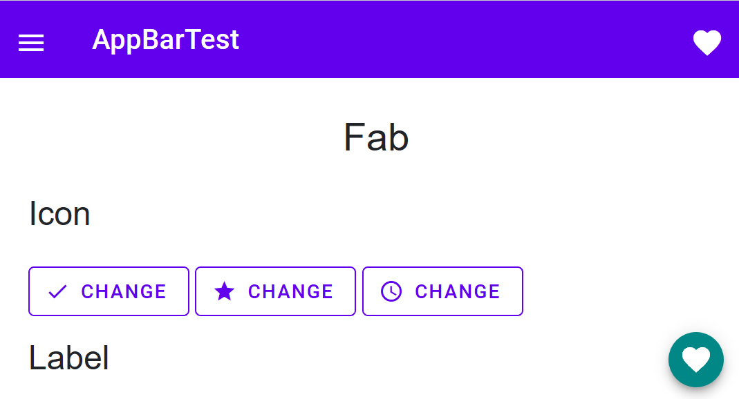
AppbarとMatMenu
Webサイトでよく見かけるアプリケーションメニューを実現できます。
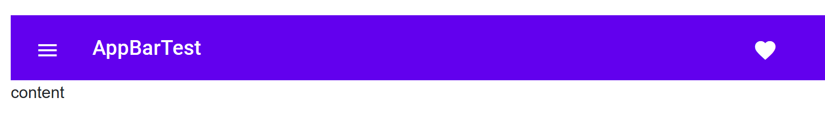
<MatAppBarContainer>
    <MatAppBar Fixed="true">
        <MatAppBarRow>
            <MatAppBarSection>
                <MatIconButton Icon="menu" OnClick="@OnClickMenu" @ref="Button"></MatIconButton>
                <MatMenu @ref="Menu">
                    <MatList>
                        <MatListItem OnClick="@(e => OnSelectMenu("Item1"))">Item 1</MatListItem>
                        <MatListItem OnClick="@(e => OnSelectMenu("Item2"))">Item 2</MatListItem>
                        <MatListItem OnClick="@(e => OnSelectMenu("Item3"))">Item 3</MatListItem>
                        <MatListItem OnClick="@(e => OnSelectMenu("Item4"))">Item 4</MatListItem>
                        <MatListItem OnClick="@(e => OnSelectMenu("Item5"))">Item 5</MatListItem>
                    </MatList>
                </MatMenu>
                <MatAppBarTitle>AppBarTest</MatAppBarTitle>
            </MatAppBarSection>
            <MatAppBarSection Align="@MatAppBarSectionAlign.End">
                <MatIconButton Icon="favorite"></MatIconButton>
            </MatAppBarSection>
        </MatAppBarRow>
    </MatAppBar>

    <MatAppBarContent>
        @content
    </MatAppBarContent>
</MatAppBarContainer>

@code {
    MatIconButton Button;
    BaseMatMenu Menu;
    private string content = "content";

    public void OnClickMenu(MouseEventArgs e)
    {
        this.Menu.OpenAsync(Button.Ref);
    }

    public void OnSelectMenu(string content)
    {
        this.content = content;
    }
}
MatAppBarContainer → MatAppBar → MatAppBarRow(行) → MatAppBarSection(領域) → MatAppBarTitle(タイトル)
といった形で領域を作成します。
MatAppBarSectionにはAlignプロパティがあるので、複数のセクションを作り、左右それぞれにコンテンツを配置するといったことが可能です。
(ただ、私の環境だけか不明ですが、MatAppBarContainerを置くとレイアウトがうまく機能しない場合があったので外しています。外すしても今のところ不都合は生じていません。)
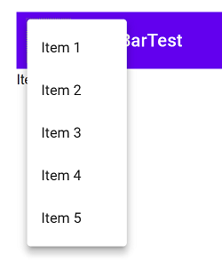
次にメニューの表示ですが、
- MatMenuに対してrefでインスタンスの参照を保持
- OpenAsyncメソッドを呼び出す
ことでドロップダウンのメニューが表示されます。
これをMatIconButtonでボタンクリックをき起点として呼び出すことで、メニューの表示を行います。
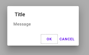
MatDialog
よく使うダイアログです。
<div class="mat-layout-grid">
    <div class="mat-layout-grid-inner">
        <div class="mat-layout-grid-cell mat-layout-grid-cell-span-3 ">
            <MatButton OnClick="@(e => { okCancelDialogIsOpen = true; })">OKCancel Dialog</MatButton>
        </div>
        <div class="mat-layout-grid-cell mat-layout-grid-cell-span-12 ">
            @result
        </div>
    </div>
</div>
<!-- ok cancel dialog -->
<MatDialog @bind-IsOpen="@okCancelDialogIsOpen" CanBeClosed="false">
    <MatDialogTitle>Title</MatDialogTitle>
    <MatDialogContent>
        <p>Message</p>
    </MatDialogContent>
    <MatDialogActions>
        <MatButton OnClick="@(e => { okCancelDialogIsOpen = false; result = "OK"; })">OK</MatButton>
        <MatButton OnClick="@(e => { okCancelDialogIsOpen = false; result = "Cancel"; })">Cancel</MatButton>
    </MatDialogActions>
</MatDialog>

@code {
    string result = string.Empty;
    bool okCancelDialogIsOpen = false;
}
ページの要素内にMatDialogのタグを作成して、 bind-IsOpenを切り替えることで表示と非表示を切り替えます。
それぞれ、タイトル(MatDialogTitle)、コンテンツ(MatDialogContent)、下部のボタン(MatDialogActions)のレイアウトを定義して使用します。
CanBeClosedpuプロパティで、画面外のクリック等で閉じられるかどうかを設定できます。
また、OK、Cancelのような定型的なダイアログなどは下記のようにコンポーネント化して使用することも可能です。
<MatDialog @bind-IsOpen="@IsDialogOpen" CanBeClosed="false">
    <MatDialogTitle>@Title</MatDialogTitle>
    <MatDialogContent>
        <p>@Message</p>
    </MatDialogContent>
    <MatDialogActions>
        <MatButton OnClick="@(e => { OnClick(true); })">OK</MatButton>
        <MatButton OnClick="@(e => { OnClick(false); })">Cancel</MatButton>
    </MatDialogActions>
</MatDialog>

@code {

    [Parameter]
    public bool IsDialogOpen { get; set; }
    [Parameter]
    public string Title { get; set; }
    [Parameter]
    public string Message { get; set; }
    [Parameter]
    public EventCallback<bool> ButtonAction { get; set; }

    void OnClick(bool result)
    {
        ButtonAction.InvokeAsync(result);
    }
}
コンポーネントを使用する側は下記のようになります。
<div class="mat-layout-grid">
    <div class="mat-layout-grid-inner">
        <div class="mat-layout-grid-cell mat-layout-grid-cell-span-3 ">
            <MatButton OnClick="@(e => { customDialogIsOpen = true; })">Custom Dialog</MatButton>
        </div>
        <div class="mat-layout-grid-cell mat-layout-grid-cell-span-12 ">
            @result
        </div>
    </div>
</div>
<!-- component dialog -->
<OKCancelDialog IsDialogOpen="@customDialogIsOpen" Title="Test" Message="メッセージ"
                ButtonAction="@(e => { customDialogIsOpen = false;  result = e.ToString(); })" />
@code {
    string result = string.Empty;
    bool customDialogIsOpen = false;
}
MatTable
表用のコンポーネントです。
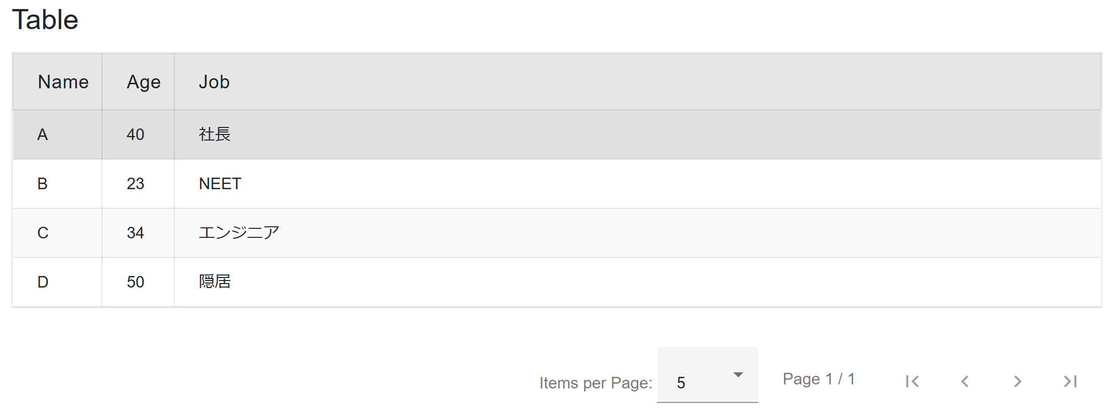
<MatTable Items="@PersonList" AllowSelection="true" Striped="true">
    <MatTableHeader>
        <th>Name</th>
        <th>Age</th>
        <th>Job</th>
    </MatTableHeader>
    <MatTableRow>
        <td>@context.Name</td>
        <td>@context.Age</td>
        <td>@context.Job</td>
    </MatTableRow>
</MatTable>

@code {
    class Person
    {
        public string Name { get; set; }

        public int Age { get; set; }

        public string Job { get; set; }
    }

    List<Person> PersonList;

    protected override void OnInitialized()
    {
        PersonList = new List<Person>();
        PersonList.Add(new Person() { Name = "A", Age = 40, Job = "社長" });
        PersonList.Add(new Person() { Name = "B", Age = 23, Job = "NEET" });
        PersonList.Add(new Person() { Name = "C", Age = 34, Job = "エンジニア" });
        PersonList.Add(new Person() { Name = "D", Age = 50, Job = "隠居" });
    }
}
コレクションをItemsにバインドして、MatTableHeaderにヘッダ名、MatTableRowに表示したいプロパティを指定します。(@context.プロパティ)
.NET技術者だと、ついDataGrid的な使い方を期待してしまいますが、
AllowSelectionプロパティで行選択は可能ですが、残念ながら選択した要素の取得方法が見つかりませんでした。
MatFAB
最近のWEBサイトでよく見かける、フローティングのアクションボタンを追加できます。
<style>
    .app-fab--absolute {
        position: fixed;
        bottom: 1rem;
        right: 1rem;
    }
</style>
<div class="mat-layout-grid">
    // 略
    <MatFAB Class="app-fab--absolute" Icon="@Icon" Label="@Label"></MatFAB>
</div>

@code {
    string Icon = MatIconNames.Favorite;
  //String.Emptyだと余計なスペースが入る
    string Label = null;
}
画面の右下に表示する方法はプロパティではなく、スタイルシートで指定します。
(razor内にも記載可能。今回はapp-fab--absolute)
Labelプロパティで文字も表示可能ですが、String.Emptyだと余計なスペースが入るので、動的に表示を切り替えたい場合はnullを設定しましょう。
IconプロパティにはSPAのUIフレームワークではおなじみのMaterial Iconが指定可能です。
MatIconNamesで定義されているアイコンのイメージは下記で確認できます。
https://samprof.github.io/MatBlazor/Icon
よく使うケースだと、画面がスクロールされた場合にボタンを表示といった使い方をすると思いますが、Javascriptと相互連携しないと難しそうなので、近いうちにまた別途調べて紹介できればと思います。
(JSがそのまま使えないのが、VueやReactなどのSPAフレームワークと違って歯がゆいところです。)
その他のコンポーネント
TextBox、CheckBox、DatePicker、RadioButton、Selectなどよく使う入力コンポーネントは一通り揃っています。
詳細は公式サイトを参照ください。
https://samprof.github.io/MatBlazor/
まとめ
Blazor向けのUIフレームワークとしてMatBlazorの紹介をしました。
Radzen.Blazorと比較するとコンポーネントの数は少ないですが、個々の機能に関してドキュメントが揃っているので使いやすいと感じました。
現在も絶賛開発中ですので今後にも期待したいですね。
参考
Blazorのその他の投稿記事
何点かBlazorに関して記事を書いていますので、良ければ見てみてください。
- [Blazorの初期読み込み画面(Loading)を変更する]
(https://qiita.com/nobu17/items/adce29d366c1fc1e86a9) - [Blazorで未ログイン時にログインページにリダイレクトする]
(https://qiita.com/nobu17/items/d43b18b8d42e7d0b4535) - [Blazorでコードビハインドでロジックとビューを分離して記述する]
(https://qiita.com/nobu17/items/b7dc78db7beb1d833dc8) - [Blazor向けのUIフレームワークのRadzen.Blazorを使ってみる]
(https://qiita.com/nobu17/items/b6fb2e35f4943a1d325a) - [Blazorで作成したウェブサイトをGitHub Pagesで公開する]
(https://qiita.com/nobu17/items/116a0d1c949885e21d70) - [Blazorで作成したウェブサイトをFirebaseで公開する]
(https://qiita.com/nobu17/items/67c11cf622f2e4721635)