はじめに
Visual Studio Code で Nuxt.js を使った Docker コンテナ内での開発
作成した環境でボタンコンポーネントを作ってみます。
下記リポジトリをクローンすれば開発できる状態になります。
https://github.com/nakazawaken1/nuxt_in_docker.git
差分が確認できるように GitHub の差分ページのリンクを載せていきます。
仕様
色、左右マーク、ボタン文字をプロパティで指定できるようにする。
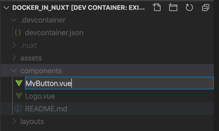
コンポーネントファイルを作成
components/MyButton.vue ファイルを作成する
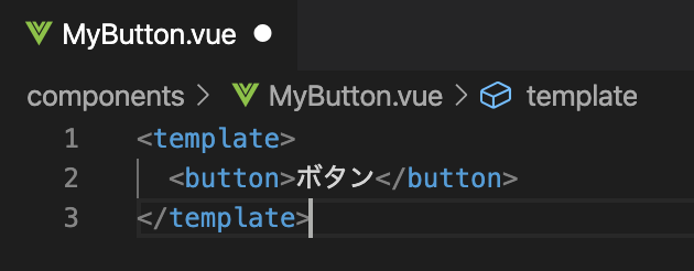
最低限の内容を入力し保存
<template>
  <a>ボタン</a>
</template>
pages/index.vue に配置してみる
index.vue はプロジェクト作成時に作成されて内容が入っているが、以下に書き換える。
<template>
  <div class="container">
    <div>
      <MyButton />
    </div>
  </div>
</template>

<script>
import MyButton from "~/components/MyButton.vue";
export default {
  components: {
    MyButton
  }
};
</script>

<style>
.container {
  margin: 0 auto;
  min-height: 100vh;
  display: flex;
  justify-content: center;
  align-items: center;
  text-align: center;
}
</style>
- template 内に <MyButton タグを記載します。
- script 内に MyButton を使用するための import と components 登録を記述します。
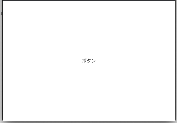
開発サーバを起動し、ブラウザをみてみると以下のように表示されます。
スタイルを適用する
MyButton.vue に <style> を追加します。
色合いを決める時は以下のサイトが便利です。
https://color.adobe.com/ja/create/color-wheel
<template>
  <a class="MyButton">ボタン</a>
</template>

<style>
.MyButton {
  background-color: #00a656;
  border-radius: 1.5em;
  box-shadow: 0 0.2em 0.5em rgba(0, 0, 0, 0.2);
  padding: 1em 2em;
  color: #ffffff;
  font-weight: bold;
  text-decoration: none;
}
</style>
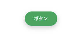
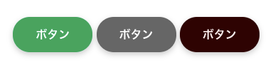
ブラウザで確認すると以下のようになっているはずです。
色を指定できるようにする
以下の2つのファイルを書き換えます。
<template>
  <a class="MyButton" :style="{'background-color': back_color, color: fore_color}">ボタン</a>
</template>

<script>
export default {
  props: {
    back_color: {
      type: String,
      default: "#00a656"
    },
    fore_color: {
      type: String,
      default: "#ffffff"
    }
  }
};
</script>

<style>
.MyButton {
  border-radius: 1.5em;
  box-shadow: 0 0.2em 0.5em rgba(0, 0, 0, 0.2);
  padding: 1em 2em;
  font-weight: bold;
  text-decoration: none;
}
</style>
-
a タグの style 属性の前に : をつけると値にJavaScriptの式がかけます。
style の場合は、ここでオブジェクト式を書くとキーがスタイル名、値がスタイルの値となります。
background-color を back_color、 color を fore_color というカスタム属性で指定できる様にしています。 -
script タグの export default するオブジェクトの中に props: を指定すると、
カスタム属性を作成できます。
back_color, fore_color の型と省略時の既定値を指定しています。 -
style タグからは background-color, color の定義を消しました。
<template>
  <div class="container">
    <div>
      <MyButton back_color="#666666"/>
    </div>
  </div>
</template>

<script>
import MyButton from "~/components/MyButton.vue";
export default {
  components: {
    MyButton
  }
};
</script>

<style>
.container {
  margin: 0 auto;
  min-height: 100vh;
  display: flex;
  justify-content: center;
  align-items: center;
  text-align: center;
}
</style>
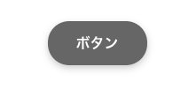
- MyButton タグに作成したカスタム属性 back_color を指定しています。
- fore_color は指定していないので、既定値が使用されます。
ブラウザで確認すると色が変わっています。
ボタンを並べてみました
矢印の有無指定ができるようにする
以下の2つのファイルを書き換えます。
<template>
  <a
    class="MyButton"
    :style="{'background-color': back_color, color: fore_color}"
    :class="{left_arrow, right_arrow}"
  >ボタン</a>
</template>

<script>
export default {
  props: {
    back_color: {
      type: String,
      default: "#00a656"
    },
    fore_color: {
      type: String,
      default: "#ffffff"
    },
    left_arrow: {
      type: Boolean,
      default: false
    },
    right_arrow: {
      type: Boolean,
      default: false
    }
  }
};
</script>

<style>
.MyButton {
  border-radius: 1.5em;
  box-shadow: 0 0.2em 0.5em rgba(0, 0, 0, 0.2);
  padding: 1em 2em;
  font-weight: bold;
  text-decoration: none;
}
.MyButton.left_arrow {
  padding-left: 0;
}
.MyButton.left_arrow::before {
  content: "〈";
  padding-right: 1em;
}
.MyButton.right_arrow {
  padding-right: 0;
}
.MyButton.right_arrow::after {
  padding-left: 1em;
  content: "〉";
}
</style>
- class 属性もオブジェクト式を指定すると、キーがクラス名、値がtrueの時のみそのクラス名がつくという書き方ができます。新しいJavaScriptの文法でキーと同名の変数がある場合はキーを省略して書けます。
- left_arrow, right_arrow という 真偽値型の属性を追加しています。
- left_arrow が true の場合は .left_arrow クラスがつくので、CSSで矢印の文字を表示するよう指定しています。
- right_arrowも同様です。
<template>
  <div class="container">
    <div>
      <MyButton />
      <MyButton back_color="#666666" />
      <MyButton back_color="#330000" fore_color="#ffeeee" />
      <MyButton left_arrow />
      <MyButton right_arrow />
      <MyButton left_arrow right_arrow />
    </div>
  </div>
</template>

<script>
import MyButton from "~/components/MyButton.vue";
export default {
  components: {
    MyButton
  }
};
</script>

<style>
.container {
  margin: 0 auto;
  min-height: 100vh;
  display: flex;
  justify-content: center;
  align-items: center;
  text-align: center;
}
</style>
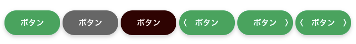
- left_arrow のみをつけたボタン
- right_arrow のみをつけたボタン
- left_arrow, right_arrow 両方つけたボタン
を追加しました。
ブラウザで確認すると以下の様に表示されます。
ボタン文字を変更できるようにする
カスタム属性を追加してもできますが、今回は slot というものを使用してみます。
以下の2つのファイルを書き換えます。
<template>
  <a
    class="MyButton"
    :style="{'background-color': back_color, color: fore_color}"
    :class="{left_arrow, right_arrow}"
  ><slot>ボタン</slot></a>
</template>

<script>
export default {
  props: {
    back_color: {
      type: String,
      default: "#00a656"
    },
    fore_color: {
      type: String,
      default: "#ffffff"
    },
    left_arrow: {
      type: Boolean,
      default: false
    },
    right_arrow: {
      type: Boolean,
      default: false
    }
  }
};
</script>

<style>
.MyButton {
  border-radius: 1.5em;
  box-shadow: 0 0.2em 0.5em rgba(0, 0, 0, 0.2);
  padding: 1em 2em;
  font-weight: bold;
  text-decoration: none;
}
.MyButton.left_arrow {
  padding-left: 0;
}
.MyButton.left_arrow::before {
  content: "〈";
  padding-right: 1em;
}
.MyButton.right_arrow {
  padding-right: 0;
}
.MyButton.right_arrow::after {
  padding-left: 1em;
  content: "〉";
}
</style>
- <slot>タグを追加しました。タグ内には省略時の既定値を書きます。
<template>
  <div class="container">
    <div>
      <MyButton />
      <MyButton back_color="#666666" />
      <MyButton back_color="#330000" fore_color="#ffeeee" />
      <MyButton left_arrow />
      <MyButton right_arrow />
      <MyButton left_arrow right_arrow />
      <MyButton>実行</MyButton>
    </div>
  </div>
</template>

<script>
import MyButton from "~/components/MyButton.vue";
export default {
  components: {
    MyButton
  }
};
</script>

<style>
.container {
  margin: 0 auto;
  min-height: 100vh;
  display: flex;
  justify-content: center;
  align-items: center;
  text-align: center;
}
</style>
- MyButton タグ内に書いた内容がボタンの文字として表示されます。
ブラウザで確認すると以下の様に表示されます。
