自分の勉強用に、沖本竜義「経済・ファイナンスデータの計量経済分析」の章末問題をpythonで解いてみました。
jupyter notebook上で記述したものをほぼそのまま載せてあります。
ソースコードの細かい説明は省いてありますが、今後余裕があれば説明を加えようと思います。
こちらの記事は第4章の章末問題を解いたものになります。
第1章、第2章、第5章、第6章、第7章も公開しています。
各種設定・モジュールのインポート
%matplotlib inline
import numpy as np
import pandas as pd
import matplotlib.pyplot as plt
from statsmodels.tsa.vector_ar.var_model import VAR

import matplotlib as mpl
font = {"family":"IPAexGothic"}
mpl.rc('font', **font)
plt.rcParams["font.size"] = 12
4.5
ファイルをインポートする
msci = pd.read_csv('./input/msci_day.csv')
print(msci.shape)
msci.head()
(1391, 8)
| Date | ca | fr | ge | it | jp | uk | us | |
|---|---|---|---|---|---|---|---|---|
| 0 | 2003/1/1 | 560.099 | 902.081 | 724.932 | 290.187 | 1593.175 | 791.076 | 824.583 |
| 1 | 2003/1/2 | 574.701 | 927.206 | 768.150 | 296.963 | 1578.214 | 797.813 | 852.219 |
| 2 | 2003/1/3 | 580.212 | 929.297 | 768.411 | 298.757 | 1578.411 | 800.175 | 851.935 |
| 3 | 2003/1/6 | 589.619 | 943.002 | 788.164 | 303.273 | 1619.700 | 803.966 | 871.515 |
| 4 | 2003/1/7 | 585.822 | 923.785 | 774.054 | 297.892 | 1590.951 | 793.625 | 865.992 |
Date列をdatetime型に変換してmsciのDatetimeIndexとする
msci.index=pd.to_datetime(msci.Date.values)
msci.drop('Date',axis=1,inplace=True)
msci.head()
| ca | fr | ge | it | jp | uk | us | |
|---|---|---|---|---|---|---|---|
| 2003-01-01 | 560.099 | 902.081 | 724.932 | 290.187 | 1593.175 | 791.076 | 824.583 |
| 2003-01-02 | 574.701 | 927.206 | 768.150 | 296.963 | 1578.214 | 797.813 | 852.219 |
| 2003-01-03 | 580.212 | 929.297 | 768.411 | 298.757 | 1578.411 | 800.175 | 851.935 |
| 2003-01-06 | 589.619 | 943.002 | 788.164 | 303.273 | 1619.700 | 803.966 | 871.515 |
| 2003-01-07 | 585.822 | 923.785 | 774.054 | 297.892 | 1590.951 | 793.625 | 865.992 |
欠損データ(e.g. 2005-01-01)があるので、グラフの目盛用にその年で1番最初の日かどうかをカラムに加える
msci['is_year_start']=[msci.index[i].year!=msci.index[i-1].year for i in range(msci.shape[0])]
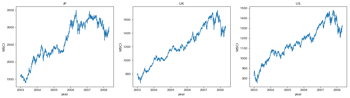
JP,UK,USのMSCIをプロットする
title=['JP','UK','US']
fig,ax=plt.subplots(1,3,figsize=[20,5])
for i in range(3):
    ax[i].plot(msci.iloc[:,i+4])
    ax[i].set_title(title[i])
    ax[i].set_xticks(msci.index[msci.is_year_start])
    ax[i].set_xlabel('year',fontsize=12)
    ax[i].set_ylabel('MSCI',fontsize=12)
plt.show()
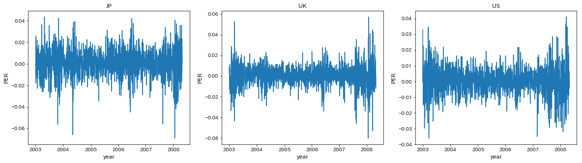
対数差分系列を計算して株式収益率(PER)のDataFrameを作る
per=pd.DataFrame(np.log(msci.iloc[:,:7]).diff(),index=msci.index[1:])
per.head()
| ca | fr | ge | it | jp | uk | us | |
|---|---|---|---|---|---|---|---|
| 2003-01-02 | 0.025736 | 0.027471 | 0.057907 | 0.023082 | -0.009435 | 0.008480 | 0.032966 |
| 2003-01-03 | 0.009544 | 0.002253 | 0.000340 | 0.006023 | 0.000125 | 0.002956 | -0.000333 |
| 2003-01-06 | 0.016083 | 0.014640 | 0.025381 | 0.015003 | 0.025822 | 0.004727 | 0.022723 |
| 2003-01-07 | -0.006461 | -0.020589 | -0.018065 | -0.017902 | -0.017909 | -0.012946 | -0.006357 |
| 2003-01-08 | -0.016002 | -0.025601 | -0.041735 | -0.013862 | -0.016723 | -0.012756 | -0.014646 |
欠損データ(e.g. 2005-01-01)があるので、グラフの目盛用にその年で1番最初の日かどうかをカラムに加える
per['is_year_start']=[per.index[i].year!=per.index[i-1].year for i in range(per.shape[0])]
JP,UK,USのPERをプロットする
names=['JP','UK','US']
fig,ax=plt.subplots(1,3,figsize=[20,5])
for i in range(3):
    ax[i].plot(per.iloc[:,i+4])
    ax[i].set_title(names[i])
    ax[i].set_xticks(per.index[per.is_year_start])
    ax[i].set_xlabel('year',fontsize=12)
    ax[i].set_ylabel('PER',fontsize=12)
plt.show()
0期から10期までのVARモデルを推定する
var=[]
for i in range(11):
     var.append(VAR(per[['jp','uk','us']]).fit(maxlags=i))
各次数のモデルのAICを確認
aic=[]
for i in range(11):
    aic.append(var[i].aic)
pd.Series(aic,index=range(11),name='AIC')
0    -27.559452
1    -27.967305
2    -27.995273
3    -28.001670
4    -28.003014
5    -28.000596
6    -28.002719
7    -27.993201
8    -27.986282
9    -27.980579
10   -27.981139
Name: AIC, dtype: float64
教科書ではVAR(3)がAIC最小だったが、今回はVAR(4)がAIC最小となった
(これは、フィッティングに使うmethodが異なるからだと考えていますが、もし理由が分かる方いればご教授ください...)
今回は教科書に合わせてVAR(3)モデルを使う
グレンジャー因果性検定を行う
names=['JP','UK','US']
stat=[]
pval=[]
null=[]
for i in range(3):
    for j in range(3):
        if i!=j:
            test=var[3].test_causality(i,j,kind='f',signif=0.05,verbose=False)
            stat.append(test['statistic'].round(1))
            pval.append(test['pvalue'].round(3))
            null.append('%s->%s'%(names[j],names[i]))
        else:
            pass
pd.DataFrame({'Statistics':stat,'P_value':pval},index=null,columns=['Statistics','P_value']).T
| UK->JP | US->JP | JP->UK | US->UK | JP->US | UK->US | |
|---|---|---|---|---|---|---|
| Statistics | 12.0 | 53.5 | 0.800 | 71.9 | 0.200 | 0.600 |
| P_value | 0.0 | 0.0 | 0.519 | 0.0 | 0.882 | 0.617 |
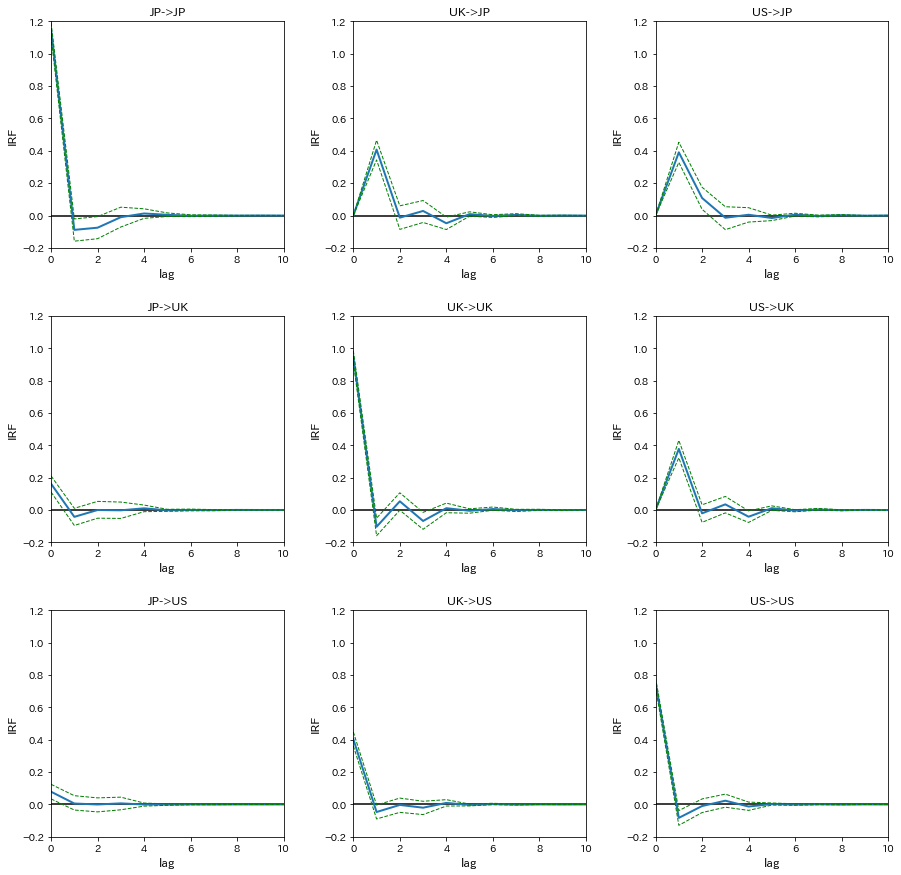
インパルス応答関数(IRF)を計算する
信頼区間はブートストラップ法によるものを採用
irf=var[3].irf(10).orth_irfs
interval=var[3].irf_errband_mc(orth=True,T=10,signif=0.05)
プロットする
names=['JP','UK','US']
fig,ax=plt.subplots(3,3,figsize=[15,15])
for i in range(3):
    for j in range(3):
        ax[i,j].plot(irf[:,i,j]*100,linewidth=2)
        ax[i,j].plot(interval[0][:,i,j]*100,linestyle='dashed',color='green',linewidth=1)
        ax[i,j].plot(interval[1][:,i,j]*100,linestyle='dashed',color='green',linewidth=1)
        ax[i,j].hlines(0,0,10)
        ax[i,j].set_xlim(0,10)
        ax[i,j].set_ylim(-0.2,1.2)
        ax[i,j].set_xlabel('lag',fontsize=12)
        ax[i,j].set_ylabel('IRF',fontsize=12)
        ax[i,j].set_title('%s->%s'%(names[j],names[i]))
plt.subplots_adjust(wspace=0.3, hspace=0.3)
plt.show()
分散分解分析を行うため、相対的分散寄与率(RVC)を計算する
decomp=var[3].fevd(11).decomp
プロットする
names=['JP','UK','US']
fig,ax=plt.subplots(3,3,figsize=[15,15])
for i in range(3):
    for j in range(3):
        ax[i,j].plot(decomp[i,:,j]*100,linewidth=2)
        ax[i,j].set_xlim(0,10)
        ax[i,j].set_ylim(0,100)
        ax[i,j].set_xlabel('lag',fontsize=12)
        ax[i,j].set_ylabel('RVC',fontsize=12)
        ax[i,j].set_title('%s->%s'%(names[j],names[i]))
plt.subplots_adjust(wspace=0.3, hspace=0.3)
plt.show()

4.6
(1)
4.5で計算済みなので、ここでは表示だけする
ただし、PERは%表示に直していない
per[['jp','fr','ca']].head()
| jp | fr | ca | |
|---|---|---|---|
| 2003-01-02 | -0.009435 | 0.027471 | 0.025736 |
| 2003-01-03 | 0.000125 | 0.002253 | 0.009544 |
| 2003-01-06 | 0.025822 | 0.014640 | 0.016083 |
| 2003-01-07 | -0.017909 | -0.020589 | -0.006461 |
| 2003-01-08 | -0.016723 | -0.025601 | -0.016002 |
(2)
日本、フランス、カナダの順に外生性が高いような再帰的構造が仮定されている
各国の証券取引所の取引時間を調べてみると、フランスはイギリスと、カナダはアメリカと同じで、UTC基準では以下のようになる
日本 0:00-6:00
フランス 8:00-16:30
カナダ 14:30-21:00
取引時間を見れば分かる通り、日本、フランス、カナダの順で取引開始時間が早く、しかもフランスとカナダの2時間以外、2つ以上の取引所が同時に開いている時間帯がない
PERのデータが日次データであるため、同時点で日本のPERは他国の影響を受けることはなく、フランスのPERは日本の影響は受けるがカナダの影響は小さく、カナダのPERは日本とフランスの影響を受けると考えられる
つまり、日本、フランス、カナダの順にが高いような再帰的構造が仮定されていることは妥当だと言える
(3)
時価総額ベースでみても、月間売買代金ベースでみても、取引所の規模は日本、フランス(ユーロネクスト)、カナダの順で大きい
よって、週次や年次のデータであっても日本、フランス、カナダの順に外生性が高いと考えられる
しかし、日次データと違って週次や年次のデータでは再帰的構造の仮定を支持する根拠はないため、実際は他の順に並べて試して結果を比較して妥当な順番を見つけ出すことになると考えられる
(筆者は計量経済学の専門ではなく、教科書の知識を基に考察していますので、ここはあまり参考にしないでください)
(4)
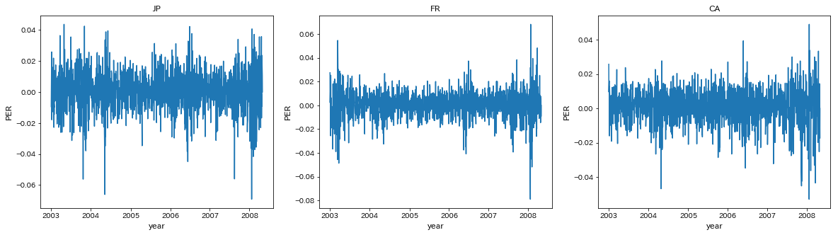
JP,FR,CAのPERをプロットする
names=['JP','FR','CA']
fig,ax=plt.subplots(1,3,figsize=[20,5])
for i in range(3):
    ax[i].plot(per.loc[:,names[i].lower()])
    ax[i].set_title(names[i])
    ax[i].set_xticks(per.index[per.is_year_start])
    ax[i].set_xlabel('year',fontsize=12)
    ax[i].set_ylabel('PER',fontsize=12)
plt.show()
0期から10期までのAICを計算する
var=[]
for i in range(11):
     var.append(VAR(per[['jp','fr','ca']]).fit(maxlags=i))
各次数のモデルのAICを確認
aic=[]
for i in range(11):
    aic.append(var[i].aic)
pd.Series(aic,index=range(11),name='AIC')
0    -27.177659
1    -27.385471
2    -27.392535
3    -27.390516
4    -27.383707
5    -27.386572
6    -27.383015
7    -27.378343
8    -27.369757
9    -27.364752
10   -27.359088
Name: AIC, dtype: float64
AICが最小となったのはVAR(2)モデル
(5)
グレンジャー因果性検定を行う
names=['JP','FR','CA']
stat=[]
pval=[]
null=[]
for i in range(3):
    for j in range(3):
        if i!=j:
            test=var[2].test_causality(i,j,kind='f',signif=0.05,verbose=False)
            stat.append(test['statistic'].round(1))
            pval.append(test['pvalue'].round(3))
            null.append('%s->%s'%(names[j],names[i]))
        else:
            pass
pd.DataFrame({'Statistics':stat,'P_value':pval},index=null,columns=['Statistics','P_value']).T
| FR->JP | CA->JP | JP->FR | CA->FR | JP->CA | FR->CA | |
|---|---|---|---|---|---|---|
| Statistics | 39.7 | 24.7 | 4.100 | 20.9 | 2.300 | 2.700 |
| P_value | 0.0 | 0.0 | 0.017 | 0.0 | 0.104 | 0.069 |
フランスに対する日本とカナダのグレンシャー因果検定では、有意水準5%で帰無仮説が棄却され、グレンジャー因果性が存在することが示唆された
つまり、フランスのPERを予測する上では、日本とカナダのPERは有用であるといえる
ただし、因果の方向性や大きさは分からない
(6)
インパルス応答関数(IRF)を計算する
信頼区間はブートストラップ法によるものを採用
irf=var[2].irf(10).orth_irfs
interval=var[2].irf_errband_mc(orth=True,T=10,signif=0.05)
プロットする
names=['JP','FR','CA']
fig,ax=plt.subplots(3,3,figsize=[15,15])
for i in range(3):
    for j in range(3):
        ax[i,j].plot(irf[:,i,j]*100,linewidth=2)
        ax[i,j].plot(interval[0][:,i,j]*100,linestyle='dashed',color='green',linewidth=1)
        ax[i,j].plot(interval[1][:,i,j]*100,linestyle='dashed',color='green',linewidth=1)
        ax[i,j].hlines(0,0,10)
        ax[i,j].set_xlim(0,10)
        ax[i,j].set_ylim(-0.2,1.2)
        ax[i,j].set_xlabel('lag',fontsize=12)
        ax[i,j].set_ylabel('IRF',fontsize=12)
        ax[i,j].set_title('%s->%s'%(names[j],names[i]))
plt.subplots_adjust(wspace=0.3, hspace=0.3)
plt.show()
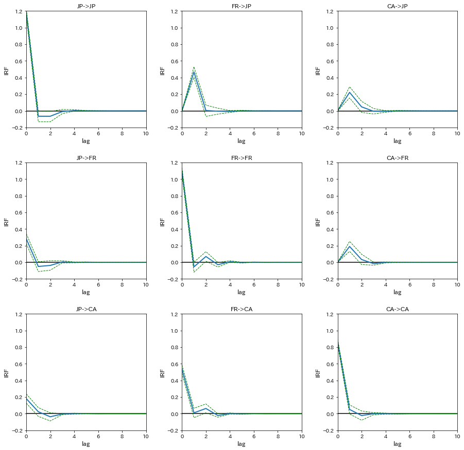
フランスの株式市場に対するショックが日本の株式市場に与える影響(FR->JP)をみると、IRFは0期では0%程度、1期では0.45%程度、2期以降は0という結果になった
また、FR->FRのIRFは0期では1.1%程度である
つまり、フランスのPERが1.1%上昇したら、1日後の日本のPERは0.45%上昇し、2日後以降には影響を与えないということが示唆される
(7)
分散分解分析を行うため、相対的分散寄与率(RVC)を計算する
decomp=var[2].fevd(11).decomp
プロットする
names=['JP','FR','CA']
fig,ax=plt.subplots(3,3,figsize=[15,15])
for i in range(3):
    for j in range(3):
        ax[i,j].plot(decomp[i,:,j]*100,linewidth=2)
        ax[i,j].set_xlim(0,10)
        ax[i,j].set_ylim(0,100)
        ax[i,j].set_xlabel('lag',fontsize=12)
        ax[i,j].set_ylabel('RVC',fontsize=12)
        ax[i,j].set_title('%s->%s'%(names[j],names[i]))
plt.subplots_adjust(wspace=0.3, hspace=0.3)
plt.show()

カナダの株式市場の変動(JP,FR,CA->CA)をみると、日本の株式市場の変動の寄与が3%程度、フランスの株式市場の変動の寄与が27%程度という結果になった
つまり、カナダの株式市場の変動に対して、日本の株式市場の変動のは3%の説明力しか持たないが、フランスの株式市場の変動は27%と比較的大きな説明力を持つことが示唆される
参考サイト
statsmodelsのドキュメントを読んだだけでは目的の変数がどこに格納されているのか分からなかったので、ソースコードをかなり参照しました
: https://github.com/statsmodels
取引所データ
: https://ja.wikipedia.org/wiki/%E8%A8%BC%E5%88%B8%E5%8F%96%E5%BC%95%E6%89%80