はじめに
わたしがGoogle UX Design Certificateで得られた素晴らしい体験を、特に重要だと思われるポイントを小さく分割して、わかりやすく簡潔に紹介していきます。
興味があれば、ぜひ Google UX Design Certificateを受講してみてください。
これまでの振り返り

コンテインメント
今回は、ページ上に要素を配置する際に留意すべきもう一つのこと、「コンテインメント」について紹介します。
コンテインメントは、 『デザインをきちんと整理しておくために視覚的な障壁』 を使用します。線や色のような障壁は、コンテンツをデザインの特定のセクションに限定するのに役立ちます。
コンテントには、4つの方法があります。
- 仕切り
- ボーダー
- 塗り
- シャドウ
1.仕切り(Dividers)
仕切りとは、セクションを区切る線のことです。シンプルで効果的なツールで、一緒にならないコンテンツをすばやく分割することができます。犬の散歩アプリでは、利用可能な各犬の散歩の間にグレーの仕切りを使用していることに気づきます。

2.ボーダー(Borders)
同様に、ボーダーはページ内のセクションを分割するために線を使います。ボーダーは連続した線であり、しばしば正方形や長方形のような形を形成する。

3.塗りつぶし(Fill)
塗りつぶしは、ちょうど色がオブジェクトを塗りつぶすと思うように、境界や図形に色を割り当てます。これによってコンテンツが際立ち、モックアップの中で新たな焦点となります。

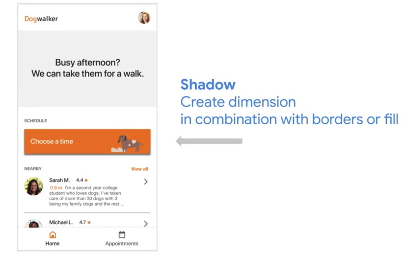
4.シャドウ(Shadow)
デザインに影を加えて、立体感を出すことができます。多くの場合、デザイナーはボーダーや塗りつぶしとの組み合わせで影を使用します。影は、要素をさらに分割するのに役立ちます。
Figmaでコンテインメントを作成する
仕切り
Figmaで仕切りを追加するのはとても簡単ですが、仕切りを配置する場所を決定するために、モックアップのセクションがお互いにどのように関連しているかを知る必要があります。
- Identify sections of content in your mockup that need to be separate from one another.
- In the toolbar at the top left of the screen, select the Rectangle tool, which is represented by an icon that looks like a square.
- Select Line from the dropdown menu, as shown in the image below.
- Choose the area of your mockup where you’d like to draw the divider. Click and drag your mouse to pull a straight line across the Frame.
- Click on the new line that was added to your mockup to select it. In the Design panel on the right side of the screen, go to the Stroke section, where you can control the look of the line you created. Select a color for the line and the line size, as shown in the image below.

ボーダー
- Identify sections of content in your mockup that need to be separate from one another.
- In the toolbar at the top left of the screen, select the Rectangle tool, which is represented by an icon that looks like a square.
- Select Line from the dropdown menu, as shown in the image below.
- Choose the area of your mockup where you’d like to draw the divider. Click and drag your mouse to pull a straight line across the Frame.
- Click on the new line that was added to your mockup to select it. In the Design panel on the right side of the screen, go to the Stroke section, where you can control the look of the line you created. Select a color for the line and the line size, as shown in the image below.
塗りつぶし
- Click to select a Layer in your design that you want to add fill to.
- In the Design panel on the right side of the screen, go to the Fill section. Click the plus (+) icon to add a fill to the layer.
- Figma will add a default solid fill with a hex value of C4C4C4. Click on the small colored rectangle, or fill swatch, to open the color picker. You can use the color picker to select any color to fill your shape.

シャドウ
ドロップシャドウとインナーシャドウの2種類があります。
- ドロップシャドウ: 要素から直接出ていて、どの方向へも向かうことができます。ドロップシャドウは、ボタンがページから飛び出しているように見せるのに最適です。
- インナーシャドウ: 要素の内側へ向かって伸びる影です。インナーシャドウは、ボタンが押されていることを示すのに最適な方法です。
- Click to select a Layer in your design that you want to add a shadow to.
- In the Design panel on the right side of the screen, go to the Effects section. The drop shadow effect is applied by default, as shown in the image below.
- Adjust the drop shadow using the Effect settings icon, which looks like a sun. Feel free to play around with a few different shadow options in order to find one that you want to use in your mockups!

サンプル
仕切り

ボーダー

塗りつぶし

シャドウ
