※ 2019/07/15 ツールが 3.0 になりいくつか内容が変わったため記事を編集します。
前回 までの記事でカスタムビジュアルに棒グラフを追加しました。今回はグラフの設定を決める書式について見ていきます。
Capabilities.json
カスタムビジュアルでできることは、Capabilities.json に定義します。
フィールドのカスタマイズ
フィールドは dataRoles に表示と種類を、dataViewMappings に設定を記述します。
表示と種類のカスタイマイズ
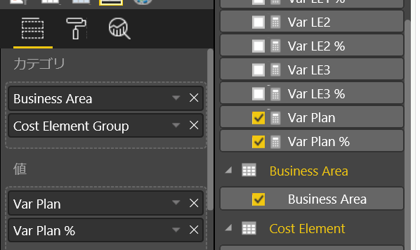
dataRoles にはフィールドの名前と種類を指定します。ここでは表示を日本語にします。
1. capabilities.json を開き、dataRoles 項目の displayName をそれぞれに日本語に変更。
"dataRoles": [
    {
        "displayName": "カテゴリ",
        "name": "category",
        "kind": "Grouping"
    },
    {
        "displayName": "値",
        "name": "measure",
        "kind": "Measure"
    }
],
2. 保存して、カスタムビジュアルを更新。内容が反映されることを確認。

設定
現時点ではカテゴリと値に複数のフィールドを配置できますが、今回のグラフは 1 つしか値を必要としないため、制限を行います。
1. まず現在複数のフィールドを指定できることを確認。
2. Capabilities.json の dataViewMappings に conditoins を追加
"conditions": [
    {
        "category": {
            "max": 1
        },
        "measure": {
            "max": 1
        }
    }
],
3. 保存して、カスタムビジュアルを更新。値が 1 つしかおけないことを確認。
書式のカスタマイズ
書式は objects に追加します。
Boolean 型の書式
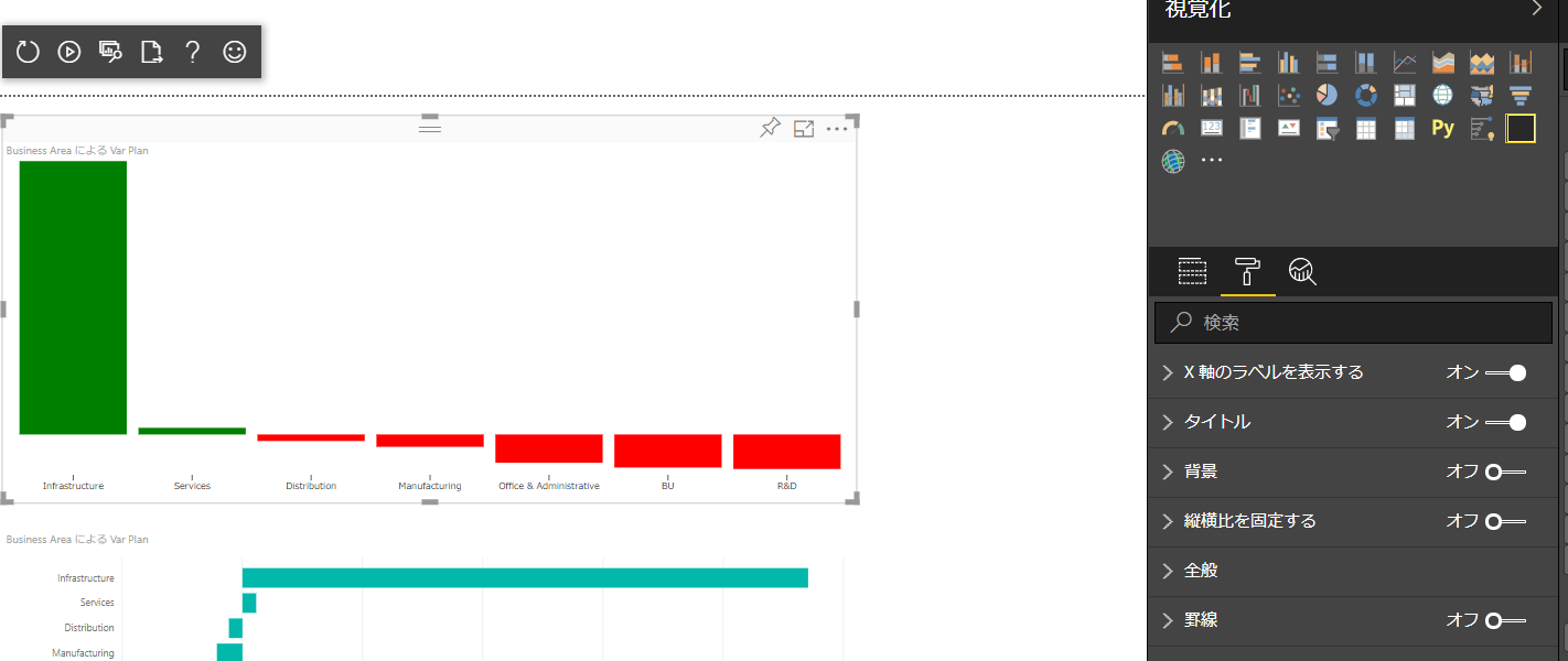
ここでは X 軸ラベルの表示/非表示を切り替えできるボタンを作成します。
1. Visual Studio Code で Capabilities.json を開きます。pbiviz で作成したプロジェクトは既定で「dataPoint」が入っています。objects ノードに以下の JSON を追加します。
"showXAxis": {
    "displayName": "X 軸のラベルを表示する",
    "properties": {
        "show": {
            "displayName": "表示する",
            "type": {
                "bool": true
            }
        }
    }
}
2. 書式はデータの変更などがある度に、書式の設定毎に Visual.ts の enumerateObjectInstances 関数が実行される。まずは書式の設定を保持するプロパティを Visual クラスに追加。
private showXAxis: boolean;
3. 次に enumerateObjectInstances 関数の中身を以下に差し替え。
public enumerateObjectInstances(options: EnumerateVisualObjectInstancesOptions): VisualObjectInstance[] | VisualObjectInstanceEnumerationObject {
   let objectName = options.objectName;
   let objectEnumeration: VisualObjectInstance[] = []
   // 設定名によって処理を実施
   switch (objectName) {
       // X 軸表示の設定
       case 'showXAxis':
           objectEnumeration.push({
               objectName: objectName,
               properties: {
                   show: this.showXAxis,
               },
               selector: null
           });
           break;
   }
   return objectEnumeration;
}
4. 保存してカスタムビジュアルを更新。書式に追加した項目が出ることを確認。
5. この時点では設定を変更してもすぐに値が元に戻る。原因は設定変更時に値を取得していないため。DataViewObjects を利用するため、npm パッケージ追加。
npm install powerbi-visuals-utils-dataviewutils --save
6. import を visual.ts に追加。
import { dataViewObjects } from "powerbi-visuals-utils-dataviewutils";
7. 次に update 関数の初めで書式を取得して、変数に保持。
// 書式から showXAxis を取得して、プロパティに設定。
this.showXAxis = dataViewObjects.getValue(
    options.dataViews[0].metadata.objects, {
        objectName: "showXAxis",
        propertyName: "show"
    }, true
);
8. 保存して、カスタムビジュアルを更新。書式の値が維持されることを確認。
9. 最後に受け取った値によって X 軸の表示を調整。xAxis の属性設定しているすぐ下に、以下コードを追加。
// X 軸の表示
this.showXAxis ? this.xAxis.style("display", "block") : this.xAxis.style("display", "none");
9. 保存して、カスタムビジュアルを更新。書式の変更で X 軸のラベルが出るかを確認。
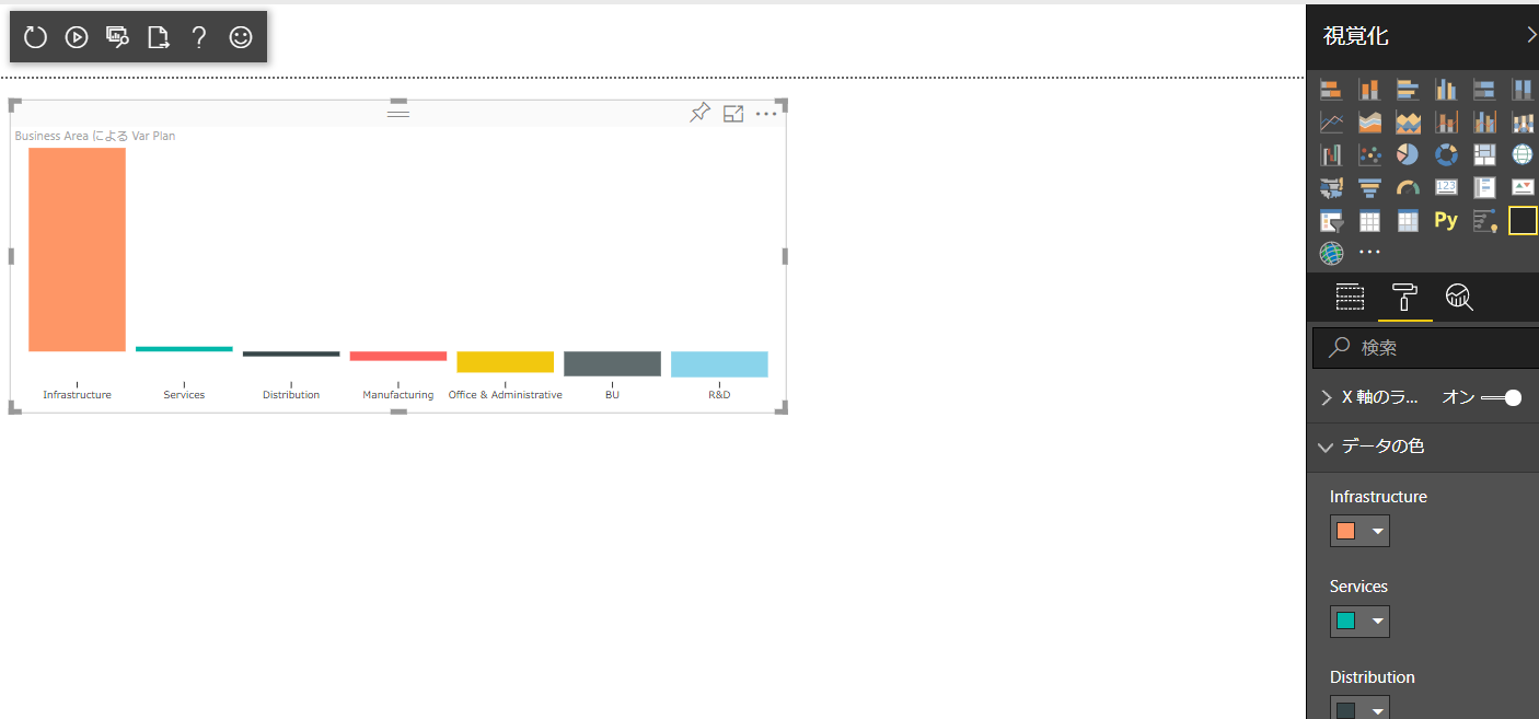
色の書式
もう 1 つよくある書式として色の指定を試してみます。既定のプロジェクトでは既に dataPoint が objects に存在しますが、今回は 1 から作ってみましょう。
1. capabilities.json の objects に、以下の JSON を追加。
"dataColor": {
    "displayName": "データの色",
    "properties": {
        "fill": {
            "displayName": "既定の色",
            "type": {
                "fill": {
                    "solid": {
                        "color": true
                    }
                }
            }
        }
    }
}
2. 色はグラフ毎にもつので、BarChartDataPoint に color プロパティを追加。
interface BarChartDataPoint {
    value: number;
    category: string;
    selectionId: ISelectionId;
    highlighted: boolean;
    color: string;
};
3. visualTransform 関数の dataPoint を作るループに color プロパティを追加。colorPalette を使って色を取得。
// カテゴリと値のセットを dataPoint に入れていく
for (let i = 0, len = Math.max(category.values.length, dataValue.values.length); i < len; i++) {
    barChartDataPoints.push({
        category: <string>category.values[i],
        value: <number>dataValue.values[i],
        selectionId: host.createSelectionIdBuilder()
            .withCategory(category, i)
            .createSelectionId(),
        highlighted: highlights ? highlights[i] ? true : false : false,
        color: host.colorPalette.getColor(<string>category.values[i]).value
    });
}
4. update 関数内、グラフ属性を付けている場所で、以前に正は緑、負は赤と指定した箇所を変更。
// 各グラフ毎に rect (四角) を追加してクラスを定義
// 高さや位置を指定
this.bars.enter()
    .append('rect')
    .on('click', (d) => {
        // インタラクティブに操作できる場合 (レポート内)
        if (this.host.allowInteractions) {
            // CTRL キーを押下している場合は複数選択。
            const isCrtlPressed: boolean = (d3.event as MouseEvent).ctrlKey;
            // selectionManager でアイテムを追加。
            this.selectionManager
                .select(d.selectionId, isCrtlPressed)
                .then((ids: ISelectionId[]) => {
                    this.syncSelectionState(this.barContainer.selectAll('.bar'), ids);
                });

            (<Event>d3.event).stopPropagation();
        }
    })
    .classed('bar', true)
    .attr("width",xScale.bandwidth())
    .attr("height", d => yScale(Math.abs(d.value)))
    .attr("y", d => {
        if (d.value > 0) {
            return yScale(max) - yScale(Math.abs(d.value));
        }
        else {
            return yScale(max);
        }
    })
    .attr("x", d => xScale(d.category))
    .attr("fill", d => d.color)
    .attr("fill-opacity", d => viewModel.highlights ? d.highlighted ? 1.0 : 0.2 : 1.0);

// 更新された際の再描写
this.bars
    .attr("width", xScale.bandwidth())
    .attr("height", d => yScale(Math.abs(d.value)))
    .attr("y", d => {
        if (d.value > 0) {
            return yScale(max) - yScale(Math.abs(d.value));
        }
        else {
            return yScale(max);
        }
    })
    .attr("x", d => xScale(d.category))
    .attr("fill", d => d.color);
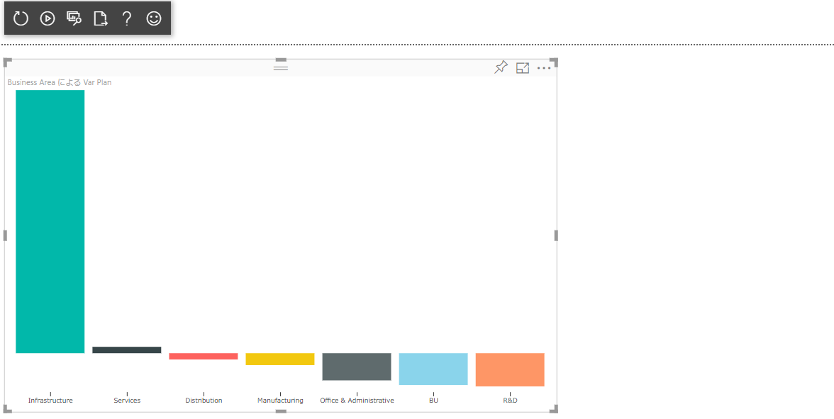
5. 保存し、カスタムビジュアルを更新。色が自動的につくことを確認。
6. 次に enumerateObjectInstances 内で書式を設定するにあたり、viewModel をプロパティ化。以下プロパティを Visual クラスに追加。
private viewModel: BarChartViewModel;
7. ローカル変数の viewModel を全て this.viewModel に変更。その後 enumerateObjectInstances 関数で case として dataColor のハンドルを追加。
case 'dataColor':
    if (this.viewModel) {
        for (let dp of this.viewModel.dataPoints) {
            objectEnumeration.push({
                objectName: objectName,
                displayName: dp.category,
                properties: {
                    fill: {
                        solid: {
                            color: dp.color
                        }
                    }
                },
                selector: dp.selectionId.getSelector()
            })
        }
    }
    break;
8. 手順 3 で追加した color の処理を変数から取得するように変更。ここではカテゴリごとのデータを変数から取得して保存。
// カテゴリと値のセットを dataPoint に入れていく
for (let i = 0, len = Math.max(category.values.length, dataValue.values.length); i < len; i++) {
    barChartDataPoints.push({
        category: <string>category.values[i],
        value: <number>dataValue.values[i],
        selectionId: host.createSelectionIdBuilder()
            .withCategory(category, i)
            .createSelectionId(),
        highlighted: highlights ? highlights[i] ? true : false : false,
        color: category.objects && category.objects[i] && dataViewObjects.getFillColor(category.objects[i], {
            objectName: "dataColor",
            propertyName: "fill"
        }, null) || host.colorPalette.getColor(<string>category.values[i]).value
    });
}
9. 保存し、カスタムビジュアルを更新。色を自由に選択できることを確認。
書式ではデータに依存しない方法でグラフの設定を変更できます。既存のグラフを見ながら、どういう設定が必要となりそうか検討してください。次回はツールティップとローカライズを見ていきます。