Plotlyでヒストグラム
この記事では plotly 2.3.0を利用しています。
はじめに
Plotlyは大変便利です。
実際に業務で利用する上で設定している項目などまとめてみました。ここではヒストグラム。
(なお、ここのチャートは静止画です。)
(180314追記)
以下でデータフレームからおこなった例を示しています。
Plotlyでヒストグラム その2
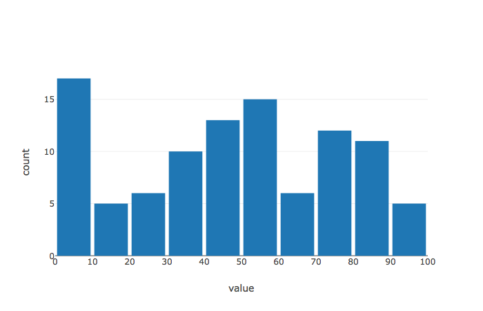
度数分布
# coding:utf-8

import pandas as pd
import numpy as np

import plotly.plotly as py
import plotly.graph_objs as go

import plotly.offline as offline
offline.init_notebook_mode()


# データの指定
X = np.random.randint(0,100,100)

data = go.Histogram(x=X,
                    xbins=dict(start=0, end=101, size=10)) # 区間の指定。sizeが区間幅


# レイアウトの指定
layout = go.Layout(
    xaxis = dict(title="value", dtick=10),     # dtick でラベルの表示間隔
    yaxis = dict(title="count"),
    bargap = 0.1) # 棒の間隔

fig = dict(data=[data], layout=layout)
offline.iplot(fig)
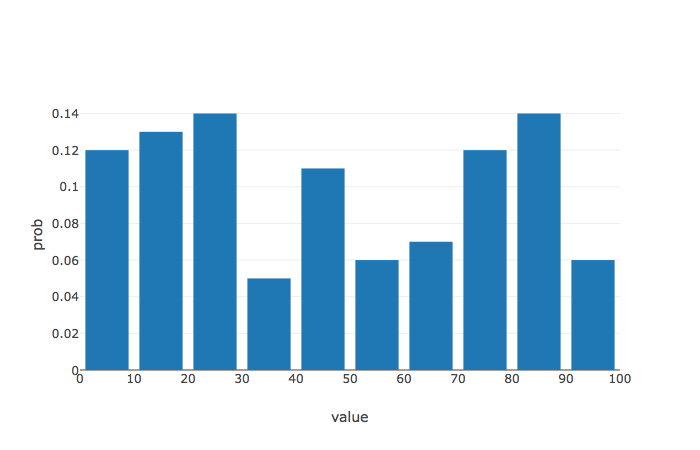
確率分布
# データの指定
X = np.random.randint(0,100,100)
data = go.Histogram(x=X,
                    xbins=dict(start=0, end=101, size=10),
histnorm='probability') #histnorm='probability'で確率分布に

# レイアウトの指定
layout = go.Layout(
    xaxis = dict(title="value", dtick = 10),
    yaxis = dict(title="prob"),
    bargap=0.2)

fig = dict(data=[data], layout=layout)
offline.iplot(fig)
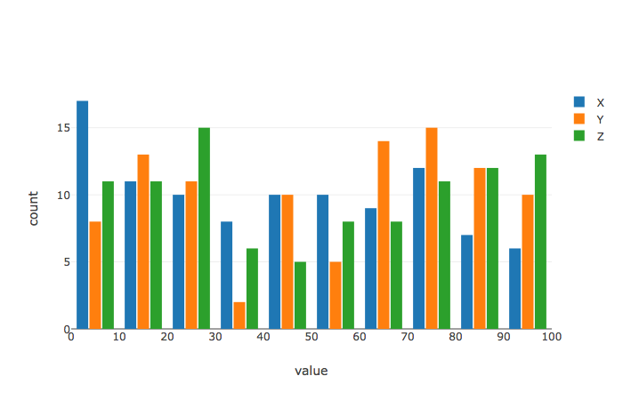
複数の項目のグラフ
# データの指定
X = np.random.randint(0,100,100)
Y = np.random.randint(0,100,100)
Z = np.random.randint(0,100,100)

trace0 = go.Histogram(x=X, xbins=dict(start=0, end=101, size=10), name = 'X')
trace1 = go.Histogram(x=Y, xbins=dict(start=0, end=101, size=10), name = 'Y')
trace2 = go.Histogram(x=Z, xbins=dict(start=0, end=101, size=10), name = 'Z')

# レイアウトの指定
layout = go.Layout(
    xaxis = dict(title="value", dtick = 10),
    yaxis = dict(title="count"),
    bargap = 0.2,
    bargroupgap = 0.1)

fig = dict(data=[trace0, trace1, trace2], layout=layout)
offline.iplot(fig)
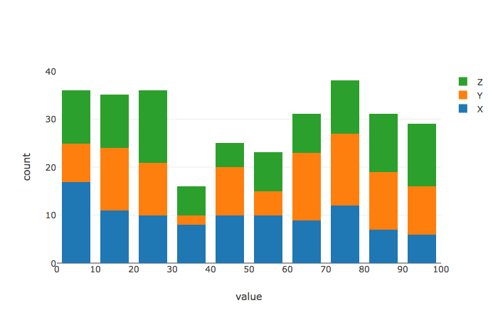
積み上げグラフ
# レイアウトの指定
layout = go.Layout(
    xaxis = dict(title="value", dtick = 10),
    yaxis = dict(title="count"),
    bargap = 0.2,
    bargroupgap = 0.1,
    barmode = 'stack') # barmode = 'stack' で積み上げ

fig = dict(data=[trace0, trace1, trace2], layout=layout)
offline.iplot(fig)