画像をコンテナの中いっぱいに収めたい
①実現したいこと
画像をページの下半分のコンテナいっぱいに表示させたい。
②現在困っていること
画像を下半分のコンテナいっぱいに表示させるつもりが、そのコンテナがそれを書いているコンポーネントよりももっと大きく伸長して、画像が大きく拡大してしまっている。
③試したこと
chatGPTやGithub Copilotを使って、いろいろ聞いて試してみたが上手くいかない。
④相談したいこと
どうやったら画像を今あるコンポーネントの下半分のコンテナに表示させれるかを教えていただきたいです。
⇩サンプルページ
https://endearing-eclair-430321.netlify.app/
⑤画像
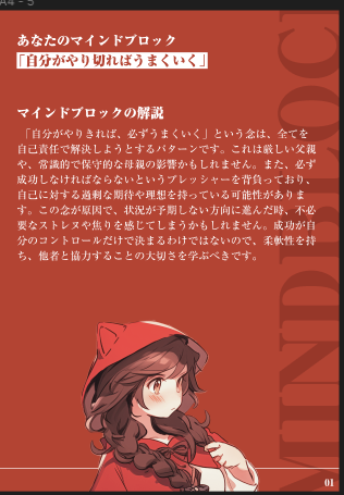
↑理想
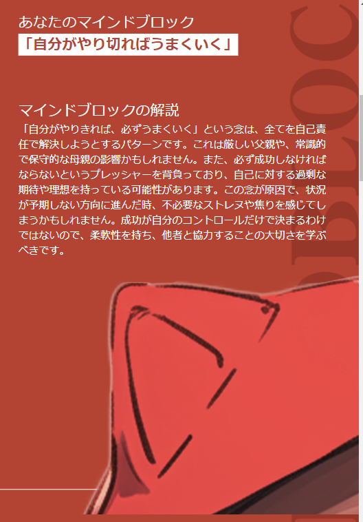
↑現状
⑥コード
Secondpage.tsx
const Secondpage: React.FC<SecondpageProps> = ({ description, name }) => {
  return (
    <div
      className={`${styles.background3} w-full relative h-screen self-stretch flex-auto overflow-hidden flex flex-col items-start lg:items-center justify-start gap-[10px] `}
    >
      <div
        className={`flex flex-col items-start  ${styles.padding} ${styles.gap}`}
      >
        <div>
          <div className={`text-white ${styles.fontsize2}`}>
            あなたのマインドブロック
          </div>
          <div className="bg-white flex items-center justify-center space-x-10 inline-flex">
            <div
              className={`text-[#B34433] ${styles.fontsize2} font-[A-OTF Ryumin Pro] font-black break-words`}
            >
              「自分がやり切ればうまくいく」
            </div>
          </div>
        </div>
        <div>
          <div className={`text-white ${styles.fontsize2}`}>
            マインドブロックの解説
          </div>
          <div className="flex justify-center ">
            <div
              className={`self-stretch ${styles.maxwidth} relative text-white ${styles.fontsize}`}
            >
              「自分がやりきれば、必ずうまくいく」という念は、全てを自己責任で解決しようとするパターンです。これは厳しい父親や、常識的で保守的な母親の影響かもしれません。また、必ず成功しなければならないというプレッシャーを背負っており、自己に対する過剰な期待や理想を持っている可能性があります。この念が原因で、状況が予期しない方向に進んだ時、不必要なストレヌや焦りを感じてしまうかもしれません。成功が自分のコントロールだけで決まるわけではないので、柔軟性を持ち、他者と協力することの大切さを学ぶべきです。
            </div>
          </div>
        </div>
      </div>
      <div className="flex-grow items-center justify-center">
        <img
          src="/girl.png"
          alt="girl"
          className="max-h-full object-contain object-center"
        />
      </div>
    </div>
  );
};
styles.module.css
 .background3 {
    /* 初期のデスクトップ用の背景画像 */
    background-image: url('/description-page.png');
    background-size: 100% 100%;
    background-repeat: no-repeat;
    background-position: center;
    height: 100vh;
    width: 100%;
  }
index.tsx
const Desktop3: NextPage = () => {
  return (
    <>
      <div className="relative w-full flex flex-col  justify-center">
        <Firstpage />

        <Secondpage  />

        <Description />

        <Description />

        <Description />

        <Finalpage/>
      </div>
    </>
  );
}
1 likes