言語処理100本ノック 2015の79本目「適合率-再現率グラフの描画」の記録です。
トレードオフ関係にある適合率と再現率がどのように関係しているかをグラフ表示します。似たようなグラフとしてROC曲線も出力しています。
今までは基本的に「素人の言語処理100本ノック」とほぼ同じ内容にしていたのでブロクに投稿していなかったのですが、「第8章: 機械学習」については、真剣に時間をかけて取り組んでいてある程度変えているので投稿します。scikit-learnをメインに使用します。
※前回の78本目「5分割交差検定」はやっていません。既に訓練時にGridSearchCV関数を使って5分割交差検定をしているため、無駄だからです(正確には5分割交差検定で適合率などを求めていないでやっていないのですが、面倒なので割愛します)。
参考リンク
| リンク | 備考 |
|---|---|
| 079.適合率-再現率グラフの描画.ipynb | 回答プログラムのGitHubリンク |
| 素人の言語処理100本ノック:79 | 言語処理100本ノックで常にお世話になっています |
| 言語処理100本ノックでPython入門 #79 - 機械学習、scikit-learnで適合率-再現率&グラフの描画 | scikit-learn使ったノック結果 |
環境
| 種類 | バージョン | 内容 |
|---|---|---|
| OS | Ubuntu18.04.01 LTS | 仮想で動かしています |
| pyenv | 1.2.15 | 複数Python環境を使うことがあるのでpyenv使っています |
| Python | 3.6.9 | pyenv上でpython3.6.9を使っています 3.7や3.8系を使っていないことに深い理由はありません パッケージはvenvを使って管理しています |
上記環境で、以下のPython追加パッケージを使っています。通常のpipでインストールするだけです。
| 種類 | バージョン |
|---|---|
| matplotlib | 3.1.1 |
| numpy | 1.17.4 |
| pandas | 0.25.3 |
| scikit-learn | 0.21.3 |
課題
第8章: 機械学習
本章では,Bo Pang氏とLillian Lee氏が公開しているMovie Review Dataのsentence polarity dataset v1.0を用い,文を肯定的(ポジティブ)もしくは否定的(ネガティブ)に分類するタスク(極性分析)に取り組む.
79. 適合率-再現率グラフの描画
ロジスティック回帰モデルの分類の閾値を変化させることで,適合率-再現率グラフを描画せよ.
適合率-再現率グラフだけでなく、ROC曲線を出力しています。
また、おまけとして学習曲線も出力しています。こちらは、適合率-再現率グラフやROC曲線とは関係なく完全に「おまけ」です。
回答
回答プログラム 079.適合率-再現率グラフ.ipynb
基本的に[前回の077.正解率の計測.ipynbに3つのグラフ出力ロジックを付加した程度です。
import csv

import pandas as pd
import matplotlib.pyplot as plt
import numpy as np
from sklearn.feature_extraction.text import CountVectorizer, TfidfVectorizer
from sklearn.linear_model import LogisticRegression
from sklearn.model_selection import GridSearchCV, train_test_split, learning_curve
from sklearn.metrics import classification_report, confusion_matrix, roc_curve, auc, precision_recall_curve
from sklearn.pipeline import Pipeline
from sklearn.base import BaseEstimator, TransformerMixin

# 単語ベクトル化をGridSearchCVで使うのためのクラス
class myVectorizer(BaseEstimator, TransformerMixin):
    def __init__(self, method='tfidf', min_df=0.0005, max_df=0.10):
        self.method = method
        self.min_df = min_df
        self.max_df = max_df

    def fit(self, x, y=None):
        if self.method == 'tfidf':
            self.vectorizer = TfidfVectorizer(min_df=self.min_df, max_df=self.max_df)
        else:
            self.vectorizer = CountVectorizer(min_df=self.min_df, max_df=self.max_df)
        self.vectorizer.fit(x)
        return self

    def transform(self, x, y=None):
        return self.vectorizer.transform(x)

# GridSearchCV用パラメータ
PARAMETERS = [
    {
        'vectorizer__method':['tfidf', 'count'],
        'vectorizer__min_df': [0.0003, 0.0004],
        'vectorizer__max_df': [0.07, 0.10],
        'classifier__C': [1, 3],    #10も試したが遅いだけでSCORE低い
        'classifier__solver': ['newton-cg', 'liblinear']},
    ]

# ファイル読込
def read_csv_column(col):
    with open('./sentiment_stem.txt') as file:
        reader = csv.reader(file, delimiter='\t')
        header = next(reader)
        return [row[col] for row in reader]

x_all = read_csv_column(1)
y_all = read_csv_column(0)
x_train, x_test, y_train, y_test = train_test_split(x_all, y_all)

def train(x_train, y_train, file):
    pipline = Pipeline([('vectorizer', myVectorizer()), ('classifier', LogisticRegression())])

    # clf は classificationの略
    clf = GridSearchCV(
            pipline, #
            PARAMETERS,           # 最適化したいパラメータセット
            cv = 5)               # 交差検定の回数

    clf.fit(x_train, y_train)
    pd.DataFrame.from_dict(clf.cv_results_).to_csv(file)

    print('Grid Search Best parameters:', clf.best_params_)
    print('Grid Search Best validation score:', clf.best_score_)
    print('Grid Search Best training score:', clf.best_estimator_.score(x_train, y_train))

    # 素性の重み出力
    output_coef(clf.best_estimator_)

    return clf.best_estimator_

# 素性の重み出力
def output_coef(estimator):
    vec = estimator.named_steps['vectorizer']
    clf = estimator.named_steps['classifier']

    coef_df = pd.DataFrame([clf.coef_[0]]).T.rename(columns={0: 'Coefficients'})
    coef_df.index = vec.vectorizer.get_feature_names()
    coef_sort = coef_df.sort_values('Coefficients')
    coef_sort[:10].plot.barh()
    coef_sort.tail(10).plot.barh()

def validate(estimator, x_test, y_test):

    for i, (x, y) in enumerate(zip(x_test, y_test)):
        y_pred = estimator.predict_proba([x])
        if y == np.argmax(y_pred).astype( str ):
            if y == '1':
                result = 'TP:正解がPositiveで予測もPositive'
            else:
                result = 'TN:正解がNegativeで予測もNegative'
        else:
            if y == '1':
                result = 'FN:正解がPositiveで予測はNegative'
            else:
                result = 'FP:正解がNegativeで予測はPositive'
        print(result, y_pred, x)
        if i == 29:
            break

    # TSV一覧出力
    y_pred = estimator.predict(x_test)
    y_prob = estimator.predict_proba(x_test)

    results = pd.DataFrame([y_test, y_pred, y_prob.T[1], x_test]).T.rename(columns={ 0: '正解', 1 : '予測', 2: '予測確率(ポジティブ)', 3 :'単語列'})
    results.to_csv('./predict.txt' , sep='\t')

    print('\n', classification_report(y_test, y_pred))
    print('\n', confusion_matrix(y_test, y_pred))

# グラフ出力
def output_graphs(estimator, x_all, y_all, x_test, y_test):

    # 学習曲線出力
    output_learning_curve(estimator, x_all, y_all)

    y_pred = estimator.predict_proba(x_test)

    # ROC曲線出力
    output_roc(y_test, y_pred)

    # 適合率-再現率グラフ出力
    output_pr_curve(y_test, y_pred)

# 学習曲線出力
def output_learning_curve(estimator, x_all, y_all):
    training_sizes, train_scores, test_scores = learning_curve(estimator,
                                                               x_all, y_all, cv=5,
                                                               train_sizes=[0.3, 0.4, 0.5, 0.6, 0.7, 0.8, 0.9, 1.0])
    plt.plot(training_sizes, train_scores.mean(axis=1), label="training scores")
    plt.plot(training_sizes, test_scores.mean(axis=1), label="test scores")
    plt.legend(loc="best")
    plt.show()

# ROC曲線出力
def output_roc(y_test, y_pred):
    # FPR, TPR(, しきい値) を算出
    fpr, tpr, thresholds = roc_curve(y_test, y_pred[:,1], pos_label='1')

    # ついでにAUCも
    auc_ = auc(fpr, tpr)

    # ROC曲線をプロット
    plt.plot(fpr, tpr, label='ROC curve (area = %.2f)'%auc_)
    plt.legend()
    plt.title('ROC curve')
    plt.xlabel('False Positive Rate')
    plt.ylabel('True Positive Rate')
    plt.grid(True)
    plt.show()

# 適合率-再現率グラフ出力
def output_pr_curve(y_test, y_pred):
    # ある閾値の時の適合率、再現率, 閾値の値を取得
    precisions, recalls, thresholds = precision_recall_curve(y_test, y_pred[:,1], pos_label='1')

    # 0から1まで0.05刻みで○をプロット
    for i in range(21):
        close_point = np.argmin(np.abs(thresholds - (i * 0.05)))
        plt.plot(precisions[close_point], recalls[close_point], 'o')

    # 適合率-再現率曲線
    plt.plot(precisions, recalls)
    plt.xlabel('Precision')
    plt.ylabel('Recall')

    plt.show()

estimator = train(x_train, y_train, 'gs_result.csv')
validate(estimator, x_test, y_test)
output_graphs(estimator, x_all, y_all, x_test, y_test)
回答解説
適合率-再現率グラフ
scikit-learnのprecision_recall_curveを使って適合率、再現率, 閾値の値を受け取り、グラフ出力しています。
# 適合率-再現率グラフ出力
def output_pr_curve(y_test, y_pred):
    # ある閾値の時の適合率、再現率, 閾値の値を取得
    precisions, recalls, thresholds = precision_recall_curve(y_test, y_pred[:,1], pos_label='1')

    # 0から1まで0.05刻みで○をプロット
    for i in range(21):
        close_point = np.argmin(np.abs(thresholds - (i * 0.05)))
        plt.plot(precisions[close_point], recalls[close_point], 'o')

    # 適合率-再現率曲線
    plt.plot(precisions, recalls)
    plt.xlabel('Precision')
    plt.ylabel('Recall')

    plt.show()
出力結果のグラフです。
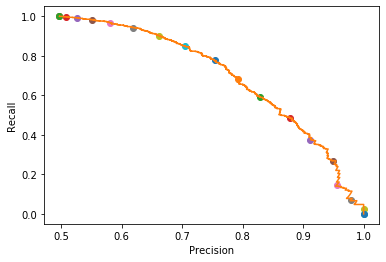
以下のトレードオフとなるのがわかります。
- Recall(再現率)が高い:自信がなくてもPositiveと判断しているので、結果的にPrecision(適合率)が下がる(Positiveと判断したけど実はNegativeという誤りが多くなる)
- Precision(適合率)が高い:自信がある場合のみPositiveと判断しているので、結果的にRecall(再現率)が下がる(PositiveなのにNegativeと判定しない誤りが多くなる)
混合行列の詳細は、別記事「【入門者向け】機械学習の分類問題評価指標解説(正解率・適合率・再現率など)」を参照ください。
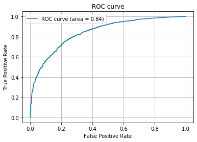
ROC曲線とAUC
roc_curve関数を使ってFalse Positive率、True Positive率、閾値を取得します。auc関数でaucの値も計算しておきます。
最後にグラフ出力します(AUCの値は凡例に出しています)。
※plot_roc_curve関数がscikit-learn v0.22から使えるようです。こっちのほうが便利だね。2021/3/11追記。
※ROC曲線は記事「はじパタ全力解説: 第3章 ベイズの識別規則」で説明しています。2021/3/11追記。
def output_roc(y_test, y_pred):
    # FPR, TPR(, しきい値) を算出
    fpr, tpr, thresholds = roc_curve(y_test, y_pred[:,1], pos_label='1')

    # ついでにAUCも
    auc_ = auc(fpr, tpr)

    # ROC曲線をプロット
    plt.plot(fpr, tpr, label='ROC curve (area = %.2f)'%auc_)
    plt.legend()
    plt.title('ROC curve')
    plt.xlabel('False Positive Rate')
    plt.ylabel('True Positive Rate')
    plt.grid(True)
    plt.show()
自信がなくてもPositiveと判定することにより、True Positiveが多くなるとともにFalse Positiveも多くなってしまうのがわかります。
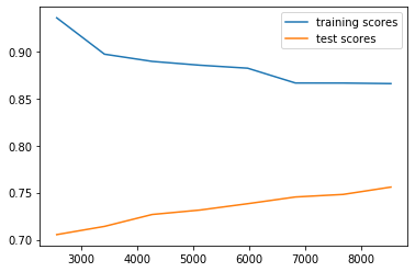
学習曲線
最後は、意味が前者2つのグラフと異なりますが、学習曲線をおまけとして書いておきます。
ハイバイアスかハイバリアンスかを見たかったので出力しました。ハイバイアスとハイバリアンスについては別記事「Coursera機械学習入門コース(6週目 - 様々なアドバイス)」に書いています(雑な記事ですが・・・)。
learning_curve関数に説明変数とラベル、交差検証の回数(5回)、訓練データサイズのリストを渡します。これにより訓練データサイズに応じた訓練とテストの正答率が返ってきます。
# 学習曲線出力
def output_learning_curve(estimator, x_all, y_all):
    training_sizes, train_scores, test_scores = learning_curve(estimator,
                                                               x_all, y_all, cv=5,
                                                               train_sizes=[0.3, 0.4, 0.5, 0.6, 0.7, 0.8, 0.9, 1.0])
    plt.plot(training_sizes, train_scores.mean(axis=1), label="training scores")
    plt.plot(training_sizes, test_scores.mean(axis=1), label="test scores")
    plt.legend(loc="best")
    plt.show()
出力結果を見ると、まだ訓練とテストで差が縮まるハイバリアンスかとも思って以下のことを試しましたが精度が良くなることはありませんでした。両者ともグリッドサーチでの選択肢にしています。
- 特徴量を減らす(TdidfVectorizer/CountVectorizerのパラメータ
min_dfを増やす) - 正則化項Cの値を増やす(ロジステック回帰のパラメータ
Cを増やす)