はじめに
Jetpack ComposeでUIを実装する際、Modifierを活用することでロジックの再利用性を高め、保守性の良いコードを書くことができます。2025年現在、Material3やAccompanistなどの高機能なライブラリが主流となっていますが、基本的なインタラクション制御やビジュアルエフェクトにはカスタムModifierが最適です。シンプルで理解しやすく、何より軽量です。
この記事では、実プロジェクトで実装した12種類のカスタムModifierを紹介します。すべて実際に動作するコードに基づいた解説です。
本記事で紹介するModifierは、以下の2つのカテゴリに分類されています:
- Visual Effects - 視覚エフェクト系(実用デザイン寄りの視覚効果)
- Interaction - インタラクション系(操作体験・UX改善のためのインタラクティブ機能)
ソースコード
Visual Effects
Animated Border Color

状態に応じてボーダー色がアニメーション変化するModifierです。rememberInfiniteTransitionと色補間を使用して滑らかな色の変化を実現します。
複数の色を指定すると、自動的に色間を補間してアニメーションします。カラーインデックスと進捗値(fraction)を計算し、RGB各チャンネルを個別に補間することで、滑らかで自然な色の遷移を実現しています。RepeatMode.Reverseにより、最後の色に到達すると自動的に逆方向に戻るため、継続的なループアニメーションが可能です。
fun Modifier.animatedBorderColor(
    colors: List<Color>,
    borderWidth: Dp = 2.dp,
    shape: Shape = RoundedCornerShape(8.dp),
    durationMillis: Int = 2000
): Modifier = composed {
    val infiniteTransition = rememberInfiniteTransition(label = "borderColor")
    val animatedColorIndex by infiniteTransition.animateFloat(
        initialValue = 0f,
        targetValue = colors.size.toFloat(),
        animationSpec = infiniteRepeatable(
            animation = tween(durationMillis, easing = LinearEasing),
            repeatMode = RepeatMode.Reverse
        ),
        label = "colorIndex"
    )

    val currentColorIndex = animatedColorIndex.toInt() % colors.size
    val nextColorIndex = (currentColorIndex + 1) % colors.size
    val fraction = animatedColorIndex - currentColorIndex

    val currentColor = colors[currentColorIndex]
    val nextColor = colors[nextColorIndex]

    val animatedColor = Color(
        red = currentColor.red + (nextColor.red - currentColor.red) * fraction,
        green = currentColor.green + (nextColor.green - currentColor.green) * fraction,
        blue = currentColor.blue + (nextColor.blue - currentColor.blue) * fraction,
        alpha = currentColor.alpha + (nextColor.alpha - currentColor.alpha) * fraction
    )

    border(borderWidth, animatedColor, shape)
}
Border With Shadow
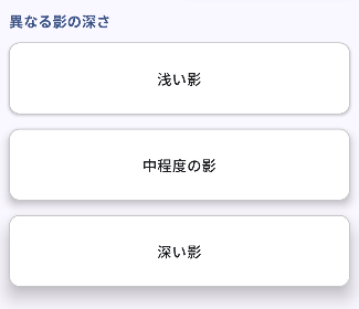
影とボーダーを同時に設定するModifierです。カード風のUIに最適です。
shadow()とborder()を組み合わせることで、Material Designのようなカード表現が簡単に実現できます。影の深さとボーダーの色・太さを個別に調整できるため、デザインの要件に応じた柔軟なカスタマイズが可能です。
fun Modifier.borderWithShadow(
    borderColor: Color = Color.LightGray,
    borderWidth: Dp = 1.dp,
    shadowElevation: Dp = 4.dp,
    shape: Shape = RoundedCornerShape(8.dp)
): Modifier = this
    .shadow(shadowElevation, shape)
    .border(borderWidth, borderColor, shape)
Gradient Background
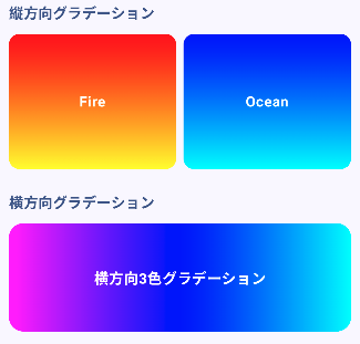
線形・円形グラデーション背景を設定するModifierです。
Brush.verticalGradient()またはBrush.horizontalGradient()を使用して、複数の色を滑らかにブレンドした背景を作成します。縦方向・横方向を選択でき、2色から多色まで自由に設定可能です。角の丸みも指定できるため、カードやボタンなど様々なUIパーツに適用できます。
fun Modifier.gradientBackground(
    colors: List<Color>,
    isVertical: Boolean = true,
    shape: Shape = RoundedCornerShape(0.dp)
): Modifier = background(
    brush = if (isVertical) {
        Brush.verticalGradient(colors)
    } else {
        Brush.horizontalGradient(colors)
    },
    shape = shape
)
Light Sweep

光のスキャン演出を追加するModifierです。ボタン強調などに最適です。
rememberInfiniteTransitionとdrawBehindを組み合わせ、要素の上を左から右へ光が流れるような効果を実現します。光の幅は要素の30%に設定され、透明から指定色、そして再び透明へとグラデーションします。アニメーション速度を調整することで、ゆっくりとした優雅な動きから高速なスキャンまで表現できます。
fun Modifier.lightSweep(
    color: Color = Color.White.copy(alpha = 0.3f),
    durationMillis: Int = 2000
): Modifier = composed {
    val infiniteTransition = rememberInfiniteTransition(label = "lightSweep")
    val offset by infiniteTransition.animateFloat(
        initialValue = -1f,
        targetValue = 1f,
        animationSpec = infiniteRepeatable(
            animation = tween(durationMillis, easing = LinearEasing),
            repeatMode = RepeatMode.Restart
        ),
        label = "sweepOffset"
    )

    drawBehind {
        val sweepWidth = size.width * 0.3f
        val sweepLeft = (size.width + sweepWidth) * offset - sweepWidth

        drawRect(
            brush = Brush.horizontalGradient(
                colors = listOf(
                    Color.Transparent,
                    color,
                    Color.Transparent
                ),
                startX = sweepLeft,
                endX = sweepLeft + sweepWidth
            )
        )
    }
}
Pulsing Shadow Glow

緩やかな発光エフェクトを追加するModifierです。フォーカス強調などに最適です。
rememberInfiniteTransitionで影の深さ(elevation)を周期的に変化させることで、脈動する発光効果を実現します。shadow()のspotColorとambientColorパラメータに同じ色を指定することで、指定した色で発光しているような視覚効果を生み出します。最小値と最大値の範囲内で滑らかに変化し、RepeatMode.Reverseにより自然な脈動を実現しています。
fun Modifier.pulsingShadowGlow(
    color: Color = Color.Blue,
    minElevation: Dp = 4.dp,
    maxElevation: Dp = 16.dp,
    durationMillis: Int = 1500,
    shape: Shape = RoundedCornerShape(8.dp)
): Modifier = composed {
    val infiniteTransition = rememberInfiniteTransition(label = "glow")
    val elevation by infiniteTransition.animateFloat(
        initialValue = minElevation.value,
        targetValue = maxElevation.value,
        animationSpec = infiniteRepeatable(
            animation = tween(durationMillis),
            repeatMode = RepeatMode.Reverse
        ),
        label = "elevation"
    )

    shadow(elevation.dp, shape, spotColor = color, ambientColor = color)
}
Interaction
Click Bounce

クリック時に弾む効果を追加するModifierです。押下感を強調します。
AnimatableとdetectTapGesturesを組み合わせ、タップ時に要素が縮小してから拡大し、最終的に元のサイズに戻るアニメーションを実現します。spring()アニメーションスペックを使用することで、物理的な弾性を持った自然な動きを表現しています。0.9倍に縮小→1.1倍に拡大→1.0倍に戻るという3段階のアニメーションにより、ボタンが弾んでいるような効果を生み出します。
fun Modifier.clickBounce(
    onClick: () -> Unit
): Modifier = composed {
    val scale = remember { Animatable(1f) }
    val scope = rememberCoroutineScope()

    graphicsLayer {
        scaleX = scale.value
        scaleY = scale.value
    }.pointerInput(Unit) {
        detectTapGestures(
            onPress = {
                scope.launch {
                    scale.animateTo(0.9f, spring())
                    tryAwaitRelease()
                    scale.animateTo(1.1f, spring())
                    scale.animateTo(1f, spring())
                }
            },
            onTap = { onClick() }
        )
    }
}
Click Scale

クリック時にわずかに縮小・拡大する効果を追加するModifierです。
clickBounceと似ていますが、よりシンプルな2段階のアニメーション(縮小→元に戻る)を実現します。スケール値をパラメータとして受け取るため、縮小の度合いを柔軟に調整できます。0.95f(微妙な縮小)から0.8f(大きな縮小)まで、デザインの要件に応じて調整可能です。
fun Modifier.clickScale(
    scale: Float = 0.95f,
    onClick: () -> Unit
): Modifier = composed {
    val animatedScale = remember { Animatable(1f) }
    val scope = rememberCoroutineScope()

    graphicsLayer {
        scaleX = animatedScale.value
        scaleY = animatedScale.value
    }.pointerInput(Unit) {
        detectTapGestures(
            onPress = {
                scope.launch {
                    animatedScale.animateTo(scale)
                    tryAwaitRelease()
                    animatedScale.animateTo(1f)
                }
            },
            onTap = { onClick() }
        )
    }
}
Debounced Click
連打防止機能を追加するModifierです。
指定した時間間隔(デフォルト500ms)内の連続クリックを無視します。前回のクリック時刻を記録し、現在の時刻との差分が指定時間以上の場合のみクリックイベントを発火します。APIリクエストの重複送信防止や、誤操作防止に非常に有効です。
fun Modifier.debouncedClick(
    debounceTime: Long = 500L,
    onClick: () -> Unit
): Modifier = composed {
    var lastClickTime by remember { mutableStateOf(0L) }

    pointerInput(Unit) {
        detectTapGestures {
            val currentTime = System.currentTimeMillis()
            if (currentTime - lastClickTime >= debounceTime) {
                lastClickTime = currentTime
                onClick()
            }
        }
    }
}
Double Tap Action
ダブルタップ対応を追加するModifierです。
detectTapGesturesのonDoubleTapとonTapを使用して、シングルタップとダブルタップを区別します。InstagramやTwitterのような「ダブルタップでいいね」機能の実装に最適です。シングルタップのコールバックはオプションで、ダブルタップのみの検出も可能です。
fun Modifier.doubleTapAction(
    onDoubleTap: () -> Unit,
    onSingleTap: (() -> Unit)? = null
): Modifier = pointerInput(Unit) {
    detectTapGestures(
        onDoubleTap = { onDoubleTap() },
        onTap = { onSingleTap?.invoke() }
    )
}
Hold To Confirm
長押しで確定する機能を追加するModifierです。誤タップを防止します。
指定時間(デフォルト1000ms)長押しすると確定処理が実行されます。長押し中の進捗状況をコールバックで受け取れるため、プログレスバーなどの視覚的フィードバックを実装できます。途中で指を離すと処理はキャンセルされ、進捗も0にリセットされます。削除や購入など、重要な操作の誤実行を防ぐのに最適です。
fun Modifier.holdToConfirm(
    holdDuration: Long = 1000L,
    onConfirm: () -> Unit,
    onProgress: (Float) -> Unit = {}
): Modifier = composed {
    var isHolding by remember { mutableStateOf(false) }
    val scope = rememberCoroutineScope()

    pointerInput(Unit) {
        detectTapGestures(
            onPress = {
                isHolding = true
                val job = scope.launch {
                    val steps = 20
                    repeat(steps) { step ->
                        if (!isHolding) return@launch
                        onProgress((step + 1) / steps.toFloat())
                        delay(holdDuration / steps)
                    }
                    onConfirm()
                }
                tryAwaitRelease()
                isHolding = false
                job.cancel()
                onProgress(0f)
            }
        )
    }
}
Swipe To Dismiss

スワイプ削除機能を追加するModifierです。
detectHorizontalDragGesturesでスワイプを検出し、指定した閾値(デフォルト50%)を超えたら削除処理を実行します。スワイプ中は要素が横に移動し、透明度も連動して変化することで、削除されていく様子を視覚的に表現します。閾値未満で指を離した場合は元の位置に戻ります。リストアイテムの削除など、モバイルUIでよく使われるパターンです。
fun Modifier.swipeToDismiss(
    onDismiss: () -> Unit,
    threshold: Float = 0.5f
): Modifier = composed {
    var offsetX by remember { mutableStateOf(0f) }

    graphicsLayer {
        translationX = offsetX
        alpha = 1f - (offsetX.coerceAtLeast(0f) / size.width).coerceIn(0f, 1f)
    }.pointerInput(Unit) {
        detectHorizontalDragGestures(
            onDragEnd = {
                if (offsetX > size.width * threshold) {
                    onDismiss()
                } else {
                    offsetX = 0f
                }
            },
            onHorizontalDrag = { _, dragAmount ->
                offsetX = (offsetX + dragAmount).coerceAtLeast(0f)
            }
        )
    }
}
Swipe To Navigate

ページ遷移用のスワイプナビゲーション機能を追加するModifierです。
左右のスワイプジェスチャーを検出し、それぞれのコールバックを実行します。カルーセルやページネーションなど、横方向のナビゲーションに最適です。閾値(デフォルト100f)を超えるスワイプのみを検出するため、偶発的な画面遷移を防ぎます。
fun Modifier.swipeToNavigate(
    onSwipeLeft: () -> Unit = {},
    onSwipeRight: () -> Unit = {},
    threshold: Float = 100f
): Modifier = composed {
    var dragAmount by remember { mutableStateOf(0f) }

    pointerInput(Unit) {
        detectHorizontalDragGestures(
            onDragEnd = {
                when {
                    dragAmount > threshold -> onSwipeRight()
                    dragAmount < -threshold -> onSwipeLeft()
                }
                dragAmount = 0f
            },
            onHorizontalDrag = { _, delta ->
                dragAmount += delta
            }
        )
    }
}
まとめ
これらのModifierは、モダンなAndroidアプリのUX向上に役立ちます。Jetpack Composeの宣言的UIと組み合わせることで、軽量で拡張性の高い実装を実現できます。
ぜひプロジェクトに取り入れて、より魅力的なUIを作ってください!