はじめに
以前に下記の投稿をしました。
- GoogleスプレッドシートとAPIでデータ取得をしてみました(Google MAP)
- 令和500円投資というのを実施しています。
- QiitaAPIを使用し自分の投稿データを2軸グラフで表示してみました
上記を踏まえて、JavaScriptでGoogleスプレッドシートに記載した実績データをAPI連携し、令和500円投資実績結果をグラフとテーブルに表示してみたいと思います。また、グラフはいままで2軸表示しかやったことなかったので、3軸にしようと思います。(おまけで利回り3%で、想定評価額も出してみたいと思います)
- 棒グラフ:合計積立金
- 折れ線グラフ1:評価額
- 折れ線グラフ2:想定評価額
作成サイト
コロナショットとその回復がわかりやすい感じになっています。

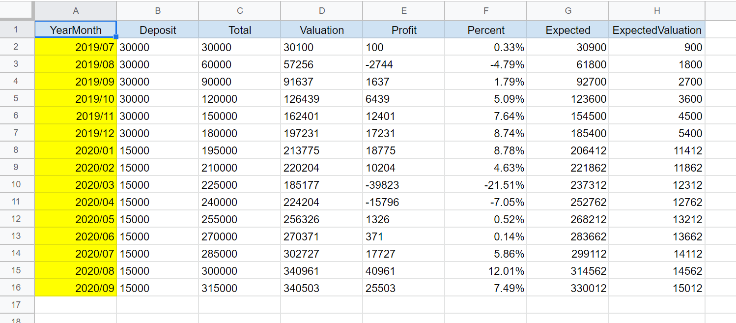
Googleスプレッドシートに記載している実績データ
コード
グラフの3軸表示
- データを下記のように設定するとうまくいきました。
graph1.js
        // グラフデータのセット
        const barChartData = {
          labels: labelData,
          datasets: [
            {
              type: 'line',
              label: '評価額',
              data: lineData1,
              borderColor: "rgba(255,165,0,0.9)",
              pointBackgroundColor: "rgba(255,165,0,0.9)",
              fill: false,
              yAxisID: "y-axis-1",
            },
            {
              type: 'line',
              label: '想定評価額(利回り3%)',
              data: lineData2,
              borderColor: "rgba(155,100,0,0.5)",
              pointBackgroundColor: "rgba(155,100,0,0.5)",
              fill: false,
              yAxisID: "y-axis-1",
            },
            {
              type: 'bar',
              label: '積立金合計',
              data: barData,
              borderColor: "rgba(7,12,57,0.9)",
              backgroundColor: "rgba(7,12,57,0.8)",
              yAxisID: "y-axis-2",
            },
          ],
        };
ticksの算出とグラフオプション
- グラフの目盛値は、固定するのではなく、グラフの数値に応じて変更したかったので、データから算出しました。
graph2.js
        // セットされたデータからticksを算出
        const maxvalue = Math.max.apply(null, lineData1);
        let setmaxvalue = maxvalue + 100000;
        do {
          setmaxvalue += 1;
        } while ("0000" != String(setmaxvalue).substr(-4,4));

        // グラフオプションの設定
        const complexChartOption = {
          responsive: true,
          scales: {
            yAxes: [
              {
                id: "y-axis-1",
                type: "linear",
                position: "left",
                ticks: {
                  max: setmaxvalue,
                  min: 0,
                  stepSize: 50000
                },
              },
              {
                id: "y-axis-2",
                type: "linear",
                position: "right",
                ticks: {
                  max: setmaxvalue,
                  min: 0,
                  stepSize: 50000
                },
                gridLines: {
                  drawOnChartArea: false,
                },
              }
            ],
          }
        };
全体コード
全体のコード
500gspread.html
<!DOCTYPE html>
<html lang="ja">
  <head>
    <title>Reiwa500yen</title>
    <meta charset="utf-8">
    <link rel="stylesheet" href="https://stackpath.bootstrapcdn.com/bootstrap/4.1.3/css/bootstrap.min.css" integrity="sha384-MCw98/SFnGE8fJT3GXwEOngsV7Zt27NXFoaoApmYm81iuXoPkFOJwJ8ERdknLPMO" crossorigin="anonymous">
  </head>

  <body onload="getData()">

    <div class="container">
      <br>
      <h3>令和500円投資実績</h3>
      <br>
      <div class="container">
        <canvas id="canvas"></canvas>
      </div>
      <br><br>
      <div class="container">
        <div id="result"></div>
      </div>
    </div>

    <script src="https://cdnjs.cloudflare.com/ajax/libs/Chart.js/2.3.0/Chart.bundle.min.js"></script>
    <script src="https://code.jquery.com/jquery-2.1.1.js" integrity="sha256-FA/0OOqu3gRvHOuidXnRbcmAWVcJORhz+pv3TX2+U6w=" crossorigin="anonymous"></script>
    <script src="https://cdn.jsdelivr.net/npm/@riversun/sortable-table@1.0.0/lib/sortable-table.js"></script>

    <script>

      // メイン処理
      function getData(){

        // Google APIにてスプレッドシートデータを取得する
        const request = new XMLHttpRequest();
        const bookid = 'xxxxxxxxxxxxxxxxxxxxxxxxxxxxxxx';
        const sheetname = 'xxxxxxxxxxxxxxxxxxx';
        const googleapi = 'xxxxxxxxxxxxxxxxxx';
        const url = 'https://sheets.googleapis.com/v4/spreadsheets/' + bookid + '/values/' + sheetname + '?key=' + googleapi;

        request.open('GET', url, true);
        request.responseType = 'json';

        request.onload = function () {
          const data = this.response;     // 取得できた値を格納
          const graphData = parseData(data);  // データ変換
          drawGraph(graphData);   // グラフの描画
          drawTable(graphData);   // テーブルの描画
        };

        request.send();

      };

      // Function:データ変換
      function parseData(data) {
        const keys = data.values[0];
        const parsegraphData = [];
        data.values.forEach(function(value, i) {
          if (i > 0) {
            const hash = {};
            value.forEach(function(d, j) {
              hash[keys[j]] = d;
            });
            parsegraphData.push(hash);
          }
        });
        return parsegraphData;
      }

      // グラフの描画
      function drawGraph(graphData) {

        const labelData = [];
        const lineData1 = [];
        const lineData2 = [];
        const barData = [];

        for(let i = 0; i < graphData.length; i++) {

          labelData.push(graphData[i].YearMonth);
          lineData1.push(graphData[i].Valuation);
          lineData2.push(graphData[i].Expected);
          barData.push(graphData[i].Total);

        };

        // console.log(labelData);
        // console.log(lineData);
        // console.log(barData);

        // セットされたデータからticksを算出
        const maxvalue = Math.max.apply(null, lineData1);
        let setmaxvalue = maxvalue + 100000;
        do {
          setmaxvalue += 1;
        } while ("0000" != String(setmaxvalue).substr(-4,4));

        // グラフデータのセット
        const barChartData = {
          labels: labelData,
          datasets: [
            {
              type: 'line',
              label: '評価額',
              data: lineData1,
              borderColor: "rgba(255,165,0,0.9)",
              pointBackgroundColor: "rgba(255,165,0,0.9)",
              fill: false,
              yAxisID: "y-axis-1",
            },
            {
              type: 'line',
              label: '想定評価額(利回り3%)',
              data: lineData2,
              borderColor: "rgba(155,100,0,0.5)",
              pointBackgroundColor: "rgba(155,100,0,0.5)",
              fill: false,
              yAxisID: "y-axis-1",
            },
            {
              type: 'bar',
              label: '積立金合計',
              data: barData,
              borderColor: "rgba(7,12,57,0.9)",
              backgroundColor: "rgba(7,12,57,0.8)",
              yAxisID: "y-axis-2",
            },
          ],
        };

        // グラフオプションの設定
        const complexChartOption = {
          responsive: true,
          scales: {
            yAxes: [
              {
                id: "y-axis-1",
                type: "linear",
                position: "left",
                ticks: {
                  max: setmaxvalue,
                  min: 0,
                  stepSize: 50000
                },
              },
              {
                id: "y-axis-2",
                type: "linear",
                position: "right",
                ticks: {
                  max: setmaxvalue,
                  min: 0,
                  stepSize: 50000
                },
                gridLines: {
                  drawOnChartArea: false,
                },
              }
            ],
          }
        };

        // グラフを描画する
        const ctx = document.getElementById("canvas").getContext("2d");
        window.myChart = new Chart(ctx, {
          type: 'bar',
          data: barChartData,
          options: complexChartOption
        });

      };

      // テーブルの描画
      function drawTable(graphData) {

        let html = '<table class="table">' +
                  '<thead class="thead-light">' +
                  '<tr><th scope="col">年月</th>' +
                  '<th scope="col">積立金</th>' +
                  '<th scope="col">積立金合計</th>' +
                  '<th scope="col">評価額</th>' +
                  '<th scope="col">評価益</th>' +
                  '<th scope="col">率</th>' +
                  '<th scope="col">想定評価額</th>' +
                  '<th scope="col">想定評価益</th></tr>' +
                  '</thead><tbody>'

        for(let i = 0; i < graphData.length; i++) {

          html +=
            '<tr>' +
            '<th scope="row">' + graphData[i].YearMonth + '末</th>' +
            '<td>' + Number(graphData[i].Deposit).toLocaleString() + '</td>' +
            '<td>' + Number(graphData[i].Total).toLocaleString() + '</td>' +
            '<td>' + Number(graphData[i].Valuation).toLocaleString() + '</td>' +
            '<td>' + Number(graphData[i].Profit).toLocaleString() + '</td>' +
            '<td>' + graphData[i].Percent + '</td>' +
            '<td>' + Number(graphData[i].Expected).toLocaleString() + '</td>' +
            '<td>' + Number(graphData[i].ExpectedValuation).toLocaleString() + '</td>' +
            '</tr>';

        };

        html += '</tbody></table>';

        const result = $("#result");

        result.empty();
        result.append(html);

      };

    </script>

  </body>
</html>
まとめ
- GoogleスプレッドシートAPI連携で、JavaScriptで3軸グラフの作成することができました。
- Googleスプレッドシートへのデータを追加のみで、ウェブサイトに簡単にグラフや表が更新される形ができましたので、今後の応用も可能かなと思いました。