- k近傍法における2種類の重み関数uniformとdistanceの違いについて、前回は視覚的にとらえました。
- 各点を距離の逆数で重みづけするdistanceは過学習を引き起こしやすく、全点を等しく重みづけするuniformの方がモデルとしての汎可性に優れていました。
- 改めて**交差検証(クロスバリデーション)**を行ない、具体的な数値として確認します。
import numpy as np
import pandas as pd

# sklearn系のライブラリ類
from sklearn import datasets # データセット
from sklearn.model_selection import train_test_split # データ分割
from sklearn.neighbors import KNeighborsClassifier # 分類モデル
from sklearn.neighbors import KNeighborsRegressor # 回帰モデル

# matplotlib系のライブラリ類
import matplotlib.pyplot as plt
from matplotlib.colors import ListedColormap

!pip install japanize-matplotlib # 日本語表示対応モジュール
import japanize_matplotlib
回帰モデル ―ボストン住宅価格―
⑴ データ作成
- sklearnに付属のデータセット「boston(ボストン住宅価格)」から、目的変数「住宅価格」と、説明変数としては「一戸当たり平均室数」のみを使うこととします。
- sklearnのデータ分割ユーティリティを利用して、データを訓練用とテスト用に分割します。
# データセットを取得
boston = datasets.load_boston()

# 説明変数・目的変数を抽出
X = boston.data[:, 5].reshape(len(boston.data), 1)
y = (boston.target).reshape(len(boston.target), 1)

# 訓練・テストにデータ分割
X_train, X_test, y_train, y_test = train_test_split(X, y, random_state = 0)
⑵ 交差検証
- 重み関数uniform、distance間で訓練データとテストデータの正解率を比較します。
# kパラメータ
n_neighbors = 14

# 正解率を格納する変数
score = []

for w in ['uniform', 'distance']:
    # モデル生成
    model = KNeighborsRegressor(n_neighbors, weights=w)
    model = model.fit(X_train, y_train)

    # 訓練データの正解率
    r_train = model.score(X_train, y_train)
    score.append(r_train)

    # テストデータの正解率
    r_test = model.score(X_test, y_test)
    score.append(r_test)

# データフレームに表現
score = np.array(score)
pd.DataFrame(score.reshape(2,2),
             columns = ['train', 'test'],
             index = ['uniform', 'distance'])
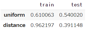
- まずuniformですが、訓練データでは61.0%、テストデータでは54.0%となっています。
- これに対してdistanceは、訓練データでは96.2%と非常に高く、テストデータになると著しく低下して40%を下回っています。
⑶ 可視化
- uniform、distance それぞれのモデルを生成し、同じテストデータを渡して予測を行います。
# kパラメータ
n_neighbors = 14

# インスタンス生成
model_u = KNeighborsRegressor(n_neighbors, weights='uniform')
model_d = KNeighborsRegressor(n_neighbors, weights='distance')

# モデル生成
model_u = model_u.fit(X_train, y_train)
model_d = model_d.fit(X_train, y_train)

# 予測
y_u = model_u.predict(X_test)
y_d = model_d.predict(X_test)
- これら2つの予測値$\hat{y}$と、実測値y_testを散布図に表します。
plt.figure(figsize=(14,6))

# 散布図
plt.scatter(X_test, y_u, color='slateblue', lw=1, label='予測値(uniform)')
plt.scatter(X_test, y_d, color='tomato', lw=1, label='予測値(distance)')
plt.scatter(X_test, y_test, color='lightgrey', label='実測値(test)')

plt.legend(fontsize=15)
plt.xlim(3, 9.5)
plt.show()
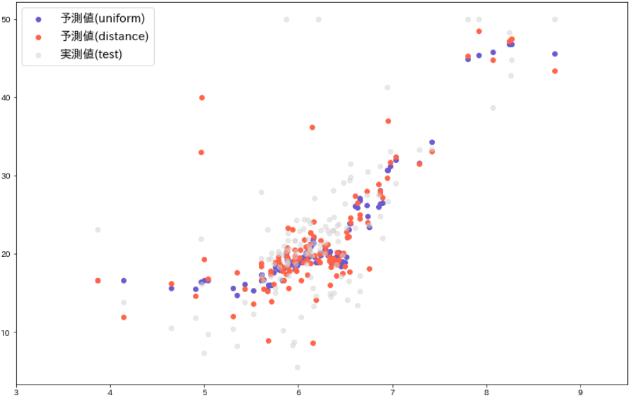
- 灰色●が実測値y_test、青●がuniform、赤●がdistanceによる予測値$\hat{y}$です。
- uniformの予測値に対してdistanceの方はばらついており、大きく外れた値も目につきます。
分類モデル ―アイリスのがく片の長さ・幅―
- sklearnに付属のデータセット「アイリス」を用いますが、問題を単純にしたいので、目的変数である「種類」を2つだけ(versicolour=1, virginica=2)に絞って2値分類とします。
- この2種類は、所与の2変数では個体が入り混じって境界を分けにくい。それを承知の上で uniform と distance にどのような違いが出るかを観察します。
⑴ データ作成
# データセットを取得
iris = datasets.load_iris()

# 説明変数・目的変数のみ抽出
X = iris.data[:, :2]
y = iris.target
y = y.reshape(-1, 1) # 形状変換

# 2値のみ抽出後、各変数を設定
data = np.hstack([X, y]) # X, yを結合
data = data[data[:, 2] != 0] # 2値のみ抽出
X = data[:, :2]
y = data[:, -1]

# データ分割
X_train, X_test, y_train, y_test = train_test_split(X, y, stratify = y, random_state = 0)
⑵ 交差検証
- kパラメータ(kの個数)は前回を踏襲して15個とします。
# kパラメータ
n_neighbors = 15

# 正解率を格納する変数
score = []

for i, w in enumerate(['uniform', 'distance']):
    # モデル生成
    model = KNeighborsClassifier(n_neighbors, weights=w)
    model = model.fit(X_train, y_train)

    # 訓練データ
    r_train = model.score(X_train, y_train)
    score.append(r_train)

    # テストデータ
    r_test = model.score(X_test, y_test)
    score.append(r_test)

# データフレームに表現
score = np.array(score)
pd.DataFrame(score.reshape(2,2),
             columns = ['train', 'test'],
             index = ['uniform', 'distance'])
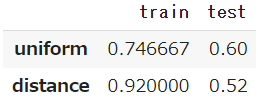
- uniformは、訓練データでは74.7%、テストデータでも60.0%となっています。
- これに対して distance は、訓練データでは92.0%という高率で、それがテストデータでは4割減の52.0%となっています。
⑶ 可視化
- 境界を予測させるためにモデルに渡すメッシュ間隔は、やはり前回と同じく0.02とします。
# kパラメータ
n_neighbors = 15

# メッシュ間隔
h = 0.02

# マッピングのためのカラーマップを生成
cmap_surface = ListedColormap(['mistyrose', 'lightcyan'])
cmap_dot = ListedColormap(['tomato', 'slateblue'])
- 重み関数をそれぞれuniform、distanceとする2つのモデルに、同じテストデータを渡して境界を生成し、そこへ実測値であるテストデータをプロットしてみます。
plt.figure(figsize=(18,6))

for j, w in enumerate(['uniform', 'distance']):
    # モデルを生成
    model = KNeighborsClassifier(n_neighbors, weights = w)
    model = model.fit(X_train, y_train)

    # テストデータをセット
    X, y = X_test, y_test

    # x,y軸の最小値・最大値を取得
    x_min, x_max = X[:, 0].min() - 1, X[:, 0].max() + 1
    y_min, y_max = X[:, 1].min() - 1, X[:, 1].max() + 1

    # 指定のメッシュ間隔で格子列を生成
    xx, yy = np.meshgrid(np.arange(x_min, x_max, h),
                         np.arange(y_min, y_max, h))

    # 格子列をモデルに渡して予測
    z = np.c_[xx.ravel(), yy.ravel()] # 一次元に平坦化してから結合
    Z = model.predict(z) # 予測
    Z = Z.reshape(xx.shape) # 形状変換

    # 描画
    plt.subplot(1, 2, j + 1)
    plt.pcolormesh(xx, yy, Z, cmap=cmap_surface) # カラープロット
    plt.scatter(X[:, 0], X[:, 1], c=y, cmap=cmap_dot, s=30)

    plt.xlim(xx.min(), xx.max())
    plt.ylim(yy.min(), yy.max())
    plt.xlabel('がく片の長さ', fontsize=12)
    plt.ylabel('がく片の幅', fontsize=12)
    plt.title("'%s'" % (w), fontsize=18)

plt.show()
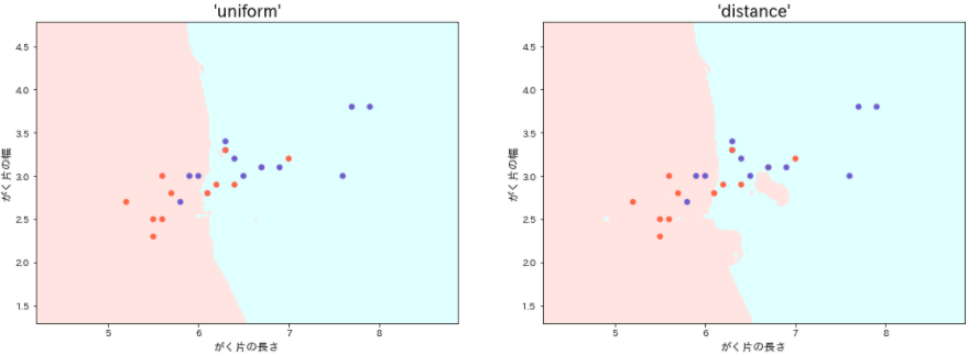
- distanceモデルは、訓練データにおける過学習のために境界は複雑となり、随所に飛び地も見られますが、それらはテストデータには適合せず意味をなしません。
- 位置関係は恒常的(いつも一定)であるとして、その間の距離は偶発的(たまたまそうなった)とみなす、というのが uniform の考え方でしょう。
- そうした偶発性をも情報として取り込み、データの特徴を色濃く反映する distance は、汎可性を求められるモデル生成には不向きといえそうです。