ScaffoldというComposableがあります。
TopAppBarとかBottomAppBarとかを使うときにお世話になるやつです。
Scaffold(
   topBar = {
      TopAppBar()
   }
) { paddingValues ->
   Box()
}
このpaddingValuesってなんなんでしょうか?
) { paddingValues ->
    ^^^^^^^^^^^^^
      これ
未使用のまま放置しているとLintに怒られます。
そこでLintの指示通り修正するとだいたいこういうコードになります。
  Scaffold(
     topBar = {
        TopAppBar()
     }
  ) { paddingValues ->
     Box(
+       modifier = Modifier.padding(paddingValues)
     )
  }
しかし本当にこれでいいのでしょうか? Lintに言われるがままにコードを書いているだけではScaffoldの使い方を理解しているとは言えません。
今回はこのPaddingValuesの正体を暴いていきましょう。
TL;DR
忙しい人のために先に結論だけ書いておきます。
Scaffoldから受け取っているPaddingValuesは『topBarもbottomBarもcontentWindowInsetsもすべて重ならないようにレイアウトするための余白』。
デフォルト値以外のWindowInsetsを使うときはcontentWindowInsetsに渡し、topBar, bottomBar内でも適切にWindowInsetsを設定する必要がある。
contentではScaffoldから受け取ったPaddingValuesをWindowInsetsとして扱い、それ以外のWindowInsetsは使わないようにしよう。
Scaffoldとは?
さて本題に入ろう。
まずは根本的なところから確認していこう。
そもそもScaffoldってなんだろう?
@Composable
fun Scaffold(
   modifier: Modifier = Modifier,
   topBar: @Composable () -> Unit = {},
   bottomBar: @Composable () -> Unit = {},
   snackbarHost: @Composable () -> Unit = {},
   floatingActionButton: @Composable () -> Unit = {},
   floatingActionButtonPosition: FabPosition = FabPosition.End,
   containerColor: Color = MaterialTheme.colorScheme.background,
   contentColor: Color = contentColorFor(containerColor),
   contentWindowInsets: WindowInsets = ScaffoldDefaults.contentWindowInsets,
   content: @Composable (PaddingValues) -> Unit
)
Scaffold implements the basic Material Design visual layout structure.
マテリアルデザインの基本的なレイアウト構造を実装したものらしい。
引数を見るともっと具体的にわかる。
topBar, bottomBar, snackbar, FAB, そしてcontentがある。
なるほど。マテリアルデザインの基本的なレイアウト構造だ。

そしてこれらのパーツが適切な位置に──具体的には、例えばbottomBarとFABが重ならないように配置することがScaffoldの役目ということだろう。
PaddingValuesを無視してみる
さて、試しに件のPaddingValuesを未使用のまま放置してみよう。
IDE上ではコンパイルエラーかのようなイカツい線が引かれるが、これはあくまでLintの警告であるため、無視してビルド・実行が可能だ。
Scaffold(
   topBar = {
      TopAppBar()
   },
   bottomBar = {
      BottomAppBar()
   },
   snackbarHost = {
      SnackbarHost()
   },
   floatingActionButton = {
      FloatingActionButton()
   }
) { paddingValues ->
//  ^^^^^^^^^^^^^ Content padding parameter paddingValues is not used
   Box(Modifier.fillMaxSize()) {
      Column(Modifier.align(Alignment.TopStart)) {
         for (i in 0..10) {
            Text("$i")
         }
      }

      Column(Modifier.align(Alignment.BottomStart)) {
         for (i in 10 downTo 0) {
            Text("$i")
         }
      }
   }
}
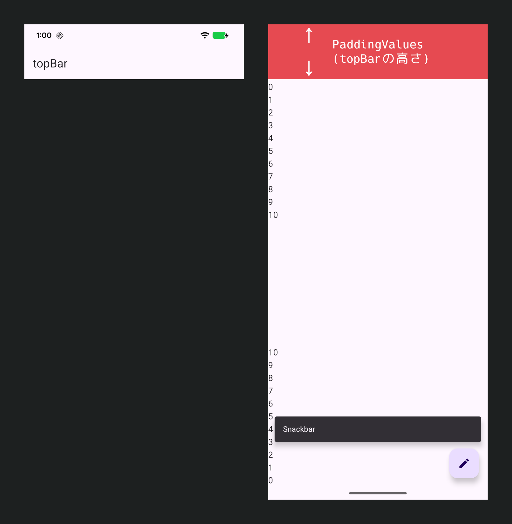
contentは検証のため上下に0〜10のTextを並べている。
このようになる。

上部に0から並べているはずのTextは4以降しか見えていない。
下部も4以降しか見えていない。
0〜3はtopBarやbottomBarの裏に重なっているということになる。
ふむ…。
topBarやbottomBarが重ならないようにレイアウトすることがScaffoldの役目ではなかったのか?
contentに対してだけはその役目を放棄しているのか?
PaddingValuesを使う場合
ではLintの指示通りPaddingValuesを使った場合はどうなのか?
  Scaffold(
     topBar = {
        TopAppBar()
     },
     bottomBar = {
        BottomAppBar()
     },
     snackbarHost = {
        SnackbarHost()
     },
     floatingActionButton = {
        FloatingActionButton()
     }
  ) { paddingValues ->
     Box(
        modifier = Modifier
+          .padding(paddingValues)
           .fillMaxSize()
     ) {
        Column(Modifier.align(Alignment.TopStart)) {
           for (i in 0..10) {
              Text("$i")
           }
        }

        Column(Modifier.align(Alignment.BottomStart)) {
           for (i in 10 downTo 0) {
              Text("$i")
           }
        }
     }
  }

上下ともに0から見えるようになった。
つまりScaffoldから受け取っているこのPaddingValuesは、 『topBarやbottomBarと重ならないようにレイアウトするために必要な余白』 だったのだ。
PaddingValuesの正体がわかった。
Scaffoldはこの値を通じて、 『topBarやbottomBarと重ならないようにレイアウトするために必要な余白』 を教えてくれていたのだ。
さて…。
『topBarやbottomBarと重ならないようにレイアウトするために必要な余白』というワードを見たとき、何かを連想しなかっただろうか? 私はした。
WindowInsetsだ。
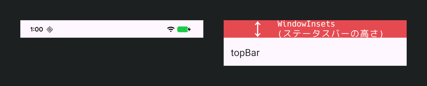
WindowInsets
WindowInsetsという概念がある。
Edge-to-Edgeが強制されたことにより直近1年くらいは特に聞く機会が増えただろう。
Edge-to-Edge、つまりディスプレイの端から端まですべてがアプリの領域として使える状況において、アプリのUIはステータスバーやナビゲーションバーと重なる。なんなら現代的なスマートフォンならインカメラも重なる。キーボードも重なる。
この状況において、『ステータスバーやナビゲーションバーと重ならないようにレイアウトするために必要な余白』を教えてくれるのがWindowInsetsだ。
これについては語り始めると長くなるし、今回の主旨ではないので割愛させていただく。
WindowInsetsについてはこちらでも話したことがあるので、よろしければご覧いただきたい。話が下手で恐縮だが…。
PaddingValues as WindowInsets
WindowInsetsは画面端にある諸々と重ならないようにレイアウトするための情報だが、一方でScaffoldから受け取っているPaddingValuesはtopBarやbottomBarと重ならないようにレイアウトするための情報だ。
これはもう、型が違うだけでほぼ同じ概念を扱っている。
通常のWindowInsetsに加えてtopBarやbottomBarの情報も含んだもの
ついでに型がPaddingValuesに変換されたもの
これがScaffoldからもらっているPaddingValuesの正体だ。
それが分かれば話は簡単だ。
WindowInsetsと同じ感覚で使えばいいのだ。
例えばbottomBarの裏が見えるUIなどがとても綺麗に、そして簡単に実装できる。

Scaffold(
   topBar = {
      TopAppBar()
   },
   bottomBar = {
      FloatingBottomBar()
   },
   snackbarHost = {
      SnackbarHost()
   },
   floatingActionButton = {
      FloatingActionButton()
   }
) { paddingValues ->
   LazyColumn(
      contentPadding = paddingValues
   ) {
      items(40) { i->
         Text("$i")
      }
   }
}
これをScaffoldなしでやろうとしたときのことを想像してみるとScaffoldのありがたさがわかるだろう。
contentWindowInsets
WindowInsetsといえば、Scaffoldの引数にもWindowInsetsを受け取るものがある。
@Composable
fun Scaffold(
      :
      :
   contentWindowInsets: WindowInsets = ScaffoldDefaults.contentWindowInsets,
                        ^^^^^^^^^^^^
   content: @Composable (PaddingValues) -> Unit
)
これはなんだろう?
デフォルト値があるようだが、試しに一度0にしてみよう。
  Scaffold(
     topBar = {
        TopAppBar()
     },
     bottomBar = {
        BottomAppBar()
     },
     snackbarHost = {
        SnackbarHost()
     },
     floatingActionButton = {
        FloatingActionButton()
     },
+    contentWindowInsets = WindowInsets(0)
  ) { paddingValues ->
     Box(
        modifier = Modifier
           .padding(paddingValues)
           .fillMaxSize()
     ) {
        Column(Modifier.align(Alignment.TopStart)) {
           for (i in 0..10) {
              Text("$i")
           }
        }

        Column(Modifier.align(Alignment.BottomStart)) {
           for (i in 10 downTo 0) {
              Text("$i")
           }
        }
     }
  }

何も変わらないではないか。
なんだこれは?
このパラメータについては、bottomBarをなくしてみるとわかりやすい。
  Scaffold(
     topBar = {
        TopAppBar()
     },
-    bottomBar = {
-       BottomAppBar()
-    },
     snackbarHost = {
        SnackbarHost()
     },
     floatingActionButton = {
        FloatingActionButton()
     },
     contentWindowInsets = WindowInsets(0)
  ) { paddingValues ->
     Box(
        modifier = Modifier
           .padding(paddingValues)
           .fillMaxSize()
     ) {
        Column(Modifier.align(Alignment.TopStart)) {
           for (i in 0..10) {
              Text("$i")
           }
        }

        Column(Modifier.align(Alignment.BottomStart)) {
           for (i in 10 downTo 0) {
              Text("$i")
           }
        }
     }
  }

画面下端がナビゲーションバーと重なった。
これはまさにWindowInsetsに0を指定したときの見た目だ。
ではcontentWindowInsetsを適切に設定すればナビゲーションバーと重ならなくなるのかというと、その通りだ。
  Scaffold(
     topBar = {
        TopAppBar()
     },
     snackbarHost = {
        SnackbarHost()
     },
     floatingActionButton = {
        FloatingActionButton()
     },
-    contentWindowInsets = WindowInsets(0)
+    contentWindowInsets = WindowInsets.safeDrawing
  ) { paddingValues ->
     Box(
        modifier = Modifier
           .padding(paddingValues)
           .fillMaxSize()
     ) {
        Column(Modifier.align(Alignment.TopStart)) {
           for (i in 0..10) {
              Text("$i")
           }
        }

        Column(Modifier.align(Alignment.BottomStart)) {
           for (i in 10 downTo 0) {
              Text("$i")
           }
        }
     }
  }

ふむ。だいたいは他のComposableのWindowInsetsと同じような挙動をしているように見えるが、どこかに違和感がある。
その違和感の原因、ScaffoldにおけるcontentWindowInsetsのポイントは3つある。
1. contentWindowInsetsはcontentにのみ作用する
名前の通り、この引数はcontentのWindowInsetsを指定するものであって、Scaffold自身には特に影響はないし、topBarやbottomBarなどのスロットにも影響はない。
例えば上部InsetsがデカすぎるWindowInsetsを渡してみよう。
+ val hugeWindowInsets = WindowInsets.safeDrawing.add(WindowInsets(top = 128.dp))

  Scaffold(
     topBar = {
        TopAppBar()
     },
     snackbarHost = {
        SnackbarHost()
     },
     floatingActionButton = {
        FloatingActionButton()
     },
-    contentWindowInsets = WindowInsets.safeDrawing
+    contentWindowInsets = hugeWindowInsets
  ) { paddingValues ->
     Box(
        modifier = Modifier
           .padding(paddingValues)
           .fillMaxSize()
     ) {
        Column(Modifier.align(Alignment.TopStart)) {
           for (i in 0..10) {
              Text("$i")
           }
        }

        Column(Modifier.align(Alignment.BottomStart)) {
           for (i in 10 downTo 0) {
              Text("$i")
           }
        }
     }
  }

何も変わらない。
つまりtopBarになんら影響を与えていない。
TopAppBar自体に適切なWindowInsetsを設定する必要がある。
  val hugeWindowInsets = WindowInsets.safeDrawing.add(WindowInsets(top = 128.dp))

  Scaffold(
     topBar = {
        TopAppBar(
+          windowInsets = hugeWindowInsets
+             .only(WindowInsetsSides.Horizontal + WindowInsetsSides.Top)
        )
     },
     snackbarHost = {
        SnackbarHost()
     },
     floatingActionButton = {
        FloatingActionButton()
     },
     contentWindowInsets = hugeWindowInsets
  ) { paddingValues ->
     Box(
        modifier = Modifier
           .padding(paddingValues)
           .fillMaxSize()
     ) {
        Column(Modifier.align(Alignment.TopStart)) {
           for (i in 0..10) {
              Text("$i")
           }
        }

        Column(Modifier.align(Alignment.BottomStart)) {
           for (i in 10 downTo 0) {
              Text("$i")
           }
        }
     }
  }

さて、これまた不思議な仕様だ。
なぜcontentのWindowInsetsだけ特別に引数が存在するのだろう?
contentだってtopBarと同じようにラムダ式内でWindowInsetsを指定できる。
何のためにScaffoldに渡すのだろう?
次項にその疑問の答えがある。
2. contentWindowInsetsはtopBarやbottomBarが存在しない場合にのみ作用する
少し話が戻るが、contentはtopBarやbottomBarの高さをPaddingValuesとして受け取っていて、それらと重ならないようにレイアウトされている。
ここで重要になるのが、 topBarとbottomBarもまたWindowInsetsと重ならないようにレイアウトされているはず というところ。
そのためにtopBarやbottomBarの高さはWindowInsetsの分増えている。
contentがWindowInsets分の余白をつけて、さらにtopBarやbottomBarの高さ分の余白をつけると、WindowInsets分の余白は二重につけていることになる。
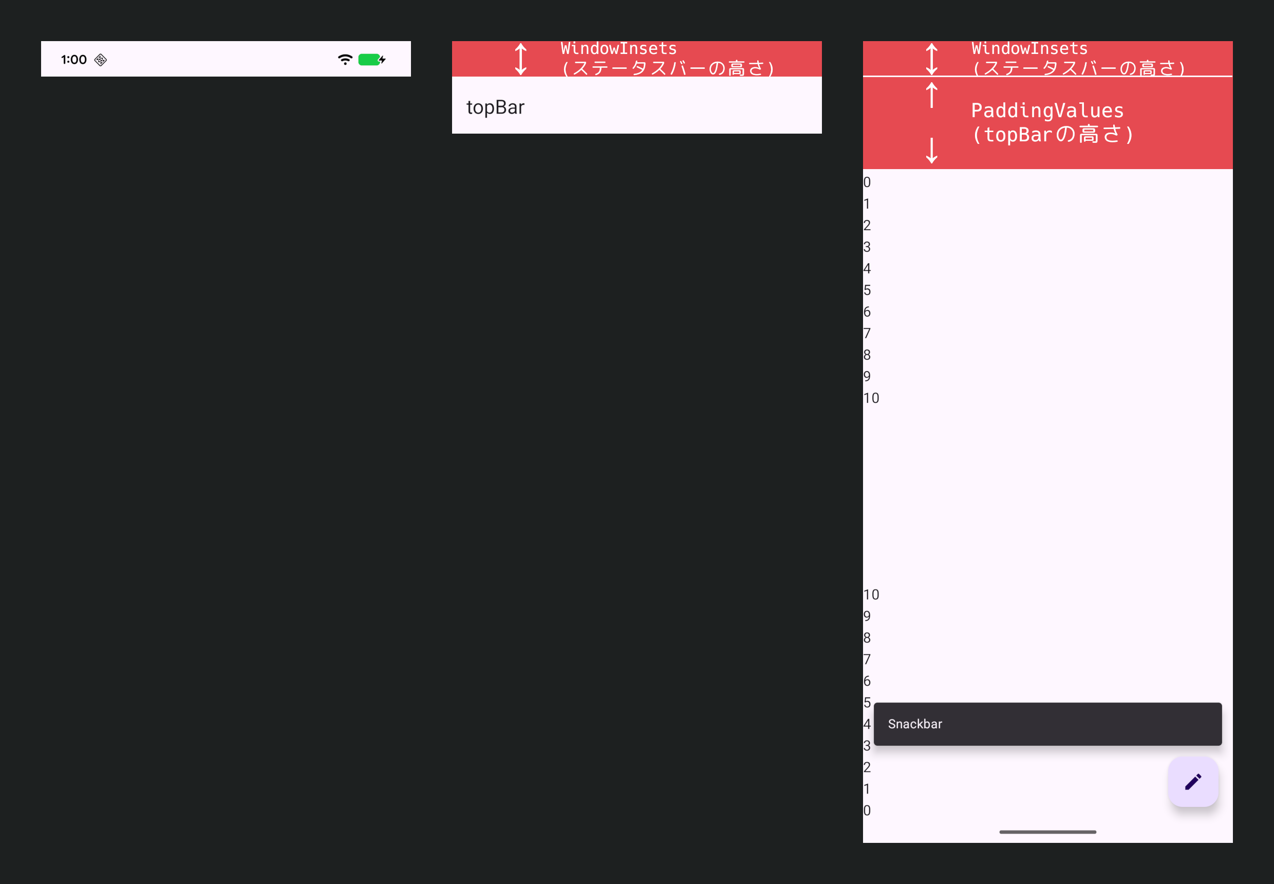
この現象を避けるためには、topBar/bottomBarが存在しないときにはcontentにWindowInsets分の余白をつけ、topBar/bottomBarが存在するときにはcontentにはtopBar/bottomBar分の余白のみをつけることになる。
これを実現するためにScaffoldはcontentWindowInsetsを受け取っている。
3. contentWindowInsetsはPaddingValuesとしてcontentに渡される
先程からcontentに余白をつけると言っているが、実際に余白をつけるのはScaffoldの役目ではない。
ScaffoldはcontentWindowInsetsをPaddingValuesとしてcontentに渡しているだけ。
Scaffold(
   contentWindowInsets = WindowInsets.safeDrawing
) { paddingValues ->     ^^^^^^^^^^^^^^^^^^^^^^^^
    ^^^^^^^^^^^^^               │  この値が
         |______________________│
    ここに反映される
この記事の前半で、このPaddingValuesについて『topBarやbottomBarと重ならないようにレイアウトするために必要な余白』だと申したが、それでは半分しか説明できていないということになる。
このPaddingValuesの本当の値はこうだ。
PaddingValues(
   left = contentWindowInsets.left,
   top = if (topBarが存在する) {
      topBarの高さ
   } else {
      contentWindowInsets.top
   },
   right = contentWindowInsets.right,
   bottom = if (bottomBarが存在する) {
      bottomBarの高さ
   } else {
      contentWindowInsets.bottom
   }
)
つまりScaffoldから受け取っているこのPaddingValuesは、『topBarもbottomBarもcontentWindowInsetsもすべて重ならないようにレイアウトするための余白』だったのだ。
Scaffoldの使い方
結局のところこれはどう使えばいいのか?
随分複雑な仕様が絡み合っているなという印象は受けますが、使う側のやることはそこまで複雑ではありません。
WindowInsetsは3箇所
WindowInsetsはScaffoldのcontentWindowInsetsに渡し、topBar, bottomBarにもそれぞれ適切に設定しましょう。
Scaffold(
   topBar = {
      TopAppBar(
         windowInsets = windowInsets
      )
   },
   bottomBar = {
      BottomAppBar(
         windowInsets = windowInsets
      )
   },
   contentWindowInsets = windowInsets
)
content内ではPaddingValuesがWindowInsets
contentではScaffoldから受け取ったPaddingValuesをWindowInsetsとして扱い、それ以外のWindowInsetsは使わないようにしましょう。
もしcontent内でWindowInsetsを使おうとしているのであれば、それは十中八九、本来ScaffoldにcontentWindowInsetsとして渡すべきものです。
Scaffold(
) { paddingValues ->
   LazyColumn(
      contentPadding = paddingValues // ⭕
      contentPadding = windowInsets.asPaddingValues() // ❌
   )
)
Scaffoldを使うときに意識すべきことはこれだけ。
これらに注意しておけば、他の面倒ごとは全部Scaffoldがやってくれて、どのようなパターンでも余白が適切に調整されたUIが完成します。
例えば、極端に面倒な例ですが、bottomBarが表示されたりされなくなったりするような画面を作ってみます。

Scaffold(
   topBar = {
      TopAppBar(
         windowInsets = windowInsets
            .only(WindowInsetsSides.Horizontal + WindowInsetsSides.Top)
      )
   },
   bottomBar = {
      AnimatedVisibility(
         visible = showBottomBar,
         enter = expandVertically(),
         exit = shrinkVertically(),
         modifier = Modifier
            .windowInsetsPadding(
               windowInsets
                  .only(WindowInsetsSides.Horizontal + WindowInsetsSides.Bottom)
            )
      ) {
         FloatingBottomBar()
      }
   },
   snackbarHost = {
      SnackbarHost()
   },
   floatingActionButton = {
      FloatingActionButton()
   },
   contentWindowInsets = windowInsets
) { paddingValues ->
   LazyColumn(
      contentPadding = paddingValues
   ) {
      items(40) { i->
         Text("$i")
      }
   }
}
LazyColumnの余白調整はかなり複雑なはずですが、それを全部Scaffoldに押し付け、我々はもらったpaddingValuesを使うだけです。
シンプルなコードのまま綺麗にできていると思います。
おわり
いろいろ書きましたが、その大半はScaffoldの内部で行われていて、我々はほとんど何も意識することなく恩恵を受けられます。
Scaffold、便利ですね。