前職にいた時、iPhoneのショートカット機能を使って出社した日を自動で記録する設定をしてました。
仕組みとしては、iPhoneの位置情報を使って「会社に着いた」というイベントをトリガーにして、メモアプリの特定のページに現在日時を書き込むショートカットを仕込んでいました。実際のメモはこんな感じです。

去年末から始めたので、ちょうど2025年の1年分のデータが溜まりました。せっかくなのでグラフにしてみます。
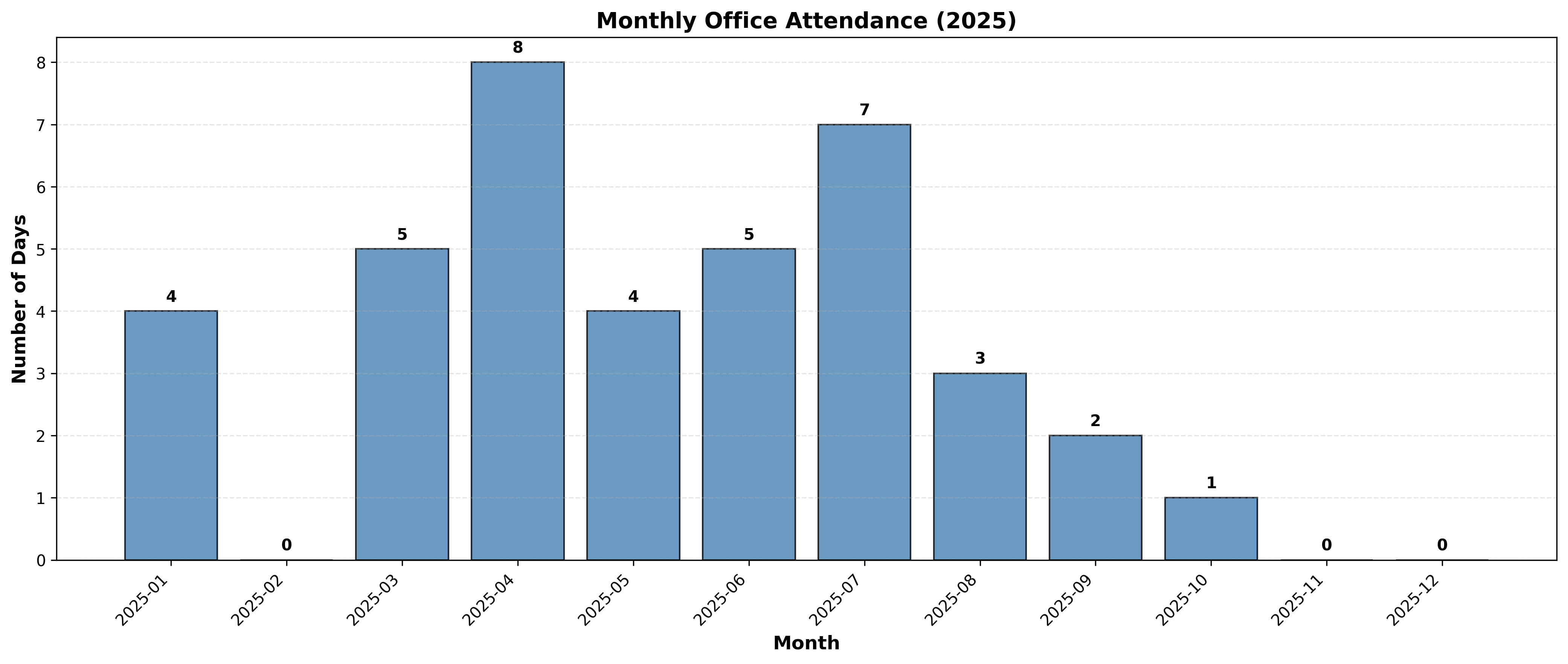
えー、全然出社してないですね。テレワークばっかりです。
10月からは転職してフルリモートの会社に入社したので、10月1日の入社式以降で出社の予定はありません。なので12月は0回で確定。
2025年は平日が261日あって自分は合計39回出社したので、出社率は約15%ほどだそうです。
ちなみにグラフ生成には以下のPythonスクリプトを使いました。(Claudeに手伝ってもらいました)
import matplotlib.pyplot as plt
from datetime import datetime
from collections import Counter
import matplotlib.dates as mdates

# 出社日データ
dates_str = """2025/01/07 8:41
2025/01/07 13:39
2025/01/21 8:37
2025/01/21 13:27
2025/01/24 8:11
2025/01/28 8:38
2025/01/28 8:42
2025/01/28 12:19
2025/03/04 8:49
2025/03/04 12:17
2025/03/04 18:14
2025/03/11 8:43
2025/03/11 12:18
2025/03/18 11:47
2025/03/25 6:45
2025/03/25 8:39
2025/03/26 6:42
2025/03/26 8:54
2025/03/26 12:37
2025/04/01 8:33
2025/04/04 13:13
2025/04/04 22:07
2025/04/08 8:56
2025/04/08 12:19
2025/04/08 12:23
2025/04/15 9:08
2025/04/15 12:46
2025/04/16 13:09
2025/04/16 18:45
2025/04/24 17:48
2025/04/25 12:02
2025/04/30 8:54
2025/04/30 12:41
2025/05/13 13:05
2025/05/14 10:07
2025/05/14 13:03
2025/05/20 8:56
2025/05/20 8:57
2025/05/20 12:34
2025/05/27 9:12
2025/05/27 12:37
2025/05/27 12:38
2025/06/03 9:08
2025/06/03 11:35
2025/06/03 12:31
2025/06/10 9:14
2025/06/11 9:12
2025/06/20 9:15
2025/06/20 13:33
2025/06/24 9:10
2025/07/01 9:18
2025/07/01 12:44
2025/07/15 9:13
2025/07/15 12:35
2025/07/17 14:04
2025/07/17 14:07
2025/07/22 8:09
2025/07/23 8:31
2025/07/23 12:42
2025/07/29 9:17
2025/07/29 12:21
2025/07/30 8:41
2025/07/30 12:13
2025/08/05 8:47
2025/08/05 12:36
2025/08/19 8:48
2025/08/19 13:16
2025/08/26 8:31
2025/08/26 8:36
2025/08/26 12:21
2025/09/02 9:16
2025/09/02 13:41
2025/09/04 9:05
2025/09/04 12:37
2025/09/04 14:05"""

# 日付のみを抽出(時刻は無視)
dates = []
for line in dates_str.strip().split('\n'):
    date_part = line.split()[0]
    dates.append(date_part)

# 10月のデータを追加
dates.append('2025/10/01')

# 重複を削除してユニークな日付のみ取得
unique_dates = sorted(set(dates))

# 月ごとに集計
month_counts = Counter()
for date in unique_dates:
    dt = datetime.strptime(date, '%Y/%m/%d')
    month_key = dt.strftime('%Y-%m')
    month_counts[month_key] += 1

# 1月から12月まで全ての月を含める(0日の月も表示)
all_months = [f'2025-{str(i).zfill(2)}' for i in range(1, 13)]
counts = [month_counts.get(month, 0) for month in all_months]
sorted_months = all_months

# グラフ作成
plt.figure(figsize=(14, 6))
plt.rcParams['font.sans-serif'] = ['DejaVu Sans']

bars = plt.bar(range(len(sorted_months)), counts, color='steelblue', alpha=0.8, edgecolor='black')

# 各バーの上に数値を表示
for i, (bar, count) in enumerate(zip(bars, counts)):
    plt.text(bar.get_x() + bar.get_width()/2, bar.get_height() + 0.1,
             str(count), ha='center', va='bottom', fontsize=10, fontweight='bold')

plt.xlabel('Month', fontsize=12, fontweight='bold')
plt.ylabel('Number of Days', fontsize=12, fontweight='bold')
plt.title('Monthly Office Attendance (2025)', fontsize=14, fontweight='bold')
plt.xticks(range(len(sorted_months)), sorted_months, rotation=45, ha='right')
plt.grid(axis='y', alpha=0.3, linestyle='--')
plt.tight_layout()

# 保存
plt.savefig('/mnt/user-data/outputs/office_attendance_monthly.png', dpi=300, bbox_inches='tight')
print(f"Monthly chart created!")

# 日付単位のグラフ作成
plt.figure(figsize=(16, 6))
date_objects = [datetime.strptime(date, '%Y/%m/%d') for date in unique_dates]

bars = plt.bar(date_objects, [1]*len(date_objects), width=0.8, color='steelblue', alpha=0.8, edgecolor='black')

plt.xlabel('Date', fontsize=12, fontweight='bold')
plt.ylabel('Attendance', fontsize=12, fontweight='bold')
plt.title('Daily Office Attendance (2025)', fontsize=14, fontweight='bold')
plt.gca().xaxis.set_major_formatter(mdates.DateFormatter('%Y-%m-%d'))
plt.gca().xaxis.set_major_locator(mdates.MonthLocator())
plt.xticks(rotation=45, ha='right')
plt.ylim(0, 1.5)
plt.yticks([0, 1], ['', 'Present'])
plt.grid(axis='x', alpha=0.3, linestyle='--')
plt.tight_layout()

plt.savefig('/mnt/user-data/outputs/office_attendance_daily.png', dpi=300, bbox_inches='tight')
print(f"Daily chart created!")

print(f"\nStatistics:")
print(f"Total records: {len(dates)}")
print(f"Unique attendance days: {len(unique_dates)}")
print(f"\nMonthly breakdown:")
for month in sorted_months:
    print(f"  {month}: {month_counts[month]} days")
なぜ出社が少ないか
息子がまだ幼いのが1番の理由です。保育園・小学校のことを考えるとテレワークの方が色々と都合が良いです。
フルリモートでやってますと非エンジニアの人に言うと「家で仕事なんてできない!」「集中力切れる!」と言われることも多いのですが、自分はあんまりこれは感じてなくて、割と家の書斎で8時間集中して仕事ができるタイプです。元々インドアな気質で、一日中家に引きこもってても大丈夫な性格なのも寄与してそうです。
出社vsテレワーク論争
SNSでは定期的に出社とテレワークどっちがいいかの問題が議論されていますね。
自分はこの論争に答えはないと思っていて、個々人によって出社が適している人・テレワークが適している人に分かれると思います。出社して対面で顔を合わせた方が捗ると感じる人もいれば、自宅のデスク環境が一番仕事が捗るという人もいます。あるいは、独身/既婚子持ちによっても意見が変わると思います。オフィスの近くに住んでた時は出社がよかったけど、結婚などで移住してテレワークの方が嬉しいと思うようになる人もいるでしょう。親の介護で出社が難しくなる人もいるでしょう。
賃貸vs持ち家、きのこvsたけのこのように、本当に答えのない問題だと思います。
大事なのは「人によって&ライフステージによって出社・テレワークの適性は変わる」ということを念頭に置いて、会社の制度を柔軟に整備していくことかなあと思います。
これから
来年も引き続きフルリモートの予定なので、今年以上に出社率は下がりそうです。
出社回帰する企業も多いですが、フルリモートを継続している企業も一定数いるんだなあと転職してから改めて感じました。
これからも引き続きフルリモートで成果を出していきます。