はじめに
前回 mplfinance を使って一目均衡表を描いたが

抵抗帯の未来(26日分)の部分が描けていないのがいけてなかった
今回は,未来26日分の抵抗帯を描くように変更する
前回のコードからの変更点が記事の主な内容となるので,
まずはこちらから確認してほしい
一目均衡表に未来26日分の抵抗帯を描くための変更点
抵抗帯は先行スパン1と先行スパン2の間の部分で,
先行スパン1と先行スパン2は,基準値などを使って計算した結果を26日先行させて表示させたものであったので,
-
pandas_datareader.DataReaderで取得したデータ(DataFrame)に未来26日すべて欠損値の DataFrame を結合 - 先行スパン以外は未来26日分のデータを消す(欠損値にする) ※どういうことか後で説明する
ということを行えば良さそうだ
未来26日すべて欠損値の DataFrame を作る
DataFrame は次のようにして作る
pandas.DataFrame(data=None, index=None, columns=None, dtype=None, copy=None)
DataFrame 作成に必要な data
26行 $\times$ pandas_datareader.DataReader で取得した DataFrame 列 の行列にすればよい
26行 $\times$ pandas_datareader.DataReader 要素の配列を作るには numpy.full を使う
numpy.full はすべて同じ要素の配列を作る関数で
>>> # 要素数8すべて欠損値の配列を作る
>>> np.full(shape=8, fill_value=np.nan)
array([nan, nan, nan, nan, nan, nan, nan, nan])
numpy.full で作った配列を指定サイズの行列にするには ndarray.reshape を使う
ndarray.reshape は ndarray の形状を変換する関数で
>>> # 要素数8の配列を2×4の行列にする
>>> np.full(shape=8, fill_value=np.nan).reshape(2, 4)
array([[nan, nan, nan, nan],
       [nan, nan, nan, nan]])
pandas_datareader.DataReader で取得した DataFrame(_df とする) の列数は len(_df.columns) なので,
以下で DataFrame 作成に必要な data を作ることができる
np.full(shape=26 * len(_df.columns), fill_value=np.nan).reshape(26, len(_df.columns))
DataFrame 作成に必要な index
pandas_datareader.DataReader で取得した最終日の次の日からの26日間で Index を作ればよい
pandas_datareader.DataReader で取得した最終日は
_df.index[-1]
なので,その次の日は
_df.index[-1] + relativedelta(days = 1)
連続した日付のリストを作るには,Pandas.date_range が便利で
連続した日付にしたい場合 freq には 'D' を渡す
様々な値を渡せるので,こちらを参考にしてほしい
>>> pd.date_range('2021-12-1', periods=3, freq='D')
DatetimeIndex(['2021-12-01', '2021-12-02', '2021-12-03'], dtype='datetime64[ns]', freq='D')
以下で DataFrame 作成に必要な index を作ることができる
next_day = _df.index[-1] + relativedelta(days = 1)
pd.date_range(next_day, periods=26, freq='D')
先行スパン以外は未来26日分のデータを消す(欠損値にする)
消さないと(欠損値にしないと)どうなるかを先に示そう
黄色く引いた線の右側(MACDとRSI)に余計な線が描かれている(赤丸)
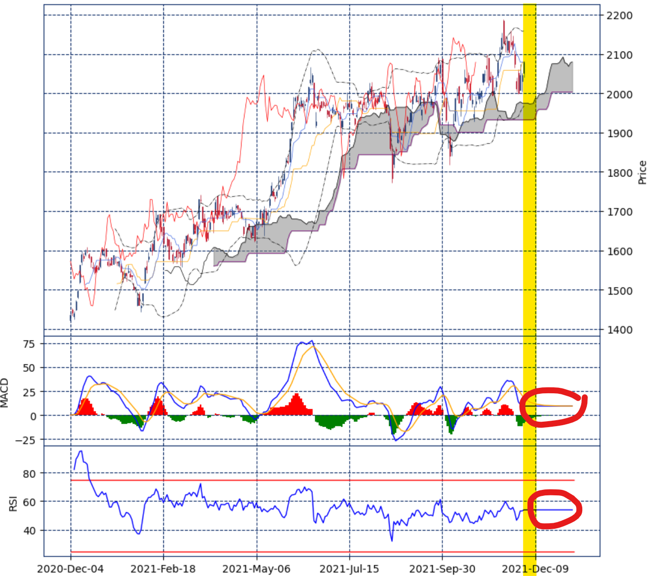
なので,MACD,RSIについて未来26日分のデータは欠損値で埋める
# 未来26日分の不要データを欠損値で埋める
macd_[-26:] = np.nan
macdsignal[-26:] = np.nan
histogram[-26:] = np.nan
histogramplus[-26:] = np.nan
histogramminus[-26:] = np.nan
rsi_[-26:] = np.nan
まとめ
まとめると以下のようだ
import numpy as np
import pandas as pd
import pandas_datareader.data as pdr
import datetime
from dateutil.relativedelta import relativedelta
import matplotlib.pyplot as plt
import mplfinance as mpf

# 12か月チャート
month = 12
# チャートの基本設定
kwargs = dict(type = 'candle', style = 'yahoo') ## starsandstripes, yahoo

# 12か月前から本日までのデータを取得する
ed = datetime.datetime.now()
st = ed - relativedelta(months = month)
# トヨタ
_df = pdr.DataReader('7203.T', 'yahoo', st, ed)

# 取得したデータの次の日から26日先までが欠損値の DataFrame を作り結合する
next_day = _df.index[-1] + relativedelta(days = 1)
_df_26 = pd.DataFrame(data=np.full(shape=26 * len(_df.columns), fill_value=np.nan).reshape(26, len(_df.columns)),
        columns=_df.columns, index=pd.date_range(next_day, periods=26, freq='D'))
df = pd.concat([_df, _df_26])

def bollingerband(c, period):
    bbma = c.rolling(window=period).mean() ## 平均
    bbstd = c.rolling(window=period).std() ## 標準偏差
    bbh1 = bbma + bbstd * 1
    bbl1 = bbma - bbstd * 1
    bbh2 = bbma + bbstd * 2
    bbl2 = bbma - bbstd * 2
    bbh3 = bbma + bbstd * 3
    bbl3 = bbma - bbstd * 3
    return bbh1,bbl1,bbh2,bbl2,bbh3,bbl3

def macd(c, n1, n2, ns):
    ema_short = c.ewm(span=n1,adjust=False).mean()
    ema_long = c.ewm(span=n2,adjust=False).mean()
    macd = ema_short - ema_long
    signal = macd.ewm(span=ns,adjust=False).mean()
    histogram = macd - signal
    histogramplus = histogram.where(histogram > 0, 0)
    histogramminus = histogram.where(histogram < 0, 0)
    return macd,signal,histogram,histogramplus,histogramminus

def rsi(c, period):
    diff = c.diff() #前日比
    up = diff.copy() #上昇
    down = diff.copy() #下落
    up = up.where(up > 0, np.nan) #上昇以外はnp.nan
    down = down.where(down < 0, np.nan) #下落以外はnp.nan
    #upma = up.rolling(window=period).mean() #平均
    #downma = down.abs().rolling(window=period).mean() #絶対値の平均
    upma = up.ewm(span=period,adjust=False).mean() #平均
    downma = down.abs().ewm(span=period,adjust=False).mean() #絶対値の平均
    rs = upma / downma
    rsi = 100 - (100 / (1.0 + rs))
    return rsi

def ichimoku(o, h, l, c):
    ## 当日を含めた過去26日間の最高値
    ## 当日を含めた過去 9日間の最高値
    ## 当日を含めた過去52日間の最高値
    max26 = h.rolling(window=26).max()
    max9  = h.rolling(window=9).max()
    max52 = h.rolling(window=52).max()
    ## 当日を含めた過去26日間の最安値
    ## 当日を含めた過去 9日間の最安値
    ## 当日を含めた過去52日間の最安値
    min26 = l.rolling(window=26).min()
    min9  = l.rolling(window=9).min()
    min52 = l.rolling(window=52).min()

    ## 基準線=(当日を含めた過去26日間の最高値+最安値)÷2
    ## 転換線=(当日を含めた過去9日間の最高値+最安値)÷2
    kijun = (max26 + min26) / 2
    tenkan = (max9 + min9) / 2
    ## 先行スパン1={(転換値+基準値)÷2}を26日先行させて表示
    senkospan1 = (kijun + tenkan) / 2
    senkospan1 = senkospan1.shift(26)
    ## 先行スパン2={(当日を含めた過去52日間の最高値+最安値)÷2}を26日先行させて表示
    senkospan2 = (max52 + min52) / 2
    senkospan2 = senkospan2.shift(26)
    ## 遅行スパン= 当日の終値を26日遅行させて表示
    chikouspan = c.shift(-26)

    return kijun, tenkan, senkospan1, senkospan2, chikouspan

# float 型に
df['Open'] = df['Open'].astype(float)
df['High'] = df['High'].astype(float)
df['Low'] = df['Low'].astype(float)
df['Close'] = df['Close'].astype(float)
o = df['Open']
c = df['Close']
l = df['Low']
h = df['High']

'''
テクニカル指標の結果を得る
'''
# ボリンジャーバンド(移動平均25日線)
bbh1, bbl1, bbh2, bbl2, bbh3, bbl3 = bollingerband(c, 25)
# MACD(短期=12,長期=26,シグナル=9)
macd_, macdsignal, histogram, histogramplus, histogramminus = macd(c, 12, 26, 9)
# RSI(14日)
rsi_ = rsi(c, 14)
# 一目均衡表
kijun, tenkan, senkospan1, senkospan2, chikouspan = ichimoku(o, h, l, c)

# 未来26日分の不要データを欠損値で埋める
macd_[-26:] = np.nan
macdsignal[-26:] = np.nan
histogram[-26:] = np.nan
histogramplus[-26:] = np.nan
histogramminus[-26:] = np.nan
rsi_[-26:] = np.nan

'''
チャートを描く
'''
# 高さの比を 3:1:1 で GridSpec を用意する
fig = mpf.figure(figsize=(9.6, 9.6), style='starsandstripes')
gs = fig.add_gridspec(3, 1, hspace=0, wspace=0, height_ratios=(3, 1, 1))
(ax1,ax2,ax3) = gs.subplots(sharex='col')

# ボリンジャーバンドは axes No.1 に描く
bbargs = dict(ax=ax1, width=.5, linestyle='dashdot', color='black')
# MACD は axes No.2 に描く
macdargs = dict(ax=ax2, width=1, ylabel='MACD')
# RSI は axes No.3 に描く
rsiargs = dict(ax=ax3, width=1, ylabel='RSI')
# 一目均衡表 axes No.1 に描く
ichimokuargs = dict(ax=ax1, width=.5)

# プロットを作成する(ボリンジャーバンド,MACD,RSI,一目均衡表)
ap = [
    mpf.make_addplot(bbh2, **bbargs),
    mpf.make_addplot(bbl2, **bbargs),
    mpf.make_addplot(macd_, **macdargs, color='blue'),
    mpf.make_addplot(macdsignal, **macdargs, color='orange'),
    mpf.make_addplot(histogramplus, **macdargs, color='red', type='bar'),
    mpf.make_addplot(histogramminus, **macdargs, color='green', type='bar'),
    mpf.make_addplot(rsi_, **rsiargs, color='blue'),
    mpf.make_addplot(kijun, **ichimokuargs, color='orange'),
    mpf.make_addplot(tenkan, **ichimokuargs, color='royalblue'),
    mpf.make_addplot(senkospan1, **ichimokuargs, color='black'),
    mpf.make_addplot(senkospan2, **ichimokuargs, color='purple'),
    mpf.make_addplot(chikouspan, **ichimokuargs, color='red')
]

# RSI(axes=3) の25%と75%に線を引く
ax3.hlines(xmin=0, xmax=len(df.index), y=25, linewidth=1, color='red')
ax3.hlines(xmin=0, xmax=len(df.index), y=75, linewidth=1, color='red')

# 一目均衡表(axes=1)の先行スパン1と先行スパン2の間を塗りつぶす
ax1.fill_between(x=range(0, len(df.index)), y1=senkospan1.values, y2=senkospan2.values, alpha=0.5, color='gray')

# ローソク足を描く,用意したプロットを渡す
mpf.plot(df, ax=ax1, addplot=ap, style='starsandstripes', type='candle', xrotation=30, ylabel='Price')
mpf.show()
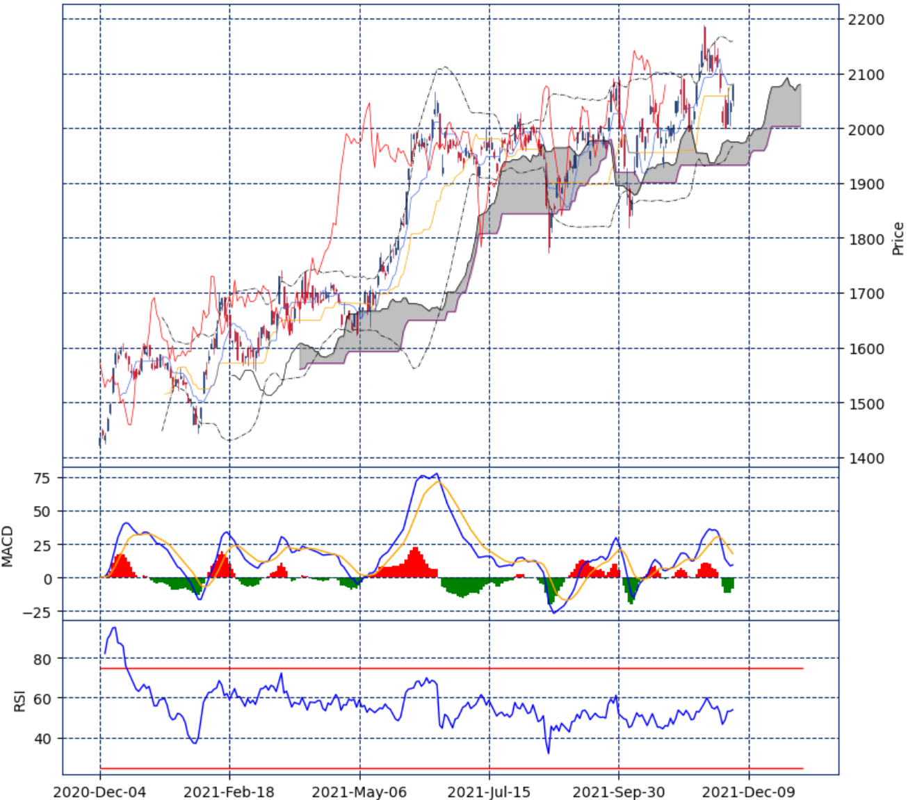
次のようなチャートが表示される
おわりに
今回は,mplfinance を使って一目均衡表を描いてみた
次回は,これをベースに複数銘柄のチャートを表示するチャートボード?を作ってみたい