
Vue.jsのチュートリアルを兼ねてカラーピッカーを作成します。
テンプレートの用意
任意のディレクトリ内にcolor_picker.htmlを作成します。
color_picker.html
<!DOCTYPE html>
<html lang="ja">
<head>
    <meta charset="utf-8">
    <meta name="viewport" content="width=device-width, initial-scale=1, shrink-to-fit=no">
    <link rel="stylesheet" href="https://stackpath.bootstrapcdn.com/bootstrap/4.5.0/css/bootstrap.min.css" integrity="sha384-9aIt2nRpC12Uk9gS9baDl411NQApFmC26EwAOH8WgZl5MYYxFfc+NcPb1dKGj7Sk" crossorigin="anonymous">
    <title>Color Picker</title>
    <style>
        body {
            padding: 70px 0;
        }

        .panel {
            height: 200px;
            border: 1px solid #ccc;
        }
    </style>
</head>
<body>
    <div id="app" class="container">
        <div class="panel"></div>
        <div class="row mt-5">
            <div class="col-4">
                <label for="red">Red</label>
                <input type="range" class="custom-range" min="0" max="255" id="red">
            </div>
            <div class="col-4">
                <label for="green">Green</label>
                <input type="range" class="custom-range" min="0" max="255" id="green">
            </div>
            <div class="col-4">
                <label for="blue">Blue</label>
                <input type="range" class="custom-range" min="0" max="255" id="blue">
            </div>
        </div>
    </div>

    <script src="https://code.jquery.com/jquery-3.5.1.slim.min.js" integrity="sha384-DfXdz2htPH0lsSSs5nCTpuj/zy4C+OGpamoFVy38MVBnE+IbbVYUew+OrCXaRkfj" crossorigin="anonymous"></script>
    <script src="https://cdn.jsdelivr.net/npm/popper.js@1.16.0/dist/umd/popper.min.js" integrity="sha384-Q6E9RHvbIyZFJoft+2mJbHaEWldlvI9IOYy5n3zV9zzTtmI3UksdQRVvoxMfooAo" crossorigin="anonymous"></script>
    <script src="https://stackpath.bootstrapcdn.com/bootstrap/4.5.0/js/bootstrap.min.js" integrity="sha384-OgVRvuATP1z7JjHLkuOU7Xw704+h835Lr+6QL9UvYjZE3Ipu6Tp75j7Bh/kR0JKI" crossorigin="anonymous"></script>
    <script src="https://cdn.jsdelivr.net/npm/vue/dist/vue.js"></script>
</body>
</html>
ブラウザで確認します。

上の画面のように表示されればテンプレートの準備は完了です。
Vue.jsの導入
bodyの終了タグの前にコードを追加します。
color_picker.html
<script>
  let app = new Vue({
    el: "#app",
    data: {
      red: 0,
      green: 0,
      blue: 0
    }
  })
</script>
次にpanelクラスに属性を追加します。
color_picker.html
<div class="panel" :style="{backgroundColor: panelColor}"></div>
scriptタグ内にコードを追加します。
color_picker.html
<script>
  let app = new Vue({
    el: "#app",
    data: {
      red: 0,
      green: 0,
      blue: 0
    },
    computed: {
      panelColor: function() {
        return `rgb(${this.red}, ${this.green}, ${this.blue})`;
      }
    }
  })
</script>
ブラウザを更新します。

現時点ではスライダーを動かしても黒色しか表示されません。
そこで、スライダーと連動できるようにv-modelを追加します。
color_picker.html
<div class="col-4">
  <label for="red">Red</label>
  <input type="range" class="custom-range" min="0" max="255" id="red" v-model="red">
</div>
<div class="col-4">
  <label for="green">Green</label>
  <input type="range" class="custom-range" min="0" max="255" id="green" v-model="green">
</div>
<div class="col-4">
  <label for="blue">Blue</label>
  <input type="range" class="custom-range" min="0" max="255" id="blue" v-model="blue">
</div>
ブラウザを更新し、スライダーを動かしてみましょう。

パネルの色が変わるのがわかります。
最後にrgbの数値を表示できるようにします。
color_picker.html
<div class="col-4">
  <label for="red">Red</label>
  <input type="range" class="custom-range" min="0" max="255" id="red" v-model="red">
  <input type="number" class="form-control" v-model="red">
</div>
<div class="col-4">
  <label for="green">Green</label>
  <input type="range" class="custom-range" min="0" max="255" id="green" v-model="green">
  <input type="number" class="form-control" v-model="green">
</div>
<div class="col-4">
  <label for="blue">Blue</label>
  <input type="range" class="custom-range" min="0" max="255" id="blue" v-model="blue">
  <input type="number" class="form-control" v-model="blue">
</div>
ブラウザを更新します。
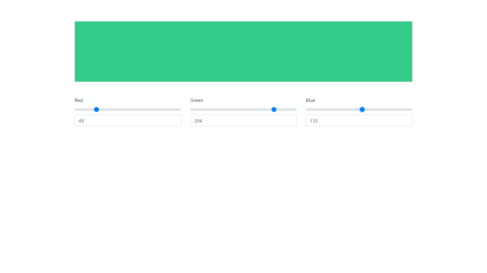
スライダーに合わせて数値が変化するのがわかります。
以上でカラーピッカーは完成です。
ソースコードを見たい方はこちらで確認できます。