はじめに
みなさんClaude Code触っていますか?
かくいう私はプロジェクトでClaude Codeを触る機会があり、それ以来プライベートでもClaude Codeユーザーです。便利ですよね。
私はフロントエンド開発をClaude Codeで行う機会が多く、特にFigmaとセットで使っています。今回はそんなFigmaの公式から提供されているMCPサーバーを用いて、Claude Codeにフロント開発を行わせる際のコツを書き記していきたいと思います。
Figmaのデザインに一工夫加えることによって、AIによるフロントエンドコーディングが格段にやりやすくなります。
Claude CodeやFigma MCPを触るのが初めての方はもちろん、フロントのAIコーディングが気になっている方へ、すぐに使える「AIにやさしい」Figmaデザインのコツをまとめた「やさしい」記事を目指しました。
Figmaに関しては、この記事を書くにあたり本格的に勉強を始めましたので、至らない部分が多分にありますことをご了承ください。(ご指摘・ご意見・ご感想ありましたらコメントお待ちしております!)
前提条件
こちらで紹介しているコツは、すでに実装したいデザインが決まっている場合に最大限の効力を発揮します。Figmaというデザイナー&エンジニアのコラボレーションツールを使うにあたり、AI前提のデザインを構築していくためのノウハウを紹介しています。
そのため、「デザインを0からAIに作らせる」といった場合には、本記事のスコープ外となってしまうこと、ご了承くださいませ。
Figma MCPとはなんぞ
概要
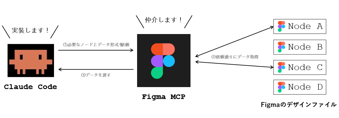
FigmaのデータをAIへ渡したい時に大変便利なのがFigma MCPです。AIとFigmaの間に立ち、Figmaのデータを仲介する役割を持っています。AIからの要求に応じて、デザインコード・スクリーンショット・構造データ等々...Figmaデザインのうち、どんな情報を渡せるのか選択肢を提示し、目的に応じたデータ授受に貢献しています。
MCPのバリエーション
Figma MCPにはDesktop版とRemote版の2種類が存在します。どちらも基本的な機能は同じですが、利用できるプランや機能が若干異なります。
| Desktop | Remote | |
|---|---|---|
| インターネットへの接続 | 不要 | 必須 |
| 利用可能なPlan | DevもしくはFull seat | 全てのプラン |
| デザインの指定方法 | ノードへのリンク、もしくはアプリ上で選択 | ノードへのリンク |
| 使用できるTools |
generate_figma_design、whoami以外は利用可能 |
基本的に全て利用可能 |
また、Desktop・リモート関係なく、プランごとにMCPサーバーのツール呼び出し回数が制限されています
DesktopとRemoteの使い分け
AIに渡されるデータの質という観点では、どちらも差はありません。しかしながら、無料枠で気軽に使いたいという方にとってはRemote版が適していると言えます。「趣味でちょっとしたものを作ってみたい」「MCPがどんなものか試してみたい」といった方は、まずはRemote版を使ってみるのが良いでしょう。
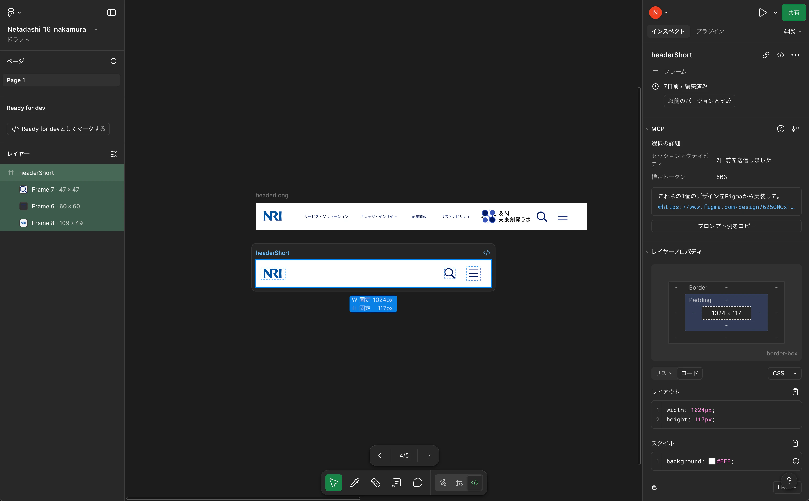
一方、Desktop版はRemote版よりも操作性の面で快適だと思う場面があります。それはAIとのリアルタイムな壁打ちが必要な場合です。Desktop版では自分が選択しているノードの情報を送ることができます。例えば以下のような感じ。
私「今Figma上で選択しているノードのメタデータを取得して」
figma-desktop - get_metadata (MCP)(clientFrameworks: "react", clientLanguages:
                                     "typescript")
  ⎿  <frame id="42:12" name="headerShort" x="-2606" y="-14" width="1024" he
     ight="117">
       <frame id="42:49" name="Frame 7" x="821" y="34" width="47" height="4
     … +6 lines (ctrl+o to expand)
  ⎿  IMPORTANT: After you call this tool, you MUST call get_design_context
     if trying to implement the design, since this tool only returns metada
     ta. If you do not call get_design_context, the agent will not be able
     to implement the design.

⏺ 現在選択中のノードのメタデータです。

  ┌──────────┬──────────────────┐
  │   属性   │        値        │
  ├──────────┼──────────────────┤
  │ ノード名 │ headerShort      │
  ├──────────┼──────────────────┤
  │ ID       │ 42:12            │
  ├──────────┼──────────────────┤
  │ 種別     │ frame            │
  ├──────────┼──────────────────┤
  │ 位置     │ x: -2606, y: -14 │
  ├──────────┼──────────────────┤
  │ サイズ   │ 1024 × 117 px    │
  └──────────┴──────────────────┘

  子ノード:

  ┌───────┬─────────┬─────┬─────┬──────────┐
  │  ID   │  名前   │  x  │  y  │  サイズ  │
  ├───────┼─────────┼─────┼─────┼──────────┤
  │ 42:49 │ Frame 7 │ 821 │ 34  │ 47 × 47  │
  ├───────┼─────────┼─────┼─────┼──────────┤
  │ 42:51 │ Frame 6 │ 918 │ 29  │ 60 × 60  │
  ├───────┼─────────┼─────┼─────┼──────────┤
  │ 42:55 │ Frame 8 │ 19  │ 34  │ 109 × 49 │
  └───────┴─────────┴─────┴─────┴──────────┘

  headerShort(幅1024px =
  SPレイアウト)で、子フレームのサイズからそれぞれ検索ボタン・ハンバーガーボタン
  ・NRIロゴに対応していると推測できます。詳細なデザイン情報が必要であれば
  get_design_context で取得できます。
プロンプトをリアルタイムで打ち込む際にリンクベースでやり取りするのは、コピー&ペーストの手間があるので少々面倒です。このような時は、Desktop版を用いることで、スムーズな情報のやり取りが実現します。
比較実験!AIにやさしくないデザイン vs やさしいデザイン
さていよいよ本題です。このFigma MCPを最大限活用するには、まず根本となるFigmaデザインを整備する必要があります。Figmaに記載したデザインを正確に、こちらの意図通りに伝えるためにはちょっとしたコツがあります。
今回の比較対象
今回は、野村総合研究所(弊社)のHPの上部に鎮座しているヘッダーになります。こちらを模倣して、Figmaデザインを作成してみました。
(A) AIにやさしくないデザイン
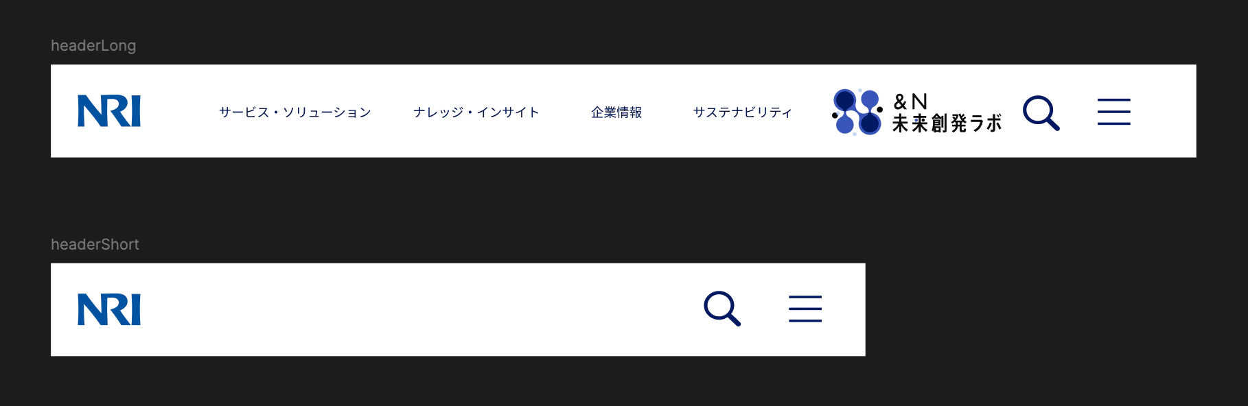
(B) AIにやさしいデザイン
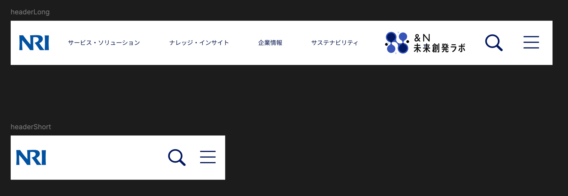
こちらでは、横幅に基づいてLongとShortでレスポンシブ対応することを期待しています。
正直見た目は何も変わりません。しかし重要なのは中身です。
Figma MCP公式のベスプラ
Figma MCPの公式では、より良いコードを生成させるために遵守すべきデザインのコツを公表しています。ここでは以下のように述べられています。
- コンポーネントを使う
- コードコネクトを用いて、コンポーネントとコードをリンクさせる
- バリアブルをデザイントークンとして用いる
- わかりやすく意味の伝わる命名をする
- オートレイアウトを利用する
- アノテーションを利用する
先ほどの(A)と(B)の違いは、これらのベストプラクティスを適用しているか否かにあります。
ここから筆者が特に注意すべきだと思った4点を抜粋してお伝えします。
コンポーネントを使う
画面を実装する際には、再利用可能なUI部品をコンポーネントとして定義します。Figmaのデザインの中でコンポーネントとして実装したい部品がある場合、その旨をプロンプトで指示するのではなく、Figma上で「これはコンポーネントである」と、再利用可能な部品であることを伝えましょう。
(A) AIにやさしくない
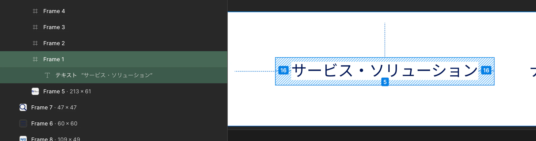
こちらのリンクボタンは、「サービス・ソリューション」という文字列を内包した単なるフレームであり、その同じ構造をコピーして利用している形になっています。
(B) AIにやさしい
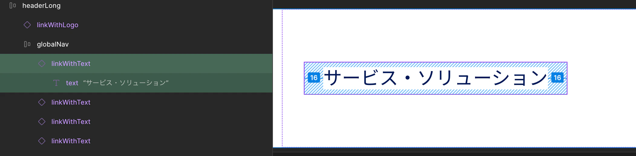
一方こちらは、テキストを内包したリンクボタンという「型」がコンポーネントとしてあらかじめ定義されています。
このコンポーネントからインスタンス化したものに「サービス・ソリューション」という文字列を渡し、ヘッダーで用いている形になっています。
意味の伝わる命名をする
(A) AIにやさしくない
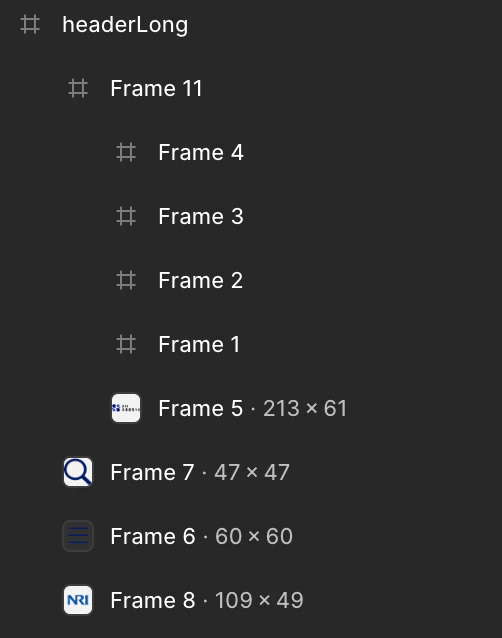
デフォルトの状態だと、このような自動命名がされてしまいます。
(B) AIにやさしい
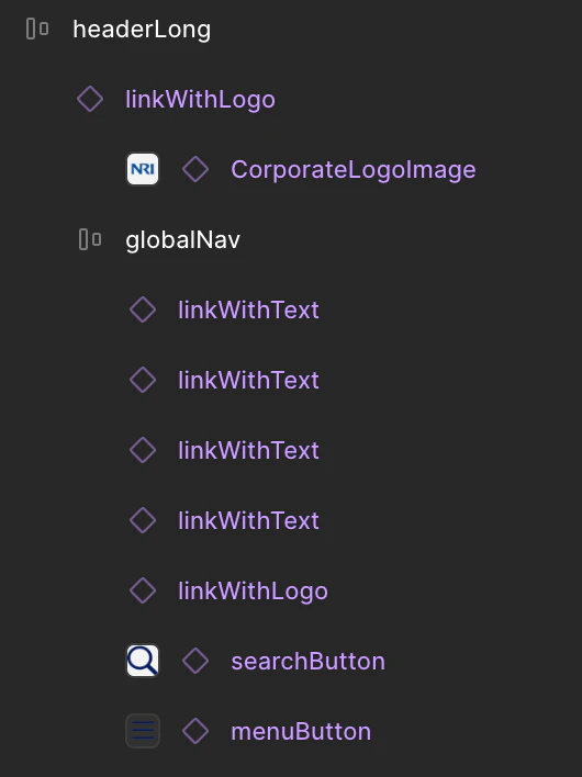
このように、各コンポーネントの役割や責務が伝わるような命名をすることで、デザイナーの意図をAIへ確実に伝えることができます。最近の言語モデルは高性能なので、コンポーネントの見た目等を考慮してある程度役割を推論してくれますが、不確実性が上がりますし、認知負荷も高くなります。
オートレイアウトを利用する
Figmaには、内包する要素を自動で整列・伸縮させるレイアウト機能が搭載されており、これをオートレイアウトと呼びます。
(A) AIにやさしくない
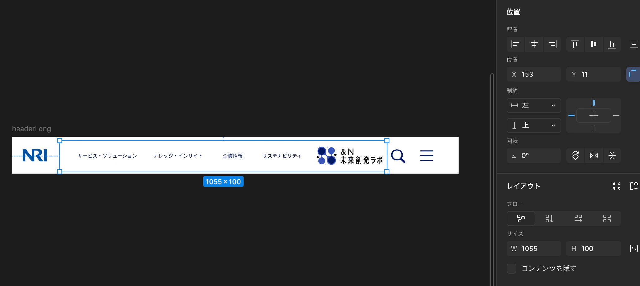
右のパネルに「位置」と言う項目がありますが、こちらでX方向・Y方向の位置を指定しています。つまり絶対座標で配置を決めているということです。
(B) AIにやさしい
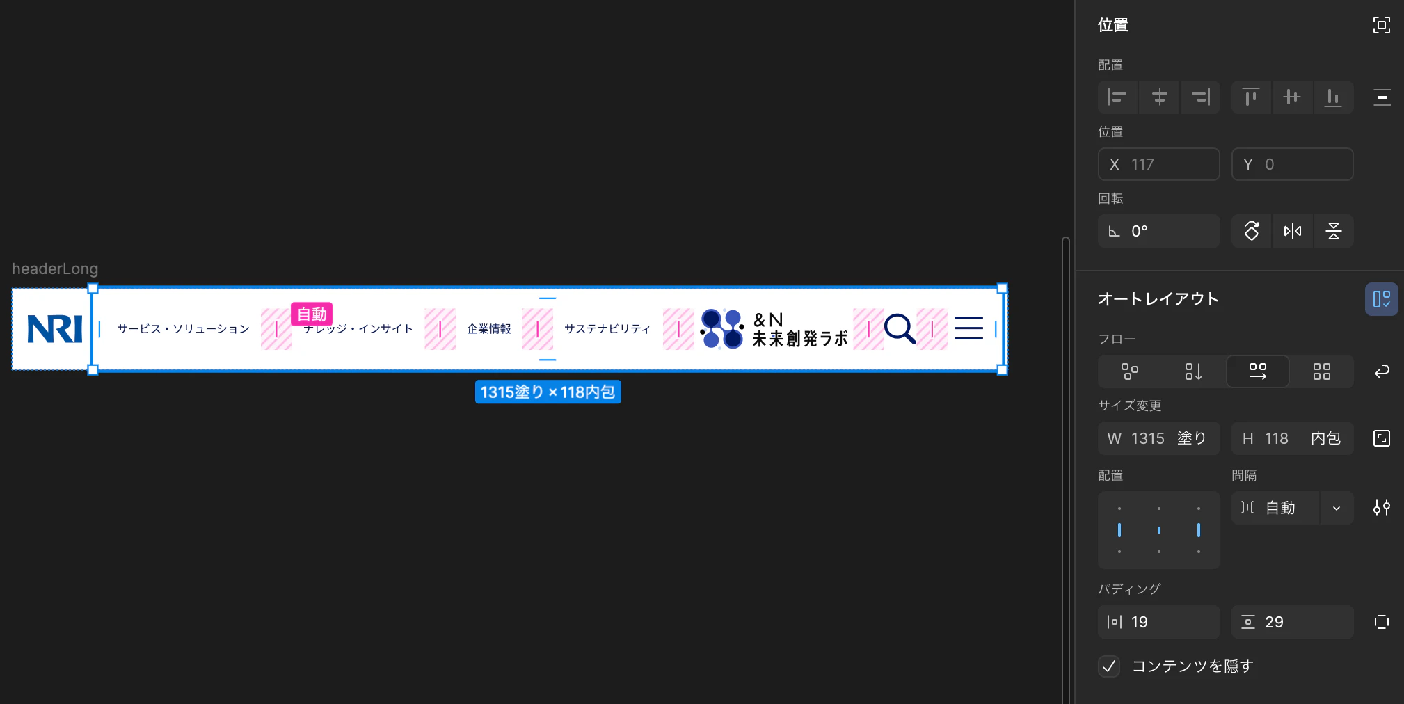
一方こちらはオートレイアウトが有効になっています。「位置」のX方向・Y方向が不活性になっており、代わりにオートレイアウトが有効になっています。並べ方、配置、間隔などを指定すれば自動で配置してくれます。
アノテーションを利用する
どうしてもFigmaの機能でカバーしきれない表現が出てきてしまいます。そんな時は、アノテーションを付与することで追加情報を伝えることができます。
(B) AIにやさしい
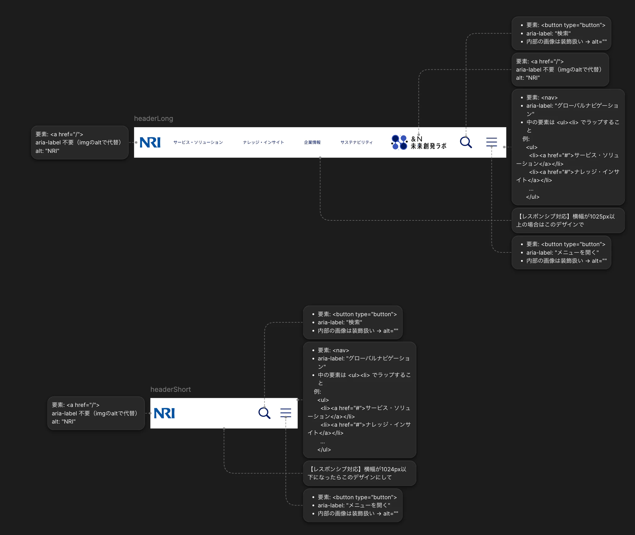
例えば、ある幅を境に特定のボタン群の表示/非表示を切り替えるようなレスポンシブ対応を表現したいとします。現状のFigmaでは、これを表現するための機能は実装されていません。これをアノテーションに書くことで、Figma上のデザインに付随してレスポンシブ対応にして欲しい旨を伝えることができます。
【レスポンシブ対応】横幅が1025px以上の場合はこのデザインで
【レスポンシブ対応】横幅が1024px以下になったらこのデザインにして
AIに投げかけたプロンプト
目的:
指定されたFigmaデザインを、視覚的・構造的に忠実に再現すること。

対象:
(PCサイズ)https://www.figma.com/design/hogehogehoge
(SPサイズ)https://www.figma.com/design/hogehoge

初期状態:
- Viteによって、React + TypeScriptでプロジェクト作成、初期状態。
- Storybookのデフォルト状態。

手順:
---

(1) Figma構造解析
- Atomic Design観点でAtoms / Molecules / Organismsに分類

---

(2) Presentationalコンポーネント実装
制約:
- 状態を持たない
- API呼び出し禁止
- ビジネスロジック禁止
- propsのみで表示決定
- Tailwind使用可

---

(3) Storybook作成
- 各コンポーネントに.story.tsxを作成

---

(4) 視覚検証
- Chrome DevTools MCPで見た目を確認
- 各viewportでFigmaとピクセルパーフェクトで一致するまで修正

---

最終出力:
- コンポーネント構造
- Storybook構成
- 修正履歴
今回使用した言語モデルは、Claude Sonnet 4.6です。
比較1 get_design_contextツールでFigmaから送られてきたデータ
Figma MCPからデザインに関するデータを取得する際に最も頻繁に用いると言っても過言ではないのがget_design_contextツールです。このツールが提供デザインコンテキストは、いわば「Figmaデザインと実装コードの橋渡し」となるデータです。デフォルトであれば、React+Tailwindっぽい構造化データを渡してくれます。
では、先ほどの(A)と(B)でデザインコンテキストを見比べてみましょう。
(A)のデザインコンテキスト
const imgFrame5 = "http://localhost:3845/assets/4b5aafb299dc2c5b1e076a7fe1d089b0f93d3c29.svg";
const imgFrame7 = "http://localhost:3845/assets/196a1d9d8ddb04276dda164e0896ed663a25e714.svg";
const imgFrame6 = "http://localhost:3845/assets/286679c8d81c78d633bd5c34c60053f466d1ac4b.svg";
const imgFrame8 = "http://localhost:3845/assets/393fc731114a82732e79dbd5039de40d8773ada4.svg";

export default function HeaderLong() {
  return (
    <div className="bg-white relative size-full" data-name="headerLong" data-node-id="5:17">
      <div className="absolute bg-white cursor-pointer h-[100px] left-[153px] top-[11px] w-[1055px]" data-node-id="5:90">
        <a className="absolute bg-[rgba(255,255,255,0)] block h-[27px] left-[638px] overflow-clip top-[36px] w-[159px]" href="https://www.nri.com/jp/sustainability/index.html" data-node-id="5:10">
          <p className="absolute font-['Inter:Regular','Noto_Sans_JP:Regular',sans-serif] font-normal leading-[normal] left-[16px] not-italic text-[#001863] text-[16px] text-left top-[4px] whitespace-nowrap" data-node-id="5:11">
            サステナビリティ
          </p>
        </a>
        <a className="absolute bg-[rgba(255,255,255,0)] block h-[27px] left-[510px] overflow-clip top-[36px] w-[96px]" href="https://www.nri.com/jp/company/index.html" data-node-id="5:7">
          <p className="absolute font-['Inter:Regular','Noto_Sans_JP:Regular',sans-serif] font-normal leading-[normal] left-[16px] not-italic text-[#001863] text-[16px] text-left top-[4px] whitespace-nowrap" data-node-id="5:8">
            企業情報
          </p>
        </a>
        <a className="absolute bg-[rgba(255,255,255,0)] block h-[27px] left-[286px] overflow-clip top-[36px] w-[192px]" href="https://www.nri.com/jp/knowledge/index.html" data-node-id="5:4">
          <p className="absolute font-['Inter:Regular','Noto_Sans_JP:Regular',sans-serif] font-normal leading-[normal] left-[16px] not-italic text-[#001863] text-[16px] text-left top-[4px] whitespace-nowrap" data-node-id="5:5">
            ナレッジ・インサイト
          </p>
        </a>
        <a className="absolute bg-[rgba(255,255,255,0)] block h-[28px] left-[42px] overflow-clip top-[36px] w-[224px]" href="https://www.nri.com/jp/service/index.html" data-node-id="5:2">
          <p className="absolute font-['Inter:Regular','Noto_Sans_JP:Regular',sans-serif] font-normal leading-[normal] left-[16px] not-italic text-[#001863] text-[16px] text-left top-[4px] w-[192px]" data-node-id="4:3">
            サービス・ソリューション
          </p>
        </a>
        <a className="absolute block h-[61px] left-[829px] top-[19px] w-[213px]" href="https://www.nri.com/jp/media/index.html" data-node-id="5:18">
          <img alt="" className="absolute block max-w-none size-full" src={imgFrame5} />
        </a>
      </div>
      <div className="absolute left-[1222px] size-[47px] top-[38px]" data-node-id="4:12">
        <img alt="" className="absolute block max-w-none size-full" src={imgFrame7} />
      </div>
      <div className="absolute left-[1306px] size-[60px] top-[31px]" data-node-id="5:15">
        <img alt="" className="absolute block max-w-none size-full" src={imgFrame6} />
      </div>
      <a className="absolute block cursor-pointer h-[49px] left-[19px] top-[34px] w-[109px]" href="https://www.nri.com/jp/index.html" data-node-id="5:16">
        <img alt="" className="absolute block max-w-none size-full" src={imgFrame8} />
      </a>
    </div>
  );
}
SUPER CRITICAL: The generated React+Tailwind code MUST be converted to match the target project's technology stack and styling system.
1. Analyze the target codebase to identify: technology stack, styling approach, component patterns, and design tokens
2. Convert React syntax to the target framework/library
3. Transform all Tailwind classes to the target styling system while preserving exact visual design
4. Follow the project's existing patterns and conventions
DO NOT install any Tailwind as a dependency unless the user instructs you to do so.

Node ids have been added to the code as data attributes, e.g. `data-node-id="1:2"`.
Image assets are stored on a localhost server. Clients can use these images directly in code as a way to view the image assets the same way they would other remote servers. Images and SVGs will be stored as constants, e.g. const image = 'http://localhost:3845/assets/10c13ac1a228a365cb98a0064b1d5afbc84887b2.png' These constants will be used in the code as the source for the image, e.g. <img src={image} /> This is true for both images and SVGs, so you can use the same approach for both types of assets.
IMPORTANT: After you call this tool, you MUST call get_screenshot to get a screenshot of the node for context.
(B)のデザインコンテキスト
const imgVector = "http://localhost:3845/assets/61ecc9bfc0a094634eb16a9b1bcb0d18ddf71ab6.svg";
const imgVector1 = "http://localhost:3845/assets/5962b4ef2f5b0fa1dd6482be8dad25b2629bb875.svg";
const imgSearch = "http://localhost:3845/assets/43d3b1165b3bceef9ef63994033f7b0d4cd74b2d.svg";
const imgLine1 = "http://localhost:3845/assets/4d2e6abd2f1e477e91ae638c4a7ca97d47451f17.svg";

function LabLogoImage({ className }: { className?: string }) {
  return (
    <div className={className || "content-stretch flex flex-col items-center justify-center px-[27px] relative w-[231px]"} data-name="labLogoImage" data-node-id="47:18">
      <div className="h-[60.038px] relative shrink-0 w-[212.66px]" data-name="Vector" data-node-id="47:12">
        <img alt="" className="absolute block max-w-none size-full" src={imgVector} />
      </div>
    </div>
  );
}
type LinkWithTextProps = {
  className?: string;
  label?: string;
};

function LinkWithText({ className, label = "initLabel" }: LinkWithTextProps) {
  return (
    <a className={className || "bg-[rgba(255,255,255,0)] content-stretch cursor-pointer flex items-center justify-center px-[16px] py-[4px] relative"} data-name="linkWithText" href="https://www.nri.com/jp/service/index.html" data-node-id="5:137">
      <p className="font-['Inter:Regular',sans-serif] font-normal leading-[normal] not-italic relative shrink-0 text-[#001863] text-[16px] text-left whitespace-nowrap" data-node-id="5:133">
        {label}
      </p>
    </a>
  );
}

function CorporateLogoImage({ className }: { className?: string }) {
  return (
    <div className={className || "h-[60px] relative w-[133px]"} data-name="CorporateLogoImage" data-node-id="47:24">
      <div className="absolute inset-[8.16%_14.2%_10.2%_13.76%]" data-name="Vector" data-node-id="47:22">
        <img alt="" className="absolute block max-w-none size-full" src={imgVector1} />
      </div>
    </div>
  );
}

export default function HeaderLong() {
  return (
    <div className="bg-white content-stretch flex items-center justify-between px-[8px] relative size-full" data-annotations="【レスポンシブ対応】横幅が1025px以上の場合はこのデザインで" data-name="headerLong" data-node-id="5:91">
      <a
        className="content-stretch cursor-pointer flex h-[60px] items-center justify-between overflow-clip relative shrink-0 w-[109px]"
        data-annotations="要素: <a href='/'>
aria-label 不要(imgのaltで代替)
alt: 'NRI'"
        data-name="linkWithLogo"
        href="https://www.nri.com/jp/index.html"
        data-node-id="45:104"
      >
        <CorporateLogoImage className="aspect-[109/49] flex-[1_0_0] min-h-px min-w-px overflow-clip relative" />
      </a>
      <div
        className="bg-white content-stretch flex flex-[1_0_0] items-center justify-between min-h-px min-w-px overflow-clip px-[19px] py-[29px] relative"
        data-annotations="1.  要素: <nav>
2.  aria-label: 'グローバルナビゲーション'
3.  中の要素は <ul><li> でラップすること

    例:

      <ul>

        <li><a href='#'>サービス・ソリューション</a></li>

        <li><a href='#'>ナレッジ・インサイト</a></li>

        ...

      </ul>"
        data-name="globalNav"
        data-node-id="5:92"
      >
        <LinkWithText className="bg-[rgba(255,255,255,0)] content-stretch cursor-pointer flex items-center justify-center overflow-clip px-[16px] py-[4px] relative shrink-0" label="サービス・ソリューション" />
        <LinkWithText className="bg-[rgba(255,255,255,0)] content-stretch cursor-pointer flex items-center justify-center overflow-clip px-[16px] py-[4px] relative shrink-0" label="ナレッジ・インサイト" />
        <LinkWithText className="bg-[rgba(255,255,255,0)] content-stretch cursor-pointer flex items-center justify-center overflow-clip px-[16px] py-[4px] relative shrink-0" label="企業情報" />
        <LinkWithText className="bg-[rgba(255,255,255,0)] content-stretch cursor-pointer flex items-center justify-center overflow-clip px-[16px] py-[4px] relative shrink-0" label="サステナビリティ" />
        <a
          className="content-stretch cursor-pointer flex h-[60px] items-center justify-between overflow-clip relative shrink-0 w-[230px]"
          data-annotations="要素: <a href='/'>
aria-label 不要(imgのaltで代替)
alt: 'NRI'"
          data-name="linkWithLogo"
          href="https://www.nri.com/jp/media/index.html"
          data-node-id="48:11"
        >
          <LabLogoImage className="content-stretch flex flex-[1_0_0] flex-col items-center justify-center min-h-px min-w-px overflow-clip px-[27px] relative" />
        </a>
        <div className="overflow-clip relative shrink-0 size-[47px]" data-name="searchButton" data-node-id="48:18">
          <div
            className="absolute inset-[2.13%_1.37%_3.04%_0]"
            data-annotations="1.  要素: <button type='button'>
2.  aria-label: '検索'
3.  内部の画像は装飾扱い → alt=''"
            data-name="search"
            data-node-id="I48:18;43:91"
          >
            <img alt="" className="absolute block max-w-none size-full" src={imgSearch} />
          </div>
        </div>
        <div className="bg-[rgba(255,255,255,0)] overflow-clip relative shrink-0 size-[60px]" data-name="menuButton" data-node-id="48:21">
          <div className="absolute h-0 left-[10px] top-[15px] w-[41px]" data-node-id="I48:21;43:93">
            <div className="absolute inset-[-3px_0_0_0]">
              <img alt="" className="block max-w-none size-full" src={imgLine1} />
            </div>
          </div>
          <div className="absolute h-0 left-[10px] top-[30px] w-[41px]" data-node-id="I48:21;43:94">
            <div className="absolute inset-[-3px_0_0_0]">
              <img alt="" className="block max-w-none size-full" src={imgLine1} />
            </div>
          </div>
          <div
            className="absolute h-0 left-[10px] top-[45px] w-[41px]"
            data-annotations="1.  要素: <button type='button'>
2.  aria-label: 'メニューを開く'
3.  内部の画像は装飾扱い → alt=''"
            data-node-id="I48:21;43:95"
          >
            <div className="absolute inset-[-3px_0_0_0]">
              <img alt="" className="block max-w-none size-full" src={imgLine1} />
            </div>
          </div>
        </div>
      </div>
    </div>
  );
}
SUPER CRITICAL: The generated React+Tailwind code MUST be converted to match the target project's technology stack and styling system.
1. Analyze the target codebase to identify: technology stack, styling approach, component patterns, and design tokens
2. Convert React syntax to the target framework/library
3. Transform all Tailwind classes to the target styling system while preserving exact visual design
4. Follow the project's existing patterns and conventions
DO NOT install any Tailwind as a dependency unless the user instructs you to do so.

Node ids have been added to the code as data attributes, e.g. `data-node-id="1:2"`.
Image assets are stored on a localhost server. Clients can use these images directly in code as a way to view the image assets the same way they would other remote servers. Images and SVGs will be stored as constants, e.g. const image = 'http://localhost:3845/assets/10c13ac1a228a365cb98a0064b1d5afbc84887b2.png' These constants will be used in the code as the source for the image, e.g. <img src={image} /> This is true for both images and SVGs, so you can use the same approach for both types of assets.
Some elements have annotation data attributes. They provide extra information about how the element should be implemented.IMPORTANT: Do not ignore these annotation attributes. They should not appear in your final code.
IMPORTANT: After you call this tool, you MUST call get_screenshot to get a screenshot of the node for context.
コンポーネントの表現方法
(A) AIにやさしくない
  <a className="absolute bg-[rgba(255,255,255,0)] block h-[27px] left-[638px] overflow-clip top-[36px] w-[159px]" href="https://www.nri.com/jp/sustainability/index.html" data-node-id="5:10">
    <p className="absolute font-['Inter:Regular','Noto_Sans_JP:Regular',sans-serif] font-normal leading-[normal] left-[16px] not-italic text-[#001863] text-[16px] text-left top-[4px] whitespace-nowrap" data-node-id="5:11">
      サステナビリティ
    </p>
  </a>
  <a className="absolute bg-[rgba(255,255,255,0)] block h-[27px] left-[510px] overflow-clip top-[36px] w-[96px]" href="https://www.nri.com/jp/company/index.html" data-node-id="5:7">
    <p className="absolute font-['Inter:Regular','Noto_Sans_JP:Regular',sans-serif] font-normal leading-[normal] left-[16px] not-italic text-[#001863] text-[16px] text-left top-[4px] whitespace-nowrap" data-node-id="5:8">
      企業情報
    </p>
  </a>
  <a className="absolute bg-[rgba(255,255,255,0)] block h-[27px] left-[286px] overflow-clip top-[36px] w-[192px]" href="https://www.nri.com/jp/knowledge/index.html" data-node-id="5:4">
    <p className="absolute font-['Inter:Regular','Noto_Sans_JP:Regular',sans-serif] font-normal leading-[normal] left-[16px] not-italic text-[#001863] text-[16px] text-left top-[4px] whitespace-nowrap" data-node-id="5:5">
      ナレッジ・インサイト
    </p>
  </a>
  <a className="absolute bg-[rgba(255,255,255,0)] block h-[28px] left-[42px] overflow-clip top-[36px] w-[224px]" href="https://www.nri.com/jp/service/index.html" data-node-id="5:2">
    <p className="absolute font-['Inter:Regular','Noto_Sans_JP:Regular',sans-serif] font-normal leading-[normal] left-[16px] not-italic text-[#001863] text-[16px] text-left top-[4px] w-[192px]" data-node-id="4:3">
      サービス・ソリューション
    </p>
  </a>
こちらは同じ構造が繰り返されている様子が見られます。
(B) AIにやさしい
/* 定義部分 */
function LinkWithText({ className, label = "initLabel" }: LinkWithTextProps) {
  return (
    <a className={className || "bg-[rgba(255,255,255,0)] content-stretch cursor-pointer flex items-center justify-center px-[16px] py-[4px] relative"} data-name="linkWithText" href="https://www.nri.com/jp/service/index.html" data-node-id="5:137">
      <p className="font-['Inter:Regular',sans-serif] font-normal leading-[normal] not-italic relative shrink-0 text-[#001863] text-[16px] text-left whitespace-nowrap" data-node-id="5:133">
        {label}
      </p>
    </a>
  );
}

/*呼び出し部分*/
<LinkWithText className="bg-[rgba(255,255,255,0)] content-stretch cursor-pointer flex items-center justify-center overflow-clip px-[16px] py-[4px] relative shrink-0" label="サービス・ソリューション" />
<LinkWithText className="bg-[rgba(255,255,255,0)] content-stretch cursor-pointer flex items-center justify-center overflow-clip px-[16px] py-[4px] relative shrink-0" label="ナレッジ・インサイト" />
<LinkWithText className="bg-[rgba(255,255,255,0)] content-stretch cursor-pointer flex items-center justify-center overflow-clip px-[16px] py-[4px] relative shrink-0" label="企業情報" />
<LinkWithText className="bg-[rgba(255,255,255,0)] content-stretch cursor-pointer flex items-center justify-center overflow-clip px-[16px] py-[4px] relative shrink-0" label="サステナビリティ" />
一方(B)の方は、LinkWithTextという関数が冒頭で定義され、呼び出し部分ではその関数に具体的なテキストを注入して使用しています。これは、Reactにおける「コンポーネント化して、中身をPropsで渡す」という構造によく似ています。
このように、Figma上でコンテキスト化するか否かで、AIへ渡される構造はかなり異なります。コンポーネント化して欲しいという意図があるのであれば、あらかじめFigmaに反映させておくのが良いでしょう。
オートレイアウトの効果
各要素のclassNameを見てみましょう。
(A) AIにやさしくない
<div className="absolute bg-white cursor-pointer h-[100px] left-[153px] top-[11px] w-[1055px]" data-node-id="5:90">
ここでは要素の位置を絶対座標で表現しています。元のFigmaデザインと同様ですね。
(B) AIにやさしい
<div className="bg-white content-stretch flex items-center justify-between px-[8px] relative size-full" ... data-node-id="5:91">
一方オートレイアウトを用いた(B)では、
flex:横並び
items-center:アイテムを縦方向に中央揃え
justify-between:両端のアイテムを端に固定し、残りのスペースをアイテム間に均等に配分する
と言った具合で、構造を伝えています。オートレイアウトにするか否かで、配置に関する情報はかなり変化します。
比較2 成果物の違い
では実際に、これを元にAIが実装したコードを見てみましょう。筆者が気になった相違点をいくつかピックアップしています。
レスポンシブ対応
これが一番大きな違いでした。
(A) AIにやさしくない
.global-nav-bar__search    { position: absolute; left: 1222px; }
.global-nav-bar__hamburger { position: absolute; left: 1306px; }

@media (max-width: 1024px) {
  .global-nav-bar__search    { left: 821px; }
  .global-nav-bar__hamburger { left: 918px; }
}
本筋と外れますが、なぜかTailwindを使っていない...。いらないと判断したのでしょうか?
(A)ではFigmaで設定されている位置をそのままCSSに転写している形になっています。またレスポンシブ対応として、特定のビューポート幅で各要素の位置を決めてしまっています。こうするとどうなるか、実際の様子を見てみましょう。

見事に左の壁へめり込んでいってしまいますね。上手くレスポンシブ対応を組み込めていないことがわかります。
(B) AIにやさしい
<nav className="
  flex items-center
  shrink-0 w-[168px] gap-[28px] justify-end
  min-[1025px]:flex-[1_0_0] min-[1025px]:w-auto min-[1025px]:justify-between
">
こちらは先ほどと打って変わって、幅がどう変わっても追従する形になっています。実際に動かしてみると一目瞭然です。

もちろん、プロンプトをもう少し工夫すれば(A)でも滑らかなレスポンシブ対応ができたように思います。とはいえ、Figmaから与えられる情報の違いでここまで実装が変わることは筆者も驚きでした。
コンポーネントの柔軟性
ここは設計思想に関わるので様々な意見があると思いますが、Propsにデータ渡す様子に違いがありました。
(A) AIにやさしくない
const DEFAULT_ITEMS = [
  { href: 'https://www.nri.com/jp/service/index.html', label: 'サービス・ソリューション' },
  { href: 'https://www.nri.com/jp/knowledge/index.html', label: 'ナレッジ・インサイト' },
  ...
]

export default function NavMenu({ items = DEFAULT_ITEMS, brandHref }: NavMenuProps) {
// items を渡す口がない
<NavMenu />
(A)の方は、NavMenuにリンクのリストを渡す形式ではなく、中でハードコーディングしています。
(B) AIにやさしい
// Header.tsx
<GlobalNav
  links={links}
  labLogoHref={labLogoHref}
  onSearch={onSearch}
  onMenuClick={onMenuClick}
/>

// GlobalNav.tsx
{links.map((link) => (
  <li key={link.href} className="hidden min-[1025px]:contents">
    <NavLink href={link.href} label={link.label} />
  </li>
))}
一方(B)の方では、propsとしてlinksリストを渡す形式になっています。今回のプロンプトでは、「Presentationalコンポーネントを実装しろ」と指示をしています。つまり各コンポーネントは「どう見せるか」ということに専念して、「何を見せるか」は外から渡される設計の方が指示の意図に沿っています。
(A)の方は、リンクリストもハードコードされているので、「何を見せるか」と「どう見せるか」という2つの役割が混在している形になっています。
結論 デザインへ忠実にさせたいならまずFigmaから
デザインの意図を忠実に再現させたい場合は、Figmaの機能をフル活用し、人間側がある程度伝える努力をすることが大事です。
もちろんプロンプト自体を工夫することも大事ですが、フロントエンド開発の特性上、なかなか言語化しにくい部分があることも事実です。またAIの認知負荷を下げるためにも、今回のベストプラクティスは有効です。
最後までお読みいただき、ありがとうございました!