CSSだけで作れる“ちょっと楽しい”アコーディオンメニューの実装と応用【初心者向けまとめ】
サイトの見た目をコンパクトにしてくれるアコーディオンメニュー、
実は JavaScript を使わずに実装できます。
<details> と <summary> タグ、そして CSS を工夫することで、JavaScript なしで動作する
アコーディオンメニューの作り方と、知ると“ちょっと楽しい”応用テクニックを紹介します。
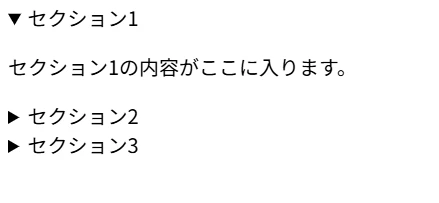
HTML の仕組み
<details>
  <summary>セクション1</summary>
  <p>セクション1の内容がここに入ります。</p>
</details>

<details>
  <summary>セクション2</summary>
  <p>セクション2の内容がここに入ります。</p>
</details>

<details>
  <summary>セクション3</summary>
  <p>セクション3の内容がここに入ります。</p>
</details>
<details> 要素はブラウザに「開閉できるコンポーネント」として実装されているため、
JavaScript を書かなくても自動で開閉が動作します。
これだけでも十分便利ですが、ここからさらに見た目を整えていきます。
CSS の実装
デフォルトのスタイルは素朴で見ずらいので、CSS で装飾します。
details {
  border: 1px solid #ddd;
  margin-bottom: 10px;
  border-radius: 4px;
  overflow: hidden;
}

summary {
  padding: 15px 20px;
  background-color: #f5f5f5;
  cursor: pointer;
  user-select: none;
  font-weight: bold;
  display: flex;
  align-items: center;
  transition: background-color 0.3s ease;
}

summary:hover {
  background-color: #e8e8e8;
}

details[open] summary {
  background-color: #3498db;
  color: white;
}

details > p {
  padding: 15px 20px;
  margin: 0;
  background-color: #fafafa;
  border-top: 1px solid #ddd;
}

アコーディオンメニューの様々な応用
1.動く三角アイコン(▶)
カスタムアイコンを追加します。
右向きの ▶ がクリック時に transform: rotate(90deg); で回転し、下向き ▼ に
変わるアニメーションを付けられます。
summary {
  list-style: none;
}

summary::before {
  content: '▶ ';
  transition: transform 0.3s ease;
  display: inline-block;
  margin-right: 10px;
}

details[open] summary::before {
  transform: rotate(90deg);
}
※ CSS の実装 に追加して使用してください。

2.色を付けて目立たせる(グラデーション)
グラデーションを使うと、より華やかで目立つメニューになります。
background: linear-gradient() を調整して好きな色に変更できます。
details {
  border-left: 4px solid #3498db;
  border-radius: 4px;
  box-shadow: 0 2px 4px rgba(0, 0, 0, 0.1);
}

summary {
  padding: 15px 20px;
  background: linear-gradient(135deg, #667eea 0%, #764ba2 100%);
  color: white;
  cursor: pointer;
  user-select: none;
  font-weight: bold;
  align-items: center;
}

summary:hover {
  opacity: 0.9;
}

details > div {
  padding: 20px;
  background-color: white;
  animation: slideDown 0.3s ease;
}

@keyframes slideDown {
  from {
    opacity: 0;
    transform: translateY(-10px);
  }
  to {
    opacity: 1;
    transform: translateY(0);
  }
}
※CSSの実装でコピーしたCSSに追加してください

3.滑らかに開閉させる(アニメーション)
<details> は開閉アニメーションを CSS だけで制御しにくいため、
チェックボックスを使い max-height を操作して滑らかなアニメーションが実現できます。
※この方法は <details> とは別の実装方法です。
<div class="accordion">
    <input type="checkbox" id="accordion1" class="accordion-check">
    <label for="accordion1" class="accordion-label">ここをクリック!</label>
    <div class="accordion-content">
        <div class="accordion-body">
            <p>
                ここにアコーディオンの内容が入ります。<br>
                JavaScriptなしでスムーズに動作します。
            </p>
        </div>
    </div>
</div>

<style>
  /* チェックボックスを隠す */
.accordion-check {
    display: none;
}

.accordion {
    border: 1px solid #ddd;
    margin-bottom: 10px;
    border-radius: 4px;
    overflow: hidden;
}

/* ラベル(クリック対象) */
.accordion-label {
    display: flex;
    align-items: center;
    padding: 15px 20px;
    background-color: #f5f5f5;
    cursor: pointer;
    user-select: none;
    font-weight: bold;
    transition: background-color 0.3s ease;
    position: relative;
}

.accordion-label:hover {
    background-color: #e8e8e8;
}

/* チェック時のラベル */
.accordion-check:checked + .accordion-label {
    background-color: #3498db;
    color: white;
}

/* コンテンツ */
.accordion-content {
    max-height: 0;
    overflow: hidden;
    transition: max-height 0.4s ease;
}

/* 開く */
.accordion-check:checked + .accordion-label + .accordion-content {
    max-height: 200px;
}

.accordion-body {
    padding: 15px 20px;
    background-color: #fafafa;
    border-top: 1px solid #ddd;
}

.accordion-body p {
    margin: 0;
    line-height: 1.6;
}
</style>
※このままHTMLにコピーしてください
複数同時オープン対応
<details> はデフォルトで複数同時に開きます。
「1つだけ開く」仕様にしたい場合は CSS だけでは難しく、JavaScript が必要です。
FAQ ページなど、複数オープンが許容される場合は
CSS だけで十分実用的に実装できます。
ブラウザ互換性
<details> と <summary> タグは、ほとんどの最新ブラウザで対応しています。
IE 11 では非対応ですが、モダンブラウザのみの対応で良い場合は問題ありません。
まとめ
CSS だけで実装したアコーディオンメニューは、保守性が高くパフォーマンスも良好です。
シンプルなアコーディオンであれば、JavaScript ライブラリを使う必要はありません。
おまけ
今回応用で紹介したものを混ぜ合わせてみました。
<!-- アコーディオン 1 -->
<div class="accordion">
  <input type="checkbox" id="accordion1" class="accordion-check">
  <label for="accordion1" class="accordion-label">見出し 1</label>
  <div class="accordion-content">
    <div class="accordion-body">
      <p>
        ここにアコーディオンの内容が入ります。<br>
        JavaScriptなしでスムーズに動作します。
      </p>
    </div>
  </div>
</div>

<!-- アコーディオン 2 -->
<div class="accordion">
  <input type="checkbox" id="accordion2" class="accordion-check">
  <label for="accordion2" class="accordion-label">見出し 2</label>
  <div class="accordion-content">
    <div class="accordion-body">
      <p>
        こちらも同じくスムーズに開閉します。<br>
        複数同時に開くこともできます。
      </p>
    </div>
  </div>
</div>

<!-- アコーディオン 3 -->
<div class="accordion">
  <input type="checkbox" id="accordion3" class="accordion-check">
  <label for="accordion3" class="accordion-label">見出し 3</label>
  <div class="accordion-content">
    <div class="accordion-body">
      <p>
        開く時も閉じる時も、<br>
        安定したアニメーションで動作します。
      </p>
    </div>
  </div>
</div>

<style>
/* チェックボックスを隠す */
.accordion-check {
    display: none;
}

.accordion {
    border: 1px solid #ddd;
    margin-bottom: 10px;
    border-radius: 4px;
    overflow: hidden;
}

/* ラベル(クリック対象) */
.accordion-label {
    display: flex;
    align-items: center;
    padding: 15px 20px;
    background: linear-gradient(135deg, #667eea 0%, #7fffd4 100%);
    color: white;
    user-select: none;
    font-weight: bold;
    transition: background-color 0.3s ease;
    position: relative;
    padding-left: 40px;
}

.accordion-label:hover {
    background-color: #e8e8e8;
}

/* チェックボックスがチェック状態の時のラベル */
.accordion-check:checked + .accordion-label {
    background-color: #3498db;
    color: white;
}

/* 矢印アイコン */
.accordion-label::before {
    content: '▶';
    position: absolute;
    left: 15px;
    font-size: 12px;
    transition: transform 0.4s ease;
}

.accordion-check:checked + .accordion-label::before {
    transform: rotate(90deg);
}

/* アコーディオンのコンテンツ */
.accordion-content {
    max-height: 0;
    overflow: hidden;
    transition: max-height 0.4s ease;
}

/* チェックボックスがチェック状態の時、コンテンツを開く */
.accordion-check:checked + .accordion-label + .accordion-content {
    max-height: 200px;
}

/* 実際の内容 */
.accordion-body {
    padding: 15px 20px;
    background-color: #fafafa;
    border-top: 1px solid #ddd;
}

.accordion-body p {
    margin: 0;
    line-height: 1.6;
}
</style>