インポート
import numpy as np
import pandas as pd
import pystan
import matplotlib.pyplot as plt
from matplotlib.figure import figaspect
%matplotlib inline
データ読み込み
outlier = pd.read_csv('./data/data-outlier.txt')
7.9 外れ値
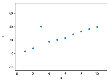
ax = outlier.plot.scatter('X', 'Y')
fig = plt.gcf()
plt.setp(fig, size_inches=figaspect(3/4))
plt.setp(ax, xlim=(-0.2, 11.2), ylim=(-25, 75))
plt.show()
X_new = np.linspace(0, 11, 100)
data = dict(
    N=outlier.index.size,
    X=outlier['X'],
    Y=outlier['Y'],
    N_new=X_new.size,
    X_new=X_new
)

fit1 = pystan.stan('./stan/model7-8.stan', data=data, seed=1234)

ms1 = fit1.extract()
d_est1 = np.percentile(ms1['y_new'], (2.5, 25, 50, 75, 97.5), axis=0)

fit2 = pystan.stan('./stan/model7-9.stan', data=data, seed=1234)

ms2 = fit2.extract()
d_est2 = np.percentile(ms2['y_new'], (2.5, 25, 50, 75, 97.5), axis=0)
_, axes = plt.subplots(1, 2, figsize=figaspect(3/8), sharex=True, sharey=True)
for ax, d_est in zip(axes, [d_est1, d_est2]):
    outlier.plot.scatter('X', 'Y', color='w', edgecolor='k', ax=ax)
    ax.fill_between(X_new, d_est[0], d_est[-1], color='k', alpha=0.2)
    ax.fill_between(X_new, d_est[1], d_est[-2], color='k', alpha=0.4)
    ax.plot(X_new, d_est[2], color='k')
plt.setp(ax, xlim=(-0.2, 11.2), ylim=(-25, 75))
plt.show()
