インポート
import numpy as np
import pandas as pd
import pystan
import matplotlib.pyplot as plt
from matplotlib.figure import figaspect
%matplotlib inline
データ読み込み
aircon = pd.read_csv('./data/data-aircon.txt')
conc = pd.read_csv('./data/data-conc.txt')
7.3 非線形の関係
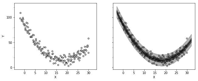
N_new = 60
X_new = np.linspace(-3, 32, N_new)
data = dict(
    N=aircon.index.size,
    X=aircon['X'],
    Y=aircon['Y'],
    N_new=N_new,
    X_new=X_new
)
fit = pystan.stan('./stan/model7-3.stan', data=data, seed=1234)
ms = fit.extract()

d_est = np.percentile(ms['y_new'], (2.5, 25, 50, 75, 97.5), axis=0)
_, (ax1, ax2) = plt.subplots(1, 2, figsize=figaspect(3/8), sharex=True, sharey=True)
for ax in [ax1, ax2]:
    aircon.plot.scatter('X', 'Y', color='w', edgecolor='k', ax=ax)
ax2.fill_between(X_new, d_est[0], d_est[-1], color='k', alpha=0.3)
ax2.fill_between(X_new, d_est[1], d_est[-2], color='k', alpha=0.5)
ax2.plot(X_new, d_est[2], color='k')
plt.setp(ax2, yticks=np.arange(0, 101, 50))
plt.show()
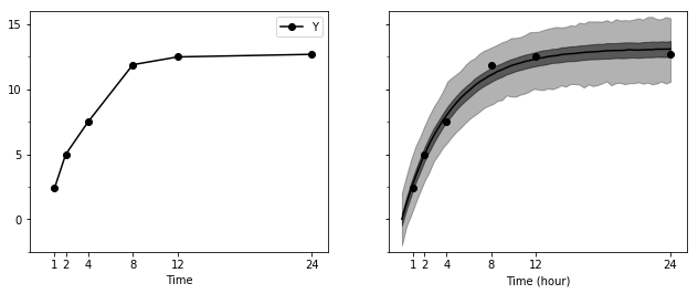
T_new = 60
Time_new = np.linspace(0, 24, T_new)
data = dict(
    T=conc.index.size,
    Time=conc['Time'],
    Y=conc['Y'],
    T_new=T_new,
    Time_new=Time_new
)
fit = pystan.stan('./stan/model7-4.stan', data=data, seed=123)
ms = fit.extract()

d_est = np.percentile(ms['y_new'], (2.5, 25, 50, 75, 97.5), axis=0)
_, (ax1, ax2) = plt.subplots(1, 2, figsize=figaspect(3/8), sharex=True, sharey=True)
conc.plot.line('Time', 'Y', marker='o', color='k', ax=ax1)
ax2.scatter('Time', 'Y', data=conc, color='k')
ax2.fill_between(Time_new, d_est[0], d_est[-1], color='k', alpha=0.3)
ax2.fill_between(Time_new, d_est[1], d_est[-2], color='k', alpha=0.5)
ax2.plot(Time_new, d_est[2], color='k')
plt.setp(ax2, xlabel='Time (hour)', ylabel='Y', xticks=conc['Time'], yticks=np.arange(0, 16, 5), ylim=(-2.5, 16))
plt.show()
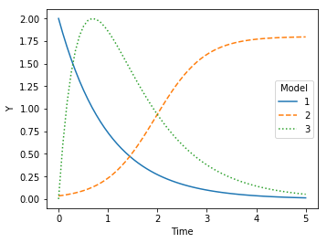
x = np.linspace(0, 5, 60)
plt.figure(figsize=figaspect(3/4))
ax = plt.axes()
ax.plot(x, 2*np.exp(-1*x), linestyle='solid', label=1)
ax.plot(x, 1.8/(1+50*np.exp(-2*x)), linestyle='dashed', label=2)
ax.plot(x, 8*(np.exp(-x) - np.exp(-2*x)), linestyle='dotted', label=3)
ax.legend(title='Model')
plt.setp(ax, xlabel='Time', ylabel='Y')
plt.show()