前回までは、過去の最高気温から、次の日の温度クラスを推定する分類問題を
扱ってきました。今回は趣向を変えて、CNNを使って最高気温を直接推定する
回帰問題を扱いたいと思います。

問題設定
問題設定を再定義します。以下の図のような問題を考えます。
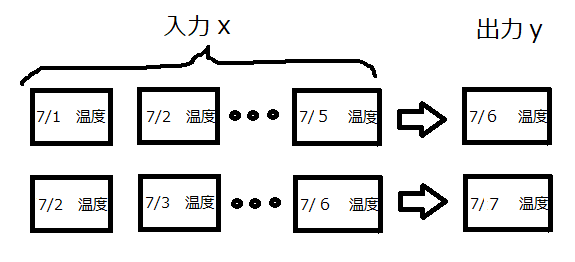
過去5日分の気温推移から次の日の最高気温を予測するものです。
今回の出力は回帰ですので、「7/6は30℃」みたいな形で出てきます。
ただし、気温は天気の影響を大きく受けるため、yを正確に予測するには
その日の天気を正確に予測しないといけません。
しかし、過去5日分の気温推移から、次の日の天気を予測することはほぼ不可能です。
そこで、出力yは「予測値は30℃だけど、天気によって±5℃くらい変動するよ」と
いう設定に置き換えます。
そして、30±5℃から外れたものを異常、つまり特異な温度推移をしている
と見なして**異常検知させます。**下の図を例にします。

青い線は実測値で、赤い実線は予測値です。点線が変動範囲を示しています。
図中の赤い矢印は変動範囲内なので正常ですが、青い矢印は範囲外なので
異常と見なします。今回こそ、2018年の高温が異常と出れば良いのですが。。。
今回の問題は、次の日の最高気温をT、予測値をt、変動幅をeとすると
以下の式になります。
T=t±e
そして、Tから外れたものを異常と見なします。
このような問題を解く場合、ベイズ線形回帰問題↓として扱えば、きれいにかつ
早くできるのでしょうが、今回はCNNを使います。
https://qiita.com/naoya_t/items/80ea108cebc694f5cd63
CNNモデルの構築
今回の問題を解くのにあたり、以下の図の方式でCNNを学習させます。

・まずは、過去5日分の気温推移でCNN1を学習させ、気温を直接推定させます。(図中の黄色)
・そして、CNN1の予測値と実測値の差をとります。(図中の緑)
・最後に、過去5日分の気温推移でCNN2を学習させ、偏差eを推定させます。(図中のオレンジ)
ただし、正常と見なす基準は図中のeを使って以下のように設定します。
T=t±1.5e
ちょっと基準を広くしました。
kerasで実装
まずは、データを取得して、時系列に並び替えます。
import matplotlib.pyplot as plt
import matplotlib.cm as cm
import numpy as np

# 30年分の 温度データロード,整列
X = np.loadtxt("temperature.csv",delimiter=",")
data = X[:20]
for i in range(1,30):
    x = X[i*20:i*20+20]
    data = np.vstack((data,x))

# テストデータと学習データの分割
x_train0 = data[:20]
x_test0 = data[20:]

from sklearn.cross_validation import train_test_split
# 新バージョンはfrom sklearn.cross_model_selection

# 時系列データの作成
def make_data(x_train_rnn,Lookback=5):
    data, target = [], []

    for i in range(x_train_rnn.shape[0]):
        for j in range(x_train_rnn.shape[1]-Lookback):
            data.append(x_train_rnn[i,j:j+Lookback])
            target.append(x_train_rnn[i,j+Lookback])

    re_data = np.array(data).reshape(len(data), Lookback, 1)
    re_target = target

    return re_data, re_target

x_train, y_train = make_data(x_train0)
X_test, Y_test = make_data(x_test0)

# trainとvalidationを分割
X_train, X_val, Y_train, Y_val = train_test_split(x_train, y_train, test_size=0.2)

# 入力が0~1になるように修正
x_max = np.max(X_train)
x_min = np.min(X_train)

X_train = (X_train-x_min)/(x_max-x_min)
Y_train = (Y_train-x_min)/(x_max-x_min)
X_val = (X_val-x_min)/(x_max-x_min)
Y_val = (Y_val-x_min)/(x_max-x_min)
X_test = (X_test-x_min)/(x_max-x_min)
Y_test = (Y_test-x_min)/(x_max-x_min)

# データを4次元化
lookback = 5
X_train = X_train.reshape((len(X_train),lookback,1,1))
X_val = X_val.reshape((len(X_val),lookback,1,1))
X_test = X_test.reshape((len(X_test),lookback,1,1))
次に、CNN1を構築します。
from keras.models import Model
from keras.layers import Dense, Dropout, Activation, Flatten, Add, Input
from keras.layers.advanced_activations import LeakyReLU
from keras.layers.convolutional import Conv2D, MaxPooling2D
from keras.layers.normalization import BatchNormalization

# resnet
def resblock(x, filters, kernel_size):
    x_ = Conv2D(filters, kernel_size, padding='same')(x)
    x_ = BatchNormalization()(x_)
    x_ = Activation(LeakyReLU())(x_)
    x_ = Conv2D(filters, kernel_size, padding='same')(x_)
    x = Add()([x_, x])
    x = BatchNormalization()(x)
    x = Activation(LeakyReLU())(x)
    return x

# CNN1(気温の予測値)の学習
input_ = Input(shape=(lookback, 1,1))#横の数、縦の数、RGB

c = Conv2D(64, (2, 1),padding='same')(input_)
x = BatchNormalization()(c)
c = Activation(LeakyReLU())(c)
c = Dropout(0.2)(c)
c = resblock(c,filters=64, kernel_size=(2, 1))
c = MaxPooling2D(pool_size=(2, 1))(c)

c = Flatten()(c)
c = Dense(30)(c)
c = Activation(LeakyReLU())(c)
c = Dropout(0.2)(c)
c = Dense(1, activation='sigmoid')(c)

model = Model(input_, c)

model.compile(loss='mse', optimizer='adam', metrics=['mse'])

hist = model.fit(X_train, Y_train, batch_size = 10, epochs=50, verbose=1, shuffle=True,
                 validation_data = (X_val,Y_val))

# 学習結果描画
plt.figure()
plt.plot(hist.history['val_loss'],label="val_loss")
plt.plot(hist.history['loss'],label="train_loss")
plt.legend()
plt.show()
損失関数の推移↓

次に、CNN2を構築します。
# 偏差の計算
predict = model.predict(X_train,batch_size=1)
predict = predict.reshape(len(predict))
Y_train_e = np.absolute(Y_train - predict)

predict_val = model.predict(X_val,batch_size=1)
predict_val = predict_val.reshape(len(predict_val))
Y_val_e = np.absolute(Y_val - predict_val)

# 入力が0~1になるように修正
e_max = np.max(Y_train_e)
e_min = np.min(Y_train_e)

Y_train_e = (Y_train_e-e_min)/(e_max - e_min)
Y_val_e = (Y_val_e-e_min)/(e_max - e_min)

# CNN2(編差)の学習
input_ = Input(shape=(lookback, 1,1))#横の数、縦の数、RGB

c = Conv2D(64, (2, 1),padding='same')(input_)
c = BatchNormalization()(c)
c = Activation(LeakyReLU())(c)
c = Dropout(0.2)(c)
c = resblock(c,filters=64, kernel_size=(2, 1))
c = MaxPooling2D(pool_size=(2, 1))(c)

c = Flatten()(c)
c = Dense(30)(c)
c = Activation(LeakyReLU())(c)
c = Dropout(0.2)(c)
c = Dense(1, activation='sigmoid')(c)

model_e = Model(input_, c)

model_e.compile(loss='mse', optimizer='adam', metrics=['mse'])

hist = model_e.fit(X_train, Y_train_e, batch_size = 10, epochs=50, verbose=1, shuffle=True,
                 validation_data = (X_val,Y_val_e))

# 学習結果描画
plt.figure()
plt.plot(hist.history['val_loss'],label="val_loss")
plt.plot(hist.history['loss'],label="train_loss")
plt.legend()
plt.show()
損失関数の推移↓

結果と考察
各年の実測値と予測値を描画します。
特徴的なグラフを見ていきます。
# 予測範囲描画
t_predict = model.predict(X_test,batch_size=1)
t_predict = (x_max-x_min)*t_predict + x_min
t_predict = t_predict.reshape((x_test0.shape[0],x_test0.shape[1]-5,))

t_predict_e = model_e.predict(X_test,batch_size=1)
t_predict_e = 1.5*((x_max-x_min)*((e_max-e_min)*t_predict_e+e_min))
t_predict_e = t_predict_e.reshape((x_test0.shape[0],x_test0.shape[1]-5,))

for i in range(len(x_test0)):
    plt.figure()
    year = 2009+i
    plt.plot(range(1,21),x_test0[i], label="true")
    plt.plot(range(6,21),t_predict[i],c="r",label="predict")
    plt.plot(range(6,21),t_predict[i] + t_predict_e[i], c="r",linestyle="dashed")
    plt.plot(range(6,21),t_predict[i] - t_predict_e[i], c="r", linestyle="dashed")
    plt.title(year)
    plt.ylim(20,40)
    plt.xlim(1,20)
    plt.xlabel("date")
    plt.ylabel("temperature")
    plt.legend(loc="lower right")
    plt.show()

図の縦軸は温度(℃)、横軸は日付(左端は7/1、右端は7/20)です。
2017年は、予測値がほとんど一致しており、例年通りの推移だったと
予想されます。

2010年は、7/13の低温は異常と認識しています。さらに、7/17の右肩
上がりの気温上昇も異常と認識しています。

2016年は、7/9の気温急降下は異常でしたが、7/11は予測値と実測値が
ピタリと一致し、かつ変動幅が小さなっています。CNNは余程自信が
あったのでしょう。

2015年は、7/6~9の低温期が異常と認識できるのかが焦点でした。
そして、その期間はほとんど異常と認識しています。

2018年は、7/15以降の高温期が異常と認識できるのかが焦点でしたが
異常と認識できたのは、7/15と7/20の二日だけでした。
惜しい!といったところでしょうか。
一応、全テストデータの異常点を赤いプロットで示してみます。
# 異常推移を赤いプロットで描画
plot_anomaly_x = []
plot_anomaly_y = []

for i in range(x_test0.shape[0]):
    for j in range(x_test0.shape[1]):
        if j > 4:#6日以降の予測値で判定
            if t_predict[i,j-5] + t_predict_e[i,j-5] < x_test0[i,j] or t_predict[i,j-5] - t_predict_e[i,j-5] > x_test0[i,j]:
                plot_anomaly_x.append(j)
                plot_anomaly_y.append(x_test0[i,j])

plt.figure()
for i in range(len(x_test0)):
    year = 2009+i
    plt.plot(range(1,21),x_test0[i], color=cm.jet(float(i) / len(x_test0)),label=year)
# plt.legend(loc="lower right")
plt.scatter(np.array(plot_anomaly_x)+1,np.array(plot_anomaly_y),c="r")
plt.title("Test data")
plt.ylim(20,40)
plt.xlim(5,20)
plt.xlabel("date")
plt.ylabel("temperature")
plt.show()

前回より、異常と認識している点が増えてしまいましたが、納得いく
異常点が増えたかなぁと思います。
まとめ
これまで3回にわたり、ディープラーニングを使って7月の気温を
分析してきました。以下に、感想をまとめました。
・時系列データに対しては、LSTMよりCNNの方が若干優れているような
気がします。
・異常検知させるに当たり、分類と回帰のどちらを用いるべきかという
問いに関しては、回帰が良い気がします。
回帰をお勧めする1つ目の理由は、設定の簡単さです。分類だとクラス分け
作業が発生するため、クラス分けの基準を決めないといけません。その作業が
面倒です。さらに、基準を都合の良いように動かすことも可能なので、
解析結果を本当に信じて良いか分からなくなってしまいます。
その点、回帰は予測値がドン!と出てくるので、簡単かつ都合よく
動かすことはできません。
回帰をお勧めする2つ目の理由は、直感的に分かりやすいという点です。
分類は確率しか出てこないので、その数値を信じるしかありませんが、
回帰は予想値がそのまま出てくるので扱いやすいです。さらに、
回帰+偏差を用いるとCNNの予測した幅が可視化できて分かりやすいです。
時系列データに対し、「確率が・・・」と説明しても客先や上司には、なかなか
伝わりにくいです。しかし、「回帰で予測した幅がこれで、実測値がその中に
入っているでしょ」というと圧倒的に分かりやすいです。このアドバイスは
cranpunさんから頂きました。ありがとうございます。
以上、長々と書いてしまいましたが、論文調査をしっかり行っていない
ので、話し半分に聞いて下さい。