はじめに
- PandasとMatplotLibを使用して簡単なデータの可視化を行います。
- 今回は国勢調査が提供するデータから男女別人口-全国,都道府県(大正9年~平成27年)を利用します。
データを読み込む
まずは、データを読み込んで、内部の構造を見てみましょう。
import numpy as np
import pandas as pd
import codecs as cd
import matplotlib.pyplot as plt
import seaborn as sns #後で使いますので、更新予定です。

with cd.open('../data/data001.csv', "r", "Shift-JIS", "ignore") as csv_file:
    data = pd.read_csv(csv_file)

data.info() #データの構造を見る
data.head(10) #20行頭からデータを表示する
実行結果を見ると、popluationの数字がobjectとなっており、
文字列であることがわかります。
## data.info() の実行結果
RangeIndex: 982 entries, 0 to 981
Data columns (total 8 columns):
code                982 non-null object
name                980 non-null object
jp_year_category    980 non-null object
jp_year             980 non-null float64
year                980 non-null float64
popluation          980 non-null object
pop_men             980 non-null object
pop_women           980 non-null object
dtypes: float64(2), object(6)
memory usage: 61.5+ KB
また、head()関数を利用した結果から、'name'列を見ると、都道府県名ごとのデータと全国のデータも入っていることもわかりますね。 後で使用する都道府県のコードもわかります。
## data.head(10)の結果
code	name	jp_year_category	jp_year	year	popluation	pop_men	pop_women
0	0	全国	大正	9.0	1920.0	55963053	28044185	27918868
1	1	北海道	大正	9.0	1920.0	2359183	1244322	1114861
2	2	青森県	大正	9.0	1920.0	756454	381293	375161
3	3	岩手県	大正	9.0	1920.0	845540	421069	424471
4	4	宮城県	大正	9.0	1920.0	961768	485309	476459
5	5	秋田県	大正	9.0	1920.0	898537	453682	444855
6	6	山形県	大正	9.0	1920.0	968925	478328	490597
7	7	福島県	大正	9.0	1920.0	1362750	673525	689225
8	8	茨城県	大正	9.0	1920.0	1350400	662128	688272
9	9	栃木県	大正	9.0	1920.0	1046479	514255	532224
10	10	群馬県	大正	9.0	1920.0	1052610	514106	538504
11	11	埼玉県	大正	9.0	1920.0	1319533	641161	678372
12	12	千葉県	大正	9.0	1920.0	1336155	656968	679187
13	13	東京都	大正	9.0	1920.0	3699428	1952989	1746439
14	14	神奈川県	大正	9.0	1920.0	1323390	689751	633639
15	15	新潟県	大正	9.0	1920.0	1776474	871532	904942
16	16	富山県	大正	9.0	1920.0	724276	354775	369501
17	17	石川県	大正	9.0	1920.0	747360	364375	382985
18	18	福井県	大正	9.0	1920.0	599155	293181	305974
19	19	山梨県	大正	9.0	1920.0	583453	290817	292636
データの前処理と整形を行う
- 今回は都市部と地方代表で、東京都と青森と北海道のデータを利用しましょう。
- 文字列になっているデータを数字に変換します。人口データが文字列となっているので、int型に変更しましょう。
# 青森のデータを作成
data_aomori= data[(data['code']=='2')].copy()
data_aomori.loc[:, 'popluation'] = data_aomori['popluation'].astype(int) #人口データを文字列からint型へ変更

# 北海道のデータを作成
data_hokkaido= data[(data['code']=='1')].copy()
data_hokkaido.loc[:, 'popluation'] = data_hokkaido['popluation'].astype(int) #人口データを文字列からint型へ変更

# 東京のデータを作成
data_tokyo= data[(data['code']=='13')].copy()
data_tokyo.loc[:, 'popluation'] = data_tokyo['popluation'].astype(int) #人口データを文字列からint型へ変更
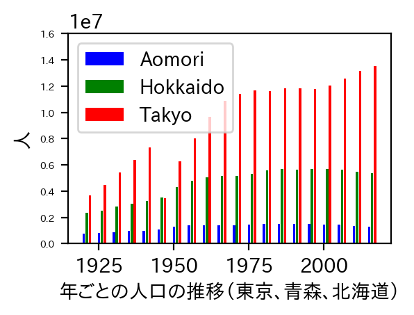
データをグラフ化する
いよいよデータをグラフ化してみましょう。
- 今回は東京都と青森と北海道の人口の推移を棒グラフで横並びで表示します。
- X軸、Y軸にラベルを設定します。
- メモリの年は見やすいように縦書きに回転させます。
plt.bar(data_aomori['year'], data_aomori['popluation'], color='blue', label='Aomori', align="center")
plt.bar(data_hokkaido['year'] +1.0, data_hokkaido['popluation'], color='green', label='Hokkaido', align="center")
plt.bar(data_tokyo['year'] +2.0, data_tokyo['popluation'], color='red', label='Tokyo', align="center")
plt.xlabel('年ごとの人口の推移(東京、青森、北海道)') #x軸のラベルを設定する
plt.xticks(rotation=90) #x軸のメモリを回転させる
plt.ylabel('人') #y軸のラベルを設定する
plt.show()
このような形で、グラフ化することができました。
今回は本当に簡単ものをやってみたので、次回もう少しきれいなグラフを書くやり方をまとめる予定です。