
clip-path
要素の表示領域を任意の図形に切り抜くことができる機能です。
写真や画像を四角形だけでなく、円形や多角形、あるいはもっと複雑な形に切り抜いて表示したい場合に非常に便利です。
#main {
    background-color: #ffed58;
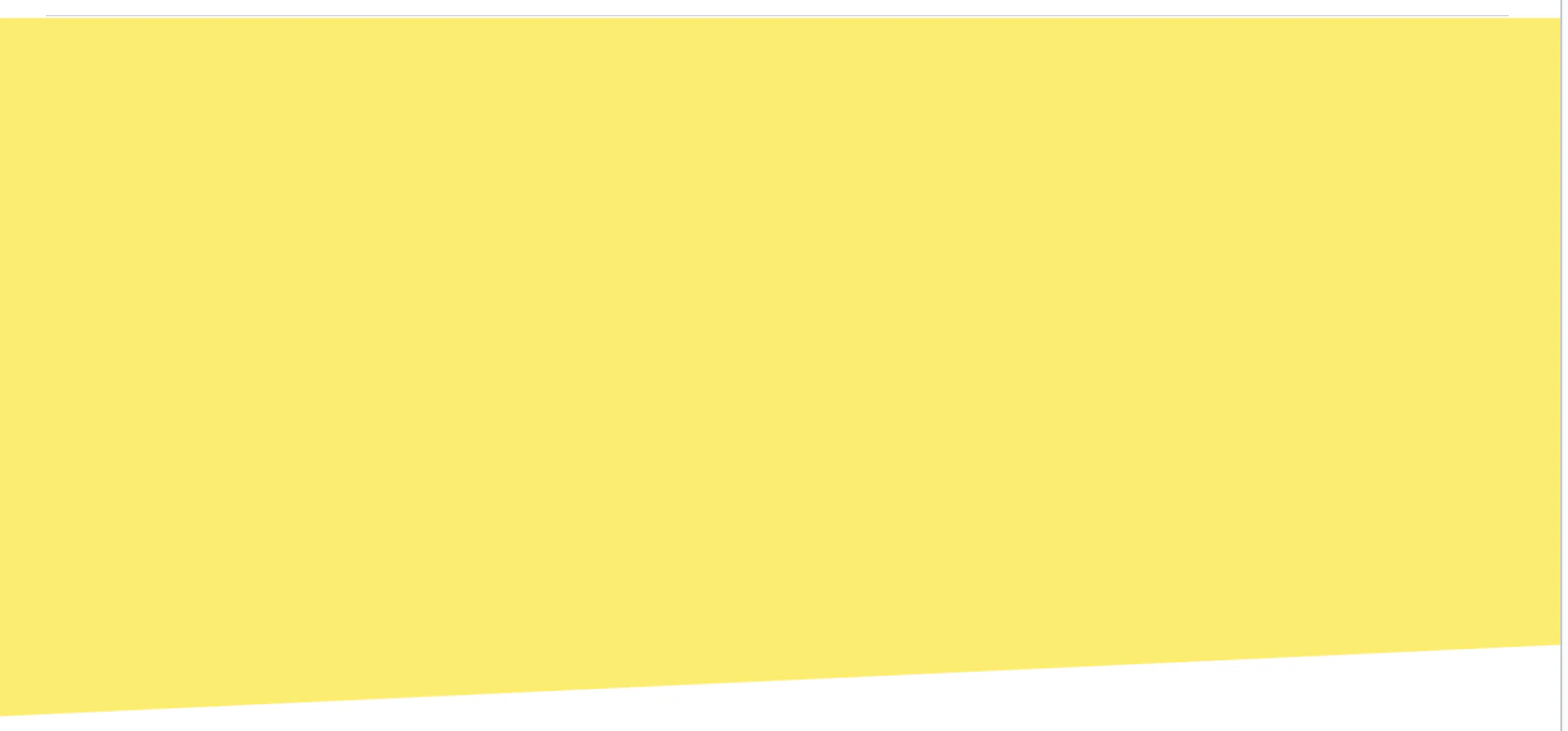
    clip-path: polygon(0 0, 100% 0, 100% 80%, 0 100%);
}
この例では、#main要素の背景(background-color: #ffed58;)が、指定された多角形の形で切り抜かれて表示されます。
-
(0 0): 左上 -
(100% 0): 右上 -
(100% 80%): 右下(高さの80%の位置) -
(0 100%): 左下
この4点を結ぶことで、右下部分が斜めに切り上がったような下記の台形の形状が作成されます。
マーカー

下記で、「文字の下半分にだけ黄色マーカーが引かれたような背景」になります。
<p>
    HOGEHOGE
    <span class="highlight">マーカー</span>
    FUGAFUGA
</p>
background: linear-gradient(transparent 50%, #fff390 50%);
font-weight: 700;
hoverしたとき下線を表示させる
#g-nav a::after {
    position: absolute;
    bottom: max(calc(-10vw / 3.9), -10px);
    left: 50%;
    transform: translateX(-50%);
    content: "";
    width: 30%;
    height: min(calc(2vw / 3.9), 2px);
    background: var(--yellow);
    opacity: 0;
    visibility: hidden;
    transition: 0.2s ease-in-out;
}

#g-nav a:hover::after {
    bottom: max(calc(-6vw / 3.9), -6px);
    opacity: 1;
    visibility: visible;
}
要素に下線を設定する
border-bottom: 2px dotted var(--yellow);
width: fit-content;
-
border-bottom: 下線設定 -
width: fit-content;: ブロック要素だと、親要素いっぱいに下線が広がってしまうが、指定することで、要素の幅を、そのコンテンツが占める幅に合わせるようにブラウザに指示できる