はじめに
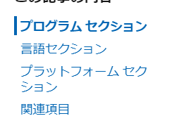
Microsoft Docs 右側のサイドメニュー?みたいなのをWPFで作らないといけなかったので、自分の実装方法を備忘録として書いておきます。
githubにソースコード置いています。
https://github.com/pisa-kun/SideBarSample
作ったサンプル
先にどんな感じのものを作ったかを公開しておきます。
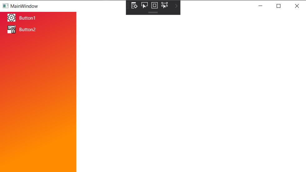
Grid.Column をサイドメニューとメイン部分(選択されたサイドメニューで切り替わるコンテンツ)で二分割しています。
サイドメニューのボタンはとりあえず二つ用意し、メイン部分には今回何も割り当てていません。あくまでサイドメニューのデモということで。

マウスオーバーされるとボタンの背景を少しだけ白で透過(15%程度)させます。
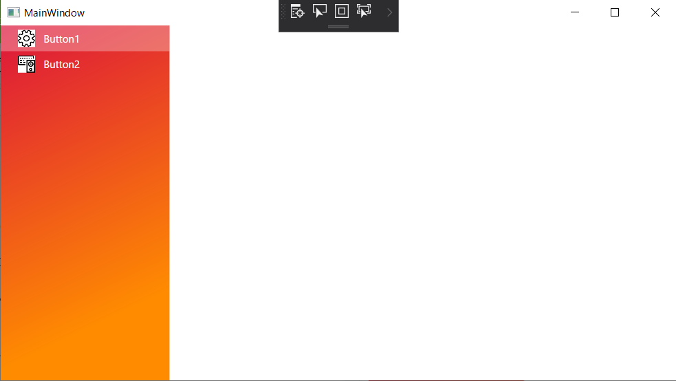
マウスクリックされるとマウスオーバー時よりも白で透過(30%)させています。
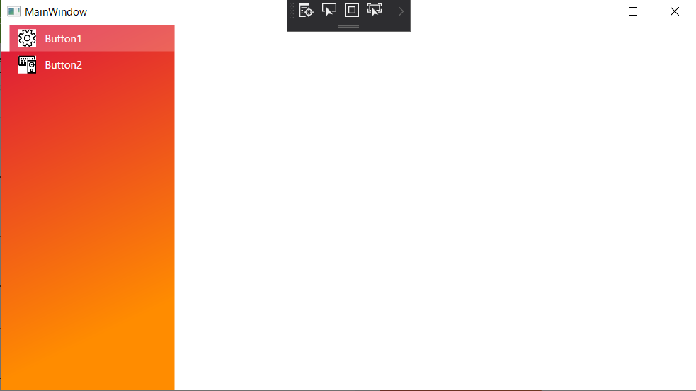
マウスクリックされて選択中になると左側に白の長方形が表示され、ボタンの背景も白で透過させます。
ButtonAを選択中にButtonBをクリックすると、ButtonAの選択中を解除してButtonBを選択中にするところまでできています。
次からソースコードの解説になります。
プロジェクト構成は下記のようにしています。必要そうな箇所のみ説明します。
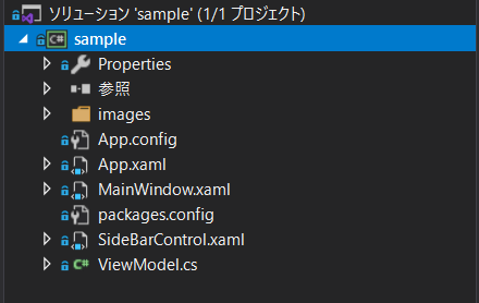
- images フォルダ
- Buttonに表示するアイコンをまとめているフォルダ。
- MainWindow.xaml
- スタートアップで起動されるウインドウ。先ほどまでお見せしていた画面。
- SideBarControl.xaml
- サイドメニューはUserControlとして作成。
- ViewModel.cs
- ButtonのCommandと選択状態のプロパティを記述
SideBarControl.xaml
ToggleButtonのテンプレートを編集して無理やりRectangle, Image, TextBlockをまとめて一つのそれっぽいコントロールを作っています。
<UserControl x:Class="sample.SideBarControl"
             xmlns="http://schemas.microsoft.com/winfx/2006/xaml/presentation"
             xmlns:x="http://schemas.microsoft.com/winfx/2006/xaml"
             xmlns:mc="http://schemas.openxmlformats.org/markup-compatibility/2006"
             xmlns:d="http://schemas.microsoft.com/expression/blend/2008"
             xmlns:local="clr-namespace:sample"
             mc:Ignorable="d"
             Name="SideBar"
             d:DesignHeight="450" d:DesignWidth="800">
    <UserControl.Resources>
        <ResourceDictionary>
            <!--Side Bar Image-->
            <!-- BackGroundのOpacityのみ変更 -->
            <!-- SolidColorBrushのアルファ値でOpacity操作 -->
            <Style x:Key="SideBarNewButtonStyle" TargetType="{x:Type ToggleButton}">
                <Setter Property="Template">
                    <Setter.Value>
                        <ControlTemplate TargetType="{x:Type ToggleButton}">
                            <Grid>
                                <StackPanel Orientation="Horizontal" Background="#00FFFFFF" x:Name="Panel">
                                    <Rectangle x:Name="rectangle" Width="10" Fill="White" Visibility="Hidden" HorizontalAlignment="Left" />
                                    <Image Source="{Binding Path=ImageFileName, ElementName=SideBar}" Width="20" Height="20" Margin="10,0,10,0" HorizontalAlignment="Center" x:Name="StyleImagePath" />
                                    <TextBlock Text="{Binding Path=ButtonText, ElementName=SideBar}" HorizontalAlignment="Right"  VerticalAlignment="Center" Foreground="White" FontSize="12" x:Name="StyleText" />
                                </StackPanel>
                            </Grid>

                            <ControlTemplate.Triggers>
                                <MultiTrigger>
                                    <MultiTrigger.Conditions>
                                        <Condition Property="IsMouseOver" Value="true" />
                                        <Condition Property="IsChecked" Value="True" />
                                    </MultiTrigger.Conditions>
                                    <Setter Property="Background" TargetName="Panel" Value="#26FFFFFF"/>
                                    <Setter Property="Visibility" TargetName="rectangle" Value="Visible"/>
                                </MultiTrigger>

                                <MultiTrigger>
                                    <MultiTrigger.Conditions>
                                        <Condition Property="IsMouseOver" Value="true" />
                                        <Condition Property="IsChecked" Value="false" />
                                    </MultiTrigger.Conditions>
                                    <Setter Property="Background" TargetName="Panel" Value="#26FFFFFF"/>
                                    <Setter Property="Visibility" TargetName="rectangle" Value="Hidden"/>
                                </MultiTrigger>

                                <MultiTrigger>
                                    <MultiTrigger.Conditions>
                                        <Condition Property="IsPressed" Value="true" />
                                    </MultiTrigger.Conditions>
                                    <Setter Property="Background" TargetName="Panel" Value="#4CFFFFFF"/>
                                </MultiTrigger>

                                <MultiTrigger>
                                    <MultiTrigger.Conditions>
                                        <Condition Property="IsChecked" Value="True" />
                                        <Condition Property="IsMouseOver" Value="False" />
                                    </MultiTrigger.Conditions>
                                    <MultiTrigger.Setters>
                                        <Setter Property="Visibility" TargetName="rectangle" Value="Visible"/>
                                        <Setter Property="Background" TargetName="Panel" Value="#39FFFFFF"/>
                                    </MultiTrigger.Setters>
                                </MultiTrigger>

                                <MultiTrigger>
                                    <MultiTrigger.Conditions>
                                        <Condition Property="IsChecked" Value="False" />
                                        <Condition Property="IsMouseOver" Value="False" />
                                    </MultiTrigger.Conditions>
                                    <MultiTrigger.Setters>
                                        <Setter Property="Visibility" TargetName="rectangle" Value="Hidden"/>
                                        <Setter Property="Background" TargetName="Panel" Value="#00FFFFFF"/>
                                    </MultiTrigger.Setters>
                                </MultiTrigger>

                            </ControlTemplate.Triggers>
                        </ControlTemplate>
                    </Setter.Value>
                </Setter>
            </Style>
        </ResourceDictionary>
    </UserControl.Resources>

    <!--UserControlのNameとElementName を紐づけ-->
    <ToggleButton x:Name="Sidebar_button" Background="Transparent" BorderThickness="0" Style="{StaticResource SideBarNewButtonStyle}"
                  IsChecked="{Binding Path=IsSelected, ElementName=SideBar}" Command="{Binding Path=ButtonCommand, ElementName=SideBar}"/>

</UserControl>
// SideBarControl.xaml.cs
using Prism.Commands;
using System.Windows;
using System.Windows.Controls;

namespace sample
{
    /// <summary>
    /// SideBarControl.xaml の相互作用ロジック
    /// </summary>
    public partial class SideBarControl : UserControl
    {
        public static readonly DependencyProperty ImageFileNameProperty =
            DependencyProperty.Register(nameof(ImageFileName), typeof(string), typeof(SideBarControl), new UIPropertyMetadata(string.Empty, new PropertyChangedCallback(OnPropertyChanged)));

        public static readonly DependencyProperty ButtonTextProperty =
            DependencyProperty.Register(nameof(ButtonText), typeof(string), typeof(SideBarControl), new UIPropertyMetadata(string.Empty, new PropertyChangedCallback(OnPropertyChanged)));

        public static readonly DependencyProperty ButtonCommandProperty =
            DependencyProperty.Register(nameof(ButtonCommand), typeof(DelegateCommand), typeof(SideBarControl), new UIPropertyMetadata(null, new PropertyChangedCallback(OnPropertyChanged)));

        public static readonly DependencyProperty IsSelectedProperty =
            DependencyProperty.Register(nameof(IsSelected), typeof(bool), typeof(SideBarControl), new UIPropertyMetadata(false, new PropertyChangedCallback(OnPropertyChanged)));

        public string ImageFileName
        {
            get { return (string)GetValue(ImageFileNameProperty); }
            set { SetValue(ImageFileNameProperty, value); }
        }

        public string ButtonText
        {
            get { return (string)GetValue(ButtonTextProperty); }
            set { SetValue(ButtonTextProperty, value); }
        }

        public bool IsSelected
        {
            get { return (bool)GetValue(IsSelectedProperty); }
            set
            {
                SetValue(IsSelectedProperty, value);
            }
        }

        public DelegateCommand ButtonCommand
        {
            get { return (DelegateCommand)GetValue(ButtonCommandProperty); }
            set { SetValue(ButtonCommandProperty, value); }
        }

        public SideBarControl()
        {
            InitializeComponent();
        }

        private static void OnPropertyChanged(DependencyObject obj, DependencyPropertyChangedEventArgs e)
        {
        }
ImageのSourceプロパティ、TextBlockのTextプロパティ、ToggleButtonのIsCheckedとCommandプロパティはDependencyPropertyを使ってMainWindow.xamlで設定できるようにしておきます。
また、ControlTemplate.Triggersでマウスオーバー、マウスプレス、クリック時などの条件でRectangleのVisibilityやPanelのBackgroundを調整します。
MainWindow.xaml
<Window x:Class="sample.MainWindow"
        xmlns="http://schemas.microsoft.com/winfx/2006/xaml/presentation"
        xmlns:x="http://schemas.microsoft.com/winfx/2006/xaml"
        xmlns:d="http://schemas.microsoft.com/expression/blend/2008"
        xmlns:mc="http://schemas.openxmlformats.org/markup-compatibility/2006"
        xmlns:local="clr-namespace:sample"
        mc:Ignorable="d"
        Title="MainWindow" Height="450" Width="800">
    <Grid>
        <Grid.ColumnDefinitions>
            <ColumnDefinition x:Name="SideBar"  Width="100*"/>
            <ColumnDefinition x:Name="MainArea" Width="300*"/>
        </Grid.ColumnDefinitions>
        <!--サイドメニュー-->
        <Grid Grid.Column="0" FocusVisualStyle="{x:Null}">
            <Grid.Background>
                <LinearGradientBrush>
                    <GradientStop Color="#dc143c" Offset="0"/>
                    <GradientStop Color="#ff8c00" Offset="0.8"/>
                </LinearGradientBrush>
            </Grid.Background>
        </Grid>
        <Grid Grid.Column="0" FocusVisualStyle="{x:Null}">
            <Grid.RowDefinitions>
                <RowDefinition Height="30"/>
                <RowDefinition Height="30"/>
            </Grid.RowDefinitions>
            <!--サイドメニューのボタン-->
            <local:SideBarControl Grid.Row="0" ImageFileName="images\e713.png" ButtonText="Button1" ButtonCommand="{Binding ButtonCommandA}" IsSelected="{Binding IsButtonA, Mode=TwoWay}" />
            <local:SideBarControl Grid.Row="1" ImageFileName="images\e772.png" ButtonText="Button2" ButtonCommand="{Binding ButtonCommandB}" IsSelected="{Binding IsButtonB, Mode=TwoWay}" />
        </Grid>
    </Grid>
</Window>
コードビハインド(MainWindow.xaml.cs)についてはコンストラクタに **this.DataContext = new ViewModel();**を追加しているだけなので割愛します。
説明すべきは下記の部分でしょうか。
<!--サイドメニューのボタン-->
<local:SideBarControl Grid.Row="0" ImageFileName="images\e713.png" ButtonText="Button1"
 ButtonCommand="{Binding ButtonCommandA}" IsSelected="{Binding IsButtonA, Mode=TwoWay}" />

<local:SideBarControl Grid.Row="1" ImageFileName="images\e772.png" ButtonText="Button2"
 ButtonCommand="{Binding ButtonCommandB}" IsSelected="{Binding IsButtonB, Mode=TwoWay}" />
ImageFileNameにpng画像のファイルパスをセット。
ButtonCommandに押されたときのAction、IsSelectedに選択中かどうかのbool値をViewModelからBindingします。
ViewModel.cs
viewModelではbool型のButtonプロパティとDelegateCommandを記述します。
ButtonCommandについてはMessageBoxを表示してButtonのプロパティを変更することを行っています。
アプリとして完成させるならメイン画面のページ遷移などをここに記述しましょう。
public class ViewModel : BindableBase
    {
        private bool isButtonA = false;
        public bool IsButtonA
        {
            get { return this.isButtonA; }
            set { this.SetProperty(ref this.isButtonA, value); }
        }

        private bool isButtonB = false;
        public bool IsButtonB
        {
            get { return this.isButtonB; }
            set { this.SetProperty(ref this.isButtonB, value); }
        }

        public DelegateCommand ButtonCommandA { get; private set; }
        public DelegateCommand ButtonCommandB { get; private set; }

        public ViewModel()
        {
            ButtonCommandA = new DelegateCommand(() => {
                MessageBox.Show($"ButtonA is [{IsButtonA}] state");
                IsButtonA = true;
                IsButtonB = false;
            });

            ButtonCommandB = new DelegateCommand(() => {
                MessageBox.Show($"ButtonB is [{IsButtonB}] state");
                IsButtonA = false;
                IsButtonB = true;
            });
        }
まとめ
UWPだとすでにこういうコントロールあるんでしょうか。