【HTML, CSS】「横に並べた要素」が縦スワイプでズレてしまいます
現在、友人にポートフォリオの作成を依頼されて、
横スクロール型のサイトを作成しています。(縦スクロールは一切ありません)
私自身、HPの作成歴はほぼありません。
ただ読めて少し書ける程度です。
先日、コーディングも完了して「サーバーにアップロードして友人に連絡だ!」というところまで来たのですが、アップロードしたサイトをスマホで確認してみると、横並びにしているはずの要素たちが上下に動いてしまうのを発見しました。
上下に動いて、元の場所に戻るのならまだ良いのですが、
上にズレた場合、元の場所よりもだいぶ上で止まってしまいます。
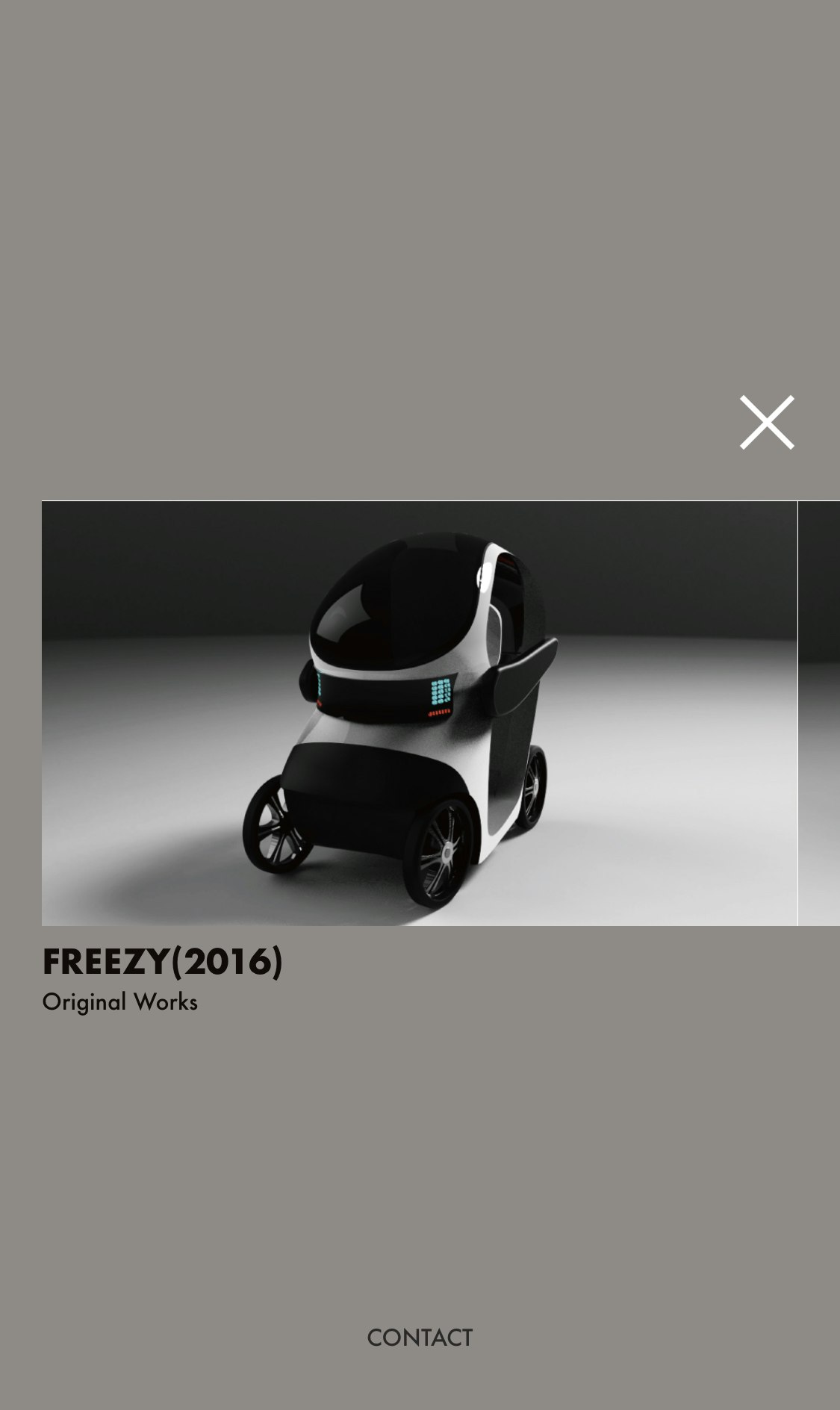
【👇 通常の位置】
【👇 指で画面を上にグイッとスワイプして、画面から指を離した時の位置】
ちょっと分かりづらいかもしれません…

モーダルも実装しているのですが、モーダル部分も上にスワイプするとズレてしまいます。
(こっちの方がパッと見で分かりやすいかもしれません)
👇 モーダル元の場所
👇 画面を上にグッとスワイプして指を離した場合

チェックの段階でパソコン(MacBook Air)でGoogleChromeのデベロッパーツールで
デバイスごとに確認した際は、どのデバイスでもそんな現象は起きていなかったのに、
自分のスマホ(iPhoneX)でアップロードしたものを実際に確認すると上下に動いてしまいます。
ちなみに、スマホ(iPhoneX)で
・GoogleChrome
・safari
の二つのブラウザを確認しましたが、どちらも同じ挙動でした。
パソコン(MacBook Air)で閲覧した場合は上下に動きません。
サンプルのコードです(HTML)
<body>
<!-- コンテンツ部分ここから -->
<div class="wrapper">
<!-- 一つ目 -->
<div class="contents" id="first">
<div id="title-wrapper">
<h1>MASAHIRO KAMEI</h1>
<h2>Archive</h2>
</div>
</div>
<!-- 二つ目 -->
<div class="contents" id="second">
<div class="content-wrapper">
<a href="#"><img src="assets/test-01.jpg" alt="2枚目の画像"></a>
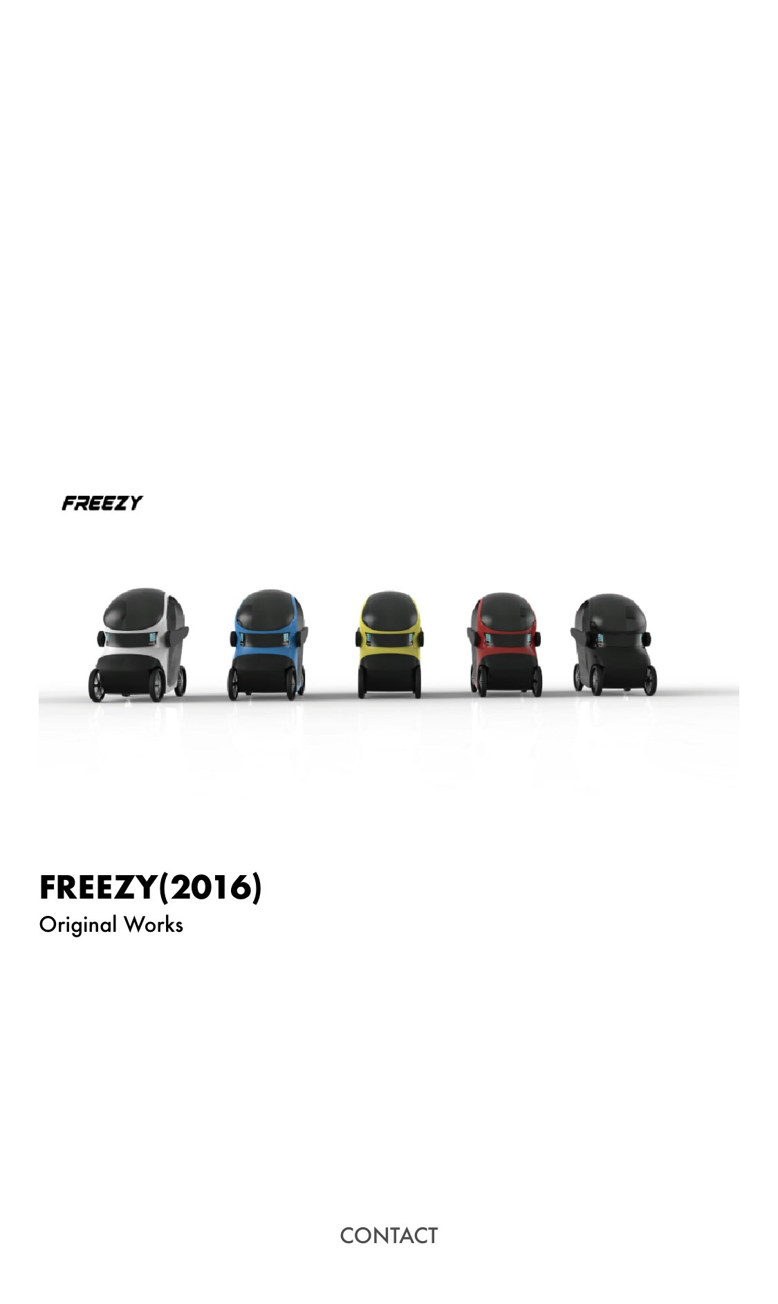
<h3>FREEZY(2016)</h3>
<p>Original Works</p>
</div>
</div>
<!-- 二つ目モーダル -->
<div class="modal-wrapper" id="second-modal">
<div class="modal">
<div class="modal-item close-modal">
<img src="assets/time04.png" class="time">
</div>
<div class="modal-item image first-modal-item">
<img src="assets/test-02.jpg" alt="モーダル1枚目の画像" class="images">
</div>
<div class="modal-item image second-modal-item">
<img src="assets/test-03.jpg" alt="モーダル2枚目の画像">
</div>
<div class="modal-item image last-modal-item">
<img src="assets/test-04.jpg" alt="モーダル3枚目の画像">
</div>
</div>
</div>
<!--- 三つ目 -->
<div class="contents" id="third">
<div class="content-wrapper">
<a href="#"><img src="assets/test-01.jpg" alt="2枚目の画像"></a>
<h3>FREEZY(2016)</h3>
<p>Original Works</p>
</div>
</div>
<!-- 三つ目モーダル -->
<div class="modal-wrapper" id="third-modal">
<div class="modal">
<div class="modal-item close-modal">
<img src="assets/time04.png" class="time">
</div>
<div class="modal-item image first-modal-item">
<img src="assets/test-02.jpg" alt="モーダル1枚目の画像" class="images">
</div>
<div class="modal-item image second-modal-item">
<img src="assets/test-03.jpg" alt="モーダル2枚目の画像">
</div>
<div class="modal-item image last-modal-item">
<img src="assets/test-04.jpg" alt="モーダル3枚目の画像">
</div>
</div>
</div>
<!--- 四つ目 -->
<div class="contents" id="fourth">
<div class="content-wrapper">
<a href="#"><img src="assets/test-01.jpg" alt="2枚目の画像"></a>
<h3>FREEZY(2016)</h3>
<p>Original Works</p>
</div>
</div>
<!-- 4つ目モーダル -->
<div class="modal-wrapper" id="fourth-modal">
<div class="modal">
<div class="modal-item close-modal">
<img src="assets/time04.png" class="time">
</div>
<div class="modal-item image first-modal-item">
<img src="assets/test-02.jpg" alt="モーダル1枚目の画像" class="images">
</div>
<div class="modal-item image second-modal-item">
<img src="assets/test-03.jpg" alt="モーダル2枚目の画像">
</div>
<div class="modal-item image last-modal-item">
<img src="assets/test-04.jpg" alt="モーダル3枚目の画像">
</div>
</div>
</div>
</div>
<!-- コンテンツ部分ここまで -->
サンプルのコードです(CSS)
  @charset "UTF-8";

@font-face{
  font-family: 'Futura-bold';
  src:local('fonts/futura.ttf')format('ttf');
}

@font-face{
  font-family: 'Futura-medium';
  src:local('fonts/futura medium bt.ttf')format('ttf');
}

@font-face{
  font-family: 'Futura-light';
  src:local('fonts/futura light bt.ttf')format('ttf');
}

/*全体設計*/

html,body{
  height: 100vh;
  width: 100vw;
  margin: 0;
  padding: 0;
  overflow: hidden;
  font-family: "futura-bold";
  box-sizing: border-box;
}

/*コンテンツ部分*/

div.wrapper{
  background-color: white;
  display: flex;
  overflow-x: scroll;
  overflow-y: hidden;
  box-sizing: border-box;
  scroll-behavior: smooth;
  scroll-snap-type: x mandatory; /*x軸のスクロールスナップ*/
}

div.wrapper::-webkit-scrollbar {
  display: none /*スクロールバーの非表示*/
}

div.contents{
  height: 100vh;
  width: 100vw;
  display: inline-block;
  text-align: center;
  scroll-snap-align: center; /*画面中央にスナップ*/
  box-sizing: border-box;
}

div#title-wrapper{
  padding-top: 33vh;
}

div#title-wrapper h1{
  background-color: white;
  width: 100vw;
  margin: 0;
  font-size: 93.34px;
  line-height: 93.34px;
}

div#title-wrapper h2{
  background-color: white;
  width: 100vw;
  font-size: 53.34px;
  line-height: 53.34px;
  margin: 0 auto;
  padding-top: 40px;
}

div.content-wrapper{
  width: 100vw;
  text-align: center;
}

div.content-wrapper a img{
  width: auto;
  padding-top: 13vh;
}

div.content-wrapper h3{
  background-color: white;
  width: 960px;
  margin: 0 auto;
  text-align: left;
  font-size: 21.34px;
}

div.content-wrapper p{
  background-color: white;
  width: 960px;
  margin: 0 auto;
  text-align: left;
  font-size: 10.34px;
  font-family: 'futura-medium';
}

/*モーダル部分*/
div.modal-wrapper{
  position: fixed;
  top: 0;
  right: 0;
  bottom: 0;
  left: 0;
  height: 100vh;
  width: 100vw;
  background-color: rgba(35, 24, 21, 0.5);
  z-index: 99;
  display: none;
}

div.modal{
  height: 100vh;
  width: 100vw;
  display: flex;
  overflow-x: scroll;
  scroll-snap-type: x mandatory;
  scroll-behavior: smooth;
}

div.modal::-webkit-scrollbar {
  display: none /*スクロールバーの非表示*/
}

div.modal-item{
  display: inline-block;
  height: 100vh;
  width: 100vw;
  text-align: center;
  scroll-snap-align: center; /*画面中央にスナップ*/
}

div.image img{
  width: auto;
  padding-top: 13vh;
}

div.close-modal{
  width: 40px;
  height: 40px;
  position: fixed;
  margin-top: 8vh;
  margin-left: 82vw;
}

div.close-modal img.time{
  width: 40px;
  height: 40px;
  cursor: pointer;
}

/*フッター*/

footer{
  height: 30px;
  width: 100vw;
  text-align: center;
  opacity: 0.7;
  position: absolute;
  bottom: 0;
  z-index: 100;
}

footer a{
  line-height: 13.34px;
  text-decoration: none;
  color: black;
  font-size: 10.34px;
  font-family: 'futura-medium';
}

/* タブレット */
@media(max-width: 1366px){

    div#wrapper{
      box-sizing: border-box;
      overflow-y: hidden;
    }

    div#title-wrapper{
        padding-top: 33vh;
    }

    div.title-wrapper h1{
      display: none;
    }

    div.title-wrapper h1#media{
      display:block;
    }

    div.content-wrapper{
        width: 100vw;
        text-align: center;
      }

    div.content-wrapper a{
        width: 90vw;
    }

    div.content-wrapper a img{
        width: 90vw;
        padding-top: 25vh;
      }

    div.content-wrapper h3{
    background-color: white;
    width: 90vw;
    margin: 0 auto;
    text-align: left;
    font-size: 15.34px;
    }

    div.content-wrapper p{
    background-color: white;
    width: 90vw;
    margin: 0 auto;
    text-align: left;
    font-size: 10.34px;
    font-family: 'futura-medium';
    }

    footer a{
      line-height: 10.34px;
      text-decoration: none;
      color: black;
      font-size: 10.34px;
      font-family: 'futura-medium';
    }

    /*ここからモーダル*/

    div.image img{
        width: 90vw;
        margin: 0 auto;
        padding-top: 25vh;
    }

    div.description{
        width: 100vw;
        text-align: left;
      }

      div.description h3{
        width: 90vw;
        margin: 0 auto;
        font-size: 30.34px;
      }

      div.description p{
        width: 90vw;
        margin: 0 auto;
        font-size: 15.34px;
        font-family: 'futura-medium';
      }

      div.close-modal{
        margin-top: 18vh;
        margin-left: 90vw;
      }

      footer{
        height: 50px;
      }

      footer a{
        line-height: 10.34px;
        text-decoration: none;
        color: black;
        font-size: 10.34px;
        font-family: 'futura-medium';
      }
}


/* スマートフォン */
@media(max-width: 670px){

    div#wrapper{
      box-sizing: border-box;
      overflow-y: hidden;
    }

    div#title-wrapper{
        padding-top: 38vh;
    }

    div#title-wrapper h1{
        font-size: 36px;
        line-height: 36px;
    }

    div#title-wrapper h2{
        margin: 0 auto;
        font-size: 25px;
        line-height: 25px;
        margin: 0 auto;
        padding-top: 20px;
    }

    div.content-wrapper{
        width: 100vw;
        text-align: center;
      }

    div.content-wrapper a{
        width: 90vw;
    }

    div.content-wrapper a img{
        width: 90vw;
        padding-top: 30vh;
      }

    div.content-wrapper h3{
    background-color: white;
    width: 90vw;
    margin: 0 auto;
    text-align: left;
    font-size: 15.34px;
    }

    div.content-wrapper p{
    background-color: white;
    width: 90vw;
    margin: 0 auto;
    text-align: left;
    font-size: 10.34px;
    font-family: 'futura-medium';
    }

    /*ここからモーダル*/

    div.image img{
        width: 90vw;
        margin: 0 auto;
        padding-top: 30vh;
    }

    div.description{
        width: 100vw;
        text-align: left;
      }

      div.description h3{
        width: 90vw;
        margin: 0 auto;
        font-size: 21.34px;
      }

      div.description p{
        width: 90vw;
        margin: 0 auto;
        font-size: 10.34px;
        font-family: 'futura-medium';
      }

      div.close-modal{
        margin-top: 23vh;
        margin-left: 86vw;
      }

      div.close-modal img.time{
        width: 35px;
        height: 35px;
      }

      footer{
        height: 50px;
      }

      footer a{
        line-height: 10.34px;
        text-decoration: none;
        color: black;
        font-size: 10.34px;
        font-family: 'futura-medium';
      }
}

/*小型スマートフォン iPhone5,SE*/
@media(max-width: 320px){
  div#title-wrapper{
      padding-top: 38vh;
  }

  div#title-wrapper h1{
      font-size: 30px;
      line-height: 30px;
  }

  div#title-wrapper h2{
      margin: 0 auto;
      font-size: 20px;
      line-height: 20px;
      margin: 0 auto;
      padding-top: 20px;
  }

  div.content-wrapper{
      width: 100vw;
      text-align: center;
    }

  div.content-wrapper a{
      width: 90vw;
  }

  div.content-wrapper a img{
      width: 90vw;
      padding-top: 30vh;
    }

  div.content-wrapper h3{
  background-color: white;
  width: 90vw;
  margin: 0 auto;
  text-align: left;
  font-size: 15.34px;
  }

  div.content-wrapper p{
  background-color: white;
  width: 90vw;
  margin: 0 auto;
  text-align: left;
  font-size: 10.34px;
  font-family: 'futura-medium';
  }

  /*ここからモーダル*/

  div.image img{
      width: 90vw;
      margin: 0 auto;
      padding-top: 30vh;
  }

  div.description{
      width: 100vw;
      text-align: left;
    }

    div.description h3{
      width: 90vw;
      margin: 0 auto;
      font-size: 21.34px;
    }

    div.description p{
      width: 90vw;
      margin: 0 auto;
      font-size: 10.34px;
      font-family: 'futura-medium';
    }

    div.close-modal{
      margin-top: 24vh;
      margin-left: 85vw;
    }

    div.close-modal img.time{
      width: 25px;
      height: 25px;
    }

    footer{
      height: 50px;
    }

    footer a{
      line-height: 10.34px;
      text-decoration: none;
      color: black;
      font-size: 10.34px;
      font-family: 'futura-medium';
    }
}
調べてやってみたこと
①要素の縦幅(height)を確認してみた
要素が画面からはみ出ているのではないかと思い、横並びにしている要素の縦幅を確認したのですが、どれも確認しているデバイスの画面の高さと同じでした。
②overflow:hidden;を付けてみた
調べてみるとoverflow-x:hidden;やoverflow-y:hidden;を付けると直ったという事例があったので、
怪しいと思った箇所に付けてみたのですが、結果は変わりませんでした。
サーバーの問題?
これはファイルをアップロードしたサーバーの設定によって直ったりする挙動なのでしょうか?調べてみたのですが、特にヒットする事例はありませんでしたが…
同じ問題に直面したことがある方や、解決方法が分かるよ!って方、
コードのこの部分、おかしいよなんてことがあればぜひとも教えていただきたいです!
どうかよろしくお願いします!m( _ _)m