概要
ReactやNext.jsを使って開発をする際に、emotion/cssを使用しています。
とても使い勝手がいいのですが、先人の方のスタイリングを参考にしたいと思ったときに、どうしてもバニラのHTML + CSSを、React + emotion/css仕様に直す工程が発生します。
大体の場合、ほぼ差異なく転写することができるのですが、CSS in JSの性質上すこし書き方に癖がある部分があったのでまとめました。
詳しく知りたい方は、是非公式ドキュメントを読みましょう。英語ですがとてもわかりやすく書いてあります。
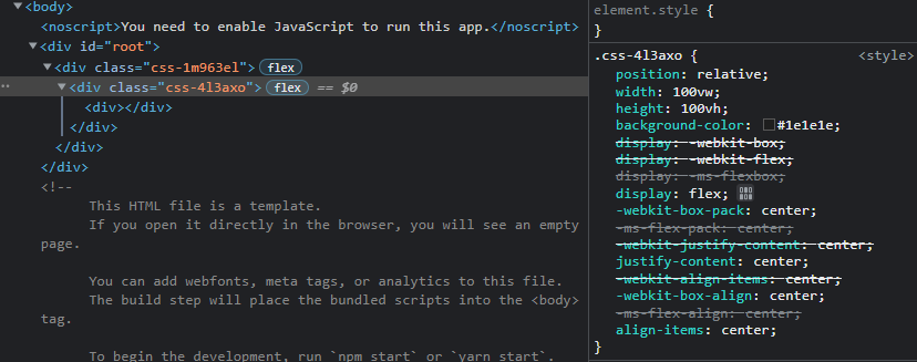
基本形(css)
css``でスタイリングしていきます。
プロパティ名はCSSと同じです。また、VSCodeだとコード補完がきくので記述が楽です。
import React, { VFC } from 'react';
import { css } from '@emotion/css';

export const Note: VFC = () => {
	return (
		<div className={styles.container}>
			<div></div>
		</div>
	)
}

const styles = {
	container: css`
		position: relative;
		width: 100vw;
		height: 100vh;
		background-color: #1e1e1e;
		display: flex;
		justify-content: center;
		align-items: center;
	`
}
- class名は自動で割り振られます。
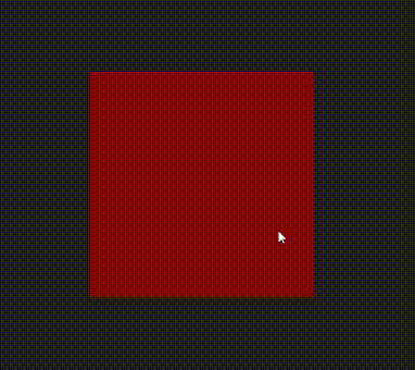
疑似クラス・疑似要素(:hover・::before)
**&**のあとに:hoverや::after、::beforeなどを記述します。

import React, { VFC } from 'react';
import { css } from '@emotion/css';

export const Note: VFC = () => {
	return (
		<div className={styles.container}>
			<div className={styles.box}></div>
		</div>
	)
}

const styles = {
	container: css`
		position: relative;
		width: 100vw;
		height: 100vh;
		background-color: #1e1e1e;
		display: flex;
		justify-content: center;
		align-items: center;
	`,
	box: css`
		position: relative;
		width: 300px;
		height: 300px;
		background-color: rgba(255, 0, 0, 0.5);

		&:hover {
			background-color: rgba(0, 0, 255, 0.5);
		}
		&::after {
			content: '';
			position: absolute;
			top: 0;
			width: 100%;
			border-top: 5px solid red;
		}
		&::before {
			content: '';
			position: absolute;
			bottom: 0;
			width: 100%;
			border-top: 5px solid blue;
		}
	`
}
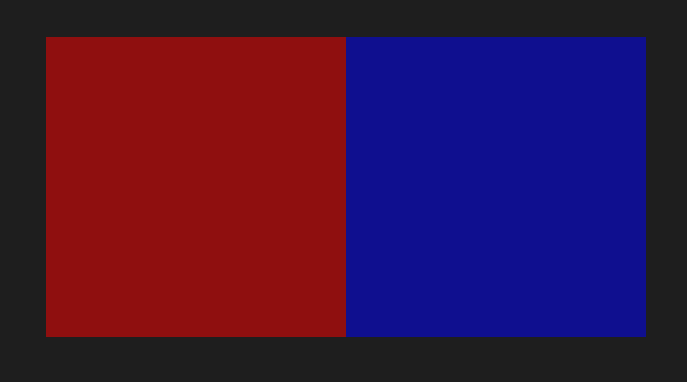
スタイルの統合(cx)
cxを使用してクラスを統合します。
import React, { VFC } from 'react';
import { css, cx } from '@emotion/css';

export const Note: VFC = () => {
	return (
		<div className={styles.container}>
			<div className={cx(styles.box, styles.red)}></div>
			<div className={cx(styles.box, styles.blue)}></div>
		</div>
	)
}

const styles = {
	container: css`
		position: relative;
		width: 100vw;
		height: 100vh;
		background-color: #1e1e1e;
		display: flex;
		justify-content: center;
		align-items: center;
	`,
	box: css`
		position: relative;
		width: 300px;
		height: 300px;
	`,
	red: css`
		background-color: rgba(255, 0, 0, 0.5);
	`,
	blue: css`
		background-color: rgba(0, 0, 255, 0.5);
	`
}
メディアクエリ(media)
バニラのCSSと同様に、@mediaのあとに記述します。
import React, { VFC } from 'react';
import { css } from '@emotion/css';

export const Note: VFC = () => {
	return (
		<div className={styles.container}>
			<div className={styles.box}></div>
		</div>
	)
}

const styles = {
	container: css`
		position: relative;
		width: 100vw;
		height: 100vh;
		background-color: #1e1e1e;
		display: flex;
		justify-content: center;
		align-items: center;
	`,
	box: css`
		position: relative;
		width: 300px;
		height: 300px;
		background-color: rgba(255, 0, 0, 0.5);

		@media (max-width: 1000px) {
			background-color: rgb(0, 0, 255, 0.5);
		}
	`
}
アニメーション(keyframes)
**keyframes``で作成したアニメーションを${}**で参照します。

import React, { VFC } from 'react';
import { css, keyframes } from '@emotion/css';

export const Note: VFC = () => {
	return (
		<div className={styles.container}>
			<div className={styles.box}></div>
		</div>
	)
}

const animations = {
	rotate: keyframes`
		0% {
			transform: rotate(0deg)
		}
		100% {
			transform: rotate(360deg)
		}
	`
}

const styles = {
	container: css`
		position: relative;
		width: 100vw;
		height: 100vh;
		background-color: #1e1e1e;
		display: flex;
		justify-content: center;
		align-items: center;
	`,
	box: css`
		position: relative;
		width: 300px;
		height: 300px;
		background-color: rgba(255, 0, 0, 0.5);
		animation: ${animations.rotate} 10s linear infinite;
	`
}
classの動的な追加による遷移(transition)
emotion/cssを使用すると、class名は自動的に生成されます。
classList.toggleなどで動的に明示的なclassを追加して、それを起点にtransitionさせたい場合は、以下のように記述します。
**&**のあとにclass名(例の場合、.toggle)を記述しています。
import React, { VFC, useRef } from 'react';
import { css } from '@emotion/css';

export const Note: VFC = () => {
	const boxRef = useRef<HTMLDivElement>(null)

	const clickHandler = () => {
		if (boxRef.current) {
			boxRef.current.classList.toggle('toggle')
		}
	}

	return (
		<div className={styles.container}>
			<div ref={boxRef} className={styles.box} onClick={clickHandler}></div>
		</div>
	)
}

const styles = {
	container: css`
		position: relative;
		width: 100vw;
		height: 100vh;
		background-color: #1e1e1e;
		display: flex;
		justify-content: center;
		align-items: center;
	`,
	box: css`
		position: relative;
		width: 300px;
		height: 300px;
		background-color: rgba(255, 0, 0, 0.5);
		transition: ease-in-out 3s;

		&.toggle {
			border-radius: 50%;
			transform: rotate(360deg) scale(0.5);
		}
	`
}
スタイルの統合(cx)を使った書き方
スタイルの統合(cx)を使用すると、以下のように書くこともできます。
import React, { useState, VFC } from 'react';
import { css, cx } from '@emotion/css';

export const Note: VFC = () => {
	const [toggle, setToggle] = useState(false)

	const clickHandler = () => {
		setToggle(!toggle)
	}

	return (
		<div className={styles.container}>
			<div
				className={cx(styles.box, { [styles.boxTrasition]: toggle })}
				onClick={clickHandler}>
			</div>
		</div>
	)
}

const styles = {
	container: css`
		position: relative;
		width: 100vw;
		height: 100vh;
		background-color: #1e1e1e;
		display: flex;
		justify-content: center;
		align-items: center;
	`,
	box: css`
		position: relative;
		width: 300px;
		height: 300px;
		background-color: rgba(255, 0, 0, 0.5);
		transition: ease-in-out 3s;
	`,
	boxTrasition: css`
		border-radius: 50%;
		transform: rotate(360deg) scale(0.5);
	`
}
-
cx(styles.box, { [styles.boxTrasition]: toggle })で、toggleの状態に応じてstyles.boxTrasitionの追加/削除を切り替えます。
引数
公式な使い方ではないですが、**css``**に引数を取ることもできます。
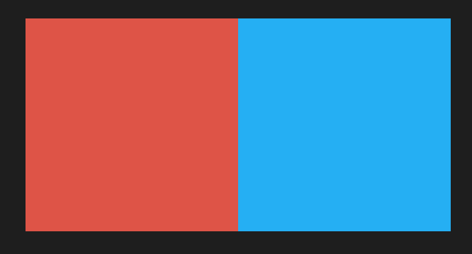
keyframesを参照するときと同様に、変数は**${}**で参照します。
import React, { VFC } from 'react';
import { css } from '@emotion/css';

export const Note: VFC = () => {
	return (
		<div className={styles.container}>
			<div className={styles.box('rgb(222, 84, 71)')}></div>
			<div className={styles.box('#25AFF3')}></div>
		</div>
	)
}

const styles = {
	container: css`
		position: relative;
		width: 100vw;
		height: 100vh;
		background-color: #1e1e1e;
		display: flex;
		justify-content: center;
		align-items: center;
	`,
	box: (bgColor: string) => css`
		position: relative;
		width: 300px;
		height: 300px;
		background-color: ${bgColor};
	`
}
おまけ(記述のルール)
試行錯誤して、個人的にコーディングしやすく可読性の良いと思った記述のルールです。
スタイルの記述位置
スタイルはコンポーネントの下に書きます。
コードを見る人の多くが一番興味があるのは、コンポーネントだからです。
import React, { VFC } from 'react';
import { css } from '@emotion/css';

export const Note: VFC = () => {
	return (
		<div className={styles.container}>
			<div></div>
		</div>
	)
}

const styles = {
	container: css`
		position: relative;
		width: 100vw;
		height: 100vh;
		background-color: #1e1e1e;
		display: flex;
		justify-content: center;
		align-items: center;
	`
}
コンポーネントのパラメーター記述位置
classNameは、先頭の方に書きます。
重要なプロパティ・変動しないプロパティを先頭側へ、変動するプロパティを末尾側へ記述します。
<Component key={i} id="box" className={styles.box} {...props} onClick={clickHandler} />
-
{...props}は、カスタムコンポーネントへ渡すプロパティです(text="aaa" など)。1個渡すこともあれば5個渡すこともあるので、末尾側です。 -
eventは、一番後ろです。eventも複数個ある場合があり、またプロパティの文字数が長くなるためです。