この記事は「【リアルタイム電力予測】需要・価格・電源最適化ダッシュボード構築記」シリーズの四日目です
Day1はこちら | 全体構成を見る
今回は、前回までに作成した 電力消費量・気象情報・日付情報を統合したデータセットを使って、実際に需要予測を行っていきます。
LightGBMを使用した理由は、簡単に実装できて精度が高いからです。
LightGBM は勾配ブースティング木ベースのモデルであり、線形回帰のように重みを直接推定するモデルに比べて、多重共線性の影響を受けにくい、という利点があります。
そのため、EDAで共線性を把握はしたものの、前処理で厳密に削る必要まではないです。
それでは、前回まで使用していたall_dfを使用して実装していきます。
特徴量追加
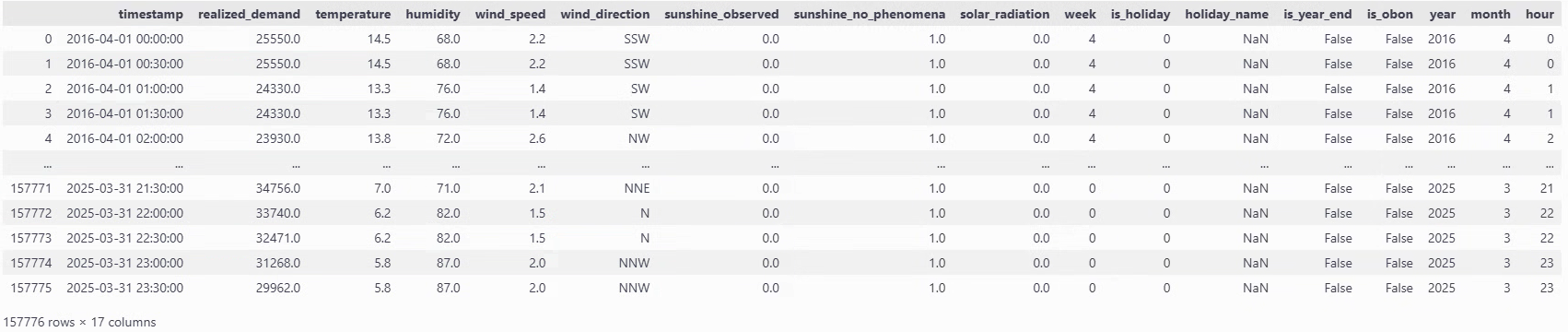
all_dfは以下のようなDataFrameでした。
前回EDAを行ったときに、電力消費量と気温には密接な関係が見られたものの、二峰性が見られるため工夫を施していきたいと思います。
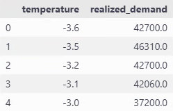
temp_avg_consumption = all_df.groupby("temperature")["realized_demand"].mean().reset_index()
plt.figure(figsize=(8, 5))
plt.plot(temp_avg_consumption['temperature'], temp_avg_consumption['realized_demand'], marker="o")
plt.xlabel("temperature (℃)")
plt.ylabel("average demand (MkW)")
plt.title("Average demand by temperature")
plt.grid()
plt.show()

# 最小値の特定
min_temp = temp_avg_consumption.loc[temp_avg_consumption['realized_demand'].idxmin(), 'temperature']
print(f"temperature for the lowest demand : {min_temp}°C")
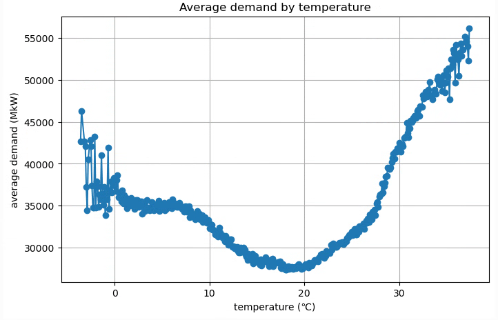
temperature for the lowest demand : 18.1°C
今回は閾値を18.1℃として、絶対値差分を計算して特徴量にします。
all_df["temperature_abs"] = (all_df['temperature'] - threshold).abs()
correlation = all_df[["temperature_abs", "realized_demand"]].corr()
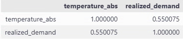
そのままだと10%に満たなかった相関係数が、55%になりました。
これで絶対値差分が大きければ、電力消費量も上がるという関係が少しは捉えられるはずです。
モデル学習
それでは早速モデルの学習を行います。
不要なカラムが多いので最初に絞ります。
use_col = ["realized_demand", "year", "month", "hour", "timestamp", "is_holiday", "humidity", "temperature", "temperature_abs"]
all_df_cl = all_df[use_col]
all_df_cl
カテゴリカル変数の設定
LighGBMには数字をカテゴリとして扱う仕組みがあります。
fit時にcategorical_feature引数に列名(または列番号)を指定するか、pandas dataframeの列をcategory型にしておくと適用されることになります。
all_df_cl["is_holiday"] = all_df_cl["is_holiday"].astype("category")
これにより、is_holidayは数値の大小ではなく、「0/1 というラベル」として分割の候補に使われるようになります。
データフレームの分割
今回は以下のように分割します
- 2016年4月〜2024年3月末 を学習用(train)
- 2024年4月〜2025年3月末 をテスト用(test)
なお、2024年1月までのcsvは時間解像度が1時間なのですが、それ以降は30分となっています。本来であれば、解像度がそろっている1時間単位での予測をするべきですが、今後行う電力価格予測との兼ね合いもあり、30分単位で予測することにしました。必然的に、学習用データの大半は1時間単位のデータであり、それを30分刻みに伸ばしただけになっている状況のため、30分単位で予測することで精度が多少下がる可能性があります。
import datetime as dt
train_df = all_df_cl[(all_df_cl['timestamp'] >= dt.datetime(2016,4,1)) & (all_df_cl['timestamp'] < dt.datetime(2024,3,31))].reset_index(drop=True)
test_df = all_df_cl[(all_df_cl['timestamp'] >= dt.datetime(2024,4,1)) & (all_df_cl['timestamp'] < dt.datetime(2025,3,31))].reset_index(drop=True)

# 可視化時にX軸として使用
test_time = test_df['timestamp']

train_df = train_df.drop(columns='timestamp')
test_df = test_df.drop(columns='timestamp')

y_train = train_df['realized_demand']
y_test = test_df['realized_demand']
X_train = train_df.drop(columns='realized_demand')
X_test = test_df.drop(columns='realized_demand')

print(X_train.shape, y_train.shape, X_test.shape, y_test.shape)
(140208, 7) (140208,) (17472, 7) (17472,)と分かれています。
モデルの設定
import lightgbm as lgb
from sklearn.inspection import permutation_importance
from sklearn.metrics import mean_squared_error, r2_score
import shap
import matplotlib.pyplot as plt

# 時間周期系の変換
def sin_cos_transform(df):
    df["month_sin"] = np.sin(2 * np.pi * df["month"] / 12)
    df["month_cos"] = np.cos(2 * np.pi * df["month"] / 12)

    df["hour_sin"] = np.sin(2 * np.pi * df["hour"] / 24)
    df["hour_cos"] = np.cos(2 * np.pi * df["hour"] / 24)
    return df

def preprocess(X_train, X_test, feature_col, tf_sin_cos=None, treat_year_as="numeric"):
    if tf_sin_cos:
        X_train = sin_cos_transform(X_train)
        X_test = sin_cos_transform(X_test)

    if "year" in feature_col:
        if treat_year_as == "categorical":
            X_train["year"] = X_train["year"].astype("category")
            X_test["year"] = X_test["year"].astype("category")
        else:
            X_train["year"] = X_train["year"].astype(int)
            X_test["year"] = X_test["year"].astype(int)

    X_train = X_train[feature_col]
    X_test = X_test[feature_col]

    return X_train, X_test

def run_lightGBM(X_train, X_test):

    lgb_model = lgb.LGBMRegressor(random_state=42, max_depth = 7, verbose=-1)
    lgb_model.fit(X_train, y_train)

    y_train_pred = lgb_model.predict(X_train)
    y_test_pred = lgb_model.predict(X_test)

    return lgb_model, y_train_pred, y_test_pred
def evaluate_and_plot(lgb_model, X_train, X_test, y_train_pred, y_test_pred):
print(
"LightGBM RMSE train: %.3f, test: %.3f"
% (
np.sqrt(mean_squared_error(y_train, y_train_pred)),
np.sqrt(mean_squared_error(y_test, y_test_pred)),
)
)
print(
"LightGBM R^2 train: %.3f, test: %.3f"
% (r2_score(y_train, y_train_pred), r2_score(y_test, y_test_pred))
)
# permutation_importanceを使用して特徴量の重要度を計算
result = permutation_importance(
lgb_model, X_test, y_test, n_repeats=10, random_state=42, scoring="neg_mean_squared_error"
)
# 特徴量の名前と重要度をペアにする
feature_names = X_train.columns
importances = result.importances_mean
feature_importance = sorted(
zip(feature_names, importances), key=lambda x: x[1], reverse=True
)
# 結果を表示
print("Permutation Importances:")
for name, score in feature_importance:
print(f"{name}: {score:.4f}")
# 特徴量重要度をプロット
plt.figure(figsize=(10, 6))
plt.barh([x[0] for x in feature_importance], [x[1] for x in feature_importance])
plt.xlabel("Permutation Importance")
plt.ylabel("Feature")
plt.title("LightGBM | Permutation Importances")
plt.gca().invert_yaxis()
plt.show()
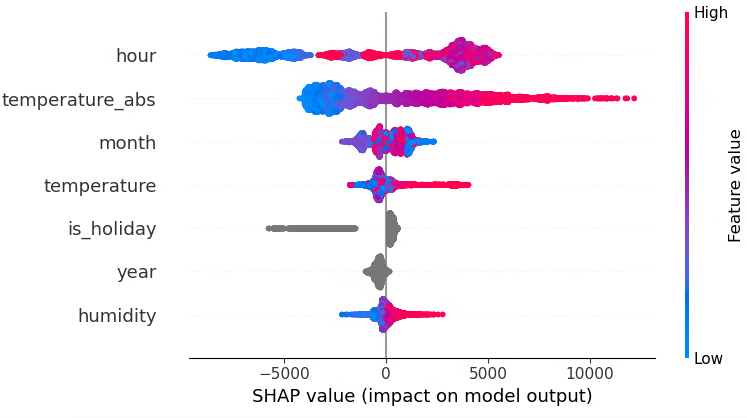
explainer = shap.TreeExplainer(lgb_model)
shap_values = explainer.shap_values(X_test)
plt.figure(figsize=(10, 6))
shap.summary_plot(shap_values, X_test)
時間周期性の特徴量について
monthやhourをそのまま連続量として使っても学習はできると思いますが、例えば「12月(=12)」と「1月(=1)」の距離が 数直線上では 11 離れているのに対して、
実際には 季節的には隣同士という性質があります。このような周期的な特徴をモデルに伝えるために、角度(0~2π)にマッピングし、sin/cos変換を行ってみました。
yearについて
yearには、「年ごとに少しずつ気候や需要構造が違う(冷夏・暖冬・省エネ進展など)」といった情報が含まれている可能性があります。それをモデルに渡す方法として、今回は以下の2通りを実験します。
-
数値特徴量として扱う場合
-
yearをそのまま整数として渡す - LightGBM は「year < 2020 のような閾値で分岐」できるので、
年が大きくなるほど何となく傾向が変わっていく、といった 大小関係・順序を利用できる
-
-
カテゴリカル特徴量として扱う場合
-
yearをcategory型にして渡す - 各年を「2020 年」「2021 年」といった 別々のグループとして扱う(年どうしの大小関係は使わず、「この年か、それ以外か」などの分割になる)
-
permutation_importanceについて
sklearn.inspection.permutation_importanceは、
「ある特徴量の値をランダムにシャッフルしたときに、モデルのスコア(例:MSE)がどれくらい悪化するか」を測ることで、その特徴量が予測精度にどれだけ貢献しているかを評価する手法です。
- 特徴量そのものを削除するのではなく、その列の値だけをシャッフルして「情報を無意味にする」
- シャッフル前後のスコア差が大きいほど、その特徴量はモデルにとって重要だとみなされる
- 「どの値が効いているのか」までは分からないが、特徴量の「残す/削る」の判断材料としては有用である
- 評価対象は「データセット全体のスコア」なので、個々の行レベルの寄与は分からない
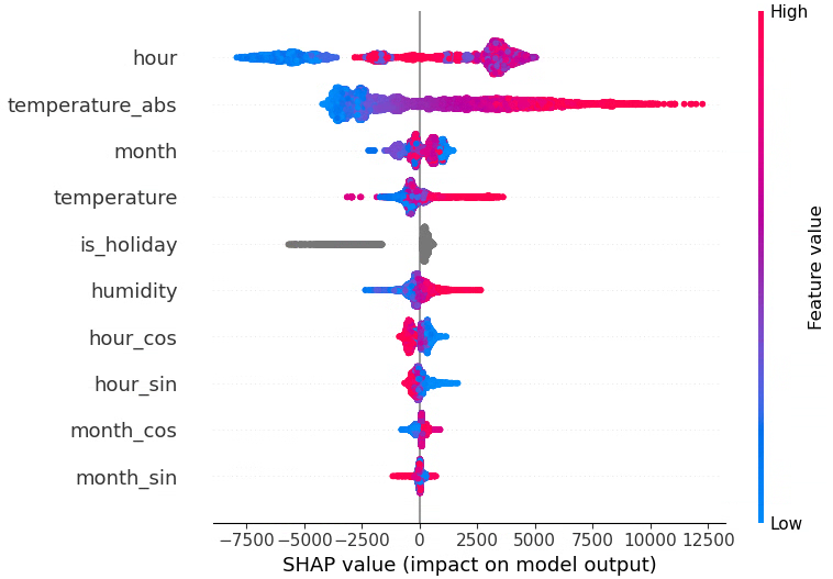
SHAP importanceについて
各サンプル(行)ごとに、各特徴量が予測値をどれだけ押し上げたり押し下げたりしているかを数値化する手法です。
- 行レベルの説明ができる
「この時刻の需要予測が高いのは、気温が高くて、かつ休日だから」 - summary plot では各特徴量について、全サンプルでの SHAP 値の分布を可視化し、
その特徴量の値が大きいとき/小さいときに、予測をどちら方向へ動かしているかを可視化できます - 符号(+/-)は「予測を増やす方向か、減らす方向か」、絶対値の大きさは「影響の強さ」を意味する
特徴量実験
精度(RMSE / R²)とpermutation importance、SHAPを見ながらどの特徴量構成が良さそうかを比較していきます。
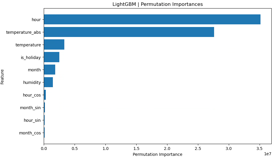
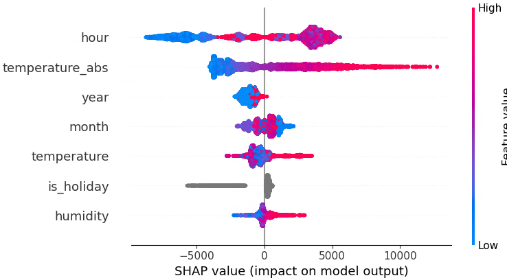
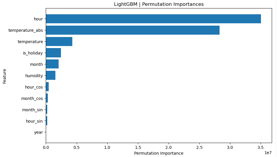
月(raw)、時間(raw)、祝日フラグ、湿度、気温、気温絶対値
X_train_tf, X_test_tf = preprocess(X_train, X_test, feature_col=["month", "hour", "is_holiday", "humidity", "temperature", "temperature_abs"], tf_sin_cos=None)
lgb_model, y_train_pred, y_test_pred = run_lightGBM(X_train_tf, X_test_tf)
evaluate_and_plot(lgb_model, X_train_tf, X_test_tf, y_train_pred, y_test_pred)
LightGBM RMSE train: 2453.124, test: 2655.754
LightGBM R^2 train: 0.865, test: 0.861
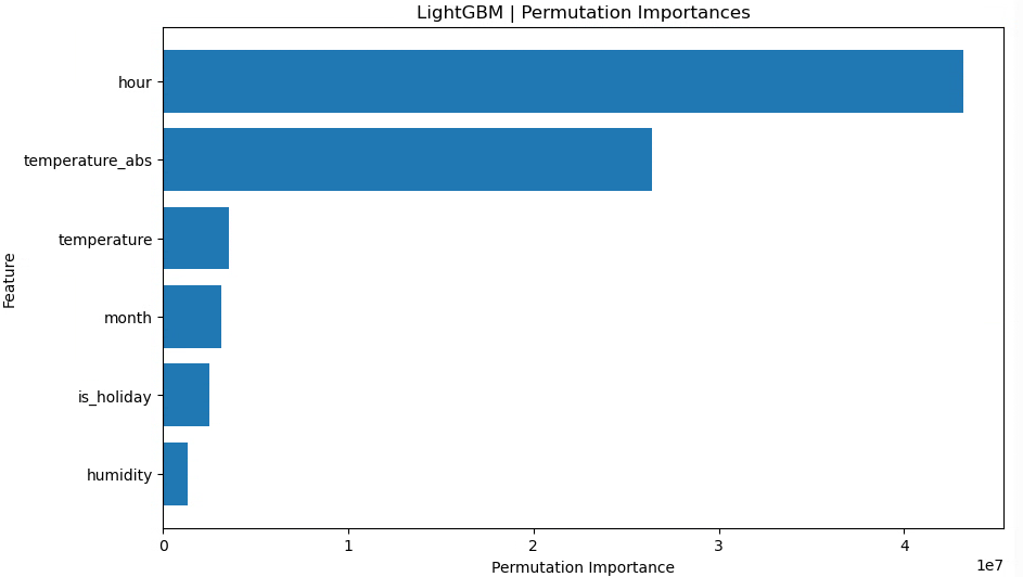
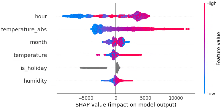
まずはベースラインとして「月」「時間」をそのまま数値で入れたケースを見ました。
特徴量重要度を見ると、時間(hour)が最も強い説明力を持っていることが分かります。
月(raw)、時間(raw)、月(sin,cos)、時間(sin,cos)、祝日フラグ、湿度、気温、気温絶対値
LightGBM RMSE train: 2452.113, test: 2667.723
LightGBM R^2 train: 0.865, test: 0.860
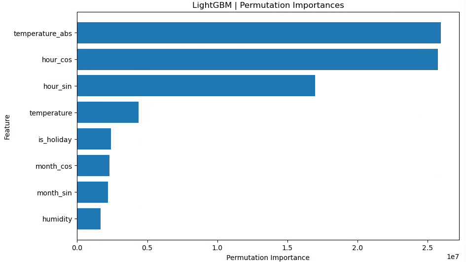
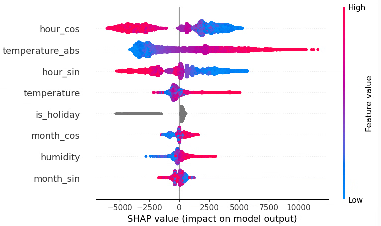
ここでは、monthとhourの周期性を捉えるために
-
month_sin,month_cos -
hour_sin,hour_cos
を追加しています。
ただ、この構成では test 側のスコアがやや悪化しており、少なくとも今回のデータ・分割条件では「raw に sin,cos を足す」メリットは見られません。
月(raw)、時間(raw)、月(sin,cos)、時間(sin,cos)、祝日フラグ、湿度、気温、気温絶対値
LightGBM RMSE train: 2448.772, test: 2658.773
LightGBM R^2 train: 0.865, test: 0.861
raw(月・時間)と sin,cos の両方を入れると、test スコアは最初のパターンとほぼ同程度まで戻りました。
ただし、明確な改善があるわけではなく、「あってもなくても大差ない」 という結果になっています。
木モデル(決定木ベース)は、もともと「閾値で区切る」ことで周期性のパターンもある程度は表現できるためか、今回のような設定では sin,cos を追加しても大きくは効いていないと考えられます。
月(raw)、時間(raw)、月(sin,cos)、時間(sin,cos)、年(num)、祝日フラグ、湿度、気温、気温絶対値
LightGBM RMSE train: 2327.217, test: 2741.217
LightGBM R^2 train: 0.878, test: 0.852

ここではyearを数値特徴量として追加しています。
train の R² は改善しているが、test の R² が下がっており、やや過学習気味になっていることが分かります。
年を連続値として扱うことで「年が大きいほどこうなる」といったトレンドも表現できますが、今回の分割(2016〜2023 を学習、2024〜2025 をテスト)では、学習期間のパターンに強く引っ張られすぎている可能性があります。
月(raw)、時間(raw)、年(num)、祝日フラグ、湿度、気温、気温絶対値
LightGBM RMSE train: 2333.181, test: 2696.781
LightGBM R^2 train: 0.877, test: 0.857
年(数値)を残しつつ、sin,cos を抜いた場合でも、train スコアは良いがtest スコアはベースライン(年なし)より悪化という結果になりました。
今回のデータに関しては、「年ごとに単純なトレンドがある」というより、年ごとに独立した癖がある 可能性が高く、連続値として扱うのはあまりうまくハマっていないように見えます。
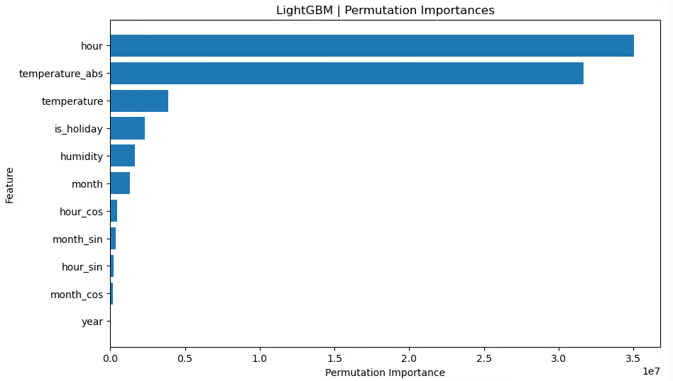
月(raw)、時間(raw)、月(sin,cos)、時間(sin,cos)、年(cat)、祝日フラグ、湿度、気温、気温絶対値
LightGBM RMSE train: 2320.219, test: 2595.909
LightGBM R^2 train: 0.879, test: 0.867
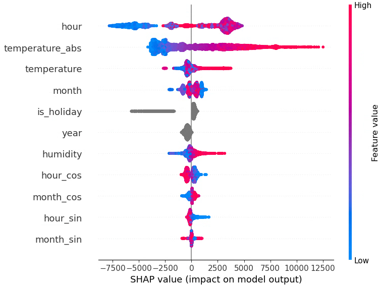
ここではyearをcategory型にして、「年ごとのダミー(年固定効果)」 のように扱っています。train/test ともにスコアが改善し、特に test 側(未来年の予測)で R² が高くなりました。
これは、年を「大小関係のある連続量」として扱うよりも、「2018 年」「2019 年」「2020 年」…をそれぞれ別のグループとして扱うほうが、このデータには合っていたと解釈できます。
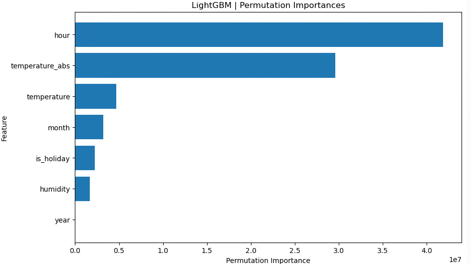
月(raw)、時間(raw)、年(cat)、祝日フラグ、湿度、気温、気温絶対値
LightGBM RMSE train: 2324.676, test: 2593.769
LightGBM R^2 train: 0.878, test: 0.868
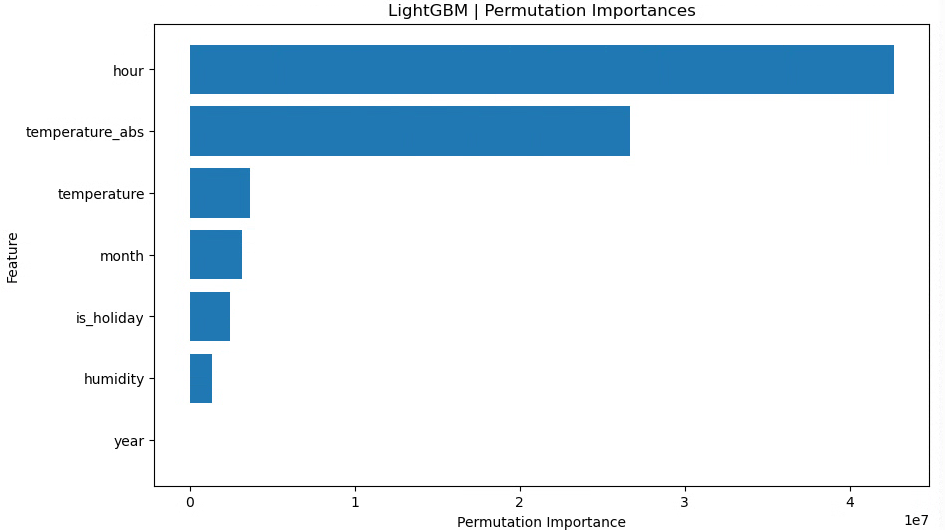
最後に、月・時間は raw のみ(sin,cos なし)、年はカテゴリカル変数、という構成に絞ったところ、test RMSE が最も小さくtest R² が最も高くなりました!
まとめ
- 月・時間は raw の整数値(1〜12, 0〜23)のままで十分
→ 決定木ベースの LightGBM が、閾値分割で時間帯パターンをうまく拾ってくれている - 年は連続値として扱うより、カテゴリカル変数として扱うほうが性能が良かった
→ 年ごとに「その年ならではのバイアス(冷夏・暖冬や省エネなど)」を持たせる形が、このデータには合っていた - 今回の条件では、
month_sin,month_cos,hour_sin,hour_cosを追加しても目立った改善は見られず、むしろ不要な次元を増やしているだけになっていた
グリッドサーチ
最後に、簡単にパラメータチューニングを行います。
from sklearn.model_selection import GridSearchCV
from sklearn.model_selection import TimeSeriesSplit
# グリッドサーチのパラメータ設定
param_grid = {
    "max_depth" : [7,9], # デフォルト-1
    "num_leaves": [7,15,31], # デフォルト31
    "learning_rate" : [0.1, 0.01] #デフォルト0.1
}

# グリッドサーチの設定
lgb_model = lgb.LGBMRegressor(random_state=42)
cv = TimeSeriesSplit(n_splits=5)
grid_search = GridSearchCV(
    estimator=lgb_model, param_grid=param_grid, cv=cv, scoring="r2", n_jobs=-1
)
# モデル学習
grid_search.fit(X_train_tf, y_train)

# 最適なパラメータの表示
print("Best Parameters:", grid_search.best_params_)

# 最適モデルで予測
best_model = grid_search.best_estimator_
y_train_pred = best_model.predict(X_train_tf)
y_test_pred = best_model.predict(X_test_tf)

# 精度評価
train_rmse = np.sqrt(mean_squared_error(y_train, y_train_pred))
test_rmse = np.sqrt(mean_squared_error(y_test, y_test_pred))
train_r2 = r2_score(y_train, y_train_pred)
test_r2 = r2_score(y_test, y_test_pred)

print(f"LightGBM RMSE train: {train_rmse:.3f}, test: {test_rmse:.3f}")
print(f"LightGBM R^2 train: {train_r2:.3f}, test: {test_r2:.3f}")
Best Parameters: {'learning_rate': 0.1, 'max_depth': 9, 'num_leaves': 15}
LightGBM RMSE train: 2390.788, test: 2612.792
LightGBM R^2 train: 0.871, test: 0.866
グリッドサーチ前の、max_depth=7だけ指定してあとはデフォルト設定だった場合に一番良い精度となりました。
※ 補足:GridSearchCV が最適化しているのは「訓練データ上での 5 分割交差検証スコア」であり、私が比較している「2024–2025 年のテストデータに対するスコア」とは評価対象が異なります
可視化
最後にplotして、どれぐらい電力消費量を追っているかを見てみましょう。
※残差分析は6日目に行います
fig = go.Figure()

# 実測値のプロット
fig.add_trace(
    go.Scatter(
        x=test_time, y=y_test, mode="lines", name="実測値", line=dict(color="blue")
    )
)

# LightGBMの予測値のプロット
fig.add_trace(
    go.Scatter(
        x=test_time,
        y=y_test_pred,
        mode="lines",
        name="LightGBM予測",
        line=dict(color="red", dash="dash"),  # 実線を破線に設定
    )
)

# グラフのレイアウト設定
fig.update_layout(
    title="2024年の電力消費量の実測値とモデルによる予測",
    xaxis_title="日付",
    yaxis_title="電力消費量 (万kW)",
    legend_title="凡例",
    width=900,  # 幅を設定
    height=400,  # 高さを設定
)
fig.update_xaxes(
    tickangle=-45,
    dtick="M1",          # 1か月ごとに目盛り
    tick0 = "2024-04-01",
    tickformat="%Y-%m",  # 表示フォーマット(例: 2024-01)
    showgrid=True        # グリッド線を表示
)

fig.show()
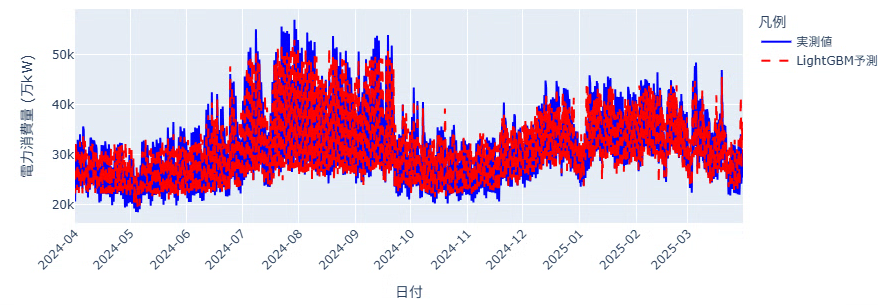
分かりにくいので8月を拡大してみます。
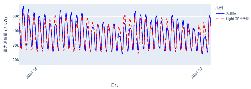
上下のギザギザな動きを追えています。一日の中の最低値はそんなに外していないですが、最大値の予測で大きく外れる日があるようです。
明日
次回はGRUモデルを使用して同じように予測を行ってみます!![]()