データの読み込み
# URL によるリソースへのアクセスを提供するライブラリをインポートする。
import urllib.request
# ウェブ上のリソースを指定する
url = 'https://raw.githubusercontent.com/maskot1977/ipython_notebook/master/toydata/airquality.txt'
# 指定したURLからリソースをダウンロードし、名前をつける。
urllib.request.urlretrieve(url, 'airquality.txt')
('airquality.txt', <http.client.HTTPMessage at 0x106112c18>)
# データフレーム操作に関するライブラリをインポートする
import pandas as pd
# データの読み込み
df1 = pd.read_csv('airquality.txt', sep='\t', index_col=0)
df1
| Ozone | Solar.R | Wind | Temp | Month | Day | |
|---|---|---|---|---|---|---|
| 1 | 41 | 190 | 7.4 | 67 | 5 | 1 |
| 2 | 36 | 118 | 8.0 | 72 | 5 | 2 |
| 3 | 12 | 149 | 12.6 | 74 | 5 | 3 |
| 4 | 18 | 313 | 11.5 | 62 | 5 | 4 |
| 7 | 23 | 299 | 8.6 | 65 | 5 | 7 |
| 8 | 19 | 99 | 13.8 | 59 | 5 | 8 |
| 9 | 8 | 19 | 20.1 | 61 | 5 | 9 |
| 12 | 16 | 256 | 9.7 | 69 | 5 | 12 |
| 13 | 11 | 290 | 9.2 | 66 | 5 | 13 |
| 14 | 14 | 274 | 10.9 | 68 | 5 | 14 |
| 15 | 18 | 65 | 13.2 | 58 | 5 | 15 |
| 16 | 14 | 334 | 11.5 | 64 | 5 | 16 |
| 17 | 34 | 307 | 12.0 | 66 | 5 | 17 |
| 18 | 6 | 78 | 18.4 | 57 | 5 | 18 |
| 19 | 30 | 322 | 11.5 | 68 | 5 | 19 |
| 20 | 11 | 44 | 9.7 | 62 | 5 | 20 |
| 21 | 1 | 8 | 9.7 | 59 | 5 | 21 |
| 22 | 11 | 320 | 16.6 | 73 | 5 | 22 |
| 23 | 4 | 25 | 9.7 | 61 | 5 | 23 |
| 24 | 32 | 92 | 12.0 | 61 | 5 | 24 |
| 28 | 23 | 13 | 12.0 | 67 | 5 | 28 |
| 29 | 45 | 252 | 14.9 | 81 | 5 | 29 |
| 30 | 115 | 223 | 5.7 | 79 | 5 | 30 |
| 31 | 37 | 279 | 7.4 | 76 | 5 | 31 |
| 38 | 29 | 127 | 9.7 | 82 | 6 | 7 |
| 40 | 71 | 291 | 13.8 | 90 | 6 | 9 |
| 41 | 39 | 323 | 11.5 | 87 | 6 | 10 |
| 44 | 23 | 148 | 8.0 | 82 | 6 | 13 |
| 47 | 21 | 191 | 14.9 | 77 | 6 | 16 |
| 48 | 37 | 284 | 20.7 | 72 | 6 | 17 |
| ... | ... | ... | ... | ... | ... | ... |
| 123 | 85 | 188 | 6.3 | 94 | 8 | 31 |
| 124 | 96 | 167 | 6.9 | 91 | 9 | 1 |
| 125 | 78 | 197 | 5.1 | 92 | 9 | 2 |
| 126 | 73 | 183 | 2.8 | 93 | 9 | 3 |
| 127 | 91 | 189 | 4.6 | 93 | 9 | 4 |
| 128 | 47 | 95 | 7.4 | 87 | 9 | 5 |
| 129 | 32 | 92 | 15.5 | 84 | 9 | 6 |
| 130 | 20 | 252 | 10.9 | 80 | 9 | 7 |
| 131 | 23 | 220 | 10.3 | 78 | 9 | 8 |
| 132 | 21 | 230 | 10.9 | 75 | 9 | 9 |
| 133 | 24 | 259 | 9.7 | 73 | 9 | 10 |
| 134 | 44 | 236 | 14.9 | 81 | 9 | 11 |
| 135 | 21 | 259 | 15.5 | 76 | 9 | 12 |
| 136 | 28 | 238 | 6.3 | 77 | 9 | 13 |
| 137 | 9 | 24 | 10.9 | 71 | 9 | 14 |
| 138 | 13 | 112 | 11.5 | 71 | 9 | 15 |
| 139 | 46 | 237 | 6.9 | 78 | 9 | 16 |
| 140 | 18 | 224 | 13.8 | 67 | 9 | 17 |
| 141 | 13 | 27 | 10.3 | 76 | 9 | 18 |
| 142 | 24 | 238 | 10.3 | 68 | 9 | 19 |
| 143 | 16 | 201 | 8.0 | 82 | 9 | 20 |
| 144 | 13 | 238 | 12.6 | 64 | 9 | 21 |
| 145 | 23 | 14 | 9.2 | 71 | 9 | 22 |
| 146 | 36 | 139 | 10.3 | 81 | 9 | 23 |
| 147 | 7 | 49 | 10.3 | 69 | 9 | 24 |
| 148 | 14 | 20 | 16.6 | 63 | 9 | 25 |
| 149 | 30 | 193 | 6.9 | 70 | 9 | 26 |
| 151 | 14 | 191 | 14.3 | 75 | 9 | 28 |
| 152 | 18 | 131 | 8.0 | 76 | 9 | 29 |
| 153 | 20 | 223 | 11.5 | 68 | 9 | 30 |
111 rows × 6 columns
# 「#」(シャープ)以降の文字はプログラムに影響しません。
# 図やグラフを図示するためのライブラリをインポートする。
import matplotlib.pyplot as plt
%matplotlib inline
折れ線グラフ
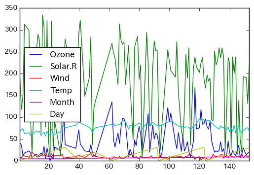
# 折れ線グラフを作成する
df1.plot()
<matplotlib.axes._subplots.AxesSubplot at 0x1157ae588>
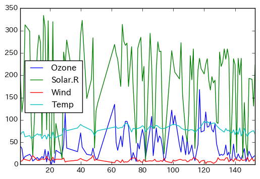
# 左側4列だけを用いて折れ線グラフを作成する
df1.iloc[:, 0:4].plot()
<matplotlib.axes._subplots.AxesSubplot at 0x11593f4a8>
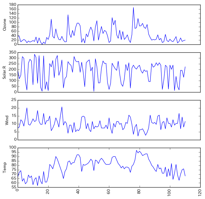
# 折れ線グラフの描き方(別法)
plt.figure(figsize=(8, 8))

plt.subplot(4, 1, 1)
plt.plot(df1.iloc[:, 0])
plt.xticks([])
plt.ylabel(df1.columns[0])

plt.subplot(4, 1, 2)
plt.plot(df1.iloc[:, 1])
plt.xticks([])
plt.ylabel(df1.columns[1])

plt.subplot(4, 1, 3)
plt.plot(df1.iloc[:, 2])
plt.xticks([])
plt.ylabel(df1.columns[2])

plt.subplot(4, 1, 4)
plt.plot(df1.iloc[:, 3])
plt.xticks(rotation=90)
plt.ylabel(df1.columns[3])
<matplotlib.text.Text at 0x115d25f98>
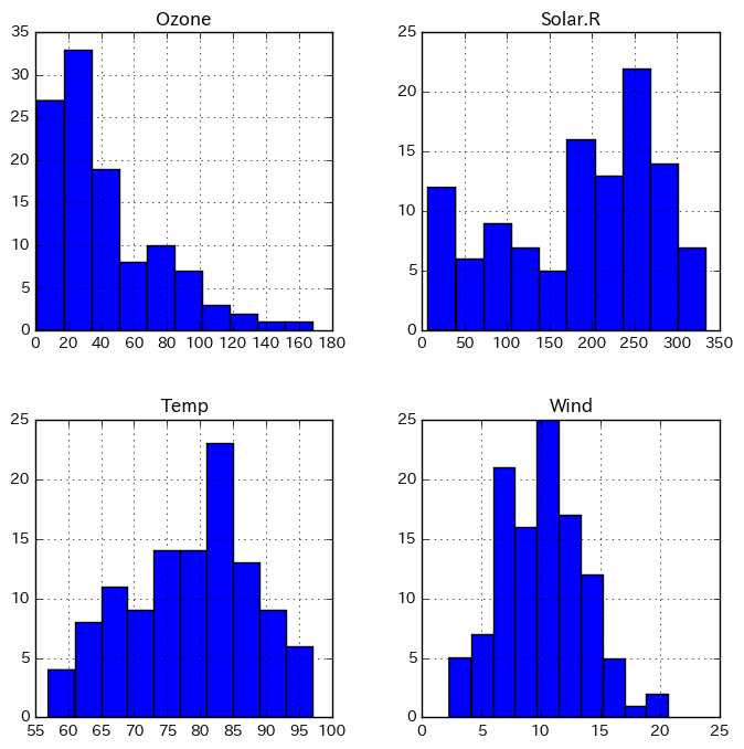
ヒストグラム
df1.iloc[:, 0:4].hist(figsize=(8,8))
array([[<matplotlib.axes._subplots.AxesSubplot object at 0x118166630>,
        <matplotlib.axes._subplots.AxesSubplot object at 0x118eac208>],
       [<matplotlib.axes._subplots.AxesSubplot object at 0x118ef3b70>,
        <matplotlib.axes._subplots.AxesSubplot object at 0x11a165668>]], dtype=object)
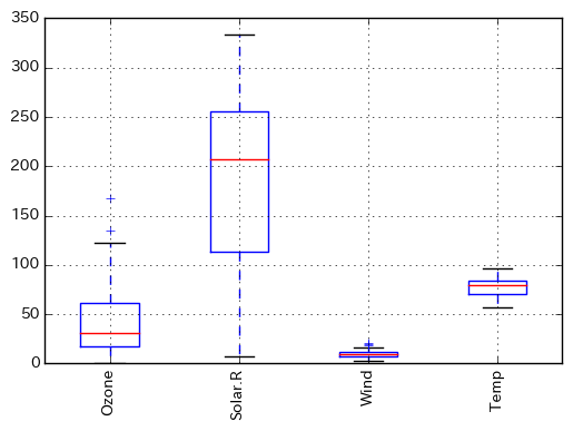
ボックスプロット(箱ひげ図)
fig = plt.figure()
ax = fig.add_subplot(111)
ax.boxplot(df1.iloc[:, 0:4].as_matrix().T.tolist())
ax.set_xticklabels(df1.columns[0:4], rotation=90)
plt.grid()
plt.show()
バイオリンプロット
# バイオリンプロット
fig = plt.figure()
ax = fig.add_subplot(111)
ax.violinplot(df1.iloc[:, 0:4].as_matrix().T.tolist())
ax.set_xticks([1, 2, 3, 4]) #データ範囲のどこに目盛りが入るかを指定する
ax.set_xticklabels(df1.columns[0:4], rotation=90)
plt.grid()
plt.show()
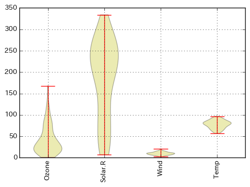
参考資料:
- バイオリンプロットの本当の描き方を見せてやる
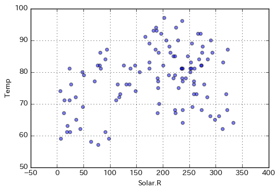
スキャッタープロット(散布図)
df1.plot(kind='scatter', x=df1.columns[1], y=df1.columns[3], grid=True, alpha=0.5)
<matplotlib.axes._subplots.AxesSubplot at 0x11fabfe10>
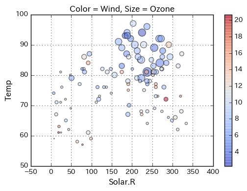
# 丸のサイズと色に意味をもたせた散布図を描く
plt.figure(figsize=(6, 4))
plt.scatter(df1.iloc[:, 1], df1.iloc[:, 3], c=df1.iloc[:, 2], s=df1.iloc[:, 0],
            alpha=0.5, cmap='coolwarm')
plt.colorbar(alpha=0.8)
plt.title("Color = " + df1.columns[2] + ", Size = " + df1.columns[0])
plt.xlabel(df1.columns[1], size=12)
plt.ylabel(df1.columns[3], size=12)
plt.grid()
plt.show()
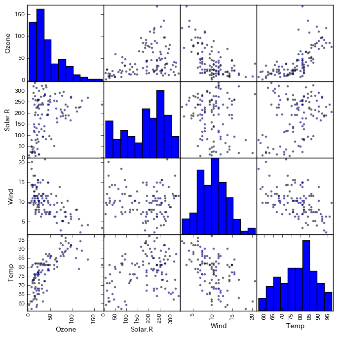
スキャッターマトリクス(散布図行列)
from pandas import plotting
plotting.scatter_matrix(df1[df1.columns[0:4]], figsize=(8, 8))
array([[<matplotlib.axes._subplots.AxesSubplot object at 0x11d8e2358>,
        <matplotlib.axes._subplots.AxesSubplot object at 0x11e0bc320>,
        <matplotlib.axes._subplots.AxesSubplot object at 0x11d8104e0>,
        <matplotlib.axes._subplots.AxesSubplot object at 0x11d5e6f60>],
       [<matplotlib.axes._subplots.AxesSubplot object at 0x11d24bc18>,
        <matplotlib.axes._subplots.AxesSubplot object at 0x11dbe3e48>,
        <matplotlib.axes._subplots.AxesSubplot object at 0x11d85ff28>,
        <matplotlib.axes._subplots.AxesSubplot object at 0x11d86e278>],
       [<matplotlib.axes._subplots.AxesSubplot object at 0x11cbb7f60>,
        <matplotlib.axes._subplots.AxesSubplot object at 0x11e335080>,
        <matplotlib.axes._subplots.AxesSubplot object at 0x11e370240>,
        <matplotlib.axes._subplots.AxesSubplot object at 0x11e3b9320>],
       [<matplotlib.axes._subplots.AxesSubplot object at 0x11e3eff60>,
        <matplotlib.axes._subplots.AxesSubplot object at 0x11e541278>,
        <matplotlib.axes._subplots.AxesSubplot object at 0x11e589358>,
        <matplotlib.axes._subplots.AxesSubplot object at 0x11e5c2e80>]], dtype=object)
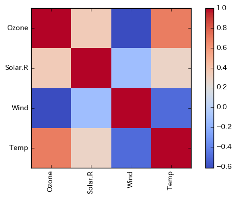
相関行列
df1.iloc[:, 0:4].corr()
| Ozone | Solar.R | Wind | Temp | |
|---|---|---|---|---|
| Ozone | 1.000000 | 0.348342 | -0.612497 | 0.698541 |
| Solar.R | 0.348342 | 1.000000 | -0.127183 | 0.294088 |
| Wind | -0.612497 | -0.127183 | 1.000000 | -0.497190 |
| Temp | 0.698541 | 0.294088 | -0.497190 | 1.000000 |
import numpy as np
corrcoef = df1.iloc[:, 0:4].corr()
plt.imshow(corrcoef, interpolation='nearest', cmap=plt.cm.coolwarm)
plt.colorbar()
tick_marks = np.arange(len(corrcoef))
plt.xticks(tick_marks, corrcoef.index, rotation=90)
plt.yticks(tick_marks, corrcoef.index)
plt.tight_layout()
課題
以下の問いに答えなさい。必要に応じて、下記のリンク先を参考にすること。
- Pandas を用いた演算
- タブ区切りデータ、コンマ区切りデータ等の読み込み
- 実習用データ
「ニューヨークの大気状態観測値」について
- 6月のデータだけ抜き出しなさい。
- 各測定値の平均と分散を計算しなさい。また、月ごとにどう変化しているか調べなさい。
- 相関の高い測定値はあるか調べなさい。
「好きなアイスクリームアンケート」について
- 各フレーバー(バニラ味〜あずき味)の嗜好度に対してボックスプロットを描きなさい。
- 横軸に年齢(age)、縦軸に来店頻度(frequency)で散布図を描き、客層を分析しなさい。また、性別による違いはあるか考察しなさい。
- 各フレーバー(バニラ味〜あずき味)の嗜好度に関して、高い正の相関のあるフレーバー、負の相関のあるフレーバーを見つけなさい。
「あわびのデータ」について
- 雄に対し、長さ〜殻の重さまでの属性に関するボックスプロットとバイオリンプロットを作成しなさい。
- 同様に雌に対してもボックスプロットとバイオリンプロットを作成しなさい。
- 雄雌の違いについて考察しなさい。