
AI画像生成の「AIっぽさ」を消すための画風プロンプト集(38スタイル+テンプレート)
ChatGPT(GPT Image)で資料やWebサイト用のイラストを作っていると、毎回同じところで引っかかります。
線が均一すぎる、グラデーションが滑らかすぎる、顔が整いすぎている、背景に意味のない小物が増える。要するに、AIが生成した画像だと一目で分かってしまうことがあります。
そこで、日本語の指示文の後ろに貼るだけで画風を固定できるプロンプトを38種類作り、すべて同じお題で生成して並べました。どれが効くのかは事前には分からなかったので、実際に総当たりで試しています。あわせて、「AIっぽさを弱める」ための追加ブロックと、そのまま使える完成形テンプレートもまとめました。
コピペ前提で構成しているので、気になった画風のコードブロックだけ持っていってもらえれば十分です。
基本の使い方
やったことは2ステップだけです。
- 描きたい内容を日本語で書く
- その後ろに、この記事から選んだプロンプトを貼る
統一するために細かい指示は与えず、「日本の少女を描いて」 と繰り返しました。
この後ろにSTYLEプロンプトを続けます。以下の生成例はすべて同じお題で作っているので、画風の違いだけを見比べられるようにしています。
STYLEプロンプトを英語にしているのは、画風を表す語彙(linework、halftone、registration など)は英語のほうが素直に効くことが多いからです。内容は日本語、画風は英語という組み合わせが、今のところ一番安定しています。
手描き・アナログ画材系
01. 自然な手描きイラスト
STYLE:
natural hand-drawn illustration, imperfect organic linework, subtle variations in line thickness, slightly uneven contours, loose human-made strokes, simplified shapes, restrained details, soft matte colors, subtle paper texture, minimal digital polish, gentle imperfections, natural spacing, understated composition, handcrafted visual character
 ![style-02-loose-hand-drawn.png]
AI画像特有の「均一すぎる線」を避けたいときの基準として使いやすいです。
02. ラフな手描き
STYLE:
loose hand-drawn illustration, casual sketch-like lines, spontaneous strokes, imperfect proportions, slightly irregular shapes, visible construction-like marks, simple coloring, relaxed composition, human drawing imperfections, understated details, natural visual rhythm
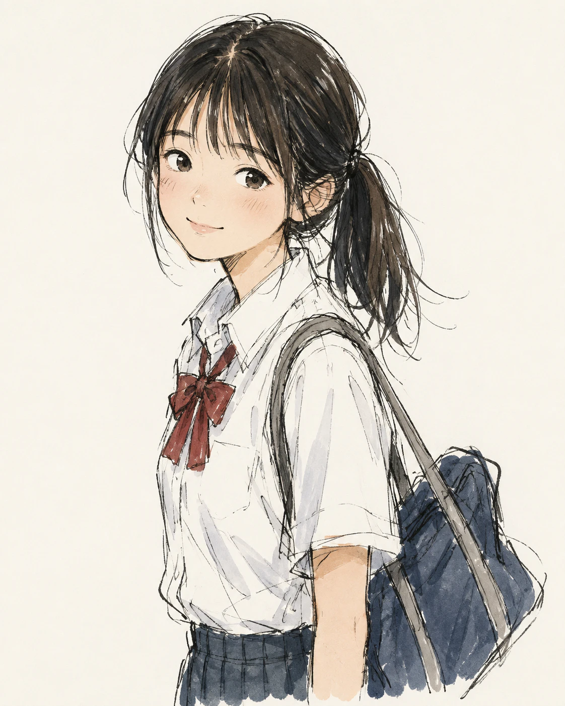
01よりさらに崩した画風になります。きれいすぎない絵や、少し勢いのある絵が欲しいときに向いています。
03. 鉛筆イラスト
STYLE:
traditional pencil illustration, visible graphite strokes, soft pencil shading, varied pencil pressure, slightly rough linework, subtle smudging, natural paper grain, imperfect hand-drawn edges, restrained contrast, authentic sketchbook quality

モノクロで落ち着かせたいときに使いやすいです。擦れやかすれが入るので、資料の挿絵として入れても浮きにくくなります。
04. 色鉛筆
STYLE:
colored pencil illustration on textured paper, visible pencil strokes, layered pigment, uneven hand pressure, slightly imperfect coloring, subtle white paper showing through, soft edges, muted natural colors, handmade children's book quality

塗り残しの白が出るのがポイントです。デジタルで均一に塗った感じが薄くなり、少し温度感のある絵になります。
05. クレヨン
STYLE:
hand-drawn crayon illustration, visible wax texture, uneven coloring, rough organic edges, overlapping crayon strokes, playful simplified shapes, warm limited color palette, imperfect childlike marks, tactile paper surface

子ども向けの掲示物やおたよりなど、親しみやすさを出したい用途に向いています。
06. 水彩
STYLE:
traditional watercolor illustration, translucent washes, gentle pigment bleeding, uneven watercolor edges, subtle paper texture, soft overlapping colors, restrained highlights, loose brushwork, organic color variations, handmade editorial illustration

にじみと紙の質感が入るぶん、AI特有のツルッとした感じが素直に薄くなります。
指定してないのに春はあけぼのを唱え始めました。
07. 水彩+ペン
STYLE:
hand-drawn ink and watercolor illustration, loose irregular ink outlines, varied line weight, transparent watercolor washes, subtle pigment bleeding, textured watercolor paper, slightly imperfect registration between line and color, understated handmade finish

線と色がわずかにズレる指定を入れているので、かなり「人間が描いた本の挿絵」に寄ります。この記事の中でも、効果が分かりやすい画風のひとつです。
08. 絵本
STYLE:
warm children's book illustration, hand-drawn organic shapes, slightly imperfect outlines, simple expressive characters, soft textured colors, subtle paper grain, gentle visual storytelling, restrained detail, charming handmade quality, traditional picture-book feeling

海外の絵本寄りの雰囲気になります。キャラクターの表情もシンプルにまとまりやすいです。
09. 日本の児童書挿絵風
STYLE:
gentle Japanese children's book illustration, clean but slightly irregular hand-drawn lines, soft restrained colors, simplified facial features, friendly proportions, minimal shading, quiet composition, subtle paper-like texture, warm everyday atmosphere

08より線が整っていて、色数も控えめです。日本の児童書で見慣れたトーンに寄せたいときに使いやすいです。
フラット・エディトリアル系
10. シンプルなフラットデザイン
STYLE:
clean flat illustration, simple geometric shapes, limited color palette, minimal shading, clear silhouettes, balanced negative space, restrained visual details, subtle asymmetry, friendly editorial design, simple vector-like forms without excessive polish
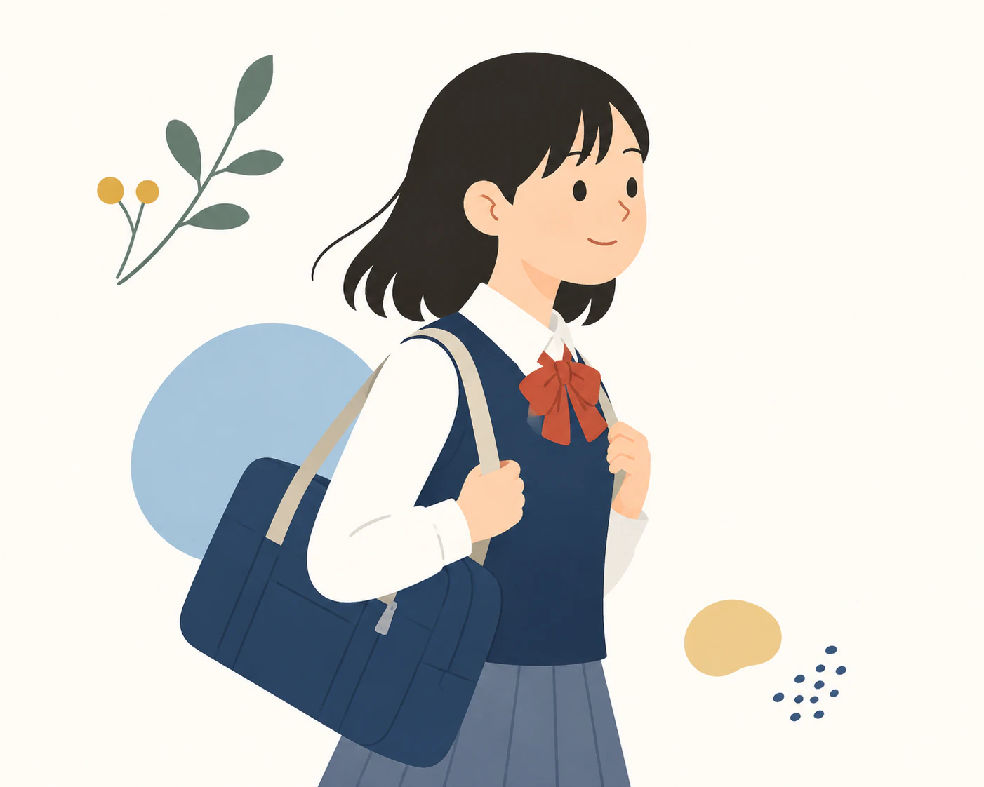
いわゆる普通のフラットイラストです。ただし、この指定だけだとツルツルしたAIっぽい絵になりやすいので、次の11もあわせて試すのがおすすめです。
11. AI感の弱いフラットデザイン
flat illustration だけだとAI特有のなめらかなベクター絵になりがちなので、あえて少し崩す指定を入れています。
STYLE:
human-designed flat illustration, simple geometric forms with subtle irregularities, slightly imperfect curves, restrained color palette, minimal shading, intentional asymmetry, varied proportions, natural spacing, subtle print-like texture, editorial graphic design, avoid overly polished vector aesthetics

intentional asymmetry(意図的な非対称)と subtle print-like texture(かすかな印刷質感)の2つが効いています。10と並べてみると、かなり差が分かりやすいです。
12. ミニマルフラット
STYLE:
minimal editorial flat illustration, very simple shapes, limited three-to-five-color palette, large areas of negative space, minimal facial details, clean silhouettes, restrained composition, subtle handmade irregularities, quiet contemporary graphic design

色数と余白を数字で縛るタイプです。情報量が増えすぎにくいので、スライドの見出しページなどにも向いています。
13. 雑誌の挿絵
STYLE:
contemporary editorial illustration, conceptual simplified forms, expressive proportions, limited sophisticated color palette, bold negative space, subtle texture, slightly imperfect geometric shapes, intelligent visual simplicity, modern magazine illustration
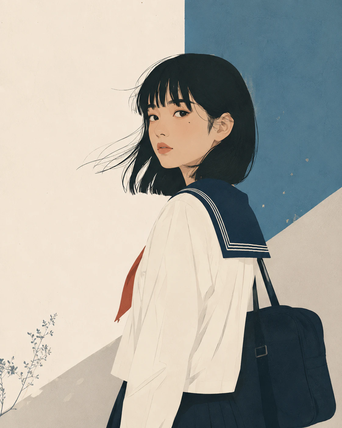
やや大人向けの画風です。抽象度が少し上がるので、概念的な話や説明の挿絵に使いやすいです。
14. Webサービス向けイラスト
STYLE:
modern web editorial illustration, friendly simplified characters, clean geometric shapes, restrained palette, minimal shading, subtle organic imperfections, approachable proportions, clear visual hierarchy, generous negative space, professional but not overly polished
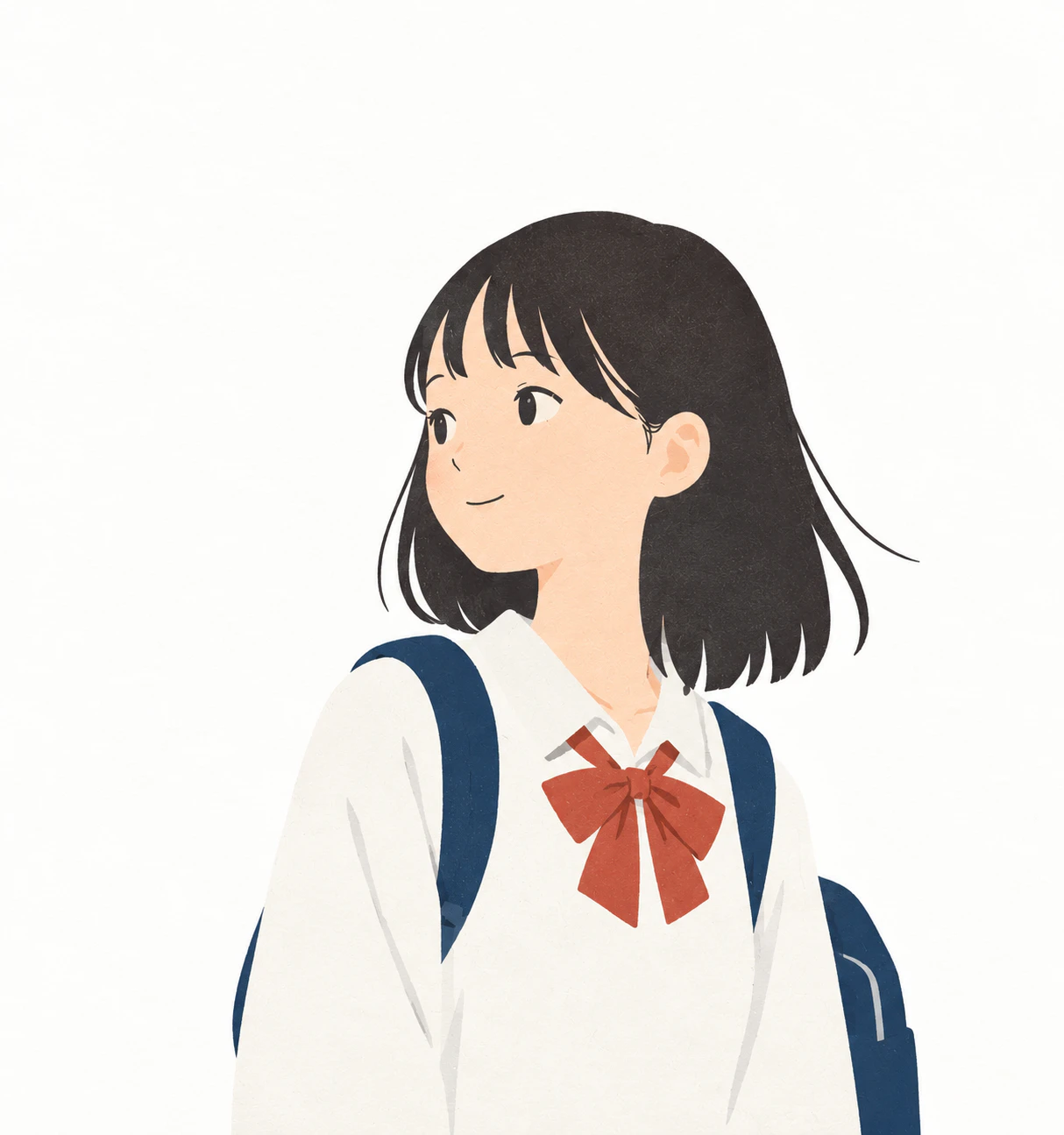
LPやサービス紹介ページ向けです。「きちんとしているけれど、作り込みすぎていない」くらいのバランスを狙っています。
15. スタートアップ系Webイラスト
STYLE:
modern product illustration, simplified human characters, abstract geometric forms, restrained contemporary palette, minimal gradients, clean composition, subtle organic line variation, friendly professional appearance, editorial rather than stock-art aesthetics

最後の editorial rather than stock-art aesthetics で、よくあるフリー素材っぽい見た目を避けています。
ポップ・キャラクター系
16. ポップな手描き
STYLE:
playful hand-drawn graphic illustration, bold irregular outlines, simplified chunky shapes, bright limited colors, intentionally imperfect proportions, energetic handmade strokes, subtle screen-print texture, casual contemporary visual language

線が太めで、かなり元気な印象になります。イベント告知やバナーなど、少し目立たせたい用途に向いています。
AI絵を見すぎて何がAIっぽくないかわからなくなってきました。
17. ゆるいイラスト
STYLE:
loose friendly doodle illustration, simple rounded characters, uneven hand-drawn outlines, minimal facial features, slightly awkward charming proportions, flat muted colors, lots of empty space, casual human-made feeling
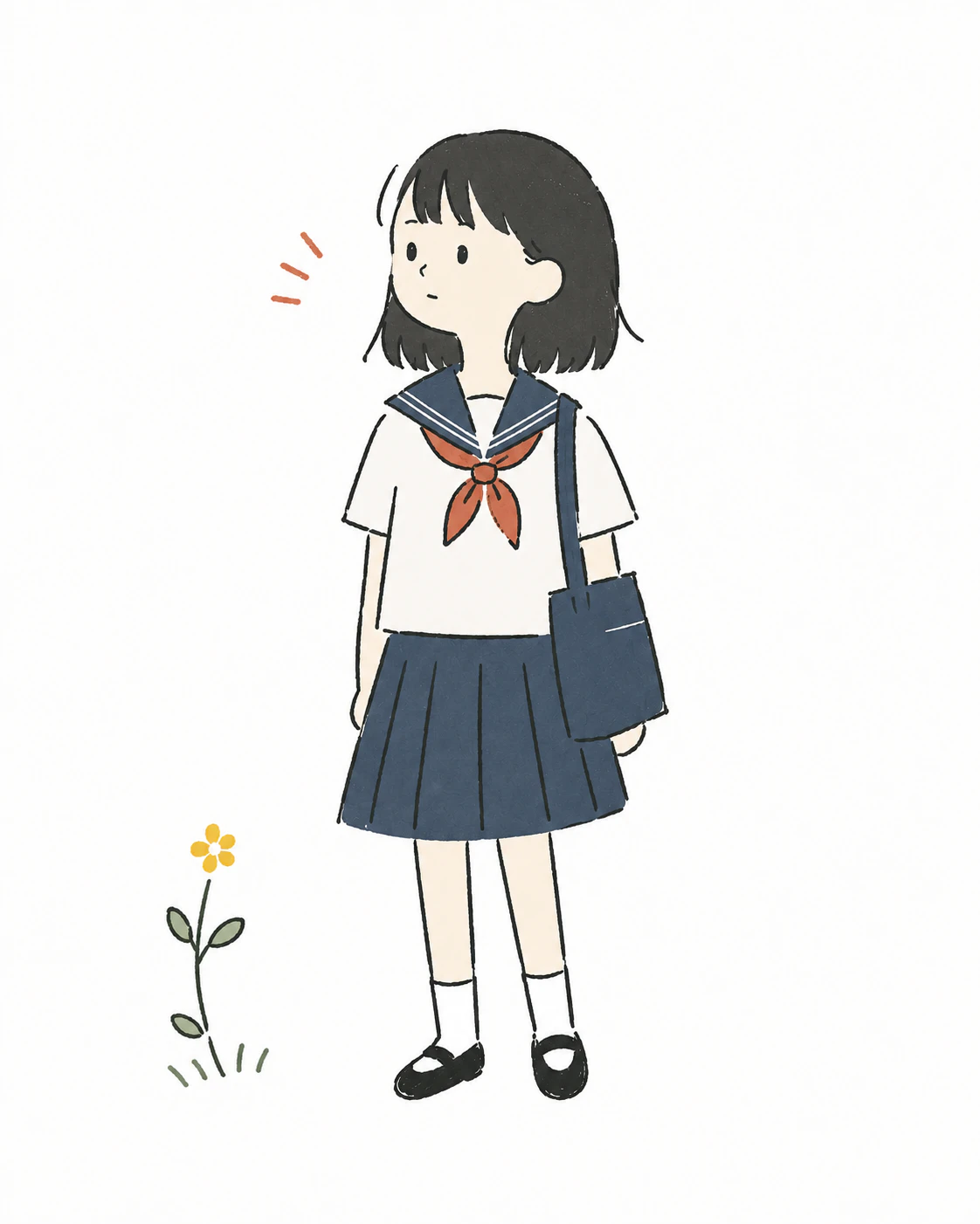
slightly awkward charming proportions(少し不器用で愛嬌のあるバランス)が、この画風の核になっています。
18. 落書き・ドゥードル
STYLE:
casual doodle illustration, spontaneous pen strokes, uneven line weight, quirky simplified shapes, sparse details, playful visual symbols, imperfect spacing, monochrome or limited colors, authentic notebook drawing quality

ノートの端に描いた落書きのような雰囲気です。図解の添え物として置くと、全体の印象を少し軽くできます。
19. 太線キャラクター
STYLE:
bold hand-drawn character illustration, thick irregular outlines, rounded simplified shapes, minimal facial features, solid flat colors, playful proportions, subtle line wobble, strong readable silhouette, screen-printed handmade character design

小さく縮小しても崩れにくいので、アイコンやステッカーなどにも向いています。
印刷・版画系
このカテゴリは、AIっぽさを消す用途では特に効きます。インクのズレ、かすれ、紙の目といった「物理的な不完全さ」が、そのまま画面に出るからです。
20. レトロ印刷
STYLE:
vintage printed illustration, limited ink palette, imperfect print registration, subtle halftone texture, slightly faded colors, rough paper grain, simple graphic shapes, uneven ink coverage, mid-century editorial character

網点と色褪せが入るので、古い印刷物のような質感になります。
21. シルクスクリーン
STYLE:
screen-print illustration, limited spot colors, slightly imperfect ink registration, bold simplified forms, textured ink coverage, rough paper surface, strong graphic silhouettes, handmade printmaking character

面で見せる画風です。色数が絞られるぶん、シンプルですが強い絵になります。
22. リソグラフ
STYLE:
risograph-style illustration, limited ink colors, visible grain, imperfect color registration, slightly uneven ink density, bold simple shapes, textured paper, playful graphic composition, authentic small-press print character

手は消えていますが、AI感は薄いかと。
23. 版画
STYLE:
hand-carved printmaking illustration, rough carved lines, irregular ink edges, simplified bold shapes, visible print texture, uneven ink coverage, limited colors, handmade relief-print character

彫り跡が出るので、線が自然にガタガタになります。この不均一さを出すのが狙いです。
24. 木版画
STYLE:
traditional woodblock-inspired illustration, carved organic outlines, flattened perspective, limited natural colors, visible paper and ink texture, simplified forms, restrained shading, subtle printing imperfections

flattened perspective(平面的な遠近)を入れることで、奥行きを意図的に潰しています。
構図被りが出てきましたね、リセットするよう指示しているはずなんですが、うまく行かないまま生成を続けてしまいました。
25. インク画
STYLE:
expressive ink illustration, varied brush pressure, broken irregular lines, occasional dry-brush texture, organic silhouettes, restrained detail, strong negative space, handmade paper texture, spontaneous human brushwork
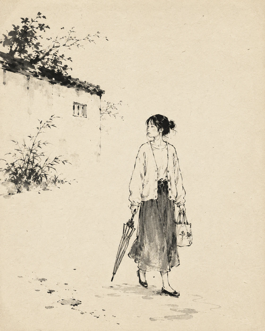
筆の入り抜きやかすれが出ます。余白を活かした絵にしたいときに向いています。
構図が被っていたので完全リセットしています。
26. マーカー
STYLE:
hand-rendered marker illustration, visible marker strokes, overlapping translucent areas, slightly uneven fills, bold simplified shapes, loose outlines, sketchbook presentation style, natural paper texture

重なった部分が濃くなるのが、マーカーらしさです。ラフな提案書やスケッチのような雰囲気になります。
27. パステル
STYLE:
soft pastel illustration, visible chalk texture, powdery blended colors, irregular edges, textured paper, gentle color transitions, loose hand-drawn shapes, restrained fine detail, tactile handmade quality
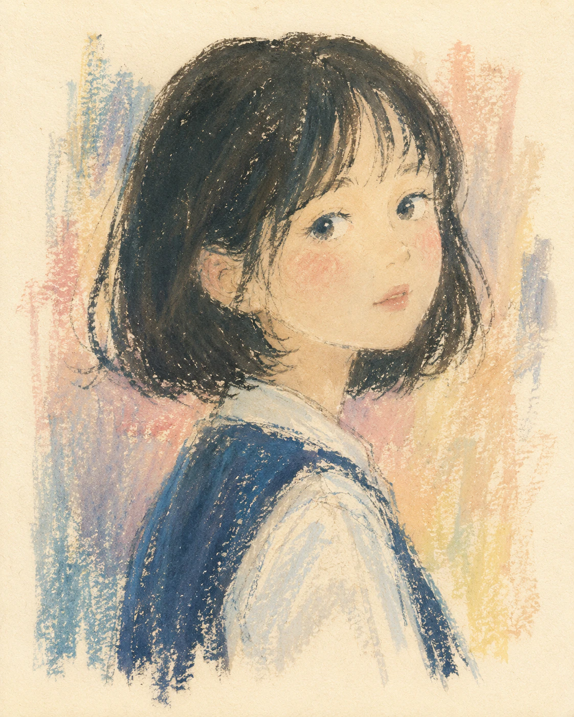
粉っぽい質感が入るので、輪郭がやわらかくなります。
28. 切り絵
STYLE:
hand-cut paper collage illustration, simple layered paper shapes, slightly irregular cut edges, subtle paper fibers, flat colors, minimal shading, handmade composition, tactile craft aesthetic

紙を切って重ねたような表現です。形がシンプルになるので、画面に情報を盛りすぎにくくなります。
29. 紙コラージュ
STYLE:
mixed paper collage illustration, torn and hand-cut paper edges, layered colored paper textures, subtle shadows between layers, imperfect handmade shapes, limited palette, playful editorial composition
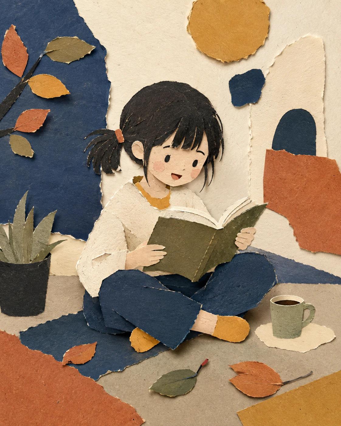
28に「ちぎった縁」と「層の影」を足したものです。より工作らしい見た目になります。
漫画・ゲーム系
30. 漫画
STYLE:
hand-drawn manga illustration, expressive black ink linework, varied pen pressure, screentone shading, simplified background details, energetic natural strokes, subtle imperfections in linework, authentic printed comic texture

トーン貼りまで含めた漫画絵です。ペン圧の変化を明示しているのがポイントです。
31. 漫画・ゆるめ
STYLE:
simple hand-drawn manga illustration, loose black ink outlines, minimal screentone, expressive simplified faces, slightly exaggerated poses, sparse background, casual serialized-comic drawing quality

30より線が少なく、背景も少し省略気味です。4コマや説明漫画のような軽い用途に向いています。
32. インディーゲーム風2D
STYLE:
independent 2D game illustration, stylized simplified characters, hand-drawn outlines, limited atmospheric palette, subtle texture, distinctive imperfect shapes, restrained detail, handcrafted visual identity

色に統一感が出やすいので、複数枚並べても世界観を揃えやすいです。
実務・教材系
33. アイコン・ピクトグラム寄り
STYLE:
simple pictographic illustration, bold readable silhouettes, minimal geometric forms, very limited colors, no unnecessary detail, clear spacing, subtle handmade irregularity, functional editorial icon design

説明図の要素として使いやすい画風です。余計な装飾が入りにくく、情報を整理しやすいです。
34. 教材向け
STYLE:
clear educational illustration, friendly simplified characters, easy-to-read shapes, restrained colors, minimal visual clutter, clear action and body language, subtle hand-drawn quality, accessible textbook illustration
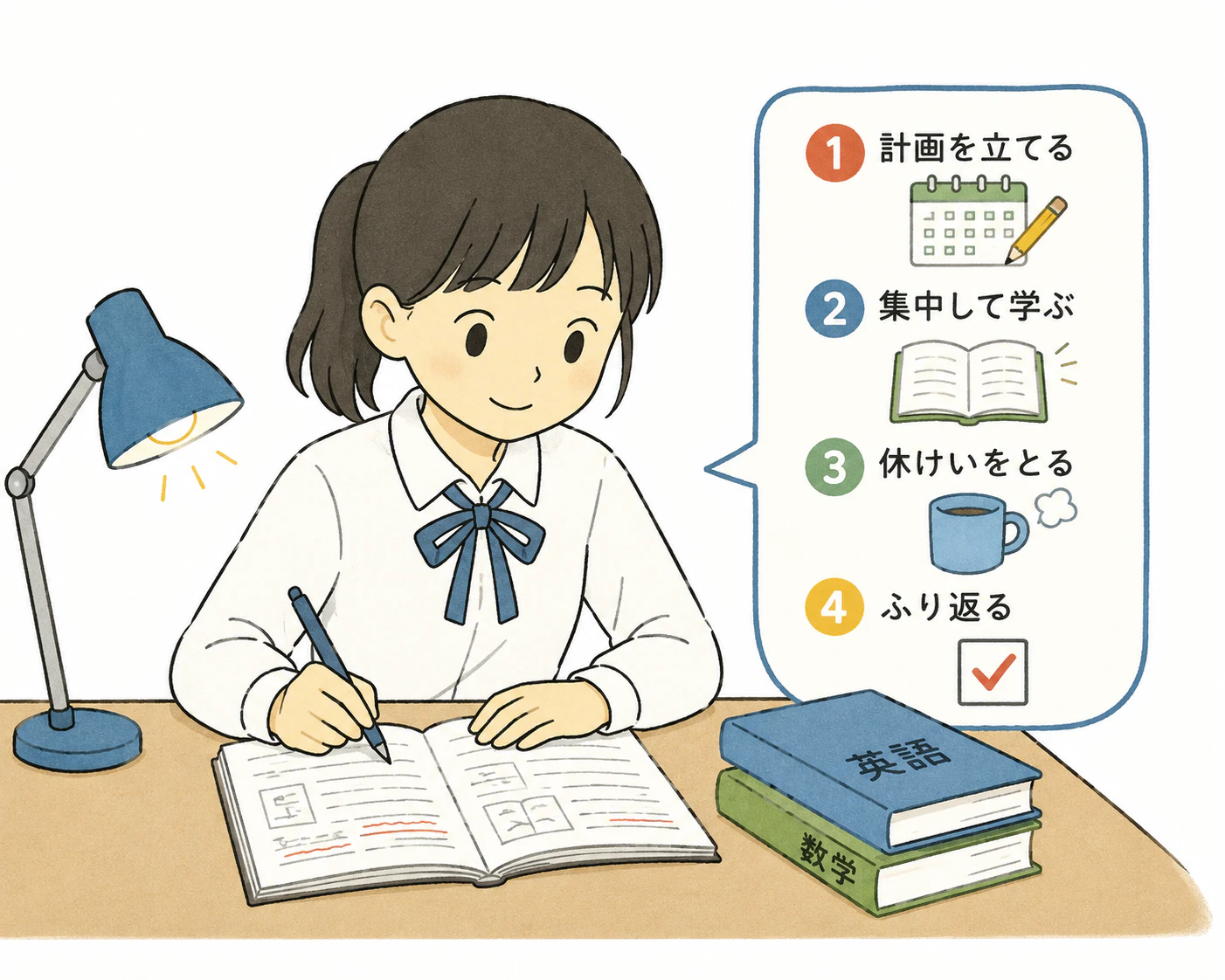
「何をしている場面か」が伝わることを優先した指定です。プリントや配布資料など、分かりやすさを優先したい場面に向いています。
35. 教科書挿絵
STYLE:
Japanese textbook-style educational illustration, clean simplified figures, restrained realistic proportions, clear gestures, minimal shading, soft neutral colors, uncluttered background, practical instructional composition

34よりも頭身が現実寄りです。日本の教科書で見慣れたトーンに近づきます。
36. 一筆書き風
STYLE:
continuous-line drawing, loose flowing ink stroke, spontaneous hand movement, irregular curves, minimal details, expressive simplified forms, abundant negative space, authentic pen-on-paper quality

線1本で見せる画風です。情報を伝えるというより、装飾的な用途に向いています。
37. ボールペン
STYLE:
ballpoint pen illustration, visible pressure variation, thin scratchy lines, repeated sketch strokes, subtle cross-hatching, imperfect contours, plain paper texture, casual notebook drawing aesthetic

重ね描きの線が残るので、手帳に描いたスケッチのような質感になります。
38. ファッションイラスト
STYLE:
hand-drawn fashion illustration, elongated expressive figures, loose confident linework, selective watercolor or marker washes, unfinished edges, large negative space, elegant spontaneous drawing quality

頭身が高く、塗りを部分的に省くのが特徴です。
AI絵を見すぎて、なにがAIっぽくないかわからなくなる現象に陥りました。
見てこれで行くかと決めるのは結局人間なんだと。
そういうことだと思いました。
「AIっぽさ」を削るための追加ブロック
ここまでのSTYLEの後ろに足して使う追加パーツです。目的別に分けているので、気になる症状に対応するものだけ貼れば十分です。
手作り感を残す
好きなSTYLEの最後に追加します。かなり汎用的に効くので、まずこれだけ覚えておいてもいいと思います。
HUMAN-MADE CHARACTER:
preserve natural imperfections, subtle asymmetry, irregular line pressure, varied spacing, slightly imperfect curves, restrained detail, natural shape variation, handmade texture, understated visual decisions, avoid excessive visual perfection
ツルツルしたAIイラストを避ける
なめらかすぎるベクター曲線、光沢、プラスチックのような表面を、名指しで禁止します。
Avoid overly smooth vector curves, glossy gradients, excessive rim lighting, plastic-looking surfaces, hyper-clean outlines, perfectly symmetrical faces, excessive tiny details, generic stock-illustration aesthetics, overly polished digital rendering.
情報を盛りすぎるのを避ける
AI画像は放っておくと、画面に物が増えていきます。余白を明示的に要求するのがかなり効きます。
Keep the composition simple and intentional. Use only necessary objects. Leave generous negative space. Avoid decorative clutter, unnecessary background objects, excessive accessories, random visual symbols, and over-detailed environments.
人物を自然にする
不自然な笑顔と、マネキンのようなポーズを禁止します。
Characters should have natural relaxed poses, subtle asymmetry, believable body language, simple expressive gestures, understated facial expressions, and slightly varied proportions. Avoid mannequin-like posing and exaggerated artificial smiles.
子どもの絵を自然にする
子どもを描かせると頭身や表情が過剰になりやすいので、子ども用の指定を別途入れます。
Children should have age-appropriate proportions, simple natural expressions, casual body language, slightly imperfect clothing folds, ordinary hairstyles, and believable everyday poses. Keep facial details simple.
背景をAIっぽくしない
同じ物が不自然に繰り返されたり、よく見ると成立していない建築になったりするのを防ぎます。
Use a simple believable background with only a few meaningful objects. Avoid repetitive objects, impossible architecture, decorative clutter, excessive depth, and random background details.
色をAIっぽくしない
彩度が上がりすぎて、全体が虹色のようになるのを抑えます。
Use a restrained limited color palette, slightly muted colors, natural color relationships, subtle variations within flat areas, and avoid overly saturated rainbow-like color combinations.
そのまま使える完成形テンプレート
ここからは、上のSTYLEと追加ブロックを組み合わせて、1つのプロンプトにまとめたものです。用途が決まっているなら、こちらをそのままコピーするほうが早いです。
汎用テンプレート
迷ったらこれです。保存しておけば、かなり幅広い場面で使えます。
[ここに日本語で描いてほしい内容を書く]

VISUAL STYLE:
hand-drawn editorial illustration, organic irregular linework, subtle variations in line thickness, simplified shapes, slightly imperfect proportions, restrained details, soft matte colors, limited harmonious color palette, subtle paper and print texture, intentional asymmetry, natural spacing, generous negative space.

HUMAN-MADE CHARACTER:
preserve small drawing imperfections, uneven line pressure, slightly irregular curves, subtle shape variations, natural visual rhythm, understated design decisions, handmade texture.

COMPOSITION:
simple clear composition, one obvious visual focus, only necessary objects, believable spatial relationships, uncluttered background.

AVOID:
overly smooth vector curves, glossy gradients, plastic-looking surfaces, excessive rim lighting, hyper-detailed rendering, perfectly symmetrical faces, generic stock illustration aesthetics, excessive decorative elements, unnecessary background objects, artificial posing, overly polished digital appearance.

VISUAL STYLE / HUMAN-MADE CHARACTER / COMPOSITION / AVOID の4ブロック構成にしています。差し替えるときは、ブロック単位で入れ替えると崩れにくいです。
手描き絵本向け
[ここに日本語で描いてほしい内容を書く]

Create the image as a warm hand-drawn children's book illustration.

Use loose organic outlines with subtle variations in thickness and pressure. Shapes should feel slightly irregular and naturally hand-drawn rather than geometrically perfect. Use simplified expressive characters, soft matte colors, a restrained harmonious palette, subtle paper grain, and occasional visible drawing or coloring texture.

Keep the composition calm and uncluttered, with generous empty space and only a few meaningful background elements. Facial expressions should be simple and natural.

Preserve subtle asymmetry, irregular curves, slight differences between repeated objects, and human drawing imperfections.

Avoid glossy digital rendering, smooth vector-like curves, strong gradients, excessive lighting effects, excessive details, perfectly symmetrical faces, generic stock illustration aesthetics, plastic-looking surfaces, and overly polished AI-generated appearance.

こちらは箇条書きではなく、散文で書いています。長文で渡したほうが素直に効く場面もあるので、両方の書き方を残しています。
フラットデザイン向け
[ここに日本語で描いてほしい内容を書く]

Create a human-designed editorial flat illustration.

Use simple geometric shapes with subtle organic irregularities, slightly imperfect curves, simplified human figures, a restrained four-to-six-color palette, minimal shading, clear silhouettes, intentional asymmetry, and generous negative space.

Keep the forms simple and graphic. Introduce subtle variations in proportions and spacing so repeated elements do not appear mechanically identical. Add a very subtle print-like texture.

Avoid glossy gradients, 3D effects, excessive shadows, perfectly smooth vector geometry, excessive decorative elements, generic corporate stock illustration aesthetics, and overly polished AI-generated appearance.

「繰り返し要素が機械的に同一に見えないように」という一文を入れているのがポイントです。フラット系のAIっぽさは、だいたいこのあたりから出てきます。
ゆるい手描き向け
[ここに日本語で描いてほしい内容を書く]

Create a loose casual hand-drawn illustration.

Use simple rounded shapes, slightly wobbly outlines, uneven line thickness, minimal facial details, relaxed proportions, flat muted colors, and plenty of empty space. The drawing should feel spontaneous and charmingly imperfect, similar to an illustrator quickly drawing with a pen in a sketchbook.

Allow minor asymmetry, irregular curves, inconsistent spacing, and subtle differences between similar shapes.

Avoid perfect geometry, smooth vector lines, realistic rendering, glossy surfaces, complex lighting, excessive details, and overly polished digital aesthetics.
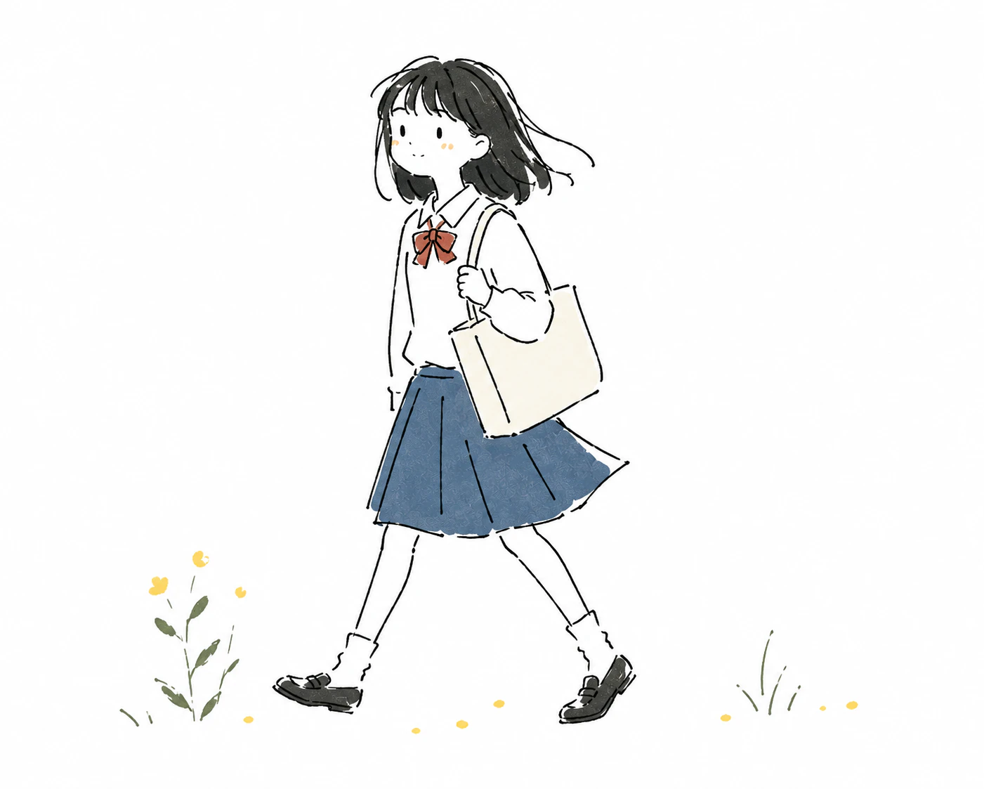
「スケッチブックにペンでさっと描いた感じ」という比喩を1文入れておくと、狙いが伝わりやすくなります。
リソグラフ向け
[ここに日本語で描いてほしい内容を書く]

Create a handmade risograph-style editorial illustration.

Use bold simplified shapes, a limited two-to-four ink color palette, visible paper grain, subtle ink noise, imperfect color registration, slightly uneven ink density, irregular handmade edges, and simplified expressive characters.

Use large graphic areas and generous negative space. Keep details deliberately sparse.

Avoid smooth gradients, photographic realism, glossy surfaces, precise vector geometry, excessive fine detail, perfect color alignment, and polished digital rendering.

インクを2〜4色に絞る指定がかなり効きます。AI感を消すのが目的なら、まずこれを試すのがいいと思います。
水彩絵本向け
[ここに日本語で描いてほしい内容を書く]

Create a traditional watercolor children's book illustration.

Use loose pencil or ink outlines combined with transparent watercolor washes. Allow subtle pigment bleeding, uneven painted edges, visible watercolor paper grain, slight variations in color density, and areas where the white paper remains visible.

Keep characters simplified and expressive. Use a gentle restrained palette and a quiet uncluttered composition.

Avoid digital airbrushing, perfectly smooth gradients, glossy highlights, sharp vector edges, excessive realism, hyper-detailed rendering, and overly polished AI-generated appearance.

「白い紙が残る部分をつくる」という指定が、水彩らしさをかなり決めています。
まとめ
38スタイルを並べてみて、AIっぽさを消すのに効いたのは次の4点でした。
-
不完全さを名指しで要求する —
slightly irregular、uneven line pressure、intentional asymmetryなどを使い、「きれいに描いて」の逆を明示します。 - 物理的な質感を借りる — 紙の目、インクのズレ、網点などを入れます。リソグラフや版画系が強いのは、これが理由です。
-
余白と色数を数字で縛る —
limited three-to-five-color palette、generous negative spaceなどで制限します。放っておくと物と色は増えます。 -
禁止事項を書く —
AVOIDブロックで、光沢グラデーションや左右対称の顔などを先に潰しておきます。
逆に、hand-drawn や illustration といった語だけでは足りませんでした。この2語だけだと、AIにとっての「よくあるイラスト」の平均値に寄りやすいので、どう崩すかまで具体的に書かないと、結局ツルツルした絵に戻ってきます。
そのまま貼れる形にしてあるので、気に入った画風を1つ選んで、日本語の指示の後ろに足すところから試してみてください。