Flutterレイアウトシリーズのその他の記事
- Stackの使い方
- FlutterレイアウトのOverlayの使用
- Flutterのレイアウトを理解する
- FlutterレイアウトのFlex、Row、Column、Wrap、Stackについて
- FlutterのBoxConstraintsを理解する
この記事はFlutterのレイアウトWidgetのExpanded、Flexible、Spacerの使い方を分かりやすく理解するため書いたものです。
※本記事は下記のZenn本にまとめました。
Flexibleウィジェット
Flutterのソースコードよると、FlexibleはRow,Column,Flexの子コンポネートとしてしか使えないことは分かります。Flexibleは柔軟に子コンポネートの充填することをコントロールできます。Flexibleの属性は2つのみです。int型のflex、列挙型のFlexFit。
class Flexible extends ParentDataWidget<FlexParentData> {
  /// Creates a widget that controls how a child of a [Row], [Column], or [Flex]
  /// flexes.
  const Flexible({
    Key? key,
    this.flex = 1,
    this.fit = FlexFit.loose,
    required Widget child,
  }) : super(key: key, child: child);
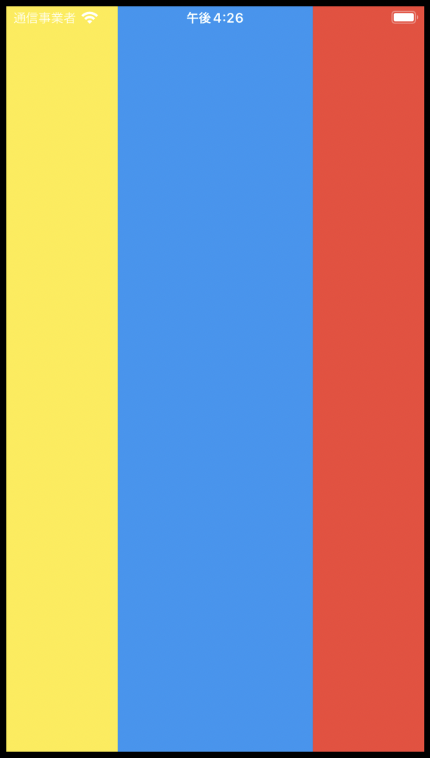
Flexibleのflex
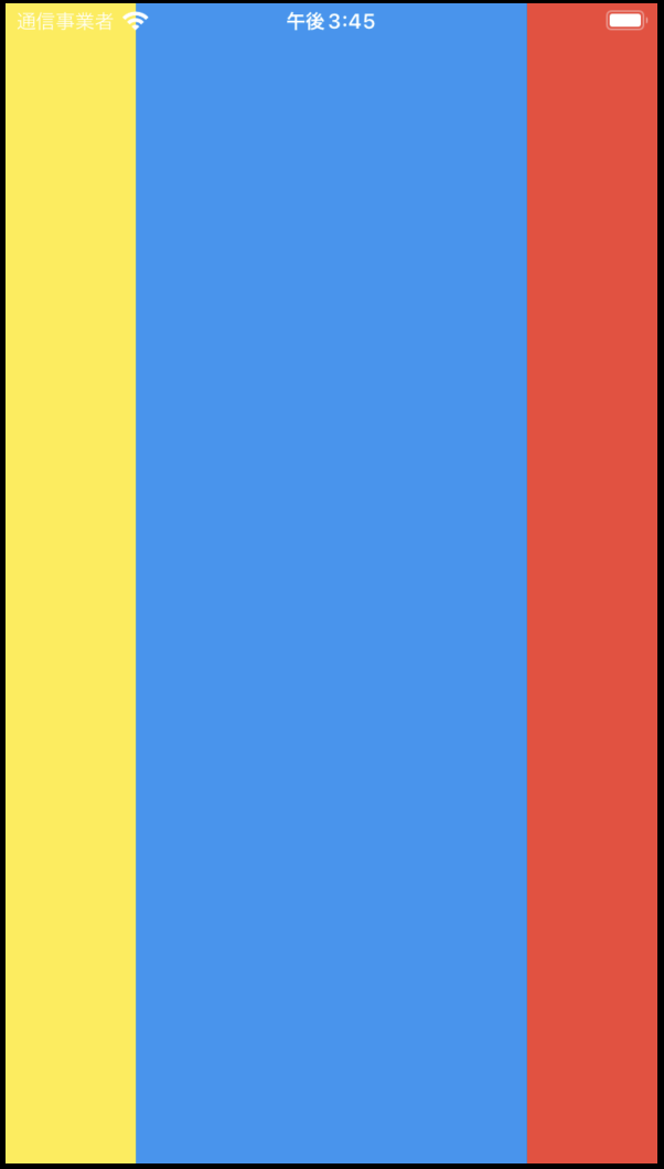
デフォルトは1,子コンポネート同士はflexの比率より、領域を配り分けます。下記の例を見れば、一目瞭然です。黄色、青色、赤色の比率は1:3:1です。
return Scaffold(
      body: Center(
        child: Row(
          children: [
            Flexible(
              flex: 1,
              child: Container(
                color: Colors.yellow,
              ),
            ),
            Flexible(
              flex: 3,
              child: Container(
                color: Colors.blue,
              ),
            ),
            Flexible(
              flex: 1,
              child: Container(
                color: Colors.red,
              ),
            )
          ],
        ),
      ),
    );
FlexibleのFlexFit
列挙型のFlexFit,デフォルトはFlexFit.loose
enum FlexFit {
  tight,
  loose,
}
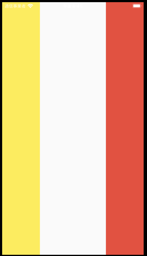
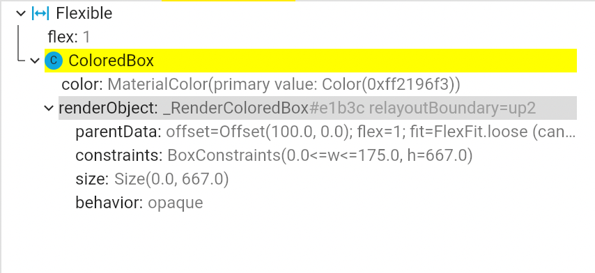
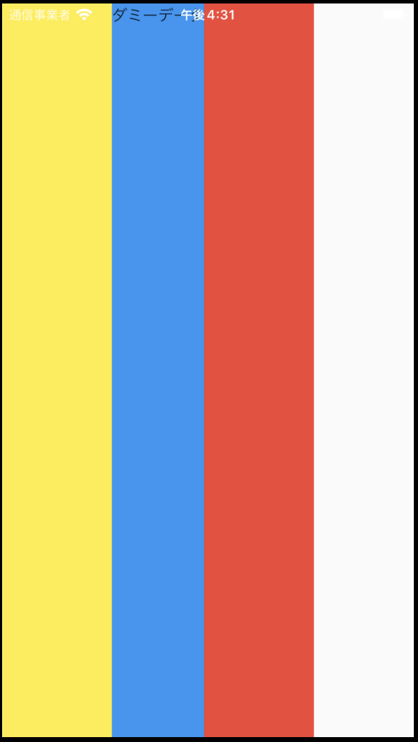
下記の例だと、ColoredBoxの幅の制約はFlexFit.looseになっているため、widthは0になっている。
Row(
        crossAxisAlignment: CrossAxisAlignment.stretch,
        children: const [
          SizedBox(
            width: 100,
            child: ColoredBox(
              color: Colors.yellow,
            ),
          ),
          Flexible(
            fit: FlexFit.loose,
            child: ColoredBox(
              color: Colors.blue,
            ),
          ),
          SizedBox(
            width: 100,
            child: ColoredBox(
              color: Colors.red,
            ),
          )
        ],
      ),
| FlexFit.loose | FlexFit.tight |
|---|---|
 |
 |
使い道としては、Flexibleは子ウィジェットの幅により、柔軟に変化できます。
return Scaffold(
      body: Row(
        crossAxisAlignment: CrossAxisAlignment.stretch,
        children: const [
          SizedBox(
            width: 100,
            child: ColoredBox(
              color: Colors.yellow,
            ),
          ),
          Flexible(
            child: ColoredBox(
              color: Colors.blue,
              child: Text("ダミーデータ"),
            ),
          ),
          SizedBox(
            width: 100,
            child: ColoredBox(
              color: Colors.red,
            ),
          )
        ],
      ),
    );
| 短い文章 | 長い文章 |
|---|---|
 |
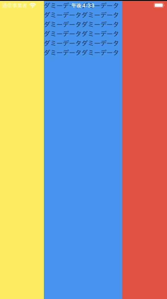 |
Expanded
ソースコードによると、ExpandedはFlexibleから継承するウィジェットです。すなわち、ExpandedはFlexFit.tight属性のFlexibleは同じものです。
コンストラクター
class Expanded extends Flexible {
  /// Creates a widget that expands a child of a [Row], [Column], or [Flex]
  /// so that the child fills the available space along the flex widget's
  /// main axis.
  const Expanded({
    Key? key,
    int flex = 1,
    required Widget child,
  }) : super(key: key, flex: flex, fit: FlexFit.tight, child: child);
Spacer
ソースコードによると、SpacerはExpandedを使って、空白の部品を実装したものです。実際に使うと、Spacerは空白を拡大したウィジェットです。
ソースコード
 @override
  Widget build(BuildContext context) {
    return Expanded(
      flex: flex,
      child: const SizedBox.shrink(),
    );
  }
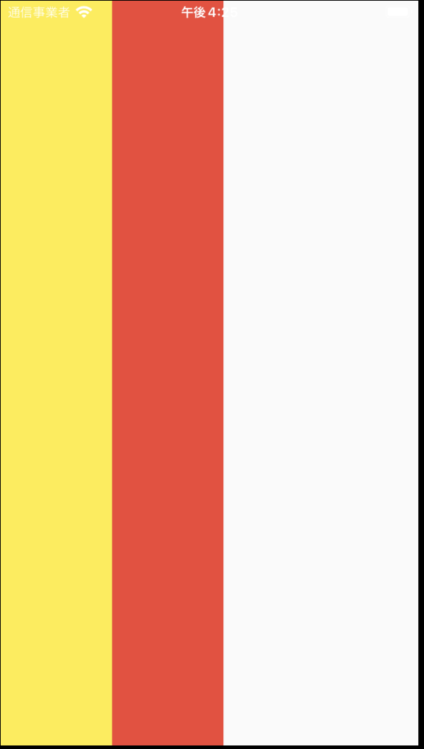
return Scaffold(
      body: Row(
        crossAxisAlignment: CrossAxisAlignment.stretch,
        children: const [
          SizedBox(
            width: 100,
            child: ColoredBox(
              color: Colors.yellow,
            ),
          ),
          Spacer(),
          SizedBox(
            width: 100,
            child: ColoredBox(
              color: Colors.red,
            ),
          )
        ],
      ),
    );