はじめに
Webサイトやサービスのトップページでよく見かける「タイピング風アニメーション」。
ユーザーの目を引くことができ、自己紹介やキャッチコピーなどにも使われています。
本記事では、HTMLとCSSだけで簡単に作る方法と、JavaScriptを組み合わせてより本格的に作る方法の2パターンを解説します。
CSSだけで作る方法
まずはJavaScriptを使わず、CSSのみでタイピングアニメーションを作成する方法を紹介します。
index.html
<div class="typewriter">
  <h1>Hello, World!</h1>
</div>
style.css
.typewriter h1 {
  display: inline-block;
  overflow: hidden;
  white-space: nowrap;
  border-right: .15em solid orange; /* カーソル風 */
  animation: typing 2s steps(26, end), blink-caret .7s step-end infinite;
}

/* タイピングアニメーション */
@keyframes typing {
  from { width: 0 }
  to { width: 13ch }
}

/* カーソル点滅 */
@keyframes blink-caret {
  0%, 100% { border-color: orange; }
  50% { border-color: transparent; }
}
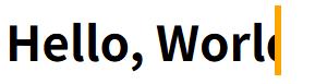
タイピング風になっていることがわかります。
ポイント
- steps(26, end)の26は13文字×2の数。テキスト内容によって調整してください
- CSSだけなので手軽に実装できますが、内容の動的な変更はできません
JavaScriptも組み合わせる方法
次は、テキストを動的に変更したい場合や複数文を表示したい場合に便利な、JavaScriptを組み合わせた方法です。
基本的な使い方
index.html
<div id="type-js"></div>
style.css
#type-js {
  font-size: 2em;
  border-right: .1em solid #333;
  white-space: nowrap;
  overflow: hidden;
  display: inline-block;
}
script.js
const text = "ありがとうございます!";
const target = document.getElementById("type-js");
let i = 0;

function typing() {
  if (i < text.length) {
    target.textContent += text.charAt(i);
    i++;
    setTimeout(typing, 120);
  }
}
typing();

タイピング風になっていることがわかります。
応用的な使い方
ここでは複数行の対応をしてみたいと思います。
index.html
<div id="type-js1"></div>
<div id="type-js2"></div>
<div id="type-js3"></div>
style.css
#type-js1, #type-js2, #type-js3 {
  font-size: 2em;
  border-right: .1em solid #333;
  white-space: nowrap;
  overflow: hidden;
  display: inline-block;
}
script.js
const texts = ["おはようございます", "こんにちは", "こんばんは!"];
const target1 = document.getElementById("type-js1");
const target2 = document.getElementById("type-js2");
const target3 = document.getElementById("type-js3");
const targets = [target1, target2, target3]
let textIndex = 0;
let charIndex = 0;

function typeLoop() {
  if (charIndex < texts[textIndex].length) {
    targets[textIndex].textContent += texts[textIndex][charIndex++];
    setTimeout(typeLoop, 100);
  } else if (textIndex + 1 === texts.length) {
    return;
  } else {
    setTimeout(() => {
      targets[textIndex].style.display = "block";
      charIndex = 0;
      textIndex = (textIndex + 1) % texts.length;
      setTimeout(typeLoop, 500);
    }, 100);
  }
}

typeLoop();

複数行がタイピング風に表示されます。
Tips
- カーソルのカスタマイズ:CSSでborder-rightの色や太さを変えて印象を変えられます
- BEMや独自クラスで他要素と干渉しないように
- レスポンシブ対応:font-sizeやwidthをvw等で指定するとスマホでもきれいに表示されます
- アクセシビリティ:アニメーションが苦手なユーザー向けに、設定で無効化できるよう配慮するとベター
最後に
CSSだけでも簡単なタイピング風アニメーションは作れますが、JavaScriptを組み合わせることで表現の幅が広がります。
他にもライブラリ(Typed.jsなど)を活用することで、さらに多機能な演出も可能です。
ぜひ、あなたのWebサイトにもタイピング風アニメーションを取り入れてみてください!