シンプル版とゴリゴリ版の 2 グラフで徹底解説
React で「ちょっとおしゃれなグラフ」を作りたいときに候補に上がるのが Nivo です。
この記事では、Nivo の特徴を
- シンプル版(Simple Nivo)
- ゴリゴリ版(Nivo Advanced/Nivo ガチガチ設定)
という 2 つのグラフで説明します。
同じデータ・同じ ResponsiveLine でも、
- 「ライトで控えめなシンプル版」
- 「グラデーション+ダークテーマ+クロスヘアなど盛り盛りのゴリゴリ版」
を並べて見ることで、Nivo がどれくらいデザインに振ったライブラリかが分かりやすくなります。
📂 GitHub リポジトリ
この記事で紹介しているコードは、以下のリポジトリにまとめています。
- 🔗 GitHub: Kazuya-Sakashita/react-charts-comparison
構成例(Next.js + TypeScript)の一部:
src/data.tssrc/components/RechartsExample.tsxsrc/components/NivoExample.tsxsrc/components/ChartJsExample.tsxsrc/components/ApexExample.tsx
🖼 グラフのスクリーンショット
記事内でイメージしやすいように、実際に描画したグラフのスクリーンショットも貼っておきます。
Nivo とは?
Nivo は、React 向けのデータビジュアライゼーションライブラリです。
- デフォルトの見た目がきれいで「映える」
- ダークテーマ・グラデーション・アニメーションなどのデザイン要素が豊富
-
ResponsiveLine,ResponsiveBar,ResponsivePieなど用途別コンポーネントが用意されている - SVG / Canvas 両対応のコンポーネントもある
「グラフ」というより “ビジュアライズ” に強い、という印象のライブラリです。
インストール
この記事のサンプルでは @nivo/line を使用します。
npm install @nivo/line
共通データ(src/data.ts)
Recharts 編と同じく、実績値と目標値を持った月次データを使います。
// src/data.ts

export type ChartDatum = {
  month: string;
  actual: number; // 実績値
  target: number; // 目標値
};

export const chartData: ChartDatum[] = [
  { month: "Jan", actual: 120, target: 150 },
  { month: "Feb", actual: 210, target: 200 },
  { month: "Mar", actual: 160, target: 220 },
  { month: "Apr", actual: 280, target: 250 },
  { month: "May", actual: 300, target: 260 },
];
NivoExample コンポーネントの全体像
1 つのコンポーネント NivoExample の中で、
- 上段に「Simple Nivo(シンプル設定)」
- 下段に「Nivo Advanced(Nivo ガチガチ設定)」
の 2 つのグラフを縦に並べています。
コード全体は次のとおりです。
// src/components/NivoExample.tsx
import { ResponsiveLine } from "@nivo/line";
import { chartData } from "../data";
const lineData = [
{
id: "Actual",
color: "#3b82f6",
data: chartData.map((d) => ({ x: d.month, y: d.actual })),
},
{
id: "Target",
color: "#9ca3af",
data: chartData.map((d) => ({ x: d.month, y: d.target })),
},
];
export function NivoExample() {
return (
<div style={{ display: "grid", gap: 24 }}>
{/* シンプル版 */}
<section>
<h2
style={{
fontSize: 14,
fontWeight: 600,
marginBottom: 8,
color: "#4b5563",
}}
>
Simple Nivo(シンプル設定)
</h2>
<p
style={{
fontSize: 12,
color: "#6b7280",
marginBottom: 12,
}}
>
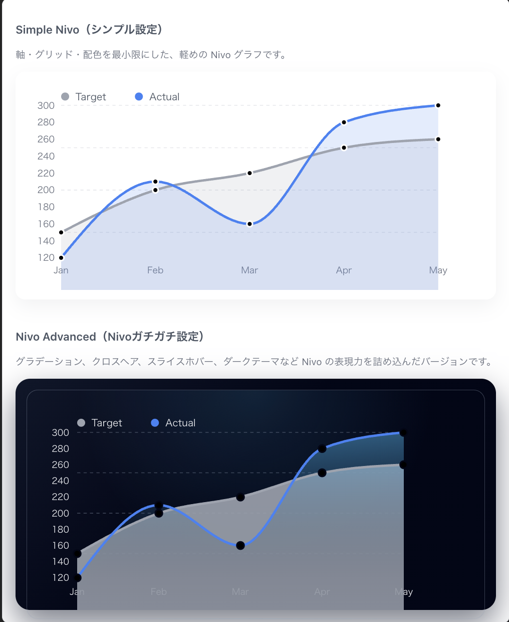
軸・グリッド・配色を最小限にした、軽めの Nivo グラフです。
</p>
<div style={{ height: 260, borderRadius: 12, background: "#ffffff", boxShadow: "0 8px 24px rgba(15,23,42,0.06)", padding: 12 }}>
<ResponsiveLine
data={lineData}
margin={{ top: 30, right: 60, bottom: 40, left: 45 }}
xScale={{ type: "point" }}
yScale={{ type: "linear", stacked: false, min: "auto", max: "auto" }}
curve="monotoneX"
enableArea
areaOpacity={0.15}
colors={{ datum: "color" }}
lineWidth={3}
pointSize={7}
pointColor={{ from: "color" }}
pointBorderWidth={2}
pointBorderColor="#ffffff"
enableGridX={false}
gridYValues={5}
useMesh
axisBottom={{
tickSize: 0,
tickPadding: 10,
}}
axisLeft={{
tickSize: 0,
tickPadding: 8,
}}
theme={{
background: "transparent",
axis: {
ticks: {
text: {
fontSize: 11,
fill: "#6b7280",
},
},
},
grid: {
line: {
stroke: "#e5e7eb",
strokeWidth: 1,
strokeDasharray: "4 4",
},
},
legends: {
text: {
fontSize: 12,
fill: "#4b5563",
},
},
tooltip: {
container: {
background: "#ffffff",
color: "#111827",
fontSize: 13,
borderRadius: 8,
border: "1px solid #e5e7eb",
boxShadow: "0 8px 24px rgba(15,23,42,0.12)",
},
},
}}
legends={[
{
anchor: "top-left",
direction: "row",
translateY: -20,
itemsSpacing: 12,
itemWidth: 80,
itemHeight: 18,
symbolSize: 10,
symbolShape: "circle",
},
]}
motionConfig="gentle"
/>
</div>
</section>
{/* Nivo ガチガチ版 */}
<section>
<h2
style={{
fontSize: 14,
fontWeight: 600,
marginBottom: 8,
color: "#4b5563",
}}
>
Nivo Advanced(Nivoガチガチ設定)
</h2>
<p
style={{
fontSize: 12,
color: "#6b7280",
marginBottom: 12,
}}
>
グラデーション、クロスヘア、スライスホバー、ダークテーマなど Nivo の表現力を詰め込んだバージョンです。
</p>
<div
style={{
height: 260,
padding: 14,
borderRadius: 18,
background:
"linear-gradient(135deg, #0f172a 0%, #020617 45%, #020617 100%)",
boxShadow: "0 18px 40px rgba(15,23,42,0.55)",
}}
>
<div
style={{
height: "100%",
borderRadius: 14,
padding: 12,
background:
"radial-gradient(circle at top, rgba(56,189,248,0.14), transparent 55%)",
border: "1px solid rgba(148,163,184,0.35)",
}}
>
<ResponsiveLine
data={lineData}
margin={{ top: 40, right: 90, bottom: 40, left: 50 }}
xScale={{ type: "point" }}
yScale={{
type: "linear",
stacked: false,
min: "auto",
max: "auto",
}}
curve="monotoneX"
defs={[
{
id: "gradientActual",
type: "linearGradient",
colors: [
{ offset: 0, color: "#38bdf8", opacity: 0.5 },
{ offset: 60, color: "#0f172a", opacity: 0.1 },
{ offset: 100, color: "#020617", opacity: 0 },
],
},
]}
fill={[
{
match: { id: "Actual" },
id: "gradientActual",
},
]}
enableArea
areaOpacity={0.9}
colors={{ datum: "color" }}
lineWidth={3}
pointSize={9}
pointColor={{ from: "color" }}
pointBorderWidth={2}
pointBorderColor="#020617"
enableGridX={false}
gridYValues={5}
enablePoints
useMesh
enableSlices="x"
axisBottom={{
tickSize: 0,
tickPadding: 12,
tickRotation: 0,
}}
axisLeft={{
tickSize: 0,
tickPadding: 10,
}}
theme={{
background: "transparent",
axis: {
ticks: {
text: {
fontSize: 11,
fill: "#e5e7eb",
},
},
},
grid: {
line: {
stroke: "rgba(148,163,184,0.35)",
strokeWidth: 1,
strokeDasharray: "4 4",
},
},
legends: {
text: {
fontSize: 12,
fill: "#e5e7eb",
},
},
tooltip: {
container: {
background: "rgba(15,23,42,0.98)",
color: "#e5e7eb",
fontSize: 13,
borderRadius: 8,
border: "1px solid rgba(148,163,184,0.6)",
boxShadow: "0 10px 30px rgba(15,23,42,0.85)",
},
},
crosshair: {
line: {
stroke: "rgba(148,163,184,0.85)",
strokeWidth: 1,
strokeOpacity: 0.9,
},
},
}}
legends={[
{
anchor: "top-left",
direction: "row",
translateY: -22,
itemsSpacing: 12,
itemWidth: 80,
itemHeight: 20,
symbolSize: 10,
symbolShape: "circle",
},
]}
motionConfig="wobbly"
enableCrosshair
crosshairType="x"
/>
</div>
</div>
</section>
</div>
);
}
Simple Nivo(シンプル設定)のポイント
上段の「Simple Nivo」は、Nivo の基本をそのまま見せる構成です。
- ResponsiveLine だけで実装した最小構成に近いラインチャート
- enableArea + areaOpacity で、うっすらとした塗りを加えた控えめなデザイン
- 軸・グリッド・凡例・Tooltip も必要最低限のテーマ調整のみ
特に注目したいのは次の点です。
- colors={{ datum: "color" }} により、lineData 側で指定した color をそのまま使っている
- theme.axis.ticks.text.fill や theme.grid.line.stroke などで、必要最低限だけ色味を整えている
- motionConfig="gentle" により、アニメーションを少し柔らかくしている
「Nivo を導入して、ちょっと整えるだけでここまで見られるグラフになる」
というラインを示すのが、この Simple 版の役割です。
Nivo Advanced(Nivo ガチガチ設定)のポイント
下段の「Nivo Advanced」は、Nivo の“本気”を見せるための構成です。
- ダークテーマ風の背景
- defs + fill によるグラデーションエリア
- enableSlices="x" + enableCrosshair によるスライスホバー
- crosshair(クロスヘア)とダークな Tooltip テーマ
- motionConfig="wobbly" による動きのあるアニメーション
特に以下の点が「Nivo 感」が強く出ているところです。
グラデーションエリア
defs={[
  {
    id: "gradientActual",
    type: "linearGradient",
    colors: [
      { offset: 0, color: "#38bdf8", opacity: 0.5 },
      { offset: 60, color: "#0f172a", opacity: 0.1 },
      { offset: 100, color: "#020617", opacity: 0 },
    ],
  },
]}
fill={[
  {
    match: { id: "Actual" },
    id: "gradientActual",
  },
]}
enableArea
areaOpacity={0.9}
データセット Actual に対してだけ、
グラデーション塗りを適用することで、「実績ライン」を強調しています。
ダークテーマ+クロスヘア
enableSlices="x"
enableCrosshair
crosshairType="x"
theme={{
  ...
  crosshair: {
    line: {
      stroke: "rgba(148,163,184,0.85)",
      strokeWidth: 1,
      strokeOpacity: 0.9,
    },
  },
}}
ホバー中の X 軸に対して
縦方向のライン(クロスヘア)とスライスハイライトが表示され、
「その月の実績・目標を一度に比較する」体験が心地よくなります。
🧩 Nivo のメリット・デメリット
Nivo はグラフライブラリの中でも デザイン性とインタラクション表現が圧倒的に強い ライブラリです。
ここでは、その特徴を「メリット」「デメリット」に分けて整理します。
✅ メリット(強み)
1. デフォルトで圧倒的に美しい
特別な設定をしなくても、
・線の太さ
・色のコントラスト
・アニメーション
・余白バランス
が整っており、“最初から見栄えが良いグラフ” を描けます。
2. 表現力(ビジュアライズ力)が高い
- グラデーション(
defs/fill) - ダークテーマ
- クロスヘア(
enableCrosshair) - スライスホバー(
enableSlices) - モーション設定(
motionConfig)
などを組み合わせると アプリ全体の世界観に寄り添ったビジュアル が作れます。
3. インタラクションが滑らかで心地よい
ホバー時の
・ポイント拡大
・クロスヘア
・スライス単位の比較
など、エクスペリエンス(UX)が強く、ダッシュボードの操作性が高まります。
4. 用途別に最適化されたコンポーネント
ResponsiveLineResponsiveBar-
ResponsivePie
など、用途ごとに専用コンポーネントがあり、
それぞれが「その種類のチャートのために作られている」ため扱いやすいです。
⚠️ デメリット(弱み)
1. 設定プロパティが多く、最初は難しい
プロパティが多機能であるぶん、
「どの設定が何の見た目に対応しているのか」
を理解するまでに少し学習コストがあります。
2. React コンポーネント合成の思想とは少し違う
Recharts が
<ComposedChart>
  <Bar />
  <Line />
</ComposedChart>
のように “パーツを組み立てる” のに対し、
Nivo は
「設定を渡して動きを作る」 スタイルです。
React 的な合成に慣れている人には、最初はやや違和感があるかもしれません。
3. 高度なカスタマイズはドキュメント必須
テーマや Tooltip の詳細をいじろうとすると、
theme, defs, fill, layers など複数の仕組みを横断する必要があり、
中級以上の知識がないと迷いがちです。
🎯 Nivo を選ぶべきケース
Nivo が特に力を発揮するのは、以下のようなプロジェクトです。
📌 UI デザインを重視したサービス
- グラフが “世界観の一部” として扱われる
- アプリ全体の色味・雰囲気に合わせた表現が必要
- ダークテーマ・ライトテーマを切り替える UI を想定している
Nivo はテーマカスタマイズやグラデーション表現が強力なため、
UI の統一感を保つのが非常に容易です。
📌 魅せるデータ可視化が必要なダッシュボード
- スライスホバー、クロスヘア、滑らかなアニメーション
- 強調したいポイントに視線誘導が必要
- マーケ・分析向けのダッシュボード
Nivo のホバー表現は他ライブラリよりリッチで滑らかです。
📌 ブランドカラーに寄せたスタイリングをしたい
- グラデーション塗り
- ビビッドなアクセントカラー
- 柔らかいモーションでブランド体験を演出
Nivo の defs / fill を使うことで
ブランド感のある “表現” を簡単に実現できます。
📌 チャートをプロダクトの体験の一部として設計したい
単なる数値表現ではなく、
「チャートの世界観まで含めて設計したい」場合、Nivo は非常に相性が良いです。
📝 まとめ
- Simple Nivo → 設定少なめでも見栄えが良い
- Nivo Advanced → グラデーション・クロスヘア・ダークテーマなど “Nivo の本気” を発揮
Nivo は、
「グラフを UI の一部として美しく・印象的に見せたい」
というプロダクトに最も適した選択肢です。
Recharts との比較で言えば、
| ライブラリ | 特徴 |
|---|---|
| Recharts | コンポーネント合成で業務向け複合チャートが作りやすい |
| Nivo | デザイン・アニメーション・テーマ表現力が圧倒的 |
👉 次回「Chart.js 編」です。
https://qiita.com/kz2021019/items/d33a644bd4c48fbfa29e