はじめに
自身の勉強を兼ねて、Widget Catalogで公開されている全てのWidgetについての解説やソースコードを交えた使い方などをまとめています。
基本方針として、掲載しているサンプルコードは公式サイトのサンプルを流用しています。しかし、公式サイトにはサンプルコードがないものが多くあるため、その場合には動作確認済みの自身のコードを掲載しています。間違い等ありましたらご指摘頂けると助かります。
| カテゴリ | Widgetの種類 | Qiitaまとめ記事 |
|---|---|---|
| Accesibility | アクセシビリティに関するWidget | Coming Soon |
| Animation and Motion | アニメーションに関するWidget | Coming Soon |
| Assets, Images, and Icons | Asset/Icon/画像表示に関するWidget | Coming Soon |
| Async | Asyncパターン (FutureBuilder, StreamBuilder) | Coming Soon |
| Basics | 最低限抑えるべき基本的なWidget | Coming Soon |
| Cupertino (iOS-style widgets) | iOS風の各種Widget | Coming Soon |
| Input | フォームやキー入力等の入力に関するWidget | 今回 |
| Interaction Models | タッチイベントやその他操作の応答に関するWidget | Coming Soon |
| Layout | レイアウトに関するWidget | Coming Soon |
| Material Components | Android マテリアルデザインの各種Widget | Coming Soon |
| Painting and effects | ペイント, エフェクト効果等のWidget | Coming Soon |
| Scrolling | GridView等のスクロール機能を保有するようなWidget | Coming Soon |
| Styling | テーマ等のスタイリングに関わるWidget | Coming Soon |
| Text | テキスト表示に関わるWidget | Flutter Text Widgetの使い方 〜 すべてのWidgetを学習 |
Form系 Widgets
テキスト入力用途のフォームやキー入力検出に関する以下のWidgetについて解説します。
| Widget名 | 用途 |
|---|---|
| Form | FormField用のコンテナWidgetで複数のFormFieldをまとめて管理する時に利用します。 |
| TextFormField | テキスト入力のFormField Widgetです。 |
| FormField | Form内で利用するベースとなるWidgetです。これを直接利用することはなく、TextFormFieldのように、FormFieldを継承して独自のFormFieldを作成する時に利用します。 |
| RawKeyboardListener | キー入力検出用のリスナーです。 |
Form
後述の複数のFormFiled Widgetをグループ化して管理するためのコンテナWidgetです。グループ化することで、ユーザが入力データの送信ボタンを押した時に、フォーム内の各入力データの形式チェックするValidatorを一括して呼び出すことが出来ます。
const Form({
  Key key,
  @required this.child,
  this.autovalidate = false,
  this.onWillPop,
  this.onChanged,
}) : assert(child != null),
     super(key: key);
Formは子クラス (後述のTextFormFiledなど) の最上位のコンテナとして定義します。
なお、Validatorを利用する場合には、第一引数のKeyにGlobalKey<FormState>を指定する必要があります。このKeyについては別の記事にて解説予定のため、ここでは以下のサンプルコードのように必要なものだレベルで覚えてるに留めておいてください。
TextFormField
別途解説予定のTextField Widgetを後述のFormFieldに適用したWidgetです。つまり、FormにおけるText入力のWidgetです。
サンプルコード
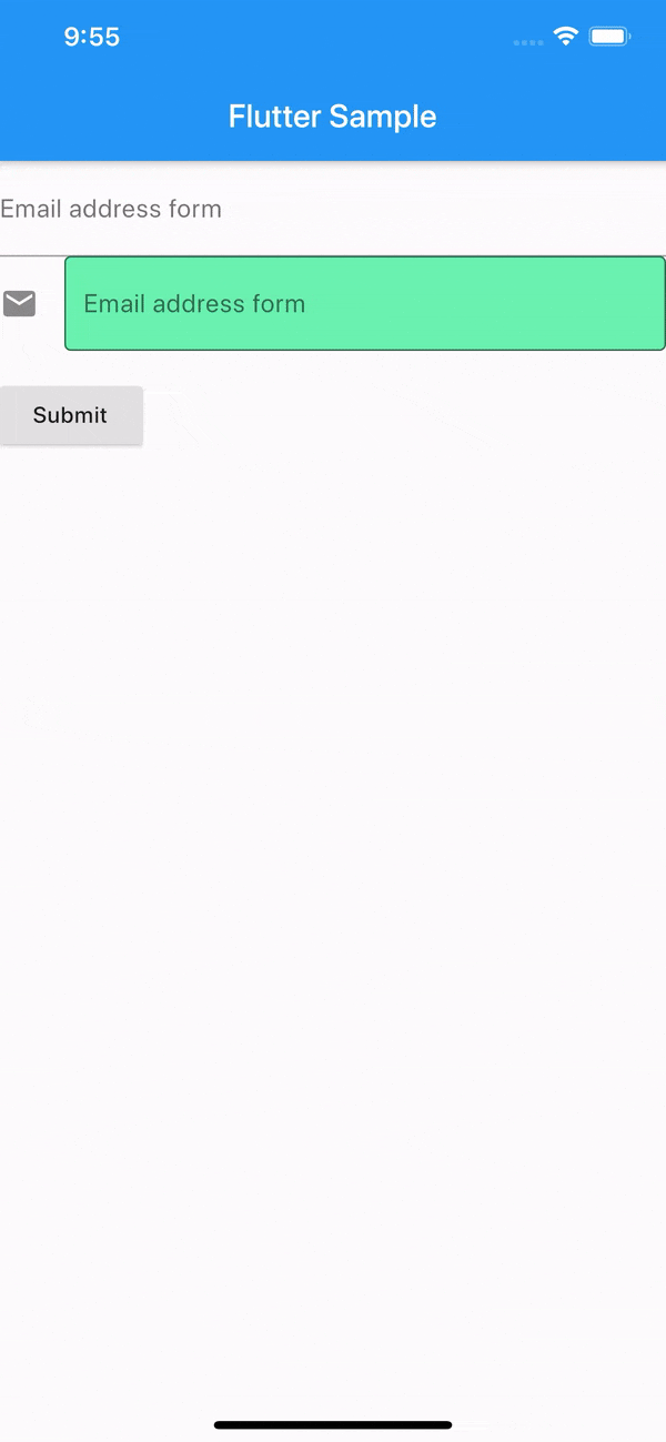
サンプルとして、2つのテキスト入力を持ったフォームの例を示します。Submitボタンを押した時に各テキスト入力をチェックし、空白以外ならOKというロジックになっています。
class FormSampleState extends State<WidgetSample> {
  final _formKey = GlobalKey<FormState>();

  @override
  Widget build(BuildContext context) {
    return Form(
      key: _formKey,
      child: Column(
        crossAxisAlignment: CrossAxisAlignment.start,
        children: <Widget>[
          TextFormField(
            decoration: const InputDecoration(
              labelText: "Email address form", // ラベル
              hintText: 'Enter your email', // 入力ヒント
            ),
            autovalidate: false, // 入力変化しても自動でチェックしない。trueにすると初期状態および入力が変化する毎に自動でvalidatorがコールされる
            validator: (value) { // _formKey.currentState.validate()でコールされる
              if (value.isEmpty) {
                return 'Please enter some text'; // エラー表示のメッセージを返す
              }
              return null; // 問題ない場合はnullを返す
            },
            onSaved: (value) => () { // this._formKey.currentState.save()でコールされる
              print('$value');
            },
          ),
          TextFormField(
            decoration: const InputDecoration(
              icon: Icon(Icons.email),
              border: OutlineInputBorder(), // 外枠付きデザイン
              filled: true, // fillColorで指定した色で塗り潰し
              fillColor: Colors.greenAccent,
              labelText: "Email address form",
              hintText: 'Enter your email',
            ),
            autovalidate: false,
            validator: (value) {
              if (value.isEmpty) {
                return 'Please enter some text';
              }
              return null;
            },
          ),
          Padding(
            padding: const EdgeInsets.symmetric(vertical: 16.0),
            child: RaisedButton(
              onPressed: () {
                // 各Fieldのvalidatorを呼び出す
                if (_formKey.currentState.validate()) {
                  // 入力データが正常な場合の処理
                  this._formKey.currentState.save();
                }
              },
              child: Text('Submit'),
            ),
          ),
        ],
      ),
    );
  }
}
FormField
FormFieldはForm内で利用するベースとなるWidgetです。後述のTextFormFieldもこれを継承しており、その他Form内で利用する独自定義Widgetを作成するなどに利用します。
サンプル
サンプルとして、独自定義Widgetを利用したフォーム入力の例を示します。初期値0のカウンタを+/-ボタンで増減するフォームを作成しています。Submitボタンを押した時に-1以外であればResult表示を更新し、それ以外はFieldにエラーメッセージが表示されます。
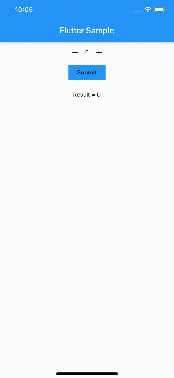
class FormFieldSampleState extends State<WidgetSample> {
  final _formKey = GlobalKey<FormState>();
  int _count = 0;

  @override
  Widget build(BuildContext context) {
    return Form(
        key: _formKey,
        child: Column(
            crossAxisAlignment: CrossAxisAlignment.center,
            children: <Widget>[
              CounterFormField( // 独自定義のFormField
                autovalidate: false,
                validator: (value) {
                  if (value < 0) return 'Negative values not supported';
                  return null;
                },
                onSaved: (value) => setState(() {
                  _count = value;
                }),
              ),
              FlatButton(
                child: Text('Submit'),
                color: Colors.blue,
                onPressed: () {
                  if (this._formKey.currentState.validate()) {
                    this._formKey.currentState.save();
                  }
                },
              ),
              SizedBox(height: 20.0),
              Text('Result = $_count')
            ]));
  }
}

// int型のデータを保有する独自FormLieldクラスを作成
class CounterFormField extends FormField<int> {
  CounterFormField(
      {FormFieldSetter<int> onSaved,
      FormFieldValidator<int> validator,
      int initialValue = 0,
      bool autovalidate = false})
      : super(
            onSaved: onSaved,
            validator: validator,
            initialValue: initialValue,
            autovalidate: autovalidate,
            builder: (FormFieldState<int> state) {
              return Column(children: <Widget>[
                Row(
                  mainAxisSize: MainAxisSize.min,
                  children: <Widget>[
                    IconButton(
                      icon: Icon(Icons.remove),
                      onPressed: () {
                        // Fieldの値を変化させる
                        state.didChange(state.value - 1);
                      },
                    ),
                    Text(state.value.toString()),
                    IconButton(
                      icon: Icon(Icons.add),
                      onPressed: () {
                        state.didChange(state.value + 1);
                      },
                    ),
                  ],
                ),
                state.hasError // Validatorの結果がエラー時の表示をここで対応
                    ? Text(
                        state.errorText,
                        style: TextStyle(color: Colors.red),
                      )
                    : Container(),
              ]);
            });
}
RawKeyboardListener
キーボード入力イベントをキャッチするためのWidgetです。iOS (かつエミュレータのみ?) 以外は問題なく動いてそうですが、iOS (かつエミュレータのみ?) だと反応が無いです。2016年の時点でissueが出ていますね。。
RawKeyboardListener doesn't receive any events from keyboard in ios simulator
サンプル
キーイベントを検出したら表示しているだけのサンプルです。
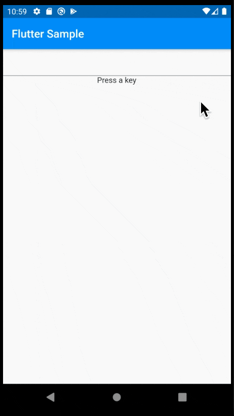
class RawKeyboardListenerSampleState extends State<WidgetSample> {
  final FocusNode _focusNode = FocusNode();
  String _message;

  @override
  void dispose() {
    _focusNode.dispose();
    super.dispose();
  }

  void _handleKeyEvent(RawKeyEvent event) {
    setState(() {
      _message =
          'Key: ${event.logicalKey.debugName}, KeyId: ${event.logicalKey.keyId}';
    });
  }

  @override
  Widget build(BuildContext context) {
    return RawKeyboardListener(
        focusNode: _focusNode,
        onKey: _handleKeyEvent,
        child: Column(
            crossAxisAlignment: CrossAxisAlignment.center,
            children: <Widget>[
              TextField(),
              Text(_message ?? 'Press a key'),
            ]));
  }
}