CSSでアンドロイドのキャラクター「ドロイド君」を作成する
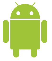
目標
次の画像にあるドロイド君を作成する
※できあがったコードはこちらから確認できます。
準備
任意のディレクトリに下記ファイルを作成
- droid.html
- droid.css
droid.html の初期状態
<!doctype html>
<html lang="ja">
<head>
<meta charset="utf-8">
<title>ドロイド君</title>
<link href="droid.css" rel="stylesheet">
</head>
<body>
  <div class="droid">
    <!-- ドロイド君のパーツをここに追加 -->
  </div>
</body>
</body>
</html>
droid.cssの初期状態
/* ドロイド君 */
.droid {
  margin: 50px;
}

/* 以下に追記していく */
作成
必要なパーツ検討
大きく分けて3パーツに分けられそう
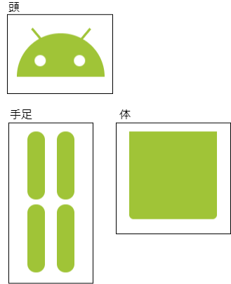
さらに、体は手足と親子関係を築けそう
droid.htmlで表現するとこんな感じになる
<!doctype html>
<html lang="ja">
<head>
<meta charset="utf-8">
<title>ドロイド君</title>
<link href="css/droid.css" rel="stylesheet">
</head>
<body>
  <div class="droid">
    <div class="droid__head">
      <div class="droid__antenna"></div>
      <div class="droid__eye"></div>
    </div>
    <div class="droid__body">
      <div class="droid__hand"></div>
      <div class="droid__leg"></div>
    </div>
  </div>
</body>
</body>
</html>
頭を作成
まずは頭のみ作成

これは半円で表現できそう。droid.css に以下を追記
.droid__head {
  width: 100px;
  height: 50px;
  border-radius: 100px 100px 0 0;
  background: #a0c437;
}
positionのrelative・absoluteとz-indexを使って、半円の上に目をのせる
.droid__head {
  width: 100px;
  height: 50px;
  border-radius: 100px 100px 0 0;
  background: #a0c437;
  /* 新規追加 */
  position: relative;
  z-index: 0;
}

.droid__eye {
  width: 100%;
  position: relative;
  z-index: 1;
}

/* 疑似属性のbefore, afterを使わなくても良いが、使用するdiv タグの数を減らせる */
.droid__eye::before,
.droid__eye::after {
  top: 25px;
  left: 20px;
  width: 13px;
  height: 13px;
  border-radius: 10px;
  background: #ffffff;
  content: "";
  position: absolute;
}
ファイルを開くとこんな感じになる

目と同じようにアンテナ用のクラスも追加
.droid__antenna {
  position: relative;
  z-index: 1;
}

.droid__antenna::before,
.droid__antenna::after {
  border: 1px solid #a0c437;
  top: px;
  left: 15px;
  width: 15px;
  background: #a0c437;
  transform: rotate(50deg);
  content: "";
  position: absolute;
}

.droid__antenna::after {
  left: 70px;
  transform: rotate(-50deg);
}
これでようやく頭ができた

頭の下に体を作成
下記を追記
.droid__body {
  width: 100px;
  height: 100px;
  background: #a0c437;
  border-radius: 0 0 5px 5px / 0 0 5px 5px; /* 体の下の角を少し丸くする */
}

ファイルを開くと…ん、頭と体がくっついてしまった、、
.droid__head に margin-bottom: 5px;を追記して調整
これでいい感じになった

手足を追加
頭に目やアンテナを付けたときと同じように手足も付けられる
.droid__hand {
  z-index: 1;
  position: relative;
}

.droid__hand::before,
.droid__hand::after {
  left: -25px;
  width: 20px;
  height: 77px;
  background: #a0c437;
  border-radius: 20px/ 20px;
  content: "";
  position: absolute;
}

.droid__hand::after {
  left: 105px;
  border-radius: 20px/ 20px;
}

.droid__leg {
  position: relative;
  z-index: 1;
}

.droid__leg::before,
.droid__leg::after {
  top: 50px;
  left: 10px;
  width: 20px;
  height: 77px;
  background: #a0c437;
  border-radius: 20px/ 20px;
  content: "";
  position: absolute;
}

.droid__leg::after {
  left: 70px;
  border-radius: 20px/ 20px;
}
できあがり!

少し工夫
ドロイド君がまばたきするようにしてみた
.droid__eye::afterにanimation: blink-r infinite 7s;を追加
さらに下記を追加
.droid__eye::before {
  animation: blink-l infinite 7s;
}

@keyframes blink-r {
  0% {
    transform: rotate(180deg) scaleY(1);
  }
  1% {
    transform: rotate(180deg) scaleY(0);
  }
  2% {
    transform: rotate(180deg) scaleY(1);
  }
  50% {
    transform: rotate(180deg) scaleY(1);
  }
  51% {
    transform: rotate(180deg) scaleY(0);
  }
  52% {
    transform: rotate(180deg) scaleY(1);
  }
  53% {
    transform: rotate(180deg) scaleY(1);
  }
  54% {
    transform: rotate(180deg) scaleY(0);
  }
  55% {
    transform: rotate(180deg) scaleY(1);
  }
  100% {
    transform: rotate(90deg) scaleY(1);
  }
}

@keyframes blink-l {
  0% {
    transform: rotate(180deg) scaleY(1);
  }
  1% {
    transform: rotate(180deg) scaleY(0);
  }
  2% {
    transform: rotate(180deg) scaleY(1);
  }
  50% {
    transform: rotate(180deg) scaleY(1);
  }
  51% {
    transform: rotate(180deg) scaleY(0);
  }
  52% {
    transform: rotate(180deg) scaleY(1);
  }
  53% {
    transform: rotate(180deg) scaleY(1);
  }
  54% {
    transform: rotate(180deg) scaleY(0);
  }
  55% {
    transform: rotate(180deg) scaleY(1);
  }
  100% {
    transform: rotate(90deg) scaleY(1);
  }
}
感想
面白かったしcssの勉強にはなったけど、
これ以上複雑なものを作ろうとしたらかなりの時間が溶けそう…。
参考
-
BEMのドキュメント
- クラス名はBEMの考え方を取り入れた
-
CSSでいろんなカタチを表現してみる
- 基本的な図形の書き方はこれを参考にした
-
画像を使わずにHTMLとCSSだけで猫を描いたお話
- ドロイド君のまばたきはこれを参考にした